Feature Friday | Miss Tiina

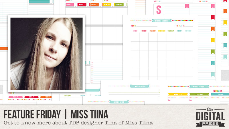
Happy Friday everyone, and welcome to another edition of our Feature Friday series here on The Digital Press blog! I’m excited to feature Miss Tiina (also known as Tina Raparanta) this week!

Tina is so talented, and if you haven’t yet seen her design work you are missing out! This is Miss Tiina’s third feature here on the blog (you can find her first feature from January 2017  HERE and her second feature from June 2017 HERE), and this time around our feature series will give you a better idea of who she is via a list of the Top 5 Things She Cannot Live Without

  1. Rainbow-colored items (of all kinds! from home decor to designs)
  2. Adobe Illustrator
  3. Franks hot sauce
  4. Big and comfy hoodies
  5. Flannel fabric

I’m completely unsurprised by her first item; after all, her products all demonstrate her love for all of the colors of the rainbow! Her love of hoodies and flannel are perfect given that we’re headed into fall at the moment! I always love learning more about our designers and getting a peek into their lives. 🙂

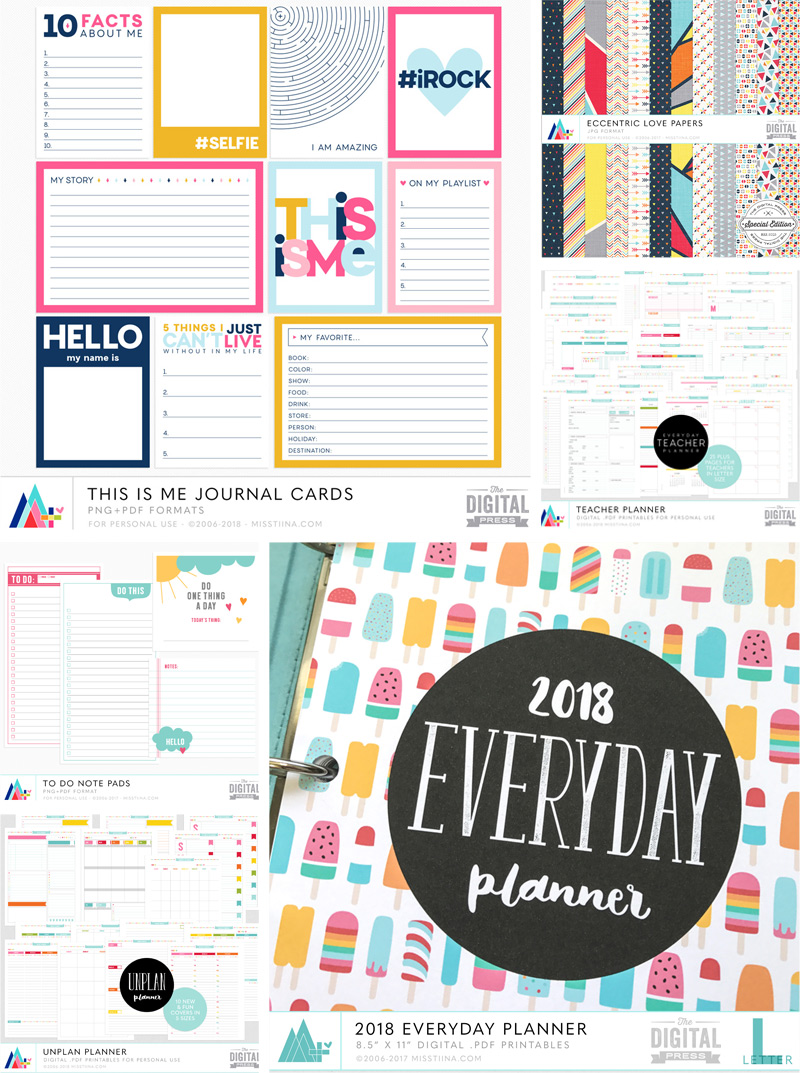
As for Miss Tiina’s products and design style… her work brings to mind the following descriptors: colorful, simplicity, happiness, and clean! Most of her products are focused on helping us to be more organized. From her beautifully-designed printable planner system, to her amazing papers and journal cards, her shop has everything you need to organize your life (as well as what you might need to inject some color into your scrapbooking projects)!

If you happen to be a teacher, she even has a teacher planner that will help organize your teaching life! And if you are a pocket scrapper, she has a really handy pocket scrapbooking project planner that includes everything you need to keep on track with the project!

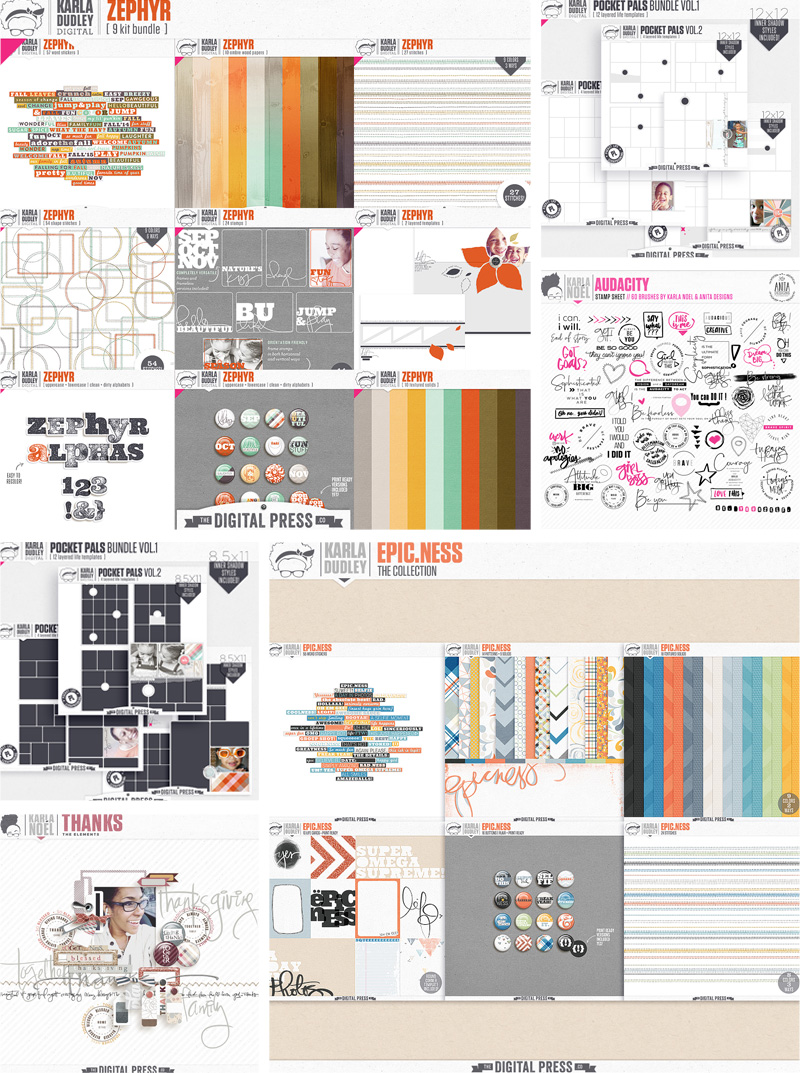
Here are just a few of my favorite products from Miss Tiina’s shop

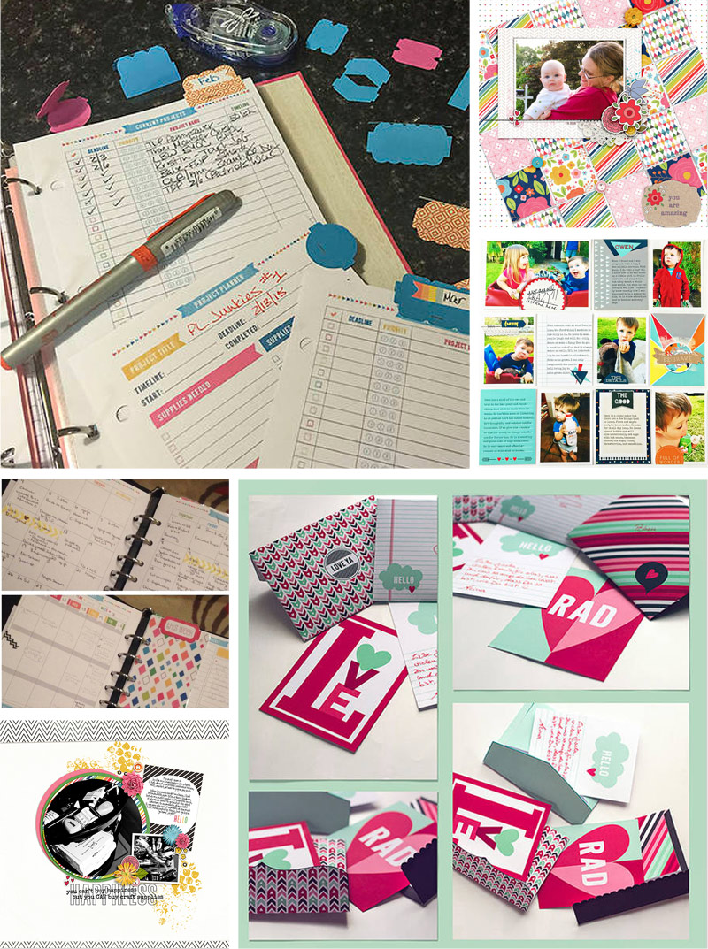
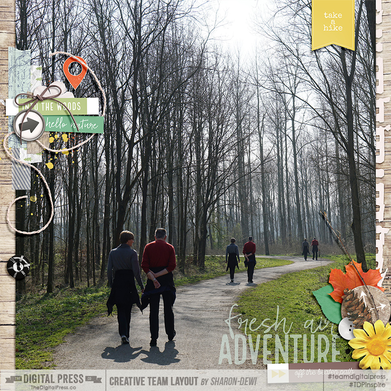
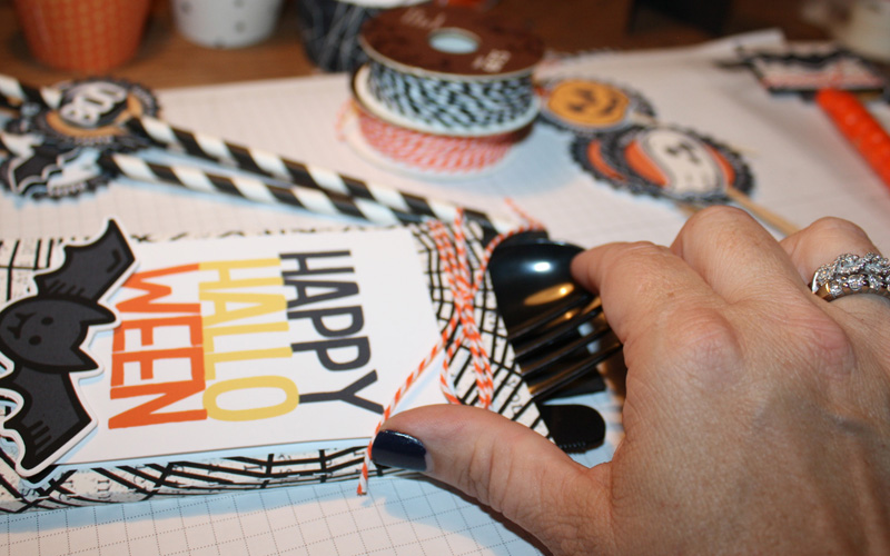
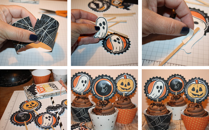
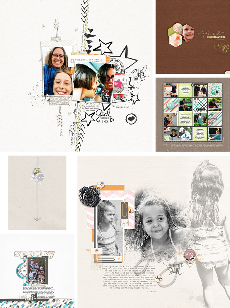
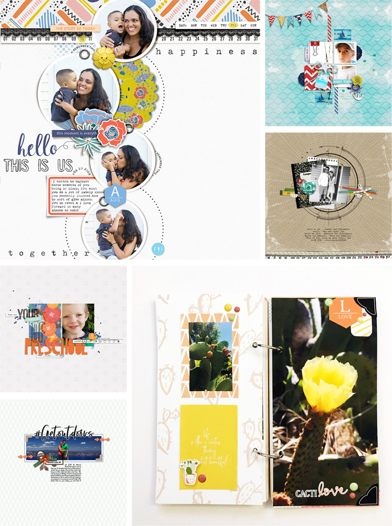
And finally, here a few examples of her products in action … as you can see, they’re fun and versatile and can be used in so many ways…

I hope you’ve enjoyed this look at the amazing Miss Tiina! You can visit her shop and get 30% OFF of her products throughout her entire feature week (the sale will end at 11:59 pm ET on Thursday 10/4)


Amy

About the Author  Amy lives in Richmond, Virginia, with her husband and their 13-year-old boy/girl twins. Their 22-year-old daughter just completed graduate school at Clemson and has moved to Pittsburgh to start her first full-time job! She has been scrapbooking since the early 1990s, but discovered digital scrapbooking in 2005 when her twins were born… and has primarily scrapped digitally since that time. She is passionate about telling her family’s stories and documenting their life together. She is also a huge reader (mostly literary fiction), a pop culture junkie, and LOVES all things beauty & makeup!

Tutorial Tuesday | Combining Multiple Photos


Hello everyone, and welcome to another edition of our Tutorial Tuesday series here on The Digital Press blog! Today I hope to inspire you to try out combining multiple photos to tell a more complete story with just a single picture.

I always struggle a lot when it comes to choosing the one perfect photo to scrap into a page. I’m the type of photographer who is always running around with a camera around my neck, constantly trying to catch up with the people I’m with because of the many photographs I’m shooting. I often run a bit ahead and then stand still with my camera ready to photograph my loved ones as they walk towards me or as they are passing by. For this tutorial I had a couple of pictures that I took during a walk through the woods. Since they are quite similar (taken from the same position) and I couldn’t decide which one I liked the best, I thought it would create a fun effect to combine these photos to create one single picture that would show a more complete story of our walk.

A great way to start is to open one of the pictures in a photo-editing program like Photoshop. I’m using Photoshop CC for this tutorial. Once a new file is created you can quickly create a better overview before adding the other photos by enlarging the canvas using the cropping tool. Then you can easily drag and drop the other photos in the same file. By changing the opacity of the photos to around 50 percent you’ll be able to position them on top of each other in a way that they almost blend perfectly. When it comes to positioning the photos, aligning the surroundings of the subjects is more important than the borders of the photos.

When you turn the opacity of the photos back to a 100 percent, you’ll might see that the borders of the different photos don’t align perfectly or are too harsh to look perfectly merged. We can improve this by erasing some of the edges and making it softer. It’s possible to do this with the eraser tool, but I always prefer using masks so the alterations aren’t permanently. You can add a vector mask to the selected layer by clicking on the mask icon in the layers window at the lower right of the screen.

When the vector mask is added to the selected layer a white rectangle appears next to the image of the layer. By clicking on this rectangle, the vector mask is selected and now editable. A brush can be selected to start removing some parts of the photo. Make sure the foreground color is set to black, since everything that’s white in the vector mask remains visible and every part that is made black becomes invisible. I always prefer using a brush that has some softness so the blending border looks more natural, but not too much softness that it’s starting to look blurry. I would recommend setting the hardness of the brush on a number somewhere between 50 and 90 percent, depending on the sharpness of the photo and the alignment of the other photos underneath. With the black foreground color selected you can now start removing the outer parts of the photos to make their transitions invisible. By changing the transparency of the photos you’re not editing, you have better sight on what you’re doing. As you can see in the picture underneath I never remove bits in a straight line. By making the border irregular or following some distinct lines in the photo like a tree trunk, the overlapping border will become almost completely invisible.

To make sure no stray pixels remain after erasing you can always apply a stroke in a distinct color on the layers to make the unwanted bits visible. When you’re happy with the gained result after erasing the borders and unnecessary overlapping parts of the different photos, you can determine how big the final picture is going to be. By using the cropping tool you can alter the canvas to the maximum complete width and height of the picture or make it a bit smaller if desired.

After the cropping is applied you’ll see the complete result of the combined picture you have created. To make the picture even more aesthetically pleasing you can now play around with levels, curves and saturation. Because I found that the pictures always turn out a bit darker when printed, I like to increase the curves layer a bit to lighten the picture and make it pop a bit more. You can easily do this by moving the point in the graph of the Curves Properties panel. By adding more points to this graph by simply clicking on it you are also able to increase or decrease the contrast of the picture.

Now the picture you have created is completely finished and ready to be scrapped into a beautiful layout! Because I liked the effect of the picture I combined so much I chose to use it as big as possible on my layout. For the layout I created with this picture I used several scrapbook kits from the July 2018 Special Edition section of The Digital Press website, which proved to be a perfect match. The finished layout I created can be seen underneath.

(credits: Into The Woods | Collection by Little Lamm & Co and Hooray, It’s Saturday! | Kit by Ninigoesdigi)


I hope I have inspired you to try out combining your own photos into one complete picture and I hope you’ll have a lot of fun with it!


Sharon-DewiAbout the Author  Sharon-Dewi is an industrial engineer with her own design company and a teacher at a technical university in the Netherlands who loves to spend every little bit of free time she gets capturing and documenting the special moments of her life and that of her loved ones by creating scrapbooks. She can often be seen running around with a camera in her hands and she is a big fan of anything Disney-related. One day she hopes to be able to permanently live at the happiest place on Earth!


Hybrid How-To | Halloween Party Fun

Hello everyone! It’s Tanya here, and I’m excited to share another edition of our Hybrid How-To series with you here on The Digital Press blog!

I don’t know about you, but I love fall. I love the crisp cool air, the colors, the smells, and the events to come… October Fest, Old Settlers Day, and most of all HALLOWEEN (the cutesy, not scary)! Today I am going to show you how to create some fun Halloween party supplies using your favorite Halloween digital kits!

I have several fun things to show you…. so let’s get started.

SUPPLIES NEEDED:

  1. Your favorite digital Halloween kit(s)
  2. White cardstock
  3. Pop dots
  4. Double sided tape
  5. Wooden picks for cupcake toppers
  6. Party Straws
  7. Ribbon
  8. Plastic silverware
  9. Scissors

For this project, I used the following digital products…

[ the brand new kit Spellbound by Little Lamm Paper Co, — Spooky by Little Lamm Paper Co. — and Spook by Karla Noel ]

*NOTE* I have recently upgraded from Silhouette Studio Edition software to the Silhouette Business Edition. There are a few features that I have really liked so far… the biggest being that with the Business Edition is that you can use more than one computer at a time. I haven’t tried it yet, but I will soon!

For my first step, I opened the following silverware box cut file that I already had in my stash of hybrid files. I did reduce the file size by just a little (and after cutting it out, I’ve decided that you can go even a tad smaller if you want to; It’s just one of those things you have to play around with)…

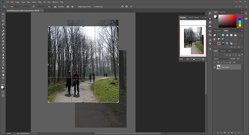
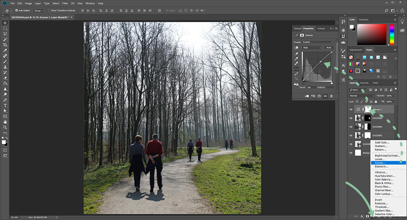
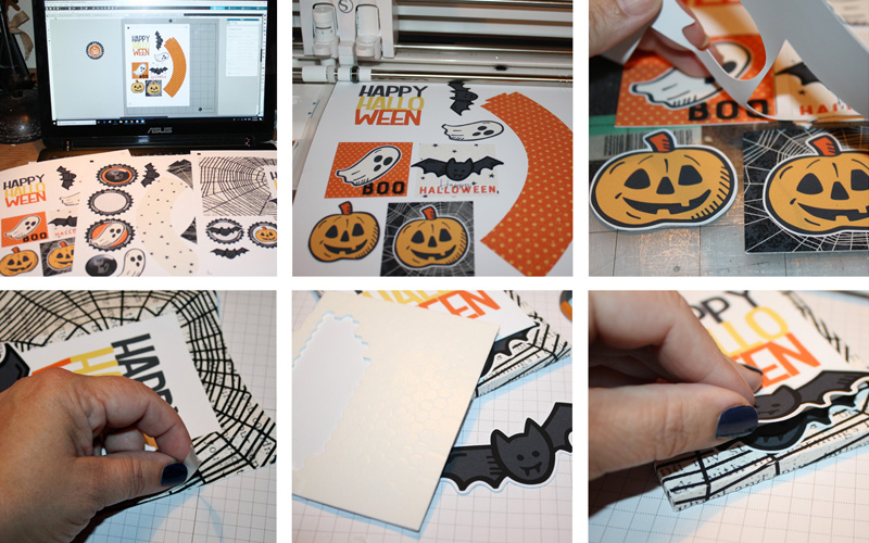
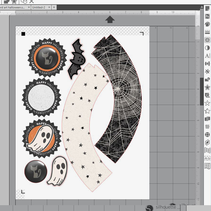
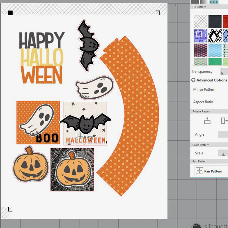
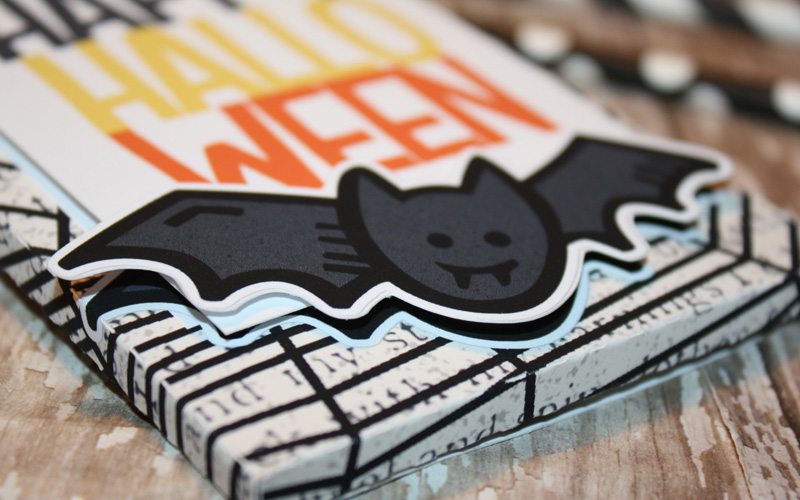
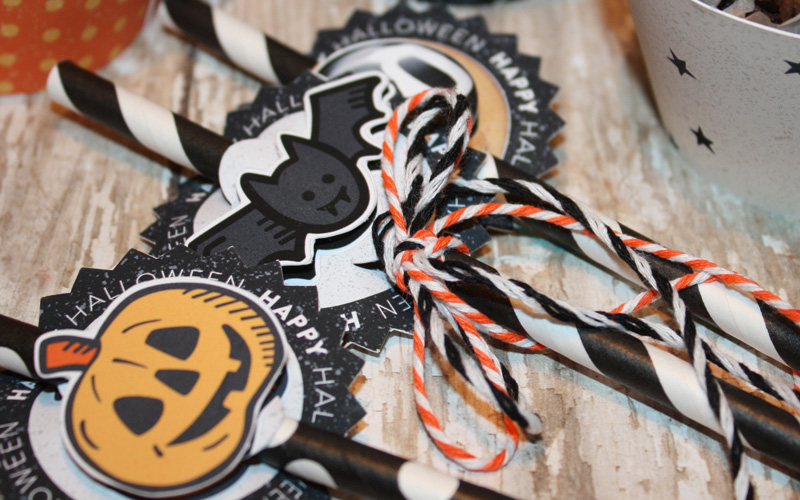
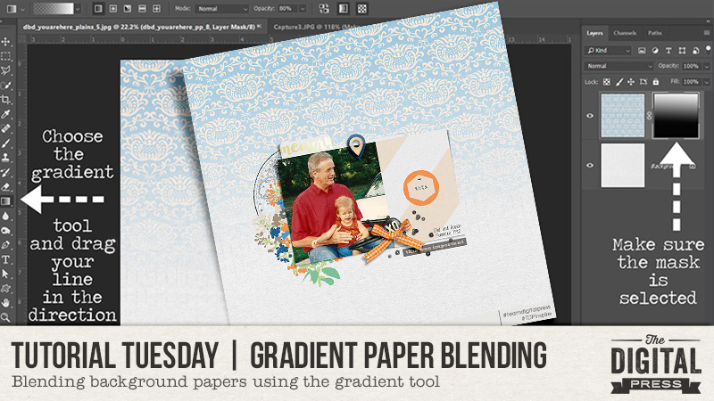
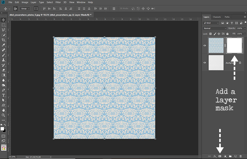
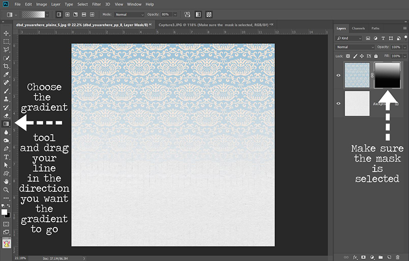
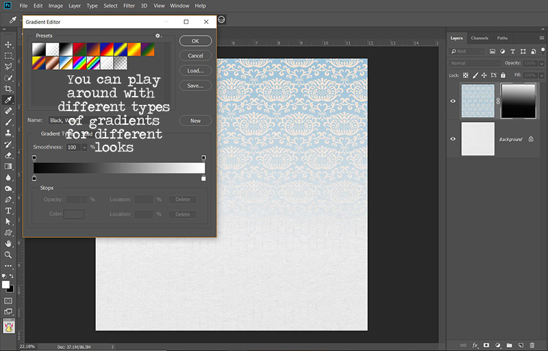
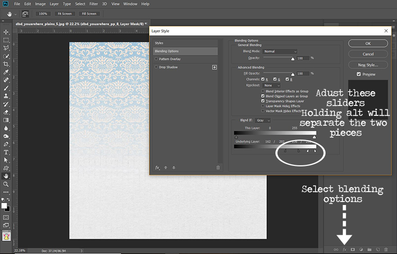
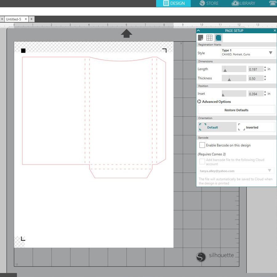
My next step was to choose digital paper for my project. For this, I opened the file where my paper was saved on my computer and drug it straight to the box file within my Silhouette software. You can see here how simple it is (and note that you can go into FILL PANEL and adjust the size and orientation of the paper)…

Next, I continued opening the elements and journal cards that I wanted to use for this project. I moved them around until I was happy with the placement. I love to have dimension on my projects, so I usually cut out extra pieces that I want to be raised up. This isn’t necessary, but I think it gives a neat finish to the project. However, if I were having a really large party, I don’t think that I would waste the time or money doing this.

After I finished creating the party supplies I printed each sheet out, ran it through my cutting machine, and assembled as shown below. Here are a couple of tutorials from TDP’s blog if you need more info on print and cuts… HERE & HERE. I used double sided tape to assemble, and then I used pop dots to attach the embellishments I’d cut out in order to add dimension.

Once I had the silverware holders assembled, I filled them with plastic cutlery…


Next came the cupcake holder… and for this, I opened a cupcake cut file that I created a while back. It’s simple and no scallops, and so I thought for Halloween it would be a good choice. I created toppers, as well, with extra pieces for dimension.

After creating the pieces you see above… I simply print, cut, and assembled…

*NOTE* For the toppers, I used little flat wooden sticks that I purchased from Hobby Lobby (they can be found in the raw wood section; I have also seen them at JoAnns Fabrics). I prefer using these over toothpicks because they are flat and your toppers lay flat without ugly ridges in your toppers. I used double sided tear tape to assemble. You can use glue, but the tear tape is awesome.


Finally I created some candy treat toppers, as well. For these, I created 2″x 2″ squares, filled them each with digital papers, and then added some elements. Again, I also added extra elements with pop dots for dimension.

To assemble the toppers, I used 1″ treat bags and filled them with Halloween-colored M&M’s. For the topper, I cut strips of black card stock just a little bigger than the printed square… and then I used double-sided tape and pop dots to assemble…

Below are some of the close ups of all of the projects shown above. Aren’t these the cutest thing you’ve ever seen?!

I also created straw toppers for this Spooky party. I really adore these cute elements. I like the fun part of Halloween, not the really scary part!

I hope that you have enjoyed this edition of Hybrid How-To. Don’t forget to visit the CROSSWORD SECTION  in The Digital Press forum, and jump into this month’s Hybrid Challenge if you are thinking of trying this project. You can earn points toward discounts & FREEBIES! I hope that you will join in!


Tanya

About the Author  Tanya is a part of the hybrid team here at The Digital Press. She has been hybrid crafting for at least 16 years now, and loves creating and sharing those creations with others. Her all-time favorite tool is her Silhouette Cameo. She has been married for 29 years to her high school sweetheart, Richard and has two sons: Chris, 26 and Chance, 22. She also enjoys crocheting, photography and woodworking.


Feature Friday | Karla Noél

Hi everyone, and welcome to another edition of our Feature Friday series here on The Digital Press blog! These posts are so much fun for me! Why? Well, I get to share a little “behind the scenes” info about who our designers are… and I learn a few new things, too.

This week, our featured designer is Karla Noél (formerly Karla Dudley). I’ve been a fan of Karla’s for some time, and we’ve been in the same digi circles for several years. And you know what? I thought I knew her pretty well, but when I asked Karla to share 5 Things We Might Not Already Know About Her… well, I had no clue about #2 on her list!

Here’s what she said:

  1. I’m engaged to my high school sweetheart ^_^ We are also expecting a baby, due next Spring! (yes, I would be the chick with the two sets of back-to-back twins already AND after I thought I couldn’t have anymore, I guess God had other plans lol! As far as all that goes, we’re both SUPER excited about it. Total parent mode already. We hardly wait to meet him or her and welcome them into this world 🙂 )
  2. I was a competitive All-Star cheerleader for most of my school days. I was asked to be in the movie “Bring it On” …but had to decline as I was heading off to college. My cheer coach at the time, Ray Jasper, was the choreographer for the movie and I could shout out the names of many cheer ‘extras’ in the film. I did end up going to college for cheer at the University of Louisville (KY). I was on the All-Girl squad and won two NCAA championships! Kachow!
  3. I have a knack for crochet. Okay, I actually love it! I go on binges and have discovered the fabulousness of making my own garments. My favorite items to crochet are cardigans and sweaters. Not only is crochet super useful during the cold months, but it’s inexpensive and it helps me de-stress and take my mind to other places while making something practical, cute, and amazing at the same time. Win-win yo!
  4. I JUST started learning my DSLR camera outside of the no-flash option. That’s right, since 2007 I have used only that single option in manual mode for all my pictures taking until recently. I’m now getting pretty proficient with the other modes, specifically AV, and loving it! I’m more in control, I’m really “understanding” my camera and a new-found love of photography has hit me. Coolness.
  5. My dream is to have my own brand of tangible and digital memory keeping products. Specifically, acrylic/rubber stamps, designer papers, lace papers and designs, mural art, decor, art items and more. Oh…and for Oprah to FINALLY interview me. I have a story to tell… if y’all are ready ^_^

As for Karla’s designs, if you love graphic-style papers and hand-written titles and wordart, then Karla just might be the designer for you! Here is just a small sampling of the amazing products you’ll find in Karla’s shop, so you can see what I mean…

And here are some fun examples of projects that were made with Karla’s products, to give you an idea of what’s possible when using her fun creations

I hope you’ve enjoyed learning a little more about Karla Noél today! To celebrate her week as our Featured Designer at The Digital Press, Karla’s entire shop will be 30% OFF all week long (the sale will end at 11:59pm ET on Thursday 9/27).

Additionally, Karla has a special Free-with-Purchase offer for everyone this week! Don’t miss out on this opportunity to stock up on your favorite products from Karla Noél … and you can also snag this brand-new (just released today!) item from her shop — Framed Template — for FREE with any $10+ purchase in her shop! (again, the offer is valid through 11:59pm ET on Thursday 9/27).


About the Author Kat Hansen is a creative team member here at The Digital Press. A Director of Human Resources by day, she loves the opportunity to spend a few hours each evening being creative. Vacation memories feature pretty heavily in Kat’s scrapbooking pages, as well as her health and fitness journey. Kat has quite the sense of humor (she “blames” her father for this), which she incorporates into her journaling and memory-keeping.

Tutorial Tuesday | Gradient Paper Blending

Hi everyone, and welcome to another edition of our Tutorial Tuesday series here on The Digital Press blog! Today we are talking paper blending!

Have you ever wanted to use more than one of those gorgeous background papers you have in a kit but don’t want the harsh line of stacking them? Do you have two or more papers that you think would work beautifully together? Blending papers for a background is something I do fairly often and there are actually several ways you can go about it.

One way is to use the gradient tool, which is what this tutorial is all about. It’s a fairly quick and simple way to achieve and beautiful new look.

Start by layering the the two papers you want to blend:

With the top paper layer selected, click the layer mask icon:

Making sure the mask is selected, choose the gradient tool. Drag your gradient line from the top edge of the image to the bottom, or bottom to top, or side to side, or even diagonally, depending on the way you want the gradient to go. You can play around with different directions to see which effect you like best. You can also start in the anywhere on the paper to move the gradient closer to one edge or corner.

For this one, I first went from bottom to top and then moved to the center of the paper and pulled up again. And just like that, your papers are beautifully blended!

You can also play around with different gradients to get different blending effects.

If you wish, you can add more paper layers and blend them as well.

Typically, I will then take it a step further in PS and adjust the blending options (click the fx button at the bottom and choose blending options), especially on a woodgrain to bring out the texture a bit more. Adjusting the underlying layer just adds a little more blending. You can hold the alt key while sliding to separate the pieces of the triangle for different blending effects.

There is a more detailed Tutorial Tuesday all about that method of blending here – Blending Papers in Photoshop and one on using gradients to blend photo masks here – Masking with Gradient Tool.

Here’s a page I did where I blended two background papers. I used You Are Here Elements and Papers by Dawn by Design.

I hope this will help you to create beautifully blended and unique background papers! Have fun and be sure to link us up to your creations if you try it out!


Jan
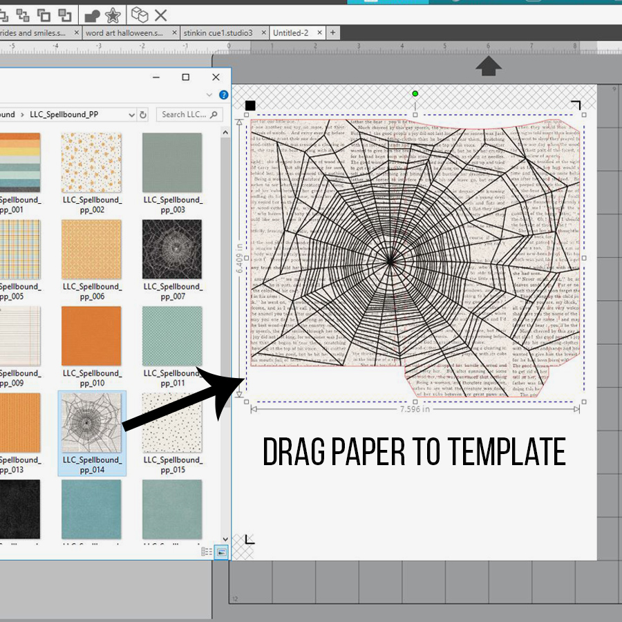
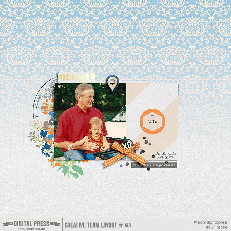
About the Author  Jan is a high school teacher, wife, mom, and grandma who spends most every little bit of free time she gets documenting her family’s memories through digital scrapbooking. She is a summertime sunshine and beach lover who gets her energy from being outdoors. She is currently looking forward to retirement and a beach chair with her name on it and someone bringing her fruity drinks on command!

Feature Friday | Rachel Etrog Designs

Hiya friends, and welcome to another edition of our Feature Friday series here on The Digital Press blog! I really enjoy doing these posts because I get a chance to get to know our designers outside of the digital design world, and it is always so fun to learn about the person behind the gorgeous designs that we sell at TDP!

This week, our featured designer is Rachel of Rachel Etrog Designs. Rachel lives in Israel, and this is her first feature here on the blog (she joined The Digital Press earlier this year as a one of our resident designers). We’re so excited to get to know her better this week!

In order to learn more about her, we asked her to share 5 Things We Might Not Already Know About Her

  1. I have a degree in architecture and interior design, and I worked for about 10 years in the profession until I changed to graphic design, which is my greatest love.
  2. I served in the army for two years after I finished high school. Here in Israel, boys and girls are obligated to serve in the army after high school.
  3. I’ve been vegan for almost 3 years.
  4. I’m a spiritual therapist. I help and guide people to understand who they really are by meditating and emotional processes.
  5. I’m a huge Depeche Mode fan, I even have the signature of singer Dave Gahan, who signed on my hand as a tattoo!

Um, I think we might be related somehow… because I am totally listening to Depeche Mode while writing this!

If you have not had a chance yet to look through the Rachel Etrog Designs shop at TDP… you really should!  There are so many gorgeous kits to choose from!  I really love the bold beautiful colors she uses and the fun elements!  I just want it all!

Here are a few of my favorite products from Rachel’s shop (and let me tell you, it was really hard to choose!)…

Additionally, I also want to share with you some gorgeous sample project pages using Rachel’s fun products, which I found in the gallery at TDP…

Those projects are so much fun — and her products work so nicely for just about any type of memory keeper, don’t you agree?!

I am so glad you joined me in learning about Rachel for her very first Feature Friday here at TDP, and I hope that you are just as excited about her gorgeous designs as I am! If so, I have good news… because during her upcoming Feature Week here at The Digital Press, Rachel’s entire shop will be marked down 30% OFF all week long (the sale will end at 11:59pm ET on Thurs 9/20). Don’t miss it!

And that’s not all! Rachel also has a special Free-with-Purchase offer for you this week, as well! Don’t miss out on this opportunity to stock up on your favorite products from Rachel’s shop at TDP, and you can also get this fantastic (and brand-new! just released today!) full kit — Storyteller — for FREE with any $10+ purchase in her shop (this week only, though… because again, this offer ends at 11:59pm ET on 9/20).


ErinErin is an artsy crafty kind of girl who is currently dabbling in far too many things, but is working hard to enjoy every moment of it, while avoiding the rain, which is difficult due to living in the land of many rains. She is slowly learning to use her smart phone to capture all the fun little bits of life that would otherwise go unremembered in the busy craziness that is raising a family!