Feature Friday | creashens

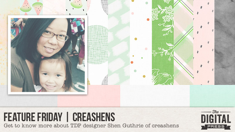
Happy Friday, everyone, and welcome to another edition of our Feature Friday series here on The Digital Press blog! This week, I’m thrilled to put the spotlight on the amazingly talented Shen Guthrie of creashens. Shen has been featured here on the blog a few times already in the past (you can learn more about her by reading her first feature article from 2016 HERE, and her 2017 feature HERE ).

In order to learn more about Shen, personally, this time around… I asked her to share 5 Things We Might Not Already Know About Her

  1. She has a secret crush on Paul Rudd.
  2. She has misophonia (people who are sensitive to selective sounds; a.k.a. “sound rage”).
  3. She would choose rain over sunshine any day.
  4. She loves plants but always kills them.
  5. She always think of things that she needs to remember, and then forgets to write them down… and doesn’t remember, in the end.

Fun trivia! Ha ha …who would’ve thought?! 🙂

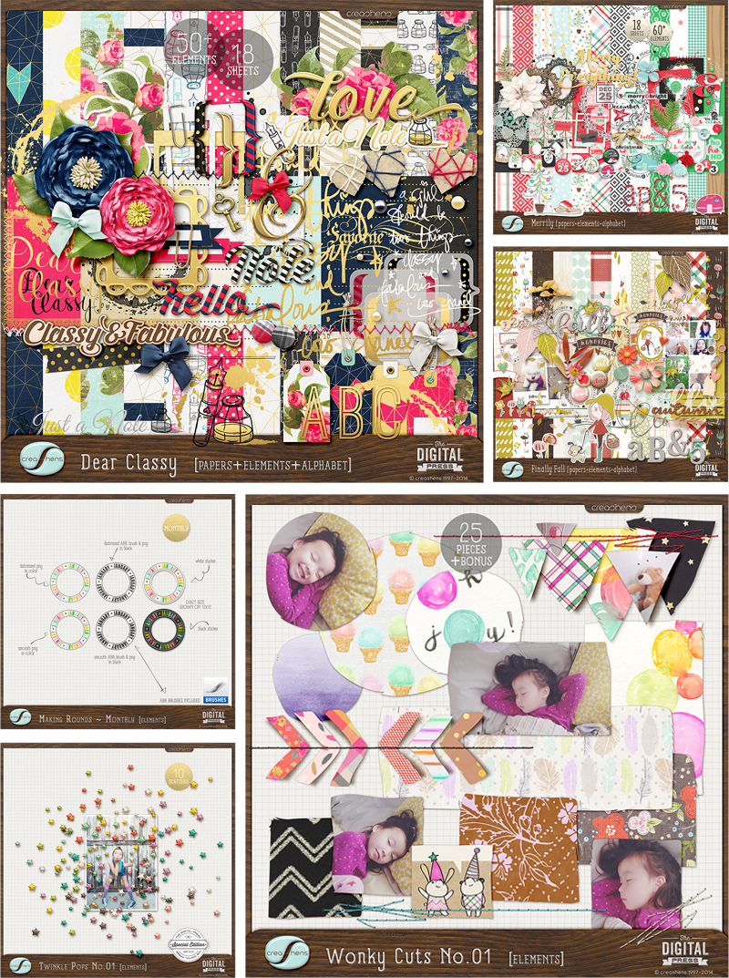
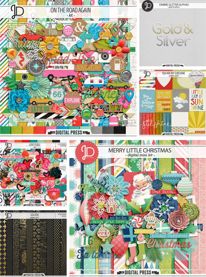
For those who have not yet had a chance to take a look at the creashen’s shop here at The Digital Press… it’s full of beautiful color palettes and a fantastic mix of whimsical and realistic elements (not to mention the incredible patterned papers). In addition to her stunning kits, she also offers a lot of other stand-alone embellishment packs, unique alphas, and other essential bits and bobs.

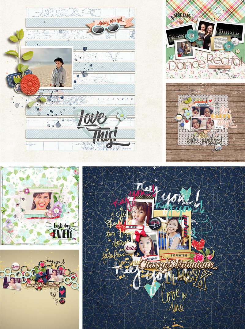
I had a really hard time picking out my favorite products, but here’s a peek at just a few of them…

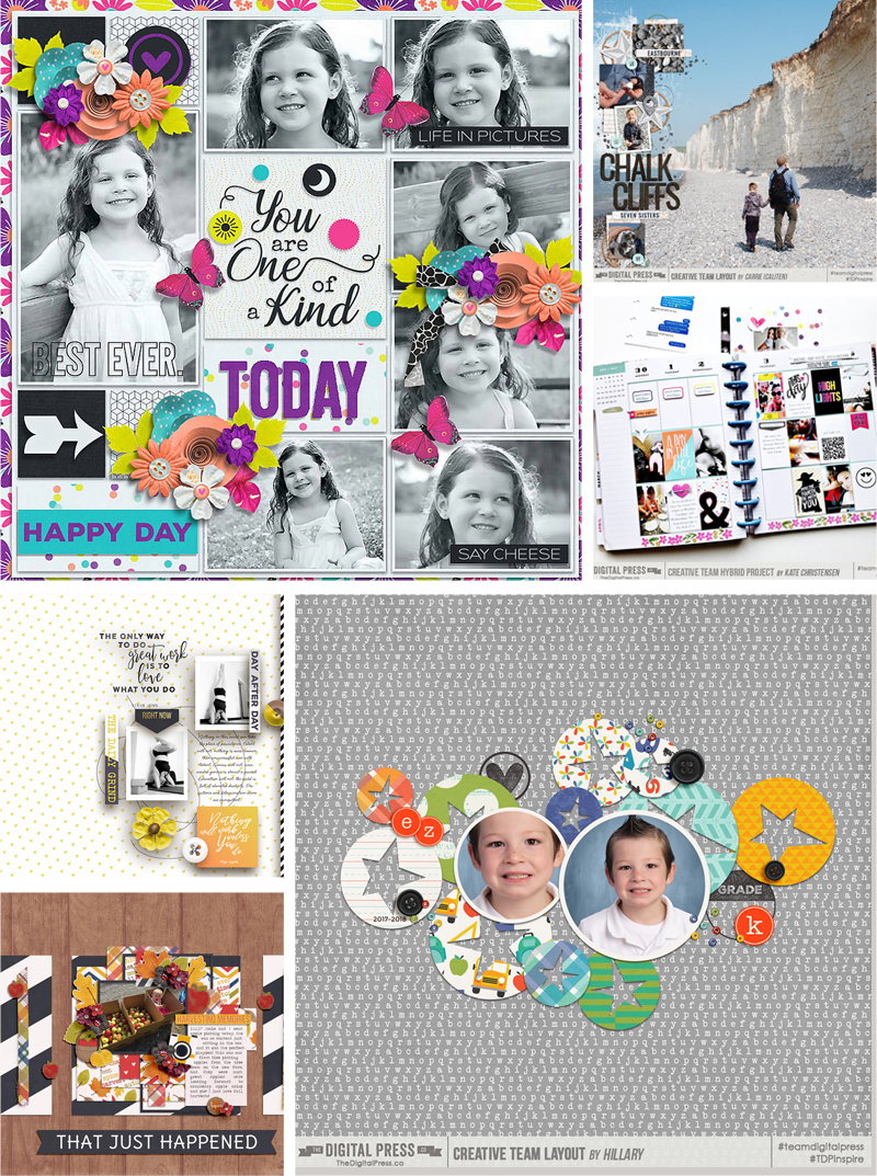
To give you a look at some of her products in action, I’ve also compiled this fun sampling of digital layouts that were created with her designs…

It was so fun to get a little peek into Shen’s world today! And now that you’re excited about her gorgeous designs… I’ve got some great news! Her entire shop HERE at The Digital Press will be marked down 30% OFF during her feature week (the sale will end at 11:59pm ET on Thursday 10/25).

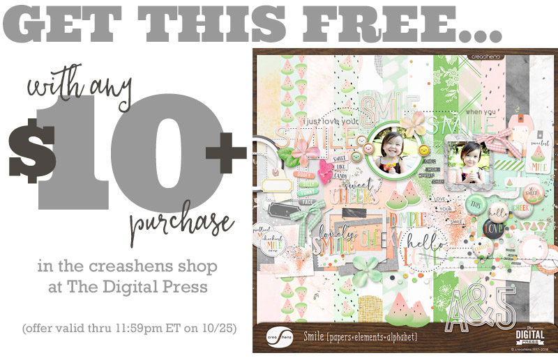
Additionally, Shen has a special Free-with-Purchase offer for everyone this week! Don’t miss out on this opportunity to stock up on your favorite products from creashens … and you can also snag this brand-new (just released today!) digital kit from her shop — Smile — for FREE with any $10+ purchase in her shop! (again, the offer is valid through 11:59pm ET on Thursday 10/25).


Christelle

ABOUT THE AUTHOR  Christelle is a creative team member at The Digital Press, happily creating for all the talented designers. She’s a pharmacist from South Africa, who recently relocated to the UK with her husband.  Christelle loves scrapping her 3 lovely step-children and 4 beautiful nieces and all of their (mis)adventures. If she could, she’d travel all the time, but for now she makes do with traveling as often as possible. Her other hobbies include machine embroidery and sewing, as well as reading soppy romance!

Tutorial Tuesday | Large Photos for Emphasis

Hello everyone, and welcome to another edition of our Tutorial Tuesday series here on The Digital Press blog! Today, I’ll be sharing ideas for using large photos creatively to emphasize them on your scrapbook layouts!

Have you ever heard the phrase “go big, or go home”? I love it, and I say it to myself quite frequently when creating scrapbook pages that feature my favorite photos. The photos that tug at your heart strings, tell a story or just deserve a large spot in your scrapbooks, those are the photos I am talking about!

A big photo makes a statement, and is the perfect way to showcase a photo that tells a story. Use one large photo to fill the entire background of your layout!  Photos that work perfect for this are ones that show the entire landscape or are a wide angle shot with lots of white space. You can add more photos in the white space of your photo as I did on the layout below. Frames help to ground the photos you place over top of the background photo and help tie multiple photos together cohesively on a layout.

Tip: Use the opacity slider to make your background photo look more transparent. This can give the photo a look of a faded memory! If you layer your photo on top of a textured cardstock, it will take on the textured look of the paper below it!

Trick: Frame your large photo to give it more definition on the page. Use stitching or other attachments to anchor your photos and elements to the large photo. That way they don’t look like they are just floating on top of your background photo!

Trick: use a template as the guiding point for your design. Fill the background layer of that template with a large photo and work from there. On the layout below I started with this photo of the skyline and added other favorite photos from our vacation on top of it.

A large horizontal or vertical photo can be used in its natural shape on a scrapbook page by layering patterned papers and embellishments below it. You still get the emphasis of a large photo layout, without filling the entire page with the photo.

Large photo layouts are the perfect way to document a conversation or quote you want to remember from the moment the photo was taken. Keep your design simple and let the photo shine! Not only does the large photo speak volumes, the words you document right on top of it will help to recreate the story from that single moment!

Tip: Use the white space on your photo to write your journaling.

So there you have it… a few simple tips and tricks to use large photos for emphasis on your scrapbook pages.  I hope this has inspired you to use a large photo on your next layout!


JenniferHignite
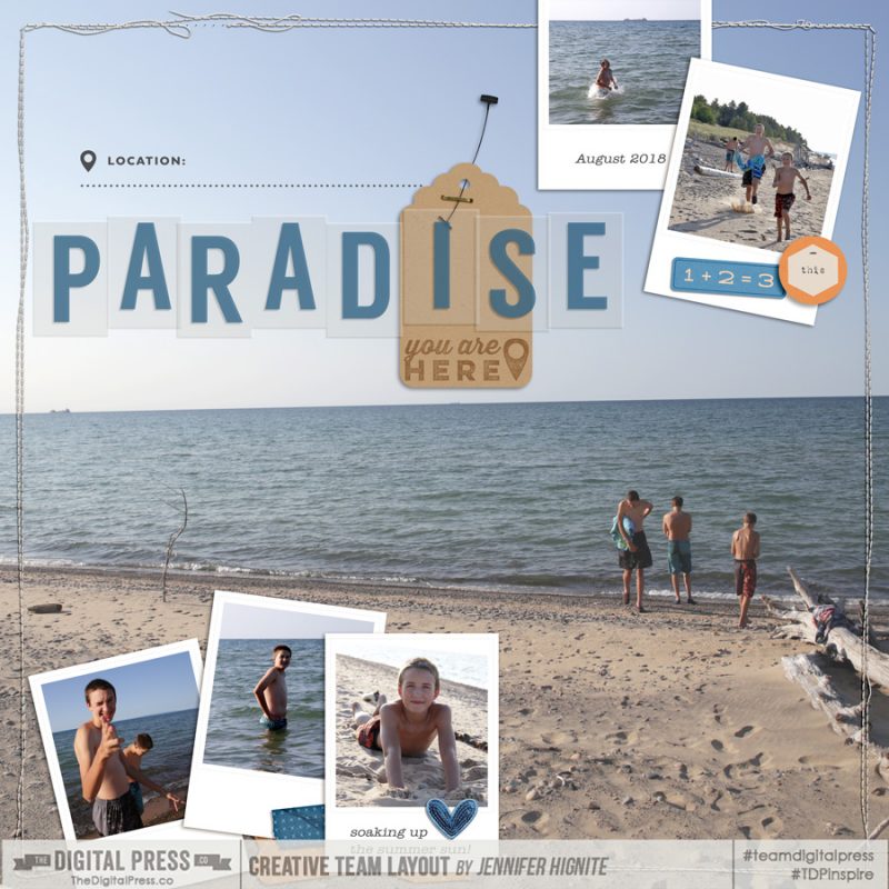
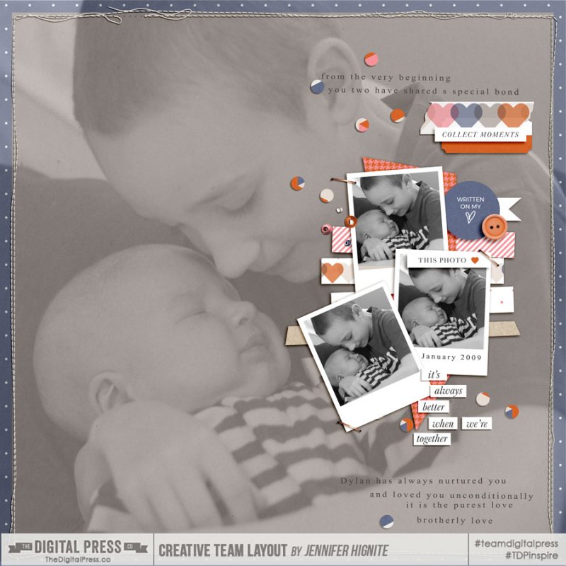
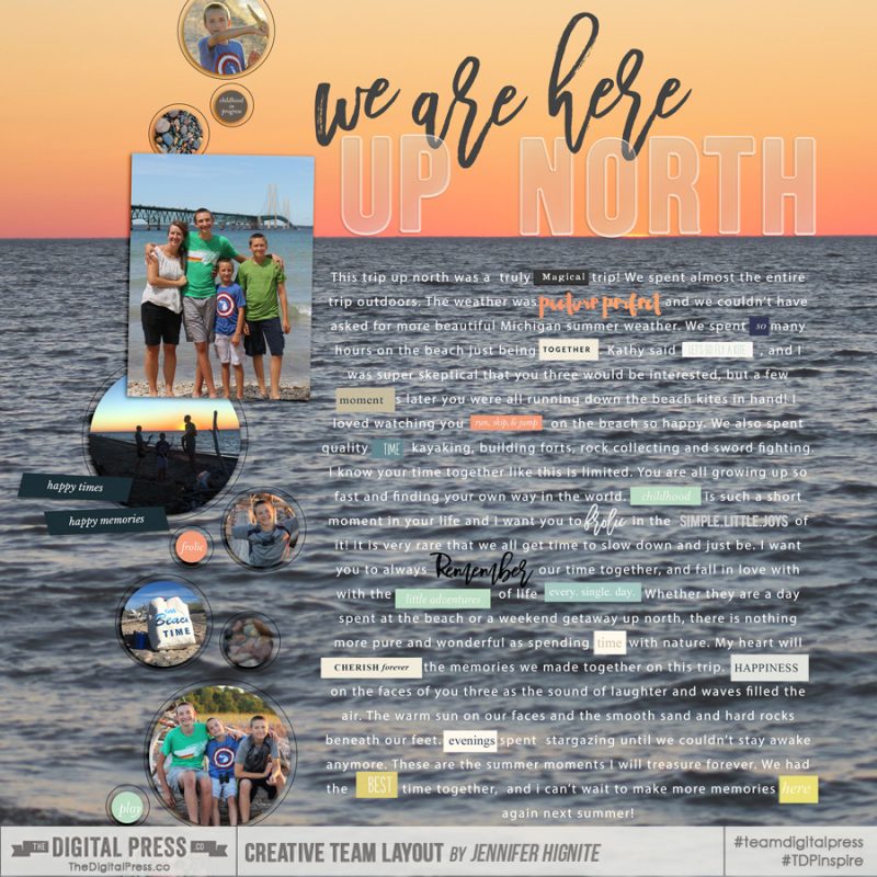
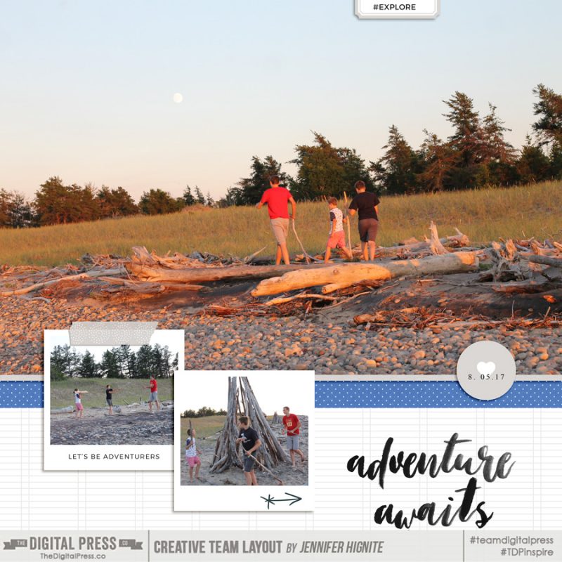
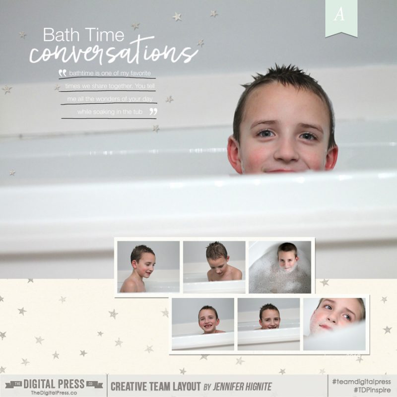
Jennifer Hignite is a mom of three boys and new homeowner with her fiance in the mitten state of Michigan. When she is not scrapbooking, she enjoys photography, watching her boys play sports, decorating, and shopping at Target.

Feature Friday | Juno Designs

Hello everyone, and welcome to another edition of our Feature Friday series here on The Digital Press blog! I really look forward to doing these posts because I always enjoy getting a glimpse at some lesser-known facts about our multi-faceted and amazingly-talented designers!

This week we are focusing the spotlight on Jill of Juno Designs. This is actually Jill’s third feature article here on The Digital Press blog. If you want to learn even more about her… you can get a peek at her creative workspace HERE (from March 2017), and learn more about her background HERE (from September 2016).

In order to learn more about her this time around, we asked her to share 5 Things We Might Not Already Know About Her

  1. I’m a total book nerd. I love collecting books and try to read at least one book a week.
  2. I’ve moved house 13 times. I like the feeling of starting over, but I don’t like how stressful the actual process of moving and renovating is. So I hope to stay put for a little while this time around.
  3. I love anything to do with True Crime: books, podcasts, documentaries, etc. It just fascinates me to learn more about what makes people do the unthinkable.
  4. I studied History and Psychology at university.
  5. I love yoga. I had surgery on my hip a few months ago, so I haven’t been able to do as much of it as I’d like lately. But I hope to get back to my regular practice soon.


As for her designs… Jill has unique, realistic, and paper-like design style, making her designs equally suitable for both digital and paper scrapbooking. Her kits use bright and bold color palettes, and often come with an abundant sprinkling of gold, glitter, and other sparkly items, which sets her style apart. You can find lots of themed kits in Jill’s collection; however, they are always super versatile and can be used for any type of page.

After having a look through her beautiful shop, here are just a few of my favorite products from her catalog of fun products…

Additionally, to give you an idea of how versatile her products are, I’ve included a sampling of the projects I found in TDP’s gallery that use her designs…

Aren’t those layouts and projects so fun and inspiring? 🙂

I hope you’ve enjoyed learning a little more about Juno Designs today! To celebrate her week as our Featured Designer at The Digital Press, Jill’s entire shop will be 30% OFF all week long (the sale will end at 11:59pm ET on Thursday 10/18).


Profile pic avatar small

About the Author  Shivani Sohal is a donner of many alter-egos. A finance professional by day in busy London, she morphs into a seemingly normal mum of two in the evenings and weekends. She is constantly found with her fingers in too many pies and juggling the metaphorical balls. That is living on the edge for her; aided by the two ankle biters and a darling hubby who define the warm and mushy for her. She is ferociously dedicated to memory keeping — almost immune to any nay-sayers (or equally-disruptive crying children or annoying house fires!); keeping her head down and forging ahead at all times.

Tutorial Tuesday | File Information Metadata

Hello, and welcome to another edition of our Tutorial Tuesday series here on The Digital Press blog! Today I am here to show you how to utilize the metadata of your layout files to track the credits for the items you use to create your projects.
Many of you are probably asking yourself, “what the heck is metadata?!”
Well, per Wikipedia…

met·a·da·ta
ˈmedəˌdādə,ˈmedəˌdadə/

noun — a set of data that describes and gives information about other data

Clear as mud, right!? Basically it’s the additional information attached to all digital files. For example, most photo files have metadata included within the file structure — info that tells when the photo was taken/created, for instance… or the file type (JPEG, etc.)… and/or other technical information like what type of camera was used to shoot that particular photo. That information stays embedded within the photo.

Now… I imagine you are asking yourself, “how does that relate to my digital scrapbooking?”

One of the best and easiest ways to keep track of the credits for your layouts (i.e. the supplies you’ve used to create your layout or project; kits/templates/fonts/etc.) is by adding in the information into the layout’s metadata! Not only does that information stay with the layout (wherever it is saved, stored, moved, etc.)… but it is also easily & quickly accessible to copy/paste into galleries!

Here are a few screenshots demonstrating how I save my credits to each of my layouts’ metadata. First, to open the File Information dialogue box… select “File,” and then “File Info” (or use the Photoshop keystroke shortcut Alt + Shift + Ctrl + I)…

There is a lot of information stored here — and under the “Basic” tab is where we will type our information.

You are welcome to edit other fields if you wish, but all I do is fill in the “Description” box. I type in any product names (kit, template, etc.), as well as the actual links to the products in the shop (especially important for creative team members who are posting layouts into galleries)…

After entering the information, select “OK.” After this step, you’ll want to re-save your layout (to ensure the new changes to the metadata stay put).

The coolest part about inputting the information here is that when you are posting to online galleries — you can quickly find it in your file folders. On my computer, I have it set up to show this metadata information on the right side of each file folder…

You can also get to the metadata info by right-clicking on your image & selecting “properties”. Under the “Details” tab, you’ll find your credits…

All you have to do then is copy & paste the info into the online galleries. Voila… you’ve done your good deed by crediting the fantastic designers’ products, while also ensuring that you have followed the rules for any gallery that might require credits to be listed! Win-win!

I have also found that when I am uploading my layouts to any of my Facebook albums, it automatically pulls the credits into the description box when the info is in the metadata. What a time-saver, right?! 🙂

I hope that taking this extra step becomes a habit for you, too, and that it eventually will become a huge time-saver when you are posting your beautiful creations into online galleries like the gallery at The Digital Press!


Amie
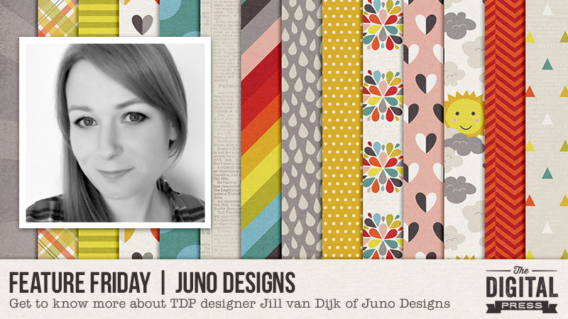
About the Author  Amie is a craft-loving dental hygienist who lives in Washington state. She loves her husband, her two crazy kids, and her English Bulldog… as well as coffee, baking cupcakes, daffodils, glitter & sprinkles, reading a good book, and lip gloss — not necessarily in that order.


Hybrid How-To | Chore Chart

Hello, everyone! Kate here to show you how I made our family chore chart. Every couple of years our chore chart gets a reboot because things change a little bit. This year, I’m adding our youngest (who is now old enough to help) and taking away chicken chores because my oldest has taken that over as part of her involvement with FFA.

Supplies

– Digital kit of your choice. I used Monthly Chronicles: Carefree.

– Photo-editing program, such as Photoshop or Photoshop Elements

– Scissors

– Lamination paper

– Glue dots

– Binder clips

– Tacks

– Cork Board

The first thing I did was type out every single chore in all the rooms of our house. I like to have one room per day deep-cleaned and the rest of the rooms tidied up. Obviously that will vary depending on preference. This is what works for us. I printed this list out so it would be easy to refer to and check off when working on the cards.

I have five kids so I made five cards per room. I started assigning chores to each card. Once I had all the cards built, I clipped in fun paper and printed everything out. My kids requested a “for hire” section where they can earn some money doing non-required chores. We also rotate the chore cards so no one gets the same chores all the time. I added a little element that I can switch between names on the chore chart to keep track of who gets the Number 1 card each day. And I also needed a tab to keep track of who’s helping me with dinner and clean up each night, because we also rotate that between kids who are 8 years and older.

I used lamination paper to laminate everything except the name cards so we can check things off or write things down.

I used tacks to secure the binder clips to the cork board. I attached magnets to the back of the two tabs I need for rotation. The name tags and “for hire” arrow are secured to the cork with glue dots.

And here’s my finished chore chart. I hope you’ll give this customized chore chart a try!


Kate About the Author  Kate is on the hybrid team here at The Digital Press. She lives on the Utah/Colorado border with her husband, 5 kids, 10 chickens, a dog named Gracie, and a cat named Kit. She’s a city-born girl who found she’s really a country girl at heart. She can be found outside, barefoot, and probably in her garden.

Tutorial Tuesday | Creating a Focal Point

Hello everyone, and welcome to yet another edition of our Tutorial Tuesday series here on The Digital Press blog! Today, I am going to share a few very simple tips for creating hierarchy on a layout in order to create a focal point.

The definition of “hierarchy” by the Oxford Dictionary is: “a system in which members of an organization or society (or photos on a scrapbooking layout) are ranked according to relative status or authority.”

I love using multi-photo layout designs in my memory-keeping, as they give a great overview of the context of the photos as well as up-close details of the event. But the question becomes… how to include so many photos without them all competing too much for attention? How to focus on the most important part of the story?

For example, let’s use the following group of photos as an example…

Step 1. Six same-sized photos will be “read” from the top left, across and then down to the second row… left to right… in our Western culture. But I want a way to cue the viewer as to which photo is more “important”…

Step 2. As you can see, I experimented with making the first photo smaller and the “after” photo of her hair much bigger. Just by changing the photo size I draw more attention to it (in a similar way, keeping one photo in color and converting the others to black and white would create the same sense of hierarchy). Then, to cement the large photo’s importance, I add the embellishments, layering them to be eye-catching and to add a pop of contrast in the glittery gold border and the light viewfinder, which also contrasts as a circle shape below the rectangles of the photos. I also add a large flower to visually anchor the photo, and add a subtle cue to the colour of her Dance dress, finally adding a pop of dimension and movement with the floaty string.

Step 3. I begin my second hierarchical cluster with the gold date tab. This is the final photo in the sequence, showing her delight at the finished view of her hair. I add some more gold wire elements to complete that visual triangle. A second smaller flower and layer some gold splatter under that cluster. The point of the heart faces into the photo.

Step 4. My third cluster at the top left is the entry point into the layout. I add the third circle element, the third pop of the pinky-purple in the wordstrip, and finally three spots of stitching. The third cluster is the least dense, made up of smaller elements… so while it serves as an entry point into the layout’s design, it does not steal any of the focus away from the focal photo.

Focal5

Step 5. This is when I usually save the layout, make a cup of tea, and then come back to re-evaluate it later. At this point, I decide to move the paper clip into the top cluster and add a curled ribbon up there. This is pretty and plays off the curls within her hairdo. I add the journaling at the top of the layout in a white hand-written font so that the eye will now be led from the top left, through the top row of the photos, down to the date tab and then from right to left across the bottom row of photos. This solidifies the circular movement into the foundation of the design. 

Step 6. I resize, sharpen and save it.

I hope that this post has given you some ideas and tips on how to create a focal point within a layout (especially one that uses a large number of photos). I hope you’ll give it a try and create this sort of flow within your next scrapbooking layout.


small avi

About the author Stefanie is a member of The Digital Press creative team and a stay at home mother of three older children living in Cape Town, South Africa with her hubby of 30 years, two of their three children, and 3 Siamese cats. She loves photography, traveling, and digital scrapbooking — documenting the good and the ordinary everyday.