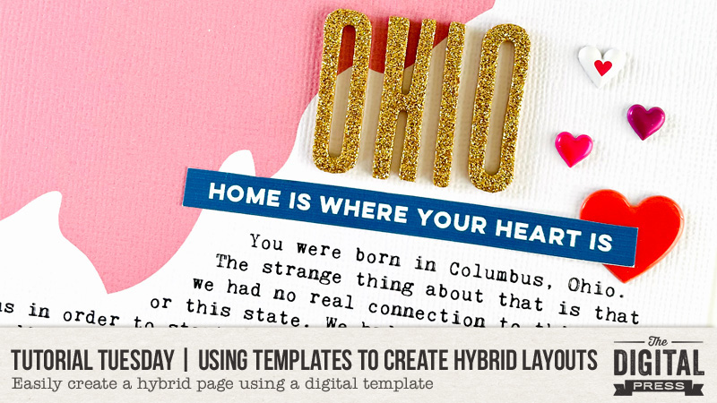
Hello, and welcome to another edition of our always-popular Tutorial Tuesday series here on The Digital Press blog!
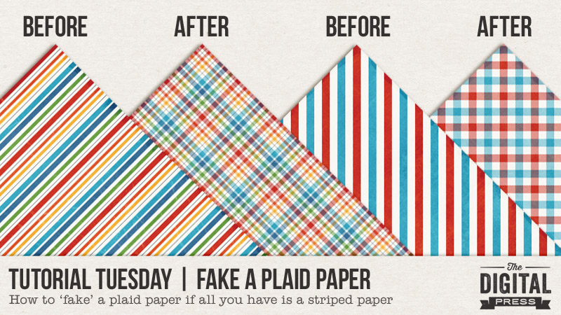
Today I am here to share with you a quick and easy way to fake a plaid paper if you’re working with a digital kit that doesn’t have one, but does have a striped paper included.
You may think to yourself, “well, I’m not a designer… I have no idea how to do anything like that!” — and I’m here to show you this quick workaround trick that you can do in less than a minute or two! It’s a really fun trick to have in your arsenal of photo-editing skills… because sometimes, frankly, you just need a plaid! Trust me, I get that.
Supplies Needed
- any striped digital paper
- photo editing software (such as, but not limited to: Photoshop (PS), Photoshop Elements (PSE), photopea.com (free online photo editor), etc.)
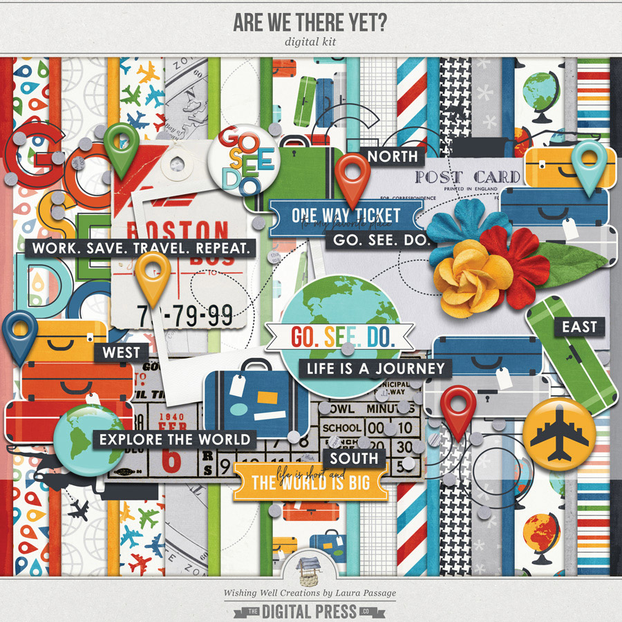
For this tutorial, I’m going to be working with two of the patterned papers found in my Are We There Yet? kit, because it is one of the few kits I’ve ever designed that doesn’t have a plaid paper in it *gasp* (seriously, though, most of my kits always do… because who doesn’t love a good plaid paper?! *swoon*).
I’ll also be using Photoshop Elements (PSE) for this tutorial, because it’s probably the most universally-popular/used program in the digital scrapbooking world… but… don’t worry! The processes I will show you should easily translate into other programs (like the full version of Photoshop (PS), photopea.com, and others). They all have pretty universal features.
Instructions
This process is about as simple as it gets, when it comes to the “how-to” of it all!
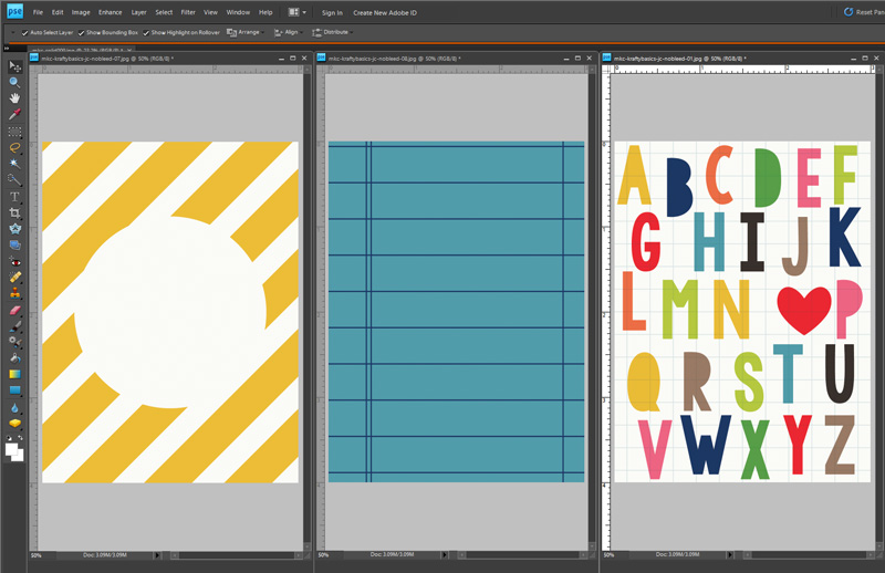
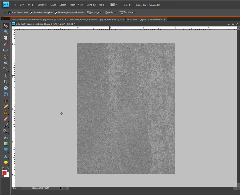
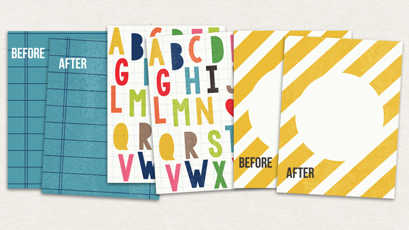
First, you’ll want to select a striped paper and open it up in your photo-editing software. I’ve selected 2 different papers to work with, as shown here…
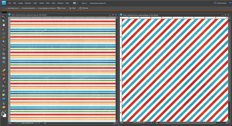
First, I’ll work with the multi-colored stripe.
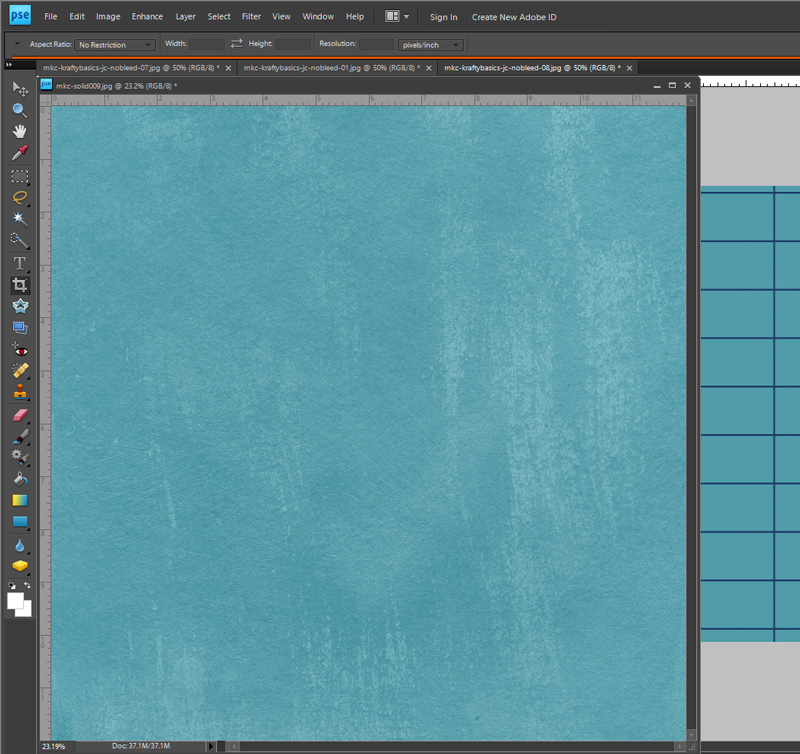
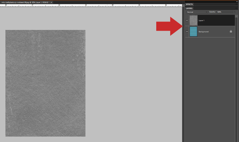
My very first step will be to duplicate the paper so I have 2 copies (layers) of the paper in the layers palette on the right…
To duplicate an item in Photoshop Elements (PSE), there are a few different methods you can use to achieve that end-goal:
- You can select the item in the layers palette on the right by clicking on it… and then use the “Layer” menu at the top of the screen and select “Duplicate Layer”
OR - You can left-click with your mouse on the item in the layers palette on the right… and a pop-up menu will appear, where you can select “Duplicate Layer”
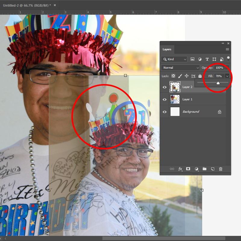
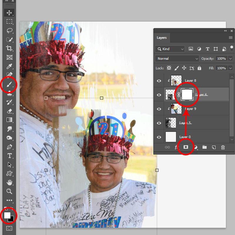
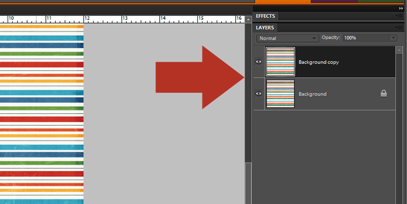
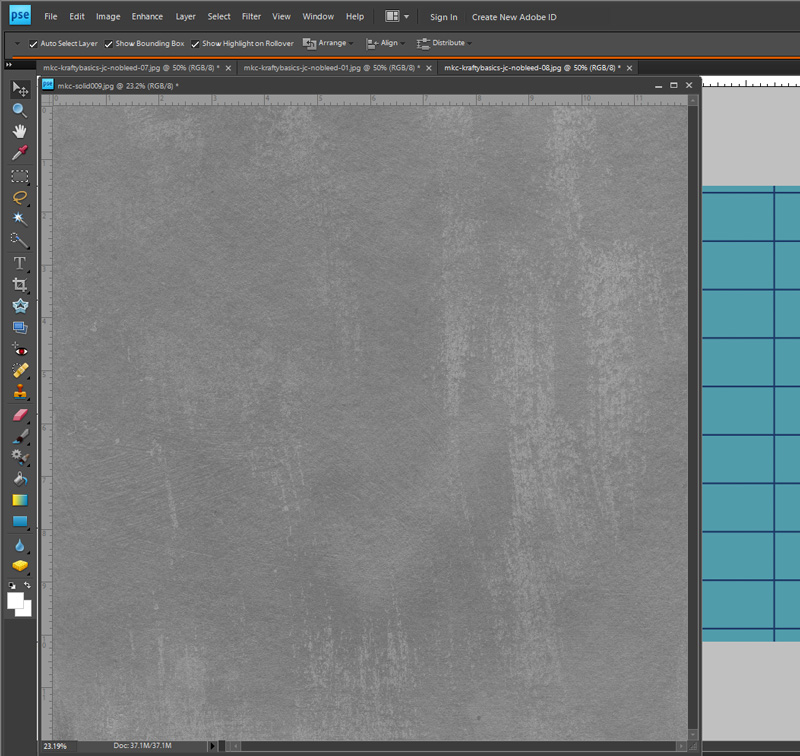
Once you have 2 copies of the paper, you’re going to rotate the top layer 90-degrees in either direction (it doesn’t matter whether you rotate to the left or the right; the only part that matters is that you rotate exactly 90-degrees). You’ll see the direction of the stripes change by 90 degrees in the layers palette, as shown below, after you complete this step…
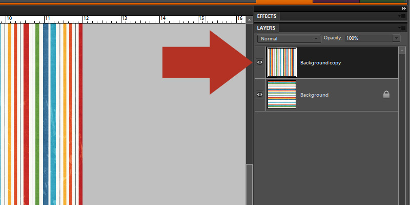
To rotate one single layer, select it in the layers palette on the right… and then use the Image menu at the top of your screen, following this sequence… Image > Rotate > Layer 90 degrees (make sure you’re just rotating the one layer — not the entire document).
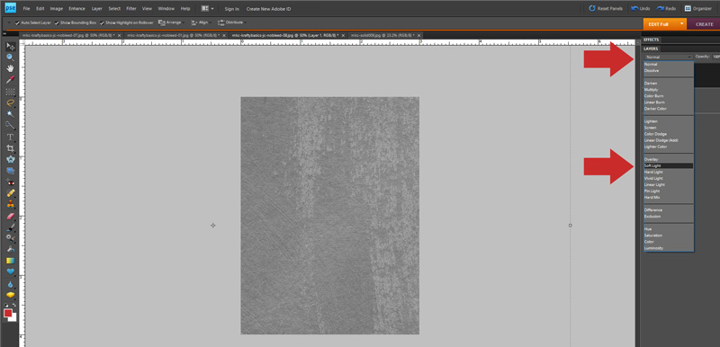
Now you’re going to change the opacity of that top layer, in order to allow the bottom layer to show through (thus creating the illusion of a plaid). To do this, select that top layer (the one you just rotated) and then change the opacity to 50%, as shown here…
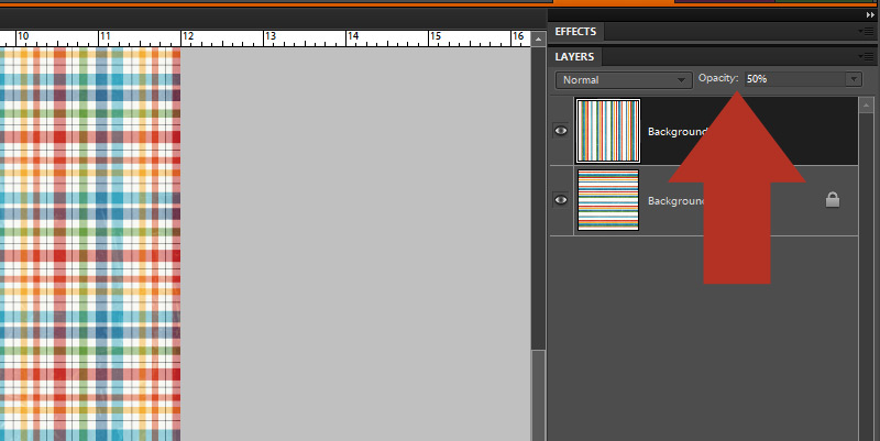
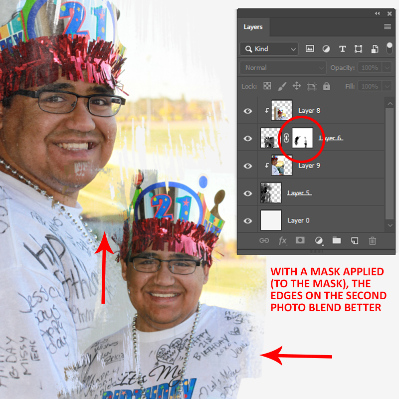
See the delicious plaid paper that appears on the left, in the screenshot above this?! YES, IT WAS JUST THAT EASY!
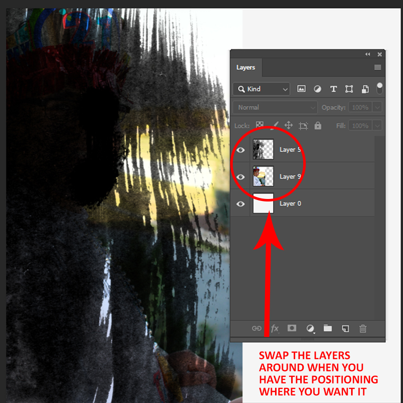
The last thing you’ll want to do, to be able to use your new creation, is to select both of the layers on the right and merge them together (in PSE, that’s CTRL-E).
Bingo! Now you have one single layer that you can drag as a paper onto a layout… or you can print it to use for a hybrid project… etc.
Possibilities = endless!
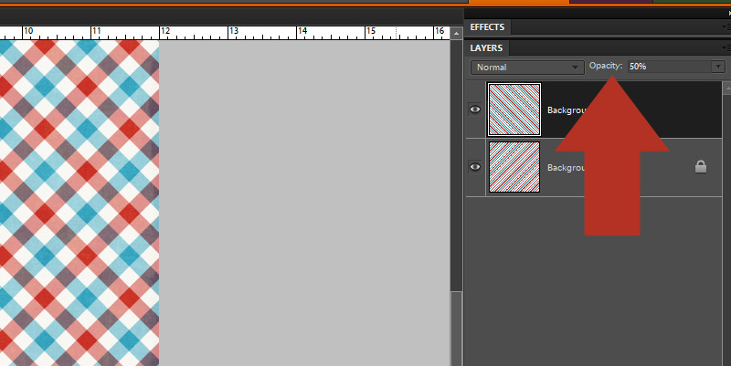
Now, it’s worth noting that if you’re working with a diagonal stripe instead of a horizontal or vertical stripe… you can also flip the top layer horizontally (instead of rotating it 90-degrees). It will work either way, giving you a gorgeous diagonal plaid…
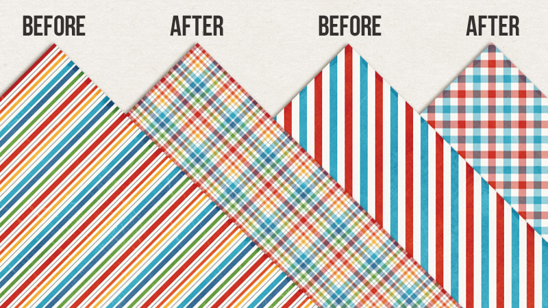
Here’s a look at the finished product(s)…
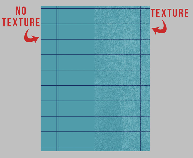
**ONE THING TO NOTE**
The reason this tutorial is called “fake a plaid” instead of “make a plaid” is because it’s truly not the best* way to create a plaid paper in all situations. What do I mean by that? Well, this process works best with papers that are lightly textured (or not textured at all). If you attempt this process with a paper that is heavily textured (think: crumpled/creased… or very obvious texture patterns like cardboard or ribbed cardstock, etc.) — you’ll find that the texture will show through when you duplicate and change the opacity of the top layer. Essentially, this means it will potentially look very weird/undesirable if the texture is obvious. So definitely keep that in mind, because you won’t want to use this trick with all striped papers.
*the best way would be to create a plaid before any texture is applied to the paper — which is what digital designers will do when creating a kit; for this tutorial, you’re using papers after that process has taken place, so you’ll want to be conscious of that when you select a paper
Here’s hoping this simple little trick opens up all sorts of new possibilities for you to to be able to stretch your digital stash and “fake” a pattern that might not be in a kit when you want/need it! It’s just so quick and easy, and helps make your digital supplies more versatile. Win-win!

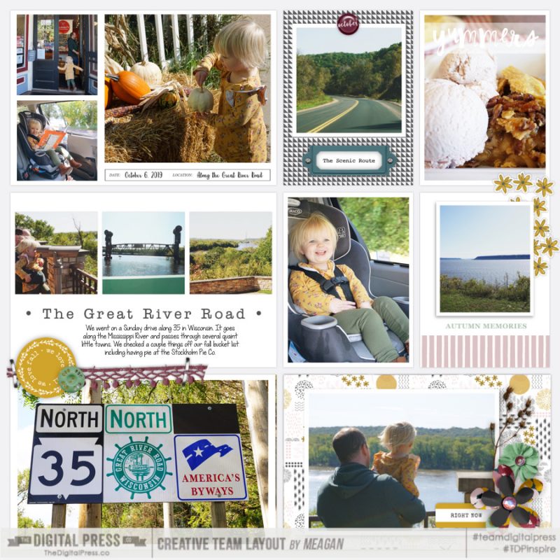
About the Author Laura Passage is the owner of The Digital Press, and also the designer behind Wishing Well Creations by Laura Passage (WWC). She works now as a graphic designer in both the digital and paper scrapbooking industries, but previously spent over a decade working as a college soccer coach. She lives in the Pacific Northwest with her husband and two sons (previously affectionately referred to as The Tiny Terrorists, but nowadays they’ve entered the pre-teen phase — so it’s even worse than that!)… and she will rationalize eating coffee ice cream for breakfast to anyone who questions it.
 About the Author Nicole Seitler is a hybrid creative team member here at The Digital Press. She’s a homeschooling momma to four fantastic kids (one of whom will graduate this year!). Once upon a time, Nicole was a designer here at TDP… but now she uses her Photoshop skills to scrapbook for herself. Nicole and her husband, Travis, sometimes dabble in web design or comic book lettering together. Most recently, Nicole has been working in the world of the Social Media Management (before 2020 hit and caused her to get laid off… meaning she has even more time for scrapping!).
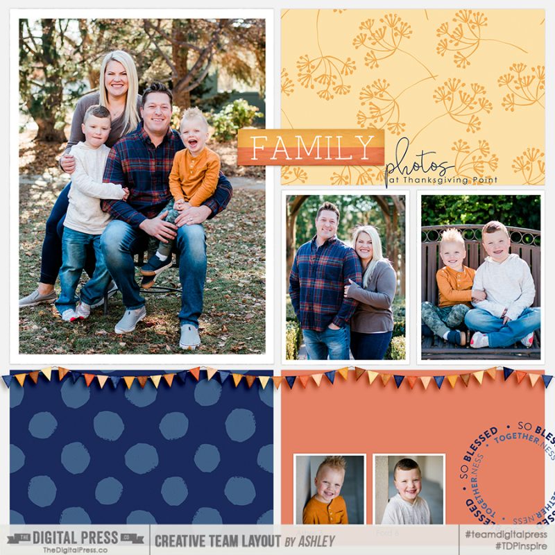
 About the Author Ashley is a member of The Digital Press creative team. She lives in Utah with her husband, 2 young boys, and 1 lazy (but lovable) pup. She works full-time at a busy medical clinic. She has been scrapbooking since childhood… scrapbooking digitally for 10 years… and most recently (& obsessively) app-scrapping on her phone.