Tutorial Tuesday | Using Brushes

blog_20180911_brushes_header

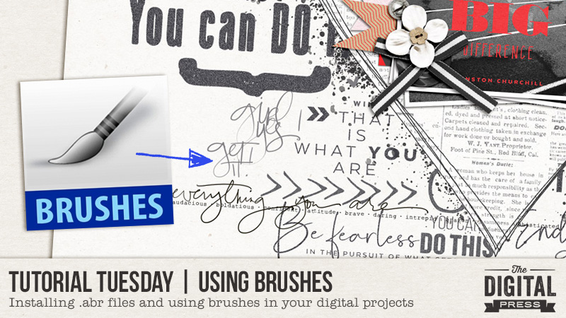
I’m sure that you’ve noticed that some of the kits available in the store at The Digital Press include a file with a .abr extension. There’s even a whole section of the store, Brushes & Stamps, where you can find our designers’ stamp element packs that include these .abr files. Have you ever wondered what those are, .abr files, and what to do with them? (I hope you haven’t just deleted them!) I wondered the same thing myself, and I’m going to share what I’ve learned with you and what I think is the quickest way to load and use those dynamic brush files.

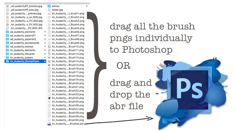
Let’s start with a kit that includes one (actually two) of these digital brush files, Audacity | Collection by Anita Designs & Karla Noél. If you open the folder with Karla’s stamps, you can see there are are 30 png files, each with a wonderful stamp that Karla has created. Each of these png files can be individually opened in Photoshop, and placed as a new layer in a digital layout. Once you get those pngs into your layout, you can adjust the size, the color, clip a paper to it, change the blending mode…..really whatever your heart desires. Easy enough, right?

However, if you want more than one or two of those pngs in your layout, there’s a faster way to get ALL the pngs from that StampSheet folder into your layout (and you can have them there in Photoshop forever, if you want): that .abr file. Now, I use a Mac, so the instructions might be a little different on a PC, but here’s what I do: in Preview, click once on that .abr file to select it; drag it over the Photoshop icon in the tray, and release the mouse button. The brushes automatically load into Photoshop. Seriously. That’s it.

blog_20180911_brushes1


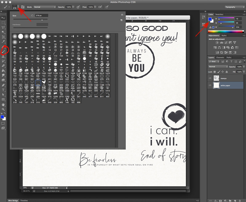
Now, in Photoshop, click SHIFT + COMMAND + N to make a new layer, then click B to select the Brush tool (or click on the paint brush icon circled in the image below). This will open up the Brush menu (did you notice that this bar at the top of the screen changes depending on which tool you have selected?). Click the second downward pointing arrow from the left to open the Brush menu (left red arrow in the image below). All the brushes from that .abr file should be loaded into your workspace. In my Brush menu below, Karla’s brushes start on the eighth line from the top. I also have loaded Anita’s .abr file from Audacity, and some excellent journaling doodles from Laura Passage (I used them to make the arrows on the image below). Select whatever brush you want, then click anywhere in that new blank layer to add the brush. The brush will show up in whatever color you have selected for your foreground (use the Color Picker to change that color if you want, it’s the blue square in the image below), so you can quickly get it to perfectly match the colors you’ve already got in your layout. The number underneath the little image of the brush in the menu gives you an idea of how big it’s going to be. You can change the size of the brush by typing a new number in that Size box (near the top of the Brush popup, where it says 378 px in the image below). You can add multiple brushes to a single layer, or make a new layer for each brush. Much like modifying the pngs, the options for customization are just about endless.

blog_20180911_brushes2b

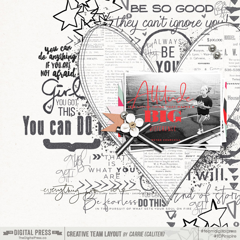
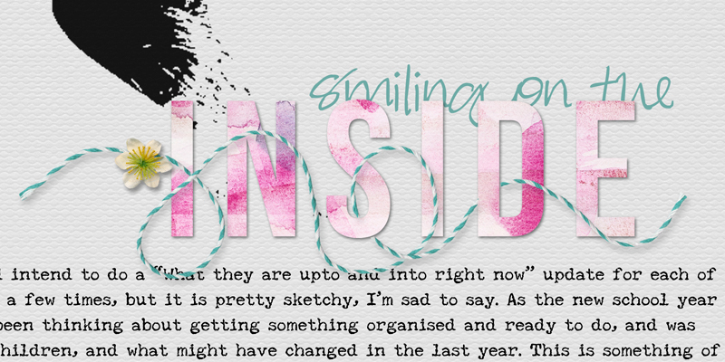
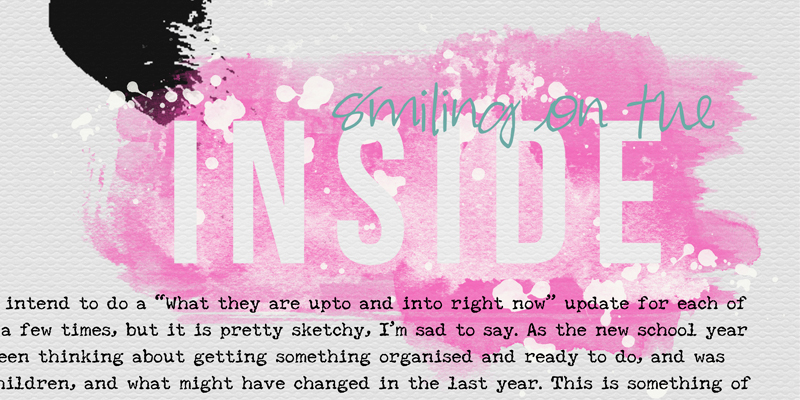
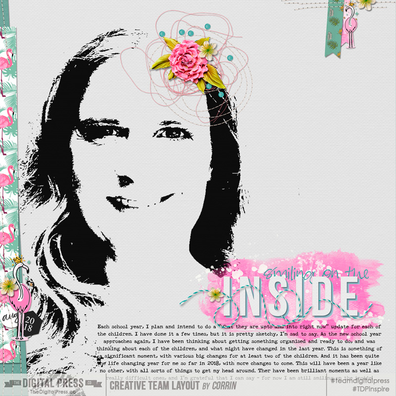
I used this technique, loading the .abr files from the Audacity | Collection, to make the page below. I started with three brush layers (each is a slightly different shade of gray) with 8-10 individual brushes in each layer to make about 90% of the background for my page below. Only the bright black pieces (one phrase and two sets of stars), the “everything you are” stamp, and the paint splatters are pngs that I dragged over individually. My brush layers also have a blend mode applied – Dissolve at 85-95% opacity, depending on the layer.

tdp_20180911tt_brushes_caliten_attitude_800


So next time you find yourself with an .abr file, try loading it into Photoshop and using the Brush tool to add one or more of those brushes to your digital project. You may just find that you prefer this technique to opening individual pngs. Happy scrapping!


caliten About the Author  Carrie is a creative team member here at The Digital Press. She and her family enjoy spending time outdoors year-round near their home in Colorado. In addition to scrapbooking and the occasional hybrid home decor project, Carrie also reads voraciously, accumulates fabric, makes soap, brews beer, grows hops, and tries to keep indoor plants alive.

Hybrid How-To | Starting a Traveler’s Notebook

Hi everyone, and welcome to another edition of our Hybrid How-To series here on The Digital Press blog! I’m here today to show you how you can start a Traveler’s Notebook and use it for your memory keeping.

Everywhere I look, I am seeing people using Traveler’s Notebooks (also called TN’s) to document all kinds of things… not just trips and vacations! If you look on Pinterest, ETSY, Amazon, or even if you just google “traveler’s notebooks” …you will get a wide display of manufacturers, sizes, and different ways people are using them. Today I would like to show you a bit about the traveler’s notebooks I am using, and how/why I decided to start using them for all sorts of scrapbooking and memory keeping projects!

Here’s just one example of the types of things you can do with a TN, with regard to memory-keeping…

Here are a few of the reasons I decided to give traveler’s notebooks a try:

  • quick, flexible memory keeping
  • no pressure to do a weekly or monthly layout
  • easy way to break into doing a hybrid project
  • no plastic pockets (unless you want them as accessories)
  • simplicity — photos, journaling, and maybe some stickers & washi tape
  • great for quick topics (vacations, food, recipes) or to record ongoing progress (weight loss, pregnancy, etc.)
  • I, personally, am drawn to the vertical orientation
  • easy to use to document things while on-the-go
  • great way to use digital templates, patterned papers, & supplies

Here’s a look at the Traveler’s Notebooks I am currently using…

I picked a few of them up at my local scrapbook store, and one is from a scrapbooking subscription club. As you can see, two of them are the “standard or regular” size (on the right), and one is a smaller size that is often referred to as the “passport” size (on the left). I didn’t spend too much money on any of them, because I wasn’t sure how often I was going to use them. It turns out, though, that I am documenting in them quite often and may eventually splurge for one of the real leather notebooks. For now, however, I am happy with these less expensive TN’s! They are made of a soft “plether” (plastic/leather) type of material, and come with the elastic bands inside that hold the inserts, and also a band that goes around the book to hold it closed.

Most TN’s come with at least one paper insert. The inserts can be made out of different colors, weights and styles of paper. Here’s a closer look at the inserts from the three TN’s I showed you, above…

The type of paper insert is important depending on how you are going to use them. For instance, f you do a lot of painting or stamping, then a thicker paper maybe needed. If you are mostly journaling in them, maybe you will want plain or lined paper instead of a dot or grid pattern. The color of the paper is important, too, if you want to work directly on that paper; for instance, up above you can see that one of these paper inserts is very cream in color, as opposed to a more pure white — but since I usually cover the insert with patterned paper, that worked for me.

One of mine came with a craft folder that has a place to put supplies and/or keepsakes, as shown here…

Some inserts are stitched together, and some are stapled… and this is also something to consider. The first TN I used had an insert that was stapled together… which enabled me to take the staples out and have flexibility moving the papers and getting them to lay perfectly flat while stamping or gluing things in place, which was nice! Since that first book, I have just left the inserts intact. Both ways work really well, and I think it is just a matter of personal preference.

There are many types of accessories and extra options you can purchase to use with your TN. Extra elastics, charms to put on the outside bands, tags, plastic pockets, zipper cases, and pen loops are all very popular and help you customize your TN…

I love the zipper pocket! Although I don’t scrapbook on-the-go very much, I often will stick in supplies that I want to use just to keep track of everything!

To give you a little more inspiration and let you see the kinds of things you can do with your TN… here are a couple of pages from my Summer 2018 Traveler’s Notebook…

And trust me, it’s all so easy! I simply printed some photos and products I liked, and then played around with putting them together on the pages. As you can see, this format works well for multi-photo pages and also for large photos. I use Epson Premium Presentation Matte paper and a Canon Pixma printer.

For the projects I’ve shown you, above, I printed digital products from these beautiful kits that you can find at The Digital Press…

The great thing about a TN is that you can use your favorite digital products and edit/alter the contents, re-size things, and even change a few colors here and there, before printing… in order to have your own personalized scrapbooking supplies ready to add to the TN. And as we discussed above, there are a lot of options to choose from when selecting and beginning a Traveler’s Notebook. Here are a few final thoughts you might consider, as you get ready to give this a try…

  • the cost — you can spend a lot or a little
  • the size — standard or regular is used by most scrapbookers (it is approximately 8.5″ tall by 4.25″ wide)
  • the paper inserts/refills — the color, weight and the style; grid, dot and lined patterns are popular
  • the topic — decide whether you want your book to be about a specific topic or just a bunch of random photos & stories you love
  • the record-keeping — TN’s are a great way to journal your thoughts, and many people use their own handwriting rather than typing
  • the supplies — use your digital supplies in a whole new way; journal cards, labels & pattern papers work well
  • the contents — large, full-size photos are dramatic and pair well with papers, journaling and embellishments
  • the rules — there are really NO rules! Just play around and find out what works for you!
  • the starting point — really, just get started! it’s so much fun to print, touch, and play around with the items you add to your TN

The important thing is to have fun with it and make it work for you. We would love to see what you create using products from The Digital Press, so please feel free to leave us comments and link us up to any projects you load into the hybrid gallery here at TDP!


IMG_2617lightedt100w

About the Author  KerriAnne is a homebody who resides in the desert SW. She started scrapbooking when her kids were little and hasn’t stopped despite the teenagers rolling their eyes and sticking out their tongues!  When not scrapping or being a chauffeur, she can be found consuming large amounts of iced coffee.


Feature Friday | Cornelia Designs

Hey there! After our annual “blog break” this past month, we’re back! Welcome to another edition of our always-popular Feature Friday series here on The Digital Press blog.

love getting to know our designers better thanks to these posts… getting a peek into their creative minds, into their lives, and into their passions outside of digital design. This week, I have the honor of introducing you to one of the newest members of our design team — Cornelia Pramendorfer of Cornelia Designs. She joined the The Digital Press family in May, and we’re so thrilled she’s here!

In order to learn more about her, we asked her to share with us “5 Things We Might Not Already Know About Herself“…

  1. Beside designing digital products, she also creates book covers and she’s an author. She already has five (5!) books published in the romance genre!
  2. She’s a new mom to a little baby boy, who is right now 4 month old and she’s newly engaged to a wonderful man and father and can’t wait to marry him. (Awwww!)
  3. She’s a gamer… and loves to play role play games like World of Warcraft, Rift, and Final Fantasy.
  4. In her free time (if there is any, LOL ), she loves to read. She loves fantasy books, and about 3/4 of her books are actually in English, even if its not her native language (she’s from Austria).
  5. She really can’t cook, so its not her who does the cooking most of the time… but she can (and loves to) bake.

A geek girl and romance author that loves to bake?! …can I move in with you, Cornelia? LOL

If you take a peek through the Cornelia Designs store at TDP, you’ll see that she designs both templates and kits/collections — all equally fabulous! She has an elegant and realistic design style. Her templates are super fun and creative, and can work for scrappers who are very clustery and love lots of layers — or — easily toned down for a more minimalistic look. Furthermore, if you like themed kits that are full of amazing details and gorgeous color combinations, and which can be used for both themed and/or generic pages… you’ll love Cornelia Designs!

Here are a few of my favorite products from Cornelia’s shop at TDP, in order to give you just a small sample of the fabulousness of her products…

Furthermore, in order to show you how much fun her products are to work with, here are a fantastic layout examples I found that use products from the Cornelia Designs shop at TDP…

Whether clustery or clean… hybrid or digital… pocket-style or artsy… as you can see, Cornelia’s products are super versatile!

I hope you had fun “meeting” Cornelia today for her very first Feature Friday here at TDP, and that you are just as excited about her gorgeous designs as I am! If so, I have good news… because during her upcoming Feature Week here at The Digital Press, Cornelia’s entire shop will be marked down 30% OFF all week long (the sale will end at 11:59pm ET on Thurs 9/13). Don’t miss it!

And that’s not all! Cornelia also has a special Free-with-Purchase offer for you this week, as well! Don’t miss out on this opportunity to stock up on your favorite products from Cornelia’s shop, and you can also get this fantastic (and brand-new! just released today!) layered template set — Half Split — for FREE with any $10+ purchase in her shop (this week only, though… because again, this offer ends at 11:59pm ET on 9/13).


ChloéAbout the author  Chloé is in charge of PR and communication for her small town by day, is a digiscrapper “by night,” and a photographer whenever the light is beautiful. She lives with her man and fur-babies in a small town of Alsace (in the northeast of France), where she loves to read, watch good TV shows (TWD being her absolute favorite), and just hang out with her friends — no matter if they are close by, online, or away in her Swiss hometown. She recently became quite obsessed with Bullet Journaling, FlyLady and Zero Waste.

Tutorial Tuesday | Fun With Fonts

Hello, and welcome to a new edition of our Tutorial Tuesday series here at The Digital Press Blog!

I am Corrin, and I am a font hoarder! I know that I am not alone in this, and so I hope that today’s tutorial will help all of us find some fun new ways to use all of those fabulous fonts.

I have recently been trying to put titles on my pages more often, and so I have been looking for ways to make my titles stand out — even while I am using the fonts and alphas that I love and use all the time. For the examples I will show you today, I will use the same page, but will change the treatment of the font that I have used for the title.

Here are the different ways I have tried using the same font today…

  1. Stack it
  2. Add a Stroke
  3. Clip a paper to it
  4. Erase from a brush background

Stack It

First, I rasterized the font (Layer–Rasterize–Type), which is actually the first step for all of these techniques I’ll be showing you today. Then, I duplicated the layer and moved one of the layers across and up or down just a little. You can play around with how far apart to have the two titles, and how similar to have the colors, as well. I chose to use a deep black title, to echo the deep black image on my page, and then contrasted that with a lighter pink for the layer behind it…


Add a Stroke

Again, I began by rasterizing the font… and then I added a stroke to it. You can choose to add the stroke to the outside of your text, the inside, or a bit of both (the center); it is really just about personal preference, so just try them all out and see which one you like best. Adding a stroke gives the font a really nice crisp and clean edge, and helps it stand out from the background paper. You can easily change the color of the stroke, so I chose to use a pink stroke around my white text. I think that leaving the layer with no shadow makes the title look like it has been printed right onto the page…

inside-2


Clip a Paper to It

Once the font is rasterized, you can clip a paper to it — a technique that can add color or texture for a fun look. Adding a small shadow to a plain paper/font can make it look like the title is a stylish vinyl sticker or die-cut paper pieces… while a deeper shadow can create the impression of chunkier letters (maybe foam, thicker cardstock, or even woodchip). You can clip a plain paper or a patterned paper — both work really well with a small shadow if you want to create the impression that you cut the letters (very neatly!) out of paper to create your title…

inside-3


Erase the Title From a Brush

Lots of kits have a painty brush included — or you can also find separate sets of brushes in the store, as well — and these can make a great background on which to put your title. In this example, I layered some brushes in different shades of pink and white, and then I laid my white title layer over the top. This made it look as though my title was erased from the pink paint/brush – as though, in real life, I’d used a stencil and painted around it. I think this is quite a nice artsy look…

inside-4


You can combine some of these ideas together, as well… perhaps clipping a pretty paper to the rasterized font, and then add a thicker stroke to make your title look like a fun sticker. Or, use a plain title with a thin stroke, and stack a layer below it for a clean, graphic style title… it is really up to you! Endless possibilities.

In the end, I chose to clip a white paper to my title font, and stack it over an aqua font, with a pink painty mask too! Here is a look at the final page I created…
inside-blo

[I used Flamingo Love by Rachel Etrog Designs, Sakura Stitches by ninigoesdigi, and Words & Bits – Two by Dunia Designs]


I hope this gives you some ideas of ways to play and have fun with your fonts, and these ideas would work with many alphas too. I hope you will have a go and see what techniques and combinations appeal to you, and maybe even link me up to your own creations (or leave some of your own font/title suggestions?) with a comment here on the blog. 🙂


Corrin
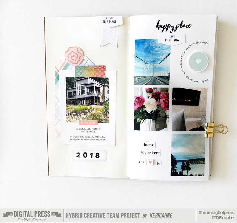
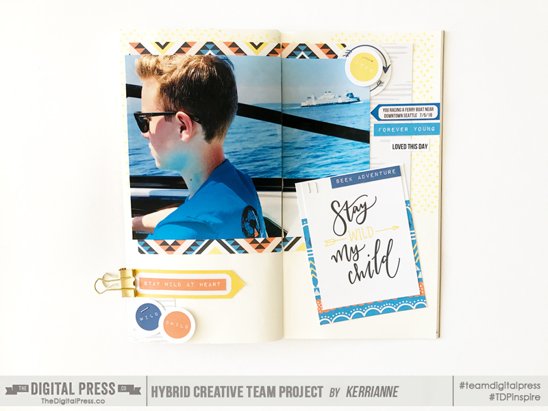
About the Author Corrin is a member of the creative team here at The Digital Press. She is a fan of the Big Bang Theory and a lover of cozy pajamas or flip flops when the sun finally shines! She lives in the breezy South of England with her husband and 4 crazy kids, who regularly discover & plunder her secret chocolate stashes, and hopes that maybe this will be the year she reaches the bottom of the laundry pile!

August Blog Break

This is just a quick note to remind everyone that The Digital Press, in keeping with previous years’ tradition, is taking a short blogging break during the month of August!

In the meantime, if you find yourself missing our Tutorial Tuesday series between now and September… come take a peek at our archived tutorial posts, and give one of the techniques a try!

If you love learning about our designers and getting a peek into their lives… you can check out the archived designer feature posts.

If you love printing our products and making pretty physical projects, but need a little extra mojo… delve into our archived Hybrid How-To posts and get your creative juices flowing!

And finally, if you are looking for something non-scrapbooking-related and you love food… come take a look at our archived Foodie Friday posts (including our Summer Camp Mess Hall features!).

We’ll see you again in September…

Summer Camp 2018 | Mess Hall | WEEK #4

Hello, and welcome to the fourth and final edition of this summer’s weekly “Mess Hall” feature — part of The Digital Press’s big SUMMER CAMP 2018 event that has been running throughout July!

If you haven’t already checked out our lineup of activities for SUMMER CAMP 2018… definitely swing through the forum, grab yourself a badge tracking card and join the fun (there’s still a week left, and you can earn discounts and prizes even if you haven’t yet jumped in during WEEKS #1-3!). We’ve got even more events, challenges, tutorials, and more lined up throughout the final week of July!

Today, I’m here to share with you some delicious recipes for WEEK #4 that we got from the always-amazing Nini Lee of ninigoesdigi. Here’s a quick look at Nini’s dishes…

photo credits to TDP design team member Nini Lee

What’s that yumminess you see up above?

  • Lemon Chicken Skewers
  • Potato and Herbs Cake
  • Vanilla Panna Cotta

LEMON CHICKEN SKEWERS

INGRIEDIENTS NEEDED

  • 2-3 cups chicken fillet to make skewers (chicken legs are possible, too; I used about 300 g of fillets for this but I think you could use up to 500 g with this recipe?)
  • 1-2 onions (depends on how many skewers you’d like to make; I was able to make 5 skewers with half of one big onion)
  • 3 tablespoons lemon juice
  • 2 tablespoons olive oil
  • 3 tablespoons Maggi seasoning (soy sauce or Worcester sauce also work)
  • 1 tablespoon thyme (if possible, fresh)
  • 1 tablespoon rosemary (if possible, fresh)
  • salt
  • pepper

INSTRUCTIONS

  1. Cut the chicken fillet in big diced pieces. Set aside (***NOTE*** if you use legs, of course, there’s no need to cut them)
  2. Also cut the onions in big diced pieces (if you make skewers).
  3. Mix the lemon juice and the oil with the following: the Maggi Seasoning (Maggi Arome) or soy sauce (that’s what I used) or Worcester sauce, as well as with the thyme and the rosemary.
  4. Mix the sauce with the chicken (or if using chicken legs, baste them with sauce).
  5. Let it marinate in the fridge for about 12 hours. If you prepare the day before, it will be perfect for your lunch.
  6. Make your skewers by alternating chicken bits and onions.
  7. Cook with a grill or in a fry pan without adding oil or butter.
  8. You can serve with some ratatouille or some semolina (or of course with the potato gratin showed below) 😉


POTATO AND HERBS CAKE

INGRIEDIENTS NEEDED

  • approx. 3 cups (750 g) potatoes (peeled)
  • 1/2 cup mixed herbs (parsley, chives, chervil, thyme)
  • 3/4 cup to 1 cup (200 ml) cream
  • 1/3 cup to 1/2 cup (100 ml) skim milk (I use almond milk)
  • 1/4 cup (50 g) grated Gruyere cheese
  • 1 pound cake mold

INSTRUCTIONS

  1. Pre-heat your oven to 350 °F (180 °C).
  2. Grease a pound cake mold.
  3. Slice the potatoes thinly and dry the moist with some kitchen paper.
  4. Layer those slices in the mold.
  5. Heat the cream and the milk in a pan up until it boils. Take off the heat and add the minced herbs and mix.
  6. Pour this mixture on the potatoes. I followed the recipe and did that but maybe you could make layers and pour the mixture in 2 steps. Once you have layered half of the potatoes you can pour half of the mixture and then finish layering the rest of the potatoes and pour the rest of the mixture. I think it would allow to have herbs also a little more in the middle of your cake. Up to you! 😉
  7. Cover with aluminum foil and let cook for 30 minutes in the oven.
  8. Take out the foil and continue cooking for 15 minutes.
  9. Spread the cheese over the top and cook again for 15 minutes until the potatoes are tender.
  10. Let rest for 10 minutes before you serve.

***NOTE*** you can also add minced ham to this recipe (I use about 75g).


VANILLA PANNA COTTA

INGRIEDIENTS NEEDED

  • 2-3/4 teaspoons gelatin
  • 2 tablespoons (30 ml) cold water
  • 8.5 oz (250 ml) heavy cream
  • 8.5 oz (250 ml) milk
  • 1/2 cup (100 g) sugar (you could also reduce this to 75 g if you don’t like things too sweet)
  • 1/2 a vanilla bean (cracked open and grated)

INSTRUCTIONS

  1. In a little bowl, add the water and spread the gelatin. Let it swell for 5 minutes. Set aside.
  2. In a small saucepan over medium heat, gently heat the cream, milk, and sugar along with the vanilla grains and bean. Mix until the sugar has melted in.
  3. Remove from the heat.
  4. Add the gelatin and mix with a whisk until it has completely dissolved.
  5. Strain it.
  6. Pour the mixture into 6 separate serving cups. Let them cool.
  7. Cover with a plastic wrap and put in the fridge for at least 6 hours until the panna cotta has taken form.
  8. If you want to, you can garnish with candied prunes or white wine poached peaches, etc.

***FOOTNOTE FROM NINI*** “I would like to say a special thank you to Amie of Little Lam Paper Co. for her help. I had issues with the recipe of Panna Cotta I found on the internet, and she helped me with the measurements. I wanted to use this Summer Camp opportunity to try out new recipes… but when you go to some unknown places there might be a few bumps, right? Well, I am glad Amie was there to lift me up LOL! Thanks a bunch Amie!”


Don’t these recipes from Nini look fantastic? If you want to give one of these recipes a try and earn your WEEK #4 MESS HALL BADGE for TDP’s SUMMER CAMP 2018… come get the details in the forum —> HERE.!


Laura Passage

About the Author  Laura Passage is the owner of The Digital Press, and also the designer behind Wishing Well Creations by Laura Passage (WWC). She works now as a graphic designer in both the digital and paper scrapbooking industries, but previously spent over a decade working as a college soccer coach. She lives in the Pacific Northwest with her husband and two young sons (affectionately referred to as The Tiny Terrorists), and will rationalize eating coffee ice cream for breakfast to anyone who questions it.