Hello and welcome to another edition of our Tutorial Tuesday series here on The Digital Press blog… this time, from the rainy Pacific Northwest! I’m here today to show you a fun trip for creating digital rain drops to add to your projects.
Rain is nothing new to me; having lived in the tropics most of my adult life, I am well accustomed to monsoons! I only recently realized, however, how fun it would be to add “rain” to some of my scrapbooking layouts! In today’s tutorial, I am going to show you an easy way to add a realistic raindrop (or 5) to your projects.
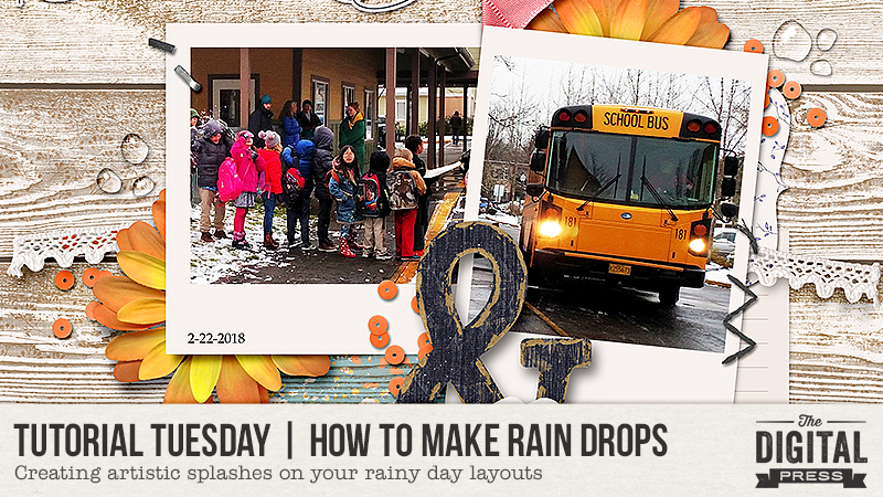
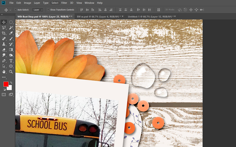
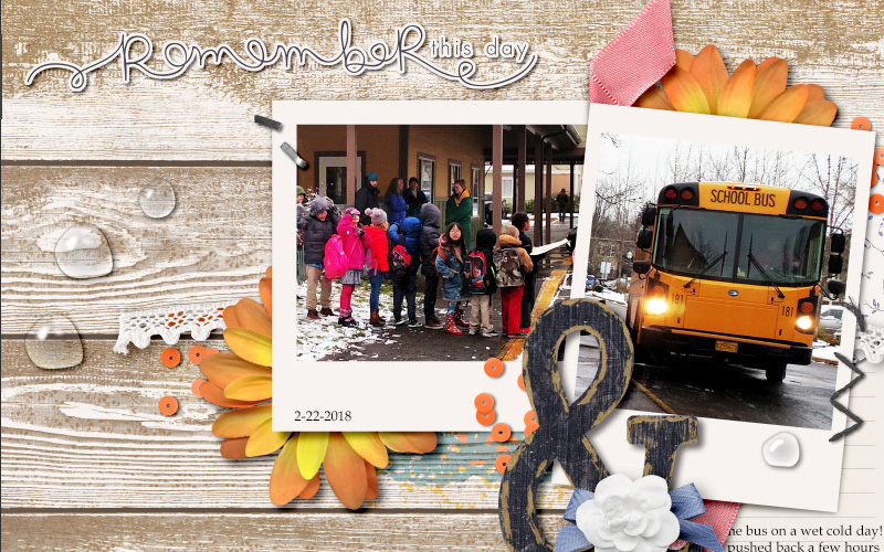
Here is an example, on a layout that I created (see the clear raindrops at the top right, middle left, and lower center-right of the main cluster?)…
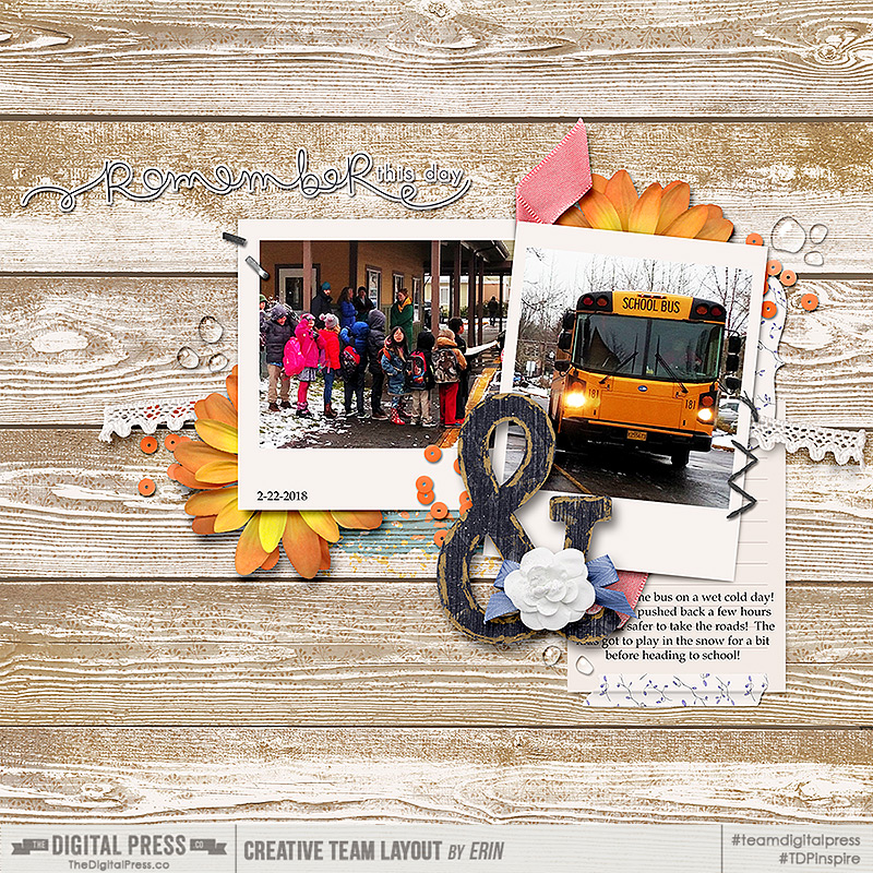
[ this layout uses “November” Papers and Elements, by Dunia Designs]
To show you how to do this technique, I am using Photoshop CC (PSCC)… but it should be similar on other versions of Photoshop, as well.
Also, there are a LOT of different ways to do this — but this is one of the easiest methods for beginners (read: it has fewer steps). There are certainly more things you can do to make it look even more realistic, but once you make one, you can easily save it as a PSD file to experiment on.
The beauty of this method is that we are going to leave our little rain drop as a smart object so we can easily move it, rotate it, adjust it, and even duplicate it to create more drops or various shapes and sizes!
So, here we go…
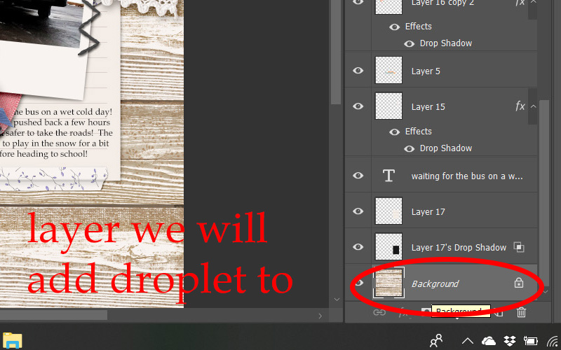
STEP 1:
You can either start this on your finished flattened page, or in your layered working document.
Either way, find the layer you want to add your droplet to and ‘create a new layer.’
For this example, I am adding water drops to the wood background, so I have selected that layer.
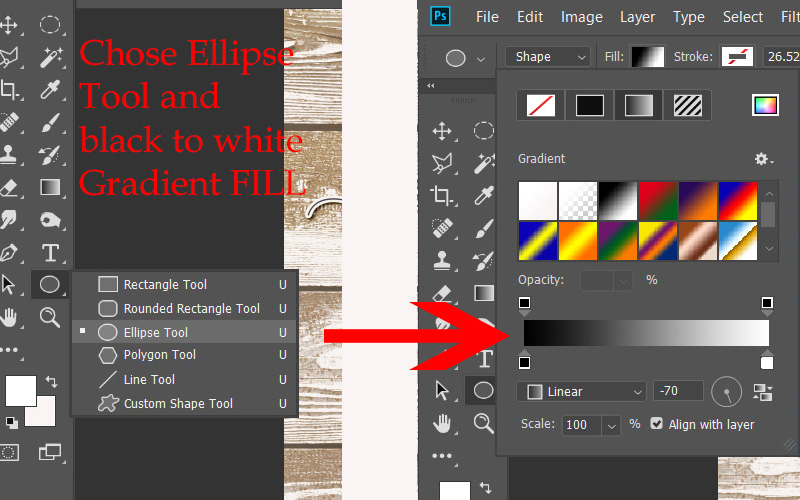
STEP 2:
Select the Elliptical SHAPE tool (not the marquee at the top) and set the settings to NO stroke – with a black to white gradient fill. You can choose the direction depending on your light source, but here are mine…
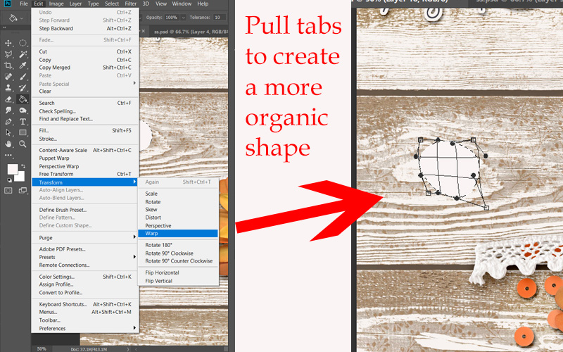
If you want your drop to have a more organic shape, select the layer your Ellipse is on, go to Edit > Transform > Warp. You can then manipulate the circle to create a more flattened or oblong shape like I did below.
STEP 3:
Once you have your shape the way you want it to be, we are ready to give it a 3D effect.
Open the BLENDING MODES/LAYER STYLE control panel by right clicking on your droplet layer in the layers panel, and selecting Blending Options. We will do the next few steps in this panel…
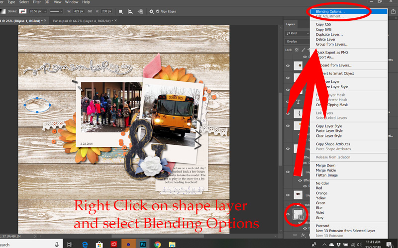
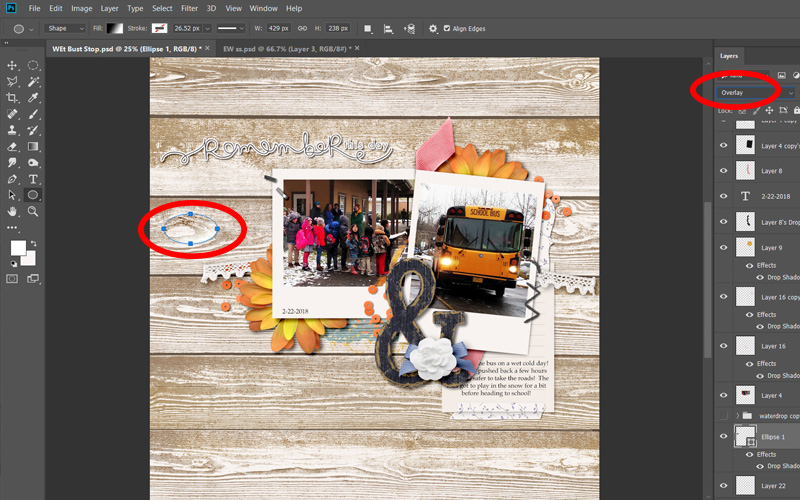
First, change your layer Style to OVERLAY (you can see below I forgot to do this in some of my images – it is much easier to see the effects you are creating if you have your layer blending mode set correctly!)…
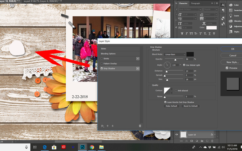
Now, add a small Drop Shadow to your shape. The direction of your shadow for your drop should match the light source and shadows from the rest of your page.
You can play with the settings to get the shadow just right for your shape, or simply use these…
Drop Shadow: blending mode = linear burn, opacity = 32, angle = 90, distance = 8, spread = 0, size = 6.
You can also always go back and change it later if you need to.
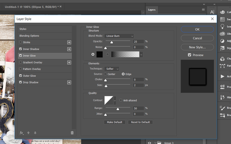
STEP 4:
Now we are going to give it an Inner Glow – to start shaping a more rounded 3D look. Keep playing with those settings.
Inner Glow: blending mode = linear burn, opacity = 33, noise = 0, choke = 0, size = 2.
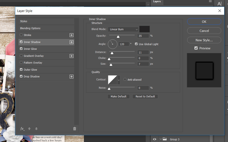
STEP 5:
Still in your LAYER STYLE panel… we will add an Inner Shadow.
Again, you can play with the settings to see what makes it look the most realistic or go with these
Inner Shadow: blending mode = linear burn, opacity = 16, angle = -53, distance = 3, size = 3 and press OK
STEP 6:
Finally, to finish off our droplet we will add some highlights.
To do this add another new layer above your droplet and using a small soft edged paint brush add a few white highlights to the edge of your droplet where the light source should be coming from. The size will vary depending on the size of your droplet, but you definitely want the hardness set to 0.
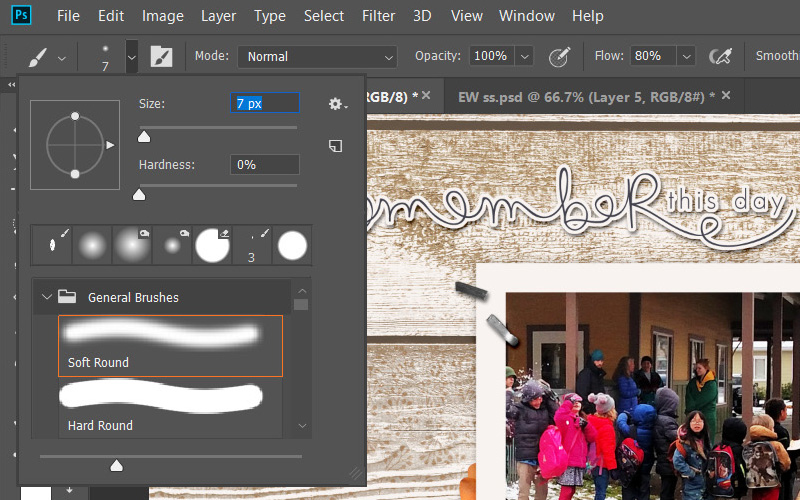
If you find that your painted highlights look too harsh, you can soften them with a blur filter in your filter gallery.
STEP 10:
Play around with it!
I will be honest with you… every time I make a new one of these droplets, something looks weird at first. For example — as I walked through this one the first time, I realized I didn’t like it (which is why you might see a few different shapes in the images, above!).
I want to encourage you to play around with the settings from above. Resize your shape — warp it into a different shape — change the size of the shadows or the blending modes to see what works best with your background image — etc.
You might notice in my finished page, above, the droplets look a little different on the lighter background paper than they do on top of the the darker one; that is one of the things that will affect your creation settings.
I gave you the basic steps, but you can definitely make little changes that really will make big differences in your droplet.
I really think that has to do with the fact that different sized and shaped droplets need different settings, so if something is looking off – play around with your different layer style settings until you get a droplet that you really like. Change the inner glow color to white, or the blending mode to screen. Move your droplets to different layers in your layout. Duplicate the layer and change the shape. The options are almost endless!
Just keep duplicating that image and changing settings to see what works best for you!
Here are some changes I made pretty quickly by copying and altering my first droplet. All of these droplets came from that first shape.
Also, keep in mind that what is behind the droplet will also change the look. If your droplet is over text, or an image, you might want to create a birds-eye effect to create that magnified look water gives… etc. (but that is another tutorial for another day!). 🙂
I hope you’ll give this fun technique a try! Have fun experimenting… and see just how fun it can be to “play in the water”!
 Erin is an artsy crafty kind of girl who is currently dabbling in far too many things, but is working hard to enjoy every moment of it, while avoiding the rain, which is difficult due to living in the land of many rains. She is slowly learning to use her smart phone to capture all the fun little bits of life that would otherwise go unremembered in the busy craziness that is raising a family!
 About the Author Kate is on the hybrid team here at The Digital Press. She lives on the Utah/Colorado border with her husband, 5 kids, 10 chickens, a dog named Gracie, and a cat named Kit. She’s a city-born girl who found she’s really a country girl at heart. She can be found outside, barefoot, and probably in her garden.


 About the Author Barbara is a member of the creative team here at The Digital Press. She’s married, has two awesome kids (a 21 year old son and an 19 year old daughter) as well as an 11 year old adorable Soft Coated Wheaton Terrier pup. You’d think with all these ages posted here about her family she’d tell you her age but NOPE … not gonna happen! 😆