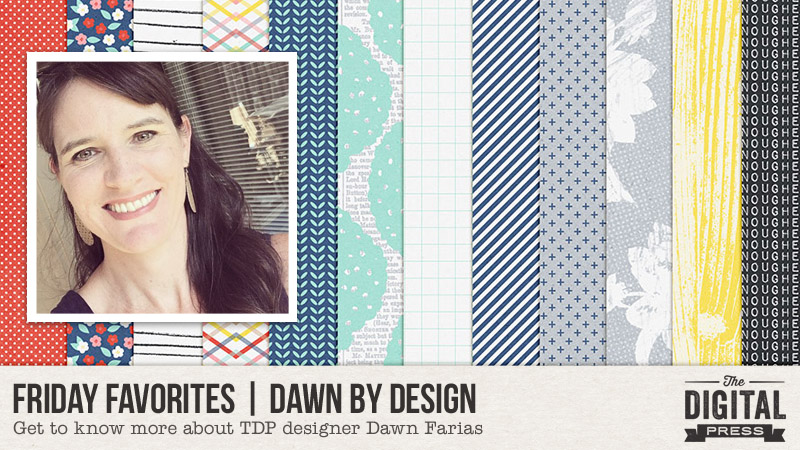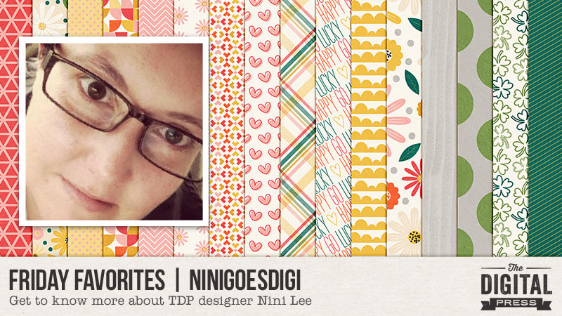
Hello everyone, and welcome to another edition of our designer feature series here on The Digital Press blog in 2019 — Friday Favorites! This year, we are learning a bit more about each of our fantastic designers by having them share some of their favorite things with us each week (so much fun!).
This week, the spotlight is on the fantastic Nini Lee of ninigoesdigi! This is actually Nini’s third feature here on the blog (you can find her most recent feature article from July 2018 HERE… and/or her Foodie Friday article from February 2018 HERE w/ yummy food ideas/recipes).
This time around, in order to learn even more about Nini, we asked her to share one (or more) of her favorite things with us… and this is what she had to say…
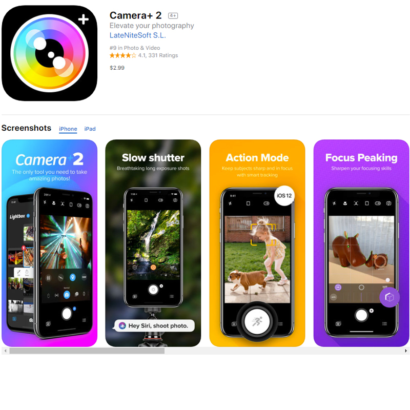
“One of my favorite things is actually an iPhone app I use to be able to take better pictures. Last year, I realized how few pictures I actually took with my big camera… but I was taking a lot of pictures with my iPhone. But I felt a little disappointed that I couldn’t take more creative pictures with just my iPhone. That all changed, however, when fellow TDP designer Laura Passage told me about this app — Camera+2! It is a paid app ($2.99), but I don’t think that is too pricey and it is well worth it!
Here’s a look at the app info/logo (so you’ll have an easier time finding it, if you decide to go give it a look in the App Store)…
It didn’t take long for me to start playing with it… and while I still don’t think I’m using it to its full capabilities yet, I do enjoy the macro feature a lot! It has been a very useful companion on my walks as I like to snapshot things on my path so that I have an interesting shot to upload to Instagram, LOL (and of course, some material to scrapbook, too!).
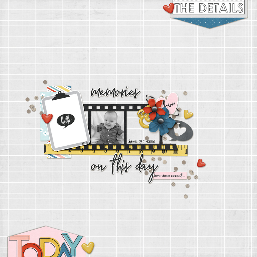
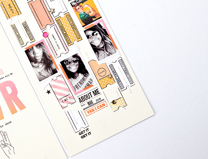
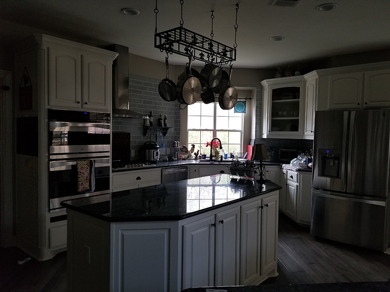
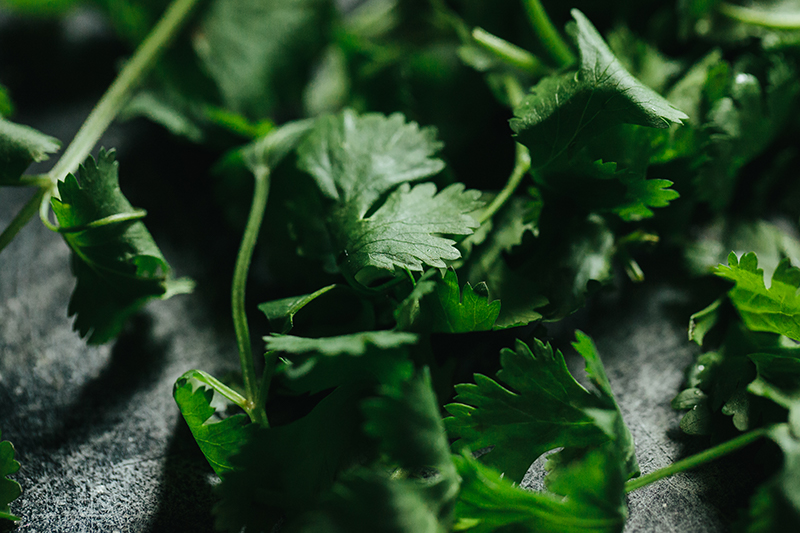
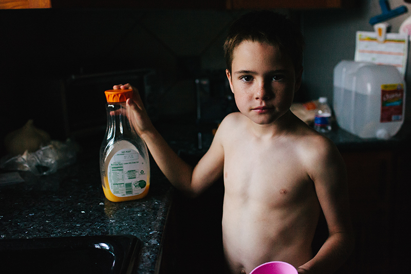
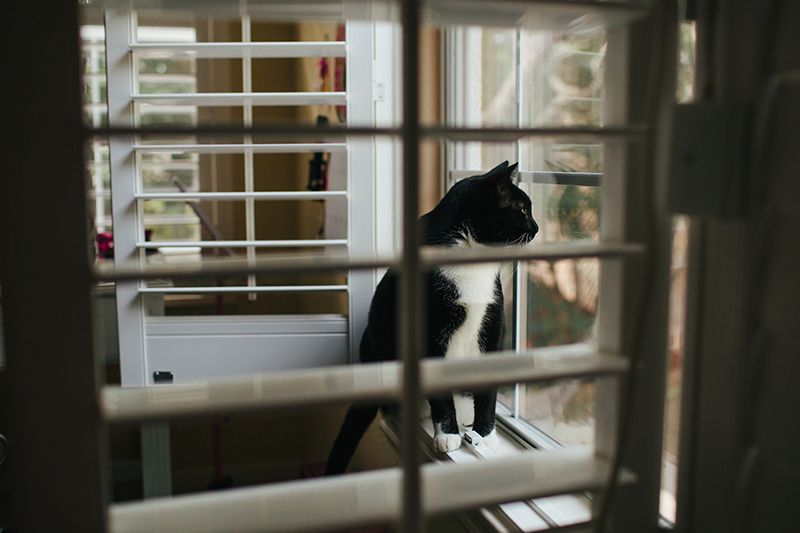
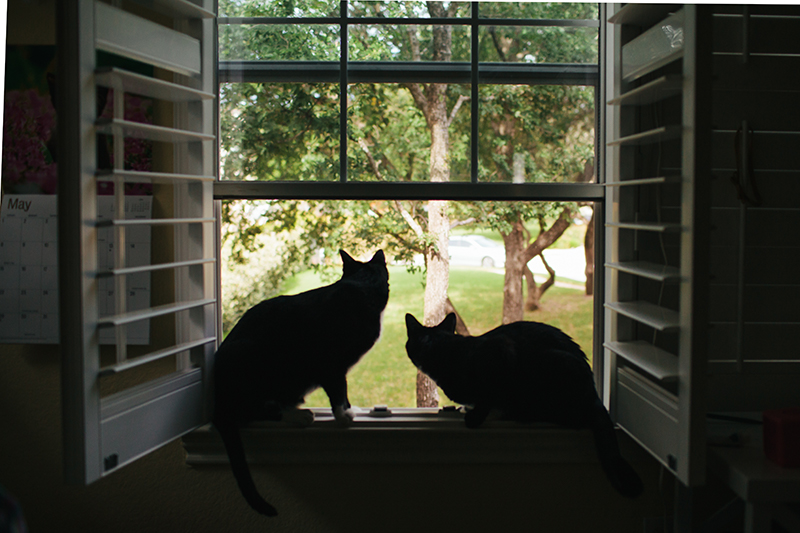
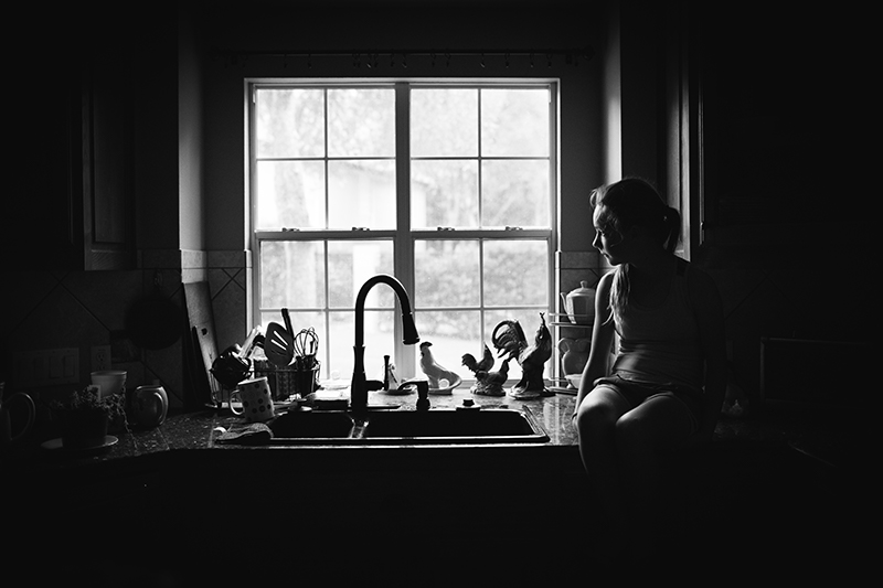
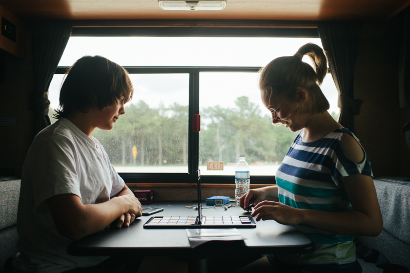
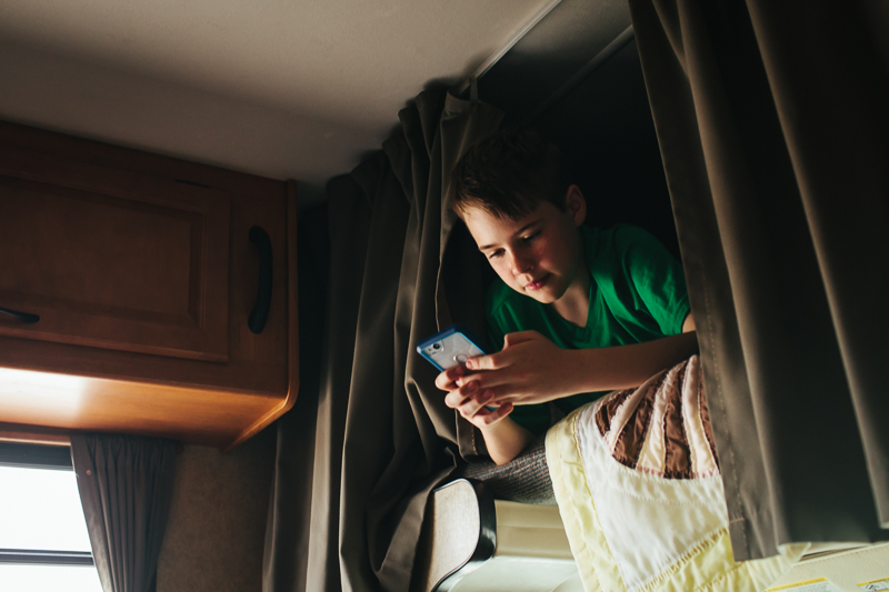
Here are a few shots I took with it. What do you think?


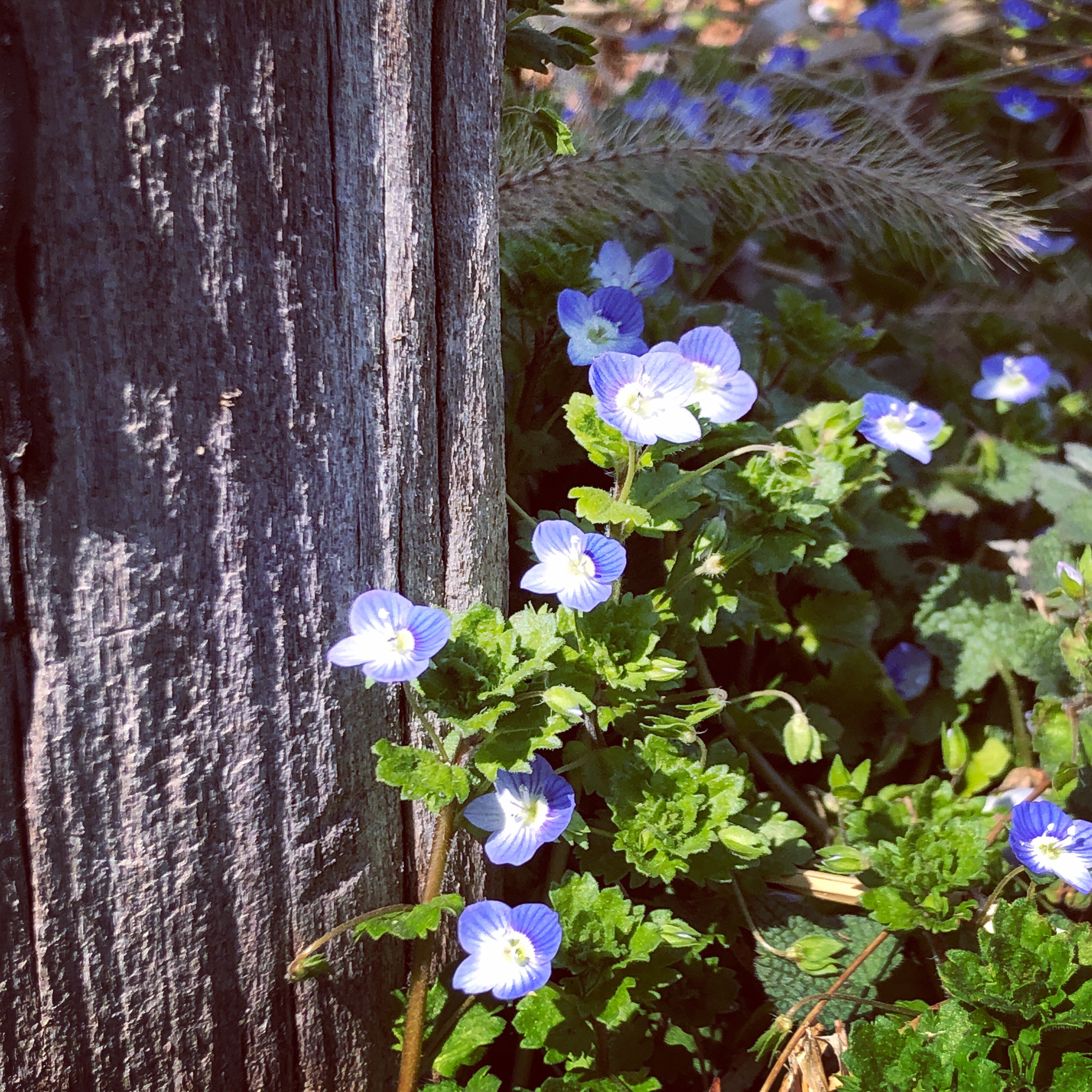
In the second photo, the bokeh was originally a mistake(!). Before you touch the screen to adjust where to focus, it can sometimes appear blurry… but this time, I decided it was beautiful and took the shot!
The normal camera on your iPhone will automatically focus on a face or something in the picture… but with this app, you have more options to choose where to focus, which is so great! I try to update my Instagram feed regularly, so you can follow me there and discover Japan through my lens!
Although I’m sure there are other camera apps out there that are very nice, I am really liking this one! If you know of any other camera apps that I should check out, I’d love to hear about them, as well!”
This app sounds fantastic… I’m definitely going to check it out! I’m always looking for ways to improve my iPhone photography.
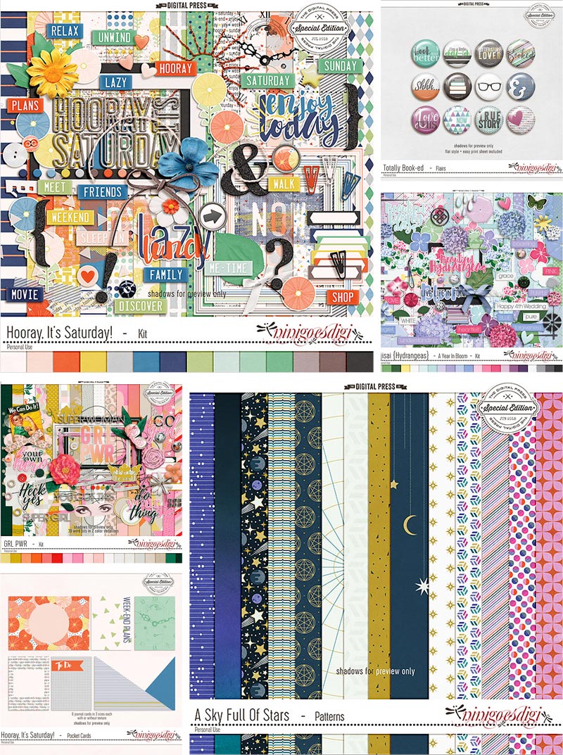
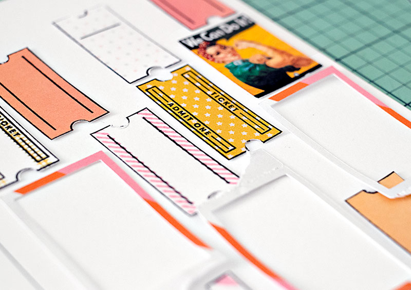
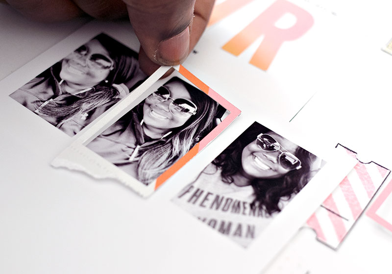
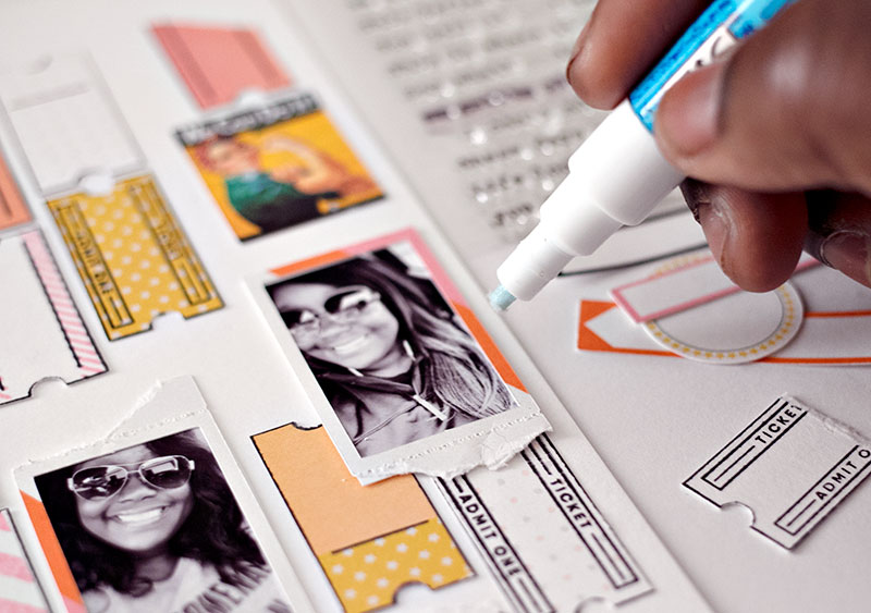
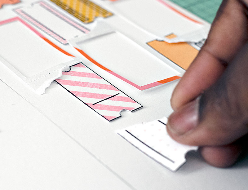
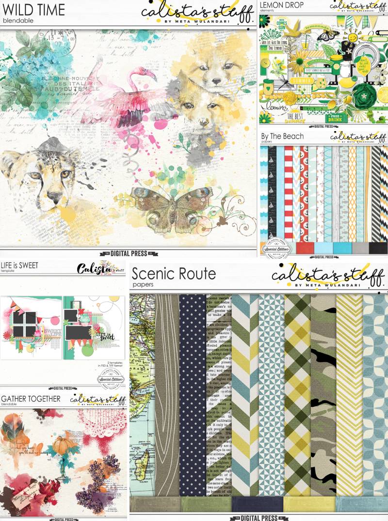
For those of you who aren’t already as familiar with Nini’s design work, she creates such colorful products! I love her kits. They are jam-packed with fantastic papers and elements. Her work is visually-compelling and her products practically scrap themselves!
Here is a sampling of some of the items you’ll find in the ninigoesdigi shop here at The Digital Press…
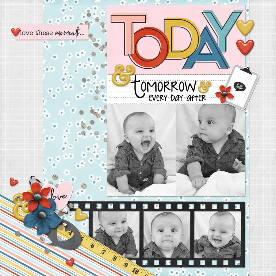
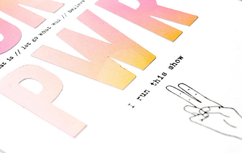
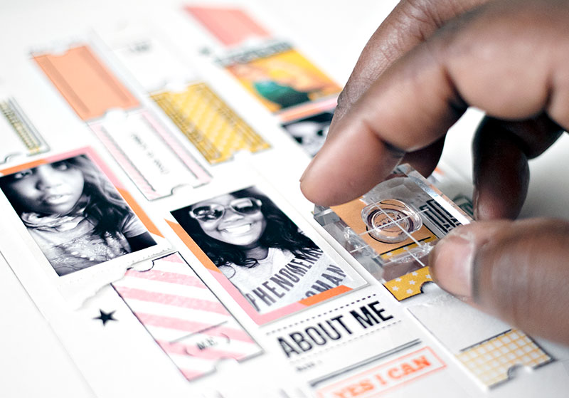
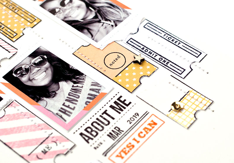
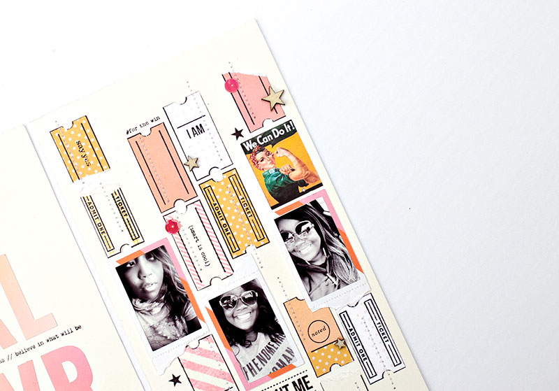
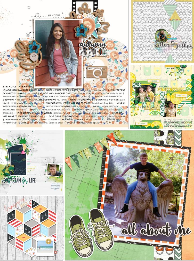
And to give you just a glimpse at her designs in action and demonstrate the beautiful pages you can create with them… here’s a look at just a few of my favorite projects from the gallery at TDP, which is always full of beauties from Nini’s shop!
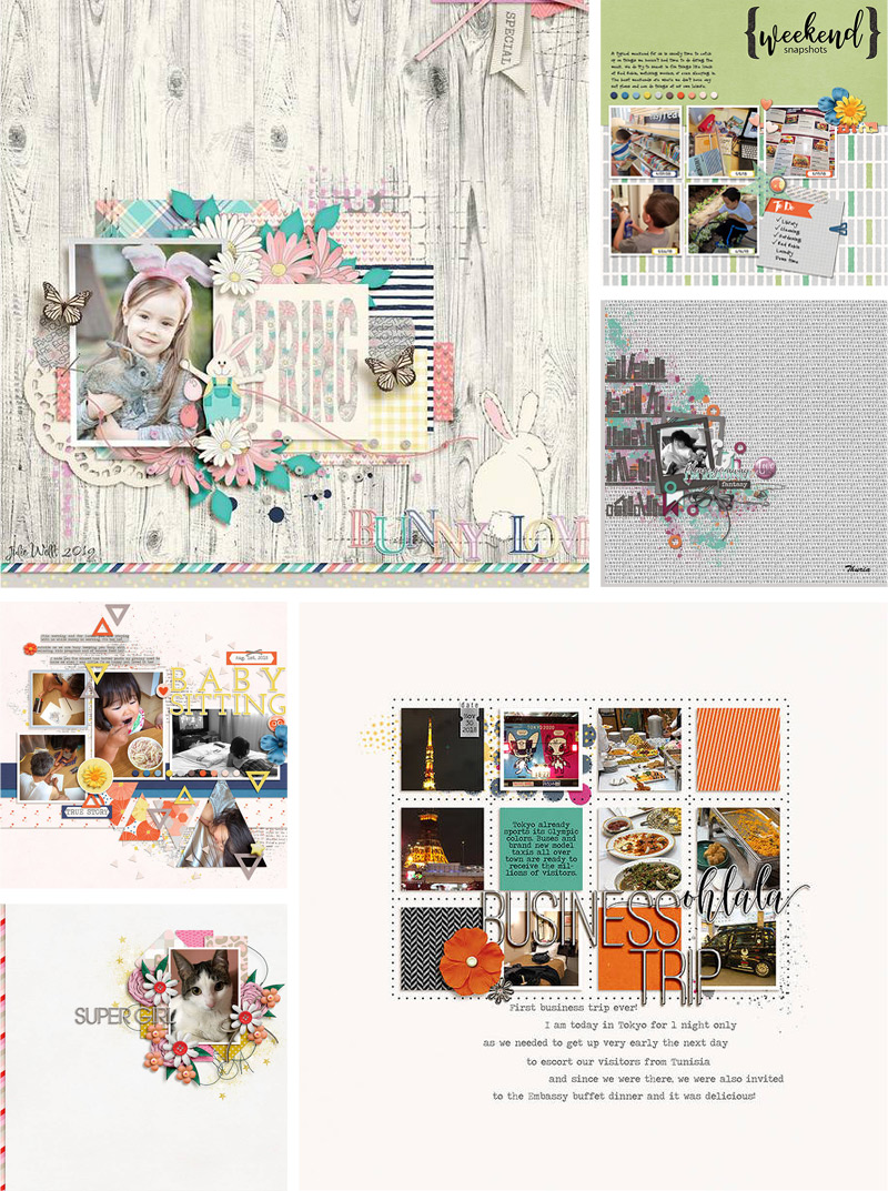
Aren’t those layouts fantastic?!
Hopefully, today’s Friday Favorites article has given you even more insight into Nini’s personal style (and again, if you want to know even more about her — scroll up and use the links to her previous features here on TDP’s blog, where’s there’s lots of good stuff!).
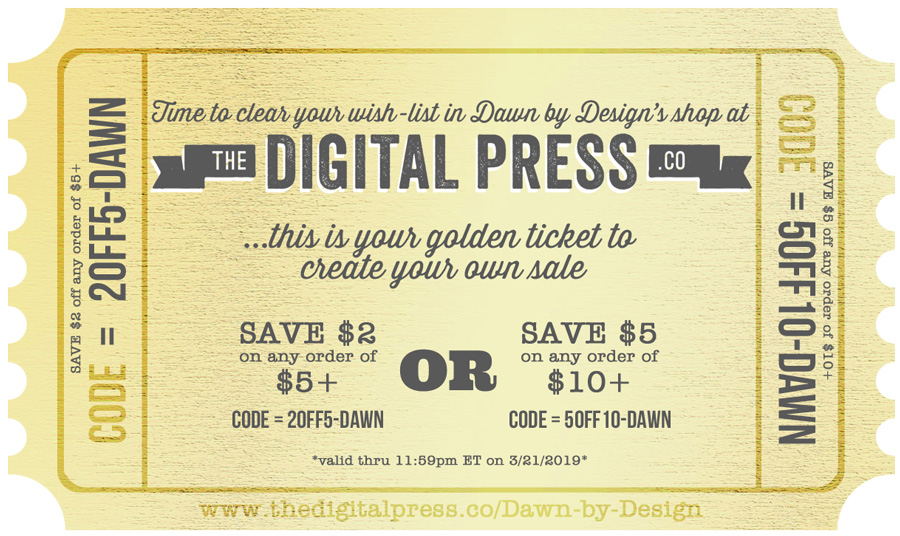
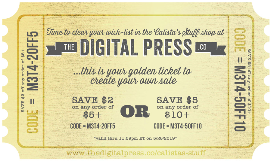
And the best news of all?! …during Nini’s upcoming feature week here at The Digital Press, you can enjoy the chance to score an amazing deal in her shop if you use the following coupon code when purchasing her digital goodies (this code/sale will be valid through 11:59pm ET on Thurs 4/4). Don’t miss it!
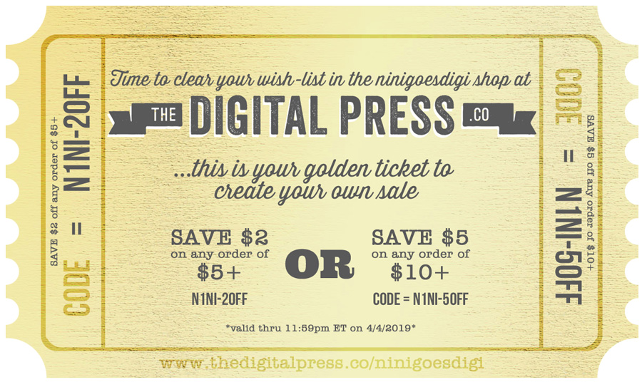
[ if you have trouble seeing the coupon image, above, the codes are as follows: “save $2 off any purchase of $5+” by using code = N1NI-2OFF . . . or “save $5 off any purchase of $10+” by using code = N1NI-5OFF ]

About the Author Amy lives in Richmond, Virginia, with her husband and their 13-year-old boy/girl twins. Their 22-year-old daughter has recently finished up graduate school at Clemson and is starting her first full-time job! She has been scrapbooking since the early 1990s, but discovered digital scrapbooking in 2005 when her twins were born… and has primarily scrapped digitally since that time. She is passionate about telling her family’s stories and documenting their life together. She is also a huge reader (mostly literary fiction), a pop culture junkie, and LOVES all things beauty & makeup!
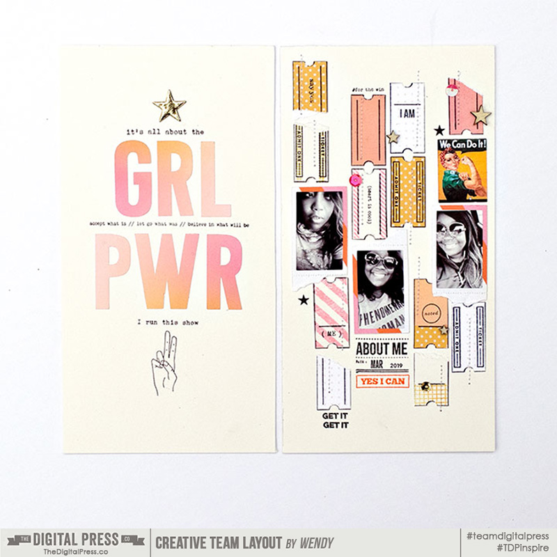

 About the Author Wendy has a strong passion for the arts, lots of creative spirit, and is fearless in working with new products and techniques. During the day, she works full-time as an Audit Manager. Wendy and her family live on the Gulf coast of emerald waters in Navarre, Florida. Her husband is from Italy and is an amazing Executive Chef at an Italian restaurant in Navarre. Her daughter is a Yorkie named Principessa. Wendy has over 20 years of experience in the scrapbooking industry. She has been published several times in print and online scrapbook magazines, and has designed for several manufacturer’s creative teams. Wendy is currently designing for The Digital Press as a hybrid artist.
 About the Author No need to adjust your computer screen, it really is a GUY hanging out here at The Digital Press! Sean is a native New Mexican who fell in love with a Utah girl 25+ years ago and never went home! He is the designated scrapbooker in his family, preserving the memories of his wife, two sons, and dog Muffin. He loves all things Disney, Harry Potter, and anything related to his favorite animal, the duck! When he’s not scrapbooking on his phone or computer, he develops curriculum to teach people how to use dental practice management software. He joined the Creative Team at TDP in February 2019.


 About the Author Beckie is a creative team member at The Digital Press and who lives near Austin, Texas. In addition to scrapping and photography, she enjoys spending time with her family, reading, and ignoring household chores.