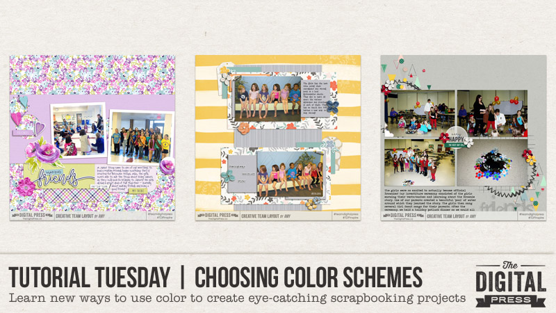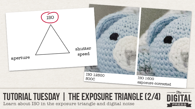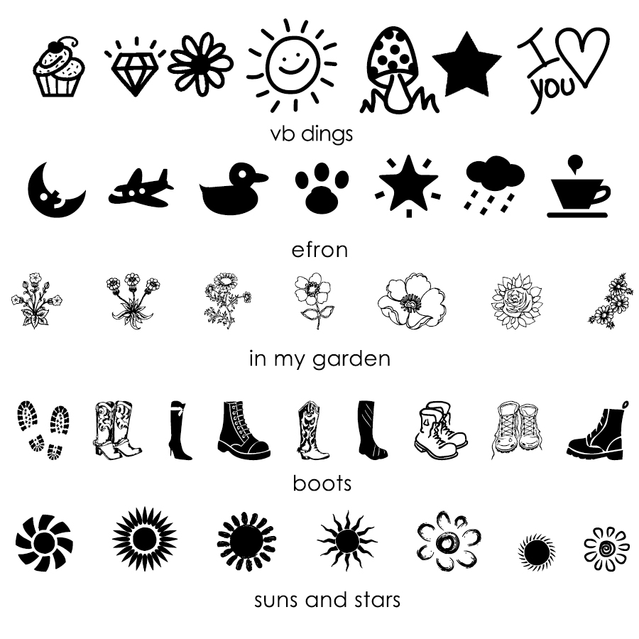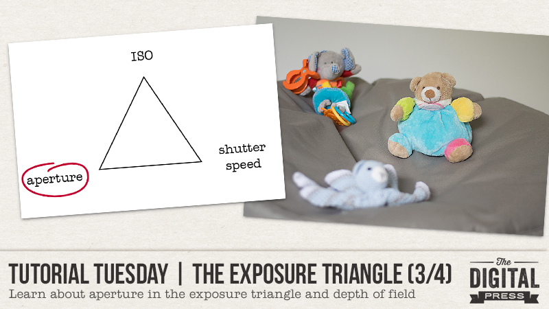
Welcome another edition of our Tutorial Tuesday series here on The Digital Press blog! This is Part 3 of our 4-part photography series all about the exposure triangle. If you happened to miss it a couple of weeks ago and need a recap, you can find Part 1 HERE and Part 2 HERE. To refresh your memory, in the first post we introduced the idea that photography exposure depends on three settings: ISO, aperture, and shutter speed. and we explored ISO in part 2.
Today we’ll be focusing on the aperture setting in the exposure triangle.
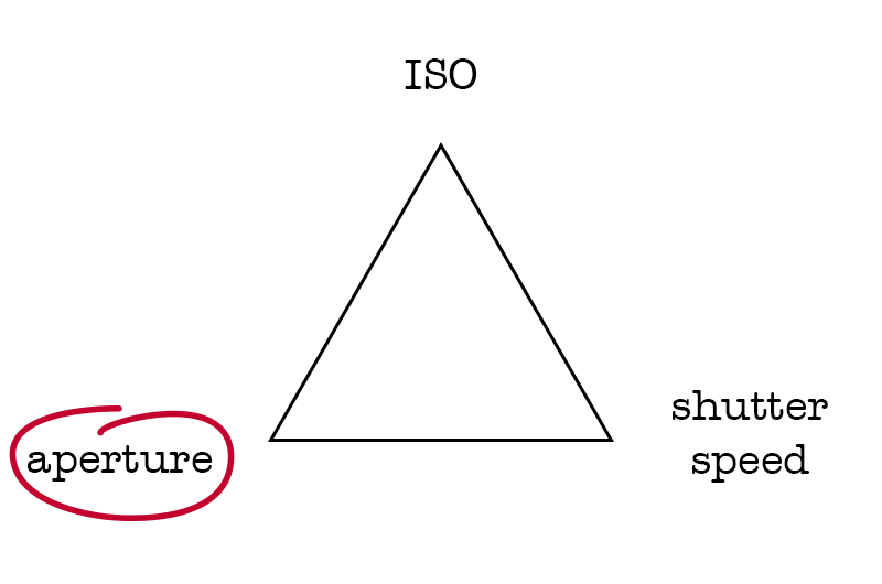
Aperture is the size of the “hole” that lets the light come into the camera and hit the sensor. As we saw in the first post, it’s expressed as a fraction. An aperture of f/2, for example, means that the “hole” equals the focal length of the lens divided by 2. As it is a fraction, a big aperture number will mean a small “hole” and hence less light coming in, and a small aperture number will mean a big “hole” and hence more light coming in. Photographers often say they shoot “wide open” (small aperture number) or “closed down” (big aperture number)
As I mentioned in Part 1 of this series, every setting of the exposure triangle has a “side effect.” In other words, each setting has consequences on the exposure but also on something else in the picture. The aperture impacts the depth of field of the photograph. Depth of field is the “slice” of the image that is sharp, in focus, when everything in front of it and behind it is blurry. How shallow or deep the depth of field will be depends on the aperture. Other factors, such as the lens and the distance, also come into play but that’s a topic for another blog post. For now, let’s focus on how aperture influence depth of field!
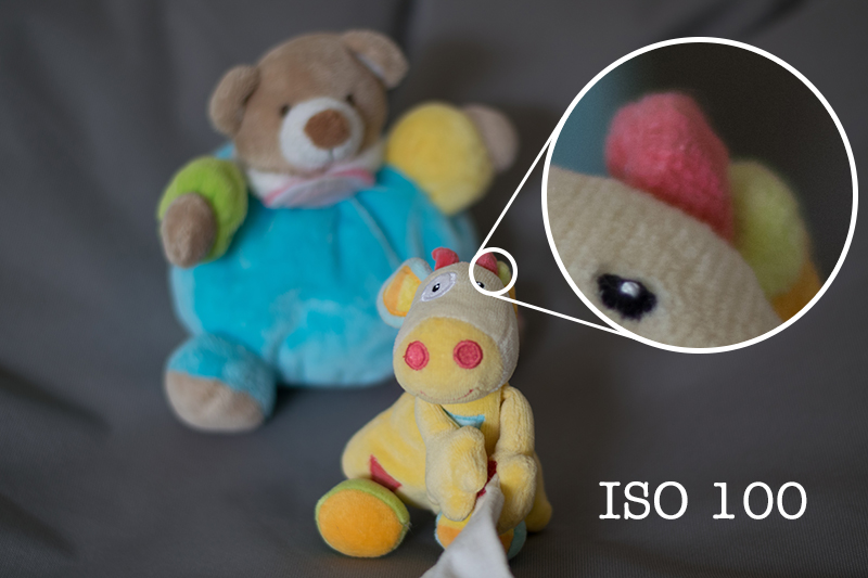
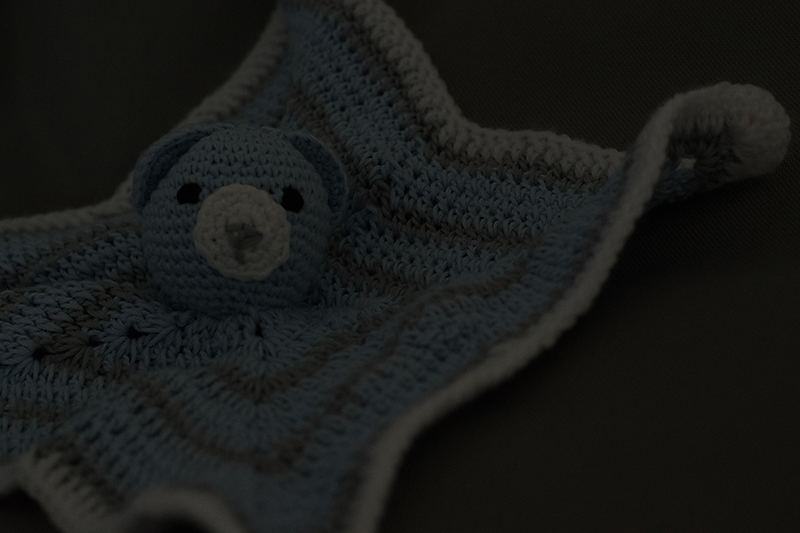
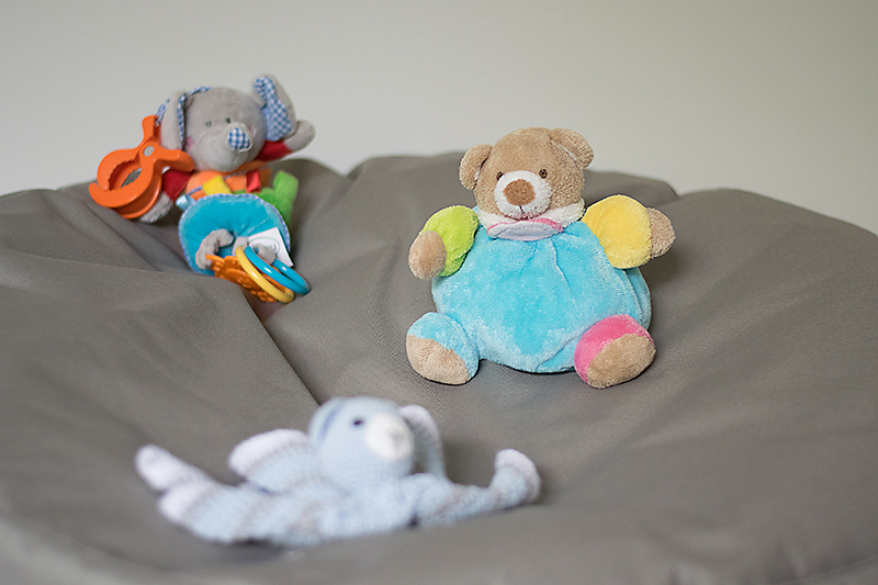
In the three next photos, I only changed my settings but didn’t move the camera or the toys. First, let’s start with a big aperture (small f/number, f/1.8 in that case). It will allow a lot of light in and will create a shallow depth of field: the “slice” of sharpness will be very small. For example, here the toys are situated one behind the other and only the one I focused on (the teddy bear on the right) is sharp. The blue bear on the front is further away from the toy I focused on than the elephant in the back, that’s why it’s more blurry than the elephant.
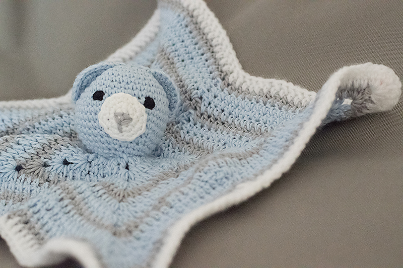
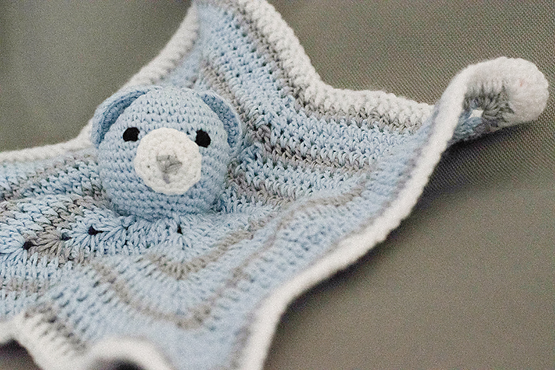
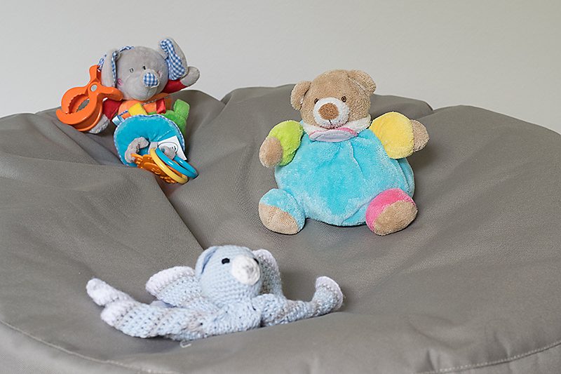
On this second image, I picked a “medium” aperture (f/6.3) and the subject (still the same teddy bear) is still sharp while the other two are sharper, but still blurry.
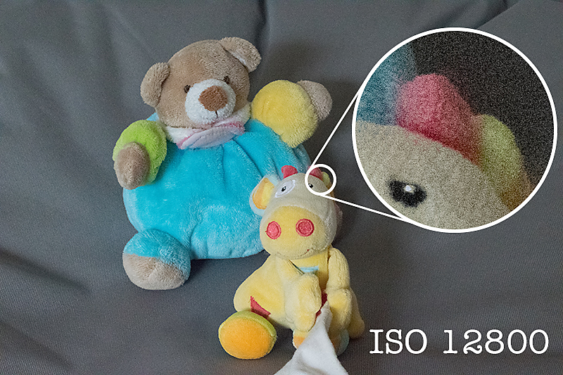
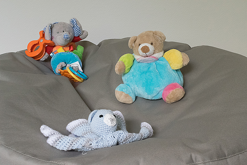
A small aperture (big f/number, f/16 in my example) will allow very little light and will create a deep depth of field: a lot of the image will be in focus. As you can see here, all three toys are sharp.
See the difference?
In the part 2 of this serie I said that ISO is a setting you can set on “auto” if you are just starting to shoot manually. That is because ISO doesn’t have much impact on the “creative” part of taking a photograph. Aperture, on the contrary, with its impact on depth of field, can totally change the image so it’s important that YOU decide which aperture to use. Do you want to blur the background of your subject? Do you want to create bokeh (this beautiful artistic blur)? Pick a wide aperture.

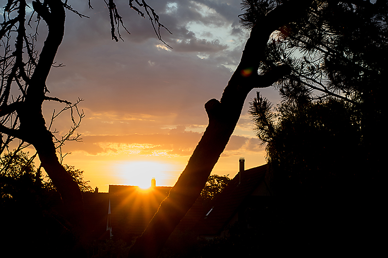
Do you want to have a very sharp image, where all of it is in focus, for example for a landscape photo? Do you want to create sunbursts? Pick a closed down aperture.
If you’re not comfortable using the manual mode of your camera (where you choose all the settings), you can use the aperture priority mode: you decide on the aperture and the camera picks the other settings in order to have a correct exposure. This “semi-automatic” mode is often represented by the letter A (Nikon) or Av (Canon) and it gives good results in most situations. It is a good way to experiment with aperture without having multiple settings to worry about and it is a great way to start learning about shooting manual.
In two weeks we will end this serie with shutter speed. See you soon!
 About the author Chloé is in charge of PR and communication for her small town by day, a digiscrapper “by night,” and a photographer whenever the light is beautiful. She recently became a very happy mom to an adorable little boy and is enjoying the last days of her maternity leave.
 About the Author Kate is on the hybrid team here at The Digital Press. She lives on the Utah/Colorado border with her husband, 5 kids, 10 chickens, a dog named Gracie, and a cat named Kit. She’s a city-born girl who found she’s really a country girl at heart. She can be found outside, barefoot, and probably in her garden.