Category: Tutorials

Tutorial Tuesday | PART 1: The Exposure Triangle

Hello, and welcome to another edition of our Tutorial Tuesday series here on The Digital Press blog! This week, we’re beginning a really awesome 4-part series that will run every other week for the next couple of months to help you with your photography!

As scrapbookers, you may have read photography tutorials in the past (including the great ones we have here on The Digital Press blog)… and in doing so, you may have seen the term “exposure triangle.” That’s the concept we’ll explore with this 4-part tutorial that will, I hope, help you better understand the notion and use it in your own photography!

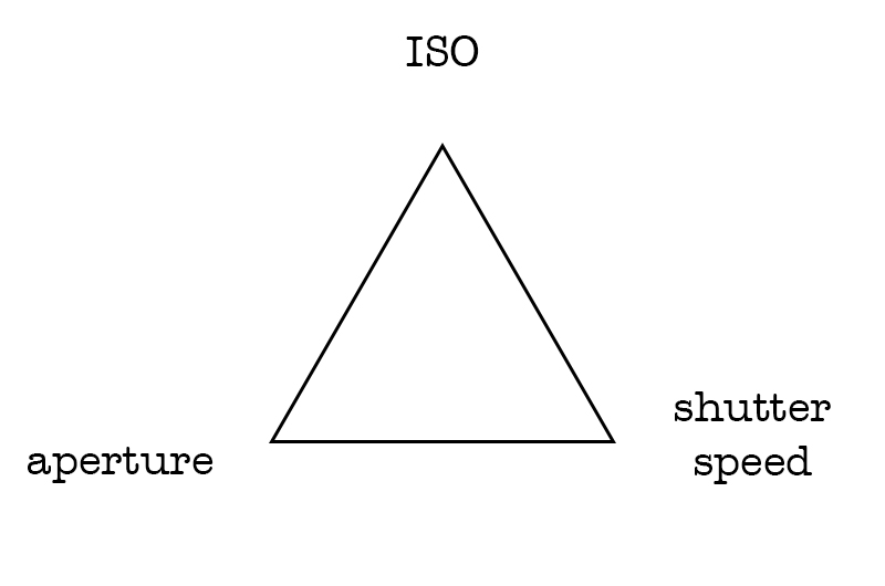
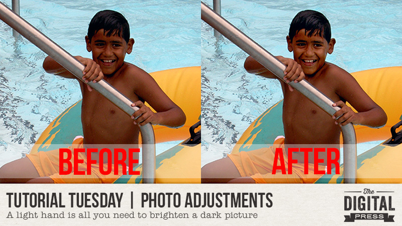
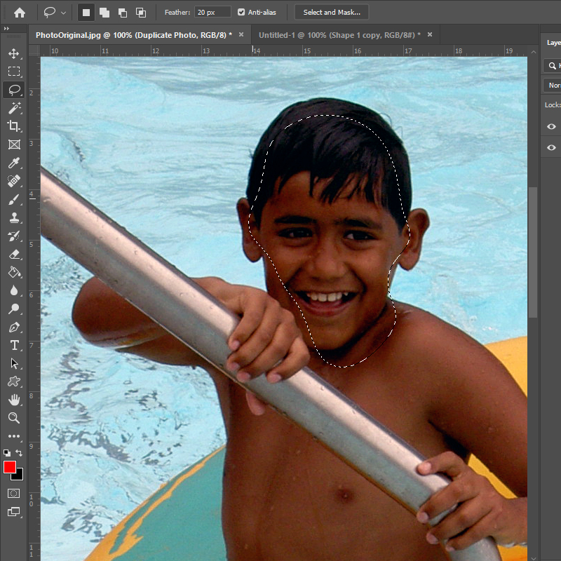
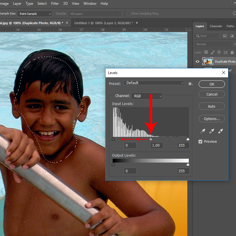
First of all, let’s see what happens in the camera when we take a picture. Basically a “hole” opens to let the light come in and hit the sensor that will capture it. Exposure is the amount of light in a photograph. An OVERexposed picture is too bright (details are lost in the highlights, the brighter areas of the image) and an UNDERexposed picture is too dark (details are lost in the shadows). To expose a picture, three settings come into play, that’s the famous “exposure triangle”. Those three settings are ISO, aperture and shutter speed. 

ISO is the sensitivity of the sensor. In the film days, each film had a set sensitivity, but today we can change it on most cameras. A high ISO means that the sensor will take more light in, a lower ISO means it will take less light in. ISO go usually from 100, sometimes 50, up to 12800 or more.

Aperture is the size of the “hole” that opens in the lens to let the light come it and hit the sensor. Let me get math-y for a minute here. This number is expressed as a fraction: f/2 for example. It means that the diameter of the hole equals the focal length of the lens (f) divided by the aperture numbre (2 in my example). That’s the reason behind the fact that the SMALLER the number, the BIGGER the aperture (the hole) and hence the MORE light entering. With a 50mm, for example, an aperture of f/2 will give a 25mm (50/2) diameter of the hole, when an aperture of f/10 will give a 5mm diameter (50/10). So, in short: big number = small aperture = small hole = less light in, small number = big aperture = big hole = more light in.

Shutter speed is for how long the “hole” remains open and let the light in. On my camera, it can go from 30 seconds to 1/4000th of a second. The longer it remains open, the more light goes in.

Here is a simple analogy: if taking a picture is like filling a bucket with water. ISO is the size of the bucket (that is meant to hold more or less water), aperture is how much water comes out of the faucet (is it wide open or is it just dripping?) and shutter speed is how long the faucet remains open.

We talk about the exposure TRIANGLE because all three setting are dependent on each other. If you let less light in through one setting, you will have to let more light in with another one (or both) in order to have a properly exposed photo. Let’s see some examples.

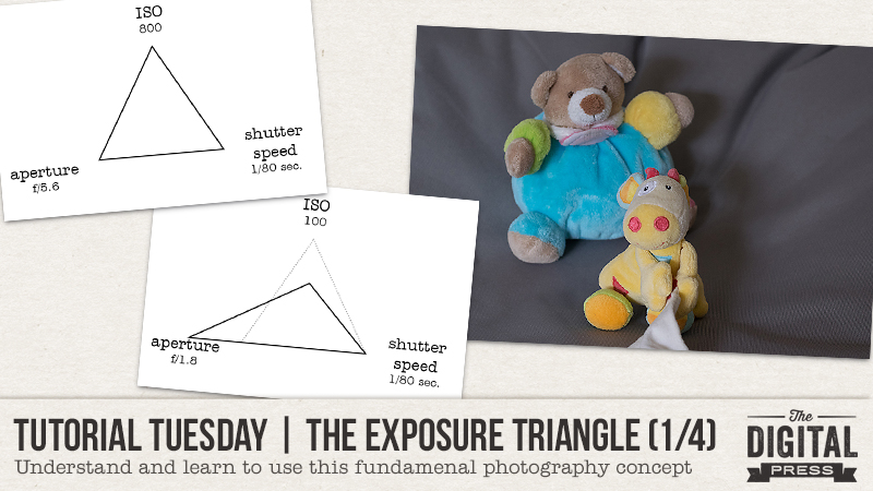
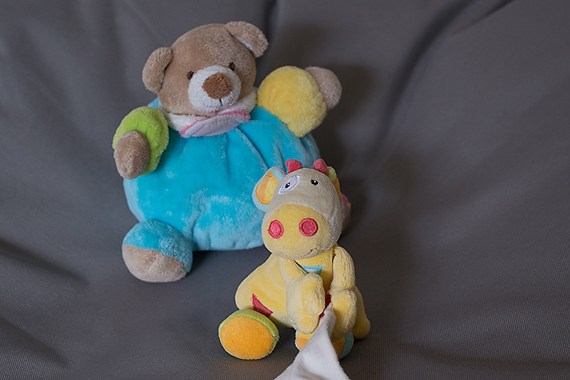
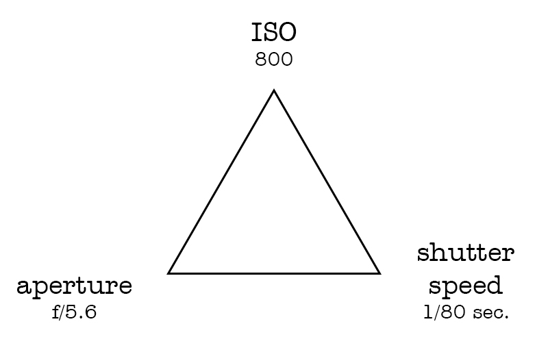
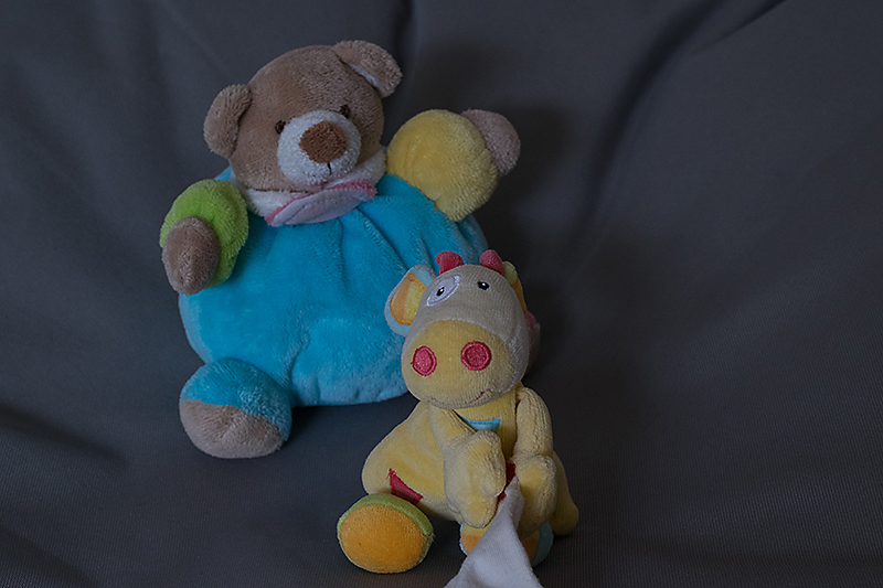
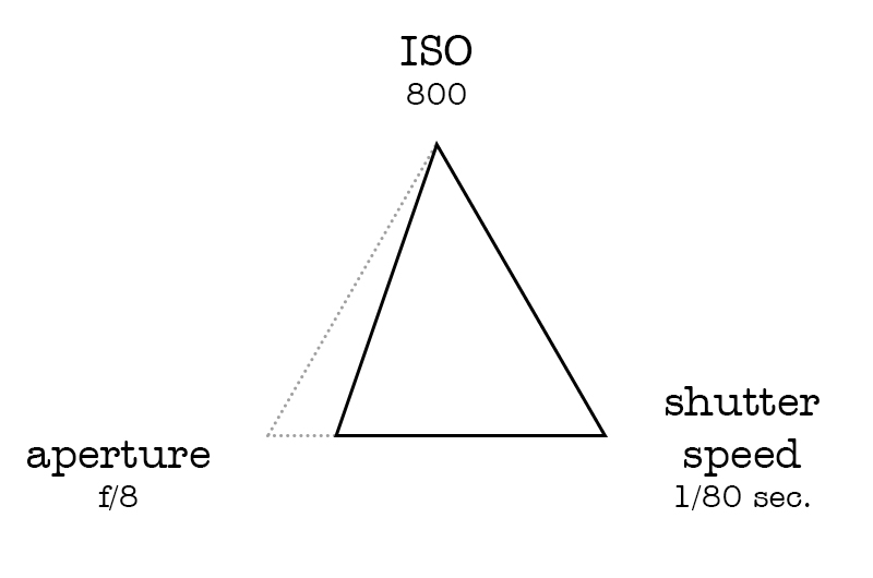
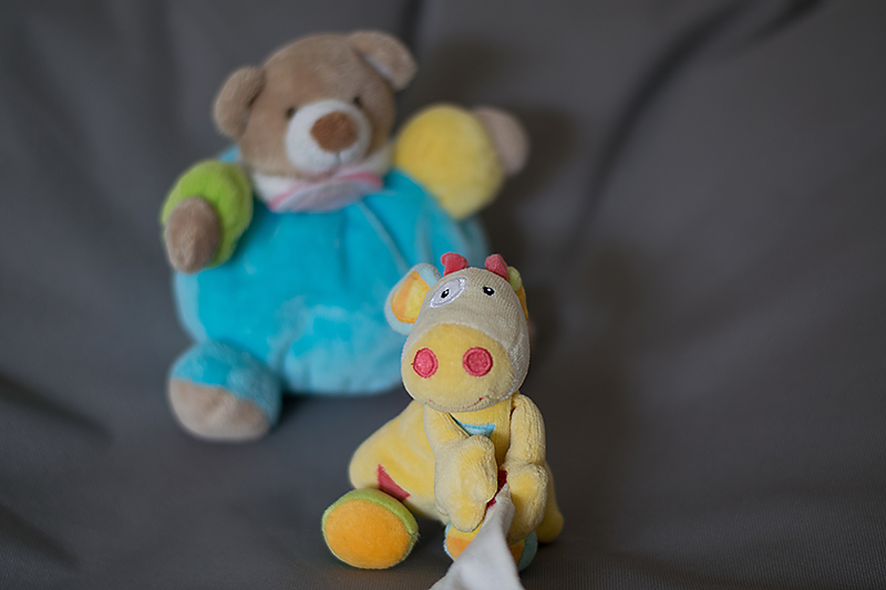
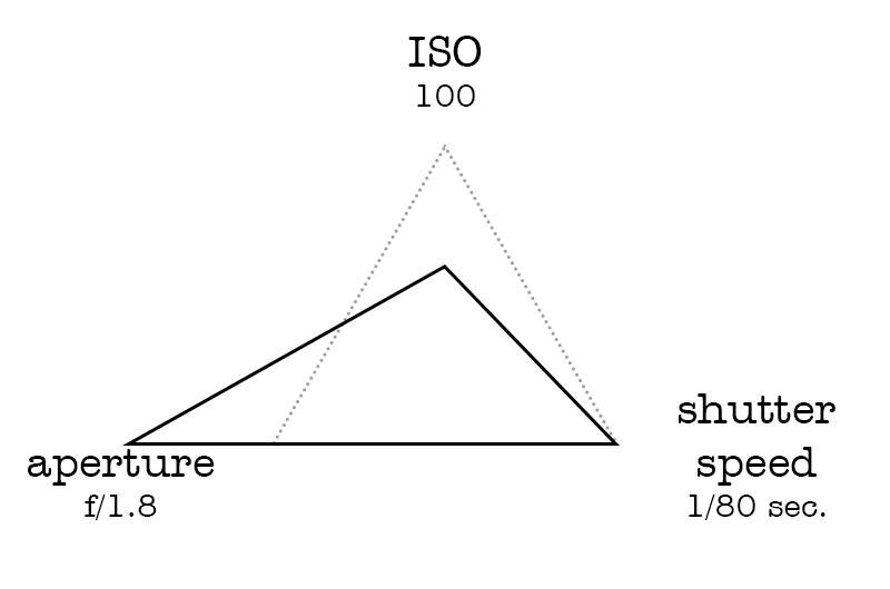
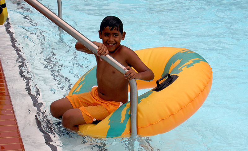
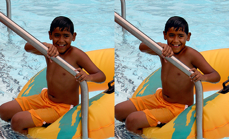
First, here is a photo where each setting is “average”. It is correctly exposed (even if totally boring, I admit, but at least those subjects are easy to work with! LOL).

Here is a representation of the exposure triangle for this image with each setting:

As I said before, if you change only ONE of the setting, the photo become under or overexposed. In this second image I decreased the aperture (increased the number) and as a consequence the image is underexposed, much darker than the first one. To have a properly exposed image, I should have let more light in through either a longer shutter speed, a higher ISO, or both.

The different combinations of those three setting can be almost infinite while the result remains very similar. Here are three other examples, each followed by the settings.

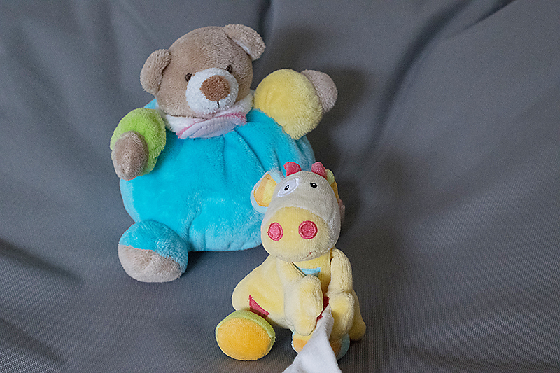
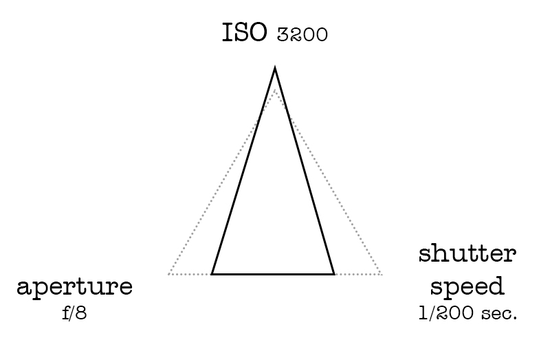
First, I kept the aperture at f/8 (like in the previous photo) but I bumped the ISO (more light) and decreased the shutter speed (less light) so that the image would be properly exposed.

Then I chose to use the lowest ISO possible (less light) and hence I used the widest aperture possible on my lens (much more light) and the “average” shutter speed we had in the first photo.

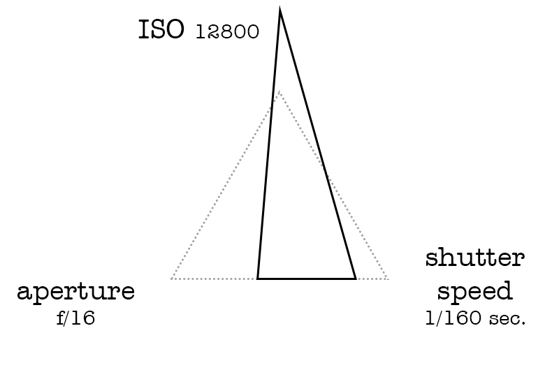
Last but not least, I chose the highest ISO possible on my camera (much more light) and the smallest aperture on my lens (way less light).

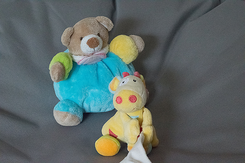
If you observe carefully the images above you can see that changing the settings doesn’t only influence the exposure, it also has other consequences. Each setting has a “side effect” that we will explore in the next posts in this series, as well as how to choose and change our settings depending on the results we are looking for.

In the meantime, I hope the overall concept of “exposure triangle” is clearer to you. Don’t hesitate to ask (here in the comments or in the forums) if you have any questions! I’ll be back in 2 weeks with PART 2 of this series.


ChloéAbout the author  Chloé is in charge of PR and communication for her small town by day, is a digiscrapper “by night,” and a photographer whenever the light is beautiful. She recently became a very happy mom to an adorable little boy and is enjoying the last weeks of her maternity leave.

Hybrid How-To | Graduation Centerpiece

Hello everyone! It’s Tanya here, and I’m excited to bring another edition of our Hybrid How-To series to you here on The Digital Press blog! Today I’m going to show you how to use your digital supplies to make a really cute graduation centerpiece.

My niece is graduating from high school in May, so I thought it would be a great time do this project. I can’t wait to package it, up along with some gift money (of course… LOL), and send it to her. I’m so proud of myself… first, because I actually made a gift… and also because I’m getting it mailed off early! All of my family knows that I’m often super late on cards and birthday gifts; I have great intentions, but it never fails — I usually send things off 3 months later (or maybe 5 or 6 months? …that’s probably more accurate!).

This project idea can be used for any type of party… graduations, birthdays, showers… just to name a few. I used my Silhouette Cameo to do all of the designing and cutting, but it can also all be done with any photo editing program and a pair of scissors and/or punches.

SUPPLIES NEEDED:

  1. digital kits that go with the theme of your party (I chose graduation & party kits for my project)
  2. cardstock in different colors (I used white, black, and gold)
  3. double-sided tape
  4. paper cutter
  5. scissors
  6. wooden skewers (I found mine in the housewares section at Wal-Mart)
  7. tissue
  8. shredded tissue paper
  9. vase, bucket, or other container (I recycled a vase that came with flowers I received for my birthday; I saw the same vase at the Dollar Tree this weekend)

Here’s a look at the digital products I chose to use for my project…

Midnight Elements by Anita Designs, Graduation Bits and Anytime Alphas by Akizo Designs, and Commencement by Sherry Ferguson Designs (item retired since the time I created this project) ]

First, I opened the folder where my images were saved and dragged them to my work area. I continued to do this for all the images I wanted to use in this project…

After opening the images in my work area, I chose one (the graduation cap, shown below) and traced the image so that it would have cut marks.

Additionally, the tassel was blue and I wanted it to be one of my niece’s school colors, instead… so I did a trace-by-color and pulled it off to the side. I recolored it (green), and then moved it back to the original spot. This sort of thing can also be achieved in Photoshop and other photo editing programs; I like to do it right in my Silhouette software to simplify things…

Continue to open and trace all of the images you want to use for your project, to create cut-marks.

Here is what my page looked like before sending to my Cameo…

Later, I also created another page with stars and her school logo (the logo brought back many high school memories; I graduated at the same high school over 30 years ago… I’m telling my age here! LOL).

After arranging all of the images to maximize print and cut space, and making sure that I had the registration marks on (you can see the little black box and black lines in the image just above this)… the next step is to print and cut. To do this, send the file to your printer and then add your cutting mat and send through the Silhouette…

I did a second cut with just black cardstock (see above) in order to have a second layer to back each image that I cut out (if you do this, though, be sure to turn off registration marks for this particular cut). I find this extra step gives it all a more finished look.

After all of the elements were cut out, I added double-sided tape to the back piece. To ensure that my skewer would stick between the two pieces, I twisted double-sided tape around the skewer tip (see lower-right corner image, above); then, I sandwiched the skewer between the top and bottom pieces. TIP: be sure to press it firmly all the way around so that it looks finished.

And finally… it’s time to put it all together!  🙂  This was definitely the fun part!

As you can see, above, I put shredded paper in the bottom of the vase and then put some in the middle of the tissue paper, as well. This gave it some substance to ensure the skewers stayed in place. After finishing the project, however, I noticed that it probably wasn’t necessary to put the shredded paper in the bottom (it is a decision that probably just comes down to personal preference).

Next… just add the pieces. I started with the photo, front and center, and then arranged the other pieces around it. I also figured out that the point part of the skewer is best to go towards the bottom; it’s easier to stab it into the tissue that way.

Here’s a look at the final result…

I loooove how it came out! I can’t wait until she sees it, and I hope she loves it as much as I do and will use it at her graduation party (I know that she will; she is such a beautiful, sweet, caring, loving, smart girl!). She got a full scholarship for college. I’m so proud of her!

I have so many ideas running around in my head for more of these cute centerpieces. There are kits in the store at TDP for every occasion… and I’m off to do some ‘window shopping!’  🙂

I hope that you have enjoyed this tutorial and that I have inspired you to create some of your own centerpieces. If you do, we would love to see them posted in the hybrid gallery here at TDP!


Tanya

About the Author  Tanya is a member of the hybrid creative team here at The Digital Press. She has been paper and hybrid crafting for at least 18 years now, and loves creating and sharing those creations with others. Her all-time favorite tool is her Silhouette Cameo. She has been married for 30 years to her high school sweetheart, Richard, and has two sons: Chris, 27 and Chance, 23. She also enjoys crocheting, photography, and woodworking.


Tutorial Tuesday | Photo Adjustments

Have you ever taken a picture, thought it was great, and then realized that there are shadows across someone’s face? The moment has gone, and while you love the photo, you wish you could see the individual features, the eyes, nose, mouth, etc., more clearly. Well, with the wonders of photo editing software, and a light hand, you can bring shadowed features into the limelight again. Let me show you how.

Here’s a photo of my son from, wow, a long time ago, at a local water park. He was having such a great time going up and down the large slides with the inner tube. It was tough to get a photo (he was so quick!), so I took what I could get. However, the more I look at this, the more I’d love to see his face in better light.  Yes, he has a good tan and is olive-skinned, but still …

I tried using Curves and Levels adjustments (I’m using Photoshop, and these can be found under the menu Image > Adjustments), but by increasing the mid-tones, it simply “blew out” the water, brightening what was already a lighter component of the picture – and the result looked unnatural.

I did, however, come up with a compromise that I really liked.

Step 1: Create a duplicate layer of your photo. (This is especially important as you will want to retain the integrity of the original picture.) You can do this quickly using short-cut keys Control-J, or using the menu option, Layer > Duplicate Layer.

Step 2: With the duplicate layer active, select the Lasso Tool from your toolbox. Set a ‘feather’ of 20-25 pixels. You will want a soft edge on the lassoed selection to ensure it blends with the rest of the photo.

Step 3: Using the Lasso Tool, outline the section you’d like to lighten. You do not need to go right around the exact edge of the shape – remember you have a feathered edge. In fact, I’d recommend deliberately going inside the edge to allow for the feathering or ‘bleed’ to help blend the changed section with the original. It certainly does not need to be an exact science here.

Step 4: Open the Levels adjustments (Image > Adjustments > Levels) and slowly move the middle slider, the one that controls the mid-range levels to the left (left increases the light, right adds dark tones). A very light hand is all that’s needed. If you are too heavy-handed, the result will not look natural.

(The shortcut Control-D will remove your selection after you’ve applied the tonal adjustment.)

The resulting change is subtle, but that’s exactly what you want! Here’s my ‘corrected’ photo:

It’s might be hard to see the difference, but the facial features now stand out a little better. There are more highlights in my son’s hair, too, and overall, the face just looks brighter. Here’s a side-by-side for an easier comparison:

Have photos of loved ones wearing baseball caps that cast shadows? Maybe just bad lighting and, as the situation I found myself in, you’re just trying to get any picture that you can. In just a few minutes, you can salvage photos that you might otherwise skim over. But remember, a light hand is all that’s needed; it’s easy to go too far with this technique.


About the Author Kat Hansen is a creative team member here at The Digital Press. A HR Manager in the real estate industry by day, she loves the opportunity to spend a few hours each evening being creative. Vacation memories feature pretty heavily in Kat’s scrapbooking pages, as well as her health and fitness journey. Kat has quite the sense of humor (she “blames” her father for this), which she incorporates into her journaling and memory-keeping.

Tutorial Tuesday | Scrap Outside the Kit

Hello, and welcome to another edition of our Tutorial Tuesday series here on The Digital Press blog! Today I thought it would be fun to share with you my love for scrapping with multiple kits at one time. I know many around digiland don’t share my same love and like to stick to one kit at a time, as they are often overwhelmed on how to use multiple kits/products on a single cohesive layout. I’m going to share with you a super simple approach that will hopefully help you to “scrap outside of one kit.”

To get things started, I select the kits/products I want to work with. You can select yours based on color palettes, themes, or anything else your heart desires. For my layout, I simply chose four gorgeous products from the shop that I loved (no other connection or reason!)…


Once I have my products selected, I take all of the elements from the products I selected and I make copies — putting all new copies into a single elements folder; I do the same for the alphas, papers, etc.. This makes it easy to have them all in one place and I don’t spend too much time flipping back and forth between kits while I work.

From there, I just scrap my page as normal, choosing anything I like (papers, elements, etc.) as though it all came out of one product (instead of 4!)…

Essentially, all I have done is create a large “mega kit” with items from various kits and/or different designer’s products. It really makes it easy to see it all in one place.

I hope this helps you dig deep in your digital stash and combine old favorites with new ones to create unique pages you and your family will treasure forever. If you give “scrapping outside the kit” a try, please share your layouts in the gallery — we would love to see them!


About the Author  Sheana is a member of The Digital Press creative team. She lives in Southeastern Ohio with her husband and 2 teenage daughters. She works full-time as a policies and procedure writer for a large investment firm. When Sheana isn’t working or scrapbooking, she enjoys spending time with her family.

Hybrid How To | Bucket List in a Traveler’s Notebook

Hello Everyone!

In this post I’m going to show you a work in progress I started recently using my traveler’s notebook with the amazing products we have here at The Digital Press. It’s my Bucket List Traveler’s Notebook. It’s super simple to do and so much fun.

Let me start by reiterating, I know this is not a finished project like you usually see on the blog from our amazing hybrid team. That’s one of my favorite aspects of this amazing hobby we share, it can be as “done” or “not done” as you want it to be. It’s all up to you.

One of the biggest reason I turned to traveler’s notebooks is because life has been super unpredictable and stressful lately for me and I need a little more distraction than a 12×12″ page can do for me. And I’ve found an easy pick me up in those moments when I need a break from overthinking everything is to look at places I’d like to be instead of the stress filled place I’m in at that moment. Rather than getting stuck in a parade of pictures (and ads) online that don’t relax me, I’ve made my own happy place to peruse till I feel ready to tackle the world.  And best part I gave myself license to get creative in my notebook. Whether it be hand drawn doodles or notes on a journaling card or whatever bits and bobs hit the spot.

For this Bucket List Traveler’s Notebook I started by collecting screenshots from Google Maps of the my most recent place of interest, the island of Mauritius. (I know the likelihood of ever getting there is 1 in 5 million-billion, but that means there’s still a chance, right?!?) It’s fun to dream and that’s what this notebook is all about.

I have templates for my traveler’s notebook set up in a layered photoshop file so that I can start clipping and printing as quickly as possible… and I waste less ink because I’m not throwing away lots of page that got printed on but didn’t get used once I cut things down to size.

To get started, I printed a couple pages on one side with light bright fun papers that I could write on as I made my plans. Then I found maps on Google first of the island itself and a second zoomed out. Then printed them on to the front of the pages I printed earlier. Here’s what I started the project with, my double sided Google map prints, photos from travel websites and few pages with papers clipped to them.

Now the fun begins. I quickly realized in my rush to get started that a couple of my picture were too large for the pages I’d printed. But that’s ok (remember, it’s a work in progress) to remedy this I creased one side and made a flap to hide notes or journaling under.

Now it’s just layering in embellishments, photos and etc till I get it where I want.


And here’s a second view.

I’m pretty happy with the start I’ve made on my notebook. My next step is to learn a little more about the island and print some journaling cards to fill in the empty spots with destinations and other ideas to fill my time while I’m “on the island”. 😉

I hope this has inspired you to create your own traveler’s notebook, in whatever theme you want or a bucket list of your own, and most importantly to give yourself permission have a work in progress to inspire your own dreams and while away some creative time.

Make sure you check out the shop at The Digital Press for the dreamy traveler’s notebook products our amazing designers have created for you to start your own notebooks with. Thank you for reading!


SandyPieAbout the author Sandy (or SandyPie as she is known in digiland) is a hybrid scrapbook enabler and nerdy introvert. When she not scrapbooking, working, or playing Pokemon Go… she is trying to survive the day with her husband, two teenage boys and four cats. Wish her luck!

Tutorial Tuesday | The Dodge and Burn Tools

Hello, and welcome to another edition of our Tutorial Tuesday series here on The Digital Press blog! Today, I am here to share information about how to use your Dodge and Burn Tools to make your layouts pop a bit more! I normally like to use it on flowers and leaves (in my photos and in the elements on my layout), but you can really use them on anything.

Your Burn Tool will make things darker and your Dodge Tool will make things lighter. You can find each of these tools in the following places…

When using either of these tools, you will want to adjust your settings (see next screenshot). Personally, I like to work with an ‘Exposure’ of 50%… Range: Midtone… and honestly any soft brush, with a size that works for the particular element or item I’m editing. It’s possible to change the exposure to make the dodging/burning less noticeable or more noticeable.

To show you the effect you can get with each of these tools… I’ve placed two flowers side by side (see next image), and I’ve burned the shadows more (making them deeper/darker), and dodged the highlights (i.e. accentuated the brighter areas) to pop the texture of this flower and to make the leaves feel fuller. I also wanted the flower to look as if it was sitting higher on the leaves, so I burned close to the edge of the flower (but on the leaves) to add extra shading, conveying more depth.

Take a look…

See the differences?

The left flower has my regular shadowing… and the right flower has been tweaked using the Dodge and Burn Tools.

I realize the changes are subtle, but they definitely add some realism… and on a full layout, they look AMAZING if you take the time to add this pop to a few elements. You can do as little or as much as you’d like to add depth… and as I said earlier, you can even do the same thing to your photos.

I’m now addicted to these two little tools… and I hope today’s tutorial will inspire you to give them a try!


About the Author  Anita is a creative team member at The Digital Press.