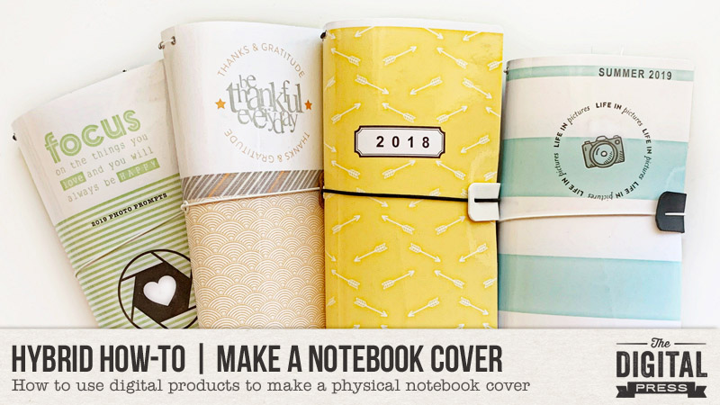
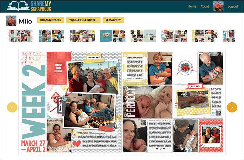
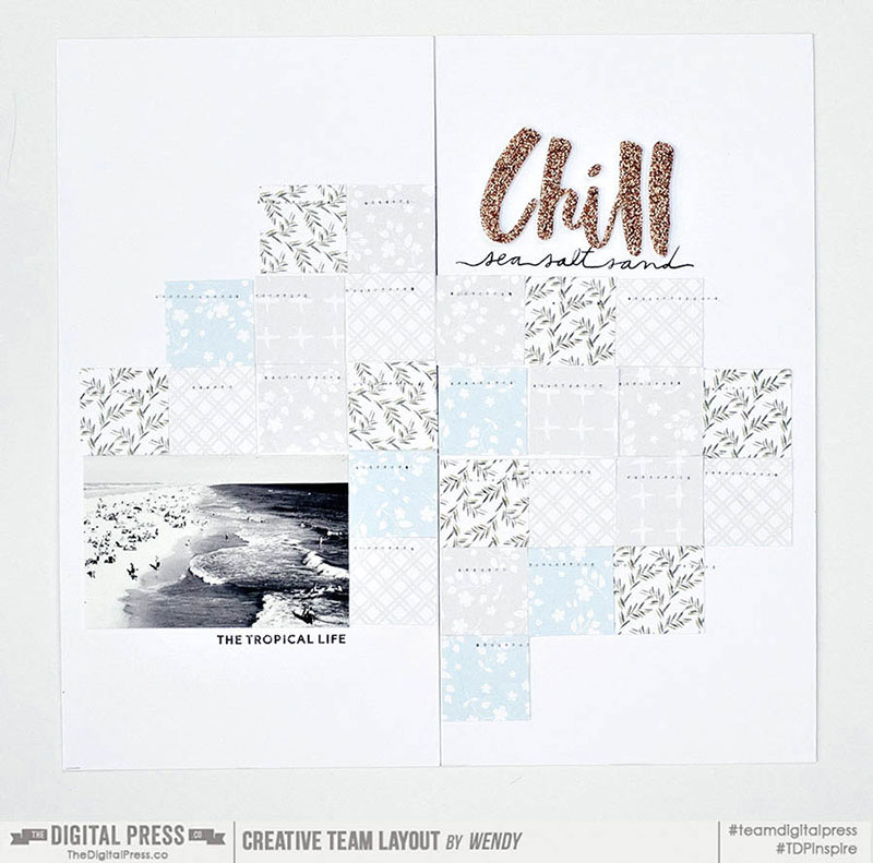
Hello everyone, and welcome to another edition of our Hybrid How-To series on The Digital Press blog! Today I’m going to teach you how to use digital products to make a physical cover for your Traveler’s Notebooks (and/or for any other small book) by printing and using your favorite papers and digital word art from The Digital Press.
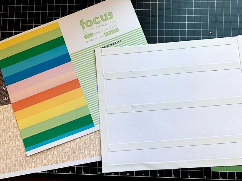
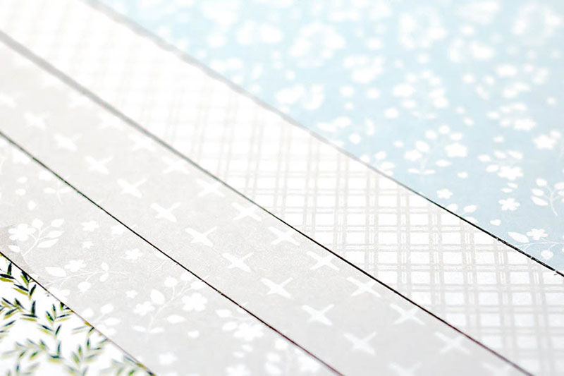
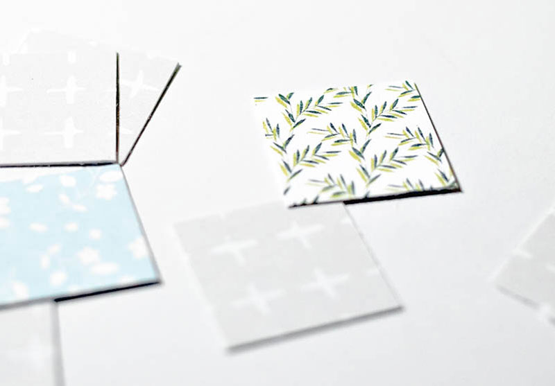
To give you a good idea of what can be created using the digital products you’ll find here at The Digital Press, I’ve selected a wide range of products to play with today. Here is a look at some of the gorgeous products I am using for today’s tutorial…
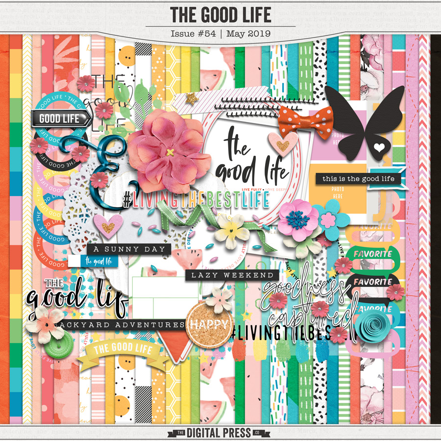
The Good Life — a TDP Designer collaboration
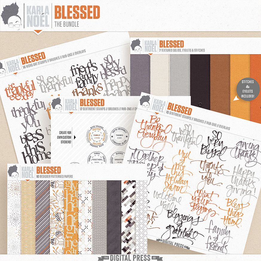
Blessed | Collection by Karla Noel
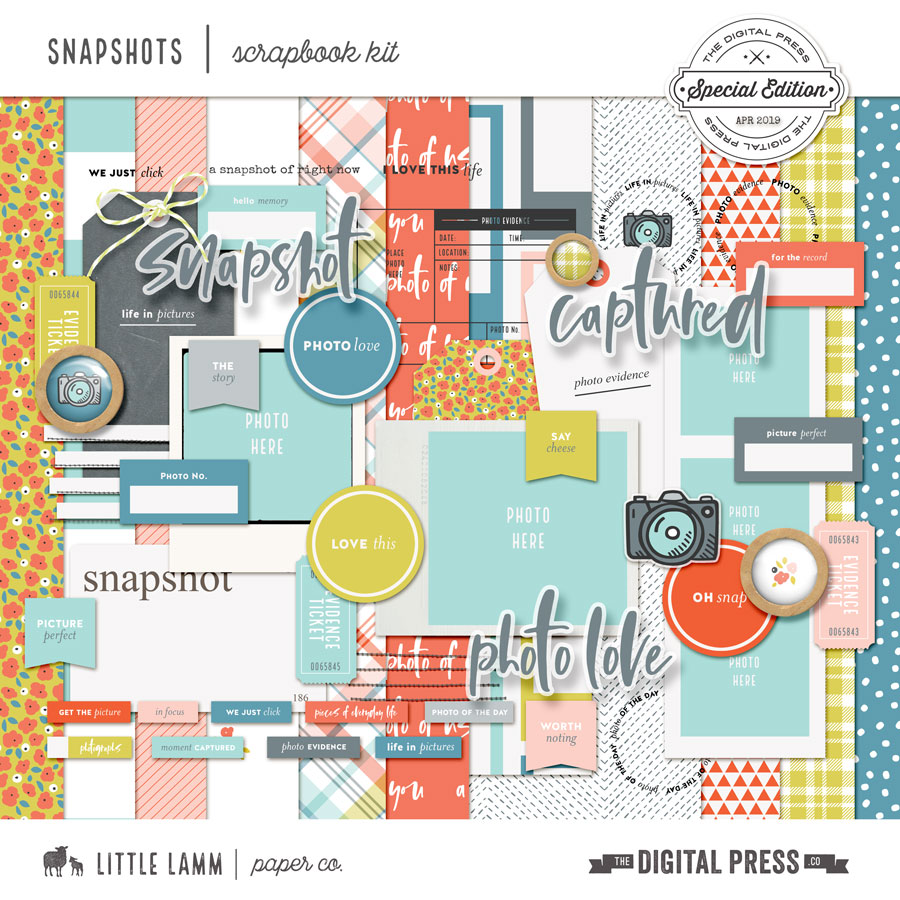
Snapshots | Kit by Little Lamm Paper Co.
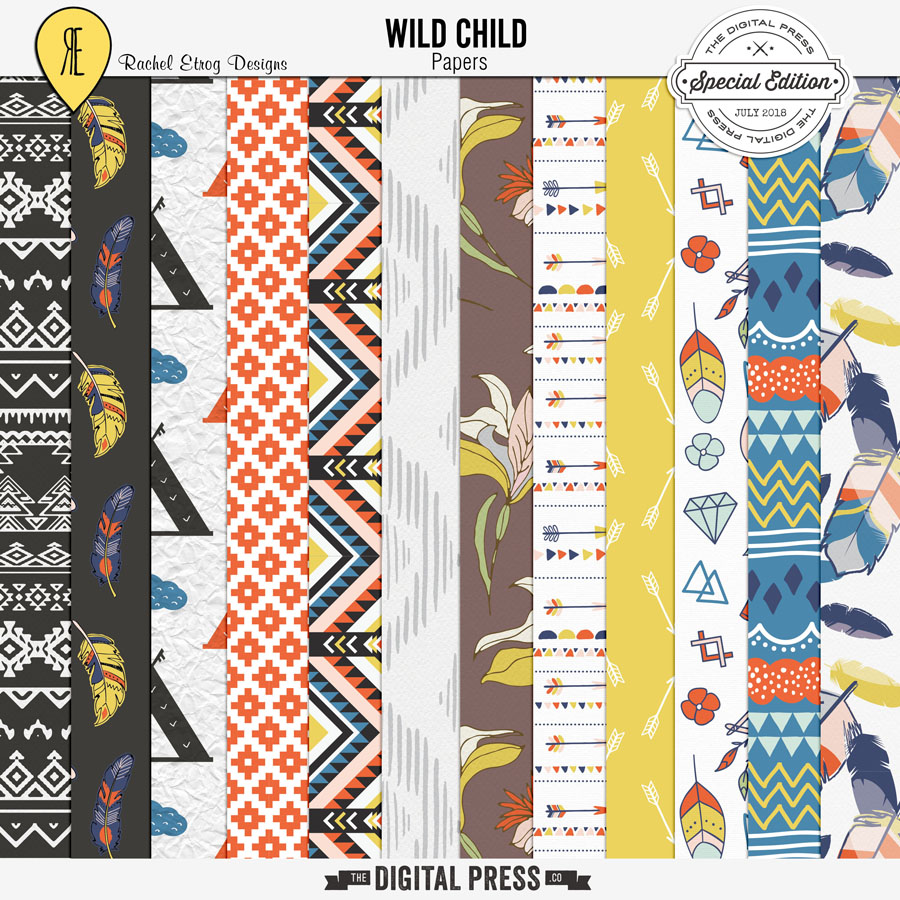
Wild Child | Papers by Rachel Etrog Designs
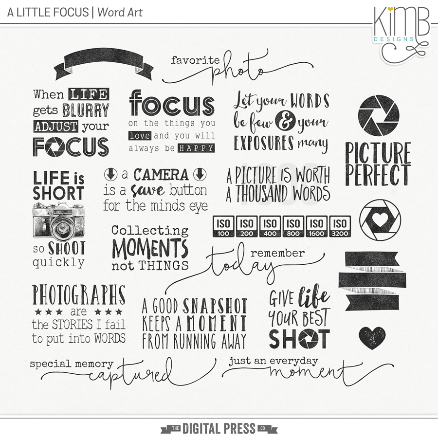
A Little Focus | Word Art by KimB Designs
That’s a good selection, right? I love how much variation there is in the different types of products (and styles, too) that you can find when you go digital.
I started doing my memory keeping in a Traveler’s Notebook about a year and half ago. The inserts I use are easy to find at my local craft store, and they are inexpensive. When I went to get covers for the notebooks, however, I was disappointed — both by the lack of selection, and by the high price tags! So I started doing some research and playing around a little bit, and made a few of my own.
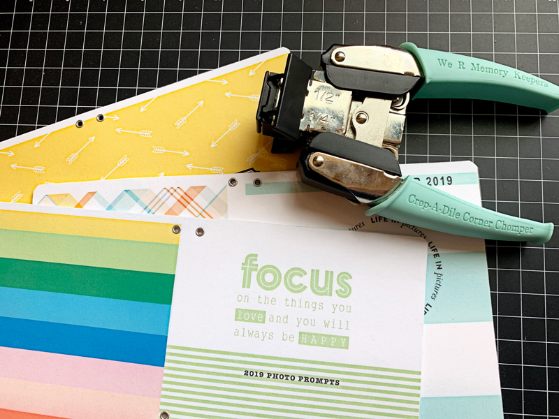
Here is a look at some of the tools I used for this project (most were purchased at my local craft store or on Amazon)…
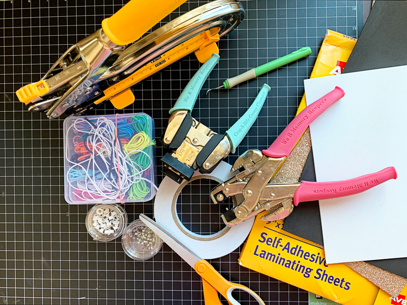
*A Few Supply Notes* The “fun foam” and Avery self-adhesive laminating sheets are 9″ x 12″ in size; you can also make these using vinyl, a laminating machine, and/or iron-on cloth webbing. The elastic cording is 2mm thick. Double-sided tape, eyelets, and a Crop-a-Dile (or some type of hole/eyelet puncher) are also necessary.
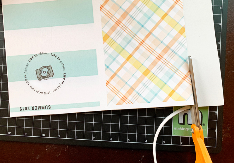
To begin, I printed my papers out on medium weight craft paper; the presentation paper that I normally use to print photos was a bit too heavy for this project, as you want something that will bend easily. I used a 8.5″ x 11″ sheet paper, which was just tall enough for my “standard” size Traveler’s Notebook (the 11″ was actually a little wide, so I ended up cutting about 1/2 inch off the width, once printed).
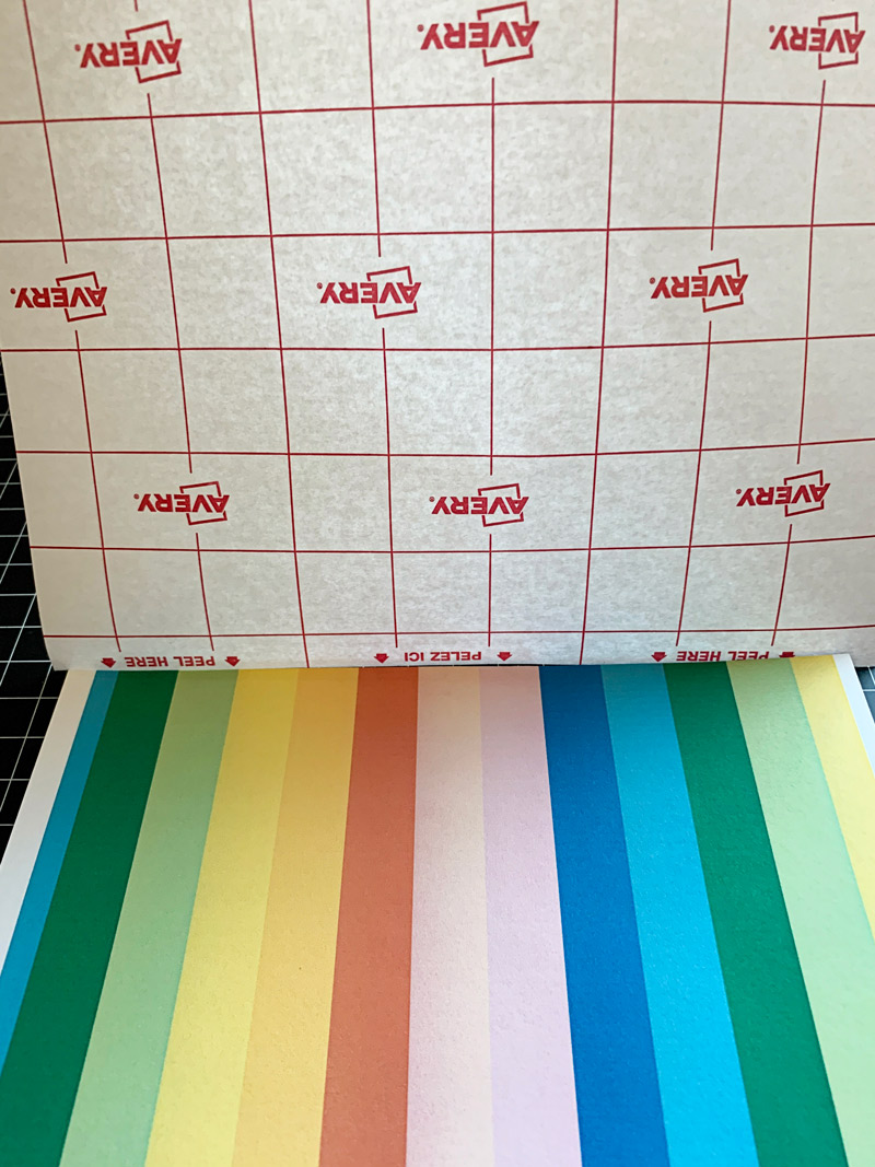
The next step is to adhere the self-laminating sheet to the printed side of your pattern paper. Smooth gently with your hand as you lay the adhesive laminate over your paper, and go slowly to avoid any bubbles or wrinkles.
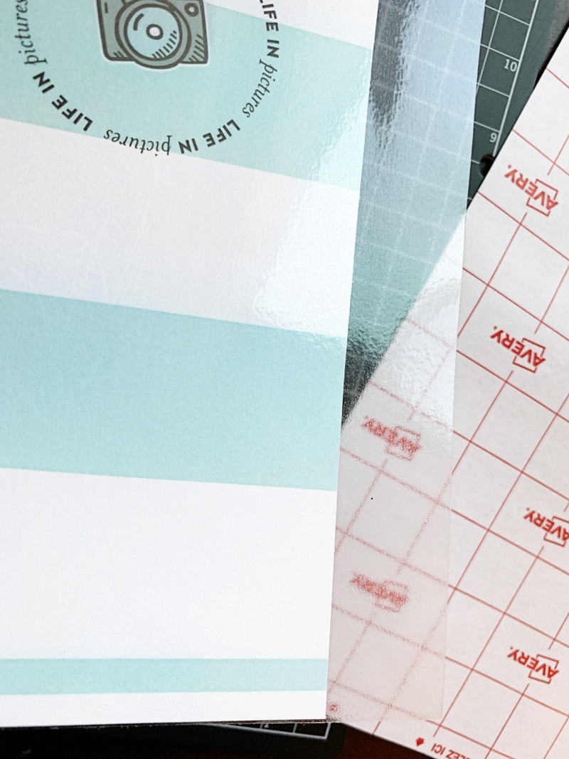
Cut off the excess laminating sheet so that it is even with the pattern paper. Now you are ready to add the foam to the other side of your paper. I used double-sided sticky tape for this, adhering it to the piece of foam first, as shown here…
Pay extra attention to the edges and the corners, as shown above, as that is where it could separate if not taped all the way to the end.
Next, remove all of the tape protector and line up the foam piece with your paper and smooth out. Once adhered… you can cut the foam to fit your paper…
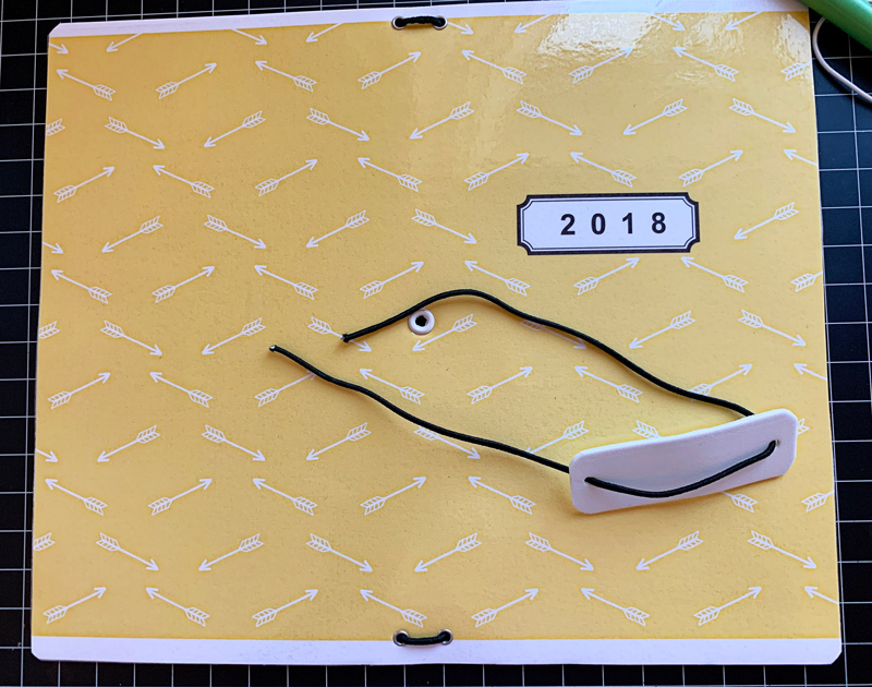
You now have your cover — approximately 8.5″ x 11″ (or whatever size you may have used, instead) with the pattern paper side laminated, and the other side adhered to the foam. This is a good time to trim it down if it is too wide, or if you have any uneven edges.
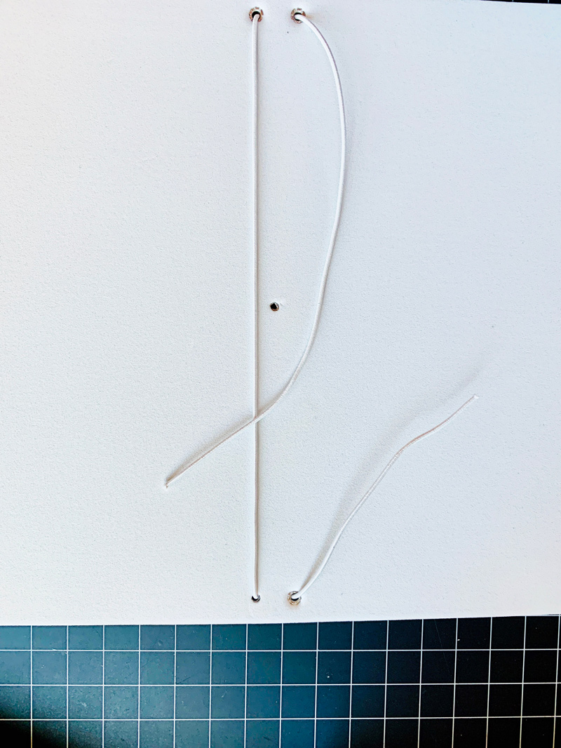
Next, you are going to punch holes for your eyelets. I punched a 1/8 inch hole using my Crop-A-Dile and my Big Bite for the center hole. You can either just measure and mark where you want to punch the holes using a pen, or you can make a paper template to set onto the foam to guide you as to where to punch the holes. I made my two holes about 1/2 inch down from each edge, and then the center hole about 4-1/2 inches down from the top.
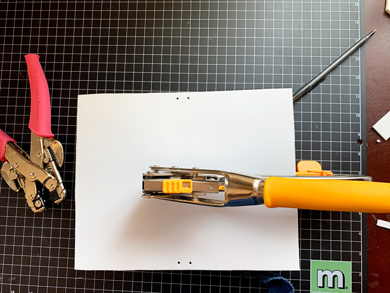
After punching the holes you are ready to set your eyelets. This is step can be a bit tricky depending on your eyelets. I had to redo a couple of mine because the eyelet wasn’t long enough to make it thru all of the layers (to fix, I just pulled out the funky eyelet and tried another eyelet from the same pack and it worked great).
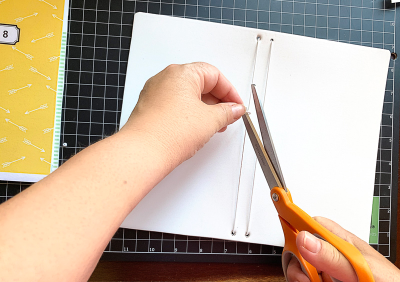
Once you set your eyelets, you can also use a corner edger/chomper to round your corners (see next image, below). I rounded mine to 1/4 inch on all four corners. This was a personal preference decision; I think it gives it a more finished look…
Now you are ready to thread your cording thru the eyelets. I cut the main piece of cording to about 20 inches. I started on the inside and left a “tail” of cord to go thru the first hole at the top, and then from the outside I threaded it through the second hole at the top, like this…
Once your cord is threaded through the eyelets, you will tie the two ends together. You’ll want this to be taut — but not so tight that your book curls up on you a lot. If you’re not sure, tie it loosely and put one of your inserts in to see if it feels right. When you are satisfied, tie your knot and trim the ends.
Next, you’ll want to thread the middle cord that actually goes around the book. For this one, I cut about 10 inches of cording. Before threading both ends thru the center hole, you may want to make a “tab” out of the fun foam like I did. I just cut a 3 inch rectangle of foam and rounded the corners, punched a hole on each end, and threaded the cord in and out of the holes.
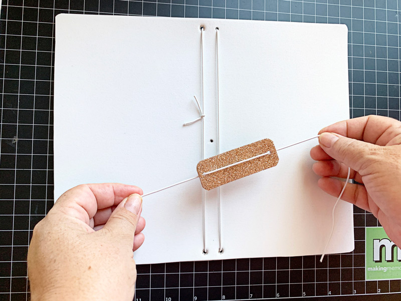
Then you are ready to take both ends from the outside to the inside of the center eyelet. Because you are pushing thru two cords this one may be tight – on 2 of mine it worked, and on two of them I went ahead and punched a bigger hole and used a bigger eyelet.
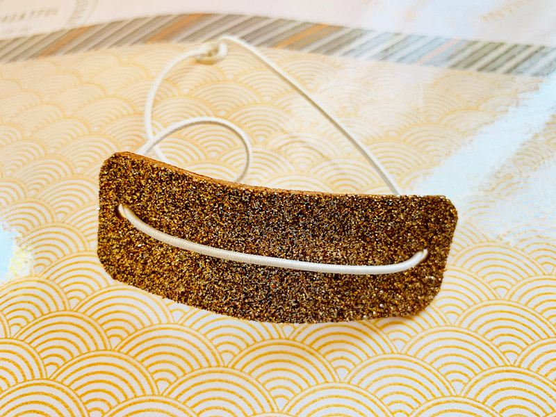
Once you get the threads in, you’ll tie a knot — making sure the cord is lose enough to fit over the top and around your notebook.
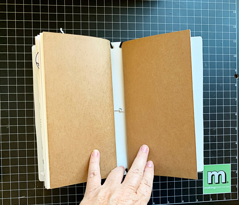
Here is a look at the finished notebooks without any inserts; they will lay much better once the inserts are placed inside…
Here is a view from the back of the book; it’s sometimes nice to put different paper or word art here…
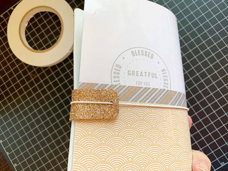
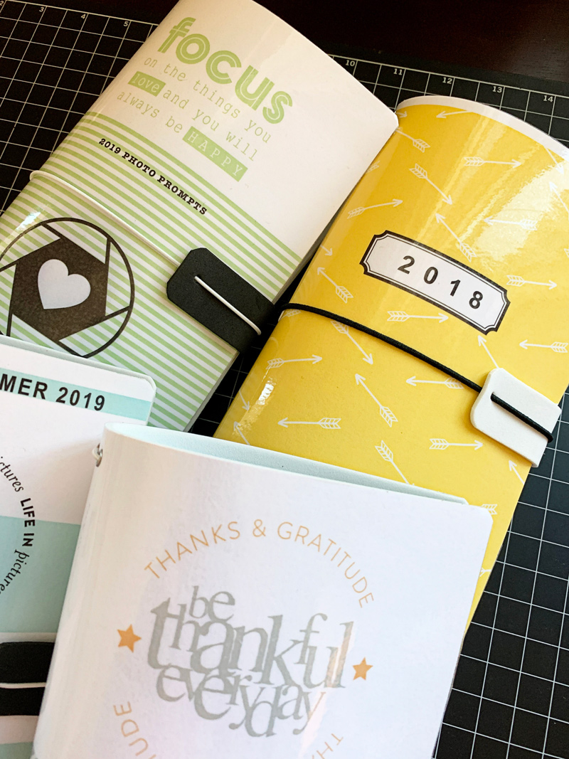
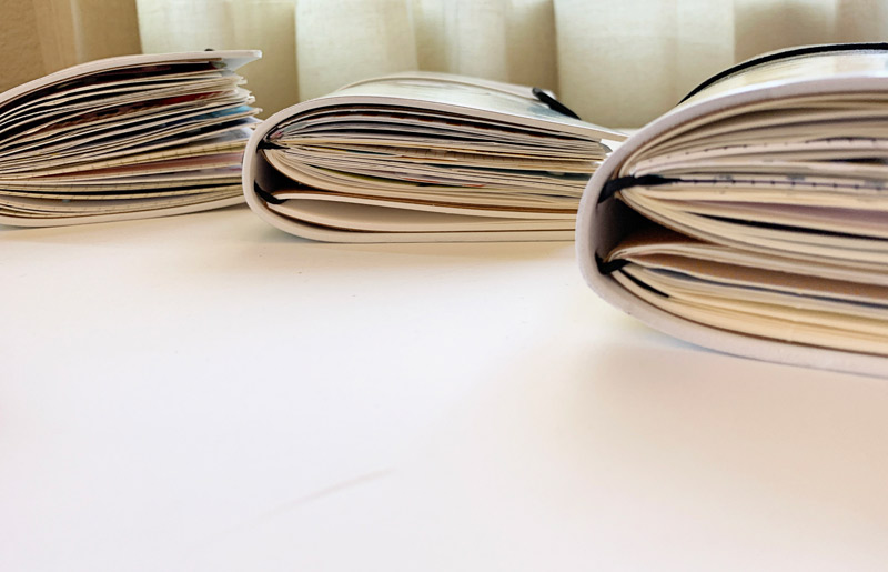
Next, you can add the inserts. My books get so bulky that I only add two insert books into mine, as you can see here…
Here are a few photos that show my book after I added my completed inserts…

As you can see, they will actually hold quite a bit!
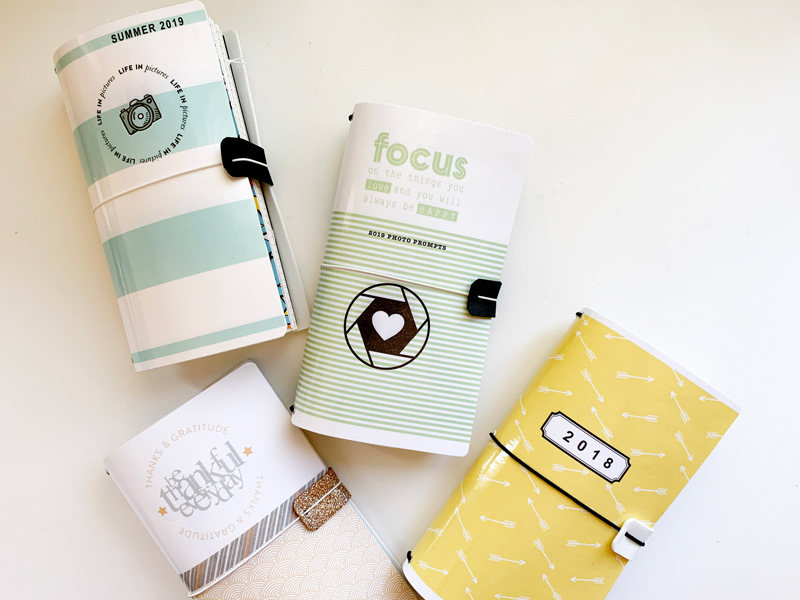
And finally, here’s a look at all of my completed notebooks with their new custom-made covers!
And that’s it! Super cute, and fun to make. I hope I’ve inspired you to use your own digital products to make a book cover! If you give this project a try, we would love to see pictures of your completed projects in the Hybrid Gallery at The Digital Press!
Happy crafting, everyone!
 About the Author KerriAnne is a homebody who resides in the desert SW. She started scrapbooking when her kids were little and hasn’t stopped despite the teenagers rolling their eyes and sticking out their tongues! When not scrapping or being a chauffeur, she can be found consuming large amounts of iced coffee.

 About the Author Corrin is a member of the creative team here at The Digital Press. She is a fan of the Big Bang Theory and a lover of cozy pajamas or flip flops when the sun finally shines! She lives in the breezy South of England with her husband and 4 crazy kids, who regularly discover & plunder her secret chocolate stashes, and hopes that maybe this will be the year she reaches the bottom of the laundry pile!
 About the Author Shannon has been completely addicted to digiscrapping since she began in early 2016 (though she’s been a scrapper since 2000). Her early morning ritual of a few quiet hours of scrapping while sipping a chai tea is her favorite part of each day. She is also the owner of a web design company, and when she’s not at the computer designing websites or digiscrap layouts, she’s probably hiking one of the local mountains in her hometown of Phoenix, Arizona. She is an avid reader and loves to travel to foreign countries.
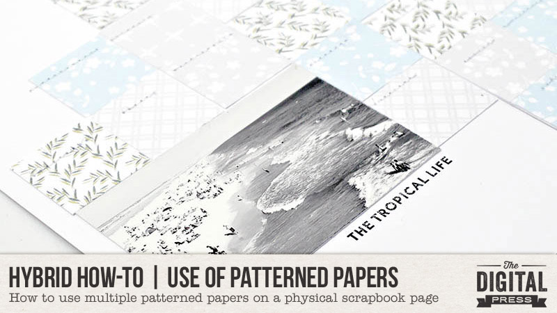
 About the Author Wendy has a strong passion for the arts, lots of creative spirit, and is fearless in working with new products and techniques. During the day, she works full-time as an Audit Manager. Wendy and her family live on the Gulf coast of emerald waters in Navarre, Florida. Her husband is from Italy and is an amazing Executive Chef at an Italian restaurant in Navarre. Her daughter is a Yorkie named Principessa. Wendy has over 20 years of experience in the scrapbooking industry. She has been published several times in print and online scrapbook magazines, and has designed for several manufacturer’s creative teams. Wendy is currently designing for The Digital Press as a hybrid artist. Also, Wendy is on the Creative Teams for Feed Your Craft, Sahin Designs, Everyday Explorers and Creative Memories.


 About the Author Beckie is a creative team member at The Digital Press who lives near Austin, Texas. In addition to scrapping and photography, she enjoys spending time with her family, reading, and ignoring household chores.