Hello, and welcome to another edition of our Tutorial Tuesday series here on The Digital Press blog! Today I will be sharing some tips for using color schemes more effectively in your scrapbooking projects!
The importance of color in scrapbooking relates to how significant color is to the human mind. Color plays a vital role in how we respond to the things we encounter every day. As such, using color effectively can make a huge difference in your creative projects. There are four main ways that using color can help you create more eye-pleasing scrapbook projects:
- Color conveys emotions and can set the mood for your project
- Color establishes a focal point on your page by telling someone where their eyes should focus first
- Color defines space and can help you provide differentiation on your pages
- Color can create harmony on your project by balancing out the different components of your page
Color schemes are simply associations of colors that can be used to create a particular style and appeal. These sets of colors that work well together can create a unified aesthetic for your project. Understanding these color schemes will give you more flexibility when creating pages that will stand out to the viewer. There are seven types of color schemes that you can use to make your pages the best that they can be.
- Monochromatic Color Schemes — use varying shades of one color such as various shades of blue
- Analogous Color Schemes — use colors that are next to one another on the color wheel such as green/blue, yellow/orange, blue/purple
- Complementary Color Schemes — are sets of colors that are opposite of one another on the color wheel such as yellow/purple, blue/orange, red/green
- Triatic Color Schemes — are a combination of colors that are equally spaced from each other on the color wheel such as yellow/red/blue and purple/green/orange
- Neutral Color Schemes — are those colors that contain equal parts of the three primary colors (red, blue, yellow) and include black, white, gray and brown
- Cool Color Schemes — are colors that give the impression of calm and soothing such as blue, green and violet
- Warm Color Schemes — are the colors that are vivid and energetic such as red, yellow, and orange
Each of these color schemes offers different ways for you to create pages that are compelling and eye-catching! Here are 4 easy ways to choose a color scheme that will help guide you when creating scrapbook projects…
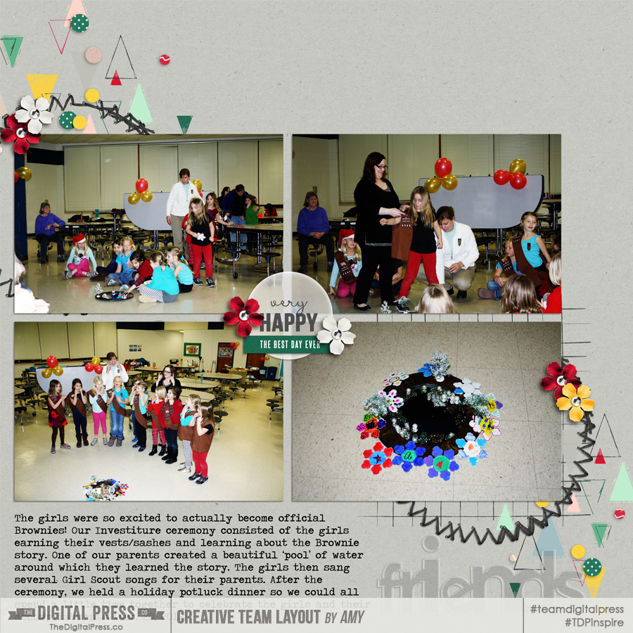
- Choose a dominant color from your photo(s) for a starting point to guide your color scheme choice. In the following page, there was a lot of red in all of the photos so it seemed like a good place to start. I decided to use a neutral background and used two complementary colors (red and green) to bring it all together…
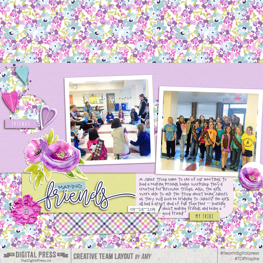
2. Choose a color that will support the emotion you’d like to convey with your project. In this case, I chose a cool color scheme of violet, blue, and green… in order to help convey the feelings of calm and harmony. I think the color scheme I chose helps reinforce the theme of friendship and togetherness.
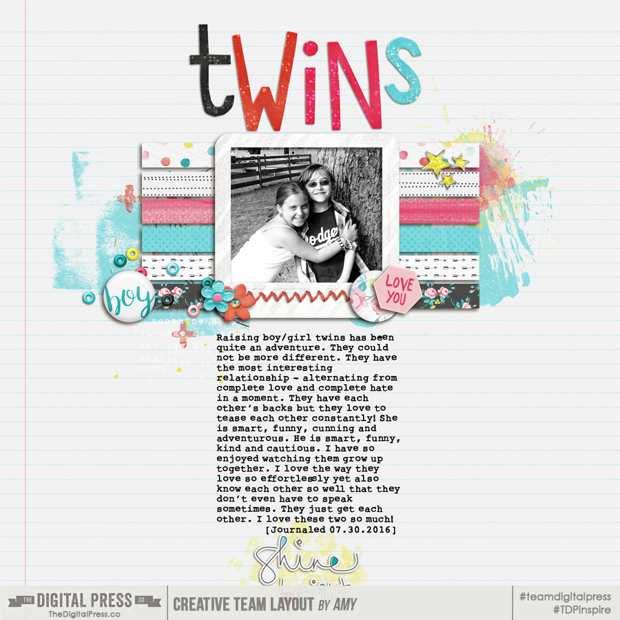
3. Consider making a photo black & white in order to allow you more flexibility in your color choices. The colors in this photograph were not cohesive in any way, but it was the perfect photo for this page. Therefore, I edited the photo to make it black and white, which opened up my color scheme options considerably!
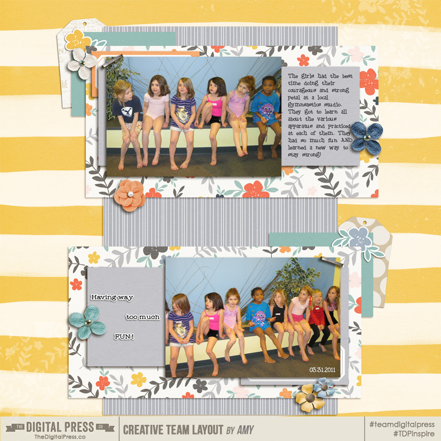
4. Another tip is to use the rule of three technique and choose one primary color and two complementary colors as accents. With this next page, I wanted the page to be bold and convey action (since the page is about gymnastics and being strong)… but I also wanted there to be a serenity to the page, as it also focuses on friendship and working together. As a result, I decided to use yellow as my primary color… but I chose blue and grey as my complementary colors in order to find that balance that I wanted the page to convey.
It’s important to work toward finding colors that enhance and coordinate with your photos to make the most memorable pages possible.
I hope these tips and techniques can help you feel more comfortable using color in a variety of ways, to help you create more eye-catching scrapbook projects!

About the Author Amy lives in Richmond, Virginia, with her husband and their 14-year-old boy/girl twins. Their 23-year-old daughter has recently finished up graduate school at Clemson and has started her first full-time job! She has been scrapbooking since the early 1990s, but discovered digital scrapbooking in 2005 when her twins were born… and has primarily scrapped digitally since that time. She is passionate about telling her family’s stories and documenting their life together. She is also a huge reader, a pop culture junkie, and LOVES all things beauty & makeup!