Author: The Digital Press

Hybrid How-To | Paper Lanterns

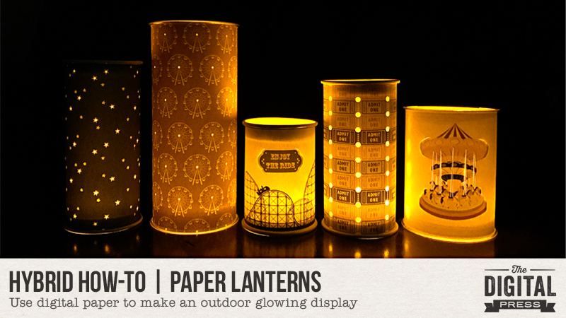
Hello, everyone! Kate here with another edition of our Hybrid How-To series here on The Digital Press blog! Today I’m here to show you how to make these cute paper lanterns that are perfect for your next backyard gathering.

Supplies Needed:

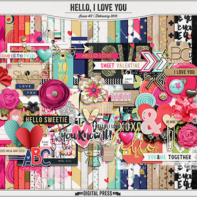
  • digital kit of your choice
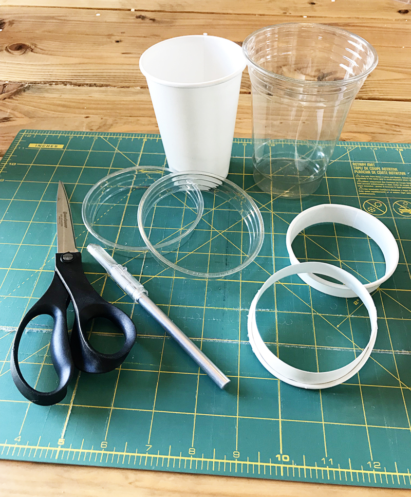
  • lighter-weight cardstock (I found a package of 65 lb that worked great)
  • plastic or paper cups
  • x-acto knife
  • scissors
  • eyelet punch (not a plier kind, since you need to reach into the middle of the papers)
  • glue stick
  • LED tea lights

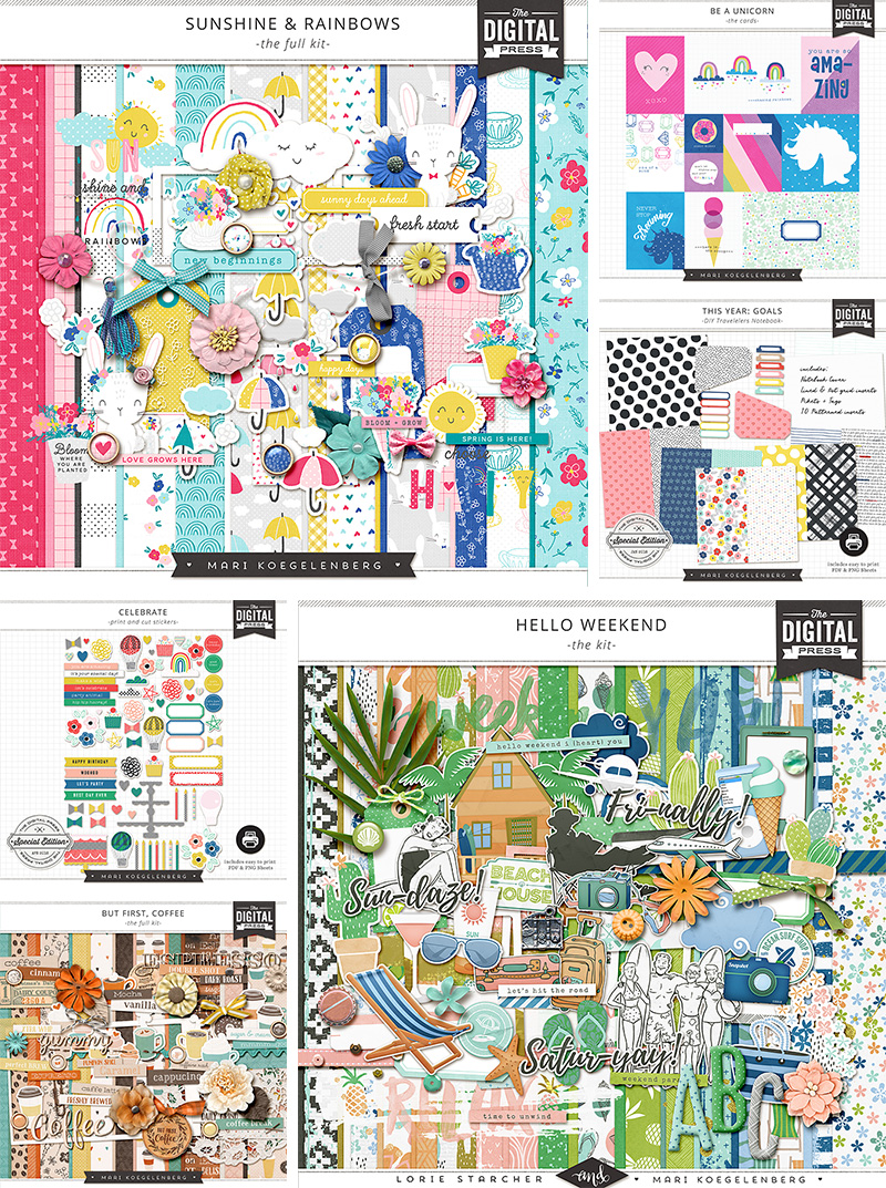
First, choose a digital kit with a theme that suits you. I chose Fun at the Fair by Rachel Etrog Designs for my lanterns, as shown here…

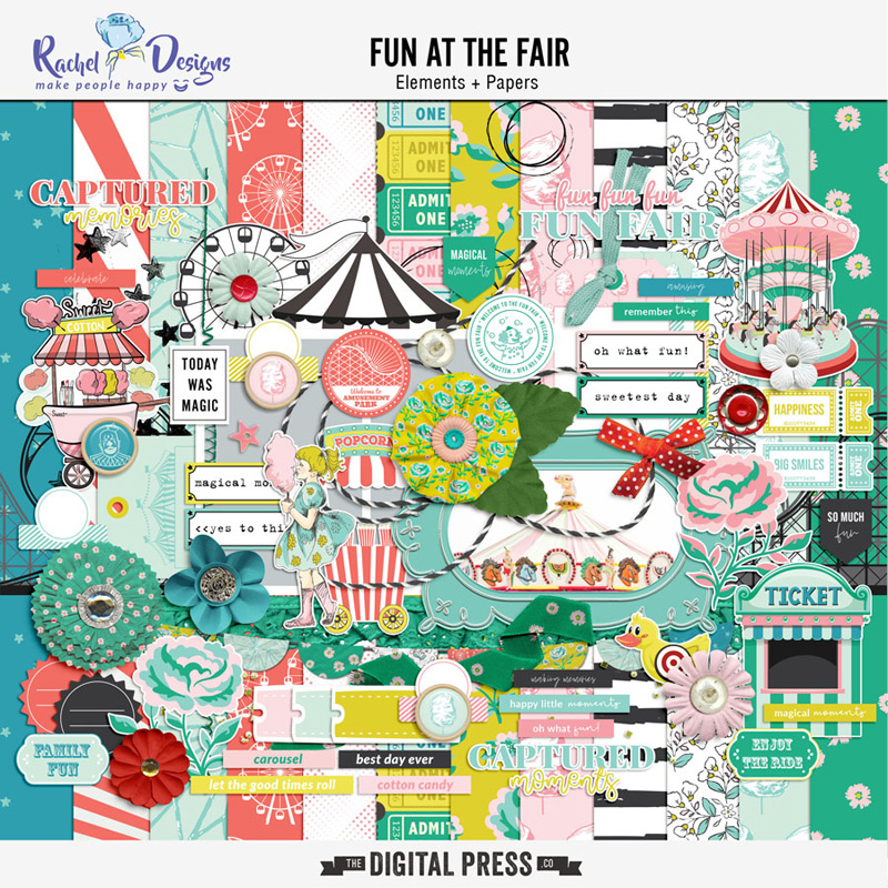
We have a concession stand we built for when we host movies on the back of our house; I thought this kit theme was perfect!

Next, measure around the thickest part of one of your cups. Add 1/2” to that (for overlap so you can glue it together). I chose two different-sized cups for my lanterns; thus, I had one that measured 10” and the other measured 12” after adding the 1/2” overlap.

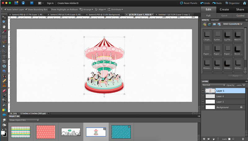
I created a canvas to those specific sizes in Photoshop because I knew I wanted to design the lanterns using both the paper AND elements from the kit, but a photo-editing program isn’t necessary to do this project. You can also just keep it simple by printing off the papers and cutting them down to size.

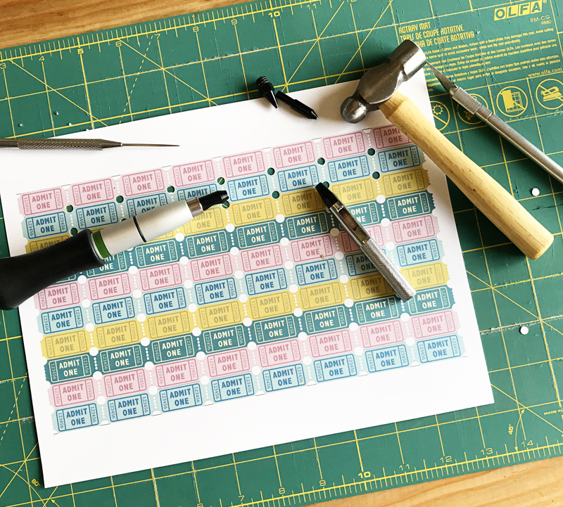
After everything is printed, take your punch or x-acto knife (or both!) and make holes or lines in the paper, depending on the pattern.  I have two different sizes available with my punch. I used the bigger one on the ticket paper I printed out, and I used the smaller one for the star paper and ferris wheel paper.

I also followed one of the roller coaster lines with my knife so light would shine through. I cut around either side of the carousel so it would pop out a little when I rolled it and then used the knife to cut the carousal poles.

Next is to cut the rims off the cups. You need two per lantern to stabilize them and to help keep their shape. I punched through the cups with my knife and then used the scissors to finish cutting around the rim, leaving about 3/4” of the cup intact.

Make a tube with the paper and glue the seam together. I had two seams for my larger lanterns.

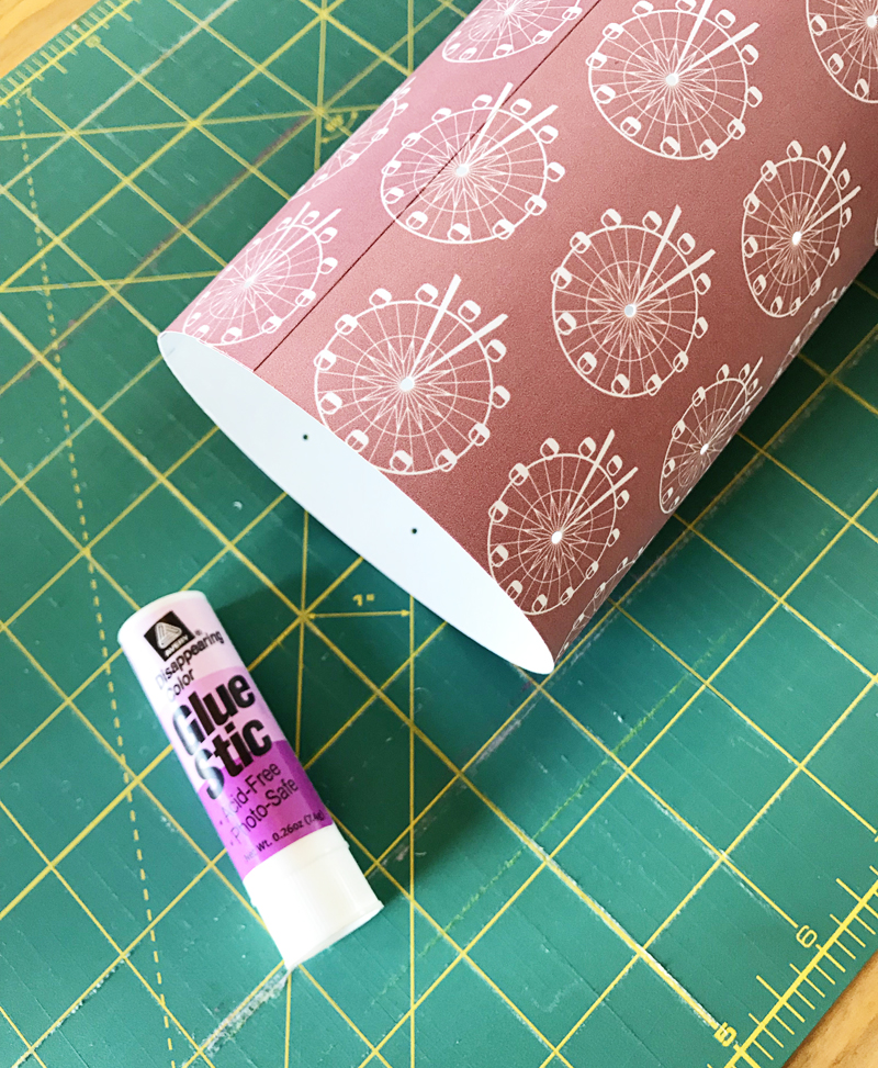
Insert the cup rims on the top and bottom. I was going to to glue them in, but they ended up tight enough that I didn’t have to do that.

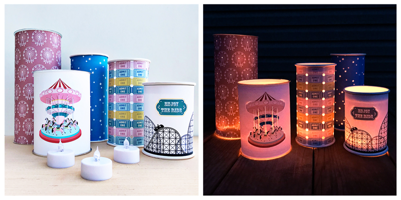
Now all you do is place them over the LED tea lights. I really love how easy these were and how impressive they looked once it got dark! It was such a fun project and I hope you’ll give it a try.


Kate About the Author  Kate is on the hybrid team here at The Digital Press. She lives on the Utah/Colorado border with her husband, 5 kids, 10 chickens, a dog named Gracie, and a cat named Kit. She’s a city-born girl who found she’s really a country girl at heart. She can be found outside, barefoot, and probably in her garden.

Tutorial Tuesday | PART 2: The Exposure Triangle

Welcome another edition of our Tutorial Tuesday series here on The Digital Press blog! This is Part 2 of our 4-part photography series all about the exposure triangle. If you happened to miss it a couple of weeks ago and need a recap, you can find Part 1 HERE. To refresh your memory, in that first post we introduced the idea that photography exposure depends on three settings: ISO, aperture, and shutter speed.

Today we’ll be focusing on that first variable — the ISO setting in the exposure triangle.

ISO is the sensitivity of the sensor. A high ISO means that the sensor of the camera is more sensitive to light, that it will “capture” every bit of light available, so to speak. More light is let in when you choose a high ISO number; conversely, less light is allowed in whenever you choose a lower ISO number.

What does this mean when you’re taking photographs? Well, for example… on a bright, sunny day outside you can choose a lower ISO (usually 100; sometimes 50) on most cameras. The opposite is true when you are indoors taking a photo in a room with very little light (at night, for example… or in a room with a tiny window and no lamp on). In that scenario, you would need to choose a much higher ISO (6400 or higher, etc.).

Here’s a look at a couple of outdoor/indoor photos, and the corresponding ISO used to capture the image…

As I mentioned in Part 1 of this series, every setting of the exposure triangle has a “side effect.” In other words, each setting has consequences on the exposure but also on something else in the picture. The side effect of ISO is noise. In the film days, it was called “grain” because the sensitivity of the film corresponded to the size of the grains of salt (the less sensitive the film, the smaller the grains and the cleaner and smoother the image appeared). With digital cameras we use the word noise to express the same thing as the film-age term “grain.”

Here are two examples of the noise that appears on images with a very low ISO and a very high ISO. As you can see, high ISO = more light allowed in but more noise; low ISO equals less light allowed in (so I had to adjust the other settings of the triangle), but less noise…

See the difference?

Even if grain was part of the charms of film photography, oftentimes digital noise is considered to be a bad thing. It can be distracting when it’s too strong, and it can create color artifacts. One way to avoid “bad” noise is to correctly expose the image in the first place, even if that means upping the ISO (noise will be better on an image correctly exposed with an ISO of 12800 than on an image with an ISO of 3200 that needs to be brightened in post-processing.

Here is another example that illustrates this idea…

First, the SOOC (straight out of camera, no post-processing) image at ISO 12800:

And next, the SOOC image at a much lower ISO of 1600, with all other settings remaining the same (hence the severe underexposure):

And finally, the second image… but with its exposure corrected in post-processing:

You can already see in the full image that the noise is much worse in the last picture (corrected) than it was in the first of the series, up above… even though the ISO is much lower. It’s even worse if you zoom in:

Moral of the story: it’s typically much better, in order to avoid bad noise, to take a picture with a high ISO but a good exposure… than it is to take an underexposed picture with a low ISO that requires brightening it in post-processing.

There are so many different cameras on which you can choose the ISO (even some smartphones!) that I will advise you to read the manual or do an online search on how to change the ISO on your own gear.

*TIP* If you are just starting to learn to shoot manually (where you, rather than than the camera, pick the settings)… ISO is a setting you can set on “auto” and let your camera take care of,,, so that you can focus on aperture and shutter speed. Once you get the hang of those, you can then start adjusting the ISO yourself.

We will explore those other two variables (aperture and shutter speed) in the next two parts of this series (coming in June, every other week). See you soon!


ChloéAbout the author  Chloé is in charge of PR and communication for her small town by day, a digiscrapper “by night,” and a photographer whenever the light is beautiful. She recently became a very happy mom to an adorable little boy and is enjoying the last days of her maternity leave.

Tutorial Tuesday | PART 1: The Exposure Triangle

Hello, and welcome to another edition of our Tutorial Tuesday series here on The Digital Press blog! This week, we’re beginning a really awesome 4-part series that will run every other week for the next couple of months to help you with your photography!

As scrapbookers, you may have read photography tutorials in the past (including the great ones we have here on The Digital Press blog)… and in doing so, you may have seen the term “exposure triangle.” That’s the concept we’ll explore with this 4-part tutorial that will, I hope, help you better understand the notion and use it in your own photography!

First of all, let’s see what happens in the camera when we take a picture. Basically a “hole” opens to let the light come in and hit the sensor that will capture it. Exposure is the amount of light in a photograph. An OVERexposed picture is too bright (details are lost in the highlights, the brighter areas of the image) and an UNDERexposed picture is too dark (details are lost in the shadows). To expose a picture, three settings come into play, that’s the famous “exposure triangle”. Those three settings are ISO, aperture and shutter speed. 

ISO is the sensitivity of the sensor. In the film days, each film had a set sensitivity, but today we can change it on most cameras. A high ISO means that the sensor will take more light in, a lower ISO means it will take less light in. ISO go usually from 100, sometimes 50, up to 12800 or more.

Aperture is the size of the “hole” that opens in the lens to let the light come it and hit the sensor. Let me get math-y for a minute here. This number is expressed as a fraction: f/2 for example. It means that the diameter of the hole equals the focal length of the lens (f) divided by the aperture numbre (2 in my example). That’s the reason behind the fact that the SMALLER the number, the BIGGER the aperture (the hole) and hence the MORE light entering. With a 50mm, for example, an aperture of f/2 will give a 25mm (50/2) diameter of the hole, when an aperture of f/10 will give a 5mm diameter (50/10). So, in short: big number = small aperture = small hole = less light in, small number = big aperture = big hole = more light in.

Shutter speed is for how long the “hole” remains open and let the light in. On my camera, it can go from 30 seconds to 1/4000th of a second. The longer it remains open, the more light goes in.

Here is a simple analogy: if taking a picture is like filling a bucket with water. ISO is the size of the bucket (that is meant to hold more or less water), aperture is how much water comes out of the faucet (is it wide open or is it just dripping?) and shutter speed is how long the faucet remains open.

We talk about the exposure TRIANGLE because all three setting are dependent on each other. If you let less light in through one setting, you will have to let more light in with another one (or both) in order to have a properly exposed photo. Let’s see some examples.

First, here is a photo where each setting is “average”. It is correctly exposed (even if totally boring, I admit, but at least those subjects are easy to work with! LOL).

Here is a representation of the exposure triangle for this image with each setting:

As I said before, if you change only ONE of the setting, the photo become under or overexposed. In this second image I decreased the aperture (increased the number) and as a consequence the image is underexposed, much darker than the first one. To have a properly exposed image, I should have let more light in through either a longer shutter speed, a higher ISO, or both.

The different combinations of those three setting can be almost infinite while the result remains very similar. Here are three other examples, each followed by the settings.

First, I kept the aperture at f/8 (like in the previous photo) but I bumped the ISO (more light) and decreased the shutter speed (less light) so that the image would be properly exposed.

Then I chose to use the lowest ISO possible (less light) and hence I used the widest aperture possible on my lens (much more light) and the “average” shutter speed we had in the first photo.

Last but not least, I chose the highest ISO possible on my camera (much more light) and the smallest aperture on my lens (way less light).

If you observe carefully the images above you can see that changing the settings doesn’t only influence the exposure, it also has other consequences. Each setting has a “side effect” that we will explore in the next posts in this series, as well as how to choose and change our settings depending on the results we are looking for.

In the meantime, I hope the overall concept of “exposure triangle” is clearer to you. Don’t hesitate to ask (here in the comments or in the forums) if you have any questions! I’ll be back in 2 weeks with PART 2 of this series.


ChloéAbout the author  Chloé is in charge of PR and communication for her small town by day, is a digiscrapper “by night,” and a photographer whenever the light is beautiful. She recently became a very happy mom to an adorable little boy and is enjoying the last weeks of her maternity leave.

Friday Favorites | Mari Koegelenberg

Hello everyone, and welcome to another edition of our designer feature series on The Digital Press blog in 2019 — Friday Favorites! This year, as you know, we’ve been learning a bit more about each of our amazingly-talented designers by having them share some of their favorite things with us each week.

This week, the spotlight is on the creative designer Mari Koegelenberg. This is actually Mari’s fifth feature here on the blog (you can find her first feature from October 2016 HERE, another from January 2017 HERE, her Foodie Friday post from October 2017 HERE, and her most recent feature from April 2018 HERE).

This time around, in order to learn even more about Mari, we asked her to share some of her favorite things with us, and here’s what she had to say…


“Hi there! If you have followed me for a while. I bet you already know by now that I love to create paper projects… uhm, dare we say ‘addiction’? …there are some serious repercussions (hoarding… *cough cough*).

Over the years, I have collected more scrapbooking stuff than I know what to do with! One of my favorite ways to de-stash (and/or get inspired to use it all up) is with all of the great videos on YouTube! It’s also a wonderful way to unwind after a crazy week at work, and do something creative.

I am subscribed to soooo many creative YouTubers that are absolutely amazing… but the following 3 ladies are my all-out favorites… 😉

1. Dani @ PopFizzPaper
Link: https://www.youtube.com/channel/UCSXHr4OfdKbJxVT9UXIvb-w
Her videos cover a bunch of crafts including Happy Mail, DIY Embellishments & Scrap your stash projects.


2. Adelle @ Inkie Quill
Link: https://www.youtube.com/channel/UC3SBSfhhz7K7e9qxAlK3n3g
Love her quirky sense of humor and obsession with Heidi Swapp’s Gold Shine. She does Project Life shares, ‘Kill a Kit’ challenges, Mixed Media and Scrapbook pages.


3. Kristina @ K Werner Designs
Link: https://www.youtube.com/channel/UCW6F7pbVdCeTj6WRZoZJ1TQ

Cards are a fun way to do small creative projects just to get the juices flowing, and Kristina is the Queen of Card making! She does a series of Holiday Cards… 1 each day for a month to get you prepped and ready for the festive season. She also covers watercoloring and copic coloring; this is another recent addiction for me, but let’s not go there yet, LOL!”


I had fun checking out Mari’s favorites! It’s amazing to see how scrapbooking supplies and digital kits can be used in so many ways! I really love that. And YouTube is really an awesome source of inspiration.

If you’re not already familiar with Mari’s designs, you’ll love browsing through all of the eye candy in her store at TDP. Here’s a peek at just some of the fabulous products you’ll find in her shop

Also, here’s a look at just a small sampling of the gorgeous projects that can be made using Mari’s products…

Hopefully, today’s Friday Favorites article has given you even more insight into Mari’s personal style (and again, if you want to know even more about her — scroll up and use the links to her previous features here on TDP’s blog, where’s there’s lots of good stuff!).

And the best news of all ?! …during Mari’s upcoming feature week here at The Digital Press, you can enjoy the chance to score an amazing deal in her shop if you use the following coupon code(s) when purchasing her digital goodies (this sale and the corresponding codes will be valid through 11:59pm EST on Thursday 5/16). Don’t miss out on these discounts!

[ if you have trouble seeing the coupon image, above, the codes are as follows: “save $2 off any purchase of $5+” by using code = S4V3-2-MKC . . . or “save $5 off any purchase of $10+” by using code = H4LF-OFF-MKC ]


About the author  Gaelle is a member of the creative team here at The Digital Press. She lives in France with her hubby, her two sons and her 3 kitties. She loves digiscrap and discovered this activity in 2012, since she’s totally addict and scrap to keep memory her everyday life. Her family is definitively her principal source of inspiration.

Tutorial Tuesday | Photo Adjustments

Have you ever taken a picture, thought it was great, and then realized that there are shadows across someone’s face? The moment has gone, and while you love the photo, you wish you could see the individual features, the eyes, nose, mouth, etc., more clearly. Well, with the wonders of photo editing software, and a light hand, you can bring shadowed features into the limelight again. Let me show you how.

Here’s a photo of my son from, wow, a long time ago, at a local water park. He was having such a great time going up and down the large slides with the inner tube. It was tough to get a photo (he was so quick!), so I took what I could get. However, the more I look at this, the more I’d love to see his face in better light.  Yes, he has a good tan and is olive-skinned, but still …

I tried using Curves and Levels adjustments (I’m using Photoshop, and these can be found under the menu Image > Adjustments), but by increasing the mid-tones, it simply “blew out” the water, brightening what was already a lighter component of the picture – and the result looked unnatural.

I did, however, come up with a compromise that I really liked.

Step 1: Create a duplicate layer of your photo. (This is especially important as you will want to retain the integrity of the original picture.) You can do this quickly using short-cut keys Control-J, or using the menu option, Layer > Duplicate Layer.

Step 2: With the duplicate layer active, select the Lasso Tool from your toolbox. Set a ‘feather’ of 20-25 pixels. You will want a soft edge on the lassoed selection to ensure it blends with the rest of the photo.

Step 3: Using the Lasso Tool, outline the section you’d like to lighten. You do not need to go right around the exact edge of the shape – remember you have a feathered edge. In fact, I’d recommend deliberately going inside the edge to allow for the feathering or ‘bleed’ to help blend the changed section with the original. It certainly does not need to be an exact science here.

Step 4: Open the Levels adjustments (Image > Adjustments > Levels) and slowly move the middle slider, the one that controls the mid-range levels to the left (left increases the light, right adds dark tones). A very light hand is all that’s needed. If you are too heavy-handed, the result will not look natural.

(The shortcut Control-D will remove your selection after you’ve applied the tonal adjustment.)

The resulting change is subtle, but that’s exactly what you want! Here’s my ‘corrected’ photo:

It’s might be hard to see the difference, but the facial features now stand out a little better. There are more highlights in my son’s hair, too, and overall, the face just looks brighter. Here’s a side-by-side for an easier comparison:

Have photos of loved ones wearing baseball caps that cast shadows? Maybe just bad lighting and, as the situation I found myself in, you’re just trying to get any picture that you can. In just a few minutes, you can salvage photos that you might otherwise skim over. But remember, a light hand is all that’s needed; it’s easy to go too far with this technique.


About the Author Kat Hansen is a creative team member here at The Digital Press. A HR Manager in the real estate industry by day, she loves the opportunity to spend a few hours each evening being creative. Vacation memories feature pretty heavily in Kat’s scrapbooking pages, as well as her health and fitness journey. Kat has quite the sense of humor (she “blames” her father for this), which she incorporates into her journaling and memory-keeping.

Tutorial Tuesday | Scrap Outside the Kit

Hello, and welcome to another edition of our Tutorial Tuesday series here on The Digital Press blog! Today I thought it would be fun to share with you my love for scrapping with multiple kits at one time. I know many around digiland don’t share my same love and like to stick to one kit at a time, as they are often overwhelmed on how to use multiple kits/products on a single cohesive layout. I’m going to share with you a super simple approach that will hopefully help you to “scrap outside of one kit.”

To get things started, I select the kits/products I want to work with. You can select yours based on color palettes, themes, or anything else your heart desires. For my layout, I simply chose four gorgeous products from the shop that I loved (no other connection or reason!)…


Once I have my products selected, I take all of the elements from the products I selected and I make copies — putting all new copies into a single elements folder; I do the same for the alphas, papers, etc.. This makes it easy to have them all in one place and I don’t spend too much time flipping back and forth between kits while I work.

From there, I just scrap my page as normal, choosing anything I like (papers, elements, etc.) as though it all came out of one product (instead of 4!)…

Essentially, all I have done is create a large “mega kit” with items from various kits and/or different designer’s products. It really makes it easy to see it all in one place.

I hope this helps you dig deep in your digital stash and combine old favorites with new ones to create unique pages you and your family will treasure forever. If you give “scrapping outside the kit” a try, please share your layouts in the gallery — we would love to see them!


About the Author  Sheana is a member of The Digital Press creative team. She lives in Southeastern Ohio with her husband and 2 teenage daughters. She works full-time as a policies and procedure writer for a large investment firm. When Sheana isn’t working or scrapbooking, she enjoys spending time with her family.