Tutorial Tuesday | Documenting Kids’ Artwork

If you’ve got children, you’ve probably also got an ever-growing assortment of art projects slowly accumulating dust and fading in the sunlight somewhere in your house.

You’ve probably also decided — maybe more than once — that it’s time to organize said pieces, and/or *gasp!* archive them into the recycling bin. Today, I am here to share a couple of ideas about preserving these amazing masterpieces (a.k.a. glimpses into our children’s lives at a certain age), while simultaneously reducing the clutter associated with this endless stream of kids’ artwork.

STEP 1: RECORD IT

How? When new artwork comes into the house, I photograph it. I do this for all things I think I might want to keep — drawings, handwritten stories, paintings, decorated bags… all of it. I try to do this immediately (or at least within a day or two), because then the art hasn’t had time to get damaged by sunlight, dirty fingers, angry siblings, the robot vacuum, being stuffed between sofa cushions, left in the bathroom, misplaced or (let’s admit it) recycled in a fit of clutter-induced pique.

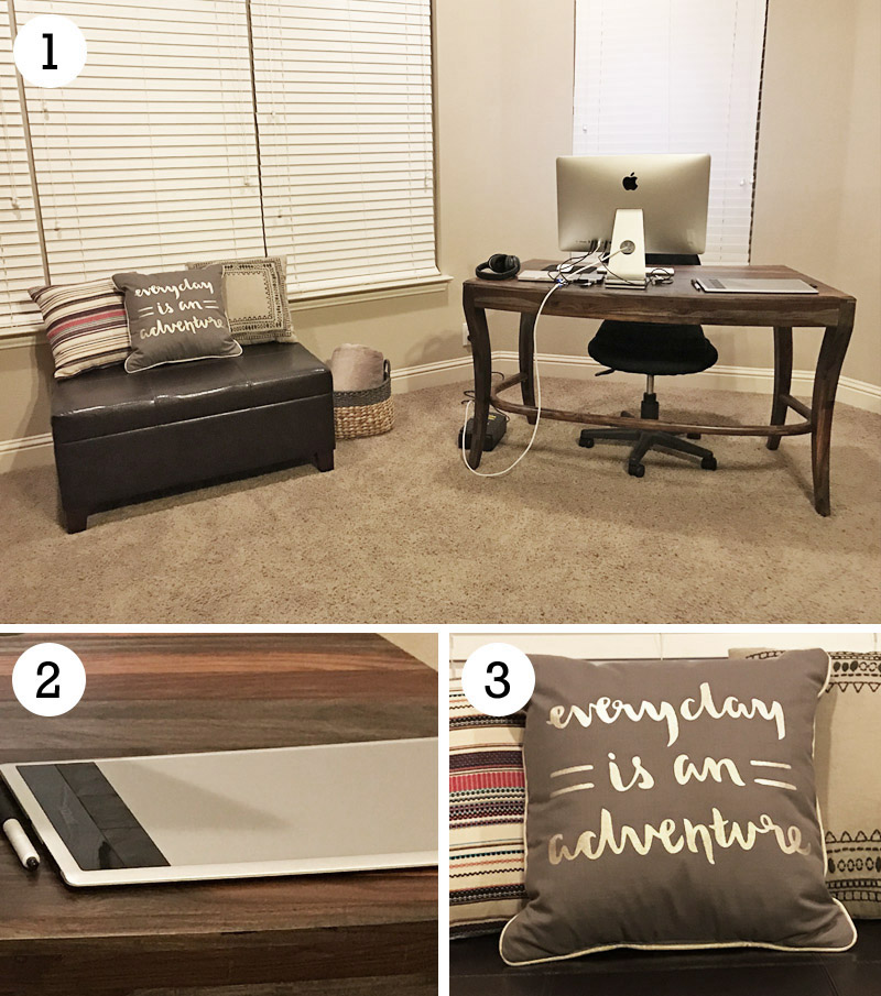
I usually try to photograph artwork mid-day, and I do it indoors in indirect natural light so there are no harsh shadows. I lay flat pieces on the floor, and photograph from directly above, usually against a background that’s a different color than the artwork so that it is easier to extract in Photoshop (if desired). For dimensional pieces, I try a variety of different angles to capture the depth and/or texture of the piece. Once I have my photos, I can take my time deciding how to archive them without having to worry about the artwork degrading or disappearing. This also allows our family the ability to enjoy the originals for as long (or short) a time as desired.

While I prefer to photograph my kids’ artwork… there are also other methods that can be employed. If you own a scanner, you can always scan the flat pieces. There are also plenty of apps out there that you can use to “archive” artwork, but I’ll admit that that particular avenue hasn’t ever held as much appeal to me. Occasionally we’ve had cute little pictures turned into tangible items such as note cards, magnets, or pillows… and/or we’ve framed our favorite finger-paintings… but in general, I much prefer photographing everything and using those photos in my memory-keeping. Shoving the old artwork deep into the recycling bin before the kids wake up seems a bit heartless, and so the photography-to-scrapbook method as worked out to be a fantastic compromise.

STEP 2: DOCUMENT IT

Once you have your artwork recorded, there are a handful of different things to do with the photos to get them off the computer and into your scrapbooks. Here are just a few ideas…

  • Scrapbook an entire page to showcase a specific piece of art
  • Use a single piece or artwork to support a page about some aspect of your child’s personality (or even about an event)
  • Turn a single piece into a pocket card and include it in a weekly or monthly summary page (or an “All About Me” page)
  • Accumulate pictures of artwork over time, and then have them all printed and bound into a single photo book that’s all about the art

My kids (and others) enjoy seeing their creations incorporated right into our family albums. Recently, for instance, I made this page about a little book my son recently made at school…

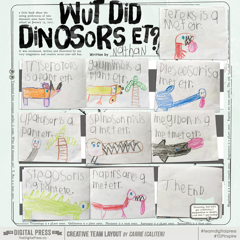
To create the above page, I individually photographed each two-page spread of his book, and then I extracted the photos in Photoshop (I also extracted the “written by” line and name from a photo by removing the white background). If you look closely, I also included a “translation” of the text in the border; be sure to include a translation or explanation if the subject matter isn’t immediately apparent, and/or if your audience isn’t fluent in “emergent speller.” 🙂

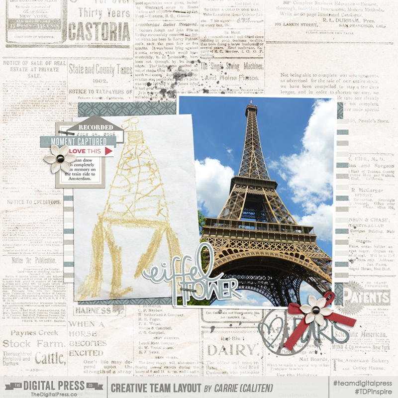
This next page highlights a single drawing, as well as the original photo that inspired it. I used a similar extraction technique on this picture…

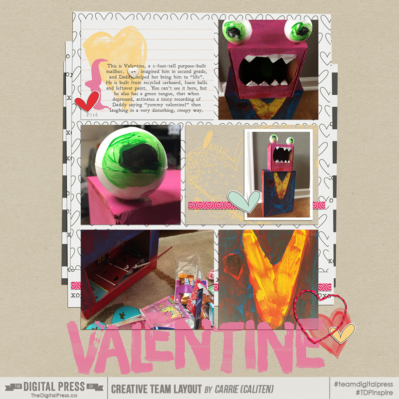
Finally, this next one highlights the mailbox my daughter dreamed up and constructed (with recyclables! and a little adult help) for Valentine’s Day. I love the detail images, such as the eyeball and the painted heart (“it’s a v-neck sweater,” I was later informed).

The artwork photography technique also works well for a host of other types of kids’ art, including…

  • Dimensional ephemera (like egg-carton caterpillars, foam-ball-and-pipe-cleaner ants, decorated rocks, and Valentine mailboxes, as shown above)
  • Artwork items that you want to record in multiple spaces (say, in both a family album and in a child’s album… or even one you send out to the grandparents)
  • Anything made out of colored construction paper

As you can see, though… it doesn’t really matter which method you use, as long as you record and document it. Whether you photograph and scrap your child’s artwork to preserve color, prevent damage, reduce clutter, record a memory, or capture a moment in time… the general idea is to get it photographed and get those pictures scrapped before the memories are faded just like the construction paper they were created on.

Including your kids’ masterpieces is simply another great way to document your child’s (or entire family’s) story, while also reducing some of the household clutter at the same time. Win-win! 🙂


caliten

About the Author  Carrie is a creative team member here at The Digital Press. She and her family enjoy spending time outdoors, year-round, near their home in Colorado. In addition to scrapbooking and the occasional hybrid home decor project, Carrie also reads voraciously, accumulates fabric, makes soap, brews beer, grows hops, and tries to keep indoor plants alive.

Feature Friday | Sherry Ferguson

Can you believe that it’s already the last Friday of February? Our bi-annual Pennysaver event has just flown right by (and there are just 5 days left to score yourself a deal, so don’t miss it!)!

As always, Fridays at The Digital Press mean that it’s Feature Friday time — and today we are here to help you get to know TDP Designer Sherry Ferguson a little bit better. This is Sherry’s second feature here on the blog (you can find her first feature from July 2016 HERE)… and whereas last year we used our feature series to help you get to know some fun trivia about your favorite designers — this year, we’re using our designer feature series to give you a little peek into our designers’ creative spaces, and more insight into their creative processes.

With that in mind… let’s take a peek into Sherry’s creative space! This is where the magic happens…

What a pretty space she has! When describing it to us, she said because “my work space is in the bedroom, I have to keep things pretty plain and neutral.” I don’t think this is plain at all, however — it’s very elegant! As you can see… even though her desk/work space might be in her bedroom (1)… she still has the tools she needs, such as her tablet for drawing her adorable designs (2)… as well as some fun inspirational home decor (3)!

We also asked Sherry for a Top 5 list that was representative of herself at this point in life… and she chose to share a list of the Top 5 Songs She’s Listening To Lately. Music is such an interesting way to get to know someone… so we love this list!

Sherry’s “Top 5 Songs I’m Listening to Lately”…

  1. Back to God by Reba McEntire — it has such a great message, and it’s uplifting in a world that seems to have gone crazy sometimes
  2. Fast by Luke Bryan — about how fast life moves and how you’d just like to slow it down sometimes
  3. Love Triangle by RaeLynn — a sad song, but not what you would think from the title
  4. How I’ll Always Be by Tim McGraw — to me, it’s about staying true to your roots and enjoying the simple things in life
  5. Dirt on My Boots by Jon Pardi — because it’s fun and has a good beat… and every playlist needs a little fun


Speaking of fun… let’s look at Sherry’s products! I love her designs because her kits are always full of fun papers with bold patterns, and yet she makes sure to include some neutrals, as well, for balance! Her products are versatile too; she makes a bunch of kits with funky themes that are also perfect for scrapping everyday life.

Here’s a look at some of my favorite products by Sherry, which show you just how talented she is…

Here’s a sampling of some projects that have been made using Sherry’s products, so you can see what I mean, above, about her designs being versatile enough to be used by all types of scrappers for all different types of pages and projects…

Her kits definitely appeal to many different people, and they’re really fun to work with. I hope you’ve enjoyed getting to know her (and her fun, fresh designs) just a little better today. Don’t forget that this weeek, her shop at The Digital Press will be 30% OFF during her Featured Designer week (sale prices will be valid through 11:59pm ET on 3/2). This makes now the perfect time to pick up some of your favorite products from her shop!

Additionally, Sherry has a special Free-with-Purchase offer for everyone this week! You can snag her Follow Your Arrow kit for FREE with any $10+ purchase in her shop — this week only!

________________________________________________________________________________________________________________________________

Robin

About the author  Robin is a member of the creative team here at The Digital Press. A wife of 25 years and a mom of 4 crazy children (2 in college and 2 still at home), she says that her life occurs mostly in the car as she transports said crazy kids to their many, many homeschool activities. When not driving, Robin loves to make her family cringe by pulling out her camera again (and again, and again…).


Save

Save

Save

Tutorial Tuesday | The Field Blur Technique

I have a hunch that I’m not the only member of Apple’s demographic who was excited to get the new iPhone 7 just for the upgraded camera! Yes, I confess, it’s true.

One of my favorite features of the new iPhone 7 camera is the Portrait Mode on the camera. In this mode, you set the focus to your subject and the background blurs out… as if you were taking the shot with a DSLR to control the depth of field. The resulting shot can be really dramatic and look quite professional — even for point-and-click phone camera photographers.

Here’s a look at the difference…

Because I loved this effect so much, I wondered (a) what could non-iPhone 7 users do to achieve the same result? …and (b) whether there was an easy method I could use in Photoshop to achieve this effect on older photos, for use on my scrapbook pages. Photoshop did not disappoint. I checked out the Field Blur filters and found that it is super easy (like, 2 minutes or less!) to create the same effect. Here’s how it’s done…

1. Open your photo in Photoshop (*NOTE* I’m using Photoshop CC 2017 for the following examples)

2. Choose Filter > Blur Gallery > Field Blur

3. You’ll wind up with a little pin graphic pointer which you can use to drop multiple pins in strategic places on your photo. Each pin drop tells Photoshop to blur that surround area to the level you specify using the adjustment ring (the circle around the center of the pin). To adjust any pin, click on the adjustment ring and drag your mouse around the wheel to the desired level. A setting of “0” means that no blurring will happen in that area.

*NOTE* To get the look you want, you’ll have to experiment and place multiple pins. What I found to work best for me was to place a “row” of pins within the boundaries of the subject… but toward the outer edge, and then also place another “row” of pins just outside the boundaries of the subject. On the inner row, I set all of the blurs to “0” and on the ring (just outside the subject), I set all of those higher (I used “25”).

4. I also dropped a couple of other pins around the rest of the image (outside the subject) to ensure that the entire background was blurred. The beauty of this technique is that you can adjust the blur intensity on each pin, in case there are areas where you need to ease into a more intense blur over a span of the image. You can always move any one pin (or delete it) by clicking and dragging on the center of the pin.

5. If you’re curious to see how the mask looks without the image, hold down “M” and you’ll be able to see the blur mask. Wherever you see white… that’s where blur is applied. Black areas are protected (no blur), and gray areas are areas of partial blur.

6. When you’re finished, click “OK” at the top of the filter window.

That’s all there is to it! It’s a technique that is super easy, once you get the hang of it!

Here’s a comparison of the photo straight from my iPhone 7 with Portrait Mode (left), and the one I doctored up in Photoshop (right)…

Pretty close, right?? The effect really makes your subject pop, and takes out any distracting background features.

Here’s a layout that I created using my image, along with KimB Designs’ Be Brave Kit and a template from Stripped Down (Vol 1) Templates by Laura Passage…


Shannon
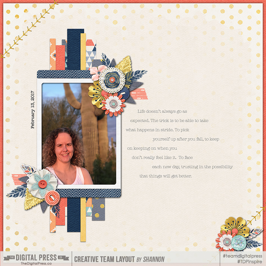
About the Author  Shannon has been completely addicted to digiscrapping since she began in early 2016 (though she’s been a scrapper since 2000). Her early morning ritual of a few quiet hours of scrapping while sipping a chai tea is her favorite part of each day. She is also the owner of a web design company, and when she’s not at the computer designing websites or digiscrap layouts, she’s probably hiking one of the local mountains in her hometown of Phoenix, Arizona. She is an avid reader and loves to travel to foreign countries.

Hybrid How-To | Bag Toppers

My daughter passed out donuts to her entire 5th grade class for Valentine’s Day. She wanted to add a little card or something she could sign her name to, so I whipped up these bag toppers we could staple to ziplock bags. It was such a quick project… and I was thinking it would be just perfect for any party favor. Throw the candy/treats/toys into any size bag and add the personalized topper. Fun and simple!

The first thing I did was measure the width of the bag. I used regular old sandwich bags for the donuts… each of which measured about 6.5″ wide. I wanted the front of the design to be 1.5″ x 6.5″ — making the total dimension for each topper (front and back) 3″ x 6.5″.

To do this, I clipped patterned paper to a simple rectangular template I made (see image, below), and then I designed the front of the topper using digital elements from the same kit. I kept my design flat — so it ended up being a simple flat digital design that I could easily print off (i.e. no extra cutting or assembling of extra embellishments/layers). I thought it would be easier that way since I was making like 30 of them. 😉

*PRO TIP* When creating your rectangular designs… make sure the “front” of the design stays on the bottom half of the template so it won’t be folded over to the back once you attach them to the bags.

After creating the design in Photoshop… the next step is to print, cut, and fold each topper in half. I filled all my bags with donuts, sealed the bags, and then stapled the toppers onto the zippered portion of the bags…

Here’s a look at the back (left) and front (right) of one of my topper designs…

This project literally took me about an hour from designing the toppers in Photoshop to completing the finished project — with no fancy cutting machine required. I hope you’ll give it a try!


Kate 
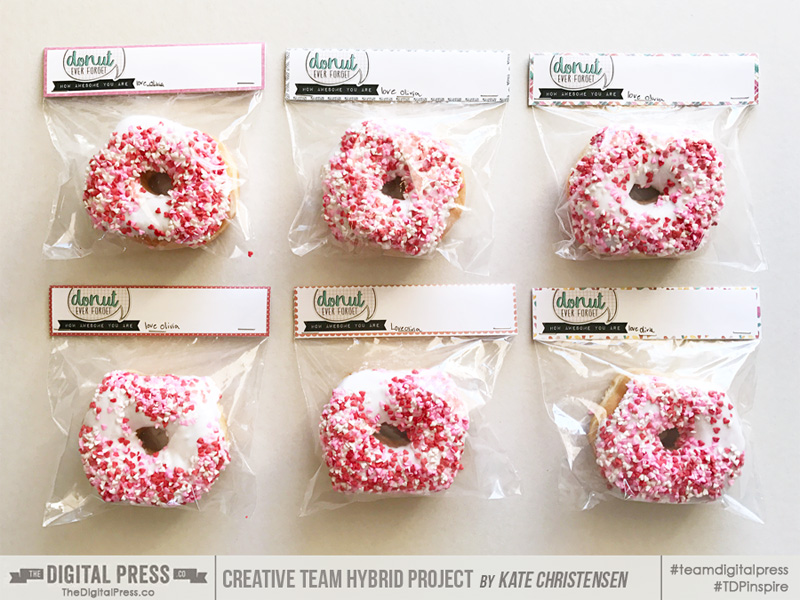
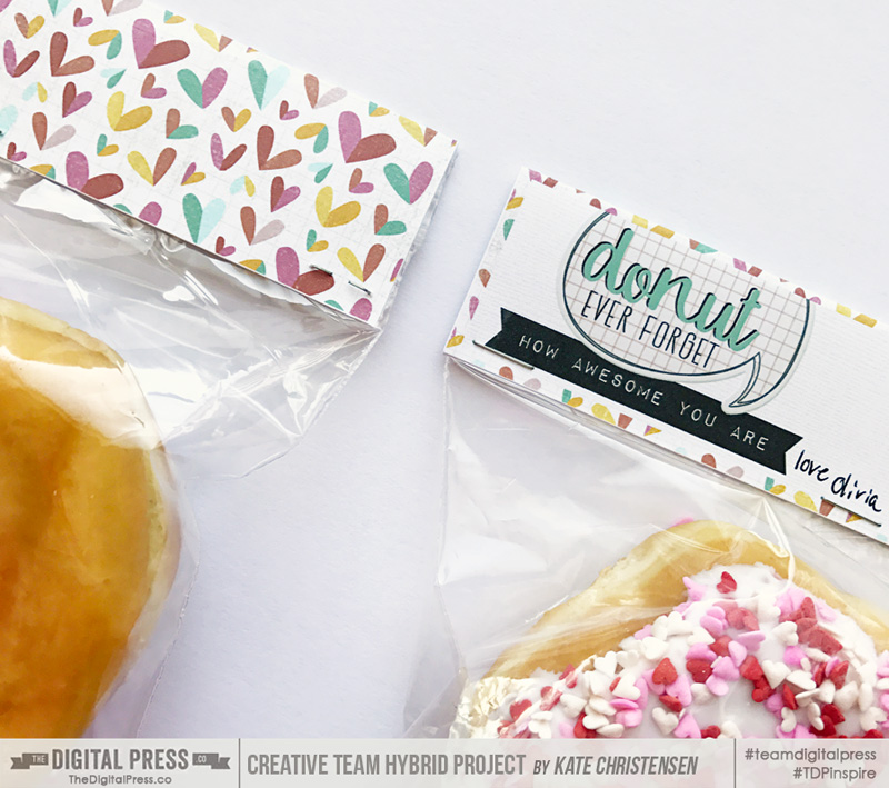
About the Author  Kate is on the hybrid team here at The Digital Press. She lives on the Utah/Colorado border with her husband, 5 kids, 10 chickens, and a dog named Gracie. She’s a city-born girl who found she’s really a country girl at heart. She can be found outside, barefoot, and probably in her garden.

Feature Friday | LJS Designs


Happy Friday, everyone! It’s time for another edition of our Feature Friday series… this time, starring the wonderful Lorie of LJS Designs. Lorie is a single mother (to a 25 year old son), and she has been designing for about 3-1/2 years now. By day, she works for an international fruit company as a production planning supervisor, and she loves coming to her home office where she can be artistic and creative in peace and quiet.

This is Lorie’s second feature here at TDP (you can find her first feature article from September 2016 HERE)… and whereas last year we used our feature series to help you get to know some fun trivia about your favorite designers — this year, we’re going to use our designer feature series to give you a little peek into our designers’ creative spaces, and more insight into their creative processes.

With that in mind, here’s a peek at Lorie’s creative space…

When talking about her work space, Lorie said, “my work space is located in my basement in my home office/laundry room.  I love the combination for three reasons: (1) my laundry is always caught up… (2) in the past, the noise from the washer and dryer would drown out any noise from my son or the TV or the dogs, or most anything else… and (3) it is always warm! For someone who is always cold, those warm comfy spots are really important.”

Additionally, we also asked Lorie to share with us a Top 5 list that is representative of herself at this point in her life… and as a huge Disney fan, she decided to share her Top 5 Favorite Disney Characters (she recently celebrated her 50th Birthday at Disney World, and as you can see she had a lot of fun)…

Lorie’s Top 5 Favorite Disney Characters…

  1. Belle from Beauty and The Beast. I love to read and am often lost in a book, so I totally relate to Belle. I appreciate her sense of self, that she is not afraid to be different, and that she is a dreamer. But what what makes her my favorite is her ability to see with her heart, and not just her eyes. In a world that too often judges a book by its cover, I appreciate that Belle reads each line of every page until she understands the whole story. It’s also really cool that it is Belle’s ability to see beyond the Beast’s exterior and love him for who he is, that saves him, which kinda makes her the hero in the end. I love tough chicks!
  2. Rolly from 101 Dalmatians. Rolly was the chubby puppy in 101 Dalmatians who was always hungry — which I can also relate to — but that is not the reason I love him. I love him because when my son was little he used to imitate Rolly’s big line in the movie when he was ready for supper… telling me, “but Mama, I’m hungry. I’m really hungry.” It always made me smile then, and the memory still makes me smile now.
  3. Captain America. Now, I know he is not the traditional Disney character… but he is part of Disney, and he is my superhero super crush (and thus, he made the list!). It helps that Chris Evans is a total hottie, but really I love Cap because of his old fashioned values, his sense of honor, and his unwavering loyalty to his country and friends. In Winter Soldier when he tells Bucky (who is beating the tar out of him at the time), “Then finish it. ‘Cause I’m with you ’til the end of the line…” I want to swoon. Seriously, I don’t care how old he is, I’d date him.
  4. Winnie the Pooh. I have to say that for a bear full of fluff and hunny, who is a terrible speller like I am, Pooh is really rather smart in all the ways that matter. He appreciates good food, good friends, and good times… and is not afraid to talk about the important stuff. One of my favorite quotes comes from Pooh: “If there ever comes a day when we can’t be together, keep me in your heart, I’ll stay there forever.” He’s got a place in my heart for sure.
  5.  Mickey Mouse. If you’re a Disney fan, then you gotta love the mouse that started it all, right? Everything about Mickey is great, but I think I like his giggle best. As a giggler myself, I can totally appreciate the joy behind it. Disney and Mickey are magic to me. They allow me to let go of the serious side that usually rules my personality and embrace my inner child. I did a lot of giggling on my recent birthday trip, and felt like I was turning five, not fifty. It was a wonderful gift. Did I mention that Mickey sang Happy Birthday to me? It was awesome!


Just like her personality — Lorie’s designs are always full of color! Also, they contain a wealth of elements — many of which are hand-drawn and distinctly her own! She is especially talented at putting together themed kits. She also makes some wonderful blocked template sets, as well, which are perfect for pocket scrapbookers (and also for those of us who simply have too many photos!). 😉

If you haven’t ever had a chance to do so… you will love looking through the LJS Designs at The Digital Press! Here’s a peek at just a fews of my favorite products…

Additionally, here are some layouts that were created using some of Lorie’s fun product offerings…

I hope you have enjoyed getting to know a little bit about Lorie! To celebrate her week as our Featured Designer at The Digital Press, the entire LJS Designs Store will be 30% OFF this week (the sale will end at 11:59 EST on Thursday 2/23).

Additionally, Lorie has a special Free-with-Purchase offer for everyone! Don’t miss out on this opportunity to stock up on your favorite products from LJS Designs… and you can snag her entire “Summer Fun: At Walt’s Place” Collection for FREE with any $10+ purchase in her shop — this week only!


AvatarAbout the author  Carolyn lives with her partner and 3 rescue dogs on 5 acres of paradise in the hinterland of the Sunshine Coast, Australia. Her camera, along with an assortment of lenses, is never out of sight. When not taking photos, she loves cooking and gardening and, of course, scrapbooking.


Discount

Save

Save

Save

Save

Save

Tutorial Tuesday | Creative Journaling

I recently found out that breaking up is easy to do! Oh it’s okay, really… I’m only talking about breaking up the journaling on my digital scrapbook pages. 😉 I’m here today to share some tips for this process.

One of the reasons I am so passionate about digital scrapbooking is because the pages I am creating today will be a legacy for future generations to enjoy years from now! I am in the process of creating books for our two beautiful grandbabies, and I try to include as much information as possible on each page.

While I’m comfortable with journaling on the pages, I have recently felt that I am in a rut with regards to the actual placement of the journaling. Simply put, I realized that my process was only to “find a spot I like and start typing and stop when the story ends.” The journaling I do is usually along one edge or the other – or smack dab in the center of the page. I have been known to ramble… and ramble… so I started thinking more about the placement and how it affected the visual composition of the page.

When I created the page shown below, I concentrated on breaking up the journaling. I wanted the words to become part of the overall design of the page, and I wanted them to flow together with the photos and the other elements of the layout.

I realized that by breaking up the journaling on the page, it gave the reader a little visual break. Perhaps even a chance to contemplate what they just read before moving on… or a breaking point to examine the photos after reading part of the story… or simply to admire the other aspects of the page. It also allows the eye to flow around the page rather than concentrating on one big block of text.

Here are a few tips you can employ in order to break up your journaling while scrapping your memories…

  • Use your title work to break up the sentences/paragraphs (this technique is shown above)
  • Similarly, you can break up your story by placing word art and/or elements right in with the journaling itself
  • Align the text differently throughout your page (right / left / center… you’ll note, above, that I changed the alignment depending on which side of the page the journaling appeared)
  • Use “bullet” type journaling — placing the bullet points randomly around your page
  • Place the photos and elements on the page first, then fit the journaling to align with the photos (something I did when I created the page shown above)

There are many more ways to achieve this, but I hope the tips I’ve shared here have at least given you a bit of journaling inspiration today! Thanks for stopping by the blog for another edition of our Tutorial Tuesday series… and until next time, “Happy Scrapping!”

____________________________________________________________________________________________________________________________________

Jill W
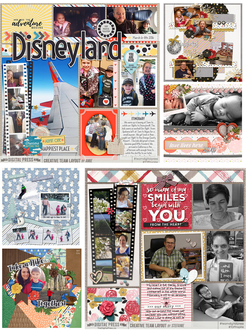
About the Author  Jill has been digiscrapping since 2006 when she came across it (quite by accident) while Googling “computer crafts.” Since that time, her love for the hobby has only increased! Her love of photography melds perfectly with digital scrapping, and she is thrilled that she has the opportunity to be part of The Digital Press creative team!

Save

Save

Save

Save

Save

Save

Save

Save

Save

Save

Save

Save

Save

Save

Save

Save