Tutorial Tuesday | Digital Mini Albums (Part 3)

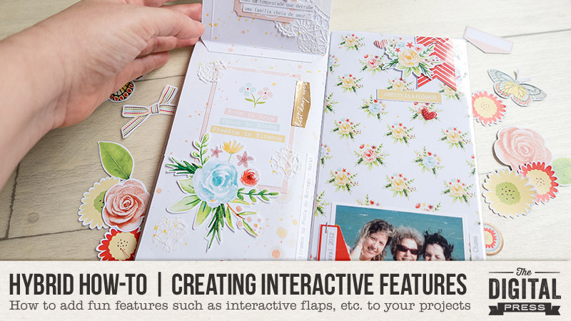
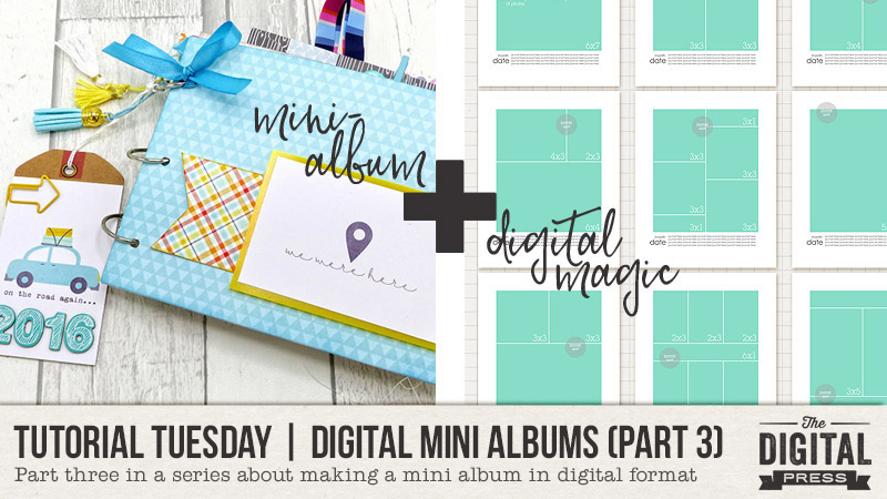
It’s time for another edition of our Tutorial Tuesday series here on The Digital Press blog! Today’s post is Part 3 in a series on creating a digital mini album (you can find Part 1, from March 2018, HERE and Part 2, from April 2018 HERE on the blog).

In that first part of the series, I shared that mini albums are handy for…

  • Scrapping a family vacation
  • Creating a special gift for someone
  • Marking a special holiday
  • Documenting a specific family tradition
  • Capturing a sports season
  • Life Events such as adoption, graduation, birthday, wedding, birth, or death

I also shared that I have found there to be four main steps in the process of creating a mini album…

  1. Planning
  2. Organizing
  3. Filling & Finishing
  4. Printing

  In Part 1 we looked at the first step: PLANNING. Part 2 I shared with you 4 different areas you could ORGANIZE to make the creation portion more streamlined.  And TODAY we get to do the fun part  . . .

Step 3: Filling and Finishing

Filling and Finishing is where all the magic happens.  This is where you get to see your pages take shape and fill in all the little details you have been wanting to add.  IT can be daunting, especially if you have a LOT of pictures to use and pages to make (can you say Baby Album??!!)

However, if you have taken care of all the prep-work in Steps 1 & 2 that we talked about, you should have everything right at hand and ready to go.

In reality, there is NO wrong way to do Step 3, as most of it comes down to your own personal scrapping style.  Some people like to completely finish on page, from photo to shadow treatment, before going on to the next.  However, if you are feeling a little overwhelmed, or the project looks daunting, having a plan and batching your work can help break things up for you and make the process go smoother.

In batching, you do a series of activities or jobs that are all similar at the same time.  This creates a work flow that actually saves you time in the end because you are not having to transition from one task to the next, which (in my case) wastes valuable brain activity.  So when I batch the tasks for my mini album, I do a single task all at once for every page in my album.  This is the method I use.

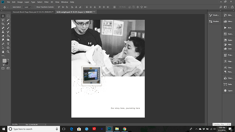
Start with your PHOTOS

You have already organized your photos into folders so why not start there.

In step 2 we created some BASE PAGES, or templates that we will use over and over for our mini album.  Open up some of these and pull your photos onto pages or templates and save them as Page 1, Page 2, etc.  (Or if you would rather, you can give them actual names.)  This will allow you to make sure you have all the pages you need and also show you if you need to condense some pages, “fix” or create a few additional pages to complete your book, or if there are any other problems you did not expect.  Some people like to do this page by page in the same order the mini album will be in once finished, but that is not necessary.

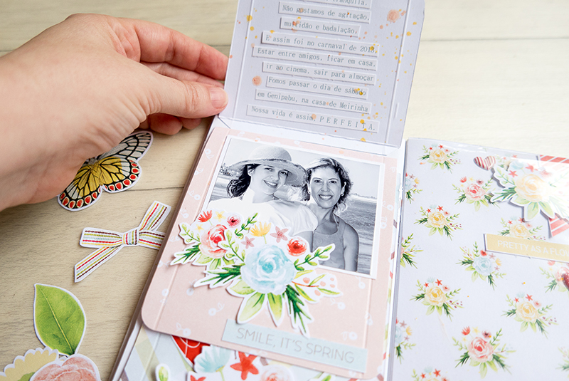
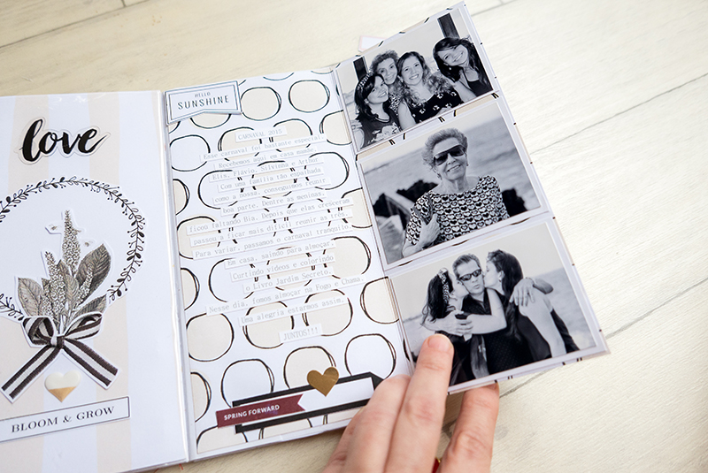
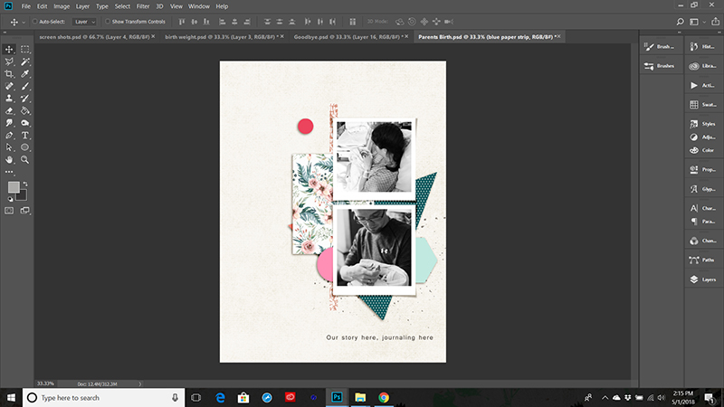
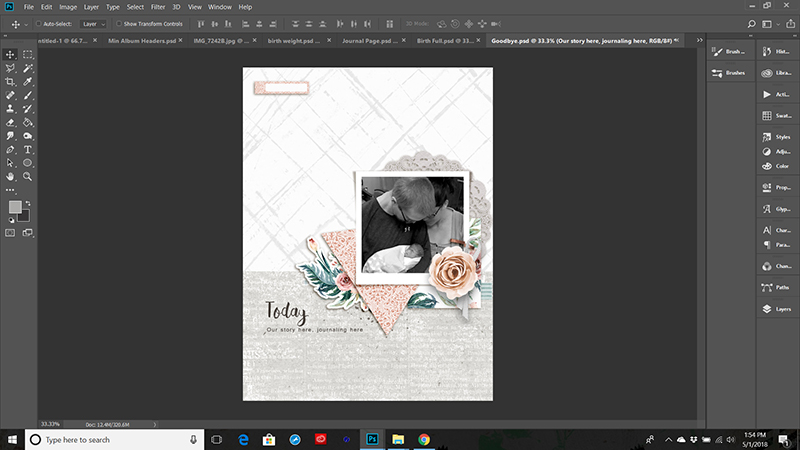
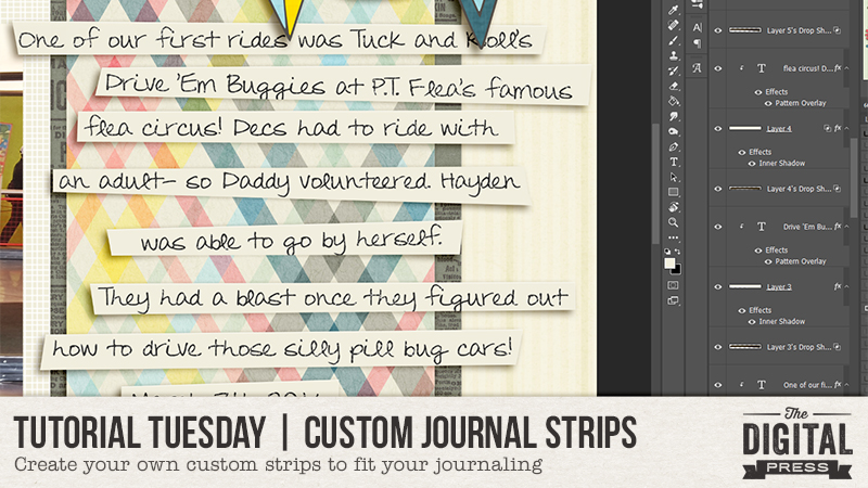
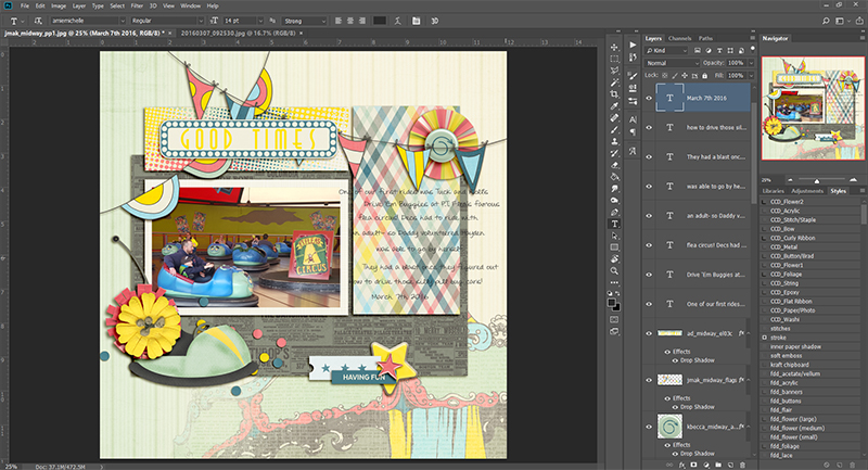
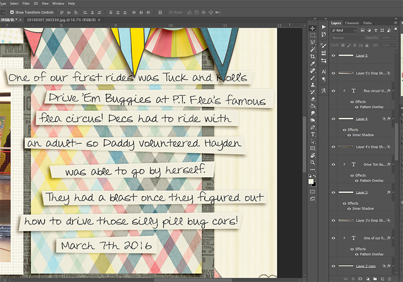
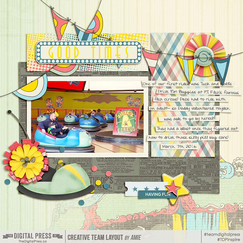
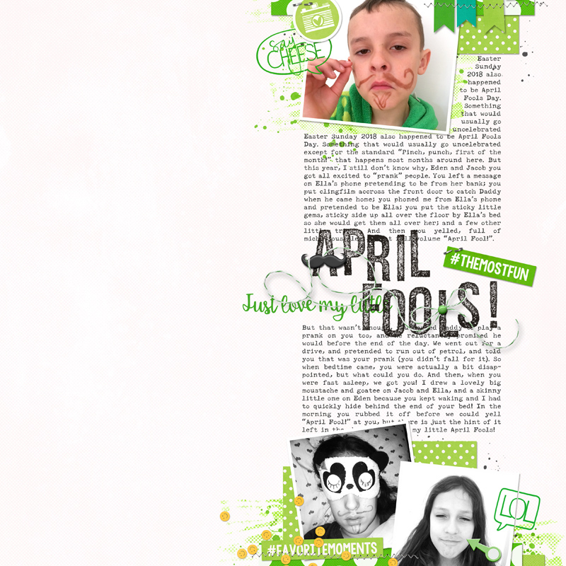
Here is what one of my pages looked like after filling the photos for the page.

Decide on Two Page Spreads

Since you are already working on your photos and numbering pages, go ahead and figure out your page spreads.

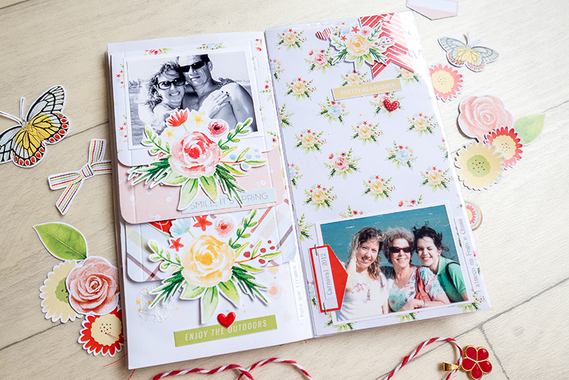
Sometimes this will be easy, for example, when you have a number of photos for one event, you will need both pages.  However, other times you only have one photo, and you will need to decide if you want to pair it with another topic/event or perhaps create a journaling or decorative page to go with it instead.  Make sure you keep in mind how many total pages you planned for during this stage.  You don’t want your mini album growing into a novel!

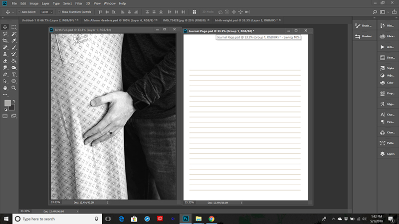
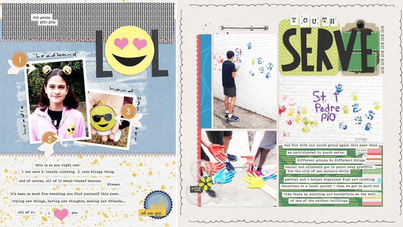
Also, consider diversifying your pages a bit to create interest.  Here I have combined a full page photo with a journaling page, because there is quite a story behind all the events leading up to this photo, and I wanted my sister to have room to tell it.

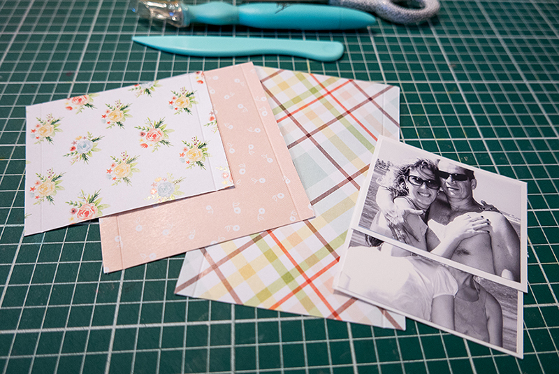
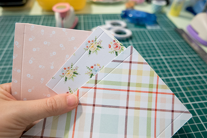
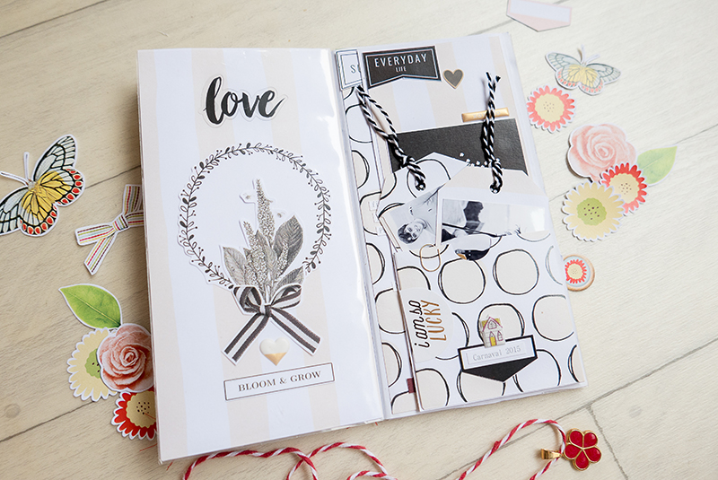
Paper and Backgrounds

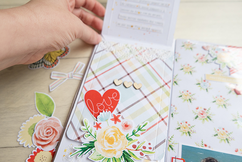
After I have all my photos in and all my pages made up and ready to go, I start adding my background papers.

I wait to add papers because I often end up switching some pages around during the above two steps.  Adding the papers now makes sure that my double page spreads still compliment each other, and I don’t have to waste time switching out papers that no longer work well together because of page moves.

Elements

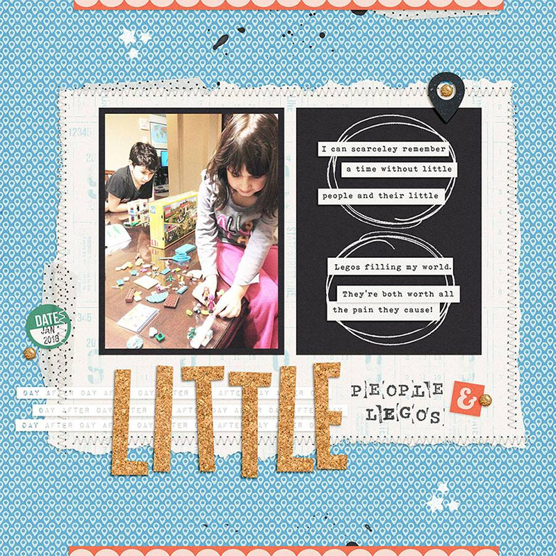
Once the backgrounds are settled I go to town adding my elements.

As mentioned in Step 2, I try to stick to a certain set of elements that I have already chosen as this creates cohesion and balance in my mini album.  Also, I don’t want to add too many elements, as this will be a smaller than normal book and can easlily get cluttered, but I do want enough to highlght my photos and rerally tell my story.

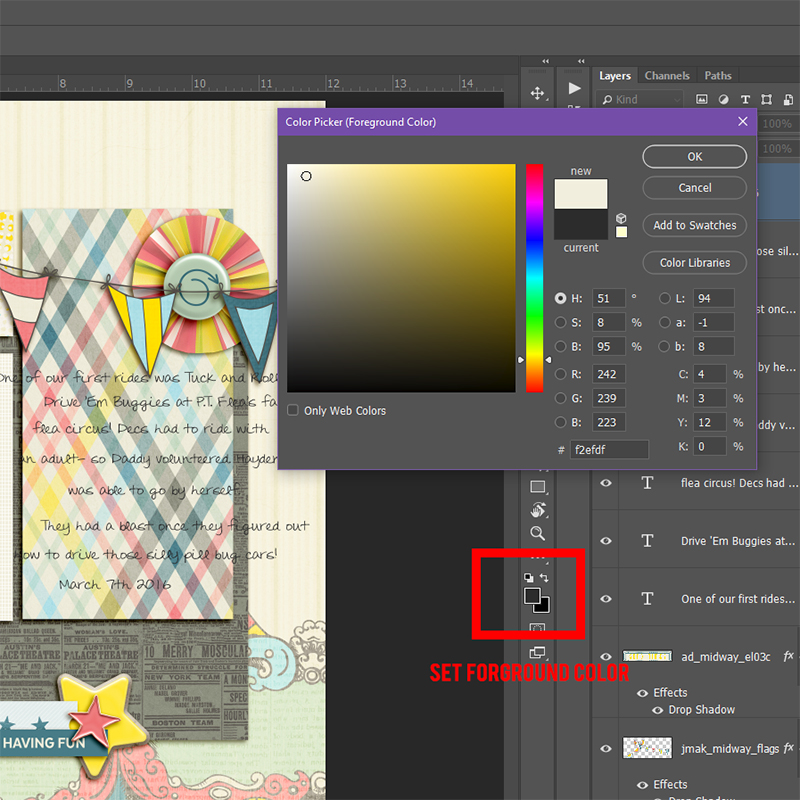
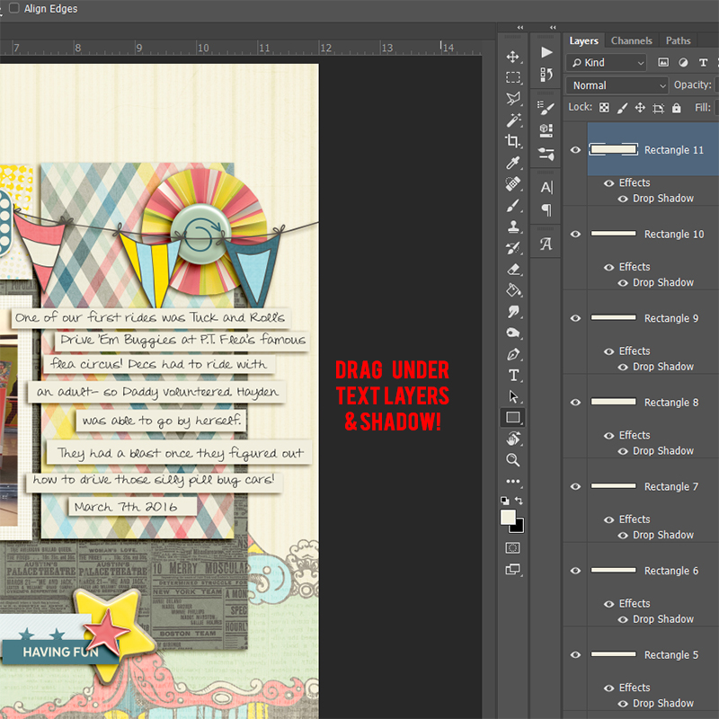
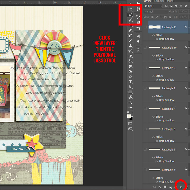
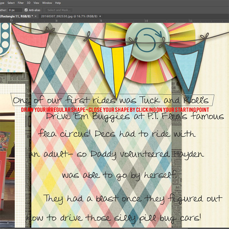
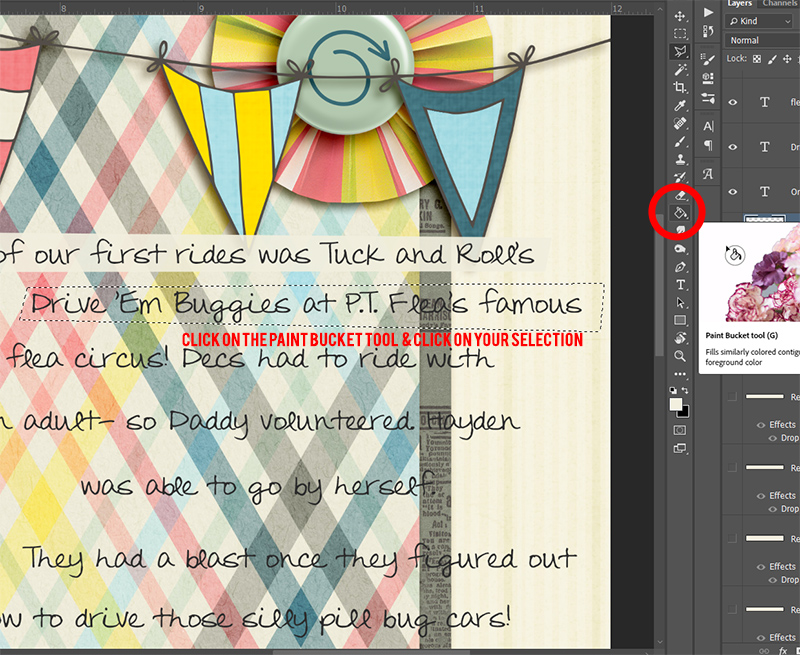
If you like to tweak your shadows you can also go ahead do that here, or you can wait to the very end if you prefer.

Journaling

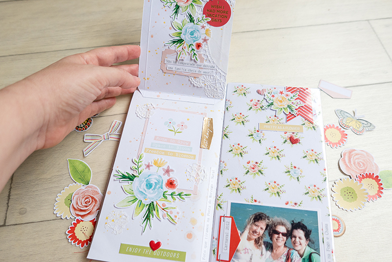
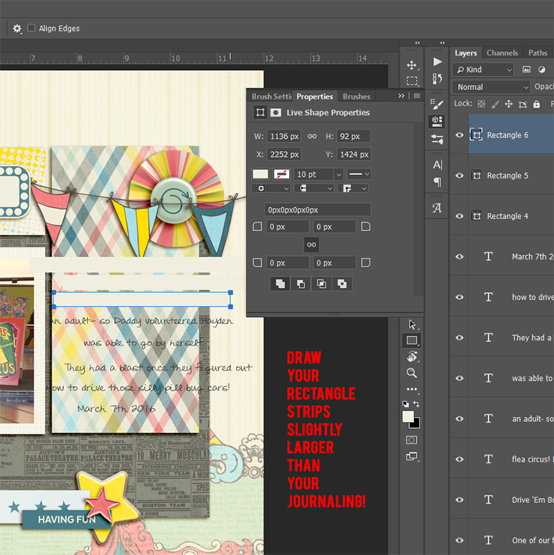
Don’t forget to add your journaling.

It can be as simple as names and dates, or as detailed as whole page stories.  If you have already written and compiled your journaling you can simply copy and paste it in.  If you still need to write your journaling, let your own journaling style shine through here.  If you run out of ideas – look through the blog.  There have been some amazing inspiration and tutorial posts about journaling that can give you some ideas.

Finishing Touches

And finally add your finishing touches.

Maybe you like to tweak your shadows, or create a cover or dedication.  Any of those little things that really FINISH off your mini album should be done now.  Take time to flip through your pages in order and make sure they flow.  Look for events, or pages that got left out, or maybe pages that don’t fit.  See if there are certain elements you should repeat in a few more places to really bring everything together.

Once you have done all that, you are almost finished.  All that is left if to make sure it is print ready and have those pages printed out.  We will talk about that next month.

In the meantime, happy scrapping, and keep an eye out for our final installment – PRINTING!!

See you next time!


ErinErin is an artsy crafty kind of girl who is currently dabbling in far too many things, but is working hard to enjoy every moment of it, while avoiding the rain, which is difficult due to living in the land of many rains. She is slowly learning to use her smart phone to capture all the fun little bits of life that would otherwise go unremembered in the busy craziness that is raising a family!

Hybrid How-To | Gifts For Mom

Hello everyone! It’s Tanya here, and I’m excited to share another edition of our Hybrid How-To series with you here on The Digital Press blog! With Mother’s Day just around the corner, I thought I’d show you how to use your digital papers and/or elements to create a couple of cute (but simple!) gifts for Mom.

I made these gifts for my husband’s Mom for Mother’s Day, but you can change up the tag to suit any occasion.

SUPPLIES NEEDED:

  1. Your favorite digital scrapbook products
  2. White cardstock
  3. Glossy photo paper (not a must, but it works best)
  4. Circle &  scallop shaped punches
  5. Hole punch
  6. Wooden skewer or popsicle stick
  7. Ribbon
  8. Pop dots
  9. Tape
  10. Scissors

For my sample project, shown below, I used the following digital products: the Lean On Me kit by Anita Designs and Kim B Designs, and Simply Mom Word Art by Kim B Designs. Here’s a look at each of those…

For this project, I used my Silhouette Studio Business Edition software. You can use any photo editing software, however.  The first step is to draw out a 8 1/2 x 11 triangle.  To do this, I used the draw tools to the right of the work space…

Next, I filled the shape with a digital paper I choose by opening the fill pattern on the right…

The next step is to print it out. I have a HP Office Jet and it prints really nicely… but I’ve found that to get the best print possible, you need to make sure when you change between different types of paper that you go into your printer preferences and change the ‘paper type’ there, as well. I also turned ‘borderless’ to ON…

Now, the fun part — creating the little gift bag! Fold as pictured below. I used a flat card (like a credit card) to get good creases. When making your second fold, overlap just a little and use double-sided tape to hold it together. Then fold the bottom up, as shown…

Now, we’ll open the bottom of the bag as shown… and flatten it down… and then fold the top down…

We will do the same to the opposite side by folding the bottom up (I taped with scotch tape). Now, we’ll stick our hand into the bag to open it up. At this point, we’ll want to fold a small portion over and punch holes for the ribbon. Of course we’ll be filling the gift bag with Mom’s favorite treats before closing with the ribbon…

Here is a look at the finished gift bag… isn’t it cute?! Instructions for the tag can be found below, as well. 😉


Next, the cute matching tag!

For the tag, I used my Silhouette Studio software again… but just as with the bag, you can use any photo editing software and a couple of punches… no cutting machine necessary. I created several choices, including the tag that you saw on my gift bag, above… and also, a cute plant flag…

Like I mentioned, above… even though I used my Silhouette to cut out my tags, it’s not a must. You can see below how I also used a couple of hand-held punches…

Next, we will take the bamboo skewer and a couple of the printed pieces… and make a plant flag with all of it. The bamboo skewer will likely be too long, so we will need to trim it with a pair of scissors. We’ll also add a couple of pop dots to the back of the top layer of the flag (I also used a small piece of tape to secure the skewer down). Now we attach to the scalloped circle to create a pretty plant flag for Mom…

Here is a look at the finished project. Just a little touch to let Mom know we went the extra mile to make her feel special…

Aren’t they so adorable?

I hope that you have enjoyed this edition of Hybrid How-To. Don’t forget to visit the CROSSWORD SECTION in The Digital Press forum, and jump into this month’s Hybrid Challenge if you are thinking of trying this project. You can earn points toward discounts & FREEBIES! I hope that you will join in!


Tanya

About the Author  Tanya is a part of the hybrid team here at The Digital Press. She has been hybrid crafting for at least 16 years now, and loves creating and sharing those creations with others. Her all-time favorite tool is her Silhouette Cameo. She has been married for 29 years to her high school sweetheart, Richard and has two sons: Chris, 26 and Chance, 22. She also enjoys crocheting, photography and woodworking.

Tutorial Tuesday | Custom Journal Strips

Hello everyone, and welcome to another edition of our Tutorial Tuesday series here on The Digital Press blog! I’m here today to share a really quick & easy tip with you — a fun way to add journaling to your pages — creating custom journal strips!

It’s possible that I love journaling cards more than most people do… but… sometimes a journaling card just doesn’t work (it might not fit the space on the page… or doesn’t contain enough space for the amount of journaling I have in mind… etc.). I’ve noticed one of our scrappy designers here at The Digital Press (the fabulous Dawn Farias of Dawn by Design fame) has a fun trick she uses to solve this issue — she creates custom journal strips that fit her layouts! Here are just a few examples of Dawn’s fabulousness…

Aren’t her layouts fun?

Now, I’ve noticed that many designers will include a journal strip or two in their kits, but sometimes they don’t fit! As seen in Dawn’s examples, though, creating your own custom strips ensures that your journaling will fit (and it also ends up being a really fun design element on the page)… and so today I’m here to show you how to quickly & easily do this.

For my example, below, you’ll see that I created my page and then needed a place to fit the journaling. I’m a sucker for plaid, and simply had to use that paper… and then none of the journal cards in this cute kit really worked for that space. Custom journal strips to the rescue!

First, you’ll see that I typed my journaling where I wanted it. A little here, a little there — loosey goosey, as this page’s topic was a fun ride at California Adventure — no left justification for journaling allowed here! 😉 

Then, I chose my foreground color by sampling the off white/cream color from the papers in the kit, using the color picker in Photoshop…

Next, I selected my “rectangle shape tool” and began creating my strips…

I drew my rectangles slightly larger than my journaling. You’ll see in my example, below, I was drawing my rectangles over the journaling, to ensure that I was covering it up (i.e. that it would fit onto the strips) — but — I could have just as easily made the rectangles under the journaling in the layers panel. The point is that either way works, and it’s just a matter of personal preference in terms of the process!

After my strips were all created, I dragged those layers down underneath my text layers, & added a shadow…

Voila! Custom journal strips that fit my text perfectly!

Another fun way to make strips is with the polygonal lasso tool. With this tool, you can make more realistic/not perfectly straight strips. I can’t cut a straight line with scissors to save my life… so this method mimics my real life perfectly!

To do this… first, you’ll need to add a new layer (not pictured here, because I forgot to screenshot that step, but you get the idea!) Then select your “polygonal lasso” tool…

Click & draw lines to make an irregular rectangle shape around your journaling. As soon as you click on the starting point to end your shape, you will get a selection…

While your shape selection (the “marching ants” in Photoshop) is active, select the “paint bucket” tool. Occasionally this will be hidden under the gradient tool; right-click to find the paint bucket nested inside. With the paint bucket tool, you will click inside your selection to fill with the foreground color. Repeat this process for all remaining strips…

My final results are shown here (with some warping added, and shadowing… as well as my text clipped to the custom journal strips)…

And then finally… here’s a look at my final layout…

[ sample layout made with: Midway by The Digital Press Designers ]

AmieAbout the Author  Amie is a craft-loving dental hygienist who lives in Washington state. She loves her husband, her two crazy kids, and her English Bulldog… as well as coffee, baking cupcakes, daffodils, glitter & sprinkles, reading a good book, and lip gloss — not necessarily in that order.

Feature Friday | MEG Designs

Happy Friday, everyone! It’s time for another edition of our Feature Friday series here on The Digital Press blog… and this week, I’m thrilled to put the spotlight on Marie Eve Goudeseune of MEG Designs! This is Marie Eve’s fourth feature at TDP (you can find her first feature from November 2016 HERE, another from May 2017 HERE, and her Foodie Friday post from November 2017 HERE).

In order to learn even more about Marie Eve this time around, I asked her to share 5 things we might not already know about her…

  1. I love staying at home during the weekend and enjoying my house and my garden. It’s the place where I feel the best.
  2. I am a very cautious person and I am always cold everywhere. I don’t like winter much, except for my birthday. I prefer the summer even if in my country, the temperatures generally reach only 22-25 C in the summer.
  3. I am left-handed …but many things are not made for left-handed people in everyday life, such as scissors (I know, it makes everybody smile). But it’s a real problem to use right-handed scissors. Imagine that you should use scissors with the inverted blades. Fortunately, now we have left-handed scissors. 😉
  4. I don’t like horror movies. It’s still as scary as it was when I was a little girl. So, I never watch this kind of movie.
  5. I am bilingual (French/Dutch) and have been for a long time. I went to a Dutch-language school until I was 15 years old. My Mother tongue is French.

As for Marie Eve’s digital designs, she had the following to say about her creations… “all of my products are inspired by my private life, whether it’s my children, the holidays, the things we do, or even something that one of my children said. Usually, I have a theme in mind and then I observe what is around me and I find a color palette that fits my theme.” I really love her color combinations. Her templates are perfect for making cleanly-designed digital pages, and her journal cards are the final touch on every pocket-style layout. Whatever crafty style suits you, you will find the perfect item in her shop.

Here is just a small sampling of the products you’ll find in the MEG Designs shop here at The Digital Press…

And just to provide a little bit more inspiration for what can be done with her products… here are a handful of really fun projects that were created using items from the MEG Designs shop here at TDP…

I hope that you’ve enjoyed learning a little more about Marie Eve of MEG Design today! To celebrate her week as our Featured Designer at The Digital Press, the entire MEG Design store will be 30% OFF all week long (the sale will end at 11:59pm ET on Thursday 5/3).


blogfotoAbout the author  Astrid is a member of the creative team here at The Digital Press. She lives with her husband and her 2 teenage/adult kids in Germany. As a mini-jobber with only 10 hours/week, she has plenty of time for her digital scrapbooking hobby. She has Netflix and Amazon Prime, and is addicted to nearly all series. Vampires, zombies, vikings… it doesn’t matter; she likes everything. She loves the ocean and the summer heat, but lives in the opposite: mountains. Therefore, she loves visiting her family in Algeria or the south of France.

Tutorial Tuesday | Scraplifting a Style

Hello, and welcome to another edition of our Tutorial Tuesday series here on The Digital Press blog! Today I’m here to share an easy (and fun!) way to find inspiration when you need a little creative kick to get you going!

You may already know what a scraplift is — and maybe you have even taken part in one or more of the scraplift challenges here at The Digital Press (?) — but just in case you aren’t yet familiar with the term… to scraplift is to copy the basics of the page design (or general feel) of another layout or scrapbook page, and then create a similar page of your own.

Today, however, I would like to suggest a bit of a different way to scraplift… by looking at another scrapper’s style, and scraplifting their general style, rather than one specific page.

To show you what I mean… let’s look at some pages by one of The Digital Press’s creative team members, Heidi Nicole. I went through her gallery here at TDP and chose four of my favorite pages, and then tried to look for some general style ideas by seeing what the pages all had in common.

Here are some of the common features that I noticed:

  • The background papers are just lightly patterened, and most of them are pale in color.
  • Heidi Nicole often uses just 1 photo, which is placed roughly centrally on her page, but the photo is often tilted just a little.
  • She tends to do something with the edges of the page (using paper strips, or just a little pennant flag, etc.).
  • She likes to use curly string, doodles, or stitching to move your eye across the page.
  • Although she may have repeated elements (beads, flowers, etc.), she tends to have one focal element (like a flower or a Santa), and small clusters of just 2 or 3 items.

So when I created a layout that scraplifted Heidi Nicole’s style, I used those style ideas — and here is how it turned out…

[ I used Finally Fall, the Orignal Torn Bits no3 and Borderlines no2 — all by creashens ]

After giving Heidi Nicole’s style a try… I decided to look at another of TDP’s creative team member’s galleries — caliten (Carrie) has a style I’d love to imitate, so I chose another four favorite pages to compare/contrast…

Here are some common style features I found on Carrie’s pages:

  • She often uses minimal colors, so these examples use almost exclusively just 3 colors (black, white and one other color — green or blue, etc.).
  • Layers! Carrie uses things such as stamps, paint, doodles, word art, mask, etc… as base layers.
  • She has a clear title on each page, which she often uses more than one font/alpha/word art to create.
  • There are several lines of journaling on most of her pages (and considerably more on half of these 4 pages!).
  • I think most of these pages encourage you to look from the top to bottom (rather than from left to right or simply focusing on the center of the page).
  • She usually chooses to journal in an easy-to-read, typewriter-style font.

So when scraplifting Carrie’s style, I made use of those style features — and here is the page I made…

[ I used #Happy Things, Travelogue, and Project Twenty Sixteen – March all by Laura Passage + Speechies by Rachel Hodge and Sans Serif Stamped alpha by Dawn by Design ]

See how easy it is to gather inspiration by scraplifting the overall style of other scrapbookers you admire? And it’s fun, too!

I hope this idea might prove helpful to you… perhaps if you are lacking mojo and looking for a creative way to get going again (or maybe you have simply noticed a scrapper in the gallery whose pages you love… and you’d like to try scrapping a little more like that person)!


CorrinAbout the Author Corrin is a member of the creative team here at The Digital Press. She is a fan of the Big Bang Theory and a lover of cozy pajamas or flip flops when the sun finally shines! She lives in the breezy South of England with her husband and 4 crazy kids, who regularly discover & plunder her secret chocolate stashes, and hopes that maybe this will be the year she reaches the bottom of the laundry pile!

Hybrid How-To| Creating Interactive Features

Hi everyone, and welcome to another edition of our Hybrid How-To series here on The Digital Press blog!  Today, I’m here to show you how to create interactive features — such as flaps and pockets — to add to your hybrid and paper projects. It’s a really fun way to add more photos and journaling into your projects!

I think it makes a project more interesting and fun to add interactive pages, which give the possibility of finding some fun surprises by flipping open the pages within our  notebook — surprises like hiding journaling notes and even some photos under flaps and in pockets.

For my project today, I will be using one of TDP’s Monthly Chronicles digital collections — Bloom — shown here…

I’m going to be adding some of these interactive features to my own Traveler’s Notebook project.

Sometimes I want to work on smaller projects like this, because they’re very fun and not as time consuming. A Traveler’s Notebook is a great way to document things in a smaller format. We can make our spreads one day at a time, without being  overwhelmed about finishing a larger 12×12 page or even a full mini album. It’s also a good way to document a weekend, a trip, a single date or event, or any other small moment in our lives.

The first interactive feature I wanted to add was a tiered page, with multiple layers/flaps for the viewer to open. This is an easy technique that you’ll master in no time at all!

The supplies you will need are listed here:

  • digital printed papers
  • your favorite embellishments
  • your photos
  • trim and score board
  • double-sided tape or glue
  • a pencil

My Traveler’s Notebook is a standard size, measuring 4.33″ x 8.25″ — but you can apply this tiered page technique to any size page/album or any kind of journal, simply by adapting the measurements to fit your own project’s “canvas”. No matter what size you are creating, keep in mind that you will have to trim the paper slightly smaller  than your journal, for a nice border finish and to prevent your book from becoming too bulky.

First, I cut three pieces of different patterned paper, measuring as follows…

  • 3 1/4″ x 4″
  • 4 1/2″ x 4″
  • 5 1/2″ x 4″

Once my papers were cut, I folded them at 1/4″ from the top, as shown in the photo above.

Next, I glued the folded top 1/4″ of each of the 3 papers down onto my main notebook page, in 3 tiers, as shown here…

Each paper was glued just below the one above it. Here’s a look at the second level…

And finally, the lowest level (and what appears underneath it)…

Tips & Tricks:

  • Have your paper widths cut evenly so they will all line up perfectly.
  • Keep the paper that lines your page slightly smaller for a nice border finish and to prevent your book from becoming too bulky.
  • Make sure your fold lines are nice and crisp for a sleek finish.
  • For a softer edges, you can round the corners.
  • Use different contrasting papers for each tier, which really adds to the effect of this technique.

Here is a look at my final spread; you can see all 3 layers nicely on the left side…


The second interactive feature that I want to show you today is a fold-out page, as you can see in the following photo…

For this page, I chose my paper and cut it so that it measured 7-1/2″ x 8-1/8″. Then, I folded it at 3-1/2″ from the right side (as shown, above).

As you can see, the flap allowed me to insert three photos on the far right, and still have space for a lot of journaling in the middle section of my notebook.

It’s a really quick/easy technique that makes the page more fun and interactive!


Finally, the last interactive feature I want to show you is the addition of a pocket on one of the fold-out pages, as shown here…

For this pocket, I cut a piece of paper, measuring slightly smaller than my notebook page’s size (mine ended up being 4″ x 3-1/2″).

Then, I folded each side at 1/4″ in order to glue my pocket on my page…

Once the paper was glued down to create the pocket, I could start sliding items inside (like the 2 tags I created, shown here)…

Then I glued some photos onto the tags, and added tag strings, to make the process of pulling the tags in/out of the pocket really fun…

Here’s another look at the finished tags, out of the pocket…

Aren’t these techniques fun? And they’re really very easy, as well!

I hope that you have enjoyed this edition of Hybrid How-To! I had a great time making this project.

If you’re feeling inspired and you’d like to give this a try, too, don’t forget that you can earn challenge points at TDP! Come visit the CROSSWORD SECTION in The Digital Press forum, and you’ll find this month’s Hybrid Challenge thread (for each month’s Hybrid Challenge at TDP, you get to choose one of the month’s “Hybrid How-To” tutorial posts from here on the blog and make your own version). You’ll see how fun it is! Give it a shot, and share your final results with us! We can’t wait to see what you come up with.

Have a great weekend you guys, and happy scrapping!


About the Author  Andrea Albuquerque is member of the hybrid creative team here at Digital Press. Andrea has been a scrapper since 2010 and a photographer since 2012… and although she adores the flexibility and creativity of digital, she can’t resist playing with paper, paint, and embellishments. Hybrid scrapping is the perfect medium for her! She lives in Brazil with her hubby.