Author: The Digital Press

Friday Favorites | September 6, 2019

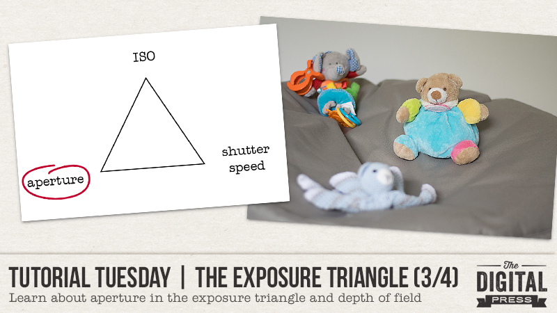
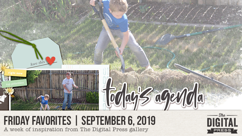
Hello, and welcome to our newest Friday blog feature here at The Digital Press. I’m excited to bring you the first post in our newly-ravamped Friday Favorites series, where we will be sharing some creative inspiration from our amazing community members here at TDP every Friday!

Here’s a look at a few of the newest gems I found in TDP’s gallery this past week (each page is linked to the gallery so you can leave the original artists some love)…

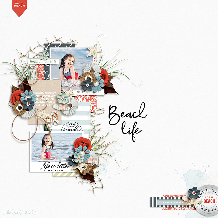
First up is this fantastic layout by Mother Bear. I just love the clustering on this page — all those tiny little elements, so carefully layered together. The flow of the page is great, too, with that simple red tag at the top starting your journey and pointing the way to the fun photos. Did you notice how the color palette for the layout mimics the colors in the photo?

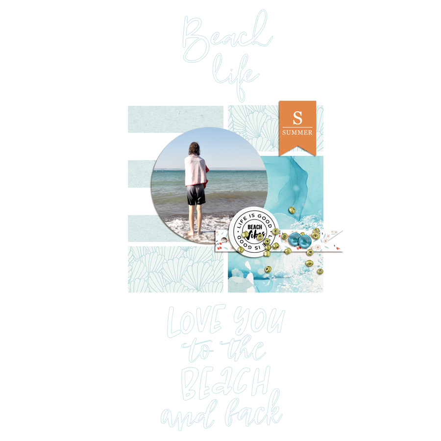
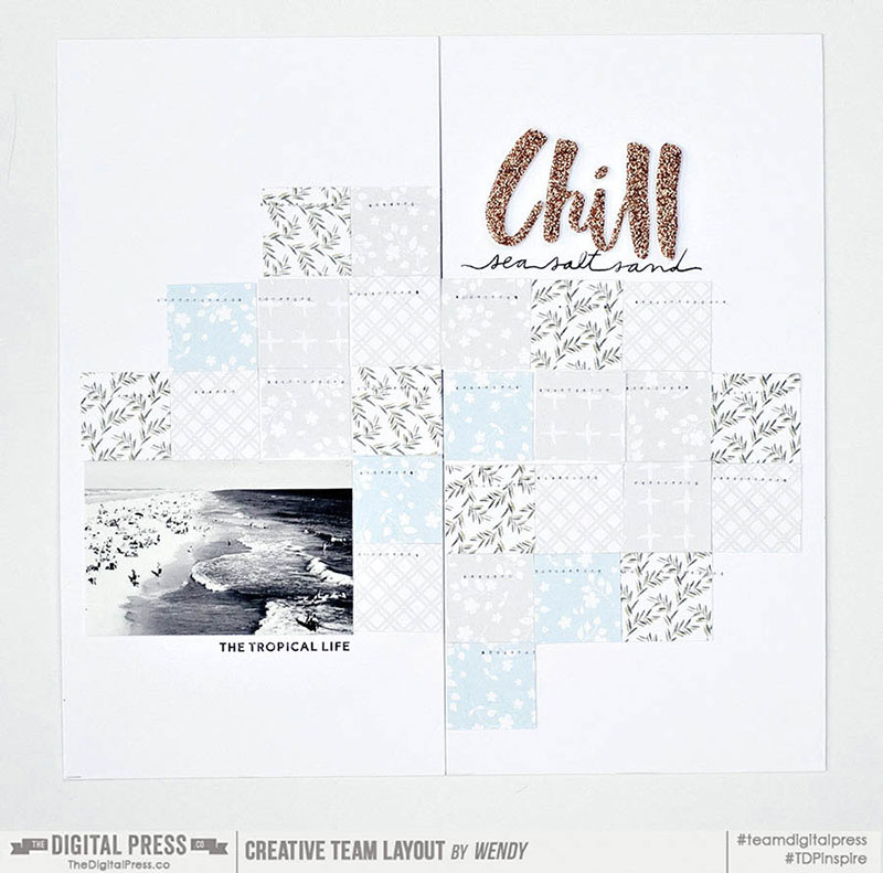
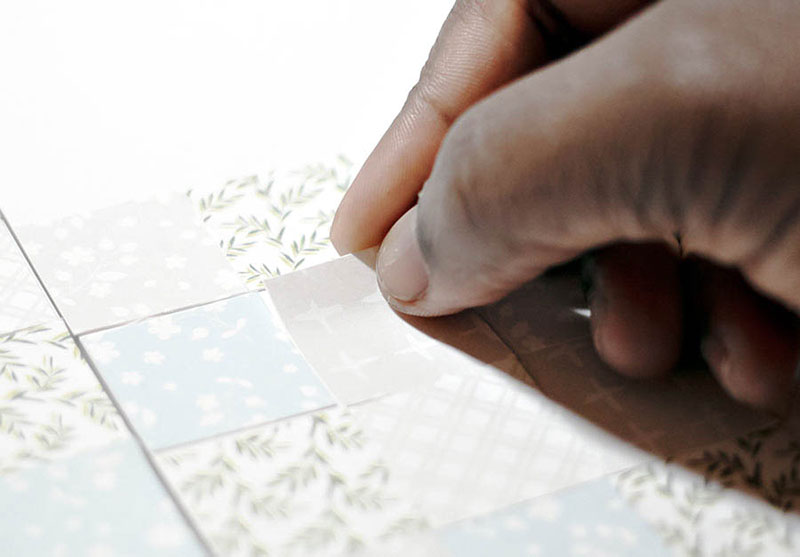
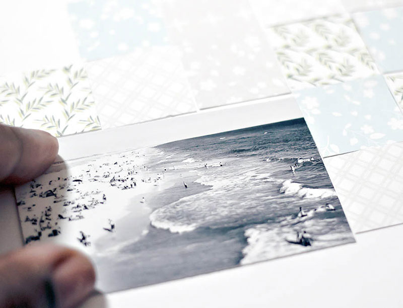
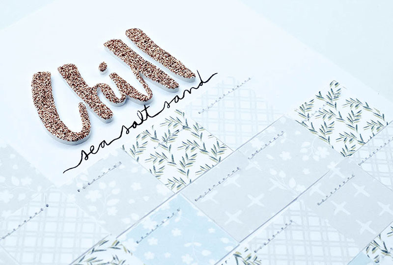
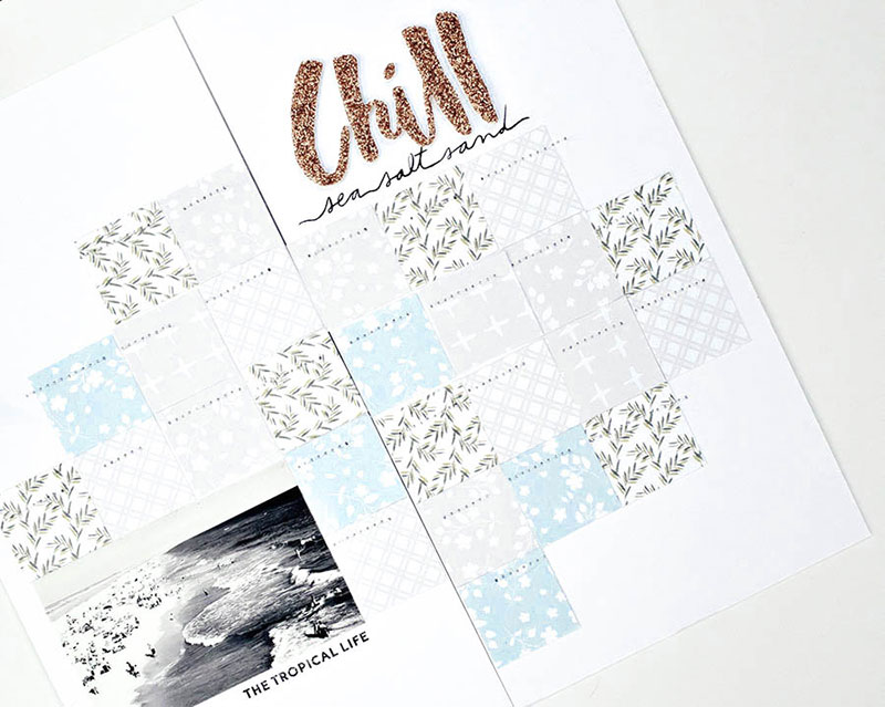
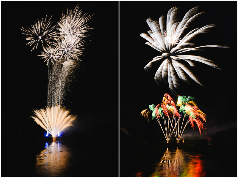
Next up is another beachy layout I chose from Anne PC (it’s the end of winter in Australia, so I’ll take all the warmth and sunshine I can get!) — and what caught my eye here was the mix of shapes. The circular photo layered on top of the patterned paper grid design is a great idea that I might have to steal on one of my future layouts! The summer tag also adds a nice pop of color against the predominantly blue and white page.

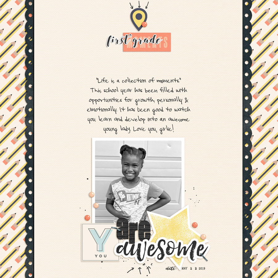
I also loved this page from ElaineU. Back-to-school pages are big in the gallery right now… but how about an end of year layout? Look at that smile! Quick pages can be great ways to catch up on your memory-keeping. Add a great photo (the choice of black and white photo was brilliant here) along with some journaling, and you’re good to go.

While browsing the gallery and admiring all the gorgeous eye-candy, I also found a few older “throwback” layouts in the gallery to share with you today, as well…

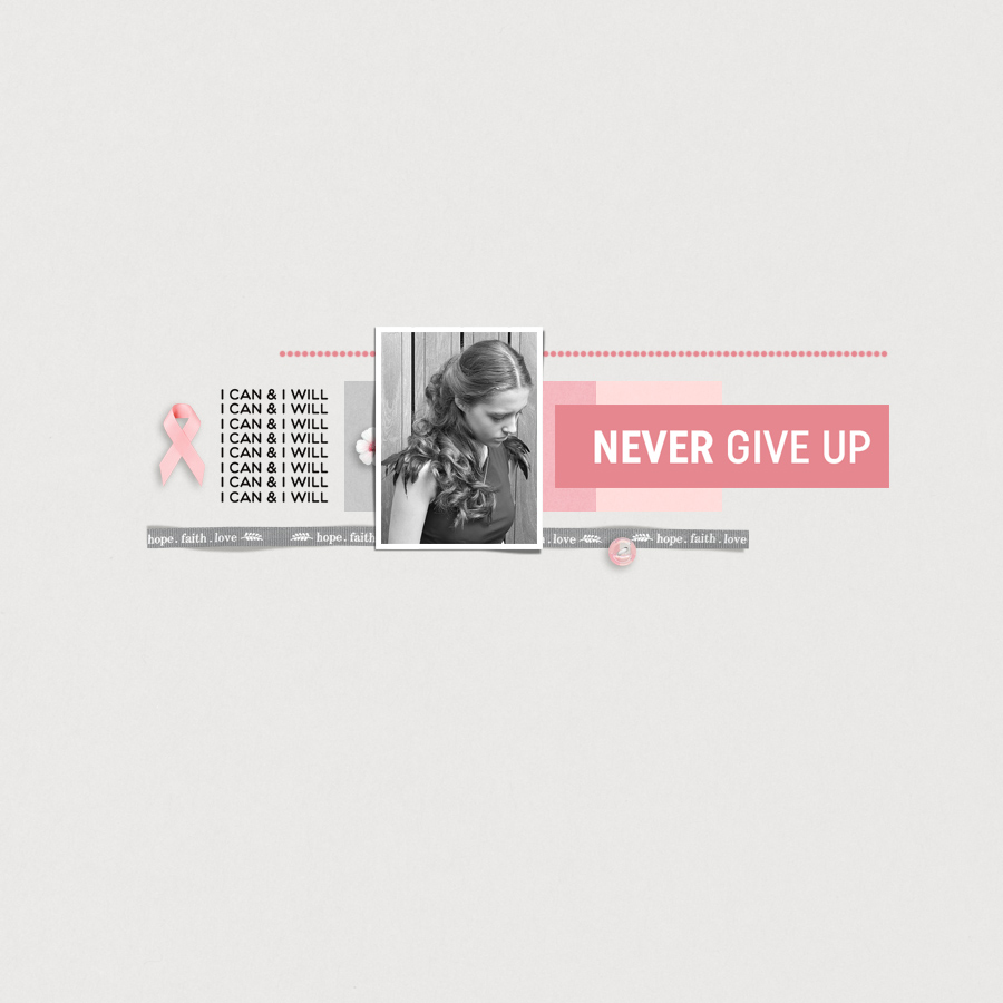
First, this simply yet lovely page by sylvia. I love the clean lines of this layout, and the pinks against the grey create a softness. A few dimensional elements just add that special ‘something’ to the page.

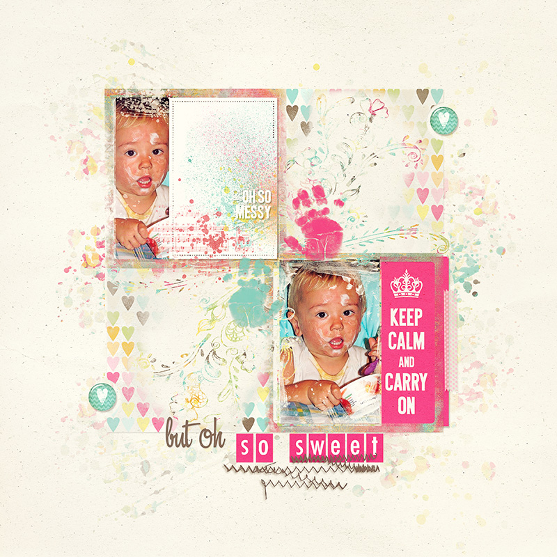
This next page by Margie just drew me in right away… not only for the adorable photo (oh my, cleaning that face would have been fun!), but also for the layers of brushes and stamps. Like the other page above, just a few elements is all it needs.

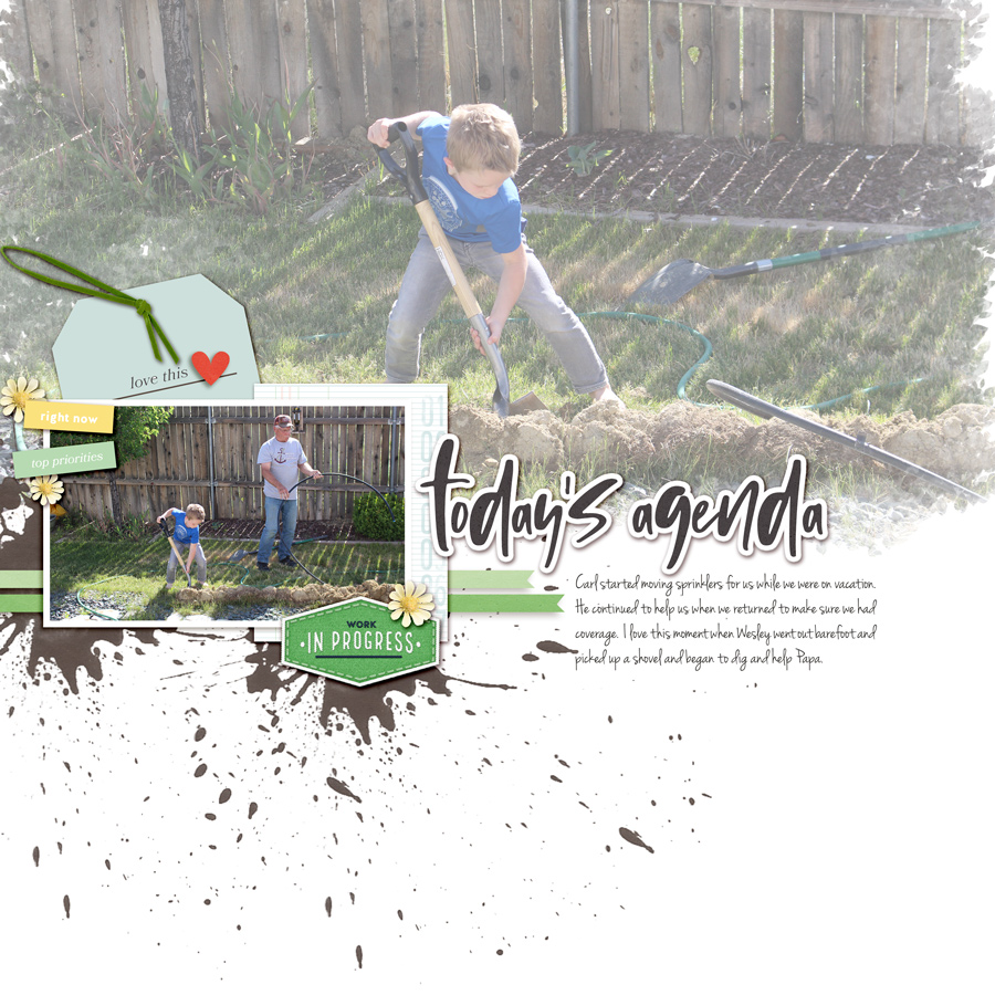
My final page to share with you today is this one by knclark of Papa’s little barefoot helper. I really like the larger, slightly blended photo that highlights the young man’s efforts. The paint splatters remind me of mud, too.

I hope you’ve enjoyed the first installment of our newly-revamped Friday Favorites series today! I had so much fun looking through the pages of inspiration that can be found in the gallery here at The Digital Press. Whether I’m in a scrapping rut and looking for ideas, or I just want to see what everyone’s been up to… the gallery is always a great place to look around.

Meanwhile, if you’re looking for even more scrappy inspiration… check out this weekend’s New Release products, as well… and then get creative, add your projects to the gallery, and perhaps you will be featured here in a future Friday Favorites post!


About the Author Kat Hansen is a creative team member here at The Digital Press. A HR Manager in the real estate industry by day, she loves the opportunity to spend a few hours each evening being creative. Vacation memories feature pretty heavily in Kat’s scrapbooking pages, as well as her health and fitness journey. Kat has quite the sense of humor (she “blames” her father for this), which she incorporates into her journaling and memory-keeping.

Hybrid How-To | Use of Patterned Papers

Hello everyone, and welcome to another edition of our Hybrid How-To series on The Digital Press blog! Today I am here to show you how to use multiple patterned papers from your favorite digital kit(s) on your next hybrid scrapbook page.

For the purpose of this tutorial, I added my patterned papers onto a Traveler’s Notebook spread. You can see the final result here…

If you are a lover of patterned papers, then this post is a shout out to YOU!

How many times do you find yourself completely in love with more than 1, 2, 3 (or more!) patterned papers in a collection… and wanting to use ALL of them on your layout? Decisions, decisions… right?! Well, let’s dive into how you can please your palate for all of your patterned paper dreams.

For my layout, I decided to use the Monthly Chronicles March 2019 Nurture collection, shown here…

Here’s a better look at the papers that were available for me to choose from, within this collection…

To begin my project, I used my paper trimmer and cut 1” strips of paper, as shown here…

Then, I turned each stack of paper strips 90 degrees and used the trimmer again to cut the strips into 1″ x 1” squares.

The reason I love using small pieces in this way? You’ll find that you can maximize using multiple patterned papers on a layout by using a shape punch (i.e. square, circle, triangle…) to really spread the love to all your chosen patterned papers. You can also use your die cutting machine (i.e. Cricut Explore Air, Silhouette Cameo, Sizzix Big Shot, etc.), or even freehand with scissors to evenly cut out your preferred shapes.


Sprinkle Patterned Paper Mini Bits Here and There…

Once I had a sampling of paper pieces to work with, I staggered my patterned papers for a smooth flow in which the overall design is not in a block or predictable square format, if that makes sense (scroll up to my layout example image, above, and you’ll see what I mean). I prefer the eye to flow to different levels throughout the layout for interest and pop.

One important recommendation — I think it’s best to lay out your design FIRST, instead of immediately gluing down your papers with a permanent adhesive. You might want to change around a few squares or so here and there. Once you have permanently glued everything down, you are committed. 🙂


Choose a Dominant Patterned Paper as Your “Showcase” Paper…

A dominant paper would be one that has a busier, bolder or stronger pattern than the others you’ve chosen to use on your layout. For example, on my layout, I chose my dominant pattern paper as the fern/leaf paper. It was a bit bolder in color and pattern than my other papers, which were all more toned-down in neutrals or pastels and design flow. If you look at the final project image, up above, you’ll see that the squares of paper with the fern pattern just stand out as a tiny bit bolder/more noticeable.

You’ll want to be careful with your dominant paper so that you don’t use it too often in your layout. I like to design in “odd” numbers for balance and eye flow. So, I cut 7 squares for my dominant paper that would not overpower my other choice of papers.

Mix and Match Your Patterned Paper With Photo(s) and/or Journaling 

I chose a minimal flow for my overall design, and decided to have one photo as the focal point of my layout. Also, I toned down the photo by printing it in black and white for a smoother transition into the multiple patterned papers (as they are various colors within themselves).

If you add a color photo, you want to be careful with your dominant pattern paper choice, as well as the rest of the coordinating papers of choice on your layout. Otherwise, things can end up being too bold and overpower the photo itself.

Finally, you’ll see in this next image that I planned my layout design out ahead, in order to leave a space at the top for my title work in addition to the space for a photo at the bottom left…

Here’s one more look at the finished project…

Hopefully these ideas will be helpful the next time you consider printing out a few of your favorite digital papers to add to a physical project!

I challenge you to choose 3-4 of your favorite pattern papers from over in The Digital Press shop on your next layout! We can’t wait to see what you come up with after you try out my tips for inspiration. Load up some projects in the gallery and link us up in the comments, if you do!


About the Author  Wendy has a strong passion for the arts, lots of creative spirit, and is fearless in working with new products and techniques. During the day, she works full-time as an Audit Manager. Wendy and her family live on the Gulf coast of emerald waters in Navarre, Florida. Her husband is from Italy and is an amazing Executive Chef at an Italian restaurant in Navarre. Her daughter is a Yorkie named Principessa. Wendy has over 20 years of experience in the scrapbooking industry. She has been published several times in print and online scrapbook magazines, and has designed for several manufacturer’s creative teams. Wendy is currently designing for The Digital Press as a hybrid artist.   Also, Wendy is on the Creative Teams for Feed Your Craft, Sahin Designs, Everyday Explorers and Creative Memories. 

Tutorial Tuesday | PART 4: The Exposure Triangle

Welcome another edition of our Tutorial Tuesday series here on The Digital Press blog! This is Part 4 of our 4-part photography series all about the exposure triangle. If you’ve happened to have missed this series throughout the past few weeks and you need a recap, you can find the other parts of this series HERE –> PART 1  — PART 2PART 3. To refresh your memory, in the first post we introduced the idea that photography exposure depends on three settings: ISO, aperture, and shutter speed… and then we’ve been exploring each of those in the subsequent editions of the series (ISO in PART 2, and aperture in PART 3).

That means that today we’ll be focusing on the final setting of the exposure triangle — shutter speed.

Shutter speed is the time when the “hole” that lets the light come into the camera and hit the sensor remains open. The longer it remains open, the more light gets in, the shorter it remains open, the less light gets in.

As I mentioned in PART 1 of this series, every setting of the exposure triangle has a “side effect.” In other words, each setting has consequences for the exposure… but also on something else in the photo, as well. The shutter speed impacts the way movement will be captured in the camera. Shutter speed indicates how long the action of taking the picture will last. If you photograph a car going from point A to point B with a fast shutter speed, you will freeze the movement because you will take the image instantly. If you use a slow shutter speed, the car will be blurred because the image will be taken while it’s starting on point A, and while it’s 5 feet away from point A, and another 5 feet away, etc.

In this first photo I used a fast shutter speed (1/500th of a second) to freeze the movement. The ball looks like it’s floating in the air. You may have noticed that my ISO was pretty high because I had very little light in the room… thus causing some noise (as we saw in PART 1).

In this second image, I chose a medium shutter speed (1/50th of a second) to show some movement, but the ball is still recognizable.

In this last image, I chose a slow shutter speed (0.6 second) and the ball is so blurry it’s not as recognizable anymore. My hand is blurry as well, even though the only movement I did was to open it to release the ball.

As you can see, one second may seem like a very short time in our regular life, but for our camera it’s considered to be a very slow shutter speed. Whether a shutter speed is slow and will create blur… or fast enough to freeze the movement… will also widely depend on your subject. For instance, you will need a much faster shutter speed to capture a sharp photo of a moving car than of someone walking.

In PART 2 and PART 3 of this series I said that ISO is a setting you can set on “auto” if you are just starting to shoot manually, because ISO doesn’t have much impact on the “creative” part of taking a photograph, but that it’s best if you decide on the aperture. Shutter speed is another setting that can drastically change the outcome so it’s important that YOU decide what it will be.

For example, you might want to freeze the movement and hence use a fast shutter speed.

Having a tiny bit of blur gives a sense of movement, like here with the foot, the dress and the hair:

On the contrary, you might want to purposefully create some blur to show movement, like I did here on those bikes from the Tour de France:

As you can notice, the shutter speed I chose was fast enough to freeze the people standing on the side of the road but too slow for the fast moving riders. I could have done the “opposite” effect called panning: by following the riders with my camera, they would be sharp while the environment would be blurry. Both options give a sense of movement for a dynamic image.

Slow shutter speed is also amazing to photograph moving lights, like fair attractions at night or those fireworks:

Be careful with slow shutter speed, though, as you can create unwanted blur. It can be caused by your subject moving too fast for your shutter speed (but in an unintentional way, unlike the examples above) or by your own movements while holding the camera. To avoid “camera shake”, the rule of thumb is to never go below 1/Xth of a second, X being the focal length of your lens. For example if you have an 18-105 zoom, never go below 1/100th of a second. With a 50 mm lens, you can go to 1/50th of a second. Below that, you will have to be very careful and ideally use something sturdy to support your camera (a tripod, a fence, a car) or for you to lean on (a wall).

Now, how do you change shutter speed? If you’re not comfortable using the manual mode of your camera (where you choose all the settings), you can use the speed priority mode: you decide on the shutter speed and the camera picks the other settings in order to have a correct exposure. This “semi-automatic” mode is often represented by the letter S (Nikon) or Tv (Canon) and it gives good results in most situations. It is a good way to experiment with shutter speed without having multiple settings to worry about and it is a great way to start learning about shooting manual.

This is the last post in this series about the exposure triangle! I hope you learned a few things about this very important concept of photography… and that you will also have fun experimenting with the settings! I cannot wait to see the photos you capture (scrapped beautifully and posted in The Digital Press gallery)!


ChloéAbout the author  Chloé is in charge of PR and communication for her small town by day, a digiscrapper “by night,” and a photographer whenever the light is beautiful. She recently became a very happy mom to an adorable little boy.

Tutorial Tuesday | Photography with Artificial Light

Hello, and welcome to another edition of our Tutorial Tuesday series here on The Digital Press blog! Today I’ll be sharing ways to use many under-utilized artificial light sources around your home in order to snap memorable photos and document your life.

Why does the light source matter?

Back in March, I shared a post here on the blog containing tips for using window lighting for capturing photos, and today I’m back to talk about the similar use of artificial light. What’s the difference, and why does it matter? Well, several reasons:

  • Always know your light source, and avoid mixing them
  • Size of light source matters (in general, artificial light sources are smaller than what you’re likely used to working with, and this requires a bit more planning and arrangement to get the photo you want because of how dramatic the shadows are likely to be; more on that later!)
  • Overhead lights don’t count. I only use overhead lights if it’s absolutely unavoidable, as the shadows are often not flattering (or non-existent) and lend themselves better to snapshots and not photographs.

If you have a DSLR camera, I recommend pulling it out to try these ideas. Be prepared to use your highest ISO settings on you DSLR. This tutorial by Chloe is a great intro (or refresher!) on setting exposure. You may be able to get similar results with a cell phone camera… if you can put it into manual exposure mode.

The subtle art behind indoor photography is revealing little bits of light to tell your story, so be prepared for lots of shadow.

Now, let’s jump in!

Computer Monitor — Rim Lighting Effect

My son would live in front of his computer if I let him, so capturing images of him at his desk is important to documenting who he is right now. My goal here was to capture him as I see him… with his face lit up by the screen of his monitor. The very bright light from the monitor quickly fades away and leaves much of this image in shadow, but the way the light frames his face and arm is called “rim lighting”.

To try this yourself: Use your DSLR in manual exposure mode, then set exposure for the brightest spots on the skin of your subject (here I exposed off the skin on his cheekbone). Be sure to eliminate all other light sources or you won’t get that rim lighting effect! Rim lighting is meant to be bright light and dark shadow with little gray in between.

Computer Monitor — as Direct Light Source

Direct Light is light that goes from the source straight to your subject.  In the lens example above, I simply placed the lens on my desk about 6 inches away from the monitor. I love the way the light reaches down into the layers of glass within the lens, and highlights the repeated circles. Notice that the light “falls off” so quickly that it doesn’t even extend down the full length of the lens! This is perfect for helping me hide all the other junk on my desktop that I didn’t need in my image. 🙂

To try this yourself: Use your DSLR in manual exposure mode, then set exposure for the brightest spots on the object you are photographing. Be sure to eliminate all other light sources in the room so you capture all that wonderful shadow! This would work well for a favorite pen, a steamy cup of coffee, or anything else that is slightly reflective!

Laptop — as Portable Light

I really wanted a picture of my oldest sleeping. Her room was lacking a suitable light source, however — so enter the laptop as a portable light! I positioned my laptop on it’s side on her night stand, pretty close to her face and just out of sight to the left in this image.  I found that putting it on it’s side allowed the light to project straight out, vs. the downward angle of a laptop screen when it’s upright and in use. (also note, my sweet sleeping angel called me a creepy stalker when she saw this! LOL).

To become a creepy stalker yourself: Use your DSLR in manual exposure mode, then focus and set exposure for the brightest spots on the skin of your subject. As always, be sure to eliminate all other light sources in the room so you capture all that wonderful shadow! You could also use a laptop on a subject fully awake too, but where’s the fun in that?!

Book Light — as Indirect Light

This is one of the easiest techniques! See that tiny book light on the left of the image, above? That’s the only light source in this whole image! Since the white paper of a book is a perfect reflector, the light bounces off the pages right back onto my subject’s face. The light would be way too harsh if I simply pointed it straight at her face, so using the book to distribute the light back into her face was the perfect solution.

To try this yourself: Grab a book light and make your kid read for 5 minutes. Position the light down onto the book, play with the angle of the book to get the most flattering light on your subject. Eliminate all other light sources. Use your DSLR in manual exposure mode, then set exposure for the brightest spots on the skin of your subject.

Cell Phones and Tablets

This is another SUPER easy technique! I had my niece hold the phone a little closer to her face than normal, set exposure off the skin on her cheekbones, focused on her eyelashes, and clicked. So easy! She was even sitting on my daughter’s bed, in the middle of her messy bedroom, and you wouldn’t even know it!

Black and White is Your Friend

I snapped this purple-skinned image with my cell phone one night after my teen spontaneously joined me while I was scrapbooking. Sure, i could use Photoshop to edit the skin tones… but I’m WAY too lazy for that! One click on a black and white preset — and voila — a beautiful black and white snapshot I’m perfectly happy with, allowing me to remember that moment forever — on a scrapbook page, of course!

[ Layout created using “Our Story” by KimB Designs ]

Don’t be afraid to convert to black and white. Many photos with low lighting tend to look awesome in black and white, which further accentuates the play of light and shadow. Give it a try, yourself!

Thanks for joining us today on the blog! I hope all of these ideas encourage you to try capturing images around your home using all those underappreciated sources of light! And don’t forget you could try many other light sources, as well — like fridge lighting, candles, televisions, etc.!


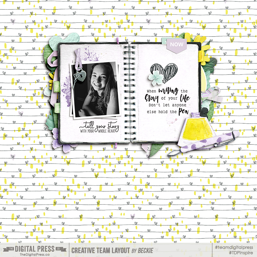
About the Author  Beckie is a creative team member at The Digital Press who lives near Austin, Texas. In addition to scrapping and photography, she enjoys spending time with her family, reading, and ignoring household chores. 

Friday Favorites | Dunia Designs

Hello and welcome to another edition of our designer feature series on The Digital Press blog in 2019 — Friday Favorites! This year, as you know, we’ve been learning a bit more about each of our amazingly-talented designers by having them share some of their favorite things with us each week.

This week, the spotlight is on Dunia Designs. This is Dunia Designs’ fifth feature here on The Digital Press blog (you can find her first feature from September 2016 HERE, another from April 2017 HERE, her Foodie Friday post from January 2018 HERE, and her most recent feature from June 2018 HERE).

This time, we asked Dunia to share some of her “favorite things” with us, and she shared a few of her favorite binge-worthy TV series…


” Right now, I love to binge-watch the following shows…

1. The Mechanism (Netflix)
When you watch The Mechanism you are led to believe it’s somehow related to House of Cards, but the big difference is that all the corruption really happened in Brazil. It’s insane to think most of the things are based on real events. It’s really exciting to watch (if you are not a Brazilian, like me, in which case it’s just sad).

2. Good Omens (Amazon Prime)
I just watched this and I’m in love! I have to say I’m fan of Doctor Who, and if you like this kind of series, Good Omens is just perfect. David Tennant and Michael Sheen are incredible in their parts.

3. Chernobyl (HBO)
For the first time they did a TV series about Chernobyl, and I remember when that happened and I was a kid. I remember receiving the news about it, every day one different and bigger, very interesting approach they have in the series and the photography is absolutely amazing.


The shows that Dunia has shared sound intriguing! I’m going to definitely have to check them out.

If you’re not already familiar with Dunia’s product offerings at The Digital Press, she has nearly 400 products in her shop at TDP. Her style is fun, colorful, and super versatile! Her templates make scrapping a breeze, and her kits are filled with traditional elements, pocket cards, unique doodled artwork, and word art pieces. If you are like me, you will be ooohhhing and aaahhhhing when you visit her shop!

Here’s a look at just a few of my favorite products from the Dunia Designs store at TDP

Here are a few fantastic examples of projects that use Dunia’s products, so you can see how lovely and versatile her designs are…


I hope you’ve enjoyed this installment of Friday Favorites.  I’m sure you enjoyed getting to know Dunia a bit better, and I bet you have found something to swoon over in her shop!

Additionally, we’ve saved the truly exciting news for last… because during Dunia’s upcoming feature week here at The Digital Press, you can enjoy the chance to score an amazing deal in her shop if you use one of the following coupon code(s) when purchasing her digital goodies (this code/sale will be valid through 11:59pm ET on Thursday 6/20). Don’t miss it!

[ if you have trouble seeing the coupon image, above, the codes are as follows: “save $2 off any purchase of $5+” by using code = DUN14-2OFF . . . or “save $5 off any purchase of $10+” by using code = DUN14-5OFF ]


About the Author  Jill W is a creative team member at The Digital Press and has been scrapping for over 13 years. She resides in Northwest Illinois. In addition to scrapping, she enjoys spending time with her family — especially her three young grandchildren (ages 6, 4 and 2). Retirement is getting closer for her, and she is anxious to travel the country with her husband, taking photos and scrapping them as they journey across the USA.

Tutorial Tuesday | PART 3: The Exposure Triangle

Welcome another edition of our Tutorial Tuesday series here on The Digital Press blog! This is Part 3 of our 4-part photography series all about the exposure triangle. If you happened to miss it a couple of weeks ago and need a recap, you can find Part 1 HERE and Part 2 HERE. To refresh your memory, in the first post we introduced the idea that photography exposure depends on three settings: ISO, aperture, and shutter speed. and we explored ISO in part 2.

Today we’ll be focusing on the aperture setting in the exposure triangle.

Aperture is the size of the “hole” that lets the light come into the camera and hit the sensor. As we saw in the first post, it’s expressed as a fraction. An aperture of f/2, for example, means that the “hole” equals the focal length of the lens divided by 2. As it is a fraction, a big aperture number will mean a small “hole” and hence less light coming in, and a small aperture number will mean a big “hole” and hence more light coming in. Photographers often say they shoot “wide open” (small aperture number) or “closed down” (big aperture number)

As I mentioned in Part 1 of this series, every setting of the exposure triangle has a “side effect.” In other words, each setting has consequences on the exposure but also on something else in the picture. The aperture impacts the depth of field of the photograph. Depth of field is the “slice” of the image that is sharp, in focus, when everything in front of it and behind it is blurry. How shallow or deep the depth of field will be depends on the aperture. Other factors, such as the lens and the distance, also come into play but that’s a topic for another blog post. For now, let’s focus on how aperture influence depth of field!

In the three next photos, I only changed my settings but didn’t move the camera or the toys. First, let’s start with a big aperture (small f/number, f/1.8 in that case). It will allow a lot of light in and will create a shallow depth of field: the “slice” of sharpness will be very small. For example, here the toys are situated one behind the other and only the one I focused on (the teddy bear on the right) is sharp. The blue bear on the front is further away from the toy I focused on than the elephant in the back, that’s why it’s more blurry than the elephant.

On this second image, I picked a “medium” aperture (f/6.3) and the subject (still the same teddy bear) is still sharp while the other two are sharper, but still blurry.

A small aperture (big f/number, f/16 in my example) will allow very little light and will create a deep depth of field: a lot of the image will be in focus. As you can see here, all three toys are sharp.

See the difference?

In the part 2 of this serie I said that ISO is a setting you can set on “auto” if you are just starting to shoot manually. That is because ISO doesn’t have much impact on the “creative” part of taking a photograph. Aperture, on the contrary, with its impact on depth of field, can totally change the image so it’s important that YOU decide which aperture to use. Do you want to blur the background of your subject? Do you want to create bokeh (this beautiful artistic blur)? Pick a wide aperture.

Do you want to have a very sharp image, where all of it is in focus, for example for a landscape photo? Do you want to create sunbursts? Pick a closed down aperture.

If you’re not comfortable using the manual mode of your camera (where you choose all the settings), you can use the aperture priority mode: you decide on the aperture and the camera picks the other settings in order to have a correct exposure. This “semi-automatic” mode is often represented by the letter A (Nikon) or Av (Canon) and it gives good results in most situations. It is a good way to experiment with aperture without having multiple settings to worry about and it is a great way to start learning about shooting manual.

In two weeks we will end this serie with shutter speed. See you soon!


ChloéAbout the author  Chloé is in charge of PR and communication for her small town by day, a digiscrapper “by night,” and a photographer whenever the light is beautiful. She recently became a very happy mom to an adorable little boy and is enjoying the last days of her maternity leave.