Friday Favorites | September 13, 2019

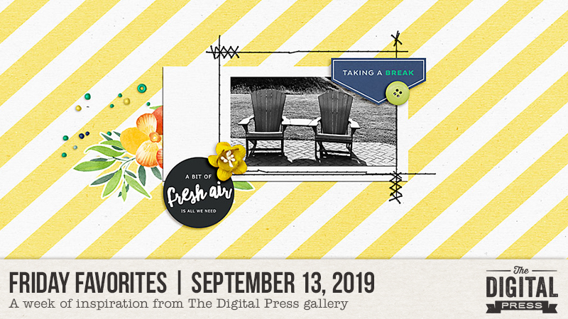
Hello, and welcome to another edition of our Friday Favorites series here on The Digital Press blog! Today we’ve got some really fantastic creative inspiration to share with you, straight from our crafty and amazing community members here at TDP.

Here’s a look at a few of the newest layouts I found in TDP’s gallery this past week (they’re linked up to the original posts in the TDP gallery, so you can click through and leave them some LOVE!)…

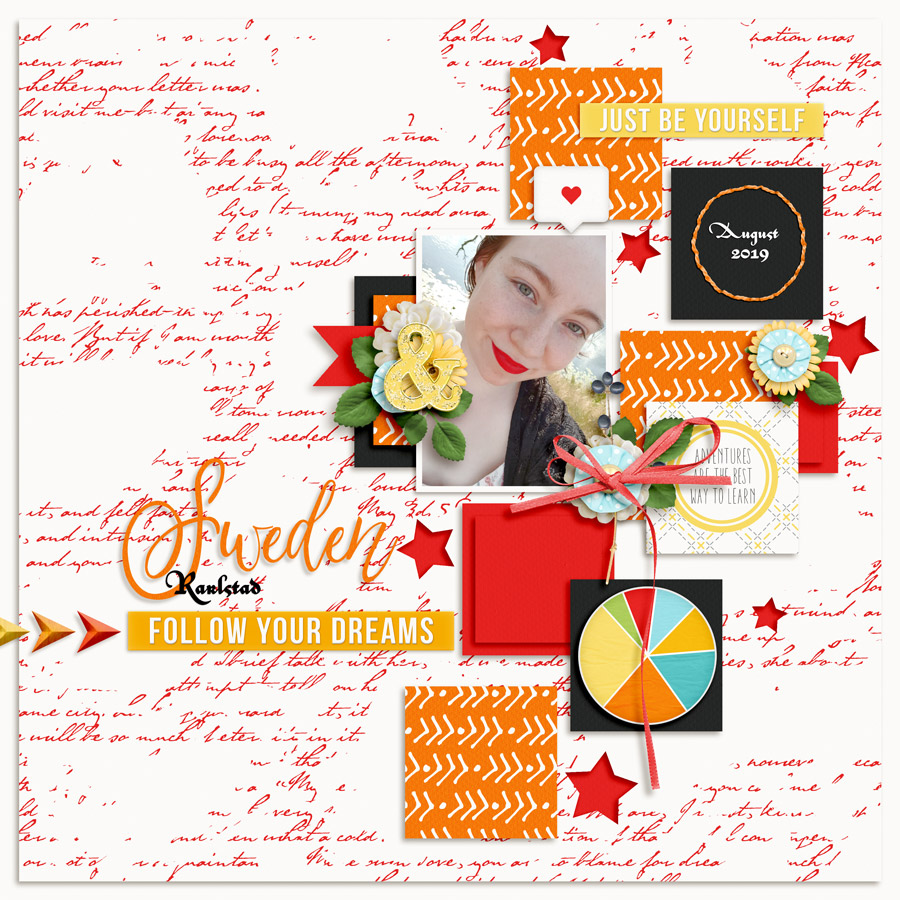
First up is this gorgeous page by Chili. I was immediately drawn to the bright colors and patterns. The picture still stands out beautifully and is really balanced with the embellishments… and that red lip color is to-die-for! 

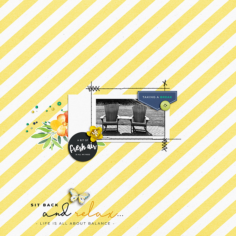
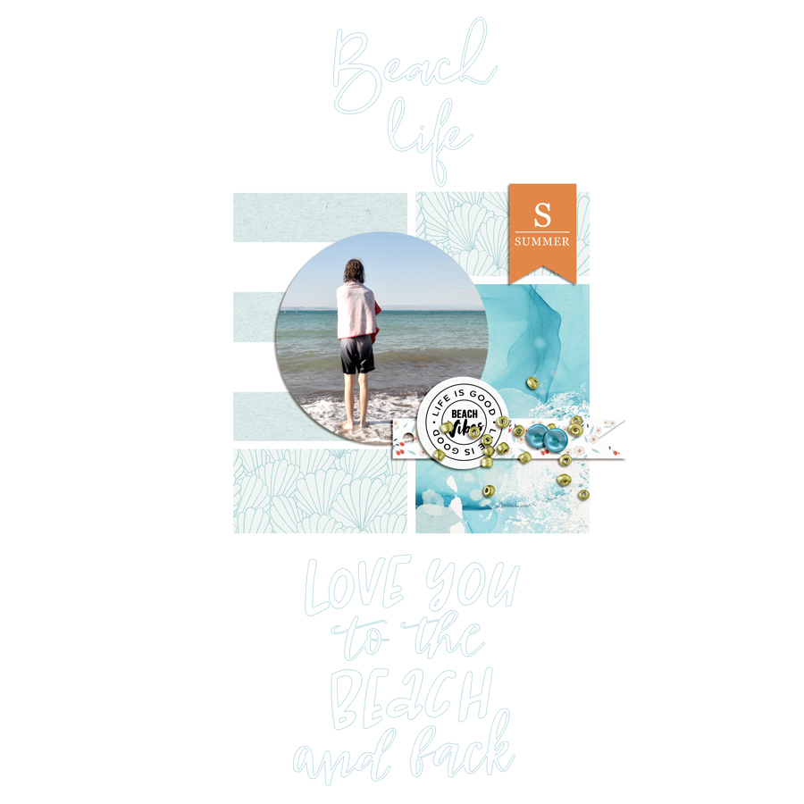
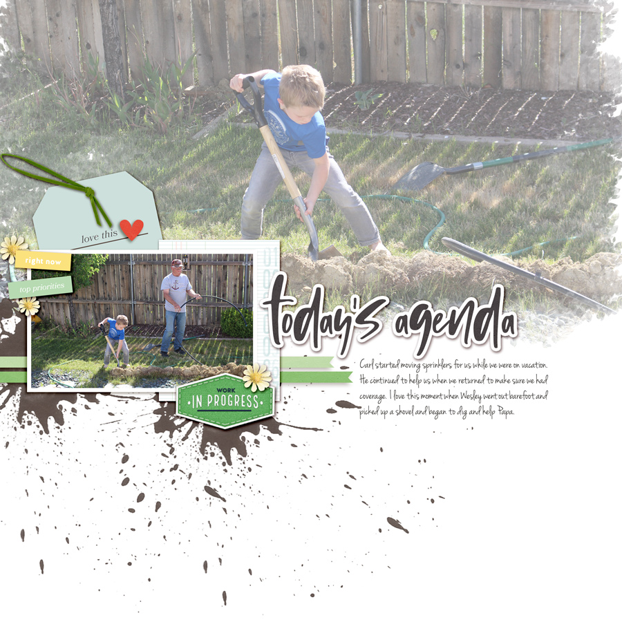
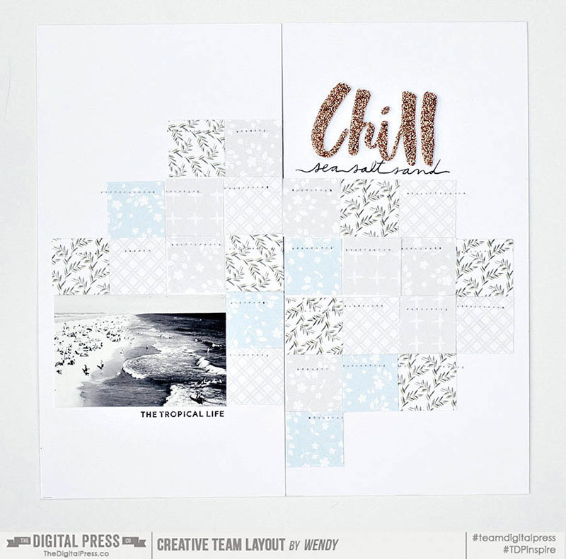
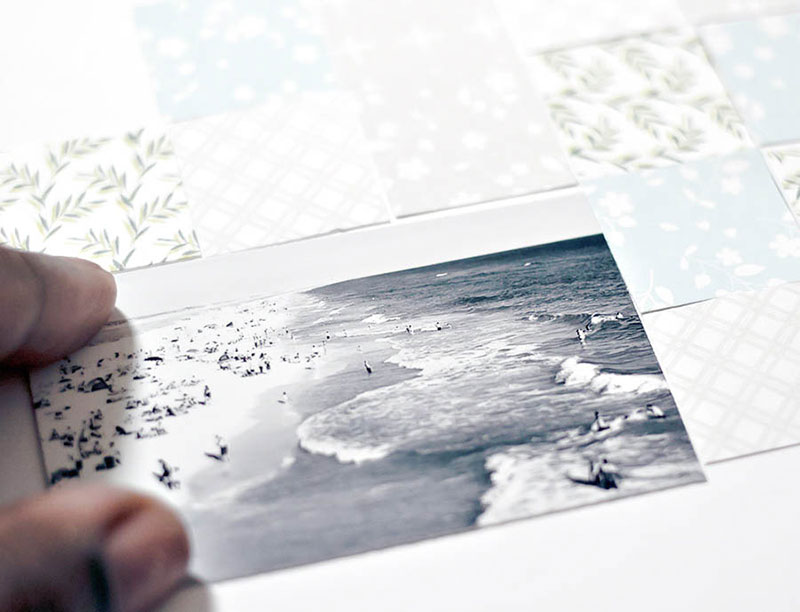
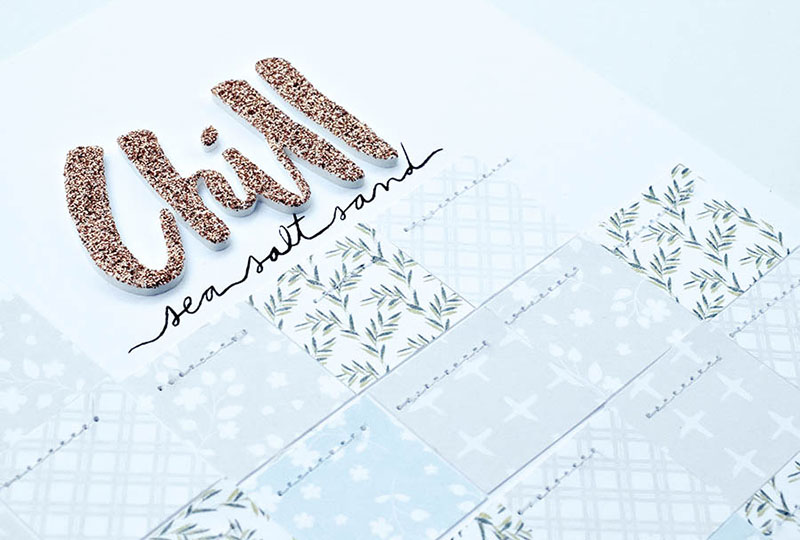
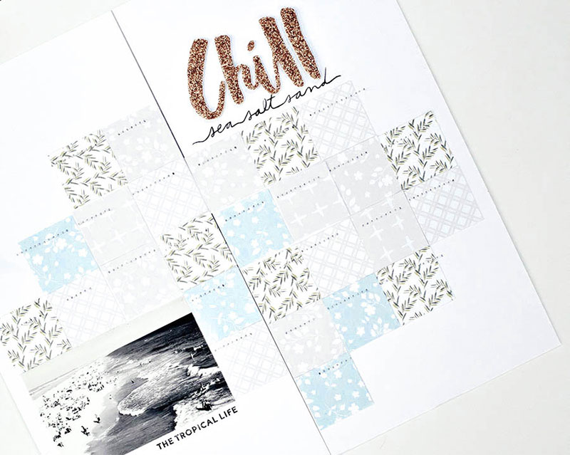
Next up is this perfectly summery and sunshiney layout by Jaye. I love the black and white photo with the colorful embellishments. And who doesn’t need a reminder to take a break, relax, and get some fresh air?

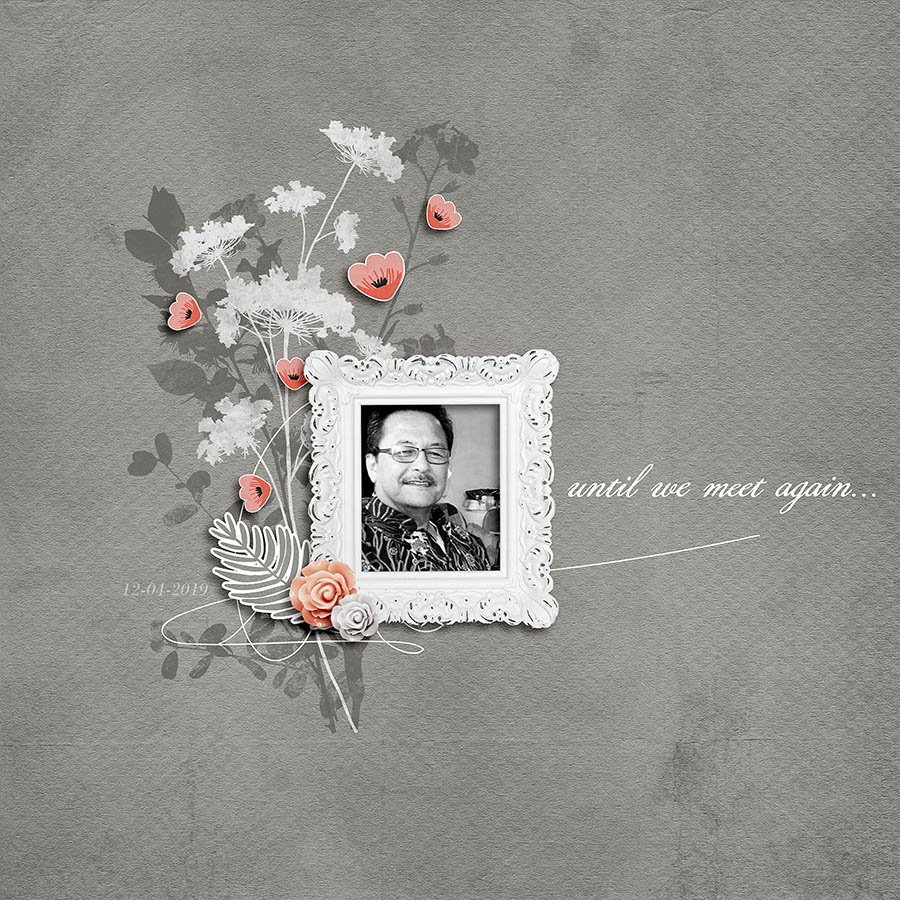
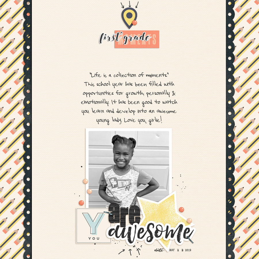
Check out this next layout by one of our very own TDP designers — Joyce Paul. It’s a beautiful tribute page. I love the flower stamps with pops of pink flowers and that black and white photo with the ornate frame…

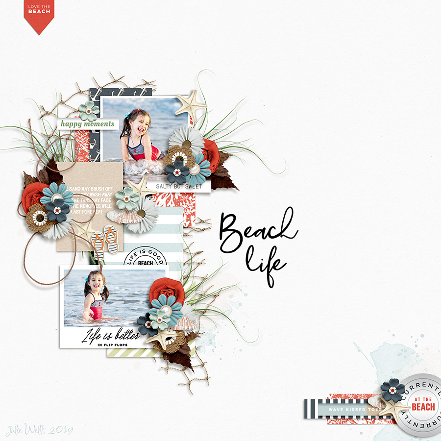
I also found some “oldies-but-goodies” in the gallery while searching around and admiring all of the gorgeous eye-candy, so I’ve included a few throwback layouts here today, as well…

First, I’m a sucker for clean lines and geometric shapes… so I really love this layout by Laurie

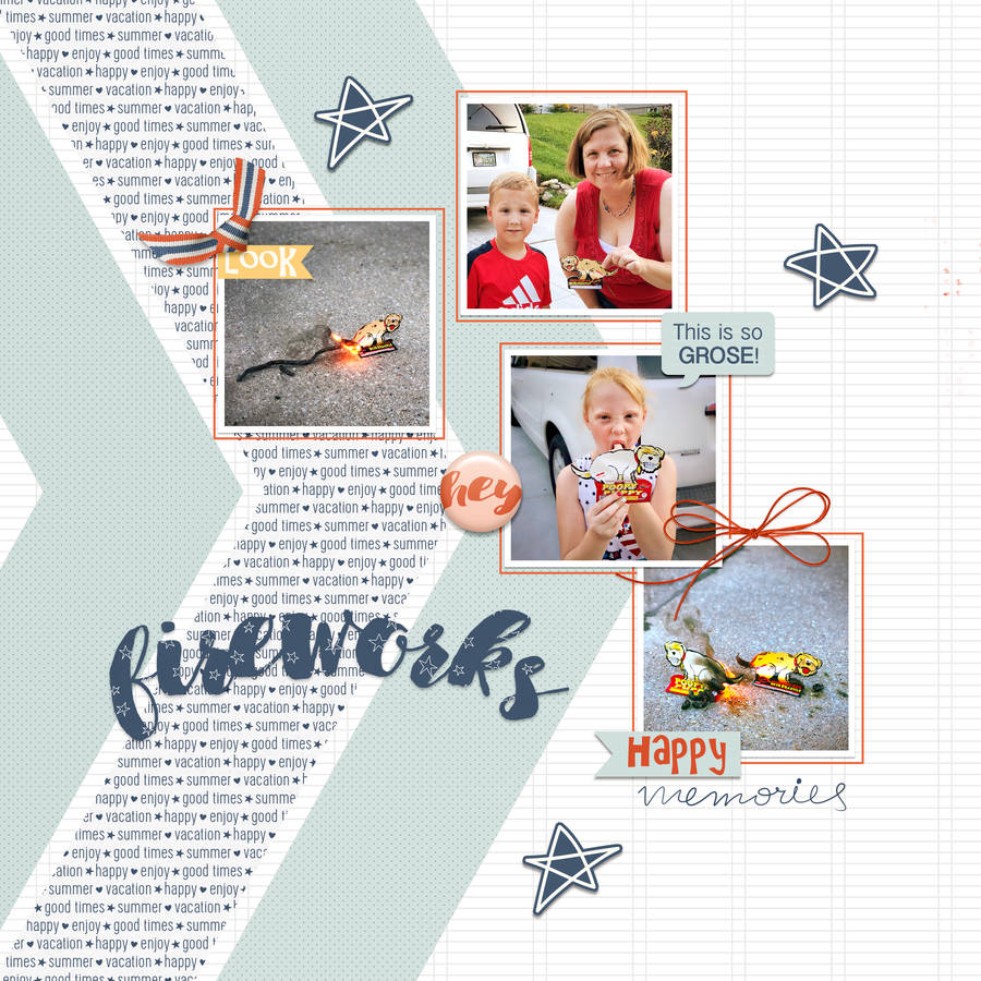
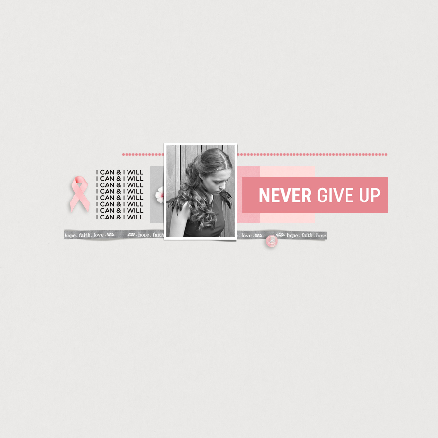
In addition to loving clean lines & geometric shapes, I big-puffy-heart LOVE white space on layouts! Or, in this case… black space. 🙂 Check out this one by rchansen

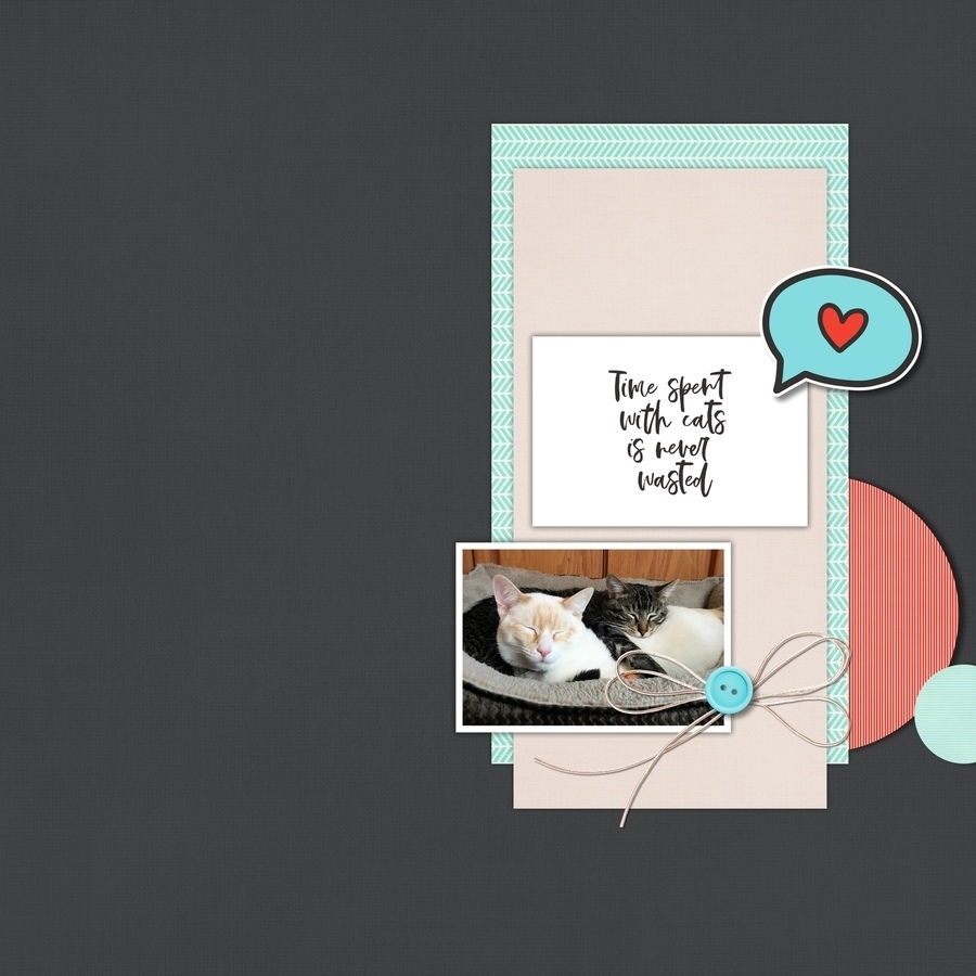
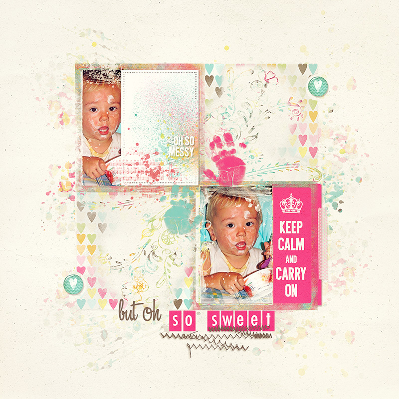
And last but certainly not least, there is also this gorgeous layout by GlazeFamily3. To be honest, I’ve fan-girled over her layouts for a long time. Her page designs are stunning and this layout with the black & white photos and soft pastel paper strips…  :::sigh:::  …it’s beautiful!

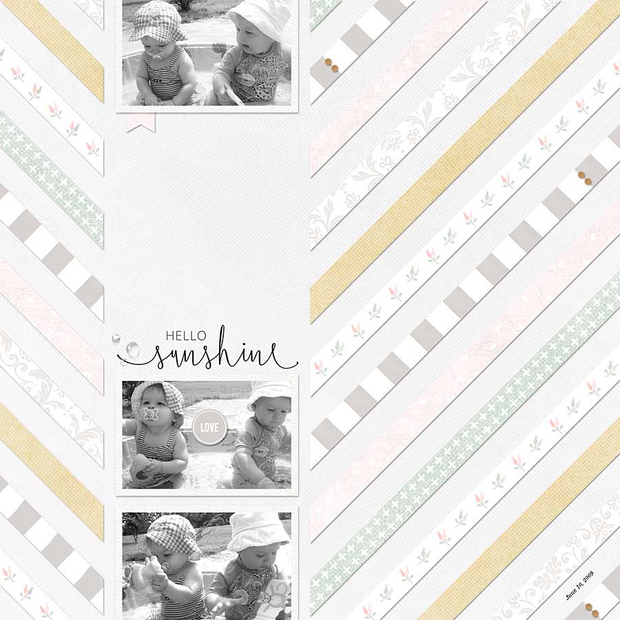
It’s always so much fun to browse through all of the beautiful inspiration that can be found in the gallery here at The Digital Press. When I’m in a scrapbooking rut, it always helps me to get me in a creative, scrappy mood!

Be sure to check out the gallery, and then head over to the shop to check out this weekend’s newest product releases so you can grab some new scrappy goodies and then post your resulting projects in the gallery! We love seeing what you create with The Digital Press goodies, and you might be featured in a future edition of this Friday Favorites series here on the blog!


About the Author  Ashley is a member of The Digital Press creative team. She lives in Utah with her husband, 2 young boys, and 1 lazy (but lovable) pup. She works full-time at a busy medical clinic. She has been scrapbooking since childhood… scrapbooking digitally for 10 years… and most recently (& obsessively) app-scrapping on her phone. 

Tutorial Tuesday | Using “Group Layers”

Hello Everyone, and welcome to an edition of Tutorial Tuesday that might change the way you scrap forever! LOL! Today I’m going to show you a trick for using the “group layers” function in Photoshop to move/adjust an entire grouping of items on your page, all at one time.

I am a little bit indecisive as a person, and that is definitely true when I am scrapping. I might think I have the page pretty much how I want it, but then I tend to fiddle and want to move the little element cluster over a bit, and make it a bit bigger, or no, actually smaller maybe and so on. I might decide that I want to try moving the main focus/photo/group of the page all the way over to the left, or go from straight lines to all at an angle. Using “group layers” is a way to do all of those things without needing to move each item individually, or lock them together. When I learned this trick, it made scrapping so much faster for me, and allowed me to satisfy my indecisive curiosity, too!

Let me give you an example. I made the following page called “Tower Bridge,” about a trip my daughter and I made to London…

[Layout created using mainly Rachel Hodge – London Take 2 Set and London Take 2 Cards]

When scrapping this page, I knew that I wanted the photo of the bridge to go across the top, so I chose my background paper and created the photo effect I wanted. So far, so good!

Next, I knew I wanted to have a photo and a journal card, with my journaling written on the background paper (and not on the journal card — that is just the kind of contrary person I can sometimes be!).

Because I knew the basic idea of the layout I wanted to create, I started to place the journal card and photo with the word art, the stickers, and the flowers, etc… until I was happy that I had the elements pretty much where I wanted them. So far, this is how the page looked…

*NOTE* If you look at my layers panel in the image above, you can see that I tend to rename the layers as I go; it is easy to do, and I like being able to find the particular element I want from that whole list of elements! I select the layer, then press OPT and double click on the layer name, and it opens a box for me to rename that layer.

Meanwhile, I had built the main cluster in the middle of my page, but soon could see that I had too much space at the bottom. I wanted to move the main cluster down, but leave the wide background photo where it was at the top. This is when the “Group Layers” function is so handy!

All you need to do is…

  1. Select/highlight the layers you want to put into a group (you need to hold down CTRL (PC) or COMMAND (Apple) and click on each layer you want to select, so that each layer is highlighted in blue).
  2. When the layers you want in your group are selected/highlighted, click CTRL+G (PC) or COMMAND+G (Apple) and it will put all of those layers into a group for you. I often rename the group at this point (for example I named this group “main group”). Now I can click on that group name, click COMMAND+T, and move the whole lot in one go. I moved it down a bit, so that I could have space for a title up at the top, and less space down at the bottom. If you click on the little triangle next to the group name, then you will be able to see all the layers in the group. Click on the little triangle again, and the list condenses into just the group name/file.

*A handy tip — if you “Group Layers” when you have only a few layers, it is faster… and any layers you add after you’ve already made that group are added into the group “folder” also, unless you move them out of the folder. You can even create a group before you have any layers to go in it.

So now that I’d moved everything in that group downward on my page… there was some space to add a title above the main cluster. This time I started a group called “TOWER title” before I opened any of the alphas because I knew I was going to use a couple of different alphas that I would then want to keep together, and that would mean a lot of layers to keep track of. I know I could have made the title and the merged the layers into a single layer, but as I mentioned, I am indecisive and I like to keep them separate until the last minute, so I still have options! Here is how it looked with the title…

(I get “group happy” and actually I have a “stencil tower title” group and a “stamp tower title” group, and then the “bridge” layer separately, so I can fiddle with each of them independently)

At this point, all that was left to do was to add the journaling… and I found I had more space than I needed for that journaling. Therefore, I decided I wanted to make that main cluster and title a little bigger. It was sooooo handy to only need to select my “MAIN GROUP’ and “TOWER title” to adapt all of them to suit my needs!

There are all sorts of things you could play around with using the “Group Layers” function. For example, I could have decided to move the main cluster over to the left of the page (but with this particular page I wanted to create a bit of a subtle “T” using the wide photo at the top and then the block of other “stuff” as the vertical section of the letter T). I have also been known to duplicate the title or text box so I can flick between different fonts or different colors until I decided which I preferred. I’ve also been known to duplicate the main cluster to tilt it a bit for a quirky angle. Sometimes, if I have created a flower cluster, I have duplicated the cluster and then moved the duplicate cluster to another location on the page and then tweaked it a bit, but I’ve found it useful to have the main structure of cluster already done.

You can see the final result of my page up at the top of this post. The wide, bridge photo has never moved, while the main cluster of photo, journal card, word art and other elements, were all adjusted with a few simple clicks of the keyboard throughout my scrapping process.

I hope this might be an easy trick that you find useful… something that helps neaten up your process (and if you are like me, maybe it can speed up any decision making you tend to dither over)!


CorrinAbout the Author Corrin is a member of the creative team here at The Digital Press. She is a fan of the Big Bang Theory and a lover of cozy pajamas or flip flops when the sun finally shines! She lives in the breezy South of England with her husband and 4 crazy kids, who regularly discover & plunder her secret chocolate stashes, and hopes that maybe this will be the year she reaches the bottom of the laundry pile!

Friday Favorites | September 6, 2019

Hello, and welcome to our newest Friday blog feature here at The Digital Press. I’m excited to bring you the first post in our newly-ravamped Friday Favorites series, where we will be sharing some creative inspiration from our amazing community members here at TDP every Friday!

Here’s a look at a few of the newest gems I found in TDP’s gallery this past week (each page is linked to the gallery so you can leave the original artists some love)…

First up is this fantastic layout by Mother Bear. I just love the clustering on this page — all those tiny little elements, so carefully layered together. The flow of the page is great, too, with that simple red tag at the top starting your journey and pointing the way to the fun photos. Did you notice how the color palette for the layout mimics the colors in the photo?

Next up is another beachy layout I chose from Anne PC (it’s the end of winter in Australia, so I’ll take all the warmth and sunshine I can get!) — and what caught my eye here was the mix of shapes. The circular photo layered on top of the patterned paper grid design is a great idea that I might have to steal on one of my future layouts! The summer tag also adds a nice pop of color against the predominantly blue and white page.

I also loved this page from ElaineU. Back-to-school pages are big in the gallery right now… but how about an end of year layout? Look at that smile! Quick pages can be great ways to catch up on your memory-keeping. Add a great photo (the choice of black and white photo was brilliant here) along with some journaling, and you’re good to go.

While browsing the gallery and admiring all the gorgeous eye-candy, I also found a few older “throwback” layouts in the gallery to share with you today, as well…

First, this simply yet lovely page by sylvia. I love the clean lines of this layout, and the pinks against the grey create a softness. A few dimensional elements just add that special ‘something’ to the page.

This next page by Margie just drew me in right away… not only for the adorable photo (oh my, cleaning that face would have been fun!), but also for the layers of brushes and stamps. Like the other page above, just a few elements is all it needs.

My final page to share with you today is this one by knclark of Papa’s little barefoot helper. I really like the larger, slightly blended photo that highlights the young man’s efforts. The paint splatters remind me of mud, too.

I hope you’ve enjoyed the first installment of our newly-revamped Friday Favorites series today! I had so much fun looking through the pages of inspiration that can be found in the gallery here at The Digital Press. Whether I’m in a scrapping rut and looking for ideas, or I just want to see what everyone’s been up to… the gallery is always a great place to look around.

Meanwhile, if you’re looking for even more scrappy inspiration… check out this weekend’s New Release products, as well… and then get creative, add your projects to the gallery, and perhaps you will be featured here in a future Friday Favorites post!


About the Author Kat Hansen is a creative team member here at The Digital Press. A HR Manager in the real estate industry by day, she loves the opportunity to spend a few hours each evening being creative. Vacation memories feature pretty heavily in Kat’s scrapbooking pages, as well as her health and fitness journey. Kat has quite the sense of humor (she “blames” her father for this), which she incorporates into her journaling and memory-keeping.

Tutorial Tuesday | Minimalism & Sharing Digital Scrapbooks

Hi there scrapping friends, and welcome to another edition of our Tutorial Tuesday series here on The Digital Press blog!

This week, I’m here to share a topic this week that’s a bit near to my heart. It’s an answer to the question — how do I store my scrapbooks and share them with friends and family across the miles — AND take them with me wherever I go?

A few years ago, I got on a huge minimalism kick. Inspired to declutter my life, I went through my entire house and sold or donated carload after carload of clothes… unused electronics… unnecessary furniture… books… oooooh, so many things!

My minimalist ambitions were even more motivated by an insatiable desire to travel that I share with my husband. We are basically digital nomads, and rarely stay in one place for very long. Over time, though, I found that it bummed me out that I didn’t have a great way to take my scrapbooks with me, since I like to look back on them often. On top of that, it got really old, really quickly to have to lug around box after box of super heavy scrapbooks every time we moved — whether the traditional paper scrapbook albums of my past, or even the books & albums I printed from my digital creations.

In addition to all of that… here I had all of these wonderful albums of memories with friends and family, but these books were only sitting on my coffee table. I wanted to share the albums with the friends and family who were featured in them… and those friends and family live all over the country, which makes sharing a physical book rather difficult.

So with a desire to share these memories across distances, minimize my household, and be able to take my books with me wherever I go… I decided to find a way to share my scrapbooks digitally.

How to do this?

Well, there are obviously social media sites like Facebook, Instagram, and Pinterest where we can share our layouts (and I do!)… but I wanted a way to share a full album, with the option to have it private, and I wanted it to “feel” like looking through a physical scrapbook.

Therefore, I did a lot of research and enlisted the help of my tech-savvy husband to find a solution that worked for me.

What I want to share with y’all today is a few ideas of ways to do this — in case anyone is in a similar boat. There are several services out there that let you upload your own layouts and share either a gallery of images (in our case, a gallery of layouts) or full albums created from a collection of layouts. To name a few:

  • Shutterfly — you can upload and digitally share a scrapbook album
  • Snapfish — you can upload layouts and share a gallery (but not in “scrapbook album” format)
  • SmugMug — you can upload layouts and share a gallery (but not in “scrapbook album” format)
  • Mixbook — you can upload layouts and share a gallery (but not in “scrapbook album” format)
  • Flickr — you can upload layouts and share a gallery (but not in “scrapbook album” format)

What I personally ended up finding is that while these were all great services, none were geared specifically toward digital scrapbookers in the way that I wanted.

My husband is a computer programmer, and in order to help me out he ended up creating a brand new service just for folks like us! It’s called ShareMyScrapbook, and it is now the site I prefer to use. It’s got a really simple interface: I can see all of my scrapbooks at once, digitally-stored, and easily shared (see below)…

For each album, when I click into it, it feels like looking at a real physical scrapbook…

There are options to create albums that are either single page spreads or double page spreads, and you can set your albums to be either public or private.

Then, something I really like, there is a way to enter credits for which designer’s products you used for any given page, as shown here…

And the albums are super easy to share. There is a unique link for each album that you can email to friends and family or post on Facebook.

So now… everything I create is available everywhere I go, there are no heavy boxes to lug around, and my albums are easily shareable across distances. It’s the perfect solution for a gal who wants to keep things simple and yet wants to carry her memories with her everywhere!

And I feel like I’m not the only one who has some of these problems… so I thought it would be helpful to share this solution here on The Digital Press blog in case you’ve been looking for something like this to simplify your own memory-keeping!

Though ShareMyScrapbook.com is my favorite because it was designed specifically for digital scrapbookers, the other services mentioned above (and there are probably tons more, too) can be used in a similar fashion to share your beautiful layouts with people you love!


About the Author  Shannon has been completely addicted to digiscrapping since she began in early 2016 (though she’s been a scrapper since 2000). Her early morning ritual of a few quiet hours of scrapping while sipping a chai tea is her favorite part of each day. She is also the owner of a web design company, and when she’s not at the computer designing websites or digiscrap layouts, she’s probably hiking one of the local mountains in her hometown of Phoenix, Arizona. She is an avid reader and loves to travel to foreign countries.

August Blog Break

This is just a quick note to remind everyone that The Digital Press, in keeping with our annual tradition, is taking a short blogging break during the month of August!

In the meantime, if you find yourself missing our Tutorial Tuesday series between now and September… come take a peek at our archived tutorial posts, and give one of the techniques a try!

If you love learning about our designers and getting a peek into their lives… you can check out the archived designer feature posts.

If you love printing our products and making pretty physical projects, but need a little extra mojo… delve into our archived Hybrid How-To posts and get your creative juices flowing!

And finally, if you are looking for something non-scrapbooking-related and you love food… come take a look at our archived Foodie Friday posts (including our Summer Camp Mess Hall features!).

We’ll see you again in September…

Hybrid How-To | Use of Patterned Papers

Hello everyone, and welcome to another edition of our Hybrid How-To series on The Digital Press blog! Today I am here to show you how to use multiple patterned papers from your favorite digital kit(s) on your next hybrid scrapbook page.

For the purpose of this tutorial, I added my patterned papers onto a Traveler’s Notebook spread. You can see the final result here…

If you are a lover of patterned papers, then this post is a shout out to YOU!

How many times do you find yourself completely in love with more than 1, 2, 3 (or more!) patterned papers in a collection… and wanting to use ALL of them on your layout? Decisions, decisions… right?! Well, let’s dive into how you can please your palate for all of your patterned paper dreams.

For my layout, I decided to use the Monthly Chronicles March 2019 Nurture collection, shown here…

Here’s a better look at the papers that were available for me to choose from, within this collection…

To begin my project, I used my paper trimmer and cut 1” strips of paper, as shown here…

Then, I turned each stack of paper strips 90 degrees and used the trimmer again to cut the strips into 1″ x 1” squares.

The reason I love using small pieces in this way? You’ll find that you can maximize using multiple patterned papers on a layout by using a shape punch (i.e. square, circle, triangle…) to really spread the love to all your chosen patterned papers. You can also use your die cutting machine (i.e. Cricut Explore Air, Silhouette Cameo, Sizzix Big Shot, etc.), or even freehand with scissors to evenly cut out your preferred shapes.


Sprinkle Patterned Paper Mini Bits Here and There…

Once I had a sampling of paper pieces to work with, I staggered my patterned papers for a smooth flow in which the overall design is not in a block or predictable square format, if that makes sense (scroll up to my layout example image, above, and you’ll see what I mean). I prefer the eye to flow to different levels throughout the layout for interest and pop.

One important recommendation — I think it’s best to lay out your design FIRST, instead of immediately gluing down your papers with a permanent adhesive. You might want to change around a few squares or so here and there. Once you have permanently glued everything down, you are committed. 🙂


Choose a Dominant Patterned Paper as Your “Showcase” Paper…

A dominant paper would be one that has a busier, bolder or stronger pattern than the others you’ve chosen to use on your layout. For example, on my layout, I chose my dominant pattern paper as the fern/leaf paper. It was a bit bolder in color and pattern than my other papers, which were all more toned-down in neutrals or pastels and design flow. If you look at the final project image, up above, you’ll see that the squares of paper with the fern pattern just stand out as a tiny bit bolder/more noticeable.

You’ll want to be careful with your dominant paper so that you don’t use it too often in your layout. I like to design in “odd” numbers for balance and eye flow. So, I cut 7 squares for my dominant paper that would not overpower my other choice of papers.

Mix and Match Your Patterned Paper With Photo(s) and/or Journaling 

I chose a minimal flow for my overall design, and decided to have one photo as the focal point of my layout. Also, I toned down the photo by printing it in black and white for a smoother transition into the multiple patterned papers (as they are various colors within themselves).

If you add a color photo, you want to be careful with your dominant pattern paper choice, as well as the rest of the coordinating papers of choice on your layout. Otherwise, things can end up being too bold and overpower the photo itself.

Finally, you’ll see in this next image that I planned my layout design out ahead, in order to leave a space at the top for my title work in addition to the space for a photo at the bottom left…

Here’s one more look at the finished project…

Hopefully these ideas will be helpful the next time you consider printing out a few of your favorite digital papers to add to a physical project!

I challenge you to choose 3-4 of your favorite pattern papers from over in The Digital Press shop on your next layout! We can’t wait to see what you come up with after you try out my tips for inspiration. Load up some projects in the gallery and link us up in the comments, if you do!


About the Author  Wendy has a strong passion for the arts, lots of creative spirit, and is fearless in working with new products and techniques. During the day, she works full-time as an Audit Manager. Wendy and her family live on the Gulf coast of emerald waters in Navarre, Florida. Her husband is from Italy and is an amazing Executive Chef at an Italian restaurant in Navarre. Her daughter is a Yorkie named Principessa. Wendy has over 20 years of experience in the scrapbooking industry. She has been published several times in print and online scrapbook magazines, and has designed for several manufacturer’s creative teams. Wendy is currently designing for The Digital Press as a hybrid artist.   Also, Wendy is on the Creative Teams for Feed Your Craft, Sahin Designs, Everyday Explorers and Creative Memories.Â