Tutorial Tuesday | Google Photos for Photo Organization

Hello Everyone, and welcome to another edition of our Tutorial Tuesday series here on The Digital Press blog! Today, I’m here to teach you how you can use Google Photos to organize all of your family’s photos in one place.

Today I hope to share with you a solution for organizing your photos — both the photos you have on your phone, and those you have stored in various places on your computer.

First off, a little disclaimer:

I don’t claim to be an expert on all the ‘ins and outs’ of how Google Photos works. I just know how I use it to organize my photos for my own scrapbooking purposes, and what works for me. There may be faster, better ways of doing things (share yours in the comments, below!)… but this is what I’ve discovered as I’ve been using it for the last few years. This is also in no way an advertisement or an endorsement of using Google Photos over other options; again, it’s just what I use, and one way to do this in the sea of many.

If you are okay with that, then here we go!


Google Photos allows users to upload photos from any mobile device and provides free unlimited storage for photos up to 16 megapixels or videos up to 1080 HD. To store higher quality photos, there is an option to use Google Drive storage, which charges a monthly fee after 15 gigabytes — $1.99 a month for 100 GB and $9.99 a month for 1 terabyte.

I just use the free option, which works great for me, and I’ve got over 10,000 photos stored there so far!  All it takes is a Google account. If you’ve got a gmail address for your email, you already have access to Google Photos!

You can also download the Google Photos app on your phone, and set it up to automatically sync the pictures you take on your iPhone into the Google Photos program. I can’t remember how exactly I set that up on my phone, but it must have been pretty automatic when I downloaded the app, because I don’t remember a whole lot of setup after that.  If you have questions about setting your phone up to auto-upload your photos… you can Google it. 🙂 LOL

When it comes to organizing my pictures on Google Photos, I use the desktop version rather than my phone using the app. What I’ll be talking about today is for the most part all done using the desktop version of Google Photos.

First, go to photos.google.com.  Here you can see all the photos that have synced from your phone, or that you’ve uploaded (which is as easy as dragging and dropping from your computer) by clicking into the PHOTOS menu (one of the main buttons on the side, once you’re in Google Photos).  By default, Google Photos stores all your photos arranged by date, in a huge long list. This is really handy if you know the date your photos were taken…but if you don’t, then you’ll need to organize them.

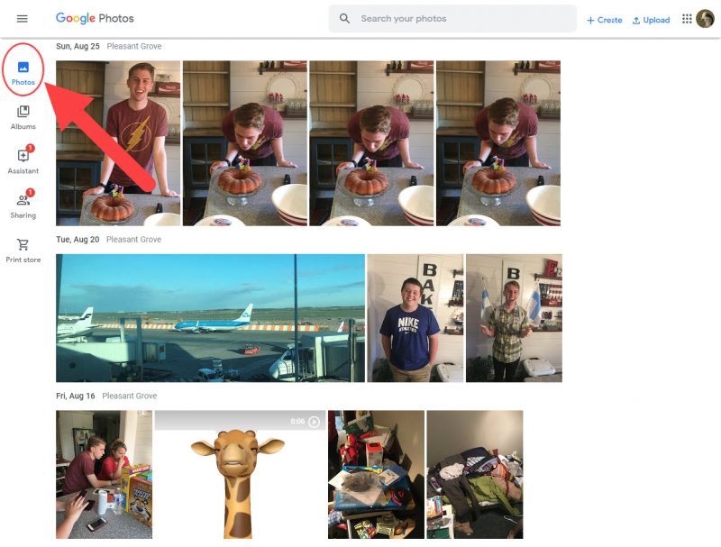
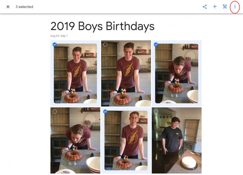
Before you can organize your photos, you need to select which ones to work with. So you need to click on individual photos to select them. When you hover over the picture with your mouse a little checkmark icon appears in the top left corner of the picture. Click that circle to select a single picture or select several at once.

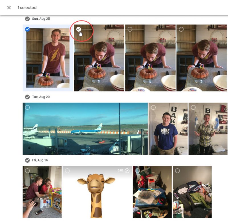
The bar across the top of your screen lets you know that you have “X” number of photos selected. On the right side of this bar is a + icon. Click it.

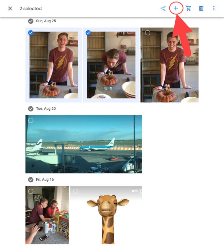
This gives you couple of different options, such as creating a new album. In Google Photos, albums are like folders where you can store pictures in categories. I use the albums just like that, as a way to organize my photos.

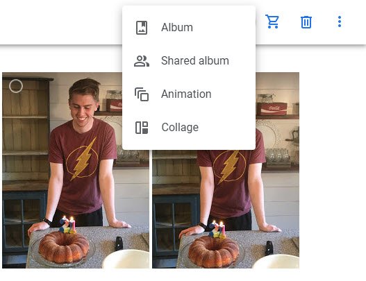
When you click the Album option, a new screen appears asking if you want to create a new album, or if you want to save the pictures into an existing album and then lists previously created albums. For the sake of this tutorial, we’ll create a new album, but if you were to select an existing album, your selected photos would be added into it. But your photos will always still be arranged by date within that main PHOTOS area of Google Photos.

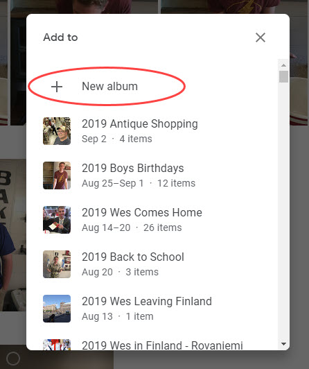
Creating a new album puts your selected pictures together on the screen.  Now it’s time to give the album a name. I have a system where I name the album with the YEAR and then a short DESCRIPTION of what the photos are all about. For example, I have albums named 2016 Graduation, 2009 Easter, 2014 Yellowstone, etc. Type a name for album and then click the checkmark in the banner across the top of the page to save it.

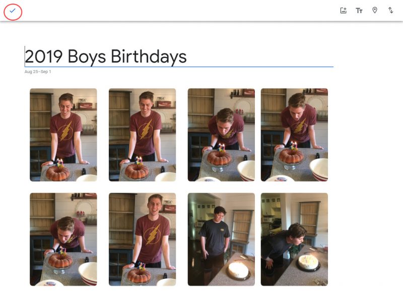
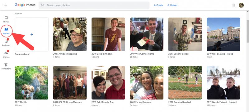
And that’s it. That’s how easy it is to organize your pictures within Google Photos! Once albums are created, you can access them all at once by clicking the ALBUMS option on the left side of Google Photos.

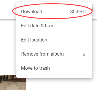
Once I have my pictures arranged into albums, I slowly work to get them scrapbooked. When I’m ready to make a page, I log into Google Photos, and find the pictures (or album full of pictures) that I want to use. I select my photos and then click the three dots button in the top right corner of the page.

Then I select the DOWNLOAD option, and download those pictures onto my computer desktop, so I can drag them into Photoshop and create my scrapbook page.

Then, after I’ve created my page, I want to make a note to myself that I have scrapbooked those photos, because let’s face it, the old memory isn’t what it used to be!

I go back to Google Photos and click the ALBUMS button to bring up all my albums. I find the album the photos came from, open it up, and I change the name of the album by adding an asterisk (*) to the beginning of the album name (for example: *2016 Graduation). This is just an indicator to me that I have scrapbooked those photos.

Believe me, you will be glad that you have some way to know what’s been scrapbooked and what hasn’t after you’ve made a few hundred scrapbook pages, or if you take a break from making pages for a while!

BONUS INFO

Now for a couple of cool things that Google Photos does.

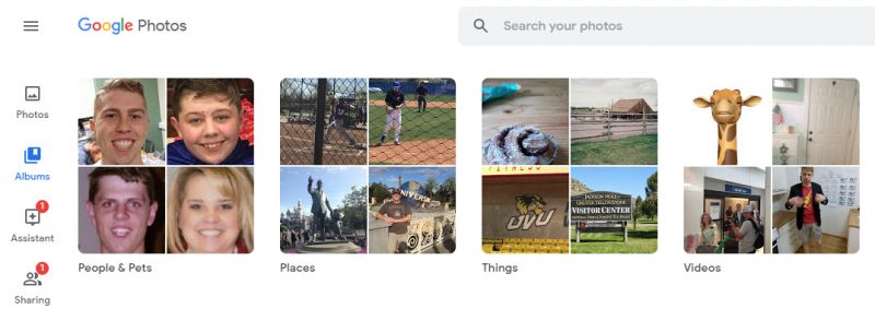
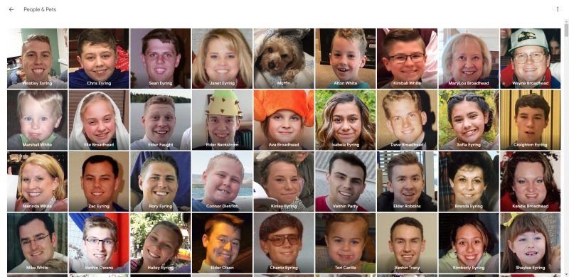
Once you have several hundred photos stored in Google Photos, try clicking the ALBUMS button. There should be groupings along the top of the page for PEOPLE & PETS, PLACES, THINGS, & VIDEOS.

If you don’t see these, it may be that you haven’t stored enough photos for Google to have enough info to create these groupings. I have found that you need to have at least 500-1000 individual photos stored in Google Photos before these options pop up.

Because Google is first and foremost, a search engine, it tries to make your photos easier to search through by creating these groupings. My favorite grouping is the first one: PEOPLE & PETS.

Click on PEOPLE & PETS and you will see a collection of individual people’s faces from your photos.

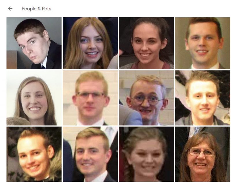
If you click on one of the faces, it will open a new screen where it shows you each album that face appears in (at the top of the page) and each photo the face appears in (at the bottom of the page). You have the ability to Add a Name to the face. Basically, you are telling Google who this person is, and it will use some behind-the-scenes-magical algorithm to locate and “auto-tag” that person in other photos within Google Photos.

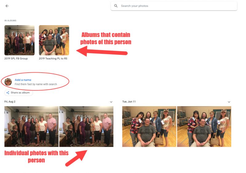
So if the person’s face you clicked on is your son Bob, where it asks you to Add a Name, type “Bob”.  Google Photos will now “recognize” Bob, and as  you add more photos of him in the future, it will continue to list the additional albums and photos in which he appears here on the page, or whenever you perform a search using his name.

And because Google is a search engine, once you have started adding names to some of the faces using the above method, you will actually be able to perform a search within Google Photos for “Bob” or “Aunt MaryAnn” or any of the names that correspond with the faces you have tagged, and it will locate every picture they’re in that you’ve uploaded! How cool is that?

This is super helpful, especially if you know in your mind what a photo looks like, but can’t remember the year or event album it’s located in. Just enter the person’s name in the search field and all the photos they are in display, making it visually easy to find what you are looking for.

In my experience, (and I have stored thousands and thousands of pictures in Google Photos), I have found that the facial recognition search engine is highly accurate, even across faces that have aged considerably. But, at times, it will “mistake” a face. This happens most often with my wife and her sisters. It pulls up a picture of my wife’s sister Carolyn thinking it’s my wife, or that my mother-in-law is my wife (much to my wife’s horror!) But before we get into how to correct that problem, let’s talk about another similar one.

Let’s say that you have begun tagging faces as described above, and you’ve already labeled your wife’s face with her name, but it pulls up another picture of your wife that it doesn’t recognize as her. Tap on the face and it will prompt you Add a Name again. Type in the first few letters of the name, and it will show a list of matching names you have already tagged. Click the name of the person in the photo and Google Photos will ask you if the photo you clicked on is the same face as one you previously added.

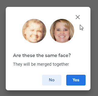
If it is, click YES, and Google Photos will “learn” to recognize those facial features as the same person. This happens a lot if you have tagged photos of babies/children and then their face shows up again as an adult.

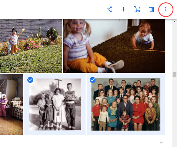
Which leads me to the opposite problem. What if, when you do a search for “Cousin Edgar” it shows in your search results some photos that quite obviously are not your dear cousin. You can also teach Google Photos when it has made a facial recognition mistake.  When you are looking at the list of matching results, select the photo that is mis-tagged by clicking the little circle icon on the photo itself (in the top left corner).

This will add a checkmark and select that photo (you can select multiple photos this way, too). At the top right corner of the page, click the three vertical dots button.

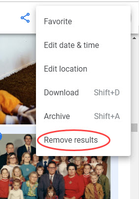
Then select REMOVE RESULTS. That photo will now longer show up in “Cousin Edgar” searches. Easy peasy!

So, in a nutshell, that’s how I organize the pictures I keep stored on Google Photos. And every few weeks as I’ve upload more photos, I do a quick face-tagging round and call it good.  Pretty soon, when you click on PEOPLE & PETS, you will have a big collection of faces you’ve identified, and you can click on any of these to quickly open a collection of photos that person is in.

Google Photos has recently added PET face recognition as well! So if you have taken photos of your dog or cat (haven’t had it work on pictures I took of my ducks, though LOL) you can tag those with your pet’s name just like you did Cousin Edgar!

But…..you will have a collection of faces that you don’t/can’t identify. Google Photos pulls in EVERY face from your pictures, even those of bystanders in the backgrounds of photos, so I just identify the ones I can and leave the rest alone.

And one last thing. You can also search your Google Photos for other keywords, too. Want to quickly find pictures from the beach? Try searching for the word “beach”, or “palm tree” or “ocean”. Google Photos finds pictures in your albums that it thinks match your search words! You can also try looking in the THINGS or PLACES groupings like you did with PEOPLE & PETS. There’s a lot of meta-data stored in your photos, and Google Photos uses those to try and store your photos geographically in the PLACES grouping.

Well, that’s about all I know about Google Photos, and what little I know I have learned from just playing around with it.  Let me know your experience with beginning to use Google Photos (or if you are experienced, some tricks you’ve learned) in the comments!


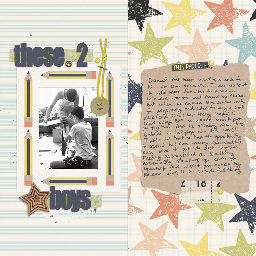
About the Author Sean is a native New Mexican who fell in love with a Utah girl 25+ years ago and never went home! He is the designated scrapbooker in his family, preserving the memories of his wife, two sons, and dog Muffin. He loves all things Disney, Harry Potter, and anything related to his favorite animal, the duck! When he’s not writing long-winded blog posts, he’s probably scrapbooking on his phone or computer. He joined the Creative Team at TDP in February 2019.

Hybrid How-To | Halloween Memory Game

Hello everyone! It’s Tanya here, and I’m excited to bring you another edition of our Hybrid How-To series here on The Digital Press blog! Today I’m going to show you how to use your digital supplies to make a cute kids’ Halloween-themed memory game. It’s a super easy project that can even be given to your child’s classmates instead of candy (we all know there will be enough candy already, right?).

First things first… a peek at the Halloween-themed kits from the shop at TDP that I chose to use for this project…

Witch Please by Rachel Etrog Designs

The Haunted House by Julia Makotinsky

Color Blocks: Halloween Elements by Julia Makotinsky

SUPPLIES NEEDED:

  1. Themed digital products (see my choices, above)
  2. White cardstock paper
  3. Double-sided tape
  4. Paper cutter or scissors (or a cutting machine)

I used Silhouette Business Edition to create this fun project; I use it for all my projects because I find the software pretty easy to use. However, using a cutting machine and related software is NOT necessary; you can also create the same thing using any photo editing software program, and some scissors or a few paper punches.

HOW TO MAKE THE MEMORY GAME:

The first step is to draw out a shape for your game pieces (I used the rounded square)…

This project will have two sides: one side with just patterned paper, and the other with the elements. After choosing a shape for the game pieces, it’s time to fill-in one side with patterned paper (if you’re using another photo editing program like Photoshop, etc… you can use your shape as a clipping mask and “clip” the patterned paper to the shape).

Once applying your paper to your game pieces shape, you can alter the pattern size, if desired…

Now, you’ll replicate this shape/pattern combo across the page… by grouping that selection and then replicating down…

Once the page is filled, you will turn ‘on’ the cut lines (if using a cutting machine), put on your mat, and run it through your cutting machine…

Make sure to keep your image from touching any of the registration marks.

Next, for the back of the game pieces… you will first fill with the paper pattern of your choice, and then add elements on top of that. Make sure to use each image on two separate game pieces (to allow for a match!)…

*TIP* You can use on sheet of paper by drawing a large square out and filling it with paper of your choice (no cut lines for this side)  Once printed flip it over, put pack in printer and cut the element side of the paper.

After cutting both pieces out, you will use double sided tape to put them together.

I created two different sets of the game… and I had to stop myself from making a third!

Here’s a look at some of the finished game pieces…

I hope I’ve inspired you to use your own digital products to create this fun game! If you give this project a try, we would love to see pictures of your completed projects in the Hybrid Gallery at The Digital Press!


TanyaAbout the Author  Tanya is a member of the hybrid creative team here at The Digital Press. She has been paper and hybrid crafting for at least 18 years now, and loves creating and sharing those creations with others. Her all-time favorite tool is her Silhouette Cameo. She has been married for 30 years to her high school sweetheart, Richard, and has two sons: Chris, 28 and Chance, 23. She also enjoys crocheting, photography, and woodworking.


Friday Favorites | September 27, 2019

Hello, and welcome to another edition of our Friday Favorites series on The Digital Press blog! I’m excited to bring you yet another post in our newly-ravamped Friday Favorites series, where every week we share some of the best creative inspiration we find in the gallery from our amazing community members here at TDP!

Here’s a look at a few of the newest layouts I love from TDP’s gallery this past week (they’re linked up to the original posts in the TDP gallery, so you can click through and leave them some LOVE!)…

First up is this stunning page by MotherBear! I am such a huge fan of her work, and this shows so many reasons why. I love the soft pastels with the bold black hexagons. The light and airy feel of the page, yet still grounded with the bold title and the shadows… to die for!  Just lovely.

Next, I’ve picked out a more grungy page by Silvia! I love the grungy feel of this page, yet the lines are still very clean… and the arrows with the fantastic shadowing is perfect! The gray background really makes those arrows pop, and pictures really tell a story.

Th next layout is a gorgeous white space layout by sucali. I really love this page. I love the wood background with the black and white photo, and the perfect placement of just enough elements and a bold title. The layout just makes me want to stop what I’m doing and relax… it’s so calming!

I wanted to add some “oldies-but-goodies” for your eye candy enjoyment, today, so here are a few throwback layouts I found in the gallery, also…

First up… I just love the clean look of this layout by Anne PC! When I look at this photo, I automatically smile! I love all the pastel circles of color against the white background, and who doesn’t love a huge title? Such a clean look, and it’s visually stunning. Love this!


Next… check out this artsy page by Margje. This page is FANTASTIC! I love all the paint and brushwork, and that picture is so much fun with the image reflecting off of her sunglasses! Very cool.

And last but not least… is this gorgeous page by ReneeB. I have to admit that as much as I love all the different styles of scrapping, my go-to is always a full page with lots of pictures and lots of fun stuff to look at (and this page does not disappoint!). Just beautiful!

It’s always so much fun to browse through all of the beautiful inspiration that can be found in the gallery here at The Digital Press. When I’m in a scrapbooking rut, browsing it can always get me in such a creative, scrappy mood!

Be sure to check out the gallery, and then head over to the shop to check out this weekend’s newest product releases so you can grab some new scrappy goodies and then post your resulting projects in the gallery! We love seeing what you create with The Digital Press goodies, and you might be featured in a future edition of this Friday Favorites series here on the blog.


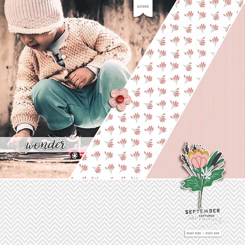
About the Author  Anita is a member of the creative team here at The Digital Press.  She lives in the US with her husband and two children, which is her inspiration and passion for scrapping.   She loves to travel and loves all animals.  She has been scrapping for 10 years now digitally and prior to that loved to paper scrap, but only made about 20 pages and collected an entire room full of paper products! lol

Friday Favorites | September 20, 2019

Hello, and welcome to another edition of our Friday Favorites series on The Digital Press blog! I’m excited to bring you yet another post in our newly-ravamped Friday Favorites series, where every week we share some of the best creative inspiration we find in the gallery from our amazing community members here at TDP!

It’s always so much fun to browse through all of the crafty inspiration that can be found in the gallery here at The Digital Press… and it always gets me into such a great, scrappy mood!

Here’s a look at a few of the newest gems I found in TDP’s gallery this past week (each page is linked to the gallery so you can leave the original artists some love)…

First up is his great page from September 2019 Guest Designer Shannel Tamara (of Gone Digital Design). I love the graphic look with the cut out triangle shapes, the gorgeous composition with the pictures and the elements, and the broken up journaling and stamps…


I also loved this page Sucali. The sweetness of the colors and the picture with the clean design is really each catching. The color harmony is perfect!


Finally, I found this amazing page by dawnfarias (a.k.a. Dawn, the designer behind Dawn by Design). I love that there are two distinct parts of the page, as if it was a traveler’s notebook spread. And the handwritten journaling is just perfect…

I also found a few “throwback” layouts in the gallery while searching around and admiring all of the newer eye-candy…

The first one is from ninigoesdigi — another designer here at The Digital Press. I love everything in this page: the clean design, the Polaroid-style pictures, and the Japanese characters. The brush and paint foundation bring depth and visual impact to the overall design…

I also adored this project by LilliJ. The theme and the colors of the layout remind me that summer is not yet finished in the northern hemisphere. The layered design gives a great graphic appearance, and the text strips are a nice touch in addition to the journaling…

And finally, I’ve chosen this page by blackkathy. It’s the opposite of the previous page (winter instead of summer!)… so that’s a fun change. The white space is really eye-catching and helps keep the focus on the central layered design. The shadowing is really nice, too…


As always, it’s just so much fun to browse through all of the crafty inspiration that can be found in the gallery here at The Digital Press… it always gets me into such a great, scrappy mood!

Come take a peek, yourself… and then make sure you swing by the shop to check out this weekend’s newest product releases and come leave a few projects in the gallery, yourself! We’ll be looking forward to seeing your handiwork really soon (and maybe you’ll be featured in a future edition of this Friday Favorites series here on the blog!).


About the author Gaelle is a member of the creative team here at The Digital Press. She lives in France with her hubby, her two sons and her 3 kitties. She loves digiscrapping and discovered this activity in 2012, since then, she’s totally addicted and scraps to keep memories of her everyday life. Her family is definitely her principal source of inspiration.

Tutorial Tuesday | “Hand-Cut” Digital Shapes

Hello, and welcome to another edition of our Tutorial Tuesday series here on The Digital Press blog! Today I’m here to show you how to create a “hand-cut” look on your digital pages.

I have a confession: I was once a paper scrapper… and I still have all of the stuff, even though I haven’t made a paper layout in probably a decade. Back then, I could literally spend an entire weekend (before I had kids, of course) on a single 12″ x 12″ page. For me, lines had to be as straight as possible, the corners to 90 degrees, and everything had to be *just right* before it got glued or stapled or stitched down. Again, back when I had time for these things.

When I switched to digital, I loved that all the lines were automatically straight and the corners were always perfect. I loved that my 2-day process had become a 2-hour process. Then, as I started printing my pages, I realized that I actually missed the little imperfections of paper scrapping: the slightly crooked lines, the not-quite-90 degree corners. Oh, the irony. So… let’s delve into ways to make those perfect digital shapes look “hand-cut,” or imperfectly perfect.

The first step, as always, is to open a new project / canvas in Photoshop. Fill your background with a solid color, or drag in a paper, just to provide some background contrast. Alternatively, you can also apply this technique in a page/project you already have open. If you’re working in an existing project, though, just start here…

1. Make a new, empty layer (I’m a fan of CMD+N (Mac) — or CTRL-N (PC)… but Layer > New > Layer works, too). To this new layer, let’s add a shape. To do this, select the Shape Tool (number 1 in the image below). The actual shape on the shape tool icon will vary based on what you used last. You can change this to the Rectangle by right-clicking on the icon and selecting the Rectangle Tool. Next, add a nice square. Two options for that… right click and type in the dimensions you want, and click OK — OR — hold down the shift key and drag out the size square you want.

2. Making sure that the layer with your shape is selected, click on the Paths tab (number 2 in the image below). A single layer should show up under paths, and it should have been autonamed “square Shape Path” (assuming that you made a square). Right click on that layer (not on the words, or the icon, but in the space just to the right of the words). This brings up a pop-up menu. Select Make Selection, then click OK to close the new menu that pops up. You should now see “marching ants” around your shape. The ants absolutely do not show up in my screen grabs.

3. Now, let’s get to work on making this shape look hand-cut. Right-click the Direct Selection Tool (number 3 in the image above). You’ll now see corner points – called Anchor Points – on your shape. You can click and drag any of those corner points just about anywhere. Pretty neat, eh? Looks kinda like the paper slipped when you were trying to use the paper cutter. You can stop here, click back over to the Layers menu, rasterize your shape layer, clip a paper, add a shadow, and be done. Or, you can make it look like you cut the shape with scissors …. make one or more of those sides a little wavy.

4. To make a wavy side, you’ll need to add a new anchor point. To do this, right-click anywhere along the side of your shape, and select the top option – Add Anchor Point. When you do that, you’ll get a new anchor point balancing what look like barbells for those marching ants. Go ahead and click on either one of those barbell ends, and drag it right or left. That will change the depth of the wave. Dragging one of those barbell ends in toward the new anchor point, or out toward one of the corner points will modify the horizontal area of the wave. You can add as many anchor points as you want. When you’re done, click back over to the Layers menu, rasterize your shape layer, clip a paper, add a shadow, and you’re done.

Just for comparison, here’s an image with a stroke of my original shape, and then my final, imperfect shape in teal. The changes I made aren’t drastic, but I think they add a little imperfection that make my 100% digital page look less than 100% digital….

Lastly, here’s a sample of a couple of these imperfect squares stacked underneath a photo…

*NOTE* I did each layer separately… but flipping, rotating, resizing, or cropping a single layer would work, too. The layer with the blue paper that says “Scotland” is the one from my example, above.

This technique can be applied to more than just squares and rectangles. You can apply it circles, triangles, hexagons, and even letters (I do recommend a sans serif font that already has squared-off or slightly rounded edges).

I hope that you’ll give this technique a try. I’d love to see your imperfectly perfect shapes!


About the Author  Carrie is a creative team member here at The Digital Press. She and her family enjoy spending time outdoors, year-round, near their home in Colorado. In addition to scrapbooking and the occasional hybrid home decor project, Carrie also reads voraciously, accumulates fabric, makes soap, brews beer, grows hops, and tries to keep indoor plants alive.

Hybrid How-To | Make a Notebook Cover

Hello everyone, and welcome to another edition of our Hybrid How-To series on The Digital Press blog! Today I’m going to teach you how to use digital products to make a physical cover for your Traveler’s Notebooks (and/or for any other small book) by printing and using your favorite papers and digital word art from The Digital Press.

To give you a good idea of what can be created using the digital products you’ll find here at The Digital Press, I’ve selected a wide range of products to play with today. Here is a look at some of the gorgeous products I am using for today’s tutorial…

The Good Life — a TDP Designer collaboration

Blessed | Collection by Karla Noel

Snapshots | Kit by Little Lamm Paper Co.

Wild Child | Papers by Rachel Etrog Designs

A Little Focus | Word Art by KimB Designs

That’s a good selection, right? I love how much variation there is in the different types of products (and styles, too) that you can find when you go digital.

I started doing my memory keeping in a Traveler’s Notebook about a year and half ago. The inserts I use are easy to find at my local craft store, and they are inexpensive. When I went to get covers for the notebooks, however, I was disappointed — both by the lack of selection, and by the high price tags! So I started doing some research and playing around a little bit, and made a few of my own.

Here is a look at some of the tools I used  for this project (most were purchased at my local craft store or on Amazon)…

*A Few Supply Notes* The “fun foam” and Avery self-adhesive laminating sheets are 9″ x 12″ in size; you can also make these using vinyl, a laminating machine, and/or iron-on cloth webbing. The elastic cording is 2mm thick. Double-sided tape, eyelets, and a Crop-a-Dile (or some type of hole/eyelet puncher) are also necessary.

To begin, I printed my papers out on medium weight craft paper; the presentation paper that I normally use to print photos was a bit too heavy for this project, as you want something that will bend easily. I used a 8.5″ x 11″ sheet paper, which was just tall enough for my “standard” size Traveler’s Notebook (the 11″ was actually a little wide, so I ended up cutting about 1/2 inch off the width, once printed).

The next step is to adhere the self-laminating sheet to the printed side of your pattern paper. Smooth gently with your hand as you lay the adhesive laminate over your paper, and go slowly to avoid any bubbles or wrinkles.

Cut off the excess laminating sheet so that it is even with the pattern paper. Now you are ready to add the foam to the other side of your paper. I used double-sided sticky tape for this, adhering it to the piece of foam first, as shown here…

Pay extra attention to the edges and the corners, as shown above, as that is where it could separate if not taped all the way to the end.

Next, remove all of the tape protector and line up the foam piece with your paper and smooth out. Once adhered… you can cut the foam to fit your paper…

You now have your cover — approximately 8.5″ x 11″ (or whatever size you may have used, instead) with the pattern paper side laminated, and the other side adhered to the foam. This is a good time to trim it down if it is too wide, or if you have any uneven edges.

Next, you are going to punch holes for your eyelets. I punched a 1/8 inch hole using my Crop-A-Dile and my Big Bite for the center hole. You can either just measure and mark where you want to punch the holes using a pen, or you can make a paper template to set onto the foam to guide you as to where to punch the holes. I made my two holes about 1/2 inch down from each edge, and then the center hole about 4-1/2 inches down from the top.

After punching the holes you are ready to set your eyelets. This is step can be a bit tricky depending on your eyelets. I had to redo a couple of mine because the eyelet wasn’t long enough to make it thru all of the layers (to fix, I just pulled out the funky eyelet and tried another eyelet from the same pack and it worked great).

Once you set your eyelets, you can also use a corner edger/chomper to round your corners (see next image, below). I rounded mine to 1/4 inch on all four corners. This was a personal preference decision; I think it gives it a more finished look…

Now you are ready to thread your cording thru the eyelets. I cut the main piece of cording to about 20 inches. I started on the inside and left a “tail” of cord to go thru the first hole at the top, and then from the outside I threaded it through the second hole at the top, like this…

Once your cord is threaded through the eyelets, you will tie the two ends together. You’ll want this to be taut — but not so tight that your book curls up on you a lot. If you’re not sure, tie it loosely and put one of your inserts in to see if it feels right. When you are satisfied, tie your knot and trim the ends.

Next, you’ll want to thread the middle cord that actually goes around the book. For this one, I cut about 10 inches of cording. Before threading both ends thru the center hole, you may want to make a “tab” out of the fun foam like I did. I just cut a 3 inch rectangle of foam and rounded the corners, punched a hole on each end, and threaded the cord in and out of the holes.

Then you are ready to take both ends from the outside to the inside of the center eyelet. Because you are pushing thru two cords this one may be tight – on 2 of mine it worked, and on two of them I went ahead and punched a bigger hole and used a bigger eyelet.

Once you get the threads in, you’ll tie a knot — making sure the cord is lose enough to fit over the top and around your notebook.

Here is a look at the finished notebooks without any inserts; they will lay much better once the inserts are placed inside…

Here is a view from the back of the book; it’s sometimes nice to put different paper or word art here…

Next, you can add the inserts. My books get so bulky that I only add two insert books into mine, as you can see here…

Here are a few photos that show my book after I added my completed inserts…

As you can see, they will actually hold quite a bit!

And finally, here’s a look at all of my completed notebooks with their new custom-made covers!

And that’s it! Super cute, and fun to make. I hope I’ve inspired you to use your own digital products to make a book cover! If you give this project a try, we would love to see pictures of your completed projects in the Hybrid Gallery at The Digital Press!

Happy crafting, everyone!


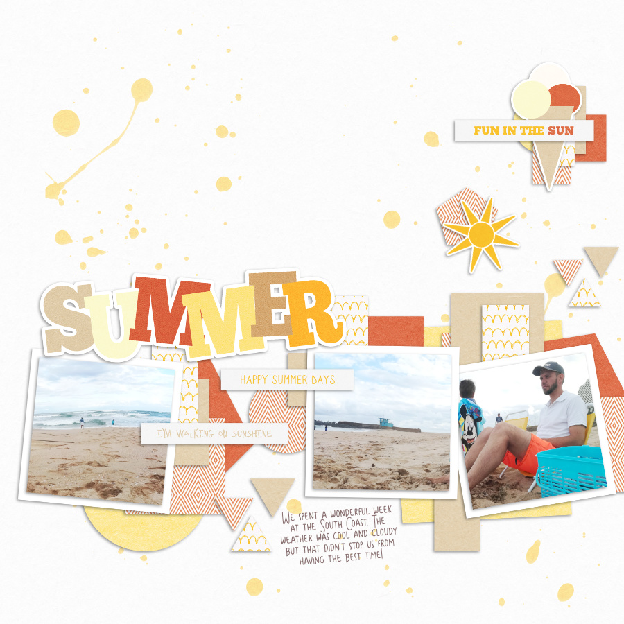
About the Author  KerriAnne is a homebody who resides in the desert SW. She started scrapbooking when her kids were little and hasn’t stopped despite the teenagers rolling their eyes and sticking out their tongues!  When not scrapping or being a chauffeur, she can be found consuming large amounts of iced coffee.