Hybrid How-To | Gardener’s Gift Set

Hello everyone! It’s Donna here, and I’m excited to share another edition of our Hybrid How-To series with you here on The Digital Press blog! With spring just around the corner, I thought I’d show you how to use your digital scrapbooking stash to create a couple of cute (but simple!) gifts for the gardeners in your life.

For this tutorial, I will be using the latest Digiscrap Parade collection from February 2019 — called Plant a Seed (it is available for FREE throughout February 2019, and it’s perfect for this project)! You could also use any digital kit/collection of your choice and achieve equally gorgeous results.

Okay, let’s get started!

SUPPLIES NEEDED

  • digital kit of your choice
  • photo editing program (such as Photoshop or Photoshop Elements, etc.)
  • white card stock or matte photo paper
  • presentation or printer paper (I used presentation paper)
  • blank notebook (I used a composition book)
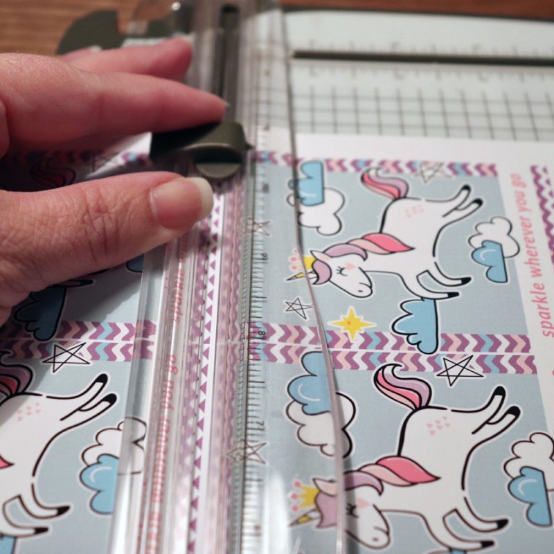
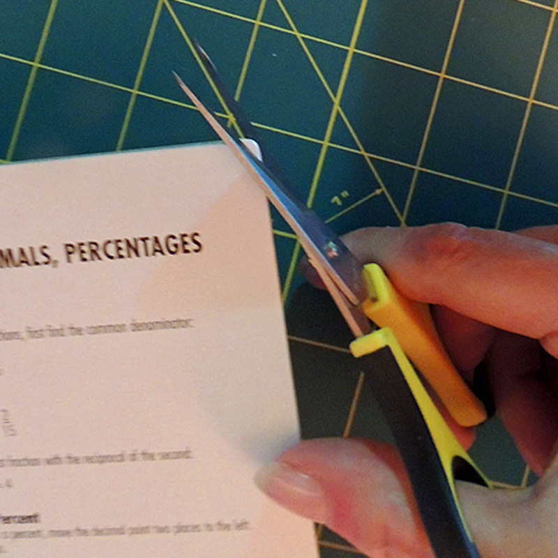
  • cutting machine or scissors
  • adhesive (I used a glue stick & double-sided tape)
  • Mod Podge (or you can make your own using 1 cup of white glue and 1/3 cup of water)
  • foam brush or paint brush
  • ribbon (optional)
  • pop dots (optional)

INSTRUCTIONS

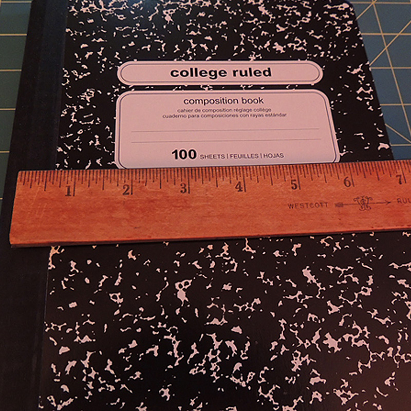
First, you’ll want to determine what size to make your Garden Journal’s front and back covers. You’ll do this by measuring the size of your notebook, leaving about 1/4 inch of the binding exposed. My book is 9.75 inches tall and 7.25 inches wide… so my covers will measure 9.75 inches tall and 7 inches wide (because I’m leaving about 1/4 inch of the black binding on the left exposed).

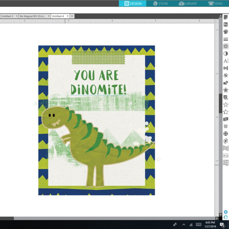
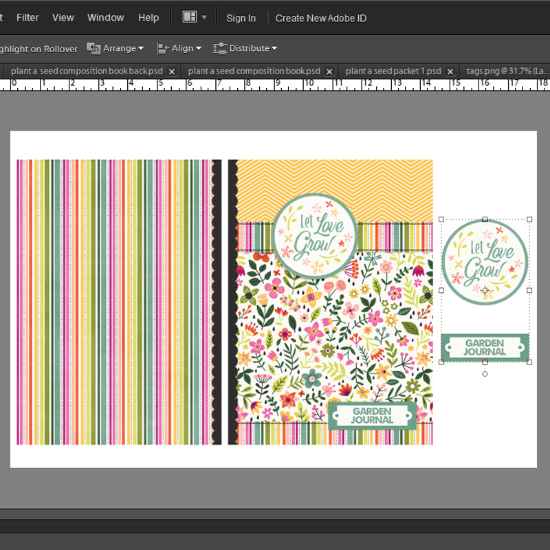
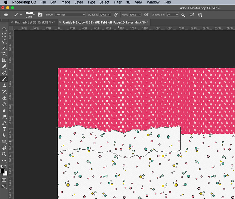
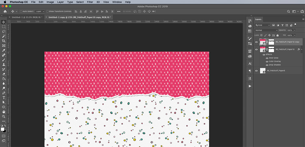
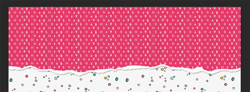
Next, you’ll open your photo editing software and create a canvas using the size you determined in the previous step. Use that canvas to design your front and back covers. Here’s a look at what I came up with…

After you come up with a design you like… you’ll print your covers on white card stock or matte photo paper. Cut them out and set them aside.

**TIP** Want to add some dimension to your book covers? I did this by printing 2 tag elements separately (see my screenshot, above; they’re the elements on the right). I cut them out separately, so I could attach them later using pop dots/etc.

Because we will be Mod Podging these covers onto the notebook, I think it’s wise to allow the ink to set up for a minimum of 2 hours before applying the Mod Podge (I usually wait overnight, just to be safe). This helps to prevent the ink from smudging once the Mod Podge is applied.

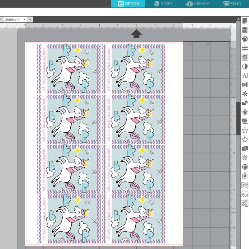
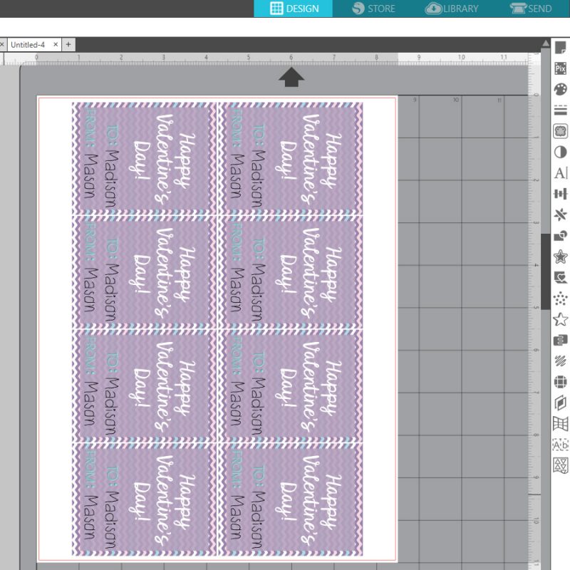
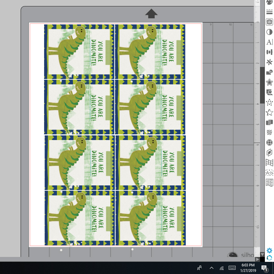
Our next step is to design the seed packets. For my project, I used a simple template that I created (see image, below); you can download it HERE if you’d like to use it and follow along.

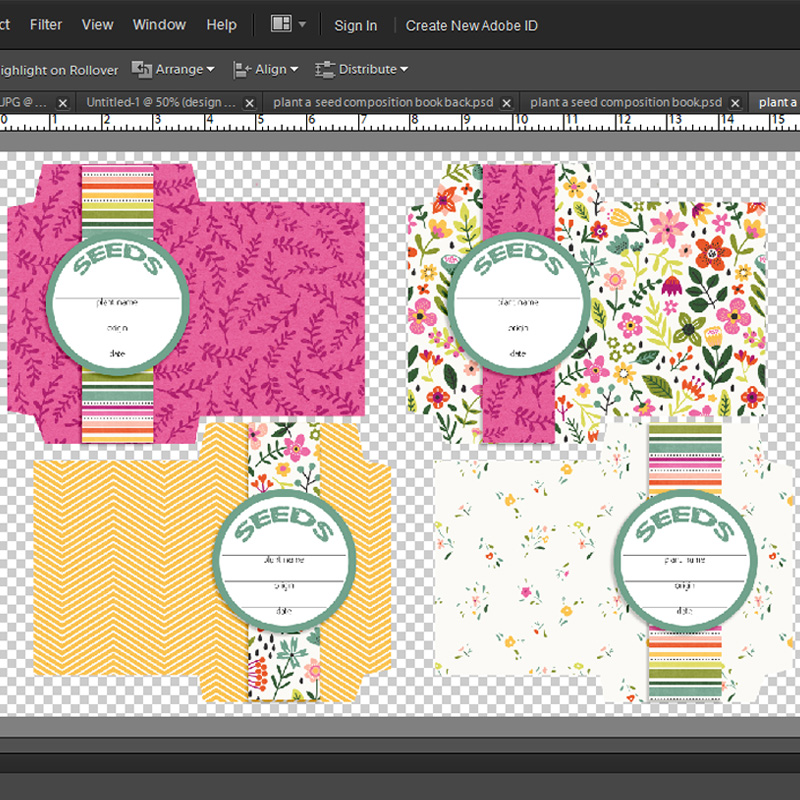
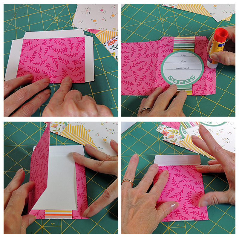
Print the seed packets on printer paper or presentation paper. We will not be mod podging the seed packets, so it’s OK to cut and assemble them right away. I used a glue stick, but any adhesive or double-sided tape will work just fine.

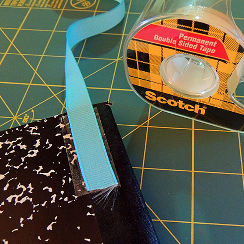
Before applying the front and back covers to the notebook, I wanted to add a ribbon bookmark. You could certainly skip this step, but if you have some extra ribbon lying around, it does add a little pizzazz to the finished project!

Cut your ribbon about 4 inches longer than the height of your book and adhere it 2 inches from the top on the back of your book. (Make sure you apply it far enough away from the binding to ensure that your back cover will cover the ribbon completely.) I used double-sided tape to attach it, but most adhesives will work.

Our next step is to attach the covers to the book. Since Mod Podge can be quite messy, you’ll want to protect the inside pages to avoid glue getting on them. I found that a gallon sized zippered plastic bag works perfectly, as shown here…

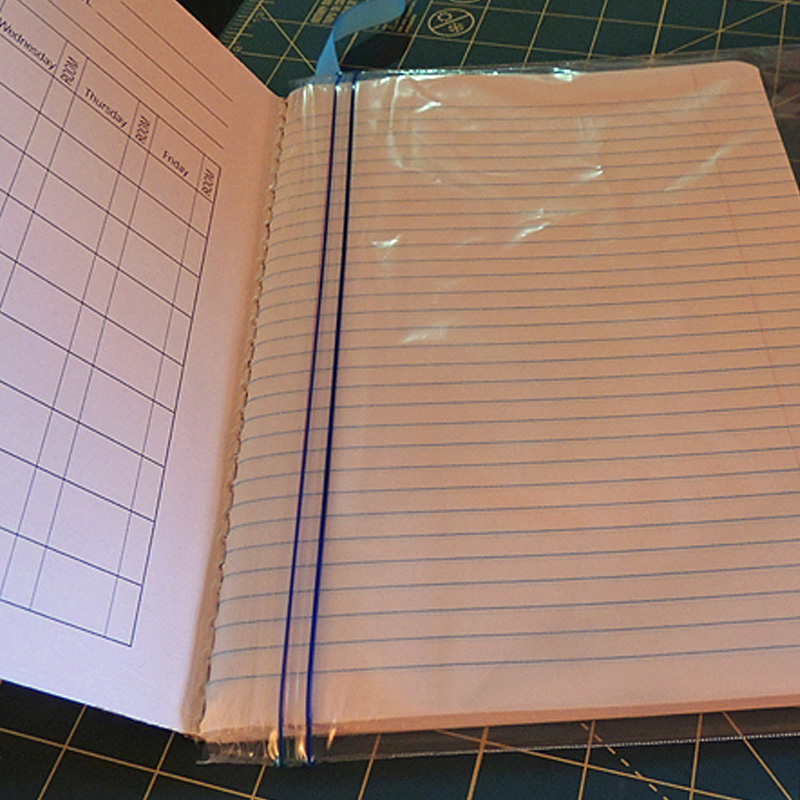
After the inner pages are protected, glue on the covers with Mod Podge. Don’t skimp when applying the Mod Podge; you’ll want it thick enough to allow some wiggle room to get the covers on straight.

Repeat this step for the back cover and allow the glue to set for a minimum of 20 minutes.

Before we apply the top coat of Mod Podge, we’ll want to trim the corners of our cover to match the corners on the book. (If your book has square corners you can skip this step)…

When applying the top coat of Mod Podge, load a generous amount onto your paintbrush and use a continuous stroke (either from top to bottom or left to right). Be careful to not overwork an area or your ink may smear. Don’t worry if you can see your brush strokes… as they will diminish as the Mod Podge dries. If you are adding any elements to your cover, be sure to apply a coat of Mod Podge to those as well so that everything has the same texture.

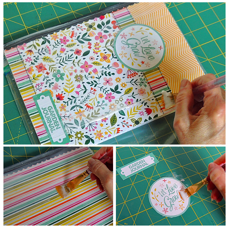
Once everything dries, the final step is to attach the tag elements to the front cover. As noted above, I used pop dots to add a little dimension.

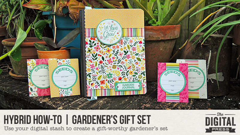
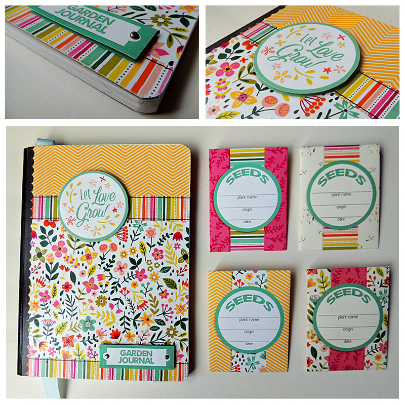
And here’s a look at my finished gardener’s set, ready for gift giving…

I hope today’s tutorial inspires you to re-think your own digital supply stash to make something completely new and fun (and gift-worthy too)!

And even better news — if you want to give this project a try, and you combine 2 (or more) different TDP designers’ contributions from the February 2019 DigiScrap ParadePlant A Seed — when creating your project… you will meet the requirements for the FEBRUARY 2019 PARADE CHALLENGE, which you’ll find in the CROSSWORD SECTION in The Digital Press forum. This challenge is open/available through the end of 2/28/2019, so go jump in and have some fun! You can earn points toward everything from discounts to free kits! I hope that you will join in. 🙂


DonnaAbout the Author  Donna is a member of the hybrid team here at The Digital Press. She has been a digital scrapper and hybrid crafter for over 10 years, and loves the flexibility digital products provide. When she’s not scrapping you’ll find her in front of the TV, at the computer, or in the kitchen  cooking up something scrumptious. She has been married for 40 years to her husband, Sonny, and they live in South Florida with their sweet little dog, Casey, and kitty siblings Cashmere and Velcro. She also enjoys swimming, gardening, traveling, and chocolate (of course!).

Tutorial Tuesday | Creating Diagonal Flow

Hello, and welcome to another edition of our Tutorial Tuesday series here on The Digital Press blog! Today, I am here to share information with you about creating diagonal flow when you are working on a scrapbook page.

In one of my previous tutorials here on the blog — Creating a Focal Point — I explained how to grab the viewer’s attention with an obvious focal point, and then to use visual hierarchy to guide the eye throughout a layout. In today’s tutorial, I will explain how to create a visual emphasis going from top left to bottom right (the way Westerners read)… or alternatively, going from top right to bottom left for variety.

Here’s a quick look at what I mean…

In that first example, the text stamp is the foundational element that I duplicated in order to place it on either side of the band of papers (at the top left and lower right corners). I would usually duplicate and horizontally flip an element to make it the perfect opposite; however, this would be immediately visible with text (as the text would be backwards on one side) and so that does not work. 🙂

The act of duplicating the stamp forms a frame, of sorts, bracketing the design so that the eye naturally joins these two halves together. This draws the eye from top left to bottom right.

As an extra layer, I have added the vellum heart (top left) and the small word art cluster (lower right) along the same diagonal line. Then, for fun, I have two heart scatters, but I placed them on the opposite (blue) line. A touch of tension is always a great idea: something that makes one look again, to see if anything is different or out of line. This re-enforces the diagonal.

Here’s another example…

In the second example, I used paper blocks and placed them at kitty corners to create the diagonal line (again, top left to lower right). This accentuates the angle at which my hubby is pointing the laser light, as well; when the subject of a photo is looking in a certain direction, the eye naturally follows the line to see what they are looking at. I tilted the title and journaling card slightly to fall on the diagonal, but not perfectly in line — again, to add a bit of tension, once again.

These are just a couple of ideas and examples for creating movement within a layout (especially one that uses a multiple photos), in order to help the viewer navigate their gaze through or across the page. Give it a try! I think you’ll find that creating this sort of flow within your next scrapbooking layout is easy and helpful!


small avi

About the author Stefanie is a member of The Digital Press creative team and a stay at home mother of three older children living in Cape Town, South Africa with her hubby of 30 years, one of their three children, and 3 Siamese cats. She loves photography, traveling, and digital scrapbooking — documenting the good and the ordinary everyday.

Tutorial Tuesday | Creating Custom Torn Paper Edges

Hello, and welcome to another edition of our Tutorial Tuesday series here on The Digital Press blog! Today, I’m here to show you how to create a torn paper edge look with any of the digital papers you can find in the wonderful kits available at The Digital Press!

I’ve had a lot of fun using this technique on layered papers to create a really cool look. The instructions you’ll find here have been created for Photoshop CC, but they’ll likely translate (maybe with a few tweaks?) to other photo-editing programs, as well.

First, here’s a look at my finished scrapbooking page to show you the effect that we’ll be learning here today…

Let’s get started!

Step 1: Download and install these Torn Paper Brushes to make this process much easier.

  • I used the brushes available here.
  • Once you download the file, unzip to get the .abr file.
  • To install, in Photoshop choose Edit > Presets > Preset Manager
  • Follow the prompts to find your download .abr file and install it in the brush folder of your choice.

torn-edges1

Step 2: On your layout, place your paper.

Step 3: Add a Layer Mask

  • In your layers palette, select the top layer of paper
  • Then use the Add Layer Mask icon on the bottom of the layers panel to add a mask.

Step 4: Use a brush to start the torn edge look

  • First select the Brush tool, then choose your favorite torn paper brush.
  • Then make sure that your foreground color is black and that you have the mask selected on your top paper layer.
  • Use the brush along the edge of the paper to create the torn edge.


Step 5: Duplicate your paper layer

  • Right click on your paper layer and choose “Duplicate layer…” to duplicate the paper layer.
  • Once you have two paper layers, hide the top one so you can work with the lower layer.

Step 6: Add a color overlay

  • With the bottom paper layer selected, choose the fx icon from your layers panel.
  • Because I wanted a white torn edge, I chose white for the color overlay with a 100% opacity.


Step 7: Add an inner glow

  • With the bottom paper layer still selected and your effects panel open, now add an Inner Glow with the following settings:
    • Blend mode = multiply
    • Opacity = 10%
    • Noise = 0%
    • Change the color swatch to black
    • Size = 25px

Step 8: Add a drop shadow

  • Keep that Layer Style panel open and now add a drop shadow with the following settings:
    • Blend mode = multiply
    • Opacity = 30%
    • Angle = 135
    • Distance = 10
    • Spread = 0
    • Size = 10

Step 9: Turn the top paper layer back on and use the Move tool (V) to move the layer up by 10 or so pixels so you can see the white torn paper below it.

Step 10: Use a smaller brush to paint away more of the edges

  • First, make sure the mask of the top paper layer is selected. Then, I used the Rough Round brush (found it in the Legacy brushes folder) with a size of 50. Paint away more of the edges to give a rough look.


And you’re done!

Yes, it has a few steps, but it gives you a whole lot of flexibility to determine just how you want your torn paper to look.  The settings suggested here are just that – suggestions.  You can play around with brush sizes, drop shadow darkness, the edge itself… so much!

Hope you guys have fun!


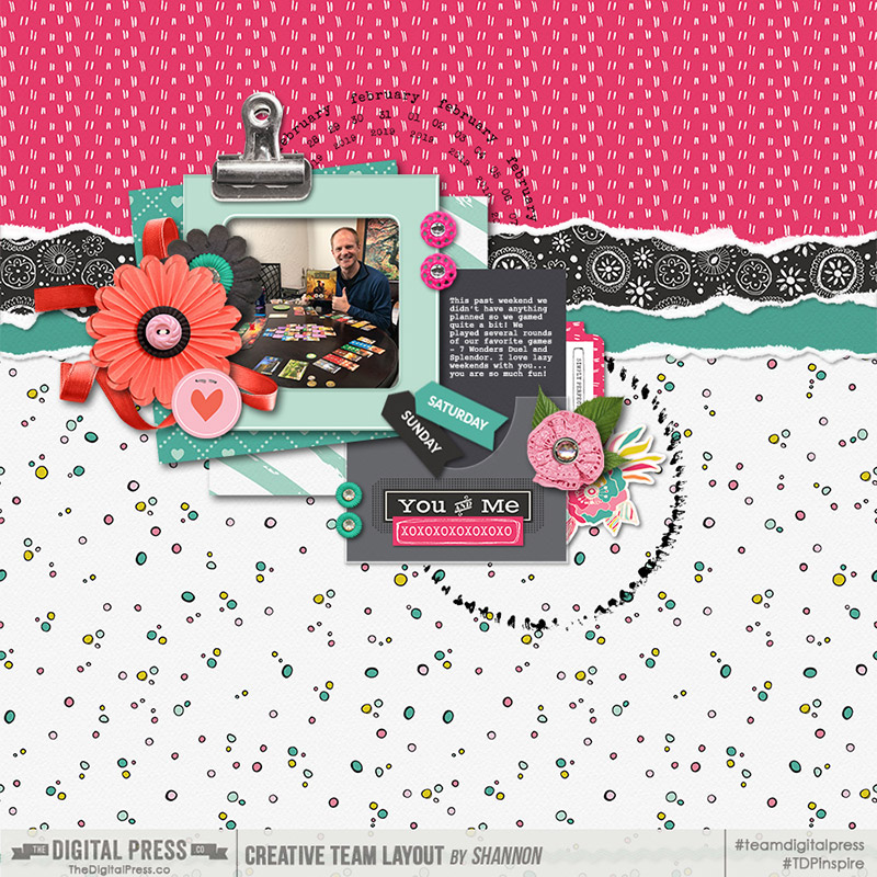
About the Author  Shannon has been completely addicted to digiscrapping since she began in early 2016 (though she’s been a scrapper since 2000). Her early morning ritual of a few quiet hours of scrapping while sipping a chai tea is her favorite part of each day. She is also the owner of a web design company, and when she’s not at the computer designing websites or digiscrap layouts, she’s probably hiking one of the local mountains in her hometown of Phoenix, Arizona. She is an avid reader and loves to travel to foreign countries.

Hybrid How-To | Valentine’s Day Trading Cards

Hello everyone! It’s Tanya here, and I’m excited to share another edition of our Hybrid How-To series with you here on The Digital Press blog today! I seriously can’t believe it’s already mid-February and almost Valentine’s Day. Today, though, I’m here to teach you how to use your digital supplies to make some super cute Valentine’s Day trading cards… a project which will hopefully remove the stress of this holiday already being upon us!

You have plenty of time to grab a digital kit or two and create some fun Valentine’s Day cards for your little ones to trade with others; it’s definitely a project you can complete this weekend!

SUPPLIES NEEDED:

  1. Your favorite digital Valentine’s Day kit(s)
    (or, you can go the unconventional route and use non-themed kits that have fun papers/elements you like!)
  2. White cardstock
  3. Double-sided tape
  4. Paper cutter
  5. Scissors
  6. Valentine’s candy
  7. Washi tape

For this project, I used the following digital products (as you can see, I went the “unconventional” route and used non-Valentine’s-themed items — Be The Magic Be A Unicorn by Rachel Etrog Designs -and- Rawr Like A Dinosaur by Mari Koegelenberg)…

I created these fun school Valentine’s cards in Silhouette Studio, but you can use any photo editing program; I really like the software and I find it very easy to use (most of you already know that my favorite thing to do with my Silhouette machine is Print and Cut; this time, however, I actually designed and printed and then used my paper trimmer to finish them off).

The first step is to open the images and papers you want to use. For the paper, I drew out a rectangle in my software and and then did a drag and drop. Then I began layering until I got the desired look I wanted…

Here is a look at the final image I ended up with, after doing the steps above…

You’ll find that there are sooooo many possibilities for what you can do! Just play around and have fun! There are some really cute embellishments in the kits I used, so I just experimented until I found something that worked.

The next step is to duplicate them and print as many as possible onto one page. Here, I was able to fit eight on one page, but if you find that you would like them to be a little larger, you can definitely go with six…

Now, we’ll create the back of the card the same way we created the front (choose papers, embellishments, word art, etc… and layer until we have a design we like).

To print them onto the back of the cards we already printed, we will need to ensure that we use the same exact layout/arrangement when we print… and then we simply flip over our paper, fee it into the printer, and print side two. Make sure to follow your printer options for double-sided printing (if applicable); on my printer, to print on the back side of a page, I have to insert it printed side up (but know your own printer, and/or experiment to be sure!).

After I created the unicorn cards shown above, I decided to make another Valentine’s Day card design — this time, using the Rawr Like A Dinosaur kit. This was created the same way I created the cards up above.

Here’s a look at the design I settled on…

Again, I arranged them 8-to-a-page… and then printed the front sides before flipping it, putting it face up in my printer, and printing the back sides.


After we have finished printing the cards, we’ll use our paper trimmer and/or scissors and cut them out…

After trimming, you’ve got yourself some super cute custom double-sided Valentine’s Day cards!

At that point, you can prep them for trading with friends by having your little one sill out & sign all of them.

Aren’t these just the cutest?  There is nothing like creating your own things… especially when you get to share them with others!

Finally, I like to use cute patterned washi tape to attach some candy goodies to the cards, if you choose to…

There are so many fun things you can do to create your own Valentine’s Day cards! Not only do you have endless options for graphics, colors, and phrases when you look through your own digital stash… but if you google “Valentine’s Day puns,” there are tons of other funny and cute ideas out there!

I hope that this simple tutorial will help inspire you to use your own digital scrapbooking stash to create some really fun and unique cards for this Valentine’s Day! Have fun!


Tanya

About the Author  Tanya is a part of the hybrid team here at The Digital Press. She has been hybrid crafting for at least 16 years now, and loves creating and sharing those creations with others. Her all-time favorite tool is her Silhouette Cameo. She has been married for 29 years to her high school sweetheart, Richard and has two sons: Chris, 26 and Chance, 22. She also enjoys crocheting, photography and woodworking.


Tutorial Tuesday | Make Your Subject Stand Out

Hello, and welcome to another edition of our always-popular Tutorial Tuesday series here on The Digital Press blog! Today, I’m here to share with you some practical tips for making your subject stand out more when taking photographs.

Whenever we take a photo, it’s usually much stronger if it has a subject (or a main subject, at least) that can be immediately identified. To make the subject of your photo stand out, you have several “tools” at your disposal. Today, I will show you how to use those tools… using a toy that was recently gifted to my newborn son (because it’s a toy and not a person, it was able to “stand still” for a loooong time while I took all the pictures to illustrate this tutorial, LOL — so it was the perfect subject for me!). Here’s a look…

As you can see in this first picture… it’s a cute stuffed animal, but there is a lot going on visually around the toy (let’s be honest and call it what it is… clutter!). Because of this, it’s not standing out as well as it could be; you cannot easily tell, in just a split second, what the subject of this photo is.

How can I change that without having to clean up the mess around it? Here are a few ideas…

Use Focus and Depth of Field

“Depth of Field” is the sharp area of your picture. If you use a shallow depth of field, that means that only a small “slice” of your image is in focus, the rest of it, in front and behind this “slice”, is blurry. This is a great technique to avoid distractions in the background and separate your subject from the background, even when it’s super messy (like my example here).

How to achieve this effect?

  1. Use a wide aperture (small f/stop in manual mode, macro mode, “portrait” mode on some smartphones)
  2. Zoom in
    …or…
  3. Increase the distance between your subject and the background

You can also mix all of those steps/techniques for an even bigger effect. That’s what I did in the 2nd image, above, when compared to the first image above it. I moved the toy away from the background (closer to the camera), and switched to my “nifty fifty lens” to have a much wider aperture (f/1.8  vs  f/3.5-5.6 with my zoom lens that I had used in the first picture).

Want to read more about depth of field? Here’s an older tutorial from TDP’s blog all about focus and depth of field.

One other idea — you can also “fake” this technique after-the-fact, using your favorite photo-retouching software to blur your background, if your subject isn’t standing out to your liking.

Use the Rules of Composition

The rules of composition — such as the most famous “rule of thirds” — are great at helping guide the eye of the viewer towards the subject to make it immediately visible. There is a great tutorial on TDP’s blog about the most common composition rules.

To quickly recap the concepts that are covered in that previous blog post… here are some of the Rules of Composition to think about…

  • Rule of Thirds
  • Balance
  • Leading Lines
  • Viewpoint
  • Background
  • Symmetry and Pattern
  • Depth
  • Framing
  • Cropping

We definitely recommend giving that old tutorial a quick read! Lots of great info.

No matter what rule you use (or if you decide to break them!)… what’s important is that you make a mindful, creative choice that’s dictated by your subject and what you want to convey. Isolating your subject is key — whether you do that through use of negative space or, on the opposite, by filling the frame completely with it. Each of these two composition choices work really well to eliminate distractions. When you use the “fill the frame” technique, don’t be afraid to crop part of your subject. To achieve these two techniques, you might have to move yourself around your subject… and sometimes move your subject itself, if it’s possible.

Here, I chose to focus on the toy’s face and fill the frame with it…

Use Color

Color can be a very powerful visual tool. Using complementary colors (colors that are opposite each other on the color wheel — for example, purple and yellow… or blue and orange… or green and red), or using contrast between bright and neutral colors, is a great way to add dynamism to your image.

If your subject is red, well… lucky you, because red is a color that stands out naturally! Watch out for red elements that are NOT your subject, however, because they will attract the viewer’s eye and distract from your subject. In this example I used the toy’s bright colors in contrast with the neutral background by photographing it from above…

If you need more color inspiration, there is an older tutorial on TDP’s blog about using colors in layouts …but those examples can perfectly apply to photographs, as well!

Change Your Perspective / Point of View

Try taking your time to work your subject… move around it… experiment various points of view… different angles, etc. Try shooting at your subject’s level, or above it (like I did for the image up above), or from below it (like this next example), or from the front or the side, or even from the back for a “faceless” portrait.

Use Light

Light is the photographer’s raw material (photography means “writing with light”)… and you can definitely use it to make your subject stand out. For example, you can use backlight (with subject between you and the light source); rim light (the light is on the side of your subject and defines it with a “glow”); or a pocket of light in an otherwise darker environment.

In this image, above, the light was actually a mix of backlight and rim light.

Focus on Details

Last but not least, sometimes you don’t have to see the “big picture” to tell a story through your photo. You can focus (no pun intended) on small parts of your subject and still evoke emotions and memories, and sometimes they will even be more powerful than an image of the whole subject.

Focusing on details can easily be “mixed” with the “filling the frame” technique I mentioned before. Here I decided to focus on the toy’s ears that are, to me, the cutest part of it. My hand got into the picture as a nice “prop” to help attract the eye to the part I wanted to highlight.

Hopefully all of these practical tips and tricks will help you get stronger photos by helping to ensure that your photos have a clear subject! Now it’s time to get out your camera, and start capturing the little Everyday things in your life from a new perspective!


ChloéAbout the author  Chloé is in charge of PR and communication for her small town by day, is a digiscrapper “by night,” and a photographer whenever the light is beautiful. She lives with her man and dog Kira in a small town of Alsace (in the northeast of France), where she loves to read, watch good TV shows (TWD being her absolute favorite), and just hang out with her friends — no matter if they are close by, online, or away in her Swiss hometown. Right now she’s busy growing her baby boy that should be here in February.

January Blog Break

This is just a quick note to let everyone know that The Digital Press will be taking a short blogging break during the month of January 2019!

In the meantime, if you find yourself missing our Tutorial Tuesday series between now and February… come take a peek at our archived tutorial posts, and give one of the techniques a try!

If you love learning about our designers and getting a peek into their lives… you can check out the archived designer feature posts.

If you love printing our products and making pretty physical projects, but need a little extra mojo… delve into our archived Hybrid How-To posts and get your creative juices flowing!

And finally, if you are looking for something non-scrapbooking-related and you love food… come take a look at our archived Foodie Friday posts (including our previous Summer Camp Mess Hall features!).

We’ll see you again in February…