Flourish…in Color. There is no escaping color’s influence in our lives – from what we wear to the rooms in our home and cars we drive – it is all related to color. Everyone has some opinion on color, too bright, too yellow, too dark or not red enough, etc. There was even a debate that took over social media a couple months ago about whether a certain dress was blue/black or white/gold. Color affects your mood, what you eat, how you sleep, what you buy….it’s ubiquitous in our daily life.
There is more than enough information on basic color theory to fill a whole year’s worth of blog posts, but I will give you some basics today. We have all seen the color wheel. Well, this wheel is based on the primary colors of red, yellow and blue is traditional in the field of art. It was first developed by Sir Isaac Newton in 1666. Since then artists and scientists have debated, changed, studied, opined on the validity of one format over another, but the essentially we can agree that any logical sequence of pure hues on the wheel has merit.
There are three categories of colors. Primary colors are the traditional red, yellow and blue and all other colors are derived from these three hues. Secondary colors are green, orange and purple and are formed by a mixing the primary colors. The third category is the tertiary colors. These colors are formed by mixing a primary color and a secondary color…officially they are called, blue-green, yellow-green or yellow-orange, but we call them aqua, lime and peach!!
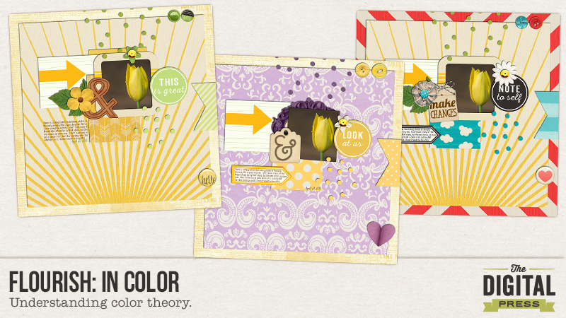
When we design our layouts, color plays a huge part in the choices we make….from the selection of a kit, to the elements we place on our layout and even filters on our photos to give color a pop or maybe warm it up. The decisions we make during the design process with respect to color are based on theories of color harmony. I will use the same layout to illustrate two of these color harmony theories: complementary and analogous.
The Color Wheel (using papers from Colorful Christmas, a TDP collaboration kit found here).
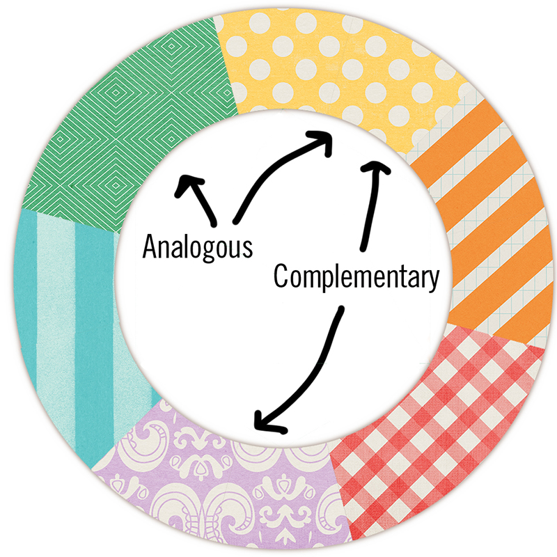
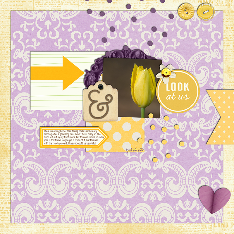
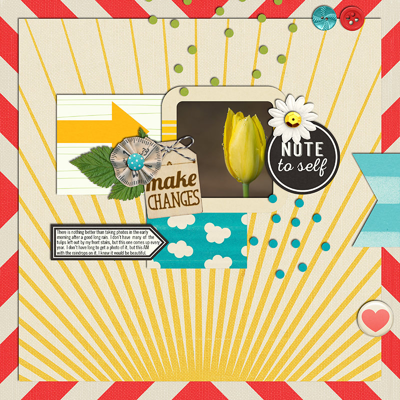
A complementary color scheme uses colors that are on opposite sides of the color wheel. The high contrast creates a vibrant look, but is tricky to use and works best when you want something to stand out. Here is an example of a layout using a complementary color scheme.
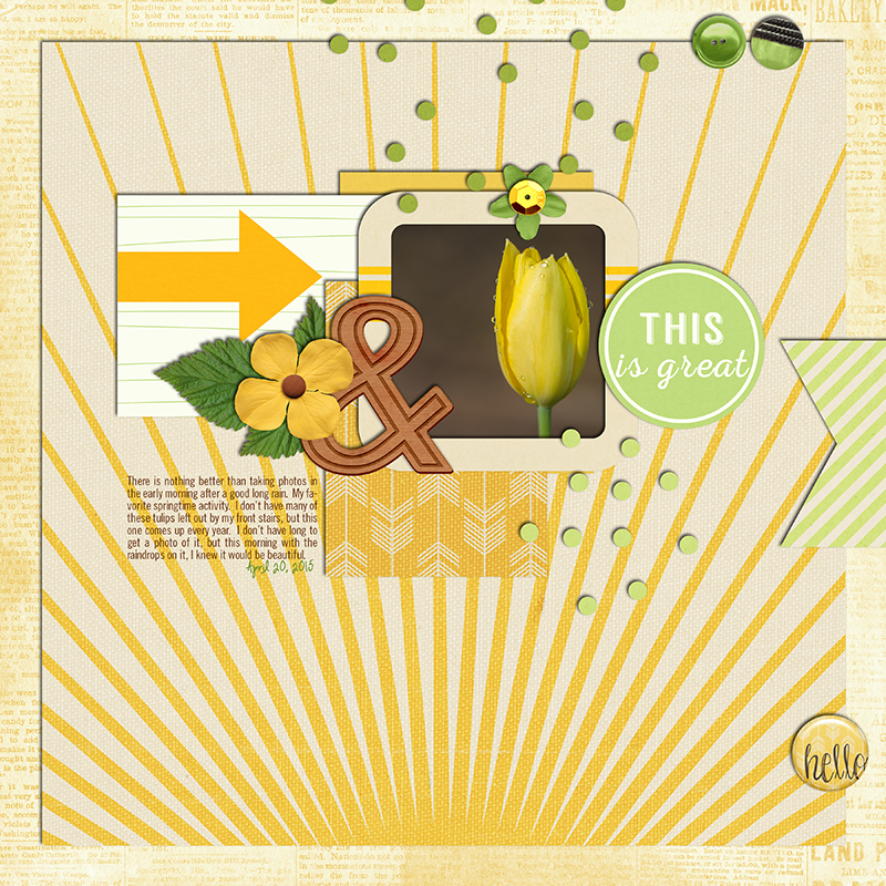
An analogous color scheme uses uses colors that are next to each other on the color wheel. These color schemes are often found in nature so they are pleasing to the eye. Here is the same layout as above using an analogous color scheme.
Or you can always go rogue and try the add any and all colors you want!!! Makes a completely different statement!!!
Credits: These layouts were created using Amanda Yi and Digital Scrapbook Ingredients collab, Time for a Change, A Colorful Christmas by the TDP Designers and Dawn by Design and Anita Designs’ collab, Lovey Dovey.
![]() About the Author: JennV is a lover of history and art (luckily she lives 5 miles outside of Washington, DC) and an accountant by training. She currently stays home with her two boys and is pursuing a career in photography, when she is not busy volunteering for every school and county initiative!!
About the Author: JennV is a lover of history and art (luckily she lives 5 miles outside of Washington, DC) and an accountant by training. She currently stays home with her two boys and is pursuing a career in photography, when she is not busy volunteering for every school and county initiative!!