Tutorial Tuesday | Photo Adjustments

Have you ever taken a picture, thought it was great, and then realized that there are shadows across someone’s face? The moment has gone, and while you love the photo, you wish you could see the individual features, the eyes, nose, mouth, etc., more clearly. Well, with the wonders of photo editing software, and a light hand, you can bring shadowed features into the limelight again. Let me show you how.

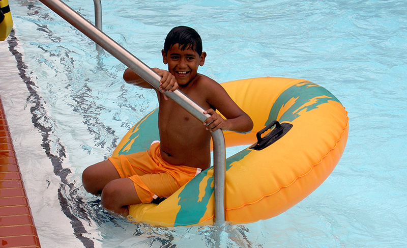
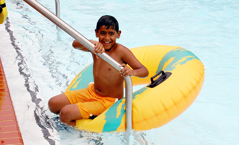
Here’s a photo of my son from, wow, a long time ago, at a local water park. He was having such a great time going up and down the large slides with the inner tube. It was tough to get a photo (he was so quick!), so I took what I could get. However, the more I look at this, the more I’d love to see his face in better light.  Yes, he has a good tan and is olive-skinned, but still …

I tried using Curves and Levels adjustments (I’m using Photoshop, and these can be found under the menu Image > Adjustments), but by increasing the mid-tones, it simply “blew out” the water, brightening what was already a lighter component of the picture – and the result looked unnatural.

I did, however, come up with a compromise that I really liked.

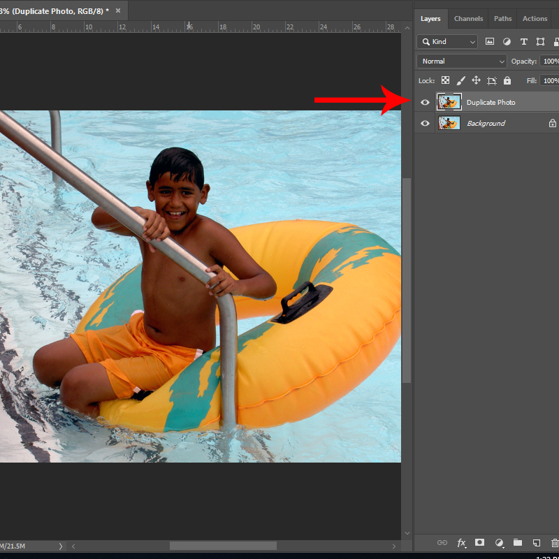
Step 1: Create a duplicate layer of your photo. (This is especially important as you will want to retain the integrity of the original picture.) You can do this quickly using short-cut keys Control-J, or using the menu option, Layer > Duplicate Layer.

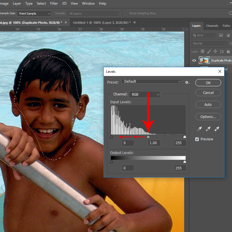
Step 2: With the duplicate layer active, select the Lasso Tool from your toolbox. Set a ‘feather’ of 20-25 pixels. You will want a soft edge on the lassoed selection to ensure it blends with the rest of the photo.

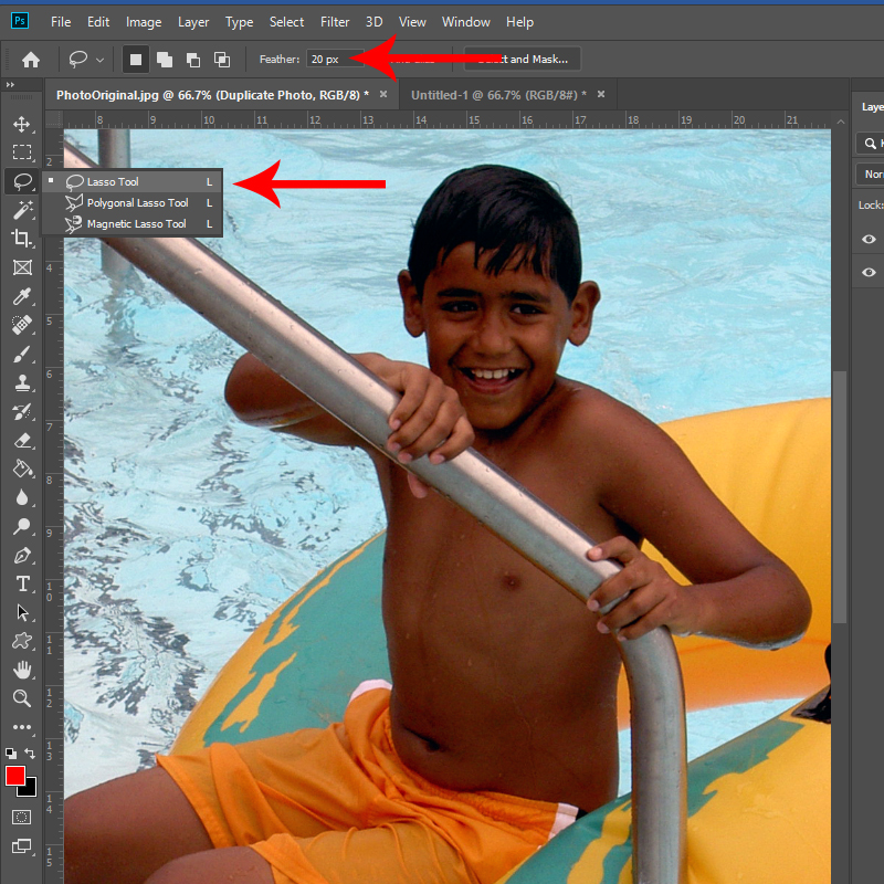
Step 3: Using the Lasso Tool, outline the section you’d like to lighten. You do not need to go right around the exact edge of the shape – remember you have a feathered edge. In fact, I’d recommend deliberately going inside the edge to allow for the feathering or ‘bleed’ to help blend the changed section with the original. It certainly does not need to be an exact science here.

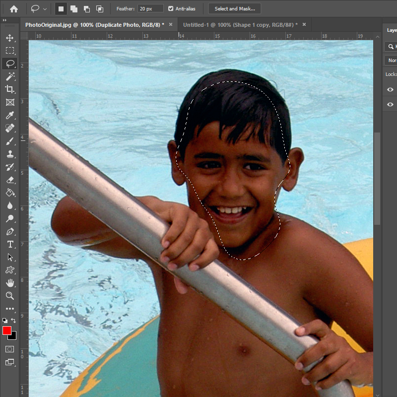
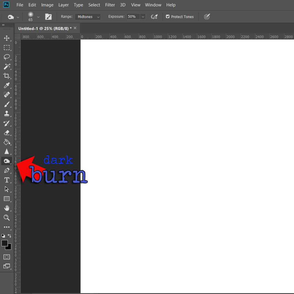
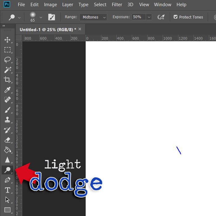
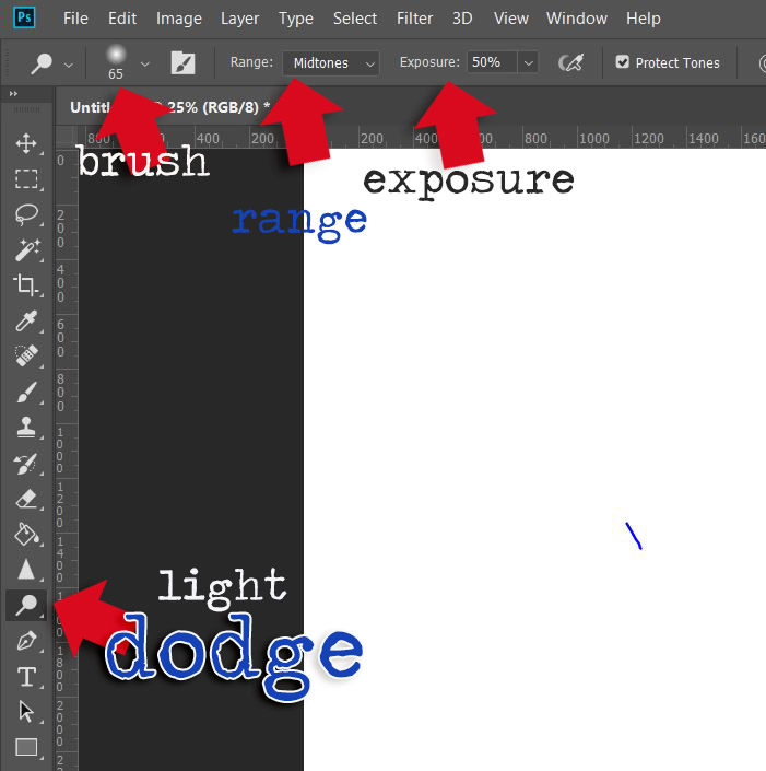
Step 4: Open the Levels adjustments (Image > Adjustments > Levels) and slowly move the middle slider, the one that controls the mid-range levels to the left (left increases the light, right adds dark tones). A very light hand is all that’s needed. If you are too heavy-handed, the result will not look natural.

(The shortcut Control-D will remove your selection after you’ve applied the tonal adjustment.)

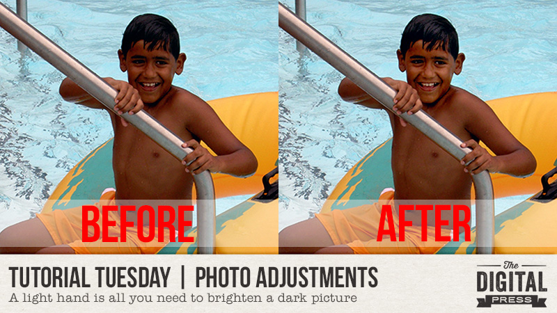
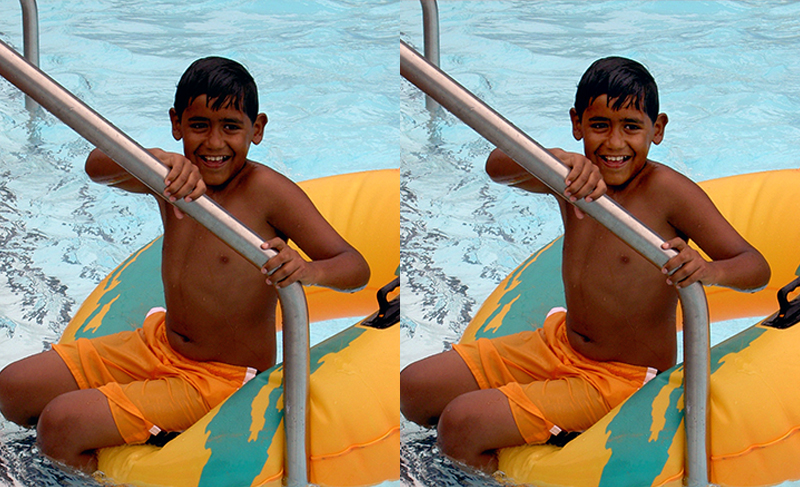
The resulting change is subtle, but that’s exactly what you want! Here’s my ‘corrected’ photo:

It’s might be hard to see the difference, but the facial features now stand out a little better. There are more highlights in my son’s hair, too, and overall, the face just looks brighter. Here’s a side-by-side for an easier comparison:

Have photos of loved ones wearing baseball caps that cast shadows? Maybe just bad lighting and, as the situation I found myself in, you’re just trying to get any picture that you can. In just a few minutes, you can salvage photos that you might otherwise skim over. But remember, a light hand is all that’s needed; it’s easy to go too far with this technique.


About the Author Kat Hansen is a creative team member here at The Digital Press. A HR Manager in the real estate industry by day, she loves the opportunity to spend a few hours each evening being creative. Vacation memories feature pretty heavily in Kat’s scrapbooking pages, as well as her health and fitness journey. Kat has quite the sense of humor (she “blames” her father for this), which she incorporates into her journaling and memory-keeping.

Tutorial Tuesday | Scrap Outside the Kit

Hello, and welcome to another edition of our Tutorial Tuesday series here on The Digital Press blog! Today I thought it would be fun to share with you my love for scrapping with multiple kits at one time. I know many around digiland don’t share my same love and like to stick to one kit at a time, as they are often overwhelmed on how to use multiple kits/products on a single cohesive layout. I’m going to share with you a super simple approach that will hopefully help you to “scrap outside of one kit.”

To get things started, I select the kits/products I want to work with. You can select yours based on color palettes, themes, or anything else your heart desires. For my layout, I simply chose four gorgeous products from the shop that I loved (no other connection or reason!)…


Once I have my products selected, I take all of the elements from the products I selected and I make copies — putting all new copies into a single elements folder; I do the same for the alphas, papers, etc.. This makes it easy to have them all in one place and I don’t spend too much time flipping back and forth between kits while I work.

From there, I just scrap my page as normal, choosing anything I like (papers, elements, etc.) as though it all came out of one product (instead of 4!)…

Essentially, all I have done is create a large “mega kit” with items from various kits and/or different designer’s products. It really makes it easy to see it all in one place.

I hope this helps you dig deep in your digital stash and combine old favorites with new ones to create unique pages you and your family will treasure forever. If you give “scrapping outside the kit” a try, please share your layouts in the gallery — we would love to see them!


About the Author  Sheana is a member of The Digital Press creative team. She lives in Southeastern Ohio with her husband and 2 teenage daughters. She works full-time as a policies and procedure writer for a large investment firm. When Sheana isn’t working or scrapbooking, she enjoys spending time with her family.

Hybrid How To | Bucket List in a Traveler’s Notebook

Hello Everyone!

In this post I’m going to show you a work in progress I started recently using my traveler’s notebook with the amazing products we have here at The Digital Press. It’s my Bucket List Traveler’s Notebook. It’s super simple to do and so much fun.

Let me start by reiterating, I know this is not a finished project like you usually see on the blog from our amazing hybrid team. That’s one of my favorite aspects of this amazing hobby we share, it can be as “done” or “not done” as you want it to be. It’s all up to you.

One of the biggest reason I turned to traveler’s notebooks is because life has been super unpredictable and stressful lately for me and I need a little more distraction than a 12×12″ page can do for me. And I’ve found an easy pick me up in those moments when I need a break from overthinking everything is to look at places I’d like to be instead of the stress filled place I’m in at that moment. Rather than getting stuck in a parade of pictures (and ads) online that don’t relax me, I’ve made my own happy place to peruse till I feel ready to tackle the world.  And best part I gave myself license to get creative in my notebook. Whether it be hand drawn doodles or notes on a journaling card or whatever bits and bobs hit the spot.

For this Bucket List Traveler’s Notebook I started by collecting screenshots from Google Maps of the my most recent place of interest, the island of Mauritius. (I know the likelihood of ever getting there is 1 in 5 million-billion, but that means there’s still a chance, right?!?) It’s fun to dream and that’s what this notebook is all about.

I have templates for my traveler’s notebook set up in a layered photoshop file so that I can start clipping and printing as quickly as possible… and I waste less ink because I’m not throwing away lots of page that got printed on but didn’t get used once I cut things down to size.

To get started, I printed a couple pages on one side with light bright fun papers that I could write on as I made my plans. Then I found maps on Google first of the island itself and a second zoomed out. Then printed them on to the front of the pages I printed earlier. Here’s what I started the project with, my double sided Google map prints, photos from travel websites and few pages with papers clipped to them.

Now the fun begins. I quickly realized in my rush to get started that a couple of my picture were too large for the pages I’d printed. But that’s ok (remember, it’s a work in progress) to remedy this I creased one side and made a flap to hide notes or journaling under.

Now it’s just layering in embellishments, photos and etc till I get it where I want.


And here’s a second view.

I’m pretty happy with the start I’ve made on my notebook. My next step is to learn a little more about the island and print some journaling cards to fill in the empty spots with destinations and other ideas to fill my time while I’m “on the island”. 😉

I hope this has inspired you to create your own traveler’s notebook, in whatever theme you want or a bucket list of your own, and most importantly to give yourself permission have a work in progress to inspire your own dreams and while away some creative time.

Make sure you check out the shop at The Digital Press for the dreamy traveler’s notebook products our amazing designers have created for you to start your own notebooks with. Thank you for reading!


SandyPieAbout the author Sandy (or SandyPie as she is known in digiland) is a hybrid scrapbook enabler and nerdy introvert. When she not scrapbooking, working, or playing Pokemon Go… she is trying to survive the day with her husband, two teenage boys and four cats. Wish her luck!

Friday Favorites | Cornelia Designs

Hello everyone, and welcome to another edition of our designer feature series on The Digital Press blog in 2019 — Friday Favorites! This year, as you know, we’ve been learning a bit more about each of our amazingly-talented designers by having them share some of their favorite things with us each week.

This week, the spotlight is on the creative designer Cornelia Designs. This is actually Cornelia’s second feature here on the blog (you can find her first feature from September 2018 HERE).

This time around, in order to learn even more about Cornelia, we asked her to share some of her favorite things with us, and here’s what she had to say…


“What makes me happy the most are BOOKS. Yes, plain and simple books. Paperback, hardcover, and even ebooks — I love them all. As some of you know, not only do I love reading books, I also enjoy writing them. I have a few romance books published, but they are written in German. And I am currently working on a middle-grade fantasy book and hope to be finished soon with the first draft.

While writing this post, I came to the conclusion that there is more I love and am grateful for. For a long time, I had a “black thumb” — every plant I owned never lived any longer than a few weeks, and then died! I don’t know what happened, but my “black thumb” has turned into a “green thumb.” I love how everything blooms and grows now. I even planted some seeds on my own!

On top of all this, there is my family, my kids. I treasure them the most. Of course, there are always bumps in the road and things aren’t always happy but most days they brighten up my life and make me the woman I am. My heart and my home is filled with joy and love and there is nothing I would change about it.”


Wow! I learned so much about Cornelia; I had no idea that she was a published author. She is such a creative soul! And that is certainly apparent in her amazing digital designs. If you’re not yet familiar with her work… everything she creates is gorgeous and so easy to use!

Here’s a peek at just some of the fabulous products you’ll find in her shop at TDP

Additionally, here are some of my favorite layouts that show off Cornelia’s products. I just love all the colorful fun in these gorgeous pages…

Hopefully, today’s Friday Favorites article has given you even more insight into who Cornelia is, and more information about her day-to-day life (and again, if you want to know even more about her — scroll up and use the link to her previous feature here on TDP’s blog, where’s there’s lots more good stuff!).

And the best news of all?! …during Cornelia’s upcoming feature week here at The Digital Press, you can enjoy the chance to score an amazing deal in her shop if you use the following coupon code(s) when purchasing her digital goodies (this code/sale will be valid through 11:59pm EST on Thursday 5/2). Don’t miss it!


About the author  Tia is a member of the creative team here at The Digital Press. A mom to a 13-year-old son, her favorite thing to do is serve those in her community who need help, and volunteer at a small alternative private school for children with special needs. When she’s not volunteering or working on school projects, Tia loves to spend time with her friends and family!

Tutorial Tuesday | The Dodge and Burn Tools

Hello, and welcome to another edition of our Tutorial Tuesday series here on The Digital Press blog! Today, I am here to share information about how to use your Dodge and Burn Tools to make your layouts pop a bit more! I normally like to use it on flowers and leaves (in my photos and in the elements on my layout), but you can really use them on anything.

Your Burn Tool will make things darker and your Dodge Tool will make things lighter. You can find each of these tools in the following places…

When using either of these tools, you will want to adjust your settings (see next screenshot). Personally, I like to work with an ‘Exposure’ of 50%… Range: Midtone… and honestly any soft brush, with a size that works for the particular element or item I’m editing. It’s possible to change the exposure to make the dodging/burning less noticeable or more noticeable.

To show you the effect you can get with each of these tools… I’ve placed two flowers side by side (see next image), and I’ve burned the shadows more (making them deeper/darker), and dodged the highlights (i.e. accentuated the brighter areas) to pop the texture of this flower and to make the leaves feel fuller. I also wanted the flower to look as if it was sitting higher on the leaves, so I burned close to the edge of the flower (but on the leaves) to add extra shading, conveying more depth.

Take a look…

See the differences?

The left flower has my regular shadowing… and the right flower has been tweaked using the Dodge and Burn Tools.

I realize the changes are subtle, but they definitely add some realism… and on a full layout, they look AMAZING if you take the time to add this pop to a few elements. You can do as little or as much as you’d like to add depth… and as I said earlier, you can even do the same thing to your photos.

I’m now addicted to these two little tools… and I hope today’s tutorial will inspire you to give them a try!


About the Author  Anita is a creative team member at The Digital Press.

Friday Favorites | Rachel Hodge

Hello everyone, and welcome to another edition of our designer feature series on The Digital Press blog in 2019 — Friday Favorites! This year, as you know, we’ve been learning a bit more about each of our amazingly-talented designers by having them share some of their favorite things with us each week.

This week, the spotlight is on the creative designer Rachel Hodge. This is actually Rachel’s fifth feature here on the blog (you can find her first feature from August 2016 HERE, another from March 2017 HERE (including a peek at her creative work space!), her Foodie Friday post from January 2018 HERE (with a few of her favorite yummy recipes!), and her most recent feature from June 2018 HERE).

This time around, in order to learn even more about Rachel, we asked her to share some of her favorite things with us, and here’s what she had to say…


OK, this was actually generally hard for me to decide. You see on one hand there’s coffee… coffee and myself have this unspeakable, unbreakable bond which I will always be grateful for. But then there’s also Netflix… Netflix has become a very important member of the family. It’s just come along and fit right in with our way of life, it doesn’t need to be put in a naughty corner, doesn’t leave washing lying around, and is there anytime we need it. So it’s fair to say that yep, it’s a total favorite at the moment.

Here’s a peek into my nightly routine…

Yup, for me Netflix is my time to unwind from the business of the day. When tea is done, the kids are in bed, and all is quiet… I sit on the couch, put my feet up, grab the ipad and enter into my little undisturbed world of Netflix. I’m telling you, the hubby knows it’s my downtime! If I get the sense he’s about to start a conversation mid-show, he get’s that look… that fierce, “think long and hard before you open your mouth and consider… is it worth it?” look.

But OK, down to the important stuff…THE SHOWS! At the moment, I’m totally loving the following…

  1. Real Detective
  2. Bodyguard
  3. it’s a tie between Broadchurch and Obessesion – Dark Desires.

Not your light hearted, romantic, comedy type shows! Just give me ALL the crime ones!

So that pretty much rounds up my favorite thing at the moment. The only way it gets any better is if it’s accompanied by a sweet little drink called Midori (or coffee)… 🙂


Doesn’t she have a great sense of humor?!  Well, her fun personality shines through in her designs, as well. Have you seen her cut files and cards in the shop at TDP? If you’re not yet familiar with her work… they are gorgeous and so easy to use! Due to their versatility, you can easily use her designs on both digital or hybrid projects… as titles, word art, stamps, or stickers. So many options!

Here’s a peek at some of the fabulous products you’ll find in her shop at TDP

And here are some of my favorite layouts that show off Rachel’s products. I hope you love these pages as much as I do (what gorgeous eye candy, eh?!)…

Hopefully, today’s Friday Favorites article has given you even more insight into who Rachel is and more about her day-to-day life (and again, if you want to know even more about her — scroll up and use the links to her previous features here on TDP’s blog, where’s there’s lots more good stuff!).

And the best news of all?! …during Rachel’s upcoming feature week here at The Digital Press, you can enjoy the chance to score an amazing deal in her shop if you use the following coupon code when purchasing her digital goodies (this code/sale will be valid through 11:59pm EST on Thurs 4/25). Don’t miss it!

[ if you have trouble seeing the coupon image, above, the codes are as follows: “save $2 off any purchase of $5+” by using code = S4V3-2-RH . . . or “save $5 off any purchase of $10+” by using code = F1V3-OFF-RH ]


Robin

About the author  Robin is a member of the creative team here at The Digital Press. A wife of 26 years and a mom of 4 crazy children (3 in college and 1 still at home), she says that her life occurs mostly in the car as she transports said crazy kids to their many, many homeschool activities. When not driving, Robin loves to make her family cringe by pulling out her camera again (and again, and again…).