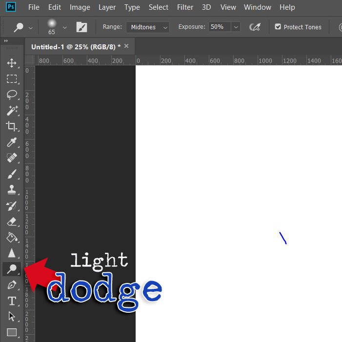
Author: The Digital Press

Hybrid How To | Bucket List in a Traveler’s Notebook

Hello Everyone!

In this post I’m going to show you a work in progress I started recently using my traveler’s notebook with the amazing products we have here at The Digital Press. It’s my Bucket List Traveler’s Notebook. It’s super simple to do and so much fun.

Let me start by reiterating, I know this is not a finished project like you usually see on the blog from our amazing hybrid team. That’s one of my favorite aspects of this amazing hobby we share, it can be as “done” or “not done” as you want it to be. It’s all up to you.

One of the biggest reason I turned to traveler’s notebooks is because life has been super unpredictable and stressful lately for me and I need a little more distraction than a 12×12″ page can do for me. And I’ve found an easy pick me up in those moments when I need a break from overthinking everything is to look at places I’d like to be instead of the stress filled place I’m in at that moment. Rather than getting stuck in a parade of pictures (and ads) online that don’t relax me, I’ve made my own happy place to peruse till I feel ready to tackle the world.  And best part I gave myself license to get creative in my notebook. Whether it be hand drawn doodles or notes on a journaling card or whatever bits and bobs hit the spot.

For this Bucket List Traveler’s Notebook I started by collecting screenshots from Google Maps of the my most recent place of interest, the island of Mauritius. (I know the likelihood of ever getting there is 1 in 5 million-billion, but that means there’s still a chance, right?!?) It’s fun to dream and that’s what this notebook is all about.

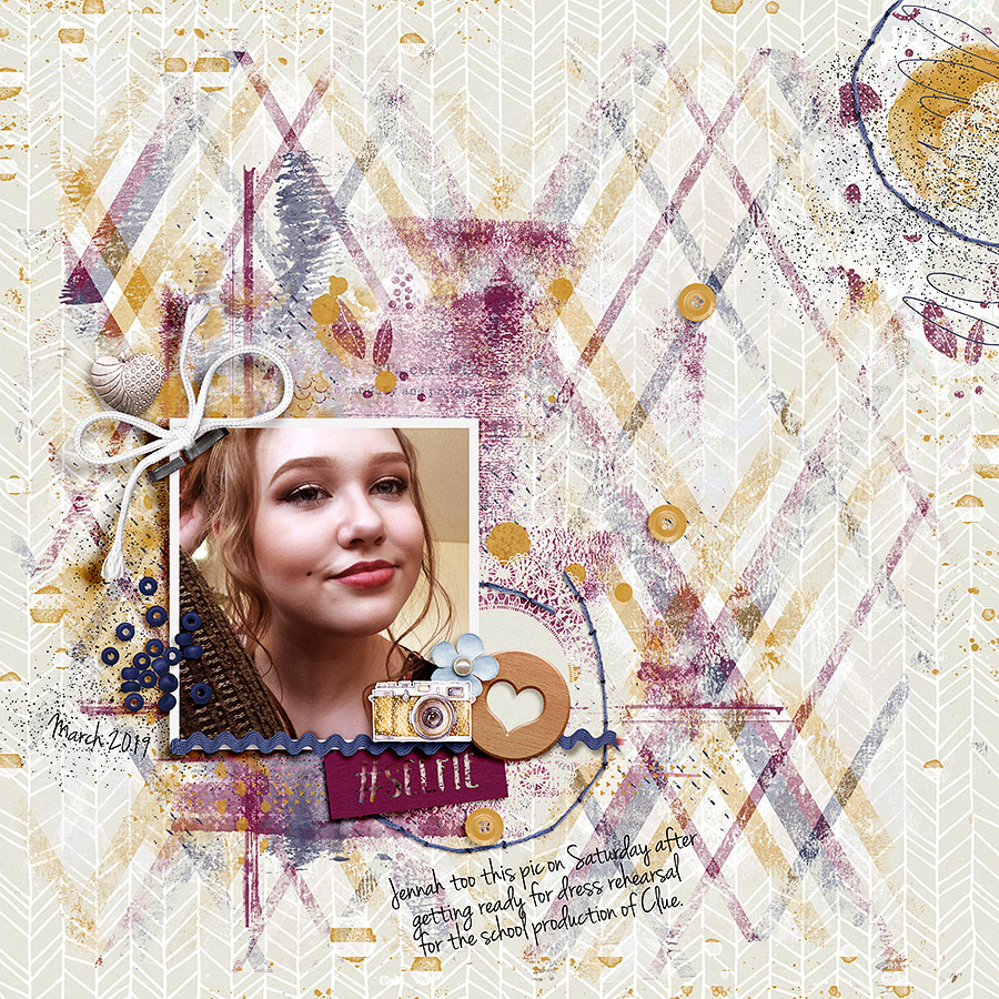
I have templates for my traveler’s notebook set up in a layered photoshop file so that I can start clipping and printing as quickly as possible… and I waste less ink because I’m not throwing away lots of page that got printed on but didn’t get used once I cut things down to size.

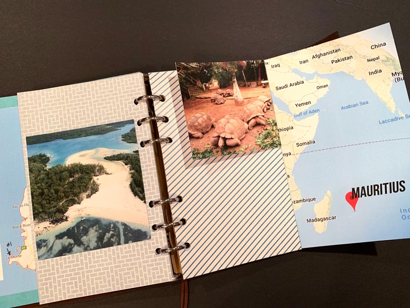
To get started, I printed a couple pages on one side with light bright fun papers that I could write on as I made my plans. Then I found maps on Google first of the island itself and a second zoomed out. Then printed them on to the front of the pages I printed earlier. Here’s what I started the project with, my double sided Google map prints, photos from travel websites and few pages with papers clipped to them.

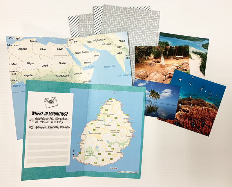
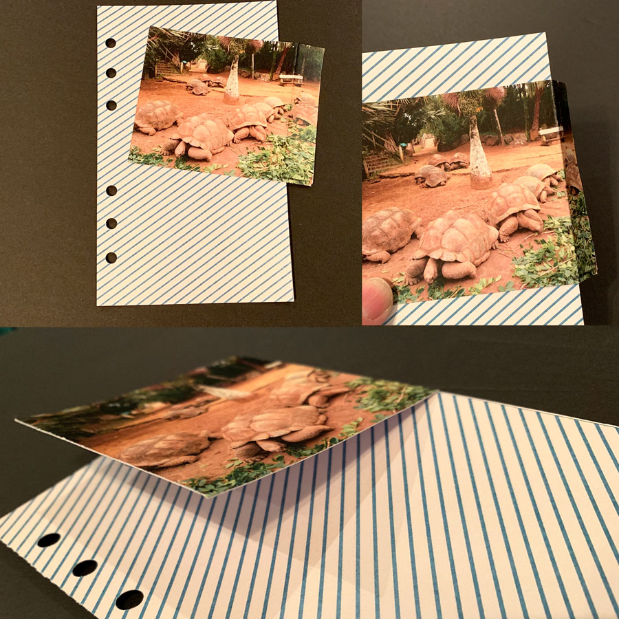
Now the fun begins. I quickly realized in my rush to get started that a couple of my picture were too large for the pages I’d printed. But that’s ok (remember, it’s a work in progress) to remedy this I creased one side and made a flap to hide notes or journaling under.

Now it’s just layering in embellishments, photos and etc till I get it where I want.


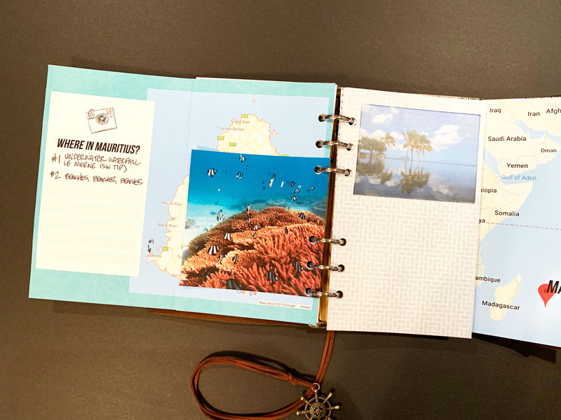
And here’s a second view.

I’m pretty happy with the start I’ve made on my notebook. My next step is to learn a little more about the island and print some journaling cards to fill in the empty spots with destinations and other ideas to fill my time while I’m “on the island”. 😉

I hope this has inspired you to create your own traveler’s notebook, in whatever theme you want or a bucket list of your own, and most importantly to give yourself permission have a work in progress to inspire your own dreams and while away some creative time.

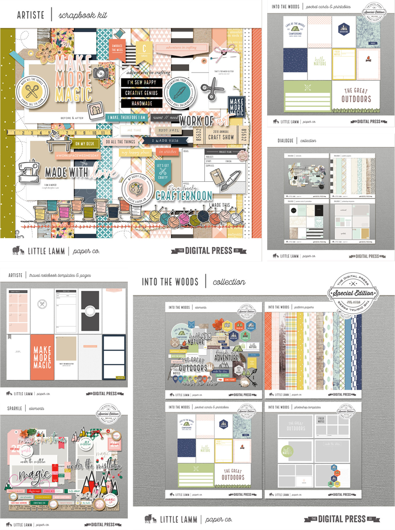
Make sure you check out the shop at The Digital Press for the dreamy traveler’s notebook products our amazing designers have created for you to start your own notebooks with. Thank you for reading!


SandyPieAbout the author Sandy (or SandyPie as she is known in digiland) is a hybrid scrapbook enabler and nerdy introvert. When she not scrapbooking, working, or playing Pokemon Go… she is trying to survive the day with her husband, two teenage boys and four cats. Wish her luck!

Friday Favorites | Cornelia Designs

Hello everyone, and welcome to another edition of our designer feature series on The Digital Press blog in 2019 — Friday Favorites! This year, as you know, we’ve been learning a bit more about each of our amazingly-talented designers by having them share some of their favorite things with us each week.

This week, the spotlight is on the creative designer Cornelia Designs. This is actually Cornelia’s second feature here on the blog (you can find her first feature from September 2018 HERE).

This time around, in order to learn even more about Cornelia, we asked her to share some of her favorite things with us, and here’s what she had to say…


“What makes me happy the most are BOOKS. Yes, plain and simple books. Paperback, hardcover, and even ebooks — I love them all. As some of you know, not only do I love reading books, I also enjoy writing them. I have a few romance books published, but they are written in German. And I am currently working on a middle-grade fantasy book and hope to be finished soon with the first draft.

While writing this post, I came to the conclusion that there is more I love and am grateful for. For a long time, I had a “black thumb” — every plant I owned never lived any longer than a few weeks, and then died! I don’t know what happened, but my “black thumb” has turned into a “green thumb.” I love how everything blooms and grows now. I even planted some seeds on my own!

On top of all this, there is my family, my kids. I treasure them the most. Of course, there are always bumps in the road and things aren’t always happy but most days they brighten up my life and make me the woman I am. My heart and my home is filled with joy and love and there is nothing I would change about it.”


Wow! I learned so much about Cornelia; I had no idea that she was a published author. She is such a creative soul! And that is certainly apparent in her amazing digital designs. If you’re not yet familiar with her work… everything she creates is gorgeous and so easy to use!

Here’s a peek at just some of the fabulous products you’ll find in her shop at TDP

Additionally, here are some of my favorite layouts that show off Cornelia’s products. I just love all the colorful fun in these gorgeous pages…

Hopefully, today’s Friday Favorites article has given you even more insight into who Cornelia is, and more information about her day-to-day life (and again, if you want to know even more about her — scroll up and use the link to her previous feature here on TDP’s blog, where’s there’s lots more good stuff!).

And the best news of all?! …during Cornelia’s upcoming feature week here at The Digital Press, you can enjoy the chance to score an amazing deal in her shop if you use the following coupon code(s) when purchasing her digital goodies (this code/sale will be valid through 11:59pm EST on Thursday 5/2). Don’t miss it!


About the author  Tia is a member of the creative team here at The Digital Press. A mom to a 13-year-old son, her favorite thing to do is serve those in her community who need help, and volunteer at a small alternative private school for children with special needs. When she’s not volunteering or working on school projects, Tia loves to spend time with her friends and family!

Tutorial Tuesday | The Dodge and Burn Tools

Hello, and welcome to another edition of our Tutorial Tuesday series here on The Digital Press blog! Today, I am here to share information about how to use your Dodge and Burn Tools to make your layouts pop a bit more! I normally like to use it on flowers and leaves (in my photos and in the elements on my layout), but you can really use them on anything.

Your Burn Tool will make things darker and your Dodge Tool will make things lighter. You can find each of these tools in the following places…

When using either of these tools, you will want to adjust your settings (see next screenshot). Personally, I like to work with an ‘Exposure’ of 50%… Range: Midtone… and honestly any soft brush, with a size that works for the particular element or item I’m editing. It’s possible to change the exposure to make the dodging/burning less noticeable or more noticeable.

To show you the effect you can get with each of these tools… I’ve placed two flowers side by side (see next image), and I’ve burned the shadows more (making them deeper/darker), and dodged the highlights (i.e. accentuated the brighter areas) to pop the texture of this flower and to make the leaves feel fuller. I also wanted the flower to look as if it was sitting higher on the leaves, so I burned close to the edge of the flower (but on the leaves) to add extra shading, conveying more depth.

Take a look…

See the differences?

The left flower has my regular shadowing… and the right flower has been tweaked using the Dodge and Burn Tools.

I realize the changes are subtle, but they definitely add some realism… and on a full layout, they look AMAZING if you take the time to add this pop to a few elements. You can do as little or as much as you’d like to add depth… and as I said earlier, you can even do the same thing to your photos.

I’m now addicted to these two little tools… and I hope today’s tutorial will inspire you to give them a try!


About the Author  Anita is a creative team member at The Digital Press.

Hybrid How To | Make a Pretty Paper Wreath

Hello everyone, and welcome to another edition of our Hybrid How-To series here on The Digital Press blog! Today I’m going to teach you how to make some pretty paper wreaths using products from your digital scrapbooking stash.

It looks like Spring has finally arrived for many of us, and it is a welcome sight for sure! This season brings us back outside, perhaps doing some gardening or work in the yard. It’s the season that feels fresh and new, so for me I thought about bringing some spring color into my house by using my pretty digital papers and word art from The Digital Press to make some paper wreaths for decoration.

I ended up making three easy decorative wreaths — each of which can hang or be propped up on my mantle or a table, etc. They add the perfect touch of seasonal decor to my home. The hardest part was selecting which gorgeous patterned papers to use… but I finally decided on the Frivolity Papers by Anita Designs, shown here…

I also picked out a word art/stamp set to use to decorate my wreaths; I love the spring designs on the Spring Is Here set by Rachel Hodge…

Finally, here is a quick look at some of the tools I grabbed out of my scrap stash to use for this project (you can easily adapt your own project to whatever tools/punches/shapes/etc. you happen to have on hand!)…


To begin, I bought a foam floral wreath from my local craft store. This one measured about 11 inches wide; they come in different sizes and are not too expensive. For the other two wreaths I just made myself a template using chipboard I had on hand. I drew a circle onto the chipboard using a cup, and then another circle around it using a bowl to outline the first circle. I cut everything out using scissors and a craft knife.

I decided to work on the large foam wreath first.

First, I selected my papers and printed them on my printer. My printer’s largest print size is 8.5″ x 11″, which worked fine for this project. I simply filled each 8.5″ x 11″ space with one of my 12″ x 12″ digital paper patterns from my stash, and then printed it out in full-sheet format, as shown here…

I loved having these gorgeous papers in my hands! After printing, I cut my papers into the strips that would later become the banner shapes that cover the wreath. I cut the strips 1 ½ inch wide and 10 ½ inches long, and I ended up with 5 strips out of each of the 4 patterns I printed. The number of strips you end up with will vary depending on how big of a ring you choose and how much you overlap your banners… but expect to use about 25 strips for a wreath this size.

Next, start attaching the strips around the foam wreath. I attached the papers together at the ends, so the paper is not actually attached to the foam and therefore is fairly loose around the wreath. You can make the strips overlap slightly, but don’t worry if a bit of the foam wreath shows thru (you can fix this later on).

I started attaching my paper strips using a tape runner, but found it wasn’t holding them together well enough, so I switched to double-sided tape instead. It seemed to work much better. I think a strong glue adhesive would work well, also.

I worked in a somewhat random pattern, using a bit more of the solid cardstock. Here is what my wreath looked like after all the strips are on it…

Pretty already, right?!

Next, I punched the paper into “banners”. This can be done a variety of different ways; I have a banner punch, so I used that… but it could be just as easy simply to cut the ends with scissors, too. You could also cut the strips into banners before attaching them to the foam… either way will work.

Once the strips were attached and cut into banner shapes, I could have stopped right there — I already thought this wreath would look great with a vase and flowers in the center sitting on a table.

But…instead, I decided to add a banner and some gorgeous digital word art by Rachel Hodge by printing it out on my printer and then attaching it with double sided tape. I then added a tissue paper flower I made by folding tissue paper, securing the middle with a string, and then fanning out all the layers.


The next wreath I set out to make was the one using the chipboard backing that I had cut out by hand (see above). For this one, I decided to get out a few of my circle punches in various sizes — from 1 inch to 3 inches, in both regular and scallop edges.

I punched circle shapes into the paper I’d printed out… and then put these circles down on top of the chipboard piece. I put the larger circles down first, and then just built on top of them with the smaller circles — all before actually gluing anything (just to get an ideas of the pattern placements, balance, etc.).

Then, I printed some more word art onto cardstock and punched it into a 2-1/2″ circle. I attached the various circles to the cardstock base, this time using my glue gun. I made sure all the chipboard was covered, and then I cut some flower shapes using my CuddleBug and Sizzix dies and added the flowers to some of the circles to add some dimension and variety. I love the way this one turned out, and it was so quick and easy!

Here’s another look…


Lastly, I got to work on the small chipboard wreath (this one was the smallest, at approximately 5 inches in diameter).

For this one, I used strips varying from about 4 to 6 inches long… punched them with my banner punch… and then just adhered them with a glue gun (this time, I did not wrap them around the chipboard base; you’ll see why, below).

After adhering them, I punched a 3 inch scallop circle and a 2 inch image of a bird from the word art collection, and used those pieces to cover the center of the wreath, as shown below. I raised the circle of bird using pop up dots to add dimension. I added the center scallop circle to the middle making sure to cover over all the banner edges.

Here’s a look at the final product…

Isn’t it cute?

Here is a look at all three wreaths hanging on my closet in my office! They make me smile every time I walk in the room!

And that’s it! Each one was so simple… and fun to make. I hope I’ve inspired you to use your own digital products to make a paper wreath — whether for spring, or at any time of the year! We would love to see pictures of your completed projects in the Hybrid Gallery at The Digital Press!

Happy Spring, everyone!


About the Author  KerriAnne is a homebody who resides in the desert SW. She started scrapbooking when her kids were little and hasn’t stopped despite the teenagers rolling their eyes and sticking out their tongues!  When not scrapping or being a chauffeur, she can be found consuming large amounts of iced coffee.

Tutorial Tuesday | Make Your Layout Pop

Hello, and welcome to another edition of our Tutorial Tuesday series here on The Digital Press blog! It’s Kelley here, and I’m here today to offer up some tips and tricks for transforming underwhelming layouts by using one of 4 different techniques that can make your layout pop! This is my first ever tutorial post here on The Digital Press blog, and I’m super excited to share these tips with you today!

You know how sometimes when you are scrapping, a page is just not looking right? Something might just seem a bit ‘off,’ and you find yourself tempted to throw the whole page out and start again? While I’ve certainly thrown pages out, it’s really pretty rare for me. I tend to try a whole slew of things to make my page more appealing, and normally can find something that works better. So today, I want to show you a few things that you can do to “save” your page (or, if your page is already feeling pretty darn awesome, you can just use these ideas to add a little extra wow factor!).

Four Ways to Make Your Layout Pop

For today’s tutorial, this is the layout I’ll be working with…

In my opinion, this layout could definitely use a little more ‘oomph.’ It looks kind of drab… the background paper I originally chose just isn’t working with the painty design I used… and there doesn’t seem to be a lot of dimension to the page.

How to tweak this around to fix it? Here are a few options…

1.  Change Out The Background

The first thing I always do if my page is looking off is to try changing out the background. I’m sure this one is a pretty obvious tip, but that’s because it really does have the power to change a page from ‘meh’ to ‘wow!’ pretty easily. Here’s a look at the same layout with a different background…

It’s really interesting to change it up completely to see what happens! Go from a pattern to a solid… from a dark color to a lighter one… etc.  In this case, because I ended up using a lot of paint on my page, I felt like the darker blue patterned background I originally went with was not working out as well. I thought it looked too dark and muddy (hard to see the paint layers), so I decided to go with a much lighter paper, instead. I think it looks much better!

2. Add Custom Shadowing

Adding custom shadows is something that I do to almost all of my layouts. It just adds more realism and oomph to the page. Unless I’m feeling particularly motivated, I’ll just custom shadow 2 or 3 items… but really, you can go all out with this if you are feeling it!

Here, I custom-edited the shadows on the photo, the string, and the ric rac…

There are a lot of ways to do this, but what I normally do is start out by adding a custom shadow to a photo or paper piece; this will allow it to look like a corner is slightly lifted, and just make it all look more realistic, overall. First, select the photo (or the clipping mask, if you’ve used a photo spot on a template). Then, in the layers panel, right-click on the drop shadow for that layer and click ‘create layer.’ This puts the shadow on its own layer. Next, select that shadow layer, and select the smudge tool in the tools palette. You can experiment with what size brush works for you, but I tend to use a medium size brush. Next, just hover over a corner of your photo that you’d like to adjust.  In order to make the corner look a little bit lifted, just click and drag a little bit in the direction of your shadowing. For added variation on the page, I also usually pick a different spot to reduce the shadow size to make it look like that part of the photo is glued down really well.

3. Color Balance Adjustment

This is quick and easy, and it is something that helps out a lot if you think that your page just isn’t looking pretty, or if you think the photos aren’t looking quite right with the page.

If you look at the photo up above, and then compare it with this next one… you’ll see that the first one has a grayer, bluer tone. I edited it with deeper reds in the shadows and yellows in the highlights, which gives it a much warmer look…

There are 2 ways I add these color adjustments.

The first is something I do simply to help the photos “go” better with the page. To do this, just click on a photo in the layers panel, then click on the color balance adjustment layer. What you’ll do next is going to depend on the look of your page. I select shadows from the color balance drop-down, and hen slide the sliders until I like how it looks with my page. A lot of times for me, this means adding blue to the shadow layer, but it really just depends. You have to experiment! Next, I’ll select highlights and then midtones, doing the same thing (but not adjusting the bars all the same).

The other way I add a color adjustment is just a means of altering the color on the overall page (i.e. not to make a photo “match” the page better… but just to give the entire page a slightly different look). I do this when I just think my page looks kind of ugly. This is something I do at the end after I’ve flattened my page; I duplicate the flattened layer, and then apply a color balance layer to the whole page to change up the look.

4. Soft Light Layer

Honestly, I use this last little trick on almost every single layout I create. Occasionally, I don’t like the look and will delete it after trying it out… but the majority of the time, a little soft light boost really takes a page to the next level.

Here’s a look at my page, from above, with a soft light layer added…

How to do this?

Once you are finished with your page and have flattened it down, just hit CTRL+J to duplicate the page. Then, with your duplicated layer selected, change the blend mode to ‘soft light.’ You’ll often get a pretty crazy looking effect at first… but the key here is to reduce the opacity pretty far down, until you get a look you like. It really varies, layout by layout, how much opacity I use… but usually it’s somewhere between 10% to 50%. In the layout above, I landed at about 25% opacity on the soft light layer.

Well, there you go! These are four of my favorite tricks to change a page from ‘meh’ to ‘wow!’ with just a few little steps. I hope you find them useful in your scrapping!


About the Author  Kelley is a member of The Digital Press creative team. She lives in Iowa with her 5 children, 3 cats, and 4 hamsters. She works full-time as a medical transcriptionist from home. She discovered digital scrapbooking as a member of Clickin Moms about 9 years ago and was immediately hooked.  Kelley also enjoys cooking, spending time with family, all things art, crafts, sewing, and soapmaking.

Friday Favorites | Little Lamm Paper Co.

Hello everyone, and welcome to another edition of our designer feature series on The Digital Press blog in 2019 — Friday Favorites! This year, as you know, we’ve been learning a bit more about each of our amazingly-talented designers by having them share some of their favorite things with us each week.

This week, the spotlight is on the creative designer behind Little Lamm Paper Co., Amie Lamm-Griffin. This is actually Amie’s fifth feature here on the blog (you can find her first feature from June 2016 HERE, another from June 2017 HERE, her Foodie Friday post from October 2017 HERE, and her most recent feature from April 2018 HERE).

This time around, in order to learn even more about Amie, we asked her to share some of her favorite things with us, and here’s what she had to say…


“Life has been hectic here for the past several months and I have had to spend most of my time waiting places… for people, pets, things… etc. I’ve come to depend on my mobile for many many things. I thought I’d share with you what I am using for apps on a daily or weekly basis in case they can help anyone else who is also super busy and on the go!

The calendar app is a favorite, obviously, so I can make note of all the appointments and events going on. But did you know you can link your calendar to Alexa? We have a tablet in the kitchen with ‘Show’ mode and i can glance at all the daily upcoming events while my coffee brews!

Google Photos is my next fave for photo back-up. You must open the app as there is no auto back-up feature for iOS, but this saves me tons of time (and it’s FREE!).

Reminders. I am constantly asking SIri to make reminders for me. One major problem with a chronic illness like arthritis is that it zaps your brain and makes memory horrible. ‘Reminders’ is something I cannot live without.

Our Groceries is where i have my shopping lists for each of the stores I go to. If I’m making dinner, I can just say, “Alexa, ask ‘Our Groceries’ to add milk to my grocery list.” or “add paper towels to my Costco list.” I love hands-free!

The Target App. This app is where I find Cartwheel discounts… and it also stores your gift cards and coupons. We don’t have Target delivery here yet, but Target pick-up is A-W-E-S-O-M-E! (and saves you money by limiting impulse buys)!

Because I’ve spent hours upon hours in waiting rooms as of late, my Kindle App and Goodreads are both a must. I love having several books and magazines ‘in my purse’. And Goodreads keeps track of all my books so I don’t grab one I’ve already read from the library. There is an awesome scan feature that you can use on the bar code or the cover or a book, and it pulls the book right up for you! (I’m ‘Amie Lamm-Griffin’ on Goodreads if anyone wants to follow me and see how many historical fiction novels I’ve read this year, LOL)

MyFitnessPal is more than just a meal and exercise tracker for me. I also use the meal tracking feature to make my menu plans for the week. You can store recipes in it!

Caribou Coffee should be obvious. I need lots of coffee and I like to skip the ordering line.

The Fire TV App is fun. We have Fire TV on both the televisions in our house and if you’ve ever had to try to type in a search on your TV with the TV remote, you know what a hassle it is. the Fire TV remote on my phone lets you use a keyboard for those times when you don’t feel like using the voice feature, or when Alexa just isn’t understanding what you say. The other fun thing I can do with the remote on my mobile is mess with the TV in another room. If my 7 year old has been watching too many Minecraft videos on YouTube, I can just use the app to play his least favorite song on the basement Fire TV (this month, that least favorite song is ‘Baby Shark’).

And last… but maybe my favorite weapon… would be the Alexa App. I have routines set up to play music and turn on lights in the 7 year old’s room to help get him up for school in the morning. I can use the app to play music and turn the volume on his echo dot up or down. We have one amazon smart plug in his room for his bedside lamp. I haven’t fully automated my other household lights or coffee maker yet, but as soon as they make a good Alexa-enabled coffee machine, I may start!

I hope this list might help someone else find a time saver or time waster depending on your needs!”


As for Amie’s designs… if you aren’t yet familiar with the Little Lamm Paper Co. shop at TDP, you’ll find that she creates an awesome collection of kits, travel notebook templates, pocket cards, elements and printables. I love the color schemes she uses in her kits, and the fact that she creates for the traditional paper-style scrapper. There are great basics for any style layout you’re creating, but especially for pocket page and planner/travel notebook-style memory keepers! Here’s a look at a few of my favorite items…

Additionally, I chose a few of my favorite layouts from Amie’s gallery to showcase the versatility of her products and to inspire you by showing you the myriad of ways her goodies can be used…


Hopefully, today’s Friday Favorites article has given you even more insight into who Amie is and what helps her in her day to day life, and an insight into her creative style (and again, if you want to know even more about her — scroll up and use the links to her previous features here on TDP’s blog, where’s there’s lots more good stuff!).

And the best news of all?! …during Amie’s upcoming feature week here at The Digital Press, you can enjoy the chance to score an amazing deal in her shop if you use the following coupon code when purchasing her digital goodies (this code/sale will be valid through 11:59pm EST on Thurs 4/11). Don’t miss it!

[ if you have trouble seeing the coupon image, above, the codes are as follows: “save $2 off any purchase of $5+” by using code = 2OFF-LLC-D34L . . . or “save $5 off any purchase of $10+” by using code = LLC-D34L-5OFF10 ]


small avi

About the author  Stefanie is a member of The Digital Press creative team and a work from home mother of three adult children living in Cape Town, South Africa with her hubby of 31 years, and 3 Siamese cats. She loves photography, traveling, and digital scrapbooking — documenting the good and the ordinary everyday.