Category: Tutorials

Blending Photos Easily

Blending Photos Easily

When we scrap, we can use frames to highlight our photos. We can also choose to show our photos partially or discreetly by blending them. Today we would like to share with you three very easy ways to blend them. Follow the step-by-step tutorial and after that you can experience them one by one 😉


First way : Use Clipping Mask

Choose your background paper. Then add a pretty paint brush or an overlay. It is better to choose one with great patterns.

Blending Photos Easily

Now add your photo and create a clipping mask on the brush.

Blending Photos Easily

Your photo will immediately take the form of your brush. Mine looks like this.

Blending Photos Easily


Second way : Use Layer Mask

Choose your background paper and add your photo.

Blending Photos Easily

Add a layer mask on your photo. Use black on the layer mask to hide areas of your photo. Your photo will begin to disappear 🙂 Don’t worry.

Blending Photos Easily

Then use a soft brush to paint white on to the shape to reveal parts of the photo. You will see the photo little by little. You will have something like this :

Blending Photos Easily


Third way : Play with Opacity

Choose your background paper and your photo.

Blending Photos Easily

Change the opacity of your photo layer. I put mine on 42% but it depends on the clarity of your photo and the background color.

Blending Photos Easily

This time use an eraser tool – a soft edge is better.

Blending Photos Easily

The final result can be like this.

Blending Photos Easily

Now you can go and play. Don’t forget to show us how you deal with blending process by sharing your page in the gallery 😉


DSC_3131About the Author : Bao is a Creative Team member at The Digital Press. She has been a Digiscrapper for about ten years now.  She joined The Digital Press in March and enjoys being active on the site. Her style tends to be clean & simple. Most of the time she scraps her family’s photos. She loves, however, to scrap other subjects such as flowers, nature, the environment, foods … She says hello to all of you from her big island named Madagascar, and feels blessed to live there.

Rating, Keywording, and People in Lightroom

150922Blog Post


Now that you know how to get your photos off your camera, let’s talk about how to manage them in a timely manner using Lightroom.


I use Lightroom CC to organize and edit my photos. Lightroom is an extremely powerful tool for doing both. As a Mac user, I have used both iPhoto and Aperture in the past and while I have loved them both for different reasons, I just couldn’t resist the pull of Lightroom because  everybody else was doing it! Yes, (bowing head in shame) I followed the crowd. Why, you ask? Because whenever I asked someone how they got their photos looking so good, the answer was always Lightroom. Whenever I saw beautifully processed photos, the answer was always a Lightroom preset. So, I decided to check it out. And while the interface is not nearly as pretty as Apple products, I was not disappointed in its functionality. While my photos definitely look better, I am still no expert in editing in Lightroom. I have, however, come up with an organizing workflow which is definitely worth mentioning. And which is the subject of this post. So let’s get started.


Last month I talked about getting your photos off your camera and into Lightroom. If you missed that post, you can find it here. Once  your photos are in Lightroom, there are a number of resources at your fingertips to help you get and stay organized: Rating, Keyboarding and Tagging People.


Ratings

While many people rate their photos using a number of different methods, I keep mine VERY simple. I only use a 5 star rating (I don’t use 1-4 stars at all.) to tag photos that I LOVE and know that I want to scrap one day. These photos are super special photos. They are either beautiful photos with great composition or they evoke a special emotion or relationship that I want to document. So, as I upload my photos to Lightroom, I look at them quickly and if they pull at me, I press the number 5 on my keyboard. That’s it. Then, when I am looking for a photo to scrap, I use Lightroom’s filter system to filter out my 5-star photos and choose one to scrap.


In the Library panel, click on attribute:

Rating in LR1


Then, click on the 5th Star:


Rating in LR2


That’s it! Now you will see all of your photos that have a 5-star rating. Pick the photo you want to scrap and scrap away!


Keywords

The next order of business is Keywording. Keywording is very personal, so how you want to keyword is completely up to you. However, I will share with you a few things I have learned about how I search for photos.


  • I often search by subject to match a Kit’s theme such as travel, bike riding, garden, etc.
  • I often search by event such as birthdays or holidays.
  • I often search by grade for school assignments or yearbook requests.
  • I often search by sport for layouts or because my children are requesting it for school assignments.
  • I often search by name (but I will discuss this in the next section).


So, here is what I do. Once I upload my photos, I quickly go through them. Because I do upload pretty regularly, (I have to because I shoot in raw which takes up a lot of space on my SD card.) it’s a fairly painless process. Most photos are from the same event and therefore would have the same keywords.


I click on the first photo and shift click and command (Mac) or control (PC) click on the other photos until all of the photos from the same event are highlighted. Then, I type the keywords that they all have in common in the Keywording panel (not the Keyword List). The keyword list is an option where you can just check the boxes next to any existing keywords that you have in order to apply them once you have already created them. However, I prefer to type them in. Especially since it auto populates as you type to finish the keyword for you if you have already created it.


In the example below, they are all photos of both of my sons, playing soccer, at the Stars of Massachusetts Soccer Tournament on Labor Day Weekend. Therefore, those are the keywords I used.


Rating in LR4


Next, I will weed through those photos and select the ones that are of each of my sons’ teams and keyword them with the team name. Then I will go through the rest of them. I created a video to show you just how quick the process is. You can watch it below:


People

Now, I mentioned before that Lightroom now has the ability to tag People using Facial Recognition and I have to tell you, it’s pretty good. However,  if you set it to work on large groups of photos, you could be there for a while. But, if you use it on a select group of photos, say, photos you just uploaded, it is a pretty painless process. Once you identify a person in your photo, Lightroom keywords the photo with that person’s name. So in the video above, I didn’t need to keyword the photos with my children’s names. Instead, it makes more sense to tag them using the people tag. This is because the more you use it, the better it gets at identifying people, making it easy to search for photos with specific people in it.


It’s pretty easy to use. In the Library module, all you do is click on the face tab on the bottom toolbar or you can press “O” on your keyboard.


Rating in LR5


Lightroom will bring up a bunch of faces for you to identify. In the photos I used for the demonstration, there are a lot of faces I do not need to tag. So, the first thing I did was to get rid of all of those faces by highlighting them and clicking on the “X.”


Rating in LR6


Next, I highlighted all of the photos of one person and type their name into the box below one of the photos which tags them all at once. These tags are then automatically added to the Keywords field of the photos metadata.


Rating in LR7


One caveat, once you start tagging people, Lightroom begins to think it’s pretty smart and starts grouping photos into stacks that it thinks are all the same person. While it is pretty good, it does sometimes make mistakes. So, you can choose to change it after the fact, or you can unstack a group of photos to make sure they are all correct before you ok Lightroom’s work. To do this, click on the stack icon at the top left corner which will spread them all out and then you can approve them all individually. Personally, I think it is easier to delete one wrong one after the fact than it is to approve them all individually.


Below is another video. This one shows you how easy it is to tag People.


I hope I’ve inspired you to tag and organize your photos as soon as you upload them. If you have any questions, feel free to ask them below and I’d be happy to help in any way I can.


Cheers!


Jen Flaherty

About the Author: Jen is a member of the Pocket Team at The Digital Press. Having scrapped digitally for many years, she has come to embrace the simplicity of Pocket Scrapping since it fits more easily into her busy lifestyle of shuttling her three children from field to field. When she is not on the computer, you will find her working out or really doing anything else she can besides cooking, cleaning and doing laundry.

Move Your Process Foward

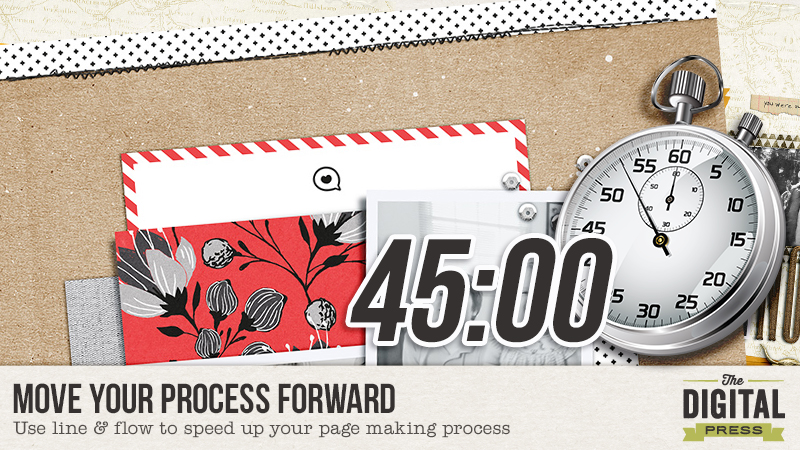
A few years ago, if there was a medal or award for word’s slowest scrapbooker, I, Carrie, probably would have won it. Turtles traveled to island destinations faster than I made a page.  My mind would be blown when seasoned scrapbookers told me they only spent 30 minutes to an hour on a page without a template. I spent a solid two years learning to make a page in 45 minutes or less and, now, I’m going to save you those two years by sharing how to make quick decisions based on line and flow.  There will be a challenge at the end of this post! 

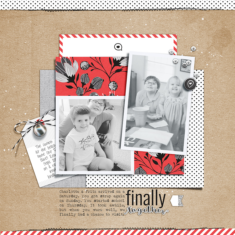
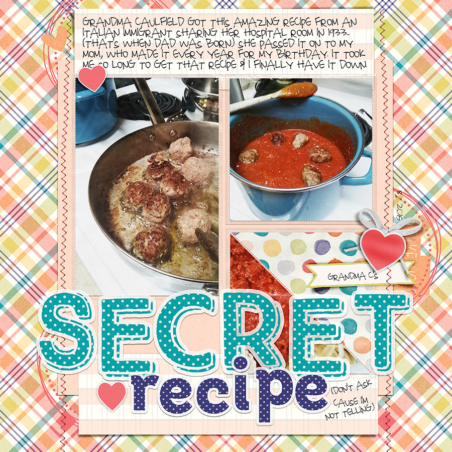
I did, in fact, time both of the example pages used in this post. Secret Recipe, made with Plastic Pocket Templates #2 Mommyish and Brilliant- Papers & Elements by Danielle Engerbretson took a full 45 minutes. Finally Together, made with Sahin Designs’ Monochrome Fall Bundle was completed in 37 minutes and 15 seconds.  A 45 minute or less scrapbooking session not only adds to my library of memories, it keeps me sane and happy. I can scrap with my morning coffee before getting to work and with my cup of tea before bed. I can start and end my day with a dose of scrappy creativity and so can you! You’re about to become a smarter, faster, more strategic scrapbooker… 

Before you even open Photoshop, the first steps to moving your process forward involves very simple planning.  I always know ahead of time:

  • what product I’m using
  • what photos I’m using
  • what story I’m telling
  • the shape of my page design

You can make these decisions ahead of time, eliminating choices you have to make once you start scrapping. Aside from the photo processing, you can come up with the rest while you’re doing the dinner dishes or while you’re taking a shower. Easy, peasy.

Helpful Hints:

  • Limit the amount of product you use and use product you know works for you.
  • Process your photos ahead of time.
  • Be familiar with some basic composition (or page design) shapes.

Just in case you aren’t familiar with basic composition shapes, I’ll give you a crash course now. When starting your process, pick one of these shapes. If you’re using a template, be aware of the template shape; This will help you the next time you create your own page design. If you know this, feel free to skip this part, but feel welcome to compliment on my awesome vector skills.

Move Your Process Forward by knowing composition shapes for scrapbook pages via The Digital Press

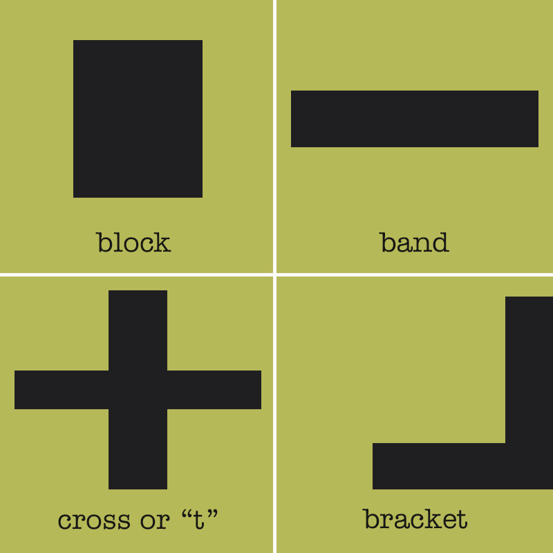
A block can be rectangle, square or grid. A circle would a variation on a block design.

A band is a design runs across the page, usually surrounded by generous white space.

A cross is made up of two bands that intersect centrally to create a lower case “t”, upper case “T”. Variations include rotating the “t” to creating an “x” or adding more lines to create a burst or star shape.

A bracket consists of a horizontal and vertical lines that meet at a right angle, creating an “L” shape. Variations include any sort of bracket or bookends, such as “[” or “{“.

(You can certainly use your creative genius to ramp up the basic composition shapes)

Okay, so now your…

  • Photos are processed
  • Your product is picked
  • You know what story your telling
  • You selected a basic composition shape (I use a block in the example pages)

…and you haven’t even starting putting things on the page. You, my lovely, are way ahead of the game! You’re ready to open a new canvas.

Keeping your page design shape in mind, place your photos on your canvas. Yes, before you even put on your background paper. No, I’m not crazy. There is an actual strategy for deciding where to place your photos, whether your using one photo or five hundred (which, you probably don’t want that many on a page, but ya never know!).

It’s all about the lines in your photo and where they are going. For people, you normally want your subject looking into the page. Our brains will naturally follow a persons line of sight. If your cutie pie kids’ eyes are looking off the page, the viewer’s eyes will go off the page. If those cutie pies are looking at the nearest photo or embellishment cluster, that’s where the viewer’s eye will go. Also take into consideration body positions: Where are the shoulders going? How are the arms directed? Is the torso leaning in or out of the composition? The lines in the photo will tell you how to position the photos within the shape of your page design.

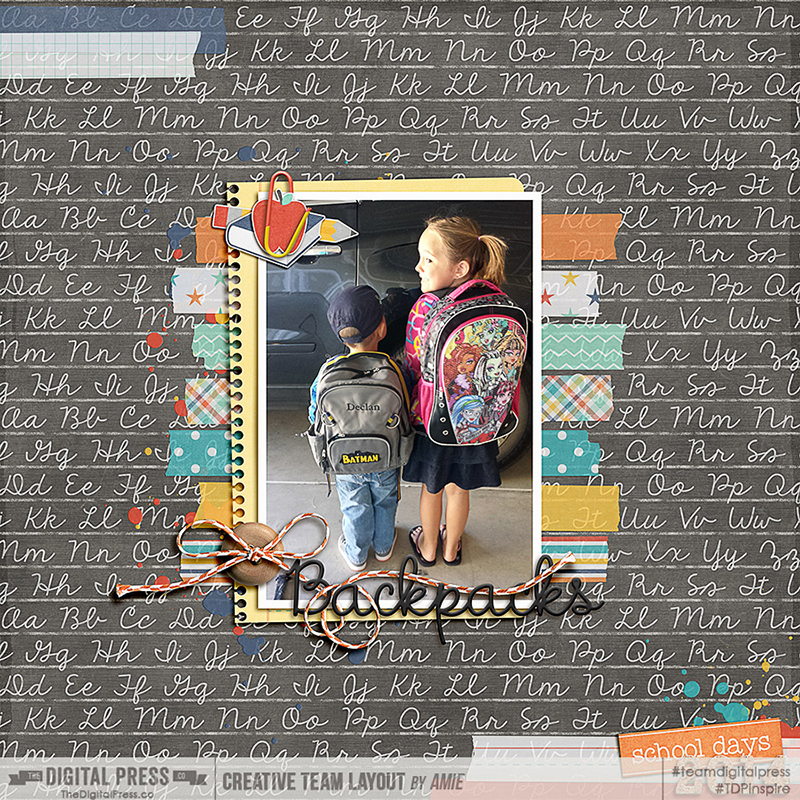
On this page eyes of the kids are kinda all over the place in these photos, but the shoulders and torsos in the photo on the left point to the photo on the right. The torsos of the kiddos on the right are turned more towards the left than right.

Move Your Process Foward


For photos without people, you still want to let the lines in the photo dictate placement. Notice on this page that the pan on the left leads to the pot on the right. The spoon on the right leads back to the pan on the left.


Flow is the way the eye moves across your page. The lines on your page and the flow of your page go hand-in-hand. By positioning your photos based on line, you’ve already begun creating the flow of your page. (yay, you!)

Now that your photos are in the right spot, add in your background paper. Add in other papers to fill out the shape of your page design and think about where to put a title and journaling. Add in the journaling and title before embellishing (trust me on this one).

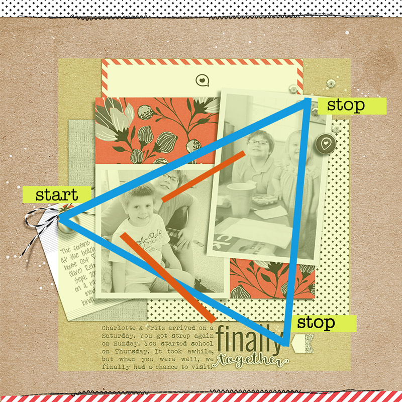
It’s time to embellish, so how do you know where to put all the pretty goodies? The lines of our photos within the shape of our page design will tell us where embellishments need to place to create strong flow. The embellishments areas create stops along your page. They tell the viewer what’s important to notice and help the eye decide where to move next.

There are three areas you usually want to the viewer to stop on your page: The start position (grabs the eye and leads it into the rest of the page), the photos, and the title and/or journaling. The focal point should always have the biggest, most visually interesting embellishing.

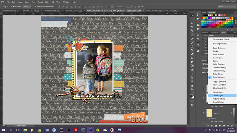
On this page, the embellished tag doubles as both a lead in to the page and establishes the focal point. The rest of the embellishing creates lines through the photos… notice that the lines fall through or next the kiddo heads and the embellishing is smaller and less dramatic.

Finally Together


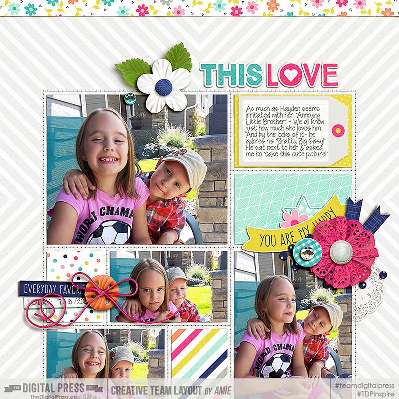
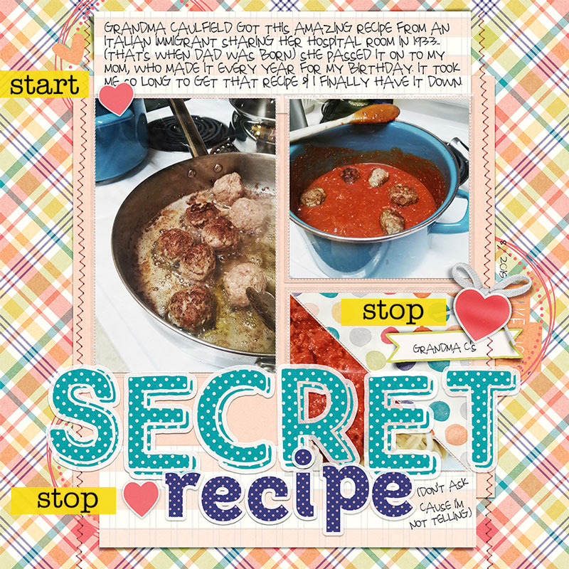
There are a lot of bold, potentially owhelming elements on this page, but I’ve used the embellishing to control the flow and establish my huge title as the focal point.  Notice how the embellishing points also work with the shape of the design and the lines in the photos.

TDP-8-21-carriew2f


If you understand how line and flow work together, you can decide where to put everything quickly. It’s choice that slows down our process and it’s choices we are simplifying with this process. To add to the awesome, when you understand how to use line and flow, it’s going to be hard to make a page you don’t like. It’s a total win. Now that you have these new, mad skillz…

For the challenge, you’ll follow this recipe:

  • Grab a timer (or use an app or use Google’s timer) and put 45 minutes on the clock.
  • Have your photos processed
  • Select the product you like to use (if you want to use multiple designers, this month’s Special Edition or Store Collab allow you that versatility and it’ll all go nicely together)
  • Pick your design shape (and stick with it!)
  • Open your canvas and place your photos
  • Add in background paper and additional papers to fill out your shape
  • Add your title and/or journaling
  • Embellish your page in three important areas– putting the most dramatic embellishing near the focal point

You can stop the clock as needed, for instance, if you need refresh your drink, answer the phone or use the restroom. Just remember to hit start when you come back to your page.

Share your page in the challenge thread HERE and tell us what composition shape you used (if you used a template, let us know what the shape it has) and how long it took you put the page together. (if you took longer than 45 minutes, no worries, I still love you.


Carrie About the Author: Carrie lives in coastal Delaware with her husband, teenage son and 5 cats. She produces and hosts The Digiscrap Geek podcast where she gets to   talk to amazing people about her favorite topic. Carrie creates for The Digital Press, Just Jaimee, Get It Scrapped and is a Be Photo Wise contributor. In her spare time, you may find her kicking but on Call of Duty, herding cats, star gazing or whipping up magic in the kitchen.

Personalizing Folder Icons on a Mac

Personalizing Folder Icons On A Mac


Today I want to show you how to turn generic folder icons on a Mac to a personalized image of your choice. What the heck do I mean? Let me show you:


Personalizing Folder Icons on a Mac


I like to do this for the main folders of digital scrapbook kits. I replace the generic folder icon with an image of the kit preview. It’s super easy to do. Here’s how:


1.   Copy the image you wish to use to the clipboard.


I prefer to do this directly from within a Finder window without opening Photoshop. When I’m using a kit preview (you can do this with any image of course):


  • Right click on the kit’s preview image provided by the designer (usually a JPG image)
  • Choose “Open With”
  • Select “Preview.app”


Once the image has opened in a Preview.app window:


  • Choose Edit > Select All (or press CMD+A)
  • Choose Edit > Copy (or press CMD+C)


At this point the image you copied is in your clipboard. You can now close the preview image. (Click the red X radio button or press CMD+Q.)


2.   In a Finder window locate the folder icon that you want to change. 


  • Right click on the folder icon
  • Choose “Get Info” (or press CMD+I)
  • Click on the small folder icon in the upper left corner of the Get Info window that just popped up
  • Choose Edit > Paste (or press CMD+V)


The folder icon has now been replaced by the image you copied in step 1 and you can close out of the Get Info window. (Click the red X radio button or press CMD+W.)


That’s it. You’ve now personalized a folder icon!


NOTE: If you change your mind and want to go back to the generic blue folder icon, just open up the Get Info window again, click on the small folder icon in the upper left of the window and press delete. Easy peasy, right?!


One more thing!  You can also personalize file icons following these steps as well! I find it really useful to personalize my styles files (.asl files). I have a master folder where I keep all of my styles. I like to keep only the .asl file from purchased styles (not the whole folder of stuff that comes with the style). If I didn’t personalize the files, I would have a folder filled with files that look like white folded pieces of paper. I follow the same steps I outlined above and copy the style preview image to the .asl file. Since I do this I can easily find the style I’m looking for and see who the designer is without having to read through for the style I’m looking for. Cool, right?!


BTW … the kit I used in my sample image is Laura Passage’s (aka Wishing Well Creations) gorgeous Project 2015 September Collection!


BarbaraUnzen

About the Author:  Barbara is a member of the creative team here at The Digital Press. She’s a mom to two teenage kids (her son, the oldest, is a freshman in college and her youngest, a daughter, is in high school). She lives in the midwest with her husband, daughter and their dog Maggie, a cuddly ball of fluff. (This is the first time she has had to say she lives with only one kid. So weird!) In Barbara’s free time she loves to digi scrap, take photos and hang out with her family.

Tutorial: Realistic Paper Shadows

Realistic Paper Shadows


Hello guys! I’m here today to share a quick trick that I use on almost every layout I make! When you look at ‘real’ paper layouts- the papers are NEVER perfectly flat- there are always areas where the adhesive stuck it down flatter than other areas. Never fear digital scrappers- here’s my quick fix!

First, you need to make your shadow on its own layer. Select the layer in the layers panel that you want to separate the shadow from.


Realistic Paper Shadows


With Photoshop- you can click on the drop shadow & select “create layer.” In Photoshop Elements- I did a tutorial on how to make shadows on their own layer- you can find that on the blog HERE.

Realistic Paper Shadows


Next- Make sure the you select the shadow layer in the layer styles panel.


Realistic Paper Shadows


This filter is present in BOTH PS & PSE so that is awesome I think- as a previous PSE user (and I used this a lot!) Under the Filters tab, click on DISTORT, then on WAVE.


Realistic Paper Shadows


That will bring up the Wave Dialogue box. First, make sure the Sine circle is checked (this is for the rolling wave effect.) Then you need to change the ‘generators.’ That is basically the number of waves. You want this number low for papers- unless you want a really wavy paper! 😉 Next adjust the  wavelength (distance from one wave crest to the next), in our case, we want LONG waves. Then adjust the Amplitude or height of the wave. Again in our case, we want short height waves. You can then adjust the scale- but I usually just leave that at 100%. Lastly, make sure the ‘Repeat Edge Pixels’ is checked (this extends the shadows edge in the direction specified.) In the preview box, you’ll see the image as you adjust all of the above. If you don’t like what it looks like, you can either click randomize which will change it or adjust the sliders to your liking.


Realistic Paper Shadows

These are my usual numbers. They are definitely not set in stone- depending on the pattern of the paper or the background, I’ll fiddle with it.

Realistic Paper Shadows


Here’s my final layout- the wave on the photo shadow is definitely subtle, but I love that it just adds a small realistic touch.

(all images linked to my gallery for credits)

Realistic Paper Shadows

I particularly like to use this filter on large background papers like this layout:

Realistic Paper Shadows


This filter works great on strips of paper too! I also ‘waved’ my shadows on the other flat elements of this layout too!


Realistic Paper Shadows


I hope you have some fun playing around with the wave filter! If you have any questions- shoot me an message!


Amie

About the Author: Amie is a craft loving, dental hygienist in WA state who loves her husband, two kids (ages 7 & 4), English Bulldog, coffee, baking cupcakes, daffodils, glitter & sprinkles, reading a good book and lip gloss- not necessarily in that order.

Get Your Photos Off Your Camera

Get Photos Off Camera


A few months ago, I wrote a post about taking pictures to help you document your everyday. This month, I’d like to discuss getting those photos off your cameras and phones and onto your computers in an organized way so they can be scrapped in a timely manner. I have found that automating this process as much as possible has helped me keep my camera’s SD card as well as my Camera Roll on my phone clean so that I never run out of space on either. Here is my process:


Phone Photos

Like most of you, I use my phone to take a lot of photos. I use an app called Carousel by Dropbox to organize and back up my phone photos. When you take a picture, it automatically backs it up to Dropbox if you have that option set up. I have mine set to back it up when I am connected to WiFi so that it doesn’t use my cellular data. Therefore, when I am home, I just open up my Carousel app and it automatically starts backing up any photos on my camera roll.


Get Photos Off Camera 2

The beauty of Carousel is that it will also alert you when your storage is low on your device. This way, you will never get a message telling you can’t take another photo because you have too many old ones stored on your phone. I don’t typically wait that long. When I think of it, I tap the ellipses at the bottom of the app, go to settings and select Free Up iPhone Space. Then, Carousel will tell me how much space it can free up by removing my photos that are safely stored in Dropbox from my Camera Roll:


IMG_7029


Wait. It gets better. Dropbox can get expensive so I don’t use it to store backups of all my photos. So, I need to get my photos out of my Dropbox folder and onto my computer. Enter Lightroom.


Lightroom works with Carousel by way of its Auto Import feature. Anytime a photo is uploaded to a watched folder, Lightroom will automatically import it into its catalog whenever Lightroom is launched and it will move it wherever you tell it. It’s pretty easy to set up. First, you need to enable Auto Import:


Choose File > Auto Import > Enable Auto Import


Next, you need to specify the settings:


Choose File > Auto Import > Auto Import Settings


In the Auto Import Settings, you will specify the name of the Watched Folder. This folder must not contain any subfolders. In the case of Carousel, the Watched Folder would be the Camera Uploads folder within your Dropbox folder. Next, specify the Destination where you want the photos moved. I move mine to a folder on my hard drive called Auto Imported Photos. Next, you can choose a File Naming option which will rename all of your imported photos. (I don’t do this.) And finally, in the Information section, you can choose to apply Develop Settings, add Metadata and/or Keywords. I apply the Auto Tone develop setting upon import which applies automatic corrections for Exposure, Blacks, Brightness, and Contrast:


Auto Import Settings


While a lot of what I said may sound overwhelming, let me stress that that is a one time set up. To be clear, my process for uploading my phone photos to Lightroom with color corrections is as follows:


Open Carousel.


That’s it. All I have to do is open the Carousel app and everything else is automatic!


Now, onto my process for downloading my dSLR photos. Unfortunately, my process for that is not as easy, but it can be.


dSLR Photos

I choose to tether my camera to my computer to download photos. My reason is this:  I feel there is less probability for damaging or losing my SD card if I don’t take it out of my camera. I keep my camera and cord by my laptop, so it is not really a big deal. I just connect the wire, connect my EHD (because that is where I store my photos), open Lightroom and press the Import button.


Along the right hand side, a number of panels open up: File Handling, File Renaming, Apply During Import and Destination.


Under File Handling, I check the box “Don’t Import Suspected Duplicates.”


File Handling


I don’t do anything under Rename my files, however, this is where you could choose to rename all your files by date or event name. I just don’t do that.


Under Apply During Import, I choose the Develop Setting Auto Tone which can be found under the Lightroom General Presets. As I stated earlier, this automatically corrects the Exposure, Blacks,  Brightness, and Contrast.


Develop Settings


Finally, under Destination, I choose to organize them By Date using the Year/Month format. Then, I select my External Hard Drive and navigate to my Pictures folder. There Lightroom will automatically copy my photos from my camera to my EHD and store them in a yearly folder which is then separated again by month.


Destination


Once my photos are in Lightroom, there are a number of ways they can be organized to make scrapping them a breeze. I will talk about this in another blog post. However, I did want to share with you how some others on our team get their photos off their computer.


Sabrina says: I use an app called PhotoSync and it transfers the photos wirelessly. I also have downloaded the application my computer so it can do the transfer. Super easy!! You can get it for iPhone or Android.


Jamie says: If you’re working with everything Apple (Mac and iPhone), Airdrop is a great feature to get pictures from your phone (or anyone else also on an iPhone) to your computer. That’s what I usually use to get pics from my phone to computer, then I import them into Lightroom at that point. When getting them off my DSLR, I just put the SD card in my computer, and import through LR. (Note: If you are working with an older Mac computer or iPhone, Airdrop may not be compatible.)


Juliette says: My compact camera automatically files my photos by date on my Mac (over wifi from anywhere in the world provided the Mac is turned on) when I press a button on the camera. It’s a Samsung WB800F; it’s absolutely brilliant!


Kathryn says: I use Google Photos auto sync to back up my phone photos. It’s a really easy process for Android users as it’s built in and the backup is free. I do also have an Eyefi SD card to do wireless transfer from my dSLR.


So, as you can see, there are a number of ways to get your photos off your camera pretty easily, so they are ready and waiting for you to scrap them. So, how about you, what’s your process?


Jen Flaherty

About the Author: Jen is a member of the Pocket Team at The Digital Press. Having scrapped digitally for many years, she has come to embrace the simplicity of Pocket Scrapping since it fits more easily into her busy lifestyle of shuttling her three children from field to field. When she is not on the computer, you will find her working out or really doing anything else she can besides cooking, cleaning and doing laundry.