Category: Tutorials

Hybrid tutorial: Fall wreath

donnaespiritu-hybridfallwreath-header

Hello everyone! Donna here to get you inspired with a hybrid project.

Although we don’t have fall where I am, it is one of my favorite seasons because of the warm colors. Today, I’d like to show you a project on how to create a simple hybrid fall wreath.

First, gather your materials.

  • Cardboard (size depends on your preference)
  • Printer, photo paper
  • Digital kits (I used WOODLAND WHIMSY DIGITAL KIT BY: INSIDE PIXELS BY LISA BELL and AUTUMN WOODLAND ELEMENTS BY: RIVER~ROSE)
  • Scissors
  • Glue gun/stick (or craft glue)
  • Ribbon
  • Die cutting machine, metal dies (optional)
  • Acrylic paint and paint brush (optional)

I already printed and cut some of the elements here. I used a 100 gsm photo paper for my print outs. Preferably, use fine-tipped scissors to cut through the intricate print outs. I cut all of these by hand but if you have an electronic cutting machine, you can also do that (I do have one but it’s under my craft table and I’m too lazy to pull it out lol).


donnaespiritu-hybridfallwreath-tut01

This is optional. I just happen to have a die cutting machine and some metal dies so I used them for this project. donnaespiritu-hybridfallwreath-tut03

I also used the same metal dies to trace solid ones. Another option is to search Google for fall leaves templates and trace those instead if you don’t have metal dies like I mine.

donnaespiritu-hybridfallwreath-tut04

donnaespiritu-hybridfallwreath-tut05

Cut a circle like the one in the image. This is approximately 8 inches in diameter. I just recycled a cardboard from a shoe box.

donnaespiritu-hybridfallwreath-tut02

The background won’t show through but I still preferred the cardboard painted. (Ignore the messy table… lol)

donnaespiritu-hybridfallwreath-tut06

Tie a ribbon and a bow. Then start adhering the cut outs. I used a glue gun because it’s faster. But you can also use any craft glue.

donnaespiritu-hybridfallwreath-tut07

Continue adhering everything, making sure there is balance in your placement. It’s also like creating digital layouts, balance is key to a desirable outcome.

donnaespiritu-hybridfallwreath-01

That’s all for now, I hope you give it a try!  Please join us in the challenge forum for a fun challenge inspired by this.

Happy Crafting!


DonnaAbout the author: Donna Espiritu is a mom to a little girl who just turned 1 year old and wife to a very supportive husband. She is currently living in the Kingdom of Saudi Arabia with them. When she is not scrapbooking, she likes to read books/e-books (sci-fi/romantic/time-travel) or watching old episodes of some of her favorite TV shows.

Harmony: Blending Papers in Photoshop

Blending Papers in Photoshop


Are you ready for this month’s theme: Harmony?  I have a quick tutorial for you about “harmonizing” papers in Photoshop.  Don’t you just love all those realistic wood backgrounds in digital kits?  Although they look great (and are much easier to scrap on than the real thing), it can sometimes be difficult to make your pages look realistic – especially with journaling and painty elements in the background.  I have a quick and easy tip for harmonizing traditional scrapbook papers and journaling with those fabulous wooden backgrounds.


Here is a sample of the problem:

Unblended-sample


Notice how the paint element, jounaling and masked papers seem to be floating on top of the wooden background?  If these elements were applied to this type of background IRL, it would look much more muted and textural.  So how do you achieve this effect in Photoshop?  It’s as easy as 1, 2, 3 . . .


  1.  Layer the paint, journaling or papers on top of the wooden background.
  2.  With the paint, journaling or paper layer active, click on the layer style icon at the bottom of the layers panel.
  3. Adjust until the element is blended to your liking.


The Blending layer style is located under the layer styles icon (fx) at the bottom of the layers panel in Photoshop.


Layer-Styles


Just click the fx icon and then choose Blending Options:


Blending-Options


Once you click on Blending Options, the blending menu will appear:


Settings


To change the appearance of the paint, journaling or paper just move the black sliders to the right and white sliders to the left until you achieve the desired result.  You can also make the effect more muted my splitting either or both of the black and white sliders.  As shown above, I split the black slider slightly on my page.  I did this by placing the cursor on the right side of the black slider and hitting the Alt key while pulling the right side away from the left side.  There is no one perfect recipe for using this blending option, you just have to play with it until you achieve the look you want.


And here is my finished layout, with the blending effect applied to the background papers (I actually applied it to the masks that the papers were clipped to), the journaling and the paint element:


Created with Fright | Bundle by Sahin Designs


Ahhh, that looks so much better!  You can also use this tool to blend an entire background page onto another (which I especially like to do with wooden background papers).  Have fun with it and be sure to link up your blended creations in the comments.


Until next time ~
Judie


JudieAbout the Author:  Judie is a member of The Digital Press creative team.  She spends most of her time engaged in creative endeavors of all sorts.  Traveling, Starbucks, football and Harry Potter are just a few of her favorite things.


Putting It All Together for Pocket Scrapping

PuttingTogether


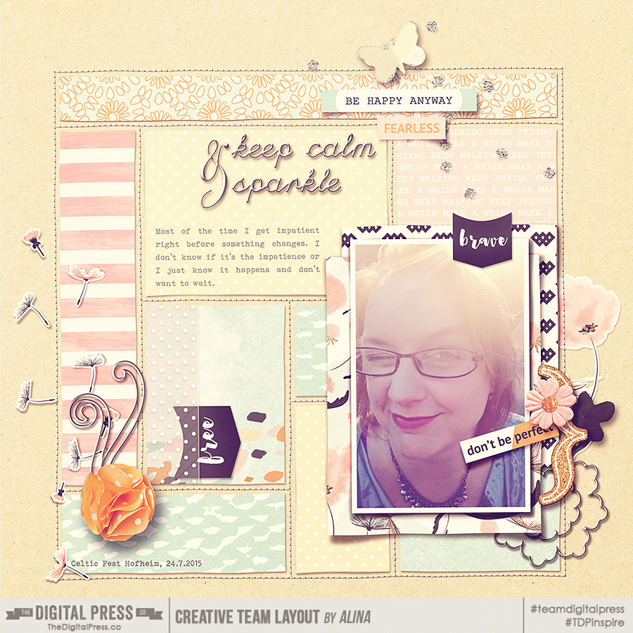
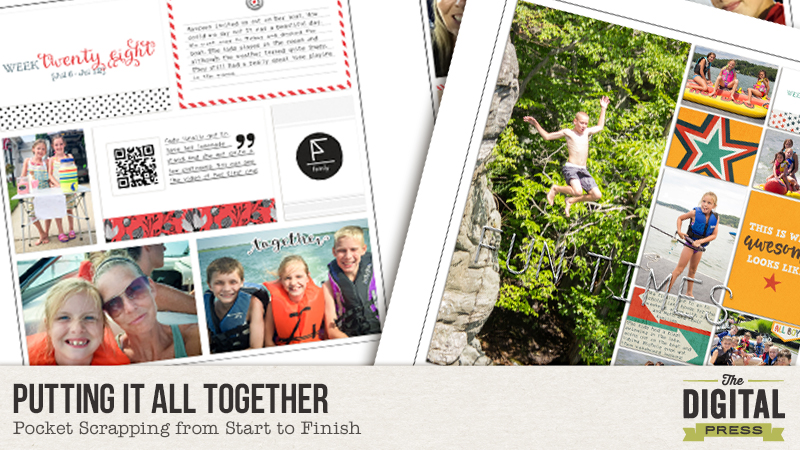
So up until this point, I have written blog posts about taking daily/weekly photos, jotting memories using various apps, and uploading and organizing your photos with keywords. Today I’d like to talk about using Smart Collections in Lightroom to organize your photos for weekly pages and putting it all together.


At the beginning of the year, in preparation for my weekly documentation of our lives, I set up Smart Collections in Lightroom, which are photo collections based on a set of rules that you define. Photos that meet those criteria you establish are automatically added to that collection. Let’s get started.


Setting Up A Collection Set

The first thing I did was set up a Collection Set called Project Life 2015. A Collection Set is container that houses Collections. Fittingly, it’s icon looks like a photo filing box.


1


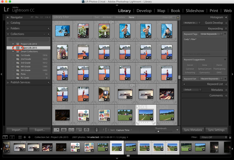
Click on the + symbol on the Collections panel and choose Create Collection Set. Name your collection set and click Create.


2


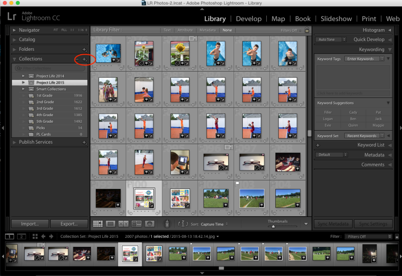
Setting Up a Smart Collection

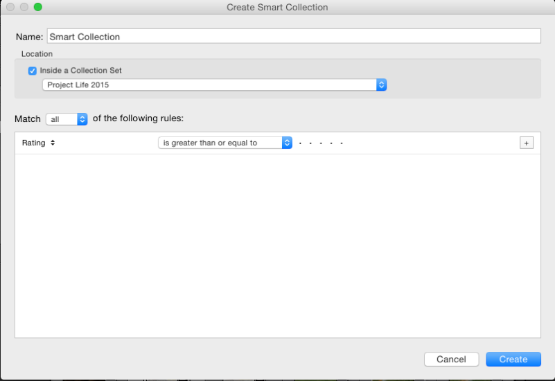
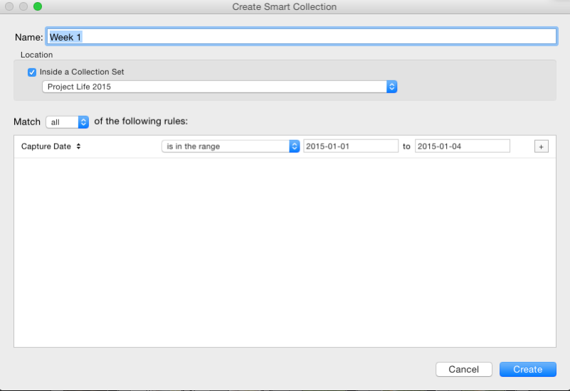
Next, I set up my first Smart Collection. Click on the name of your Collection Set so that it is highlighted and then click on the same + symbol you clicked on before. This time scroll down to Create Smart Collection. The following dialog box will pop up:


3


The first thing you need to do is create a name for your Smart Collection. I called mine Week 1.


Next, make sure you check off to have it located inside the Collection Set you just created. In my case, I located this Smart Collection inside the Collection Set called Project Life 2015.


Next, you need to establish the rules it will follow when deciding which photos to include in your Smart Collection. I told it to match ALL of the rules (of which there is only one in my case). That rule was that the Capture Date  be during the first week of January. To do this, click where it says Rating. It will bring up a drop down menu. Scroll down to Date and then select Capture Date from the fly out menu. Then click where it says, “is” and change it to, “is in the range.” Next, input your dates.


4


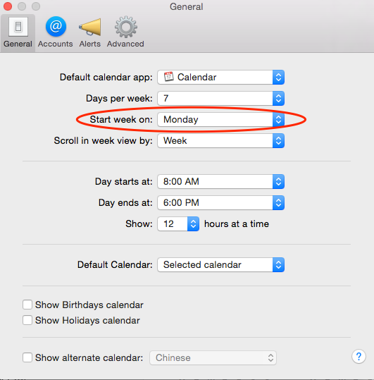
Mac User Tip: In Calendar, under preferences, you can set your calendar up to start the week on any day of your choosing. I set mine up to start on a Monday.


5


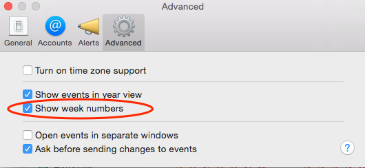
In addition, under the Advanced tab, you can check off to show week numbers. Perfect for weekly documenting!


6


The last Smart Collection I set up is called, “Weekly Picks.” My rules are to filter out Flagged Photos. You will see why in the next section.


Simple Steps for Pocket Scrapping: Flagging Photos

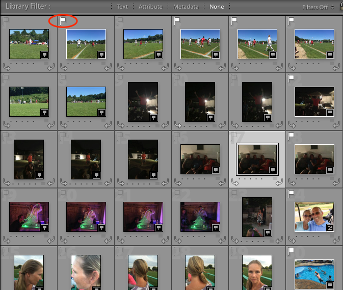
When I am ready to sit down and scrap a weekly spread, I open up Lightroom and click on the weekly folder of photos that I am up to. I scroll through the photos and flag the photos that I would like to use by pressing  “P” on the keyboard to “Pick” the photos I like. A small white flag will appear above your flagged photos.


LR_Photos-2_lrcat_-_Adobe_Photoshop_Lightroom_-_Library


Once I flag all the photos I like, I go to my “Weekly Picks” folder and look through the photos I picked. I take a look at the number of photos I have chosen and decide whether I have too many, too little, or just right. If I think I have too many, I whittle them down a little bit more by pressing “U” on the keyboard to “Unpick” some photos. If I don’t have enough, I do a search for “Filler” photos. These are photos that can be used in any given week.


During my uploading process, I try to identify photos that are not time specific — meaning they really could be used in any weekly spread because the specific week they were taken in is not relevant. For example, this past week, my photos to choose from were pretty light, so I searched for some filler photos and found a photo of my daughter drinking milk. She drinks several cups of milk every day, so it really didn’t matter what week the photo ended up in. What mattered was that somewhere I told the story of her continued love for milk during this stage in her life.


Exporting Photos

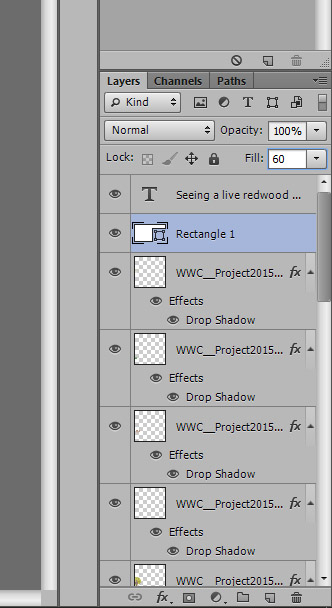
The next step I take is to export the photos to Photoshop. In Lightroom, select all the photos you have flagged and right click on one of the photos. Scroll down to Edit In>Open as Layers in Photoshop.


Fullscreen_10_25_15__10_06_PM


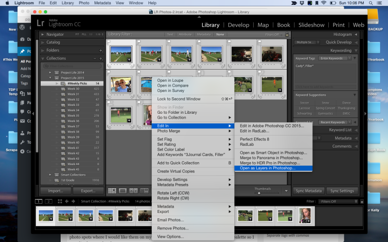
This will open a new document in Photoshop with all of the photos in that one document on separate layers. All of the layers will be highlighted. Using the move tool, I click and drag all the layers over onto the template I am using. I then move the layers around on my template to  the photo spots where I would like them on my template. Then I do the same in my layers palette so I can clip them to the photo spots.


Adding Journal Cards and Embellishments

The next step is to add my Weekly Calendar Card and Journal Cards. Then I add any other embellishments. (Though, honestly, I keep my layouts pretty simple. It’s all about the documenting for me.)


Saving

The final step is to save my layout. I save a .PSD version and a full resolution .JPG version. The .PSD version is in case I need to make any changes and the .JPG version is for printing. I also have to save web versions for uploading to galleries, but once they are uploaded, I delete these versions.


And that’s all there is to it. By following these steps week in and week out, it has really sped up my process and that’s what I need to do in order to keep up with such an ambitious project. Hopefully these tips will help you in your process or inspire you to give it a shot next year. I can say with certainty, my kids LOVE seeing their lives documented with such detail.


Happy scrapping!


Jen Flaherty

About the Author: Jen is a member of the Pocket Team at The Digital Press. Having scrapped digitally for many years, she has come to embrace the simplicity of Pocket Scrapping since it fits more easily into her busy lifestyle of shuttling her three children from field to field. When she is not on the computer, you will find her working out or really doing anything else she can besides cooking, cleaning and doing laundry.

Simple Trick for Digital Vellum

Simple Trick for Digital Vellum

When I scrapbooked on paper, I often used vellum as an accent or as the paper for my journaling.  The look is easy to achieve digitally!

I like to type out my journaling for the page first.

Simple Trick for Digital Vellum

Using the Shape tool, draw a white box behind your journaling.

Simple Trick for Digital Vellum


Simple Trick for Digital Vellum

Change the fill of the shape layer until it looks right to you – I usually use between 50 and 60 percent fill.

Simple Trick for Digital Vellum

Using the shape tool allows you to put a drop shadow on the journaling block without having the shadow make the digital vellum look darker – so throw on the drop shadow of your choice, position your text and vellum on your layout, and you are done!

Simple Trick for Digital Vellum

Happy scrapping!  🙂

Supplies Used: Project Twenty Fifteen | October Collection by Laura Passage


ProfileAbout the Author:  Kacy is a member of The Digital Press Creative Team.  She’s an Environmental Engineer living in Arizona with a cranky, pudgy, but insanely cute calico kitty.  She enjoys scrapbooking, crocheting, dancing awkwardly to electronic dance music, Grumpy Cat, cupcakes, Stephen King books, and men in kilts.

Playing with Pocket Templates

Playing with Pocket Templates

Do you love pocket templates and use them all the time? Or do you struggle with them? I personally love project life but I’m not a big fan of straight lines. Every layout that I made with pockets in the past was not obeying to the rules of pockets. Let me show you how I deconstruct pocket templates, sometimes even to a point that they are unrecognizable.

  • Downsizing the template

While I think it’s good that the designers provide templates that use the whole 12×12 layout, I need more visual breathing room on my canvas. It’s rare that I leave it as it is. I downsize the template at least by 10%, most of the times 20% or more, sometimes I add a mat underneath the pockets, to have a framing of the whole. Even when you are using the whole 12×12, rethink this when you want to print your pages. You might need some bleed to provide nothing gets cut off in the printing process. All my layouts you see in this post are sized down.

  • Going out of bounds of the pockets

One thing I seem to be afraid of when playing with pockets are the straight lines. I usually can’t let them rule my layout. I have to break the lines up. Mostly with embellishments on top of it all, leaping over the edges. I tend to make it a more classic layout, applying the rule of thirds or getting more attention to certain parts of the layout. I emphasize the shadows on these embellishments, to make the 3d quality of them stand out more.

Playing with Pocket Templates

Playing with Pocket Templates


  • Changing the shape of the pockets

All pockets are rectangular by nature. Weird, right? There are only little exceptions to this rule. Sometimes a rectangle is broken up to make it two triangles. Still not very organic and still too straight for me. How about replacing one or more of the rectangles with a different shape like a circle or an oval? I tend to do that with frames in that shape. It makes the whole layout softer and it gives a great entry point for the eyes.

Playing with Pocket Templates

Playing with Pocket Templates


  • Tilting the template

Sometimes the tilt does the trick for me. With a little tilt I get a more natural look to the whole. And if I strive for one thing, then it is the natural, real paper look. It may look as if the pockets were photographed on the background paper.

Playing with Pocket Templates

Playing with Pocket Templates


A bigger tilt might give you a whole new look, like this template wasn’t intended for pocket scrapping at all.

Playing with Pocket Templates

Playing with Pocket Templates


  • Use the template for a pieced background and add your own photocluster

From going out of the pockets with embellisments and frames it’s not far to this step. You can even go further by adding more embellishments than I did here. You could also use a second template with a big cluster and plop it onto your pocket template and go from there.

Playing with Pocket Templates

Playing with Pocket Templates


  • Using it for Art Journaling

I remember that once someone asked if I consider myself more towards the pocket scrapping side, the „regular“ scrapping side or the Art Journaling side. As if pocket scrapping and Art Journaling are two very different ends on a spectrum of scrapping. Maybe they are. I personally don’t think so. There are some very reflective pocket pages out there. And some very to the rule Art Journaling pages. And last but not least “regular” pages with a grid or no visible structure. I love being challenged to try something different and always want to make things work, even if at first it seems awkward. I tried a more artsy approach to pockets several times and I love it. Yay for art in rectangles!

Playing with Pocket Templates

Playing with Pocket Templates


That’s it for now. I’m sure there’s much more that you can do with your pocket templates. Do you have more ideas? Feel free to comment below and point me to one of your layouts. And who knows, maybe I will scraplift your idea! Thanks for reading and have a great time while putting new inspiration into practice. Happy scrapping!


AlinaAbout the Author: Alina enjoys sitting in front of her large computer screens too much. Apart from that she loves walking her dog and watching sunsets while being amazed of life in general. She is married to her best friend. Tries to manage the needs of her two cats and her dog and badly fails when they all want their cuddle time at once. Everything else is scrapping, taking photos and currently crafting. Having said that, she needs a bigger craft room.


Tiny Technique for a Boost of Realism!

tiny-technique


I really enjoy creating layouts that are simple… but look as realistic as possible. Today I am going to share with you a very easy technique (just a few simple steps!) to add a dose of realism to your layouts.


1. I want to accent the text on the post-it note with a paint element, but I also want it to look like it really was painted on top of the elements.

1


2. As you see, I had originally placed this paint layer right under the text layer… but it is about to get a makeover!


2


3. You’ll take your paint layer and place it directly above the top element that it is being painted onto. In this case, that is the post-it note. Then you will duplicate your paint layer and place it BELOW the post-it, as well.


3


4. This next part may sound tricky… but it isn’t. You will take the top paint layer and “clip” it to the object underneath it (which, in this case, is the post-it note). For this layer, you are now done! NEXT!


4


5. Next, you will select the object you’ve painted onto (again, for me, it’s the post-it)… and do one of those snazzy “selection” thingies. I do Control+A, and then I double-click the layer (thereby selecting the layer and creating the “marching ants” around it). Then you will Modify > Expand > 2px (or whatever you want… when you see the effect you can decide if you want yours larger or smaller).


5


6. With your “marching ants” still active… select your 2nd/duplicate paint layer (the one that is under your object), and get out your eraser. You will erase inside the selection area.


6


7. You can stop there… but personally, I like to move the paint layer around a bit (in this case, slightly down and to the right). Depending on your lighting angle, you may want to move your paint element a different direction. Totally up to you!


7


8. TADA!  As you can see, the effect may be minimal… but it is one that adds just a tiny dose of realism to a digital layout.


8


Another little tip: if you have multiple layers that your paint will need to be “clipped” to after you duplicate your layers… you can “link” them together. This ensures that if you’d like to move the paint around, each layer moves as one, also.


I hope you enjoyed this tutorial!  Don’t be afraid to give this technique a try!


Leah/Mommyish

 About the Author: Leah is the designer behind Mommyish and owner of The Digital Press. She lives in the beautiful lower Hudson Valley of NY with her husband, her two girls, and her in-laws! She has a love for all things geeky and quirky. In addition to being a graphic designer, she is an avid pianist.