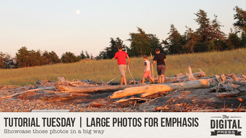
Hello everyone, and welcome to another edition of our Tutorial Tuesday series here on The Digital Press blog! Today, I’ll be sharing ideas for using large photos creatively to emphasize them on your scrapbook layouts!
Have you ever heard the phrase “go big, or go home”? I love it, and I say it to myself quite frequently when creating scrapbook pages that feature my favorite photos. The photos that tug at your heart strings, tell a story or just deserve a large spot in your scrapbooks, those are the photos I am talking about!
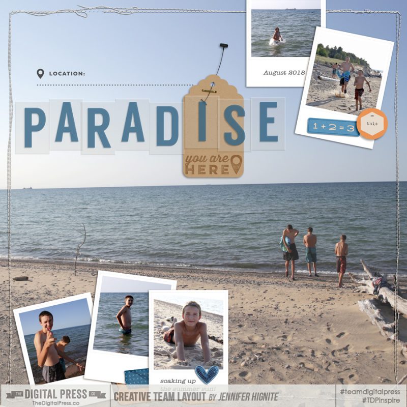
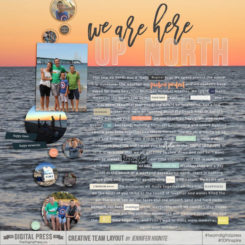
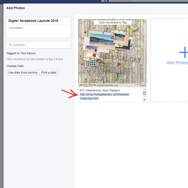
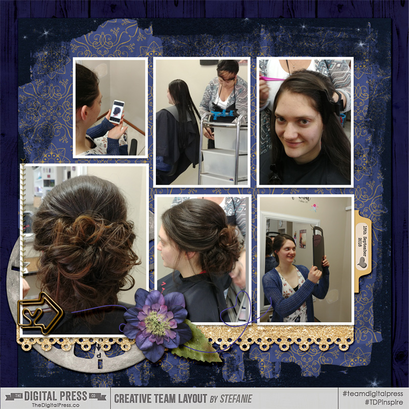
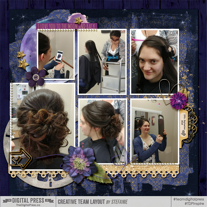
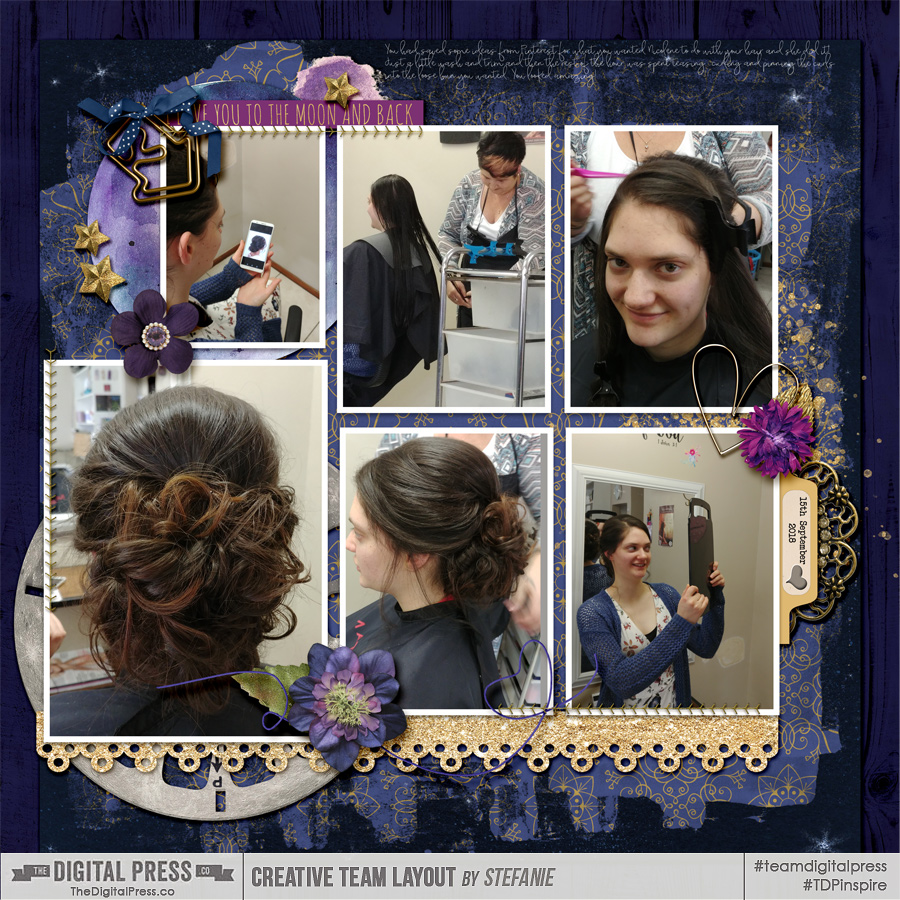
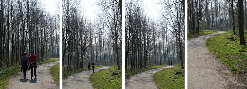
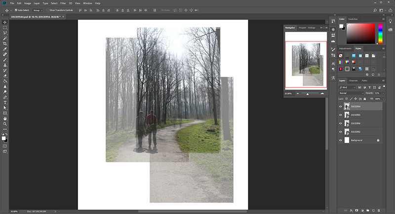
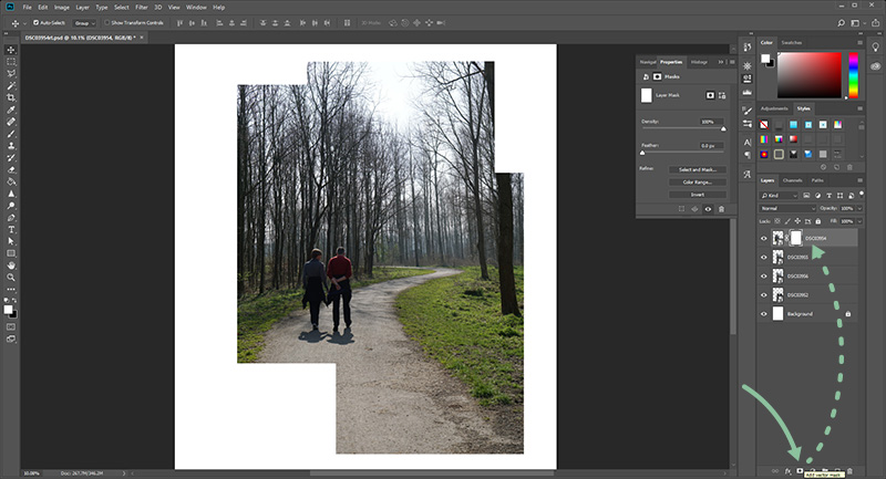
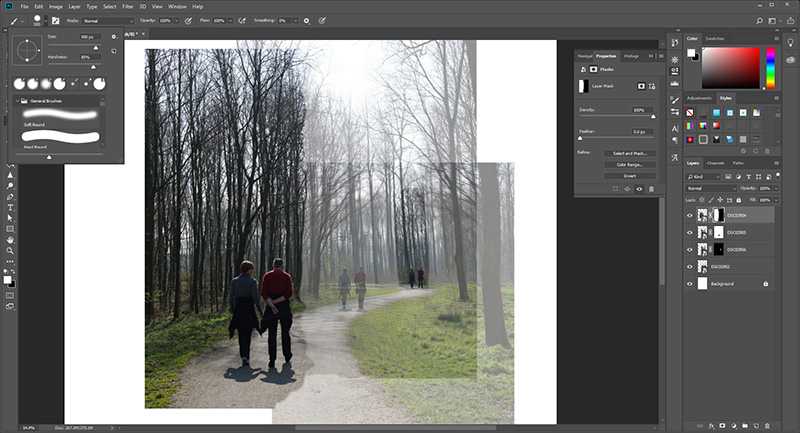
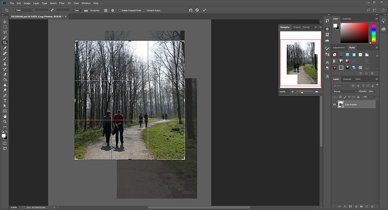
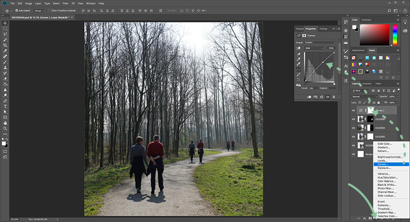
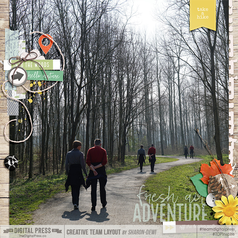
A big photo makes a statement, and is the perfect way to showcase a photo that tells a story. Use one large photo to fill the entire background of your layout! Photos that work perfect for this are ones that show the entire landscape or are a wide angle shot with lots of white space. You can add more photos in the white space of your photo as I did on the layout below. Frames help to ground the photos you place over top of the background photo and help tie multiple photos together cohesively on a layout.
Tip: Use the opacity slider to make your background photo look more transparent. This can give the photo a look of a faded memory! If you layer your photo on top of a textured cardstock, it will take on the textured look of the paper below it!
Trick: Frame your large photo to give it more definition on the page. Use stitching or other attachments to anchor your photos and elements to the large photo. That way they don’t look like they are just floating on top of your background photo!
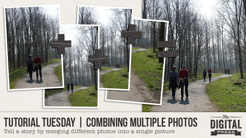
Trick: use a template as the guiding point for your design. Fill the background layer of that template with a large photo and work from there. On the layout below I started with this photo of the skyline and added other favorite photos from our vacation on top of it.
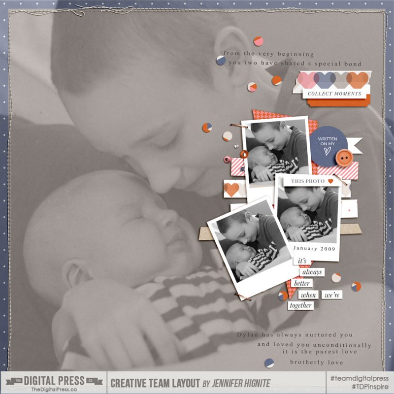
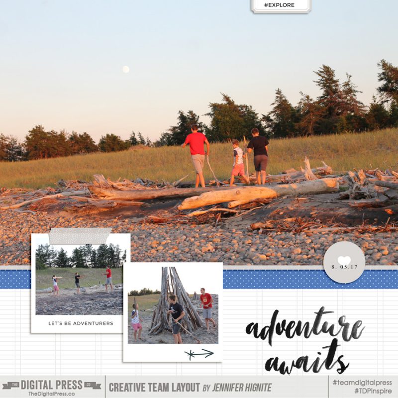
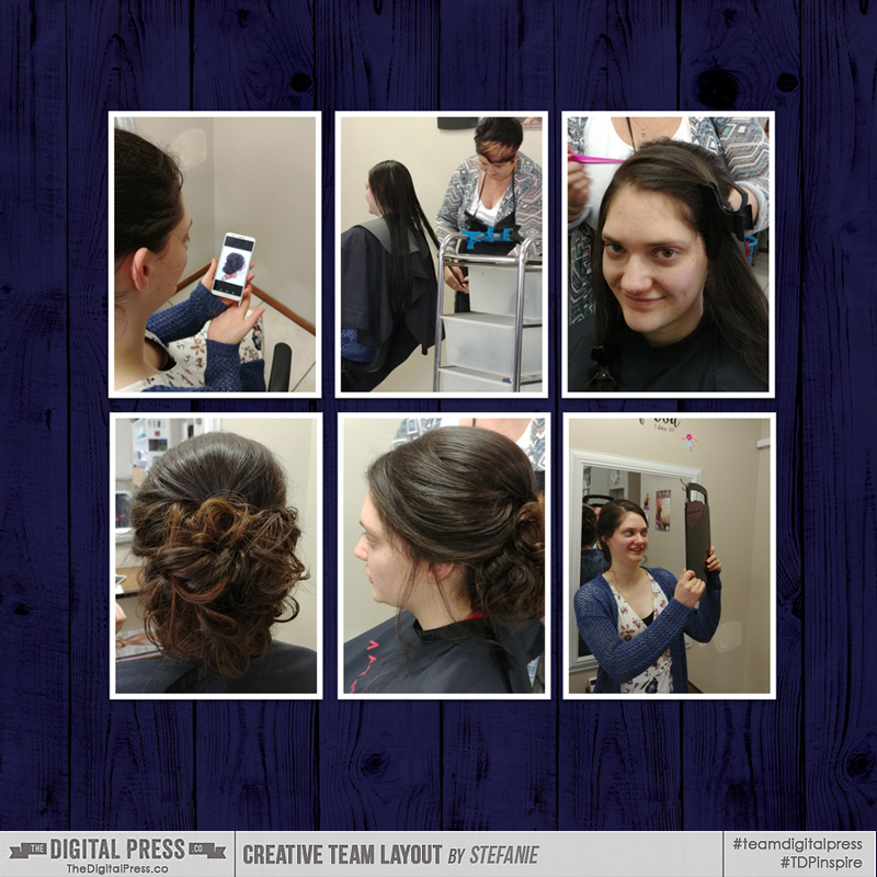
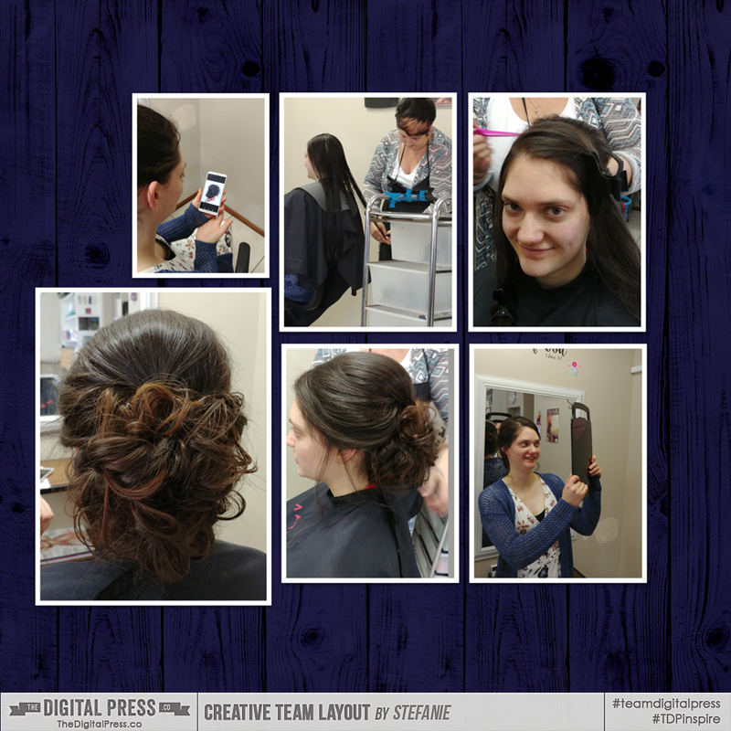
A large horizontal or vertical photo can be used in its natural shape on a scrapbook page by layering patterned papers and embellishments below it. You still get the emphasis of a large photo layout, without filling the entire page with the photo.
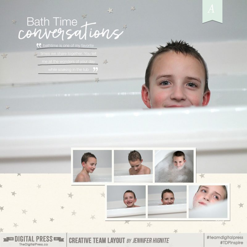
Large photo layouts are the perfect way to document a conversation or quote you want to remember from the moment the photo was taken. Keep your design simple and let the photo shine! Not only does the large photo speak volumes, the words you document right on top of it will help to recreate the story from that single moment!
Tip: Use the white space on your photo to write your journaling.
So there you have it… a few simple tips and tricks to use large photos for emphasis on your scrapbook pages. I hope this has inspired you to use a large photo on your next layout!
 Jennifer Hignite is a mom of three boys and new homeowner with her fiance in the mitten state of Michigan. When she is not scrapbooking, she enjoys photography, watching her boys play sports, decorating, and shopping at Target.
 About the Author Amie is a craft-loving dental hygienist who lives in Washington state. She loves her husband, her two crazy kids, and her English Bulldog… as well as coffee, baking cupcakes, daffodils, glitter & sprinkles, reading a good book, and lip gloss — not necessarily in that order.

 About the Author Kate is on the hybrid team here at The Digital Press. She lives on the Utah/Colorado border with her husband, 5 kids, 10 chickens, a dog named Gracie, and a cat named Kit. She’s a city-born girl who found she’s really a country girl at heart. She can be found outside, barefoot, and probably in her garden.
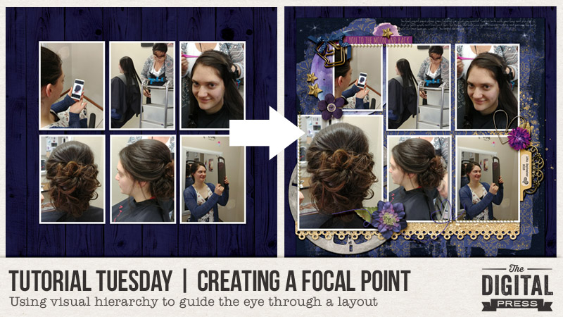

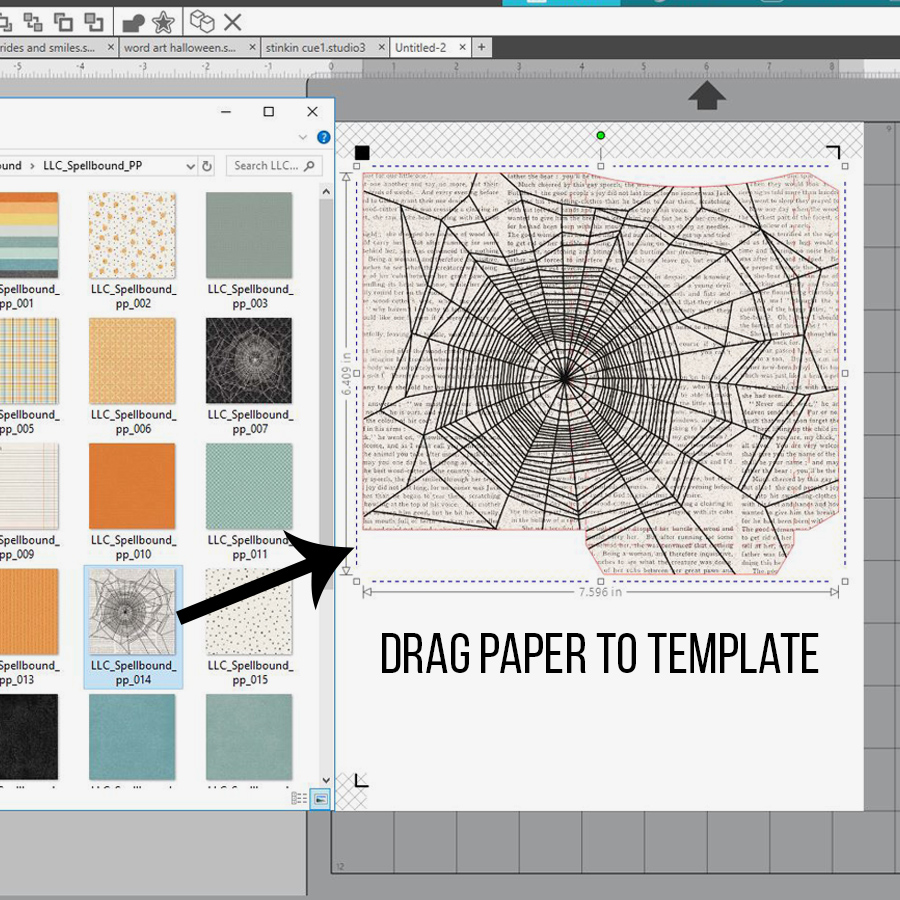
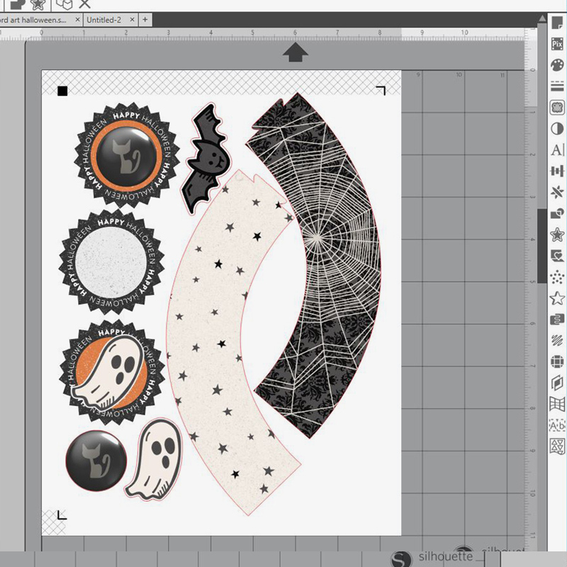
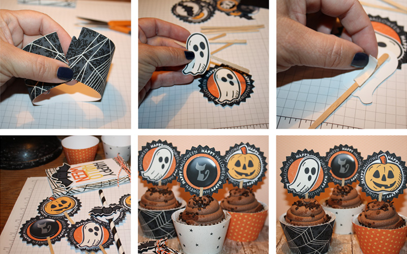
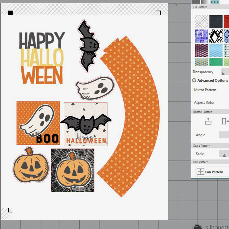
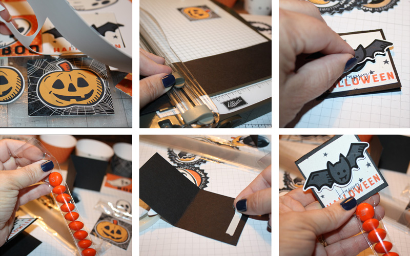
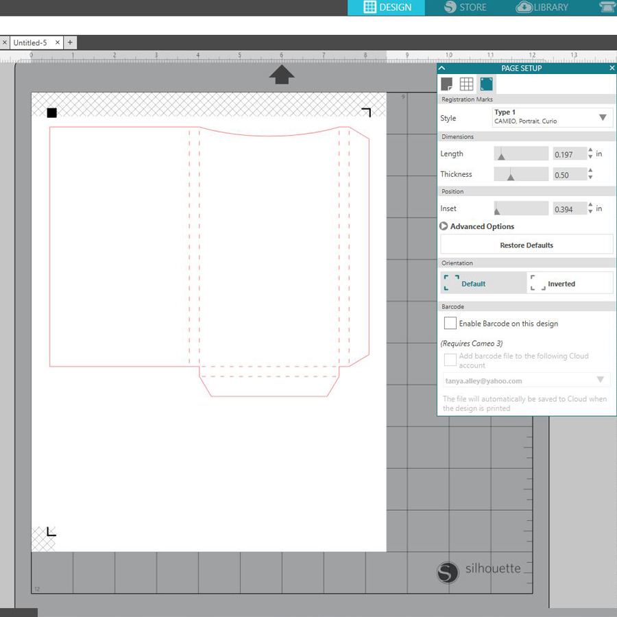 My next step was to choose digital paper for my project. For this, I opened the file where my paper was saved on my computer and drug it straight to the box file within my Silhouette software. You can see here how simple it is (and note that you can go into FILL PANEL and adjust the size and orientation of the paper)…