Tips for Printing At Home

Tips For Printing At Home
It’s often that people, and scrapbookers specifically, say that they cannot get good prints at home. I’ve been printing at home for a long time with great success, so I always wonder what is causing all this trouble. Today I’m going to be sharing the knowledge I’ve accumulated over the years that helps me achieve great quality prints at home!
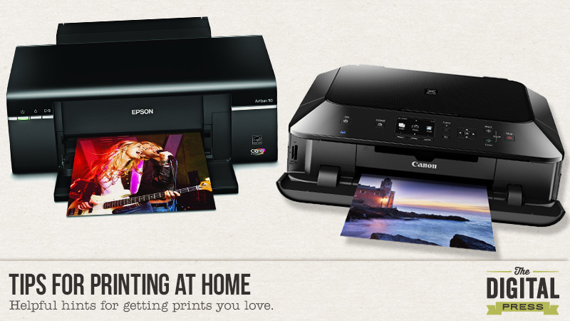
Printer Types

Generally speaking there are 2 types of printers. One type is targeted towards offices and businesses. These types of printers are great for printing text and simple graphics such as graphs or clip art, and they tend to focus on speed rather than image quality. They also tend to have fewer single color ink cartridges, or one ink cartridge that contains 3 colors in one unit.

The second type of printer is a photo printer. It is made with photo printing in mind and will do a much better job at making prints because it’s focus is on print quality – not speed. Part of the reason it makes better prints is because it has a specialized print head, and generally speaking will lay down the ink in much finer drops which creates less striping and better gradients. Photo printers also tend to have more ink tanks, and some of the more advanced printers these days will have 8 to 10 separate colors of ink!

Ink

As with most things you can buy brand name or a knock off/generic. This holds true for ink. Each printer manufacturer produces ink that is formulated to work in their printers, and will give you the best prints with no fuss & little to no problems.

However, I’ve recently begun to experiment with generic ink in one of my printers and I’m finding it to not be that bad. Years ago refilling ink cartridges was a messy endeavor; bottles of ink, syringes, and filling up empty cartridges without spills was a pain. Now you can just buy the cartridges all filled and ready to go; I buy mine on Amazon. The manufacturer of your printer doesn’t want you to use generic ink, because that is where they make most of their profits. In recent years they’ve begun installing little micro-chips that let the printer detect one or all of the following: if the cartridge is authentic, if it’s been installed before, and/or the last known level of ink it contained. It’s designed to prevent the use of “unauthorized” ink, but there are workarounds. The downsides to generic ink are that it’s not available for every printer or cartridge number, there’s a greater chance that you may get a defective or non-functioning cartridge, and that the ink may not produce as good a print as manufacturer made ink.

Paper

I suspect the leading cause of “bad prints” is because of the wrong choice in paper. Regular printer/copy paper and cardstock soaks up ink which leads to dull results. Paper that is intended for making photo quality prints has a coating and also comes in various finishes such as glossy, semi-gloss or lustre, and matte. The coating and finishes are what allow you to achieve prints that are vibrant and colorful. Just as with ink, the printer manufacturers make their own paper and you can also get generic paper. Generic photo paper is made without a specific printer in mind and as such will more often that not give you a print with “wonky colors”. Paper that is made by the same manufacturer as the printer has been tested to work and produce good results simply by selecting the type in the printer settings dialog box. So it’s very important to make sure that you are telling your printer what you are using!

There is also a third category. Paper with corresponding printer profiles. What that means is that an independent paper mill has had their paper profiled for different printers which ensures that you get accurrate colors in your prints that match with what you see on screen. One such company that does this is Red River Paper. I am not affiliated with Red River, but am a happy customer so I like to spread the word in regards to their quality product. Check their ICC Profile Page to see if your printer is one that they offer profiles for that works with their paper. They have many helpful resources on that page that will help you install & use their ICC Profiles. One thing to note is that you need to print through software that handles “color management”. The only software that I’m aware of that does this is Photoshop.

I’m often asked what printer I use. Currently I have 2 Canon brand printers. One is the Pixma Pro-100, which is a wide-format photo printer that uses an 8 ink system, and the other is the Pixma MG7120. It’s also a photo printer but it only uses 6 colors of ink and prints standard letter paper width. You may wonder why I have two printers, and that’s a good question! I use Canon brand ink in the wide-format printer and only use that when I need to print photos & hybrid projects larger than letter size paper or I want the absolute best print. The other printer is filled with generic ink (but still makes a very good print) and is used for my family’s everyday printing which includes everything from text documents to coupons to smaller hybrid projects. Epson is another highly regarded printer manufacturer.

Printers are just like any other machine – they only do what you tell them to do. By making wise choices about ink, paper, and settings you too can have prints that you are proud of!

AmberAbout the author: Amber Funk enjoys a vast assortment of interests such as scrapbooking, photography, getting crafty with her Silhouette Cameo, reading, and playing video games. She is a Wife and Mother of 2 living in Northern California and blogs her crafty adventures at http://perfectly-fabulous.com/

Hybrid: Disney Pendant

Hybrid:  Disney Pendant

Hello all you Disney goers.  Whether you have gone on that dream vacation or getting ready to go, this pendant will be perfect for wearing during your vacation (if you haven’t gone yet) or to wear as a keepsake to remember all those fun times.  I have always wanted to take my boys to Disney, but it just never happened.  Now that they are grown men, maybe one day I will have some grand kiddos to take.   I plan to take them and then use these wonderful Disney kits to scrap all the great memories.

This is a great project to use all those scraps you have laying around.  God knows I have a lot of those, but for now I will use the Disney themed kit, Vacation Magic by using Scotty Girl Design.  This is a super easy project that you can create for friends and family for any occasion.

 Hybrid:  Disney Pendant


So let’s get started on the tutorial.  Here is a list of supplies you will need for this project.

  • Punches and/or scissors
  • Printed background papers and embellishments
  • Pendants (I bought mine at Hobby Lobby)
  • 3D Crystal Lacquer (I bought mine at Hobby Lobby – there is also a Mod Podge lacquer)
  • Mickey heads (I designed these in Silhouette Studio v3 but it’s easy enough that you can simply draw and cut out)

Hybrid:  Disney Pendant

STEP 1:  Cut or punch pieces you want to use for your pendant.  I didn’t have a square punch so I cut the size I needed with a pair of scissors.  For  Mickey, I used my Silhouette Cameo to design & cut.  I will show you how to do that below.

Hybrid:  Disney Pendant

Steps for making Mickey with the Silhouette.

Draw out the circles using the circle tool on the side menu.

Hybrid:  Disney Pendant

Now drag your bounding box around all three circles.

Hybrid:  Disney Pendant

 Finally, select the WELD icon at the top right of the page.  It opens the welding options where you will select weld.

Viola, there ya have…..Mickey!!

Hybrid:  Disney Pendant

STEP 2:  Once you lay the pieces in your pendant you will add the crystal lacquer.

With one pendant,  I added two thin layers and the other I filled to the rim of the pendant and they both turned out the same.   You may get some tiny air bubbles, to get rid of those simply use a sewing needle to pop them.  Set aside on a flat surface for at least 12 hours to dry.

Hybrid:  Disney Pendant

 That is it….Your done!!  Wasn’t that easy?  Now get to work on those pendants, you have 5 months until Christmas!!


About the Author:  TanyaTanya is a part of the Hybrid team here at The Digital Press.  She has been hybrid crafting for at least 10 years now.  She loves creating and sharing those creations with you.  Her all time favorite tool is her Silhouette Cameo.  She says with the Cameo the sky is the limit.  Tanya has been married for 26 years and has two sons, Chris, 23 and Chance 19.   She also enjoys crocheting, photography and wood working.

Make Your Scrapbooking Life Easier with Shortcut Keys

Make Your Scrapbooking Life Easier with Shortcut Keys


It is very helpful to have shortcut keys available when we scrapbook. Other than the shortcut keys we all already know, like “Ctrl+S” to save or “Ctrl+T” to transform our image, we would like to share with you 15 other shortcuts you can use for Photoshop. Let’s try them and you will see how they will help make your scrapping life much easier!


Fill a layer : Allows you to fill an empty layer with current background color.

  • PC: Ctrl+Delete
  • MAC: Command+Delete


Merge visible layers : Allows you to merge all your visible layers. Beware – it is difficult to separate merged layers.

  • PC: Ctrl+Shift+E 
  • MAC: Command+Alt+E


Bring layer forward : Allows you to bring the selected layer to the front.

  • PC: Ctrl+]
  • MAC: Command+J


Invert selection : Allows you to select the area around an already selected image.

  • PC: Ctrl+Shift+I
  • MAC: Command+Shift+I


Select all layers : Allows you to select all layers at the same time.

  • PC: Ctrl+Alt+A
  • MAC: Command+Option+A


Select everything in a layer : When you hold the control key and click on a layer in the layers pallet, you can select everything in that layer.

  • PC: Ctrl+Click on a layer
  • MAC: Command+Click on a layer


Deselect all : Allows you to deselect a selection.

  • PC: Ctrl+D
  • MAC: Command+D


Keep proportion : Allow you to keep the proportion size of your image when you are making them bigger or smaller with your mouse, while in transform.

  • PC: Shift+Resize with mouse
  • MAC: Shift+ Resize with mouse


Create perfect forms : Allows you to make a perfect square or circle if you hold Shift down when you use a marquee tool. Can be used for cropping as well.

  • PC: Shift+Marquee tool or Crop tool
  • MAC: Shift+Marquee tool or Crop tool


Draw a perfect line : Allows you to draw a perfect line if you hold Shift down when you use the eraser, pencil, or paintbrush.

  • PC: Shift+Eraser, Pencil, or Brush
  • MAC: Shift+Eraser, Pencil, or Brush


Distort a layer : If you hold the control key when you drag the corners of your layer, you can distort it.

  • PC: Ctrl+Drag with mouse
  • MAC: Command+Drag with mouse


Align text : Allows you to align your text Left, Center or Right.

  • PC: Ctrl+Shift+L, C, or R
  • MAC: Command+Shift+L, C, or R


Zoom in or out : Allows you to zoom in or zoom out.

  • PC: Ctrl+Minus (-) or Plus (+)
  • MAC: Command+Minus (-) or Plus (+)


Fit on screen : Allows you to fit the size of your work on screen.

  • PC: Ctrl+0 (zero)
  • MAC: Command+0 (zero)


Adjust photo level : Allows you to access directly to level parameters when you want to edit your photo.

  • PC: Ctrl+L
  • MAC: Command+L


I hope you find these little tips helpful!


DSC_3131About the Author : Bao is a Creative Team member at The Digital Press. She has been a Digiscrapper for about ten years now.  She joined The Digital Press in March and enjoys being active on the site. Her style tends to be clean & simple. Most of the time she scraps her family’s photos. She loves, however, to scrap other subjects such as flowers, nature, the environment, foods … She says hello to all of you from her big island named Madagascar, and feels blessed to live there.

Using Masks Creatively

using masks creatively banner

Hello everyone. Hope you are all enjoying the sun and the fabulous summer school here at the Digital Press. I have been following all the lessons and there have been so many useful tips and tricks that I have noted down to try on!

In line with the Art Journaling week, I thought about sharing some techniques I use with masks. Now masks can seem a little intimidating at first but once you get the hang of them there is no better way to make certain adjustments to your images or layouts non-destructively. These are especially helpful when you might change your mind later, especially as I am prone to!!!

So the first technique is what I use to selectively apply adjustment layers to my photo. Take for example the one below. It was taken against a very bright background but my daughter’s face and body are a little dark. I especially want to bring out the little light rays filtering on to her face. So ideally I would like to brighten only her face a bit and not the whole picture. I use Photoshop Elements but these steps should be fairly simple to replicate in Photoshop as well.

The first thing I do is use the quick selection tool to roughly select the portion to which I will apply the adjustment layer.


Step 1
Step 1

Next from the adjustment layer drop down list choose the adjustment you would like to apply. In my case I chose the “brightness and contrast” . You will see a layer mask appear with the selected portion in white and rest in black. That is the thumb rule when using masks – white reveals and black conceals. This also means any fine tuning we do on this layer will only apply to selected portion. Before doing this, however, you can also further refine the selection by using black or white brushes but make sure you have the right layer i.e. mask layer selected and not the background photo.

Step 2
Step 2

That is most of the work done! Now play with the brightness and contrast till you are satisfied and voila there is a little more light and colour on that face!

Step 3
Step 3

The second technique I want to share is for realistic element placement on the layout. For example if you are using a paper clip on a stack of papers or a thread looping through a bead or button or some such element. Now the idea is that certain portion of the clip or thread should be visible and others hidden. Using layer masks again helps us do that in a non-destructive and stress free way!

In the same layout, I have now added a tag and a closed loop string. What I want is for the string to loop through the little hole on the tag.

1. First place your elements one on top of the other.

2. Now select a layer mask to apply to the string layer

3. Use a black brush and start erasing portions of string that you want to hide. You may want to zoom in to do this step.

Tucking-elements
Tucking-elements

We are nearly there ! But there is still the erased string’s shadow left which is looking quite odd indeed. To edit this, simply place the string’s shadow on a separate layer and follow steps 2 and 3 again.

I added a few more rings to that string and here is the final layout.

Using masks creatively - final layout


Hope you found these tips useful and I would love to see any layouts created using these techniques. So please do not hesitate to share or any other techniques you use to get the same effects.


Profile pic avatar small

About the author: Shivani Sohal is a donner of many alter-egos. A finance professional by day in busy London, she morphs into a seemingly normal mum of two in the evenings and weekends. She is constantly found with her fingers in too many pies and juggling the metaphorical balls. That is living on the edge for her; aided by the two ankle biters and a darling hubby who define the warm and mushy for her. She is ferociously dedicated to memory keeping – almost immune to any nay-sayers (or equally disruptive crying children or annoying house fires!!!);keeping her head down and forging ahead at all times.

Tutorial – Get Artsy with the Filter Gallery in Photoshop

 Tutorial- Get Artsy with the Filter Gallery in Photoshop | The Digital Press

It’s Artsy Week in Summer School and I’m here to tempt you to put your art journaling hat on by using the Filter Gallery in Photoshop. Sure, we all know how to do a pencil drawing, but did you know you can do so much more and easily, too using the Filter Gallery? With Photoshop CC 2015, you can now apply multiple effects to one image. It’s 100% non-destructive, artsy heaven! I say this as an artsy non-art-journaler.

I’ve selected two photos to work with for this tutorial. One is a pretty decent photo of my hubby and son, if I don’t say so myself, and the other is a hot mess photo of my son as a toddler. Open a photo or two in Photoshop and play along with me.

First, we need to prepare our photos: I recommend deciding what size photo you’d like to use on your layout, so you won’t need to do any difficult re-sizing of the filters on your canvas. Once that’s done, you need to convert your photo for smart filters.  If you don’t have PS CC 2015, yet, (and you so should), you will only be able to apply one filter to your image. To apply another filter, you will need to rasterize your image and start again.

In Photoshop CC 2015:

In the menu bar, click Filters> Convert for Smart Filters

All this means is that Photoshop is working magic so you can add more than one filter on your photo at a time.

 Tutorial- Get Artsy with the Filter Gallery in Photoshop | The Digital Press


When the scary dialogue box appears, click “ok” (really, it’s okay)

One thing to note is that the color selected in the color palette will effect the filters. I recommend you start with the default colors picked (B&W) and explore the different filters before going a bit wild with colors. (and I do hope you get to that wild place!)

Now it’s time to open the Filter Gallery! Click Filters> Filter Gallery

To see your entire photo, in the bottom left-hand corner, click the drop down arrow. Select Fit in View.

 Tutorial- Get Artsy with the Filter Gallery in Photoshop | The Digital Press


For this photo, I selected the Stamp option. I reduced the smoothness and the lightness until I have the fewest lines, but can still tell what I’m looking at. Start with these settings and adjust the sliders until you’re happy with your image:

  • Light/Dark Balance: 12
  • Smoothness: 6

 Tutorial- Get Artsy with the Filter Gallery in Photoshop | The Digital Press


The next photo I’ll be using is already prepared. It’s an old, damaged, sad photo that was scanned. I neglected to wipe off the dust… um, d’oh! It’s the perfect photo to use with the Artistic Filters.

I started by using the Colored Pencil Filter. It doesn’t have be perfect because we’re going to add another filter on top of this one. What I want here is to really just bring out the eyes and lines of the face. I’m not worried about the background- I’ll take that out later.  If you’re photo isn’t a person, the same still applies- bring out the lines that define the object. When you’re happy with your photo, click okay. 

Start Here:

  • Pencil Width: 16
  • Stroke Pressure: 8
  • Page Brightness: 43

 Tutorial- Get Artsy with the Filter Gallery in Photoshop | The Digital Press


Go back into the Filter Gallery. This time, we’ll use a Sketch Filter, specifically, Charcoal. Again, we’re making sure the important lines are clearly defined…in an artsy way of course.

Start here:

  • Charcoal Thickness: 5
  • Detail: 2
  • Light/Dark Balance: 59

 Tutorial- Get Artsy with the Filter Gallery in Photoshop | The Digital Press


Click on your photo in the layers palette. Now click on Layer Mask icon. Select black as your color, use a round brush and brush out your background. You can select a different brush with a lighter opacity if you want to keep some of your background. If you brush out too much, don’t worry. Swap your color to white and brush over the area of the photo you erased. It’s magic!

 Tutorial- Get Artsy with the Filter Gallery in Photoshop | The Digital Press


When your happy with your image, it’s time to drag onto to your layout. I’m using Real Life in Pockets: Rad Lab: Elements, Papers & Word Art by Mommyish and Just Jaimee. I’ve chosen an embossed kraft paper to show off my artsy photos. If you’d like your work of art to show the background paper, choose a blending mode like Multiply or Color Burn. Then, reduce the opacity so it blends into the paper.

 Tutorial- Get Artsy with the Filter Gallery in Photoshop | The Digital Press


Here’s my finished product:

  Tutorial- Get Artsy with the Filter Gallery in Photoshop | The Digital Press


There you have it: a simple way to get artsy looks on your pages. Now, off to Summer School with you to learn more artsy techniques you can pair with this tutorial.  


Carrie About the Author: Carrie is a mom to an ASD teenager and wife to a Chiarian living in coastal Delaware. Currently, the producer and host of The Digiscrap Geek Podcast, Creative Team Lead for Just Jaimee, creative team member at The Digital Press & Get It Scrapped. Carrie’s other passions include genealogy and family history, beating your husbands and sons at Call of Duty, binge watching TV shows on Netflix, visiting the beach, reading, doting on her cats, making cards with digital products and front porch chats with her neighbors.

Tutorial – Text on A Path with Shapes

Tutorial: Text on a path with shapes

Hi there scrappers! I’m back with another tutorial post and today I am going to teach you how to do text on a path with the shape tools. It’s a super easy way to add some interest to your journaling or title work. I’m using Photoshop CC for this tutorial, but I’ll also link you to a video at the end that will teach you how to do the same technique with Photoshop Elements.

To use a shape to create a text path, you need to first choose the shape tool. For this tutorial, we will use the ellipse tool, but you can choose whichever shape suits your layout.

Tutorial - Text on a path with the shape tools


Once you have chosen your shape, on the top left of the screen, be sure that you have chosen “Path” from the dropdown menu, next to the shape.

Tutorial - Text on a path with the shape tools

Then, draw your shape.

Tutorial - Text on a path with the shape tools

Once you have created the path with the shape tool, you will choose the horizontal type tool (the one you usually use for typing text). Hover your cursor over the path for the shape and you will see a wavy line appear in the middle of the regular symbol for the type tool. Click down where you want your text to begin and type your text. You can adjust your size, font, and color just like you would if typing in a regular text box. When you are finished typing, adjust your font size to fill the shape as desired.

Tutorial - Text on a path with the shape tools

Finally, to make the path disappear so that only the type remains, click off the layer with the path.

Tutorial - Text on a path with the shape tools

If you are a PSE user, you can see this Adobe video to get the steps for this technique.

I hope this tip helps typing on paths seem less intimidating! I know I was hestitant to try it, but once I gave it a shot, I realized it was easy! If you use this technique, link me up to you layout in the comments so I can see what you have created! Happy scrapping!

KatieKatie is a member of the Creative Team here at The Digital Press. She lives in Central Florida with her husband and their four sweet but crazy boys. When she’s not dodging Nerf bullets or trying to dig out from under the never ending pile of laundry, she enjoys photography, cooking, going to Disney World with her family, and, of course, digital scrapbooking.