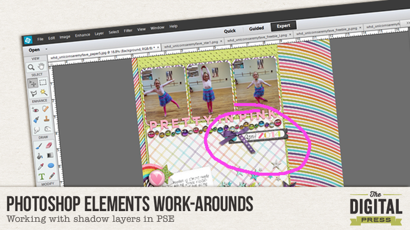
I have to confess, I am a bit of a shadow-tweaking fanatic. I first learned that I could tweak my shadows about a year and a half ago and I am still learning new tricks all the time. Playing with the shadows is my favorite part of creating a digital layout. I love seeing the elements “come to life”and pop right out of the page at me. Sometimes I spend more time on my shadows than the rest of the layout, and I am fine with that because I enjoy it so much.
But I also have to confess that some days I just don’t have it in me. I home school three kiddos aged toddler to preteen and we live in the tropics – which means it is LOUD and HOT all the time at my house. Some days I am lucky if I even get to touch my computer, and when time is running short on a project, I sometimes just don’t have the energy to spend hand- tweaking every single shadow.
BUT I really like having realistic shadows!
Over the course of the last year I have been compiling a list of little tricks I either found on the web or discovered on my own to help me create more realistic shadows when I am on a “time budget” and just cannot warp and tweak. I work in Adobe CS6, and I understand that not all of these will work in every program, but hopefully you can find one or two tricks to help you create beautiful, simple shadows in no time at all.
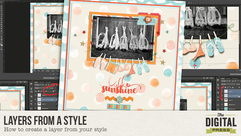
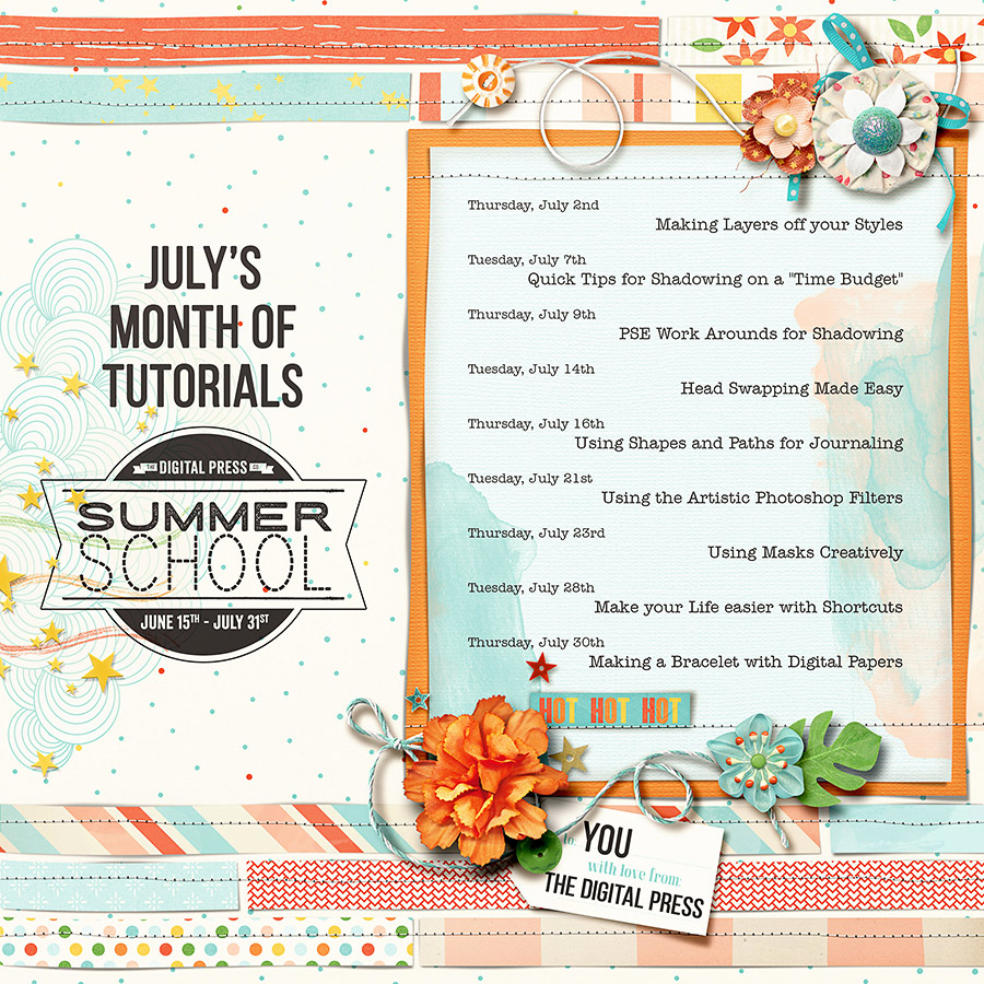
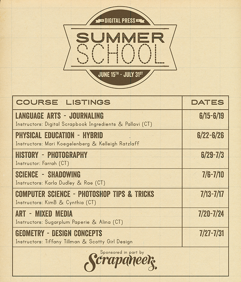
Quick Hints for Creating Great Shadows in Less Time
1. Invest in a Shadow Style Set.
You can interpret this one of two different ways.
You can either invest the money, or you can invest the time.
Either way, a good shadow style set will do wonders to cut down on your crafting time.
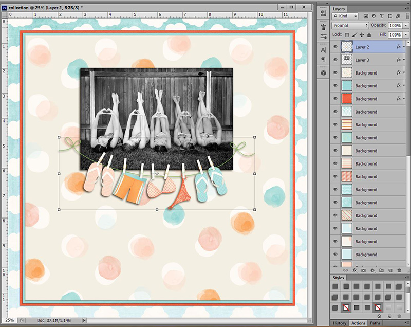
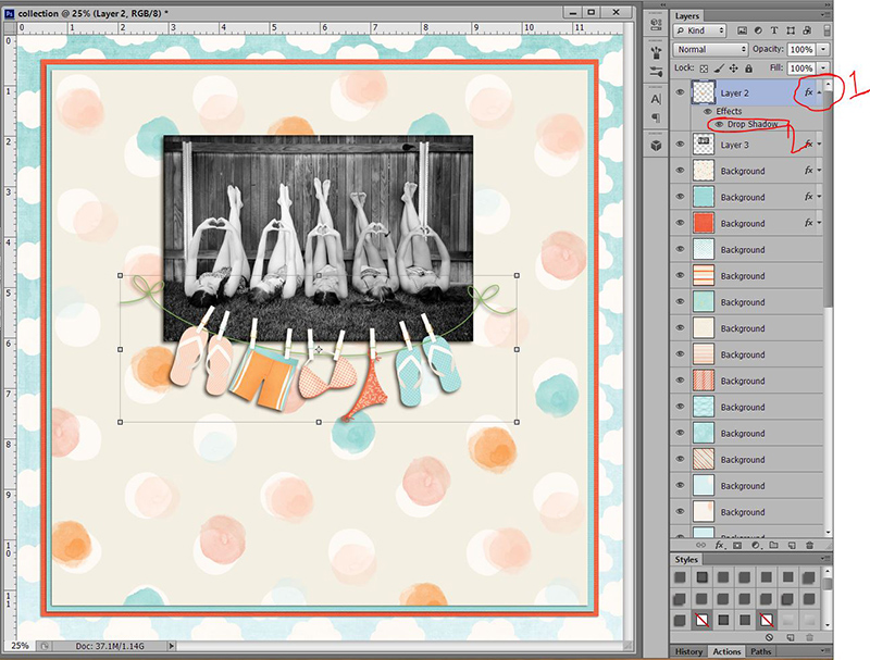
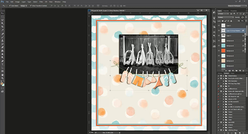
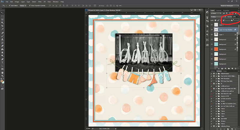
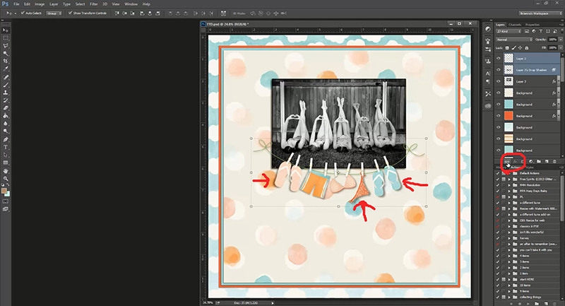
In general, elements that are of the same type tend to have roughly the same shadow settings. For example, all buttons are pretty close to the same in dimensions and so their shadows will fall roughly the same way. However, a sticker and rumpled paper flower will have much different shadow settings. Paying attention to the different ways shadows fall is one of the key elements in great shadowing, but it can take time. That is where styles are helpful. They take into consideration the various dimensions of different elements but can be applied in a single click. Just using the default drop shadow for all of your elements leaves a very flat look to your page. Using the preset styles costs you the same amount of time, but gives very different results.
See what I mean?
with default drop shadow only

with shadow styles (no tweaking)

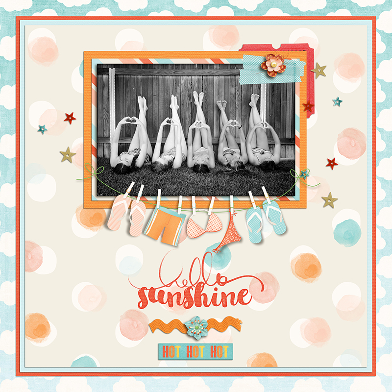
credits: A Story Captured Vol 10 by Anita Designs
The shop has two gorgeous Shadow Styles Set both of which would work great for those times when you need to get a page done quick. (And might I add that they are priced ridiculously LOW for they amount of time the save – by far they are both an AWESOME deal!)
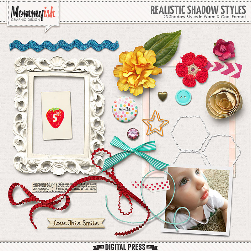
Realistic Shadow Styles by Mommyish
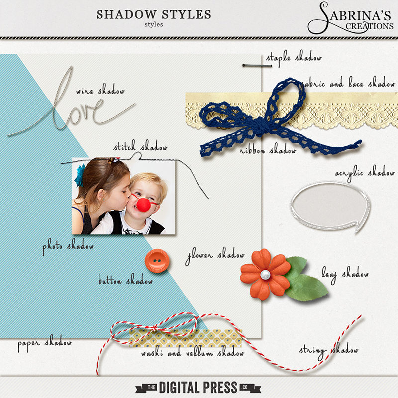
Shadow Styles by Sabrina’s Creations
Here are some pages I made just using each of these style sets so you can see them in action.
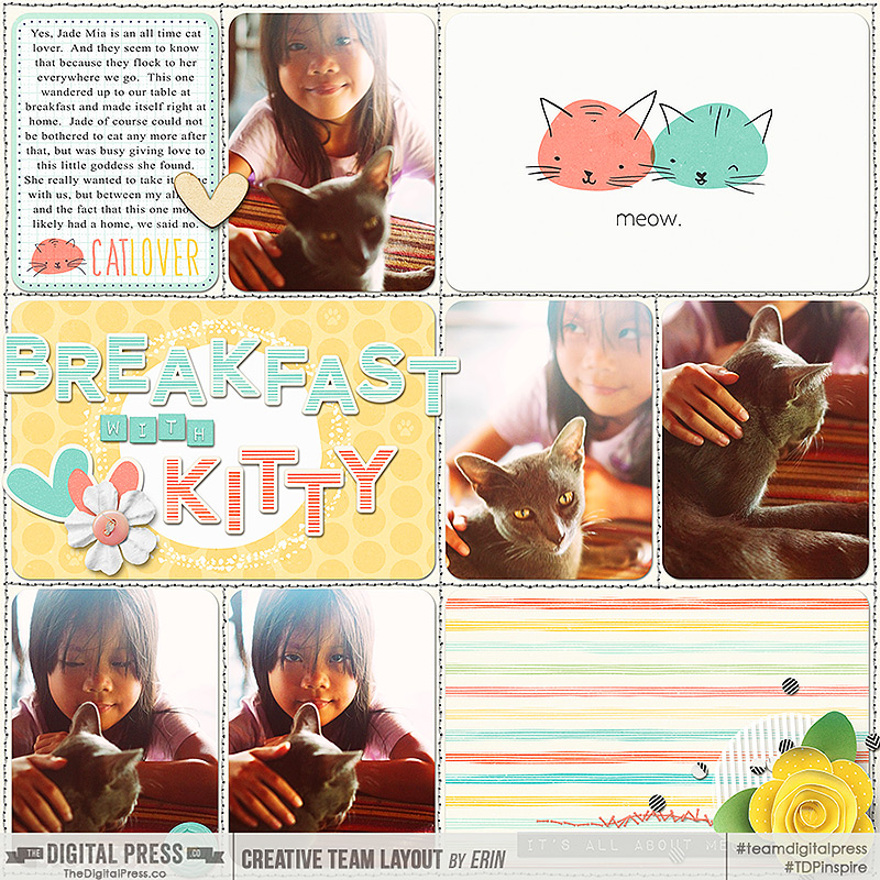
credits: Crazy Cat Lady Collection by Mommyish, Realistic Shadow Styles by Mommyish, and Project Twenty Fifteen Templates Vol. 2 by Laura Passage
credits: Currently Collection by Sabrina’s Creations, Everyday Life Templates Vol 4 by Sabrina’s Creations, Shadow Styles by Sabrina’s Creations
If you just don’t have the extra funds at the moment and would rather invest your time, then you can make your own shadow style set fairly easily. ( If you do not know how to do that then I have a little tutorial for you HERE.) Choose some of your most commonly used elements and set the shadows to the settings you prefer. Once you have them set, you can go through and save them so you can repeat that look with a single click on other layouts. When creating your own shadow styles do keep in mind what the real life counterpart to this element looks like and how its shadow might fall, this will help you love your shadow styles even more.
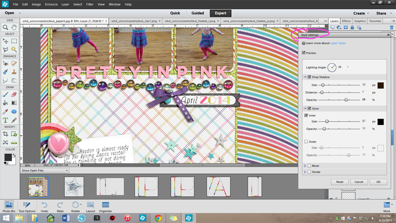
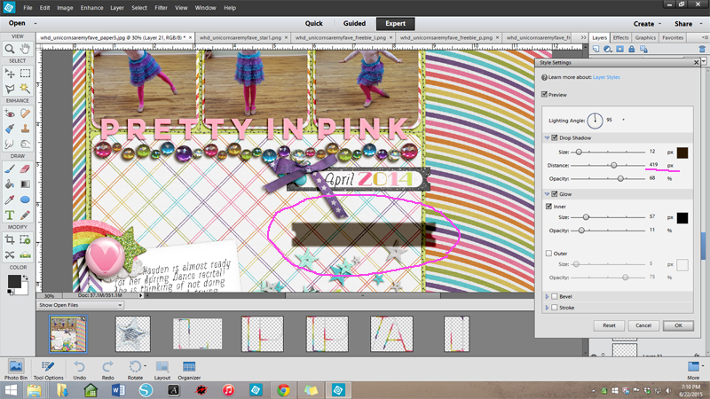
2. Choose your light source/direction and keep it consistent.
I think this is probably one of the most important things to achieving realistic shadows, whether you warp them or not.
Many elements already have an established light source. This is indicated by the highlights and shadows on the element. The highlight shows us from which direction the light is coming and the shadow tells us the angle and depth at which any shadow we add should fall.
Designers often have a favorite light direction that they use, so if you are a one kit scrapper this may not be as big of a problem. However, different designers have different preferences so if you are mixing multiple designers you will need to pay close attention to the light source and direction.
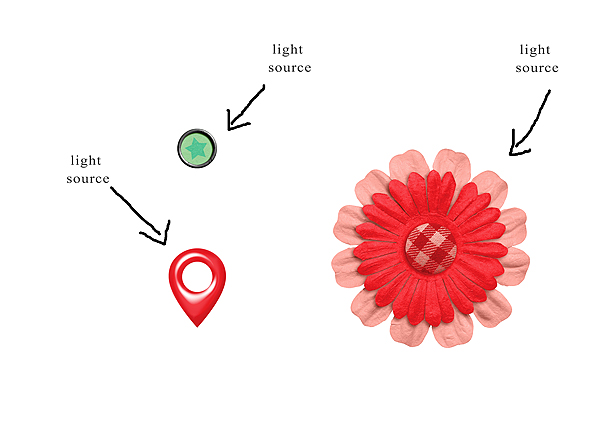
Why does it matter? Well when two elements have different light sources (or the drop shadow is different from the established light source of an element) it causes a disjointed feeling in the composition of the page. The brain is trying to understand how this can be possible and so something feels a little off. Take a look at these elements, for example. It is not immediately noticeable, but they are not quite right because the light source on the elements is different from the light source of the drop shadow.

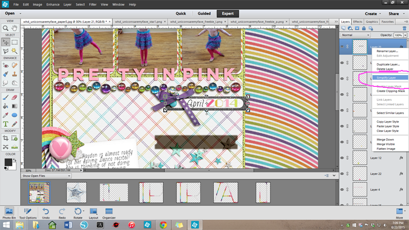
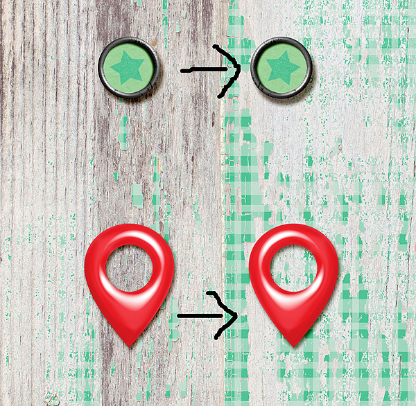
This can be fixed quite simply by either rotating/flipping the elements so the light source matches or by applying a shadow that follows the light source on the elements. In this example, I horizontally flipped the elements to go with the shadow. Can you see the difference? This really helps the elements come to life and creates a consistency that makes our eyes and our brains happy.
With most elements there is no one “right way” to place them on the page so they can be rotated, flipped or whatever to achieve the unified light source you need. However, elements with letters, numbers, and text can be tricky. You cannot flip a word flair, for example, or the writing will be backwards and no longer useful. Take a look at these two elements. Both have an established light source (which are different from each other as well) and text.

When I know I want to use an element that has both words and a defined light source I generally try to match the rest of my page to that element so as to avoid shadow issues. In this case I would change my shadow style to match the larger red element. The flair can then be slightly tilted to match, like this.

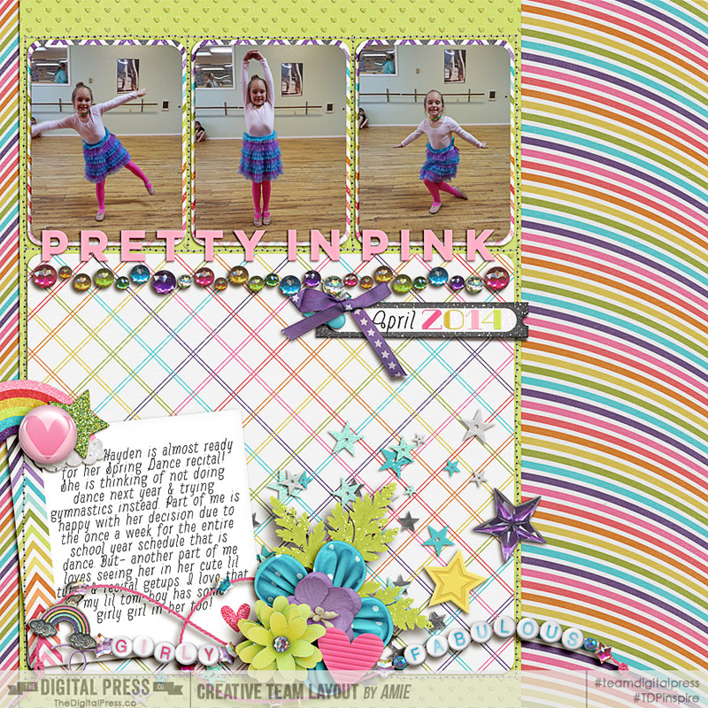
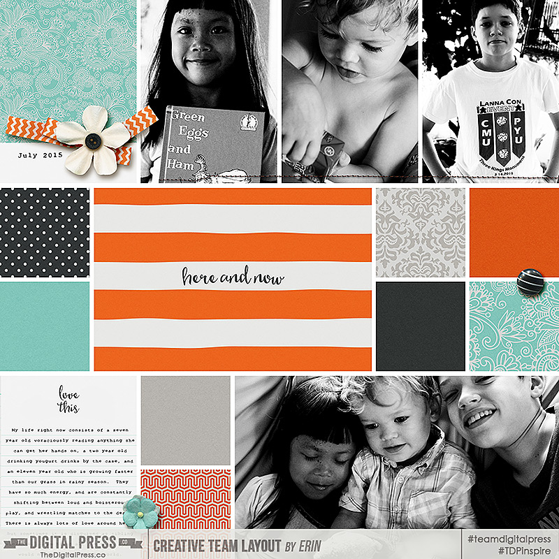
credits: Gingham Style by The Digital Press
See how much better that looks! And it really does not take all that much time at all.
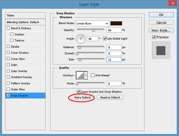
3. Set your default drop shadow to your most commonly used shadow settings.
I only learned this one this last year. I just assumed the default was set in the program and so was constantly having to go in and alter for everything, because I hated my default drop shadow setting. One day I found this little check box at the bottom of the layer styles palette (been right there in front of me the whole time). I checked it and voila! My most used drop shadow was now my default! For me that is the paper setting I use. If you have a drop shadow setting you find yourself using often then set it as the default and save yourself some time.
You can do that here: Layer Style>Blending Options>Drop Shadow
4. Format your shadows as you go.
This was a new idea for me too. I used to throw everything on a page then go back and tweak shadows later, but I found that when I ran into a problem, like a word flair with lighting opposite to the rest of the page, I would have to start all over and so wasted a LOT of time. Now obviously if you are going to be really tweaking your shadows you should probably wait to warp and smudge till you have a solid idea of your page design because who wants to re-tweak an entire page. But if you are going the quick route with drop shadows it really does save time to add them as you go. By doing this I catch the problem areas sooner and so have less to re-do, and often no re-dos at all. Plus, once I get that last bit on the page I am done, which always feels good right!
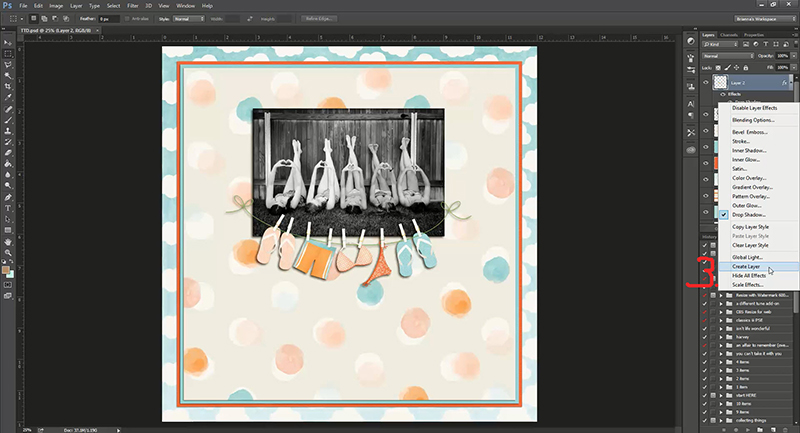
5. Make Actions for your most used commands.
If you just cannot give up warping and smudging, and I hear ya on that one, but still want to save some time, make actions for your most common techniques. An action for separating your layer styles for example (Heidi showed us how to do separate our layer style here), or for adding a wave or a blur or whatever you find yourself always doing, would give you that one click satisfaction of having a great shadow in half the time!
I hope that you are able to use some of these little tricks I have found to improve your shadows and lessen your crafting time. I am always looking for more ideas and I would love to hear form you as well.
Do you have some quick tips for great shadows?
Share them with us in the comments below!
 About the Author: Erin is a work from home mom of three living in Thailand. She loves playing with her kids and anything artsy. She can often be found knee deep in toys with paint on her face. She is slowly learning the meaning of living an authentic life, and enjoying every minute of the adventure.

 About the Author: Farrah Jobling is a member of the Creative Team here at The Digital Press. She lives in Denver with her amazing family, Mike, Nicholas (8), Claire (5) and Hope (1 yr old puppy). She works from home as a photographer and enjoys scrapping her personal photos.