Savoring the moment

Savor the Moment


Like many people, when I first stumbled across the world of scrapping, I was very much an “event scrapper.” I began by working my way through my photographs chronologically, making pages that mainly focused on the date and place. On a good day, I might also describe what we were doing there in my journaling.

Don’t worry, though… today I’m not going to subject you to my earliest layouts!

As time progressed and I settled more into this new hobby,  I worked out how to add shadows that didn’t look terrible, and went through the phase of painstakingly adding a bit of string curled around some elements… and I eventually decided that the journaling is now the most important part of my layout. As such, I began to change my style of writing.

These days, I’m much more likely to write about what I (or a member of my family, even) was thinking or feeling than about the bare bones of “who, what, where.”

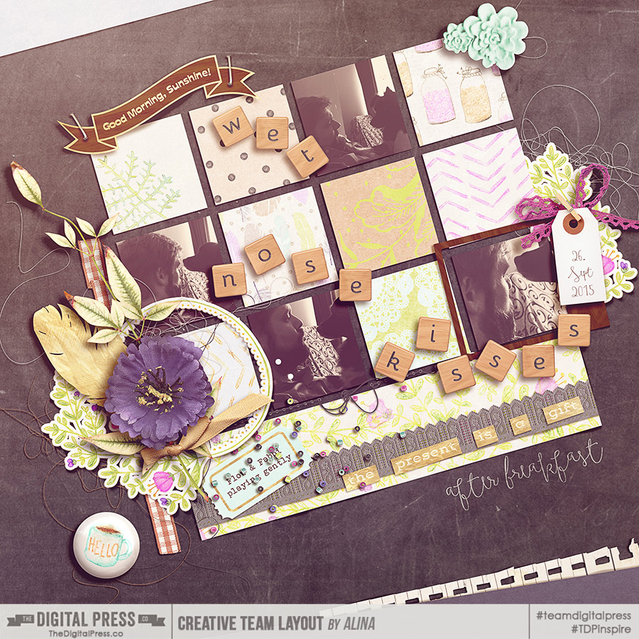
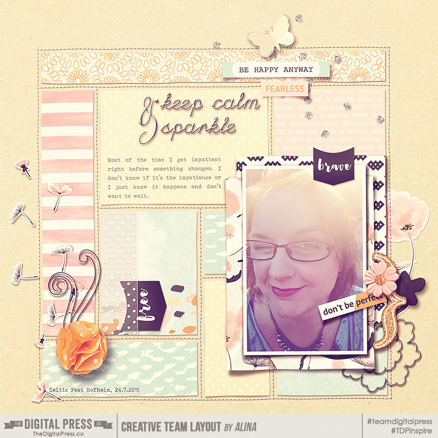
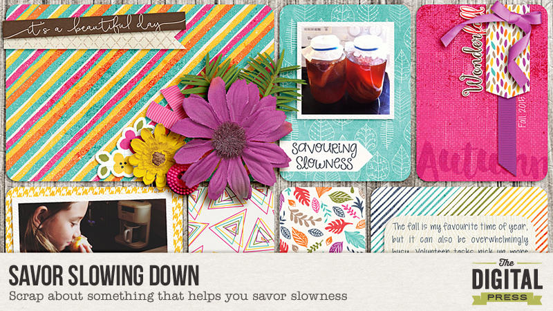
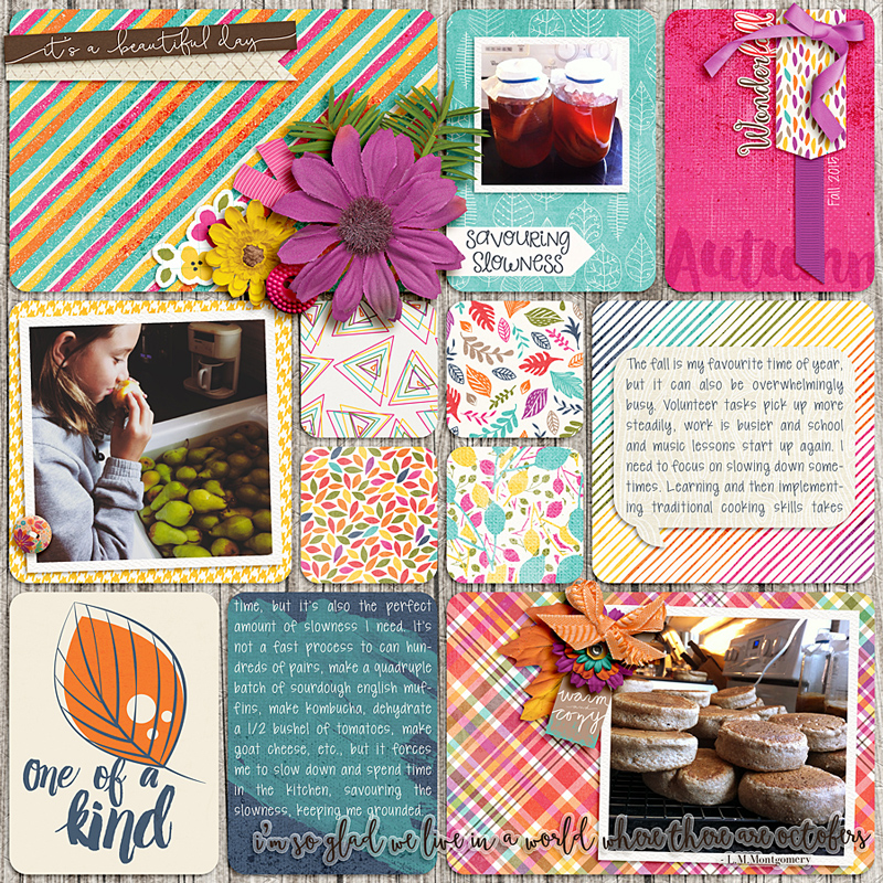
I’d like to show you a layout that I’ve just recently completed, based on a photo I took of my girls on a walk in the countryside near where we live. I used the kit Beautiful Life by River~Rose…

Walking Layout


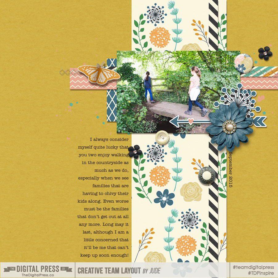
We go walking most weekends, so I could easily have an album full of similar layouts… but I preferred to pick out a slightly different theme. This time, when I looked at this photo, it came to me that I’m so glad we can still walk together as a family. That was a feeling definitely worth savoring! So that was where I focused my journaling.

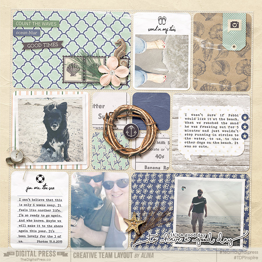
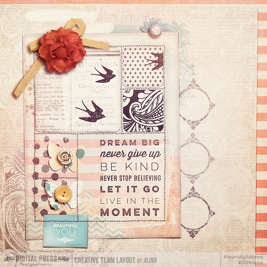
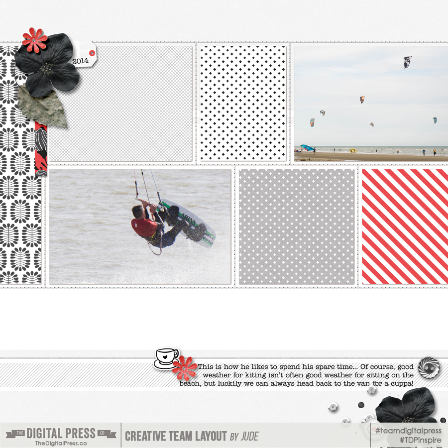
Another layout that I’ve done recently is about my husband’s favorite pastime. Again, it’s something that happens all the time — so I’ve chosen to generalize about the activity rather than write about one particular trip to the beach. I used Sahin Design’s beautiful Monochrome Fall collection for this page…

Kiter Layout


As you can see, it’s not always necessary to scrap every instance of an event in our lives, chronologically… but instead, you can record your memories through the capture of generalized ideas, themes, or events. This is a great way to savor the moment now, while recording it for the future.

Don’t forget to head over to the challenge forum to take part in today’s challenge and savor your own special moment!


JudeAbout the Author: Jude is part of the Creative Team at The Digital Press. She lives in the UK with her husband and two fantastic girls. She loves traveling, would be off in her campervan every weekend if she could get away with it, and loves time spent exploring new places and trying new experiences (and photographing them!). She also spends too much time on the computer, and still doesn’t go running as often as she says she’s going to.

Playing with Pocket Templates

Playing with Pocket Templates

Do you love pocket templates and use them all the time? Or do you struggle with them? I personally love project life but I’m not a big fan of straight lines. Every layout that I made with pockets in the past was not obeying to the rules of pockets. Let me show you how I deconstruct pocket templates, sometimes even to a point that they are unrecognizable.

  • Downsizing the template

While I think it’s good that the designers provide templates that use the whole 12×12 layout, I need more visual breathing room on my canvas. It’s rare that I leave it as it is. I downsize the template at least by 10%, most of the times 20% or more, sometimes I add a mat underneath the pockets, to have a framing of the whole. Even when you are using the whole 12×12, rethink this when you want to print your pages. You might need some bleed to provide nothing gets cut off in the printing process. All my layouts you see in this post are sized down.

  • Going out of bounds of the pockets

One thing I seem to be afraid of when playing with pockets are the straight lines. I usually can’t let them rule my layout. I have to break the lines up. Mostly with embellishments on top of it all, leaping over the edges. I tend to make it a more classic layout, applying the rule of thirds or getting more attention to certain parts of the layout. I emphasize the shadows on these embellishments, to make the 3d quality of them stand out more.

Playing with Pocket Templates

Playing with Pocket Templates


  • Changing the shape of the pockets

All pockets are rectangular by nature. Weird, right? There are only little exceptions to this rule. Sometimes a rectangle is broken up to make it two triangles. Still not very organic and still too straight for me. How about replacing one or more of the rectangles with a different shape like a circle or an oval? I tend to do that with frames in that shape. It makes the whole layout softer and it gives a great entry point for the eyes.

Playing with Pocket Templates

Playing with Pocket Templates


  • Tilting the template

Sometimes the tilt does the trick for me. With a little tilt I get a more natural look to the whole. And if I strive for one thing, then it is the natural, real paper look. It may look as if the pockets were photographed on the background paper.

Playing with Pocket Templates

Playing with Pocket Templates


A bigger tilt might give you a whole new look, like this template wasn’t intended for pocket scrapping at all.

Playing with Pocket Templates

Playing with Pocket Templates


  • Use the template for a pieced background and add your own photocluster

From going out of the pockets with embellisments and frames it’s not far to this step. You can even go further by adding more embellishments than I did here. You could also use a second template with a big cluster and plop it onto your pocket template and go from there.

Playing with Pocket Templates

Playing with Pocket Templates


  • Using it for Art Journaling

I remember that once someone asked if I consider myself more towards the pocket scrapping side, the „regular“ scrapping side or the Art Journaling side. As if pocket scrapping and Art Journaling are two very different ends on a spectrum of scrapping. Maybe they are. I personally don’t think so. There are some very reflective pocket pages out there. And some very to the rule Art Journaling pages. And last but not least “regular” pages with a grid or no visible structure. I love being challenged to try something different and always want to make things work, even if at first it seems awkward. I tried a more artsy approach to pockets several times and I love it. Yay for art in rectangles!

Playing with Pocket Templates

Playing with Pocket Templates


That’s it for now. I’m sure there’s much more that you can do with your pocket templates. Do you have more ideas? Feel free to comment below and point me to one of your layouts. And who knows, maybe I will scraplift your idea! Thanks for reading and have a great time while putting new inspiration into practice. Happy scrapping!


AlinaAbout the Author: Alina enjoys sitting in front of her large computer screens too much. Apart from that she loves walking her dog and watching sunsets while being amazed of life in general. She is married to her best friend. Tries to manage the needs of her two cats and her dog and badly fails when they all want their cuddle time at once. Everything else is scrapping, taking photos and currently crafting. Having said that, she needs a bigger craft room.


Savoring Your Personality

blogtemplate_savor

Personality is one of the most telling things about us – it demonstrates the differences in the way we each think, feel and behave. Understanding someone’s personality can help you better understand who someone is and how they view the world. I recently listened to a podcast about the Myers Briggs personality types and it got me thinking about how great it might be to create some scrapbook pages that center around personality types and traits.

I dug into my paperwork and found some of the various personality tests I’ve taken over the years to help me determine what approach to take in creating a personality based page. I decided to focus my page on my StrengthsFinder results and here is the final page which outlines the top 5 themes resulting from my assessment. I think this layout represents a really interesting look into who I am and how I react to the world.

StrengthsFinders_900ov

There are a lot of ways to assess personality types that don’t require expensive tests. I’ll outline just a few below in case it’s interesting to you. You can easily use any of the results you might find about your personality (or the personalities of your friends and family) to create so many different pages!

  1. The StrengthsFinder test can be taken by purchasing a copy of the book StrengthsFinder 2.o which allows you to take the assessment as well as access a wealth of information about the various themes.
  2. The Myers-Briggs test is a common test that most people have heard of which ultimately identifies which personality type (of 16 standard types) that you might have. There are a number of online options that will allow you to identify your Myers Brigges type for free. One that I’ve used with success is 16 Personalities.
  3. Others I’ve seen online include See My Personality, Personality Assessor, and Psych Central Personality Test. I am sure a quick google search could offer you thousands of other options!

In addition to using specific personality measures to document personality on your scrapbook pages, you can also just make an effort to create more pages that tell the stories behind the various personalities among your family and friends. The personalities of the people you care about can tell the world a lot about who you are and what kinds of people you like to surround yourself with in life.

Here are a few ideas that might help you as you try to add more personality traits on your pages:

  1. Use word art pieces to identify the traits that you see in yourself or a friend for a visually interesting scrapbook page.
  2. Choose one personality trait about someone and focus all of your journaling on that particular trait and how it makes them who they are!
  3. Compare multiple people’s personality types or traits on one page. This would be a perfect way to compare and contrast your immediate family’s various personalities.
  4. Use colors on your page that reinforce the primary ‘feel’ of the persons personality (for example, using bright colors for happy go lucky, pink for sweetness, purple for ambition, and blue for loyal).
  5. Ask yourself what elements, patterns, colors and shapes come to mind when you think of a particular person. That can help guide you to reinforce the page with things that remind you of them!

OK, I hope you’re feeling inspired to create some pages about your personality and the personalities in your life! So, now it’s your turn! I would love to see what you can do to document personality by creating a scrapbook page that tells the story of someone’s personality type or traits.  I’m hosting a challenge over on the forums and I hope you will come play along!  Check it out at The Drawing Board: Challenges.

Amy

About the Author: Amy lives in Reston, VA with her husband of 14 years and their 10 year old boy/girl twins. Their 19 year old daughter has just started her third year at West Virginia University!  Amy has been scrapbooking since the early 1990s but discovered digital scrapbooking in 2005 when her twins were born and has primarily scrapped digitally since that time. She is passionate about telling her family’s stories and documenting their life together! Amy is a huge reader (mostly literary fiction) and is a pop culture junkie! She also LOVES all things beauty & makeup!

Tiny Technique for a Boost of Realism!

tiny-technique


I really enjoy creating layouts that are simple… but look as realistic as possible. Today I am going to share with you a very easy technique (just a few simple steps!) to add a dose of realism to your layouts.


1. I want to accent the text on the post-it note with a paint element, but I also want it to look like it really was painted on top of the elements.

1


2. As you see, I had originally placed this paint layer right under the text layer… but it is about to get a makeover!


2


3. You’ll take your paint layer and place it directly above the top element that it is being painted onto. In this case, that is the post-it note. Then you will duplicate your paint layer and place it BELOW the post-it, as well.


3


4. This next part may sound tricky… but it isn’t. You will take the top paint layer and “clip” it to the object underneath it (which, in this case, is the post-it note). For this layer, you are now done! NEXT!


4


5. Next, you will select the object you’ve painted onto (again, for me, it’s the post-it)… and do one of those snazzy “selection” thingies. I do Control+A, and then I double-click the layer (thereby selecting the layer and creating the “marching ants” around it). Then you will Modify > Expand > 2px (or whatever you want… when you see the effect you can decide if you want yours larger or smaller).


5


6. With your “marching ants” still active… select your 2nd/duplicate paint layer (the one that is under your object), and get out your eraser. You will erase inside the selection area.


6


7. You can stop there… but personally, I like to move the paint layer around a bit (in this case, slightly down and to the right). Depending on your lighting angle, you may want to move your paint element a different direction. Totally up to you!


7


8. TADA!  As you can see, the effect may be minimal… but it is one that adds just a tiny dose of realism to a digital layout.


8


Another little tip: if you have multiple layers that your paint will need to be “clipped” to after you duplicate your layers… you can “link” them together. This ensures that if you’d like to move the paint around, each layer moves as one, also.


I hope you enjoyed this tutorial!  Don’t be afraid to give this technique a try!


Leah/Mommyish

 About the Author: Leah is the designer behind Mommyish and owner of The Digital Press. She lives in the beautiful lower Hudson Valley of NY with her husband, her two girls, and her in-laws! She has a love for all things geeky and quirky. In addition to being a graphic designer, she is an avid pianist.

Hybrid: Halloween Treat Bags

HYBRID:  HALLOWEEN TREAT BAGS


Where has this year gone? I don’t know about you, but even summer is just a blur to me. Before we know it, we will be singing Christmas Carols and opening Christmas gifts. I’m so not ready for that… and neither is my pocketbook.

I do love fall, though. I love the colors, the smells, the crisp cool air, cooking soups, and cuddling under my warm blanket. This year, I’m going to try some of those Pinterest crock pot recipes. Fall also means that Halloween is quickly approaching. I love to decorate and hand out candy! We don’t do all the scary stuff, but I love pumpkins, bats, and the traditional Halloween colors.

I love creating fun treats for Halloween, and am excited to show you how! I had a bunch of muslin bags stashed away that I bought online… and I knew this would be the perfect time to use them. These treat bags are perfect for school parties, co-workers, friends, and family.


HYBRID:  HALLOWEEN TREAT BAGS


To create these treat bags, I used Mommyish’s kit Hallowed Gothic. There are some GREAT papers and elements in this kit, and it is perfect for making everything from cards, to a fun banner for that big Halloween party you have planned, to cupcake toppers, and more! The list goes on and on. Put that imagination to work.


HYBRID:  HALLOWEEN TREAT BAGS


Supply List: any Halloween-themed kit of your choice; muslin Bags (I purchased mine online & they are 3″x5″); parchment paper; scissors; iron-on transfer paper (I got mine at Wal-Mart); iron; printer; and, of course, lots of candy to fill the finished product with.


HYBRID:  HALLOWEEN TREAT BAGS


I used the Silhouette Designer Edition software to create the print page, but you can use just about any photo-editing software out there. First, I opened all of the elements I wanted to use and positioned them on the 8.5″ x 11″ mat because my printer will not print any larger than that. As you can see, you can put more images on the page. Because you can trim close to your image, I would recommend doing that (a penny saved is more in my pocket to purchase more crafting supplies! …OK, it takes more than a penny, but you get what I am saying!).


HYBRID:  HALLOWEEN TREAT BAGS


Now, this is an important tip — to ensure that the images aren’t backwards when you iron them on, you have to do a “Mirror Image.”  I mirrored left, but I don’t think it matters which way they are mirrored, as long as they are “backwards.”


HYBRID:  HALLOWEEN TREAT BAGS


After printing the images onto the iron-on transfer paper, cut around the images. I find that the closer you cut, the better your finished project looks.


HYBRID:  HALLOWEEN TREAT BAGS


Once you have cut them out, lay them face down on the bags and put a piece of parchment paper on top. This keeps the item you are ironing from burning. I also laid a piece down under my bag (because I was using my desk as an “ironing board,” and it’s all wood — not really the ideal place to iron).


presswithiron


Apply the iron firmly with your body weight for about 20 seconds, while moving it around the whole image. If you are using a steam iron, make sure that it is NOT set on steam, but instead — on the highest cotton setting. You can take a peek by lifting the edge, and go over it again if needed (I have done this and it does work). I’ve found that if your iron is not hot enough, it leaves more of a worn look on the finished product.


HYBRID:  HALLOWEEN TREAT BAGS


Wait 2-3 seconds before removing the backing. This is called a “hot peel” and it leaves a matte finish.


HYBRID:  HALLOWEEN TREAT BAGS


For a glossy finish, however, wait until it is completely cool before you remove the backing. You guessed it… this is called a “cold peel.” It really does make a difference.


HYBRID: HALLOWEEN TREAT BAGS

HYBRID: HALLOWEEN TREAT BAGS

HYBRID: HALLOWEEN TREAT BAGS


I can’t wait to hand out these little treat bags! I hope the Trick-or-Treaters enjoy them as much as I enjoyed making them. We don’t usually have a lot of kids come around in our neighborhood, so I’m able to make these for those who do. If we had more, I would probably make something different… like a tag attached to the treat or something simpler like that.

I Hope this tutorial was helpful and that it has inspired you! If you’d like to give it a try, head on over to the challenge forum and you can participate in the corresponding hybrid challenge… while having fun creating something awesome for Halloween. I can’t wait to see your creations!

You can pick up this kit for 50% off using the code listed below!

facebook-promo


About the Author:  TanyaTanya is a part of the Hybrid team here at The Digital Press. She has been hybrid crafting for at least 10 years now, and loves creating and sharing those creations with others. Her all-time favorite tool is her Silhouette Cameo. She says “with the Cameo the sky is the limit!” Tanya has been married for 26 years and has two sons: Chris, 23 and Chance, 19. She also enjoys crocheting, photography and woodworking.


Savor Slowing Down

Savor Slowing Down - Scrap about something that helps you savor slowness

Hi everyone! It’s the start of a new month, and that means a new crop of challenges in the forums here at The Digital Press. Each month we create a series of blog posts and challenges that correspond with one word. This month, we chose the word SAVOR (or SAVOUR if you’re not from the USA like me!).

“Savor” can be interpreted many different ways and we would love to have you join us as we investigate these different aspects through our scrapbooking.

I personally gravitated towards the “Once she stopped rushing through life, she was amazed how much more life she had time for” and “stop the glorification of busy” word art. I was thinking about how this feeling of overwhelm and overcommitment sometimes consumes me. When those times hit, I know I have to reevaluate and adjust. Taking time to savor slowness or the slowing down of a hectic pace is really important!

There have been other times in my life when time was already going slowly (like when I had three children 16 months and younger), and I had to remember to savor and take joy in the little, seemingly mundane moments and tasks that filled my days during that season of life. I’m grateful for the role of memory keeping in my life then as well. I wrote things down and took lots of photos of everyday events so I could savor them, either in the moment or several years later, as I do now.

This is what helps me slow down currently: working in the kitchen, my happy place.

Savor Slowing Down - Scrap about something that helps you savor slowness

So, what about you? Will you take some time to savor slowing down? Is there something you have or do that helps you slow down? Is your life already slow and you’re looking to savor some of those slow moments? I’m hosting a challenge over on the forums at The Digital Press and I hope you will come play along! Check it out at The Drawing Board: Challenges. See you there!


Amy H.About the Author: Amy is a wife and mom to three from Ontario, Canada. She’s always been interested in scrapbooking, but didn’t try digiscrapping until 2008 when she received PSE for her birthday. By then she had 1 year old twins and a baby, so the thought of just playing for 10 minutes, hitting save and walking away with no mess was extremely appealing! She’s been hooked ever since. She loves being the memory keeper in the family, loves taking photos, loves telling the stories. She’s also excited to know that these memories are recorded for her grandchildren to enjoy someday!