Tutorial Tuesday | Easy Font Management


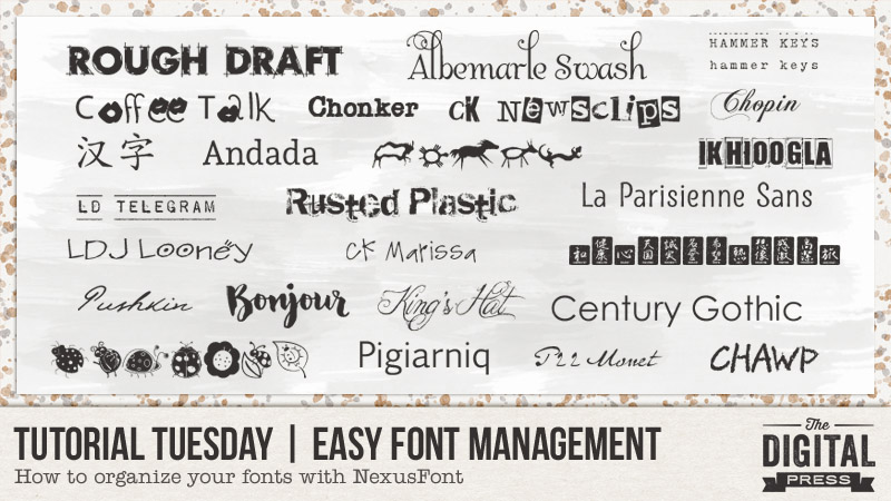
I have to admit it – I am a font addict!

Until just recently, my fonts were a mess on my computer… and believe it or not, all 1600 were installed in the Windows font folder. This slowed down my machine when using text in any program. Oops! In the past, I had used “The Font Thing” to organize my fonts — but when it stopped operating with this newer computer, I was lost. Good news — I have found a fantastic little freeware program called NexusFont, which has proved to be a perfect replacement for me.

This program catalogs all of the fonts on your computer and then allows you to sort fonts into categories that you, yourself, can set up. For me, the best thing is that I can access any of my fonts… no matter where they are stored on my computer (and from any program, even though they are not actually installed). Fantastic!

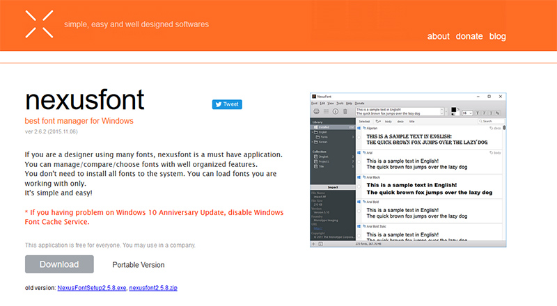
To start out, you can download the NexusFont program HERE*.

*NOTE: this is a program that is only available for those who are using Windows as their operating system


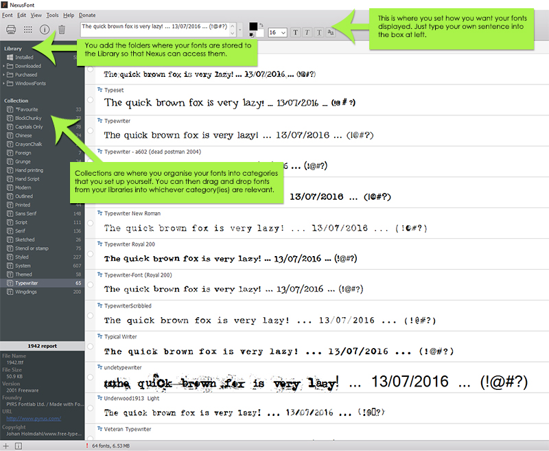
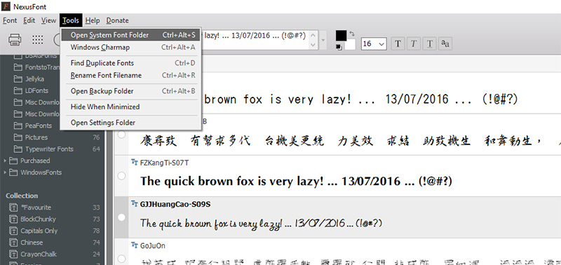
Once you install the program, you will see under Library (left panel) that there is a folder called Installed. This folder contains all the fonts currently installed on your computer and located in the windows/font folder. Under this there will be a heading Collection but until you set up collections (ie categories for your fonts) this will be empty.

After organizing all my fonts, this is what my main screen looks like when I have one of my Collections (Typewriter fonts) highlighted.


So what do you do after you have installed the program?

  1. First, add any font folders you have (of fonts not installed and located in your windows font folder) to the Library by right clicking on Library and selecting New Folder Group. I have created 2 folder groups – one for purchased fonts and one for free downloaded fonts. You can then right click on this new folder group and select Add Folder.  This will allow you to navigate to the relevant font storage folder on your computer so that you can add this to your Library.
  2. Set up your Collections by right clicking on Collection and selecting New Collection. My collections include Serif, Sans Serif, Hand Printing, Hand Script, Typewriter, Wingdings, Grunge, Stencil or Stamp etc.
  3. Type in a sentence into the display panel so that you can preview the fonts.
  4. You can add fonts to Collections either using drag and drop to drag fonts from any folder in your Library to one or more of the collections or right clicking on a font and selecting the category (see following screenshot). And one of the best things is that you can put a font into more than one Collection! Note that if you have a large number of fonts as I did, this will take you a few days to complete.


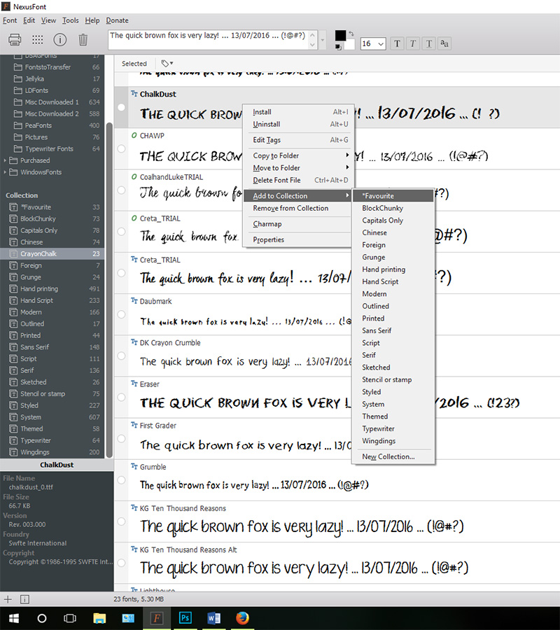
Once everything is set up, it is much easier to search for types of fonts just by clicking on one of your Collections. It certainly saves time. On a recent page I was looking for a particular chalk font, so clicked on the CrayonChalk collection above and only had to search through 23 fonts rather than 1600. And best of all it so easy to compare fonts.

One of the other features of this program which I love are that it is easy to find duplicate fonts even though they may be named differently. Just go to Tools and select Find Duplicate Fonts. Easy! The program found over 50 in my folders which I then just deleted.


And a handy fact — remember earlier that I said that you do not have to install the fonts to be able to use them. All you have to do is open NexusFont before using the text tool in Photoshop and all fonts within the NexusFont Library will be available to you. This is so handy! You can install and uninstall fonts straight from the NexusFont program itself.

NexusFont would have to be one of the best programs for those of us who love fonts and who use Windows as our operating system. Why not download it and start rediscovering some of your lost fonts? 🙂

Postscript: In the latest Windows update, there were changes to font management and this slowed down the loading of fonts in NexusFont. The workaround, if this occurs for you, is to disable Windows Font Cache Service. I did this and NexusFont is now running as quickly as it was before the update.


AvatarAbout the author  Carolyn lives with her partner, eldest daughter, and 3 rescue dogs on 5 acres of paradise in the hinterland of the Sunshine Coast, Australia. Her camera, along with an assortment of lenses, is never out of sight. When not taking photos, she loves cooking and gardening and, of course, scrapbooking.


Hybrid How-To | Halloween Decor


I love decorating for different seasons and holidays and my absolute favourite is to decorate for halloween. I love everything about Halloween …and today I am going to show you how to make a few fun decor items — Halloween candles and 3D stars.

All digital items I used for these projects can be found in the Fright | Kit by Sahin Designs here at The Digital Press.


First, we’ll do the stars.

I found a PDF template online for the star shape, but the lines were dotted, so I used it to make a PSD template that I could clip each of the papers to. I printed out different sizes using different combinations of papers. You can cut out your stars by hand, or using a digital cutter. Here’s an example of one of my stars before printing…


Once all my stars were cut out, I scored the fold lines. This is done on the back of the star from each tip, through the center to the other side.

Turn your stars over and fold each tip, aligning the other tips with other to get a precise fold. You only crease from the center to the tip, not the other side. Then fold in between the tips with valley folds, as shown here…

Here’s a look at the finished products… stars of all sizes!

Now for the candles.

Print your desired images onto tissue paper [for more detailed instructions on printing on tissue paper, you can refer to one of my previous posts here or Arielle’s post here].

Cut your tissue to size, and use a hairdryer to heat the candle. You will see the tissue “disappear” into the wax. Be careful, your hands may get get hot… just give them a break every now and then and work your way around the candle…

Here’s a look at the candles once the tissue paper image has adhered on/into the wax of the candles…

I also printed the frame from the kit in a few different sizes… and cut them out with my paper cutter (I use a Silhouette) to add on my wall, along with the stars…

And that’s it! So simple! If you give it a try, definitely come post your final product in the gallery (and even join the monthly Hybrid Challenge and earn points toward discounts and free stuff at TDP!).

Happy Halloween!


About the Author  Amanda found digital scrapbooking in 2006, as a paper scrapper who was frustrated with the limitations of paper scrapping products. She now loves to combine paper and digital products and techniques for her pages and projects. She is the wife of a Naval Officer and has two teenage children. She lives in Australia, and has also lived in the U.S and Malaysia and loves that she has had the opportunity to travel the world with her family.

Feature Friday | Mari Koegelenberg


Hello and welcome to a new Feature Friday! Today we are getting to know designer Mari Koegelenberg a little better. Mari is the designer behind Mari Koegelenberg Creations (the name gave that one away, didn’t it?!), where you will find beautiful floral designs right next to cute and whimsical papers — some featuring dogs, cats, cacti, raccoons, donuts, and just about anything else you could wish for! Not only does Mari create digital scrapbooking kits and pocket style scrapping supplies, she also has amazing cutting files and planner kits in her collection of products, as well.

Here are just a few of the brilliant products you will find in her store at The Digital Press:

To get to know Mari a little better, we asked her a few questions…

Where do you live?
The Central Coast of California

When you’re not designing, what do you do with your time?
Planning and decorating… I just bought a house with a separate office! Pinterest is my bestest friend.

What are 5 tidbits of trivia we might not know about you?
LOL! I have been doing this for so long and this question always comes up, so at this point there probably aren’t 5 things people don’t know about me yet… but if this is your fist time learning about me, then let’s go with these…
—I am double-jointed and can do a weird pop thing with my thumb.
—My eyes are 2 different colors.
—I would never, ever wear yellow BUT I love using it in kits!
—When I grow up, I want to be a monster truck driver.
—When I laugh (which happens a lot) I do a pig snort which usually just leads to more uncontrollable laughter… which means I am NOT a good person to sneak around with being quiet, it just isn’t possible!

Which of your products is your favorite?
Smart Cat and Plan With Me

mari2

And now, here are a selection of pages and projects made with Mari’s gorgeous products:

mari3

So there you have it, a little insider information about Mari Koegelenberg, and a peek at some of her gorgeous digital goodies! If you still need any more of a nudge to go and check out her store, then you are in luck — because Mari’s store will be 30% OFF throughout all of this week, so this is the perfect moment to browse all her products, and grab yourself a bargain (the sale will end on Thursday 10/20 at 11:59pm ET). Happy Scrapping!


CorrinAbout the Author  Corrin is on the creative team here at The Digital Press. She is a fan of the Big Bang Theory and a lover of cozy pajamas. She lives in the currently-sunny but breezy South of England with her husband and 4 crazy kids, who regularly discover & plunder her secret chocolate stashes! She is still trying to get the house straight after moving 2 years ago. Who knows… maybe this will be the year she reaches the bottom of the laundry pile!

Tutorial Tuesday | Create Your Own Postage Stamp Frame


I love the look of postage stamps on a scrapbook page. They add a nice little touch of interest to a page. Papers look great when they’re clipped to postage stamp shapes, but what I really love is the look of photos inside a postage stamp frames. You can get some great postage stamp frames in digi kits, but you can also easily create them on your own in just a few quick steps while you’re scrapping a page. Let me show you how.


When I create a postage stamp frame I usually create it right on my page as I’m creating it, but for ease of instruction I’m going to show you on a blank canvas. My instructions are for Photoshop CS6 but you can use the same basic instructions in Photoshop Elements and other versions of Photoshop as well.


1. Create a blank 5″ x 5″ canvas.


I’m going to create a 4 inch x 4 inch frame so I’m going to create it on a 5″ x 5″ canvas. (Again, you can easily create your frame directly on your scrapbook page as well.) Here’s how to create a 5″x5″ canvas:


File > New > Width: 5 inches, Height: 5 inches, Resolution: 300 pixels/inch


2. Create a new blank layer.


You can create a new blank layer several different ways. You can click on the Create a New Layer icon in the layers panel (it looks like a folded piece of paper) OR you can select Layer > New > Layer  OR you can press CMD+SHIFT+N and press OK.


3. Create the shape you want to turn into a postage stamp.


With the new layer active in the layers panel, use the Rectangular Marquee tool (hotkey M) and click and drag to create your shape. I’m going to create a square about 4″ x 4″, but you can create a rectangle as well. NOTE: If after you click and drag to create your shape you press the SHIFT key, you will get a perfect square.


4. Fill your shape with a color.


Since I’m working on a blank white canvas I’m going to fill my shape with a color. I like to fill my shape using the Paint Bucket tool (hotkey G). With the Paint Bucket tool active, simply click inside the marching ants of the shape you created in Step 3 and your shape will be filled with whatever color is in your foreground color picker.


5. Create the postage stamp edge.


Now comes the fun part – creating the postage stamp edge. Using the Eraser tool (hotkey E), choose a hard round brush. (Do not use a soft round brush.) For my example I used a 60 pixel hard round brush. You will also need to adjust the spacing of the brush in order for this to work. Click on the Brush Panel icon (it’s next to the brush size and looks like a file folder with paint brushes). Adjust your spacing to about 150%. As you change the spacing you can see the effect it will have in the brush tool.


Now that you’ve set your Eraser Brush settings, line the center of your brush shape up with one of the corner edges of the square shape that is going to become the postage stamp. I like to center the dot of the Eraser Brush right on the edge of the shape. (NOTE, as long as your Caps Lock is OFF you should be able to see the outline of your brush shape.) I like to start at the left and work around the square.


While holding down the Shift key (which will keep the line straight), click at the start and then again at the end of the top edge of your shape. The Eraser Brush will have erased a straight line of circles from your shape giving you a postage stamp effect on the first side of your shape.  Release the Shift key and your mouse and then do the same thing on the other sides of your shape. Continue until you’ve done the same to all four sides.


At this point you can mask a photo or a paper to this shape. You can also cut out the center and make it a frame.


6. Create the frame.


To create the frame effect you will want to cut out the center of the postage stamp shape you just created. With the postage stamp shape layer active in the layer panel, simply use the Rectangular Marquee tool (hotkey M) and click and drag to create a square over your newly created shape. When you’re happy with the area you want to cut out, simply press the Delete key.


NOTE: If you do not want to erase away part of your postage stamp shape, you can also create a new layer above the postage stamp shape and, using the Rectangular Marquee tool, create a new shape layer ABOVE your postage stamp shape (be sure to use a contrasting color so you can see the shape you added) and you can clip your photo to the new shape.


7. Embellish your new Postage Stamp Frame!


Voila! You’re done! You’ve created a quick postage stamp frame. Now you can embellish the heck out of it. here are some ideas:

  • Add a drop shadow to your frame
  • Clip a textured paper to the frame
  • Clip some paints, etc. to the frame
  • The possibilities are endless!


NOTE: I used River Rose Designs’ Sunday Morning kit to embellish my frame.


So what do you think? Did you know that you could create a postage stamp frame on your scrapbook pages so quickly?  Give these steps a try and please let us know if you’ve got any questions.


BarbaraAbout the Author |   Barbara is a member of the creative team here at The Digital Press. She lives in Minnesota, is married and has two awesome kids (a 19 year old boy and a 17 year old girl) as well as an adorable 10 year old Soft Coated Wheaton Terrier. In her free time she loves to take photos and play around in Photoshop. Life is good!

Feature Friday | Karla Noél

Happy Feature Friday! This week, we’re excited to help you get to know our very own Karla Noél (formerly Dudley) a little bit better! Karla has a love of art, design, and family. She enjoys spreading her love of design and scrapbooking to all. Her design style is uniquely her own — filled with artsy, hand-drawn patterns and elements… eclectic colors… and fun handwritten word art.

This is just a small sampling of the inspiring product offerings you’ll find in her store here at The Digital Press


And now, let’s get to know Karla a little better! We asked her to answer a few questions so we could learn more about her…

Where do you live?
live in Downtown San Diego.

When you’re not designing, what do you do with your time?
I’m working and crocheting… or is it crocheting and working… 😉

What are 5 tidbits of trivia we might not know about you?
—I can do backflips.
—I’m together and in love with my first love.
—I prefer my eggs burnt (and pretty much all of my food that way, actually).
—I know my fonts!
—I lost over 100 pounds in one year.

Which of your products is your favorite?
Hmm… in the store right now, I think it would have to be the Epic.ness collection. It’s fresh and fun and timeless…


Here is a look at some of my favorite projects using Karla’s designs…

If you haven’t already browsed through Karla’s shop here at The Digital Press… definitely check it out HERE! You will want to take a peek this week, for sure, because her entire shop will be 30% OFF through the end of next Thursday (sale will end at 11:59pm ET on Thurs 10/13)!


LindyKrickbaum

About the Author  Lindy Krickbaum is a member of the creative team at the Digital Press. She is a happily-married wife, and best friend to her twin sister. She currently lives in Johnson City, Tennessee in the United States. Lindy is a self-admitted scrap-a-holic, rarely missing a day to scrap. She also enjoys designing jewelry, reading, and traveling every chance she gets.

Tutorial Tuesday | Blending Text

Hi there, scrappers!

My tutorial for you today is all about making your text look more realistic. When you write or type on real paper, what you see is a mixture of the ink and the texture and material of the paper. But, when we add a type layer on top of a digital paper, we don’t automatically get the same result. I’ll show you a couple quick steps that you can follow in order to make digital text look more like it is written on the paper instead of floating on top.

  • First, type your text as you would like it to appear on your layout
  • Right click on your type layer and choose Blending Options (or, you can also click the little ‘fx’ button at the bottom of your layer palette)

  • When the Layer Style menu opens up, you will see two sliders. You want the bottom one, Underlying Layer
  • Grab the left side of the bar and drag it to the right until the text starts to disappear
  • Hold down the Option key and click on the little carrot you just dragged to the right so that it splits into two little arrows

  • Drag the left of the two new arrows to the left until you like the way the text looks

  • Tweak it as much as you like until your text looks just right!


Here is a look at the original text… and the blended text… so you can see the difference!


Isn’t that great? I hope you’ll give this technique a try. I find that it really gives that extra realistic look to my digital layouts.


KatieAbout the Author  Katie is a member of the creative team here at The Digital Press. She lives in Central Florida with her husband and their four sweet but crazy boys. When she’s not dodging Nerf bullets or trying to dig out from under the never-ending pile of laundry, she enjoys photography, cooking, going to Disney World with her family, and, of course, digital scrapbooking.