Author: The Digital Press

Hybrid How-To | Making Flair Buttons

Hi, everyone! It’s Kate here, and I’m so stoked to present another edition of our Hybrid How-To series here on The Digital Press blog! Today, I’ll be sharing my process for making hybrid flair — a quick and easy trick I’ve been using for a long time now.

I love digital flair so much, but it doesn’t always transfer very well to the hybrid world. A couple of years ago, I started using googly eyes to give the printed digital flair some dimension and I LOVED the result. The best part of hybrid flair? You can make it any size you want (because googly eyes come in every size imaginable!)… and additionally, they’re flatter than real flair buttons, which makes it much easier to store your pages.

Supplies Needed:

  • Digital flair images of your choice (I used Get Lucky by creashens)
  • Photo editing software, like Photoshop (PS) or Photoshop Elements (PSE). Cutting machine software also works for this project; you just need to be able to re-size.
  • Photo paper or cardstock; photo paper makes it more vibrant.
  • Googly eyes
  • Straight blade or X-ACTO knife.
  • Scissors or cutting machine

Instructions:

1. The first step is to cut a slit along the edge of the googly eyes. I used the corner of a straight blade to punch through where the clear plastic meets the backing. Then I held the blade still while moving the eye around it in a circle, until I had cut about half-way around the plastic. Basically, you just need a slit big enough to pop the black part out and pop the printed flair in…

2. Next, measure the googly eyes and size your flair in your photo-editing software program accordingly. Then, print and cut your flair.

3. Now, just pop the flair into the plastic. You can secure the slit with a little bit of hot glue if you want to. I used to do this, but I’ve found over the years that it’s not really necessary because there’s always a little lip all the way around that holds the paper in place.

Here’s a close-up look at my finished “googly-eye” flair buttons…

Easy-peasy hybrid flair with dimension!

And to think that my kids think I keep googly eyes around for their projects. Psh. No. I keep them around for my projects. 🙂

I hope you’ll give this project a try! And please share your projects with me — I’d love to see what you make with your new flair. If you’re participating in The Digital Press’s challenge system for March 2018, don’t forget to visit the CROSSWORD SECTION in TDP’s forum to get the details about this month’s Hybrid Challenge — because you can earn challenge points if you give this project a try (you can earn points toward discounts & FREEBIES)!


Kate About the Author  Kate is on the hybrid team here at The Digital Press. She lives on the Utah/Colorado border with her husband, 5 kids, 10 chickens, and a dog named Gracie. She’s a city-born girl who found she’s really a country girl at heart. She can be found outside, barefoot, and probably in her garden.

Feature Friday | Dawn by Design

Happy Friday, everyone! It’s time for another edition of our Feature Friday series here on The Digital Press blog! This week, I’m thrilled to put the spotlight on Dawn Farias of Dawn by Design.

This is Dawn’s second feature on The Digital Press blog (if you want to learn a little bit more about her, you can check out her first post from September 2017 — her Foodie Friday post — HERE).

This time around, in order to learn more about Dawn, we asked her to share 5 things about herself that we might not already know… and this is what she came up with:

  1. I can twirl a baton …but I was never actually an official baton twirler anywhere.
  2. I took synchronized swimming as a class in college. It was really, really hard… but I can still get around the pool, floating perfectly horizontal, using only my wrists and hands to get me around, turn circles, go forward and backward, etc.
  3. I have been dealing with IBS (says the doctors) for the past five years. I think and talk about my stomach problems constantly. I have lots of dresses (they have soft waists) in my wardrobe to accommodate bad days and was thrilled recently to discover that some styles of Old Navy’s rockstar skinny jeans are v-e-r-y stretchy. This means Casual Friday at work is more of a treat and less of a trick for me now.
  4. I have five kids and the last two were born in my house.
  5. I went back to work full-time last year after being a stay-at-home-mom for almost 15 years. I teach high school. When I’m at work, I talk to my students about my family. When I’m at home, I talk to my family about my students. I enjoy both parts of my life and even though things are technically crazier now, I am happier.

This is one of Dawn’s favorite photos of her with her youngest daughter…

Aren’t they adorable? 🙂

As for Dawn’s products… I love that the things you can find in her shop are perfect for scrapping just about anything/everything — from little everyday moments, to special trips, to events, and more. Dawn’s products are some of my favorites to scrap with! The mix of bold colors with the perfect neutrals make it easy for everyone to find something to love in her shop. Her alphas are amazing, too!

When I asked Dawn to describe her style, she said, “My design style is both clean and traditional. I love a lot of white AND a lot of color. I try to plan patterns and elements that are both fun and functional. I am inspired a lot by paper scrapping, and I tend to shy away from making my things look very digital.”

Here is a sampling of some of my favorite items from the Dawn by Design shop here at TDP

Aren’t her products just amazing? I know that I can always turn to Dawn’s shop and find just the right kit for my layouts.

It’s also really fun to look at her products in action when browsing the gallery at TDP. Here are some projects that were created using her products…

I hope you enjoyed getting to know more about Dawn today, and I bet you can’t wait to hit up her shop after all of that fun eye candy up above! Good news — throughout her coming feature week, you can enjoy a 30% off sale in her store all week long (the sale will end at 11:59pm ET on Thurs 3/29)… so go take a peek! It’s a great way to pick up some of her digi-goodness while saving a little money!

Additionally, even better news — Dawn also has a special Free-with-Purchase offer for everyone this week! That’s right… all week long, you can snag this awesomene FULL KIT — Tropicana — for FREE with any $10+ purchase in her shop! (again, the offer is valid through 11:59pm ET on Thurs 3/29).


KatieAbout the Author  Katie is a member of the creative team here at The Digital Press. She lives in Central Florida with her husband and their four sweet but crazy boys. When she’s not dodging Nerf bullets or trying to dig out from under the never-ending pile of laundry, she enjoys photography, cooking, going to Disney World with her family, and, of course, digital scrapbooking.

Tutorial Tuesday | Digital Mini Albums (Part 1)


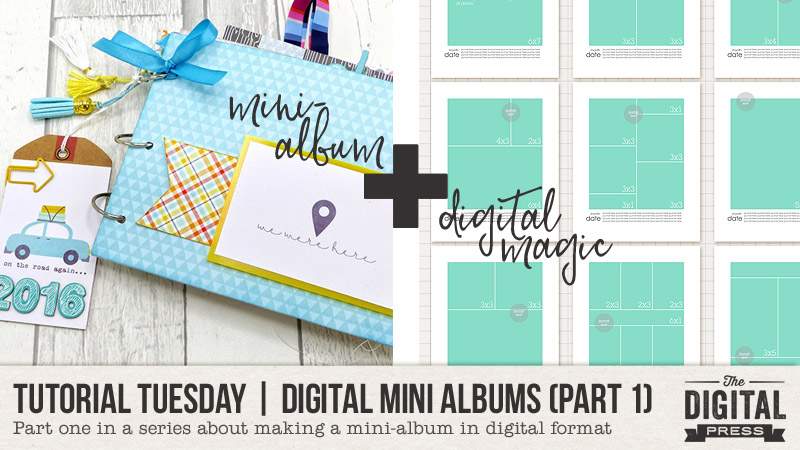
If you have ever looked at the beautiful mini-albums that our hybrid creative team members make for gifts or holidays, and thought, “I want to do that!” …but then your brain kicks in and reminds you that you live in a teeny, tiny apartment with 5 other people and not enough room for a dining room table (No? That’s just me then? OK, well)…

…I would like to propose a solution: a fully digital mini album! It’s perfect for those of us who love the idea of creating a cute little mini-album, but who are lacking in space, tools, supplies, or even simply the “courage to tackle hybrid or paper scrapping”!

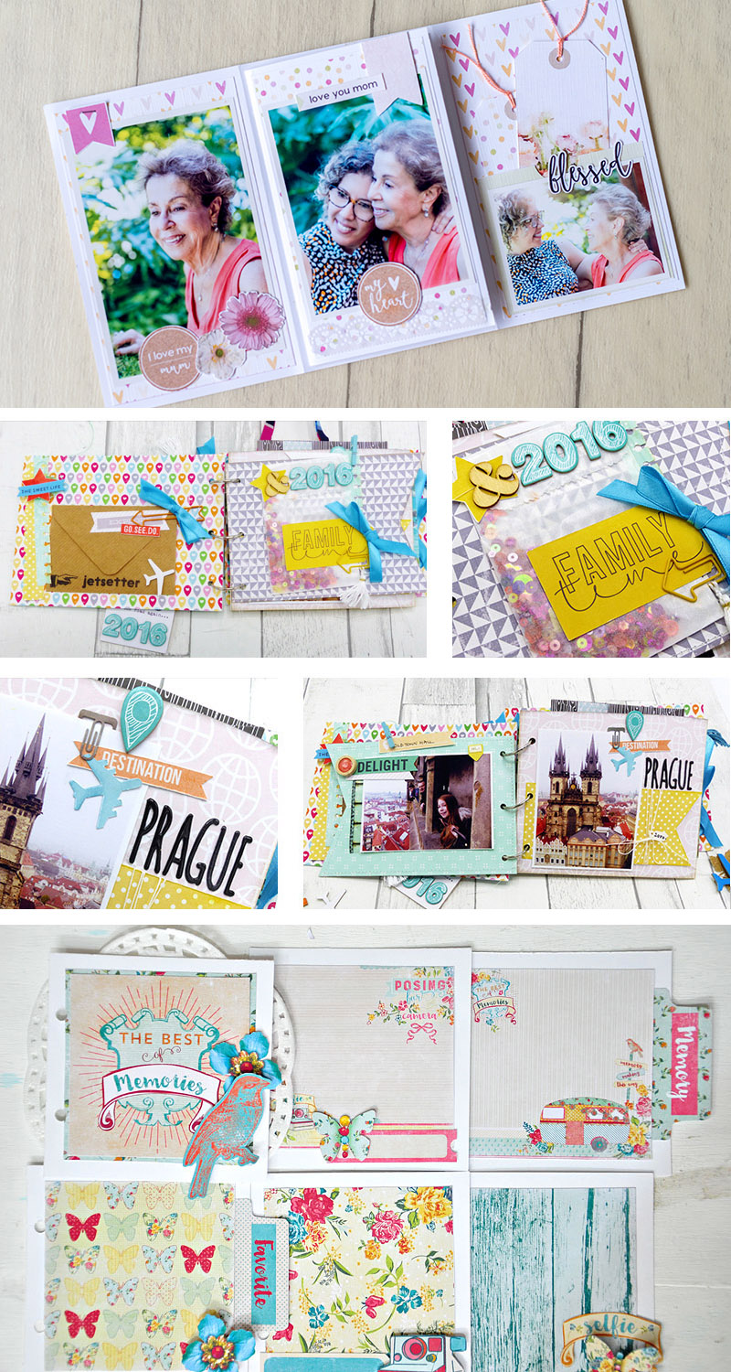
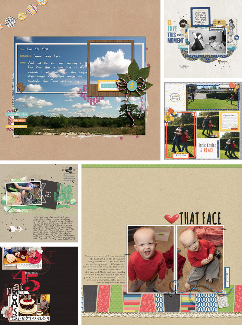
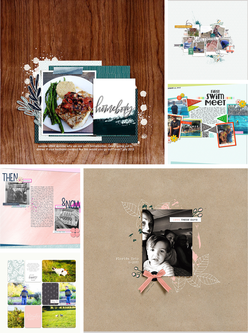
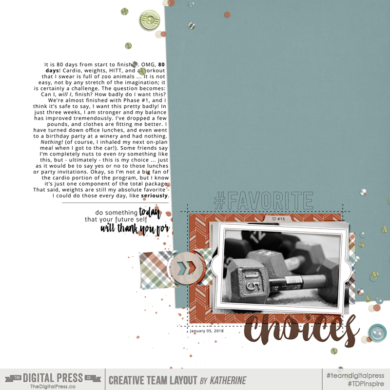
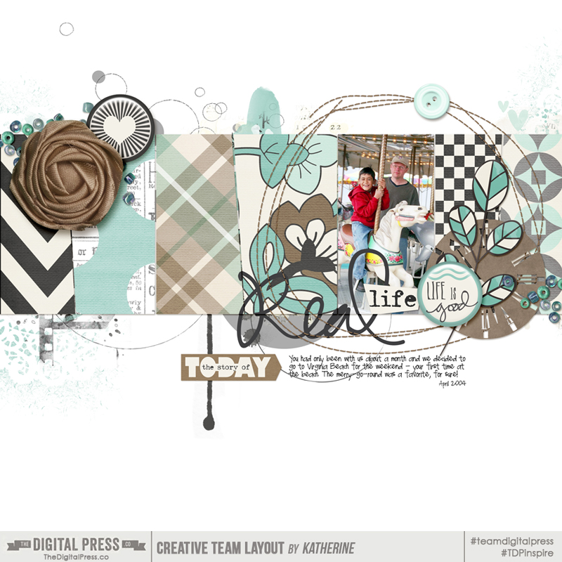
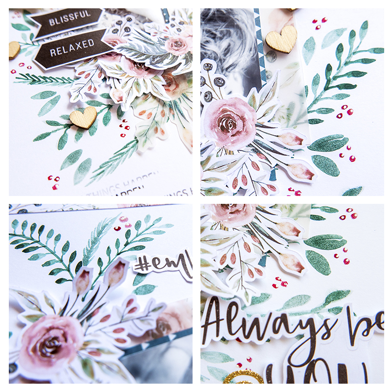
If you search for “mini album” here on The Digital Press blog, you will be rewarded with a bunch of articles that are all full of fantastic ideas and inspiration. Here are just a few examples of the gorgeous mini-albums I found…

Mini-albums are handy for all sorts of things:

  • Creating a separate album for a family vacation
  • Creating a special gift for someone
  • Documenting a special holiday
  • Documenting a specific family tradition
  • Capturing a sports season or extra-curricular event
  • Documenting major life events such as adoption, graduation, birthday, wedding, birth, or death

You could create a mini album for just about anything you want to… but they are especially helpful when you want to highlight a certain event, or create a gift using your crazy awesome scrapbooking skills. 🙂

Technically, you could simply throw together a bunch of pages and call it a mini-album… but if you look at most of the examples in the link I posted, above, you’ll likely notice that mini-albums usually have a consistent flow. That sort of cohesion does not just come together on its own… but instead, it takes a little bit of thought and planning.

After thinking about my own album creation process, I broke it down into the following steps:

  1. Planning
  2. Organizing
  3. Filling & Finishing
  4. Printing

These are not hard and fast rules, mind you… but I have found that they help me to get through the process quicker and end up with a final product that I love!

Over the course of several tutorial posts here on the blog throughout the coming weeks, I will walk you through each of the above steps for creating a digital mini-album. Today, we are looking specifically at the first step — planning.


Step 1: Planning

I have found planning to be the most important step in the process of creating a mini-album. It sets the stage for everything that comes later, gives you a definite direction, and makes the actual production of the album go like clockwork. For me, this is key to actually completing the project — something which, I admit, I often struggle with otherwise.

Planning allows you to decide ahead of time what you want the finished album to look like, and ensure that there is consistency and cohesion throughout the pages.  I encourage you to pull out some paper, or make a document on your phone or computer, to jot down your planning notes.  That way you can look back at it later, or make adjustments if needed.

CHOOSE YOUR SUBJECT

Decide what your album is going to feature before you even start.

Back in the days when I paper scrapped on a regular basis, I always made mini-albums of our vacations. This was mostly because the kids (including the kid in me) loved to look back on those short moments in time that seemed so perfect. Other times I have made special “I LOVE YOU” books for a relative, or special teacher. And when we adopted our middle child I made a special album just for her that walked through the entire process.  She loves it and thumbs through it regularly.

Your subject matter can be anything you like. For myself, and for the purposes of this blog series, though… I am going to be making a very specific kind of mini-album. Last fall, my youngest sister lost her baby girl in a still birth. It was heart-wrenching and difficult, but she very much wanted to take pictures and remember everything she could about her little angel. So one sister took pictures, and over the last few months my youngest sister has curated the ones she wants and asked me to make them into a book: a mini-album that celebrates the short life of her youngest daughter. How could I say no?

CHOOSE A SIZE/ORIENTATION FOR YOUR ALBUM

Depending on your chosen topic, decide which type of album would be best.

You can print your pages at home, at a local print shop, or have them printed as a complete book using an online print service. There really are a multitude of choices here. One thing to note, though… a mini-album is just that — mini (in size) — so it should be smaller in size than a “Year in the Life”-type book, etc. (both in dimension, and in number of pages).

Things to consider when choosing your album size and style:

  1. How do you plan on printing it? If using a print shop, or online book print service, what are the requirements?
  2. What size restrictions do you have? For instance, do you have the ability to print “9 inches wide” (etc.)?
  3. What is the orientation of most of your photos? Are they mixed, or are they primarily landscape/portrait?
  4. Do you have a lot of journaling to include? The smaller the page size, the more difficult it may be to read lengthy journaling.
  5. Will you use digital templates to help you achieve a layout style you like?
  6. If this is a gift album, what are the storage capabilities of the recipient? (i.e. do they have room to store your gift?)
  7. What do you LIKE?

In my mind, templates are one of the biggest benefits to doing a digital album, and The Digital Press offers a wide variety of templates from which to choose. Templates that are geared specifically to album-making can be found HERE.

Here are just a few examples of album-based template packs that I have enjoyed working with in the past…

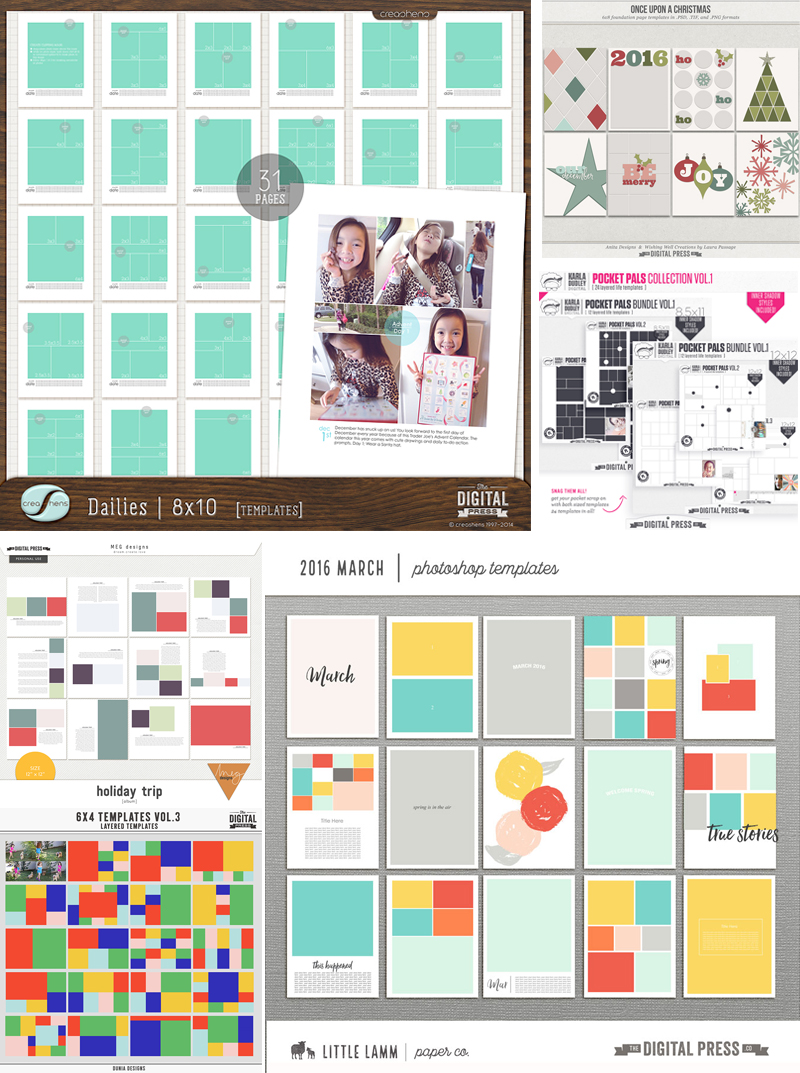
Working with an album template pack is especially helpful in constructing a mini-album because these template bundles usually contain a variety of templates in a similar style… and thus, they already work well together.

The use of templates does not have to completely dictate your page size, however. If you look on the blog HERE you can read a number of articles containing tips for transforming your templates to fit into different-sized pages.

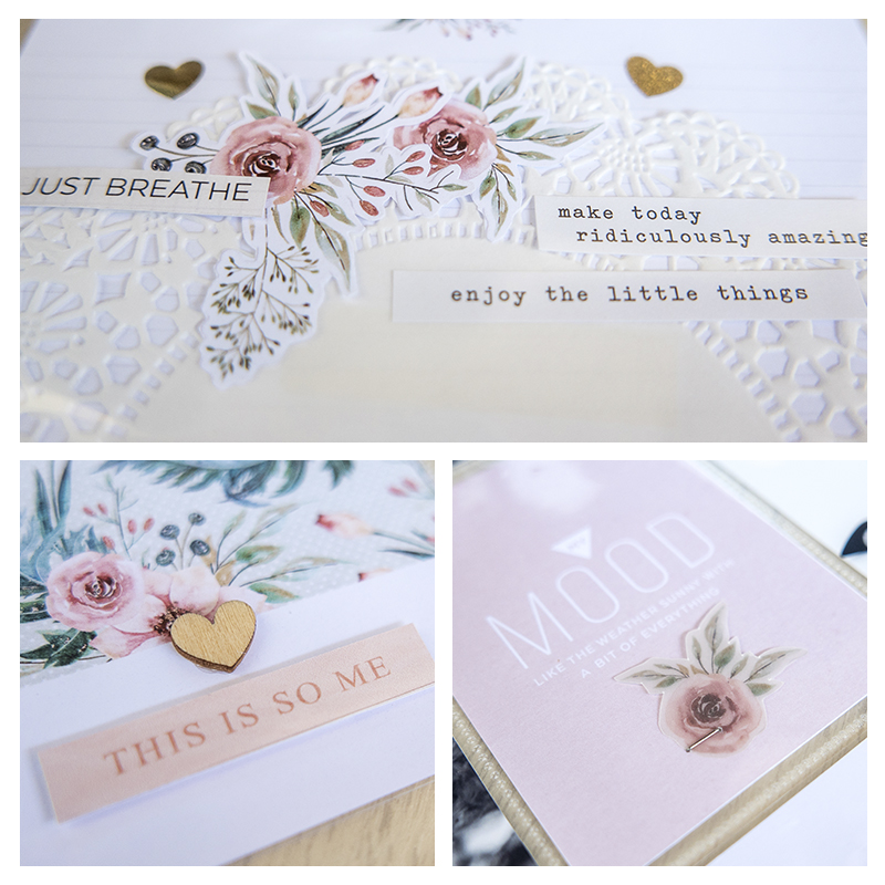
For myself… I plan to print my pages separately at a local print shop and then put them in a SNAP album using plastic pocket pages. This will allow my sister to add additional items to the album as she sees fit. To do this, my pages will need to be sized at 6″ x 8″. I decided to use The Great Escape by Anita Designs to give my album pages some consistency — and also to allow me to quickly pull the pages together…

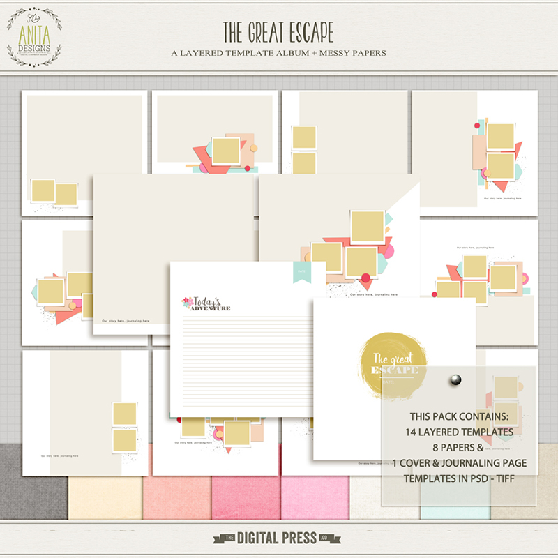
This set offers a lot of variety… from full photo pages, to full-page journaling spots. I will, however, need to re-format them a bit to work in the binder I chose for the printed album. I will show you how I did that in PART 2 of this tutorial series (the ORGANIZE portion of the series)!

DEFINE YOUR COLOR SCHEME

Color plays a huge role in our lives. It is a well-documented fact that certain colors are linked to specific emotions. While this is somewhat cultural, there are several universal connections as well. For instance, bright colorful patterns are usually connected to playfulness and energy, while blues and greys tend to have a more calming effect.

If you are unsure what color scheme works for you, you can always browse Pinterest or do a Google search to get ideas (for instance, you could search “Winter Colors” or “Ski Vacation Colors” to get ideas for a ski trip mini-album). The Digital Press blog also has some fun information about color, if you want to learn more.

Things to consider when choosing colors:

  1. What is my subject matter? An album about a trip to the beach will look nice with tropical colors (whereas an album about a funeral… not so much).
  2. Do my photos “need” a certain color? For instance, a mini-album documenting a sports team will need to use that team’s colors.
  3. What colors are in my photos? Or will I potentially use black and white photos?
  4. What emotion/feeling am I trying to convey?
  5. Do these colors look nice together? We don’t want clashing pages in an album.
  6. Is there a certain digital kit you really want to use? What color scheme does it employ?

For my album, I need a little bit of flexibility. My sister requested some girly colors, and the first part of the album will have some happy pregnancy photos… so a more upbeat feel to those pages will be great. But I also want to be able to create a more subdued & calm feel to the end of the book (not dark and brooding, even though the subject matter is sad… but rather, somber and thoughtful).

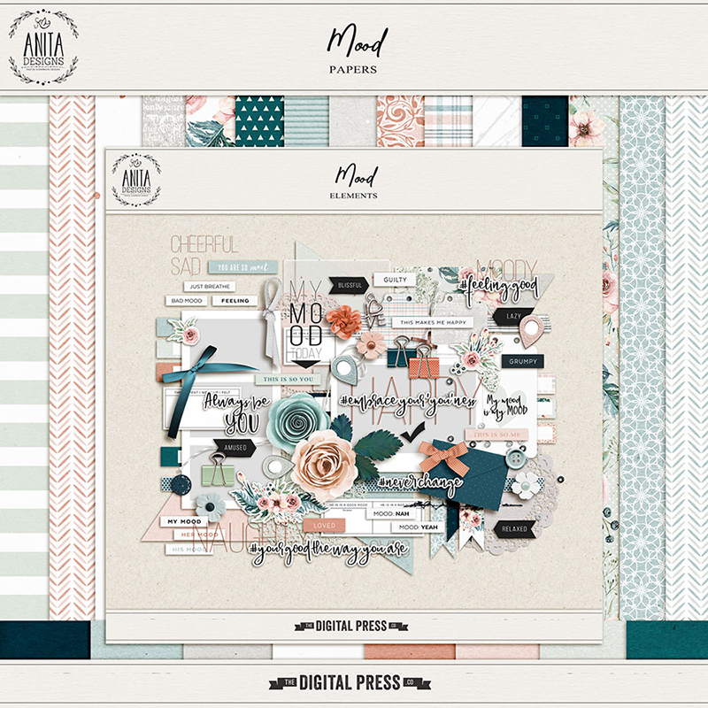
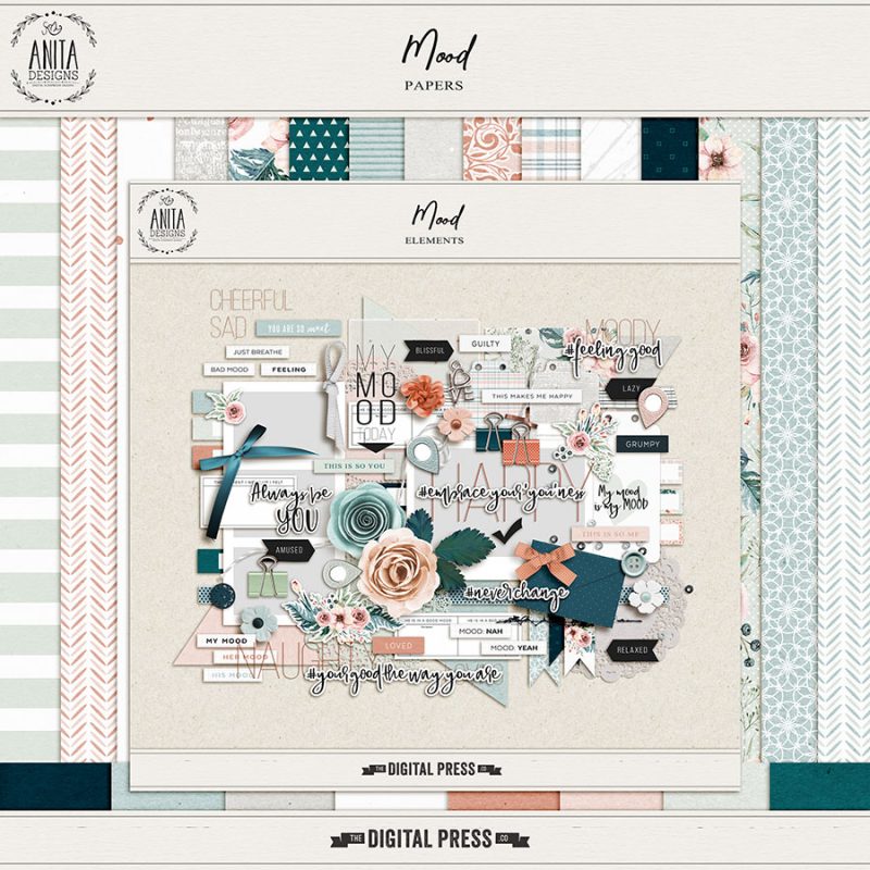
I realized that Anita’s template pack (the one I linked, above) came with some great colored solid papers, and I thought those colors would work pretty well for what I wanted to do. They play nicely together, but also offer the flexibility I need. Using those colors, I searched through the store and found this additional kit, Mood, also by Anita… which uses similar colors and some word art that will work well for this subject. I can use my color scheme to recolor items that need it, and I can always add more paper/elements from other kits if I decide there is something missing.

DETERMINE SPECIFIC ELEMENTS NEEDED

Thinking about the theme of your album… try to decide if there are specific elements you NEED or WANT to use. This does not mean that you have to plan out every embellishment you will use, but just that you decide on some thematic elements that you can use to connect your pages to the event you are documenting.

For example, if you are documenting a Disney Trip — you would want to include some Disney-inspired elements. Or perhaps you’d use some flip flop stickers and a birthday cake for a pool party-themed mini-album. Planning these things out, ahead of the actual construction of the book, will allow you to be proactive and have all your supplies handy when it is time to create.

You can also go ahead and decide which generic element types you might use. For instance, because my book centers around a baby girl — I will be including lots of flowers, ribbons, and buttons. All generic, but easily associated with baby girls. Notice that the kit I chose to work with, above, already has a lot of these types of elements. I can find additional elements, as well, if needed — but these will be my base for my album.

ASSESS ADDITIONAL PLANNING NEEDS

Feel free to brainstorm other areas that might need fleshing out a bit as well. I realized that my sister might want to add things… like cards she received, or her own handwritten thoughts, or even drawings from her older children. I decided to include a few “blank” pages for these types of additions.


As you can see, it really does not hurt to spend some time planning out your project — as it will actually save you time, later, when you begin working.

The areas listed above are the things I like to plan-out prior to building my mini-albums. Having concrete plans on these topics help me to have a strong idea of where I am going with my project… and those plans also allow me to concentrate more on the creation of the album when that time comes.

Now that we have begin to get everything all planned out… we are well on our way to creating our digital mini-album this spring! Keep a look out for PART 2 of this series — coming here to the blog really soon!


ErinErin is an artsy crafty kind of girl who is currently dabbling in far too many things, but is working hard to enjoy every moment of it, while avoiding the rain, which is difficult due to living in the land of many rains. She is slowly learning to use her smart phone to capture all the fun little bits of life that would otherwise go unremembered in the busy craziness that is raising a family!


Feature Friday | k.becca

Hello everyone and happy Friday! Fridays are always a happy day… and with each Friday also comes our newest edition of Feature Friday here on The Digital Press blog. This week, I am absolutely thrilled to be shining a spotlight on Kristen of k.becca.

This is Kristen’s third feature article here on the blog; if you’re interested in learning even more about her, you can check out her first feature post from April 2017 (a glimpse at her creative workspace), or her second feature post from September 2017 (her Foodie Friday post). 🙂

This time around, we simply asked Kristen to share “5 Things We Might Not Know About Her” …and I think you’ll agree that her trivia tidbits are really fun!

  1. I’m left-handed. When I was a little one and was first starting to do all the things with my left hand, my mom attempted to turn me into a righty for a while, but it didn’t take. I’m stubborn like that.
  2. I can’t eat gluten or sugar. A little over a decade ago, I started having some serious health issues. After a series of tests and physicals and check-ups, I was told that I was fine. But I wasn’t. So, I went on an elimination diet and discovered that most of my symptoms started to clear up within days after cutting out gluten and sugar. It was and still is a bummer sometimes, especially at birthday parties (cake!) and holidays (cookies!), but thankfully I love to cook and bake and have replaced most of the gluten and sugar-filled things that I used to love with gluten and sugar-free goodies that I like just as much or better.
  3. I love cats. Like, super love. They’re just so fuzzy and cute and purry. Sadly, my husband (also a cat lover) and I don’t currently have any cats of our own, as it’s taken us some time to get over the passing of Moses, our incredibly spoiled and demanding but totally awesome and super foofy Maine Coon mix. But we’re hoping that a couple of new kitties will be adopting us sometime later this year. Until then, I’m overindulging in cute cat videos on YouTube.
  4. I have a degree in art history with a concentration in Medieval and Northern Renaissance art. I absolutely loved studying art history and thought that I would become either a museum curator or a professor, but I became interested in web development and design during a seminar class in which we had to design a website for the college art collection… and I ended up becoming a web developer / designer, instead!
  5. I can’t roll my R’s. When I first started taking Spanish classes in junior high, I practiced and practiced and practiced… to no avail. It just wasn’t happening. My Spanish teacher told me that I was “great on paper” but that I “suck out loud.” Thanks, dude.

As for the products she designs… when you take a peek at Kristen’s store at The Digital Press, you are sure to be struck by her distinctive style. The colors are soft and her kits are very well put together. I am also always attracted to the wonderful array of hand-lettered and hand-drawn items in her collections (from word art and stamps, to the patterns on her papers and cards, etc.).

Here’s a quick sampling of some of my own personal favorites out of all of the gorgeous products you will find in the k.becca shop at TDP…


 Don’t these products look absolutely amazing? The attention to detail and the little touches that are sure to make any of your crafty projects stand out!

Additionally, as I looked through all the lovely layouts that use k.becca‘s products in TDP’s gallery… the versatility of her products was so apparent. Here are a few of the projects that stood out to me…

I hope you enjoyed getting to know even more about Kristen today! If you adore her products, as I do (or even if she’s new-to-you and you haven’t used them before), here’s a great opportunity to clear your k.becca wish list and add to your stash! I can assure you, you will fall in love with her products! Throughout the coming week, you can enjoy a 30% off sale in her store all week long (the sale will end at 11:59pm ET on Thursday 3/22)… so go take a peek!

Additionally, Kristen has a special Free-with-Purchase offer for everyone this week! That’s right… all week long, you can snag this awesome full kit — Spring Whimsy — for FREE with any $10+ purchase in her shop — this week only!


Profile pic avatar small

About the Author Shivani Sohal is a donner of many alter-egos. A finance professional by day in busy London, she morphs into a seemingly normal mum of two in the evenings and weekends. She is constantly found with her fingers in too many pies and juggling the metaphorical balls. That is living on the edge for her; aided by the two ankle biters and a darling hubby who define the warm and mushy for her. She is ferociously dedicated to memory keeping — almost immune to any nay-sayers (or equally-disruptive crying children or annoying house fires!); keeping her head down and forging ahead at all times.

Tutorial Tuesday | Creating a Stamped Title

Creating a Stamped Title

I’m a big believer in trying to make my more traditionally-styled digital scrapbook pages, well, traditional! Sure, there are a ton of things you can do in the digital realm that simply aren’t possible with supplies that you’d buy at a craft store, but I’m always looking for ways to create the illusion of something being “real.” I wanted to share with you an easy way to re-create the look of a stamped or painted title on your page that’s layered among papers, photos, or other flat elements.

Let’s stop for a minute and think about this: If you had a stack of papers or photos spread about on a table and you grabbed a wood block stamp, inked it up, and stamped away, what would the words look like? Some might be a little transparent, with patterns or images peeking through. Maybe the edges are fuzzy. If your stamps go over the edge of two or more papers or pictures, does everything line up exactly? Yes, folks, these are the kinds of things I think about when I’m creating my digital layouts and trying to get the finished product to look as realistic as possible.

As I placed this title on my page, I found that I wanted it sitting on the patterned paper and spilling over to the background. Realistically speaking, if this were truly stamped, I would see some of the pattern on the orange/brown paper bleeding through, and I’d see the bottom edge of the paper, too. As things stand right now, that’s not the case. Here’s how I changed that.

Step 1: Create a duplicate layer of the title, wordart or alpha.

Step 2: Place one copy of the title immediately above the paper on which the title sits; place the other copy underneath.

In my example, I have a copy of the word “Choice” right on top of my patterned paper, and another copy above the lines layer.

Step 3: Clip the title to the patterned paper. This will allow the bottom edge of the paper to be visible and reveal any shadowing you might have.

You could leave things just the way they are and be done. Personally, I still tweak things a bit more, and here’s why: Remember what a truly stamped image might look like if you were using ink and paper? I would still see some of the pattern on the paper coming through. The same goes for the dashed lines on the background paper. Read on

Step 4: Lower the opacity of the title layer that is clipped to the patterned paper, and play with blending modes to allow the pattern the bleed through.

I like to use Multiply or Linear Burn, depending on the color of the paper. This step is really a little bit of trial and error, so just play and see what you come up with. I ended up with a blend mode of Multiply, and Opacity of 65%. I also lowered the opacity on the bottom copy of the title (the one that’s sitting on top of the dashed lines), just a little, to allow the lines to peek through ever so slightly. These formatting options are in my Layers Palette (I’m using CS6), but you could also use the toolbar menus if you’re more comfortable with that, or if your desktop is configured differently. From the toolbar, I would select Layer > Layer Style > Blending Options to access these choices.

Once again, you can stop here, if you like … or not.

Step 5: Select one of the two title layers (either one is fine), and nudge just that layer a little to one side. The amount of movement really is very small; it’s just enough to add to the illusion that the stamping is on multiple layers.

TIP: Although not necessary, one last thing that I like to do is select the title layers, both of them, and link them together.
This way, if I need to move or resize the title, both layers change in unison.

Credits: Choices by MEG Designs

Credits: Real Life by Calista’s Stuff

As you can see in the second example that I’m sharing here, your title could spill over onto multiple photos and papers. Even if it seems complicated, the steps to creating the look of a stamped or painted title remain the same:

  1. Duplicate.
  2. Position.
  3. Clip.
  4. Blend and Opacity.
  5. Nudge.

I hope you’ll give this a go!


About the Author Kat Hansen is a creative team member here at The Digital Press. A Director of Human Resources by day, she loves the opportunity to spend a few hours each evening being creative. Vacation memories feature pretty heavily in Kat’s scrapbooking pages, as well as her health and fitness journey. Kat has quite the sense of humor (she “blames” her father for this), which she incorporates into her journaling and memory-keeping.

Hybrid How-To | Using Watercolors On Layouts

Hi everyone, and welcome to another edition of our Hybrid How-To series here on The Digital Press blog!  Today, I’m here to show you how to create a physical layout using watercolors (using fun paint that you can make to perfectly match your digital kit).

If you’ve followed my posts here on the blog in the past, you know that I love working with paper and physical elements — and especially stamps. I also love to use watercolors on my scrapbook pages! Sometimes, I even scan my paints and turn them into digital printables. It’s so much fun, and I can match my paints with my digital stash and  stretch my crafty budget that much more.

The first thing I’ll tell you when it comes to using paint on your layouts… don’t be afraid! Trust me, it’s easy, fun, and even relaxing! Think of it like this: we’re not going to make a painting to go into a gallery… we only want to make pretty stuff for our own layouts!  🙂

For my project today, I will be using the digital collection Mood by Anita Designs…

When I first saw the gorgeous watercolor florals in this beautiful collection, I knew I wanted to paint something to match them. Then, I started thinking about painting some leaves below the printed florals. For my project, I actually didn’t make a previous digital version in Photoshop (which, sometimes, I do). This time, I simply chose my favorite elements, cards, and papers and then printed all of them, as shown in the image below…

I also printed some florals and cards onto vellum paper (see it on the right, above). Look how beautiful and soft they turned out! 🙂

When choosing these items and printing them out, I actually knew that I might not use all of the items… but it is not a problem. Now I have some pretties ready to use in my memory planner, which I love to play with as well!

After I printed all these goodies, I had some fun relaxing and fussy-cutting them, while planning out my spread. You’ll see below that I made a spread with a traditional scrapbook page and a pocket page.

Finally, after cutting it all out… here is the gorgeous stuff that I had in hand, ready to play with…

With all of these items in hand, I started thinking about my color palette… and then I grabbed my sketchbook and began testing some different greens…

After choose my color scheme, I painted some samples on my sketchbook, just to know how I’d like to arrange my leaves…

Here’s a look at my painted leaves underneath one of the pretty sticker elements from the digital kit I worked with…

When I was satisfied with my paint, I grabbed my white cardstock paper and arranged my photos and mats… just to make sure where to paint my leaves…

I made a mark on the middle of my page and just painted some leaves, branches, and berries… very similar to what I had done before in my sketchbook while practicing…

Here is a look at my 2-page spread after I had finished my paint and placed some floral stickers, word art pieces, and some other word bits in a simple design with the patterned paper as a border…

Then, after placing my photos and elements, you’ll see that I decided to paint some more leaves onto the upper left corner, in order to give more balance to my design.

I also used the vellum cards as the mats for my photos, and also placed some vellum florals as the first layer of my clusters.

Here’s a close-up view of a few different areas of the project…

Finally, to finish things off, I added some stamps, some wood veneers, and some gold stickers along with a gorgeous big gold heart.

I like to print my journaling and cut it into strips because I’m not a big fan of my handwriting directly on the page (and sometimes I ruin my work by making a big mess!). 🙂 Here’s a look…

As you know if you’ve followed me here on the blog, I love to add texture to my work… so I added a delicate doily, more wood veneer, glitter sitckers, and word stickers.

Finally, I think the “cherry on top” is a vellum floral which I just stapled on my soft pink card. I really loved how this spread turned out!

If you’d like to give this a try, too, don’t forget that you can earn challenge points at TDP! Come visit the CROSSWORD SECTION in The Digital Press forum, and you’ll find this month’s Hybrid Challenge thread (for each month’s Hybrid Challenge at TDP, you get to choose one of the month’s”Hybrid How-To” tutorial posts from here on the blog and make your own version). If you choose to give today’s project a try… all you have to do is make a hybrid page using some digital elements and papers and add some watercolor paint, as shown above (it doesn’t have to be leaves, though; you can paint what you want — whether circles, hearts, background washes — whatever your imagination comes up with!). You’ll see how fun it is! Give it a shot, and share your final results with us! We can’t wait to see what you come up with.

Have a great weekend you guys, and happy scrapping!


PERFIL TDPAbout the Author  Andrea Albuquerque is part of the Hybrid Creative Team here at Digital Press. Andrea has been a scrapper since 2010 and a photographer since 2012. Although she adores the flexibility and creativity of digital, she can’t resist playing with paper, paint, and embellishments… so hybrid scrapping is the perfect medium for her! She lives in Brazil with her hubby.