I’m a big believer in trying to make my more traditionally-styled digital scrapbook pages, well, traditional! Sure, there are a ton of things you can do in the digital realm that simply aren’t possible with supplies that you’d buy at a craft store, but I’m always looking for ways to create the illusion of something being “real.” I wanted to share with you an easy way to re-create the look of a stamped or painted title on your page that’s layered among papers, photos, or other flat elements.
Let’s stop for a minute and think about this: If you had a stack of papers or photos spread about on a table and you grabbed a wood block stamp, inked it up, and stamped away, what would the words look like? Some might be a little transparent, with patterns or images peeking through. Maybe the edges are fuzzy. If your stamps go over the edge of two or more papers or pictures, does everything line up exactly? Yes, folks, these are the kinds of things I think about when I’m creating my digital layouts and trying to get the finished product to look as realistic as possible.

As I placed this title on my page, I found that I wanted it sitting on the patterned paper and spilling over to the background. Realistically speaking, if this were truly stamped, I would see some of the pattern on the orange/brown paper bleeding through, and I’d see the bottom edge of the paper, too. As things stand right now, that’s not the case. Here’s how I changed that.
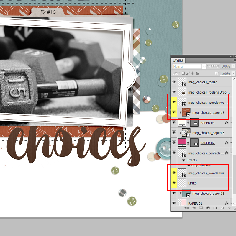
Step 1: Create a duplicate layer of the title, wordart or alpha.
Step 2: Place one copy of the title immediately above the paper on which the title sits; place the other copy underneath.
In my example, I have a copy of the word “Choice” right on top of my patterned paper, and another copy above the lines layer.
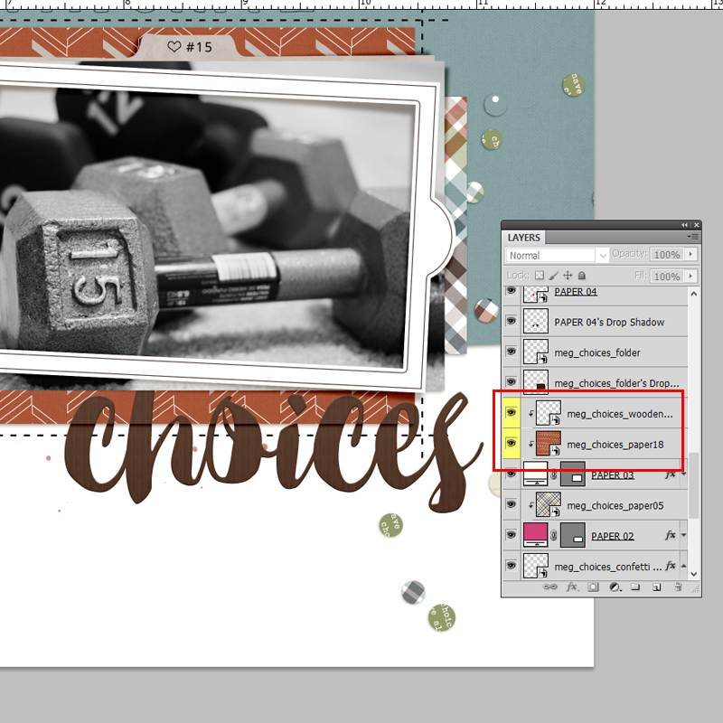
Step 3: Clip the title to the patterned paper. This will allow the bottom edge of the paper to be visible and reveal any shadowing you might have.
You could leave things just the way they are and be done. Personally, I still tweak things a bit more, and here’s why: Remember what a truly stamped image might look like if you were using ink and paper? I would still see some of the pattern on the paper coming through. The same goes for the dashed lines on the background paper. Read on …
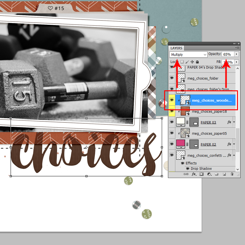
Step 4: Lower the opacity of the title layer that is clipped to the patterned paper, and play with blending modes to allow the pattern the bleed through.
I like to use Multiply or Linear Burn, depending on the color of the paper. This step is really a little bit of trial and error, so just play and see what you come up with. I ended up with a blend mode of Multiply, and Opacity of 65%. I also lowered the opacity on the bottom copy of the title (the one that’s sitting on top of the dashed lines), just a little, to allow the lines to peek through ever so slightly. These formatting options are in my Layers Palette (I’m using CS6), but you could also use the toolbar menus if you’re more comfortable with that, or if your desktop is configured differently. From the toolbar, I would select Layer > Layer Style > Blending Options to access these choices.
Once again, you can stop here, if you like … or not.
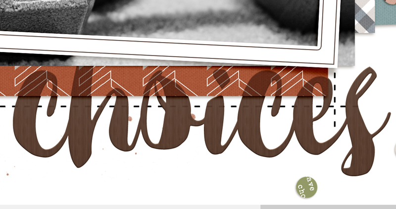
Step 5: Select one of the two title layers (either one is fine), and nudge just that layer a little to one side. The amount of movement really is very small; it’s just enough to add to the illusion that the stamping is on multiple layers.
TIP: Although not necessary, one last thing that I like to do is select the title layers, both of them, and link them together.
This way, if I need to move or resize the title, both layers change in unison.
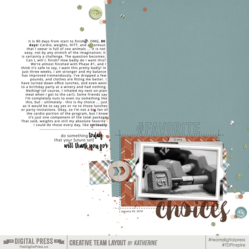
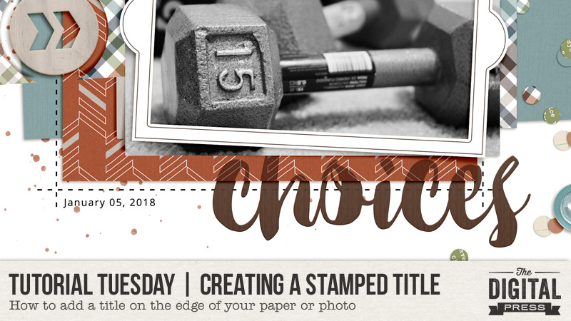
Credits: Choices by MEG Designs
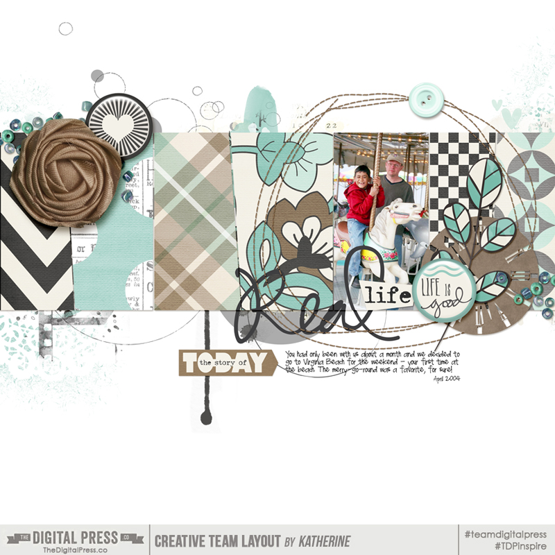
Credits: Real Life by Calista’s Stuff
As you can see in the second example that I’m sharing here, your title could spill over onto multiple photos and papers. Even if it seems complicated, the steps to creating the look of a stamped or painted title remain the same:
- Duplicate.
- Position.
- Clip.
- Blend and Opacity.
- Nudge.
I hope you’ll give this a go!

About the Author Kat Hansen is a creative team member here at The Digital Press. A Director of Human Resources by day, she loves the opportunity to spend a few hours each evening being creative. Vacation memories feature pretty heavily in Kat’s scrapbooking pages, as well as her health and fitness journey. Kat has quite the sense of humor (she “blames” her father for this), which she incorporates into her journaling and memory-keeping.