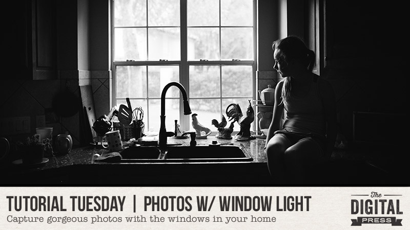
Hello, and welcome to another edition of our Tutorial Tuesday series here on The Digital Press blog! Today, I’m here to show you ways that you can capture photos using the light from the windows in your home.
Have you ever avoided taking photos in your home because the lighting isn’t great? Or looked around and wished you had gorgeous natural light flooding in, as with the beautiful homes we see in magazine spreads? Me too! I love our current home, but it has several rooms that are rather dark. As I eventually discovered, myself, window lighting has so much potential — even if it’s hard to see at first.
A few tips before we begin:
- I highly recommend pulling out your DSLR if you have one. If all you have is a cell phone camera, however, that’s OK! Explore all the options and controls available in your camera app and ensure you’re making the most of your images.
- Turn out the artificial lights! These techniques rely on having only the light from the window affecting your subject.
Ready? Let’s go!
Where’s The Light?
I love our kitchen, but it’s dark. There’s one window behind the sink, but it only gets indirect sunlight and the rest of the kitchen pretty much stays in shadow…
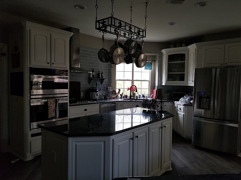
While it’s true that good light makes an image, the same can be said for shadows. Having both shadow and light gives much more depth to an image, and shadows can help hide the junk in the background that you don’t want to see anyway! As you’ll soon see, this kitchen window has become my absolute favorite spot to capture photos in my home.
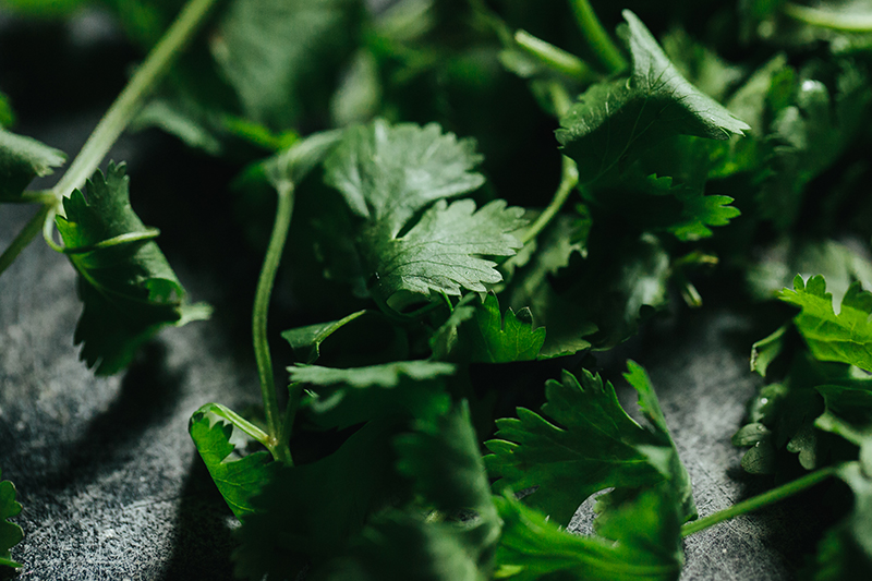
Once I even had to stop mid-chop to capture a photo of cilantro as I was preparing dinner!
Now that we’ve focused on figuring out where the light is… let’s explore all the ways we can utilize the windows in our home to capture amazing photos.
Photograph At An Angle To The Window
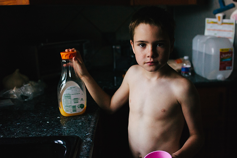
Stand perpendicular to the window. This means to stand so that one of your shoulders is toward the window, and one of your shoulders is away from it. The subject should be right in front of the window. This allows you to capture strong directional light and shadows moving across your subject.
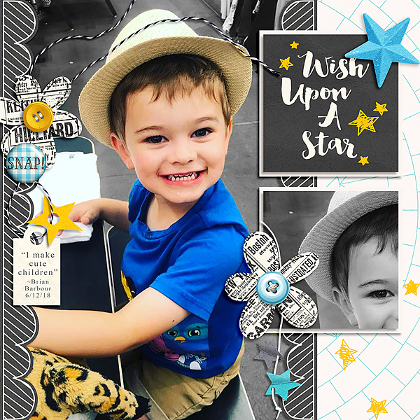
Here is my son standing in front of the kitchen window, and my left shoulder was toward the window. Notice how the light falls off and the right side of his face and body is in shadow?
Here are two more examples using the same kitchen window. I placed these flowers in a cup on the kitchen floor and pulled out my macro lens! I love how the light just kisses the flowers and then dies off, leaving the rest of the image in shadow. You can’t even see the floor just a few inches below.

*TIP* If you do product photography, for an Etsy shop or another type of online sales listing, consider using lighting like this!

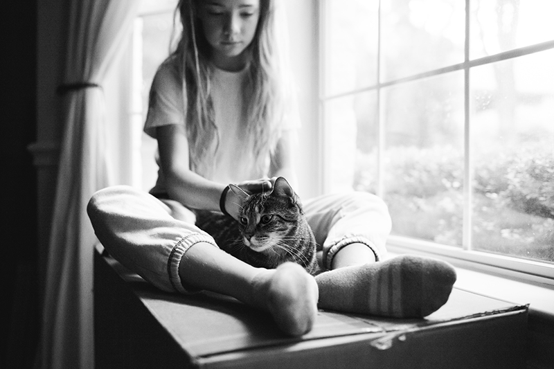
And just to show that I do have more than one window in my house, here’s my daughter and our cat Tiggy. In this instance, my right shoulder was toward the window. These windows happen to be much larger than my kitchen window, so you can see that the image overall is pretty well lit even though we still have those awesome shadows in there…
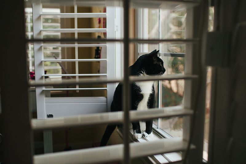
And one more of yet another cat, Pinkie Pie (we have four cats!). This is a window in my daughter’s bedroom…
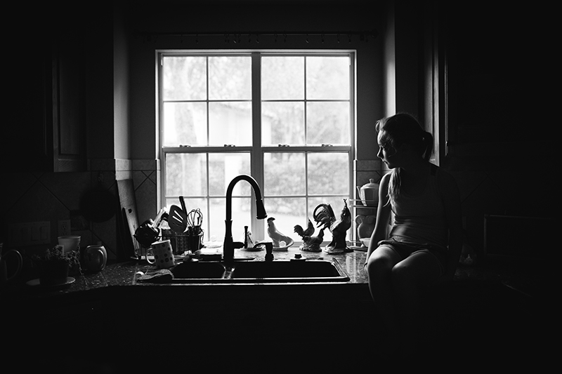
Photograph Straight On To The Window
OK, so now you know how to use the window when you are standing perpendicular to it. But you can also shoot straight on to the window, as well. Here’s another shot of the cats in my daughter’s window… only this time, I was directly facing the window…
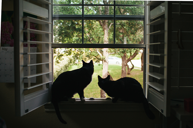
This presents challenges, as the outside will often be much brighter than the inside. In this example, I used the meter of my DSLR to set the exposure for the front yard, which resulted in the cats being in shadow. I focused on their ears so I could capture the outline of their ears in focus. I think this works because cats have a distinctive silhouette and this lets me tell the story of two cats staring out into the trees in the front yard.
And now, back to my favorite kitchen window. You’ll notice my kitchen’s a mess, dishes all around, even a dead plant off to the left! I want my kids to look back on our photos and connect with what they see, so I don’t stress over clutter or creating a perfect frame. I just had my daughter hop up on the counter and I snapped this. Took just a few minutes!
A few things to note:
- While I am facing straight to the window, my daughter’s body is at an angle to the window so the light can touch her face. I had her slowly turn her head back towards the window just until I saw the light outline her sweet face and then I took the photo. If she was sitting with her back fully to the window and looking directly at us, her entire face would be in shadow and we wouldn’t be able to see her.
- It’s totally OK if the window itself is blown out when you attempt this type of photo (“blown out” meaning that the image data is so bright that it has become fully white and lost all detail).
- I set exposure off her face — that little patch of skin on her left cheek — to get the results here. You can easily play around with the exposure in your editing software later.
- It’s very difficult to capture this type of an image with a cell phone. Most cell phones will try to auto-meter and it’s nearly impossible for the phone to determine what it should be metering for (and thus, it will probably over-expose the image — i.e. make the interior of the home appear fully lit).
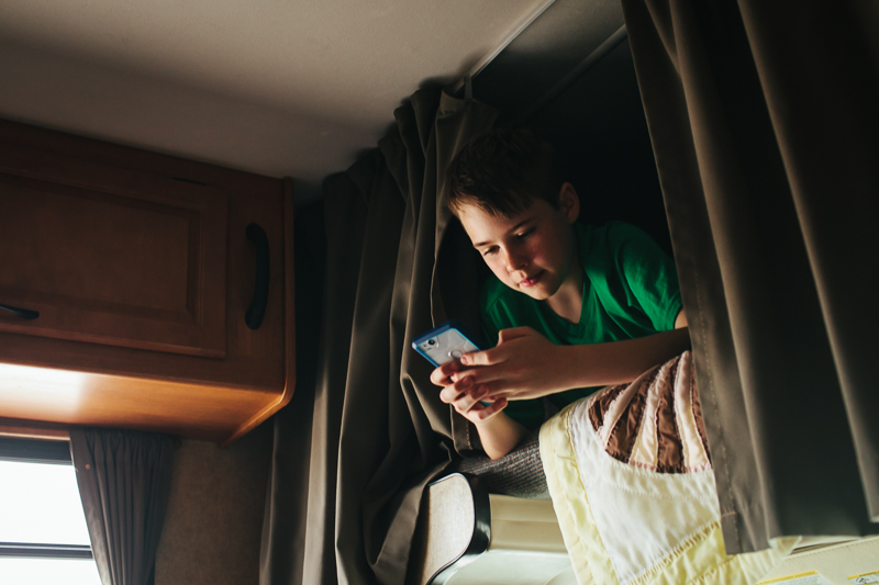
Get Out There And Practice!
I took these photos in a camper we rented over spring break last year…
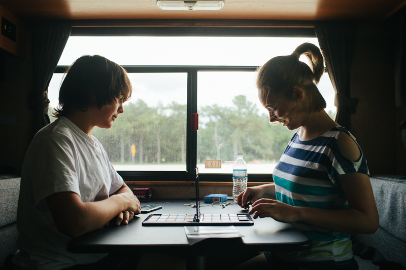
Once you learn to manage window light, you’ll see opportunities everywhere! At stores… restaurants… even in campers!
There’s no substitute for practice. If some of these techniques seem confusing, pull out your camera and try to replicate the setups from the sample images. I’ve been known to use a doll in place of a child because the doll listens to my directions much better than my kids do. As you practice, really focus on “seeing” the light and shadow, and notice how small changes in positioning can make a huge difference in the impact of the photo.
A few things to consider:
- What is the story you’re trying to convey? Are things properly illuminated (or hidden!) to support that message?
- Editing is key. Remember that what I’m showing here are edited images! Now, I’m pretty lazy… so the editing on these is pretty basic. But I do like to enhance contrast a bit so my images pop.
- Explore black and white. The high-contrast images you get from directional lighting naturally lend themselves to gorgeous black and white edits.
I hope that I’ve inspired you to try using window lighting in your home in new ways when taking photographs. I’ll be back later to show you tips on creating amazing photos using the artificial light in your home!
 About the Author Beckie is a creative team member at The Digital Press and who lives near Austin, Texas. In addition to scrapping and photography, she enjoys spending time with her family, reading, and ignoring household chores.


 About the Author Jill W is a creative team member at The Digital Press and has been scrapping for over 13 years. She resides in Northwest Illinois. In addition to scrapping, she enjoys spending time with her family — especially her three young grandchildren (ages 6, 4 and 2). Retirement is getting closer for her, and she is anxious to travel the country with her husband, taking photos and scrapping them as they journey across the USA.
 About the Author Kate is on the hybrid team here at The Digital Press. She lives on the Utah/Colorado border with her husband, 5 kids, 10 chickens, a dog named Gracie, and a cat named Kit. She’s a city-born girl who found she’s really a country girl at heart. She can be found outside, barefoot, and probably in her garden.