Category: Tutorials

Tutorial Tuesday | PART 3: Use Products from TDP to Scrap on Your Phone


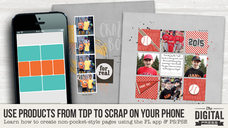
Throughout the past few weeks, we have showed you how to use products from The Digital Press on your mobile device (using the Project Life app) to make quick and easy Pocket Pages on your phone using your own digital stash. If you missed the first 2 posts of this series, be sure to check out PART 1 HERE (full of great tips to get you started with using your own digital stash in mobile scrapping) and also PART 2 HERE (in which we explain how to add journaling/text to cards that come from your own digital stash).

Today, we’re here to share PART 3 of this 3-part series… and show you how to use the app to scrap non-pocket-style layouts — with a teeny tiny little bit of help from Photoshop and/or Photoshop Elements (PSE) …or the photo-editing software of your choice.

You’ll be happily shocked at how quick and easy this can be! Are you ready?


PART 3 — USING A PHONE TO SCRAP NON-POCKET-STYLE PAGES

So, possibly you’ve been following along with this series on our blog… but you haven’t been super excited about it, because you just don’t love the pocket-scrapping style.

Raise your hand if this describes you.

If this is you… then you’ve likely been feeling a little jealous as we progress through this tutorial series, right? You love the idea of using the 20 minutes you sit in a doctor’s office waiting room to document your family’s memories… but you don’t want pocket pages in your album. You can see the benefit of mobile scrapping… but you really wish there was a way to scrap more traditionally-styled pages within the app.

Laura has a few ideas for you today… 🙂


EXAMPLE 1

Sometimes I find myself with random chunks of time on my hands and nothing to do.

HAHAHAHAHAHAHA! 🙂 *everyone falls over laughing at the idea of a mom with spare time on her hands*

OK, now that we’re all finished laughing… seriously, though… it’s true. Think about all of the times you sit for 15 minutes in a doctor’s office or dentist’s office in the waiting room. You waste time reading the office’s year-old copies of People Magazine, and you sort of hate yourself for caring enough about Brangelina to flip to the middle and read one of the articles. Don’t you wish you had something more fun (and productive) to do?

I have found, in recent months, that I can effectively use these small blocks of time — sitting in waiting rooms, or sitting with the engine off in the afternoon car line at my kids’ school, etc. — to do the majority of the “hard work” of scrapping a page of my family’s memories.

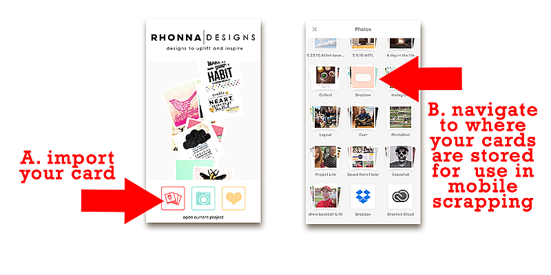
I have also found that if I figure out which photos I want to scrap, and I upload a few digital supplies (papers/cards) to my phone from my own digital stash about once every week or two, then I always have what I need to create the backbone of some easy-peasy non-pocket style pages when I find myself with spare time.


HERE’S HOW YOU DO IT…

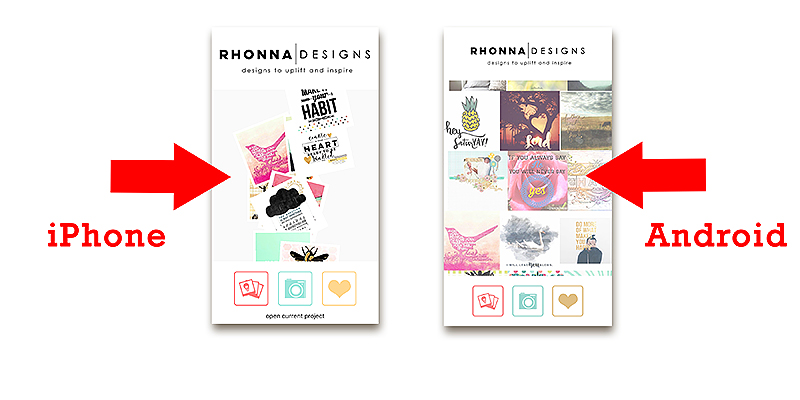
As we know from PART 1 of this tutorial series, the Project Life app comes with multiple pocket-style layout choices pre-installed (and you can also make in-app purchases to add to the number of other layout choices that are available to you).

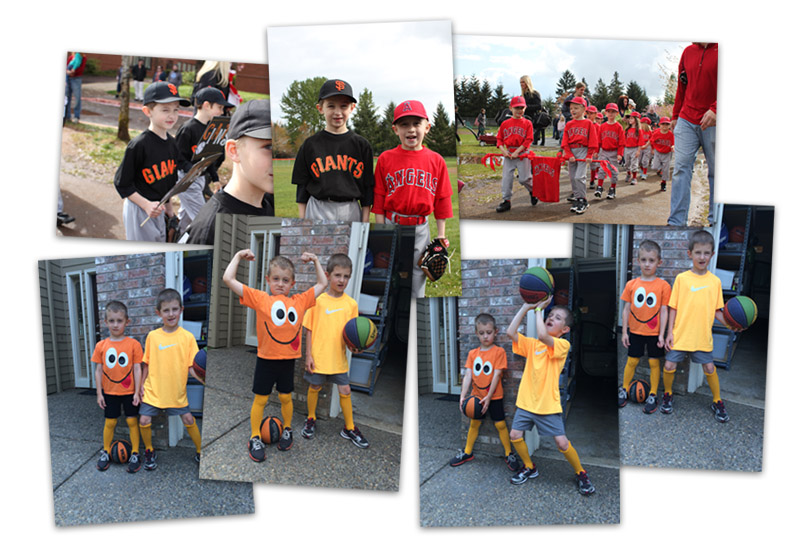
For this example, I knew that I had 2 sets of photos that were sitting on my phone — a series of baseball photos of my boys, and another series of photos of them being goofy in our driveway one morning — and all of these photos were just taking up space on my phone, waiting for me to finally put them into a page…

Once I know what photos I want to work with, I can quickly and easily choose a layout/design that will work with either (a) the number of photos I have to scrap, or (b) the type of photos I am wanting to work with.

  • For instance, for the top 3 photos (the baseball photos), I figured I could create a page with 4 photos — one of each parade, and also one of each of my boys (if I cut that center photo apart into 2 portraits).
  • Similarly, for the bottom 4 photos, I knew that a photo-strip of all 4 photos lined up in a row would work nicely (see EXAMPLE 2, below).

Therefore, to work with the baseball photos — I uploaded a few sports-themed (and color-appropriate) 12×12 digital papers to Dropbox, and then transferred them to my phone (see PART 1 of this tutorial series for info on doing this).

Then I opened the app, and chose my desired layout…

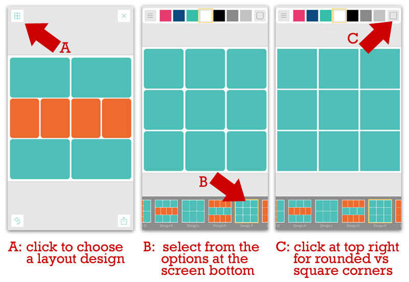
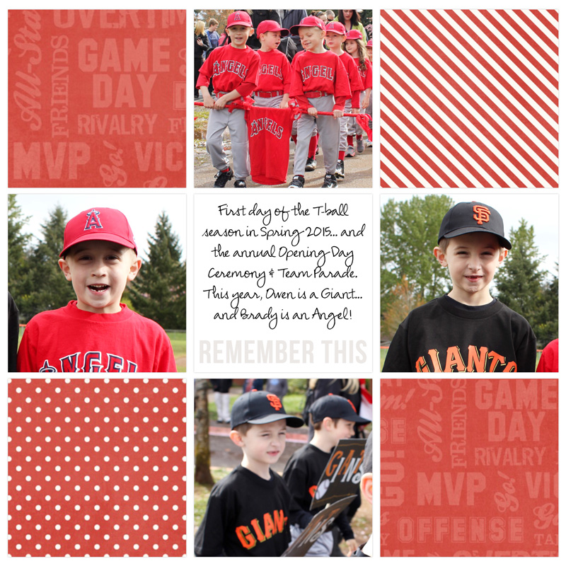
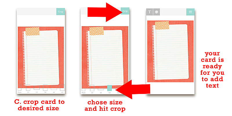
Once I selected my 3×3 grid design, I knew that I wanted to have the photos of my kids take up 4 of the 9 spots… and that I wanted the 12×12 digital papers in 4 of the spots… and that I wanted one simple journaling space in the center…

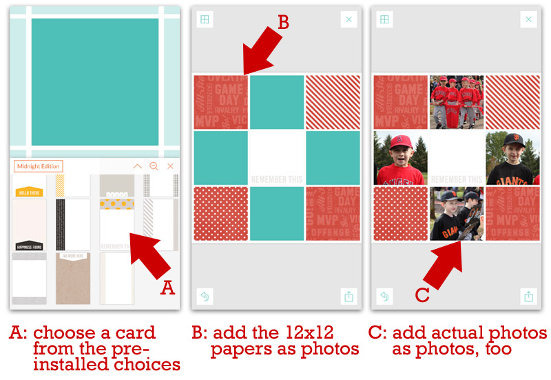
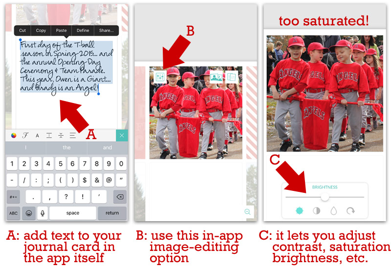
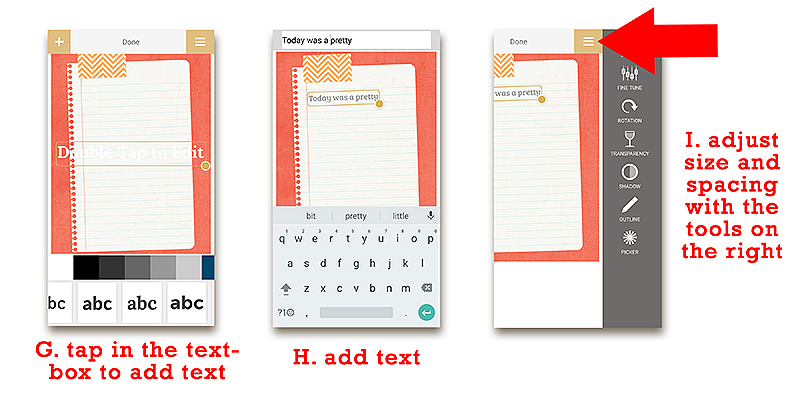
I used a card that came pre-installed in the app itself (a relatively simple/plain card from the “Midnight” edition). Because I was using the 3×3 grid design, each block on the layout was a 4″ square. Therefore, the app only allowed me to choose/use cards that were 4″x4″ or 4″x6″. As you can see, above, I chose a 4″x6″ card and I positioned it in a way that cropped off the top (grey and yellow dots), leaving me just a simple white card with “REMEMBER THIS” in grey text at the bottom.

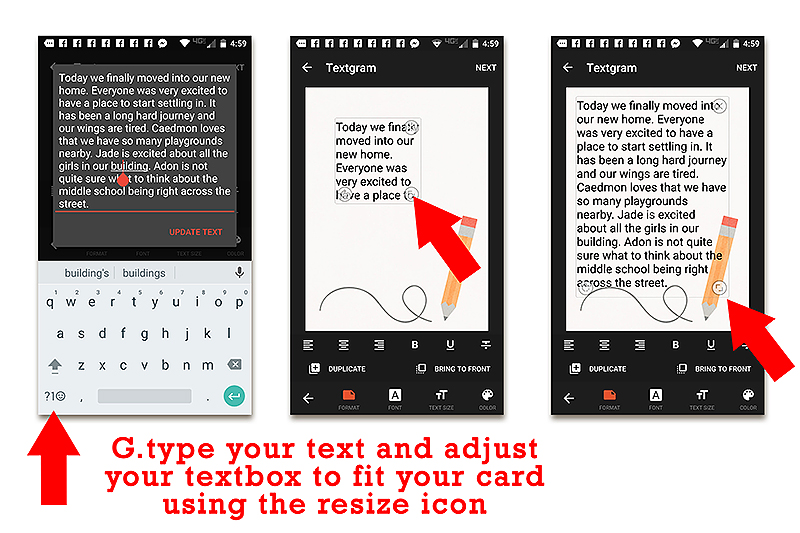
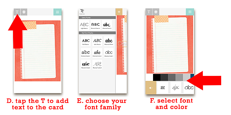
Next, I added some text to the center space (the journaling card). Because I used one of the cards that came pre-installed in the app, the app allowed me to add text straight to the card on my layout (as opposed to having to add text to one of my own cards outside of the app, as we showed you in PART 2 of this series).

I also did some really quick/simple photo editing, because I felt that a couple of my photos were a bit too saturated/bright. See the following image for the easy photo-editing option that is built right into the app itself…

After going through all of the above steps, I felt that my layout was finally completed within the app. All of the photos, papers, and journaling was added (typically the more time-intensive things for me to do when I scrap — because of all of the decisions that go into all of it!)… and the only thing left to add (later) were some embellishments & shadows.

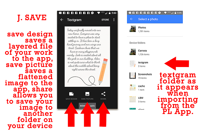
At this point, it was time to EXPORT the finished in-app page… save it to my phone’s camera roll… and then transfer it to Dropbox in order to access it later from my computer.

Here’s what my page looked like when I was finished with it in the app…

Now, honestly… there’s nothing wrong with that layout. It captures the moment… displays the memories… includes some journaling to help us remember what was happening that day… etc. Could it go into our album like that? ABSOLUTELY!

But with another 10 minutes in Photoshop/Photoshop Elements (PS/PSE)… I knew I could tweak a few things to make this more like a traditionally-scrapped digital page. And that’s where the fun comes in.

The following video shows you — in real time — exactly what I did to take this page from what you see above to the finished page you see below. 🙂 ENJOY!

**NOTE** if you are viewing this in Firefox and have trouble w/ the video… please try another browser. Firefox has known glitches with video, whereas Chrome, IE, and Safari all seem to be working fine. 🙂


And here’s a look at the final digital page — after I added everything you saw in the video (above), as well as (a) a year in the upper-right corner, and (b) a felt pennant element in the lower-left corner (two last-minute additions I threw in there right before I saved the final 12×12 print-ready copy)

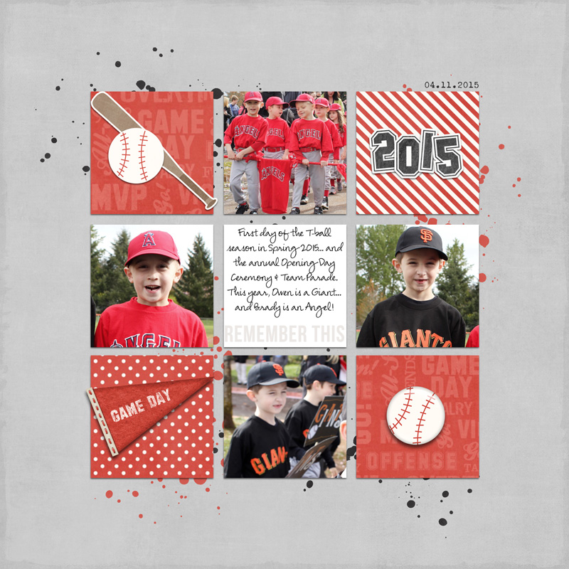
Isn’t that just a little bit more fun than the page I got out of the app? And it only took me an extra 10 minutes to do it! 🙂


EXAMPLE 2

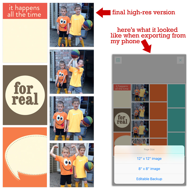
If you remember the “pile of photos” I found on my phone (see above) and wanted to use to create pages… in addition to the baseball photos I just used in EXAMPLE 1, there was also a series of 4 photos of my kids being goofy in our driveway one morning. I mentioned above that I thought I might want to create a photo-strip of that series, and use it on a layout. So… that’s what we will do here, using the app!

First, using the same processed described above… I chose a layout design within the app that would accommodate a 4-photo “strip,” as shown here…

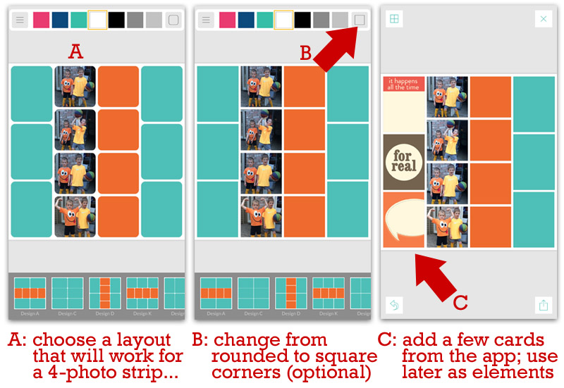
As you can see in image C (above)… I also added a few cards that are available pre-installed in the app (the ones I chose are from the “Kraft” edition).

Now, you’ll notice that the design of my photos and cards isn’t necessarily all that artistic or visually-appealing. That’s OK. It won’t stay that way. 🙂

Once I “grabbed” all of the items from the app that I thought I might need to create my layout… I once again exported it as a 12×12 high-resolution image, the same way I did up in EXAMPLE 1, above. This is what it looked like when I exported it (you’ll notice that if you leave blank spaces in the app… when it exports it, it erases those and you get a plain white background in those spots)

Once I had the high-resolution exported copy of this “half-baked” layout… it was time to pull everything into Photoshop/Photoshop Elements (PS/PSE). The following video shows you — once again, in real time — exactly what I did to take this page from what you see above to the finished page you see below…

**NOTE** if you are viewing this in Firefox and have trouble w/ the video… please try another browser. Firefox has known glitches with video, whereas Chrome, IE, and Safari all seem to be working fine. 🙂


And once again, here’s a look at the final digital page — after I added everything you saw in the video (above), as well as (a) a quick page title, (b) some typed journaling, and (c) a date just under the photo strip (all of which took me about 2 more minutes to add after the video stopped rolling)

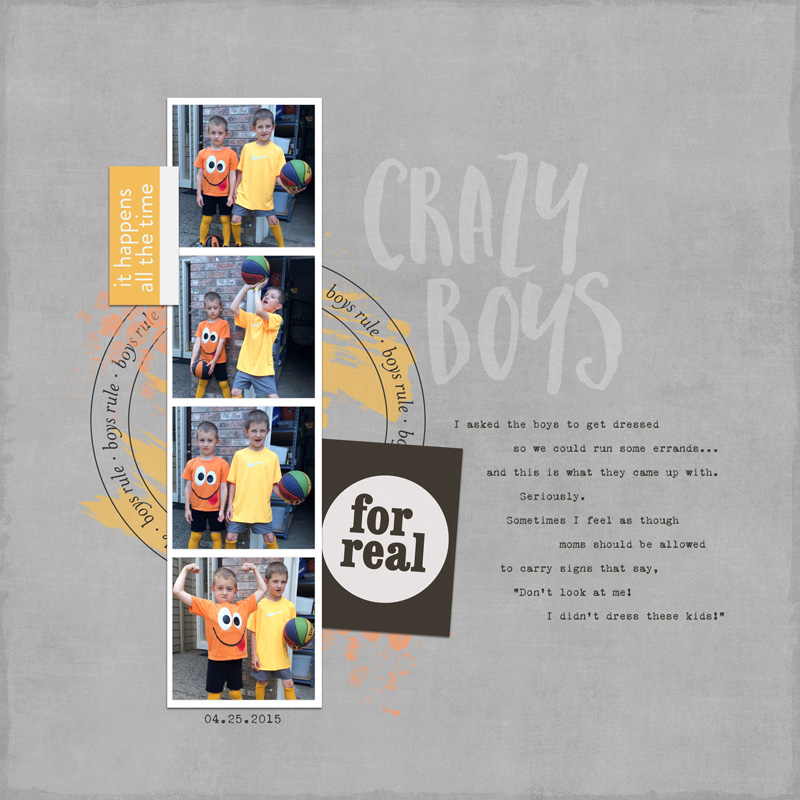
And that’s all there is to it! It took about 10 minutes or so, give-or-take… and it was super easy!

This is all very exciting, right? The idea of creating non-pocket style pages by doing the bulk of your work in this app is something that expands the possibilities of this app in a way that is just awesome. Freeing. Liberating, even.

The flexibility to scrap in numerous styles from the palm of your hand is just way too cool. We hope this helps give you all sorts of ideas and inspiration about ways to use all of those random little 15-minute pockets of time from your day more effectively and productively!

Enjoy, have fun, and happy scrapping!


Laura PassageAbout the Authors

Laura Passage is the owner of The Digital Press, and also the designer behind Wishing Well Creations by Laura Passage (WWC). She works now as a graphic designer in both the digital and paper scrapbooking industries, but previously spent over a decade working as a college soccer coach. She lives in the Pacific Northwest with her husband and two young sons (affectionately referred to as The Tiny Terrorists), and will rationalize eating coffee ice cream for breakfast to anyone who questions it.

Erin


Erin is a work from home mom of three who just moved from Thailand to the west coast of the United States. She loves playing with her kids and anything artsy. She can often be found knee deep in toys with paint on her face. She is slowly learning the meaning of living an authentic life, and enjoying every minute of the adventure.


Jennifer Hignite


Jennifer Hignite is a mom of three boys and new homeowner with her fiance in the mitten state of Michigan. When she is not scrapbooking, she enjoys photography, decorating, and shopping at Target.

Tutorial Tuesday | 5 Ways to Create Visually-Appealing Layout Designs

blogtemplate9202016

Do you want to absolutely LOVE every layout you create? Do you want to spend less time pulling everything together to make a great layout? Do you want to spend less time on arrangements and more time telling the heart of your story?

Yes, yes, yes! We all do. 🙂

Here are 5 simple tips to help you create visually-appealing layout designs every time…

1 — Create a Main Focal Point
Make the most important piece on your layout take up the most room on the page. This will help ensure that it is what you see first (see the target I added?).


2 — Use the Rule of Thirds
As with photography, using the Rule Of Thirds (ROT) helps to place the focus of your design elements in a more appealing place. Simply divide your page into thirds, horizontally and vertically and choose a point where the lines intersect.

3 — Create a Visual Triangle
Place key elements along an invisible triangle to add interest and draw the eye from one point to the next.


4 — Create Movement & Flow
Use motion to direct attention throughout the page to tell your story. Arrows, lines, and tags help create a flow to follow within your layout, especially on Pocket Pages.

5 — Change up the Alignment
Creating a visual connection among elements helps to create interest. A row of three or more aligned objects creates harmony…

…but it’s also fun to mix it up — drawing the attention to something out of order…


I hope these tips will help you create layouts that you love, easier and faster!


FarrahAbout the Author  Farrah Jobling is a member of the creative team here at The Digital Press. She lives in Denver with her amazing family — Mike, Nicholas (9), Claire (7), Hope (2 yr old puppy) & Kringle (9 mo old bunny). She works from home as a photographer and enjoys scrapping her personal photos.

Save

Save

Save

Save

Save

Hybrid How-To | Halloween Stickers

Hello everyone, It’s Tanya here to show you step-by-step how to create your own (really cute) Halloween stickers!

I thought that stickers like these would make the perfect Halloween treat for school parties. You just never know when one of your child’s classmates might have a food allergy… and with all of the sugar they will be getting already, these will surely be a big hit! My boys are way to old for this, but I am excited to create a bunch and give them out on Halloween night!

Supplies Needed:

  • Your favorite Halloween-themed digital kit (I used FREAKIN ADORABLE 1.0 and FREAKIN ADORABLE 2.0 by Mari Koegelenberg and Danielle Engebretson, shown below)
  • Cutting machine (I use a Silhouette Cameo)
  • Printer
  • White shipping labels
  • 3 x 4 treat bags
  • Stapler (I use a mini stapler that came with colored staples)

The reason I chose these kits — there are just soooooo many fun elements to choose from! I chose 4 different elements from each kit and believe me, that was really hard to do because I wanted to use them all!

The first thing you need to do is to open the images/elements you are going to use in your cutting machine software (I’m using Silhouette Studio Designer Edition). Open your elements and simply drag them over to a new drawing area, as shown here…

Once you have decided on the images you will use, you will have to do a “trace” on each one in your software. This will tell the machine where to cut. This is also referred to as a Print and Cut.   Open the Trace menu and select the trace area (see the small black circle I drew near the upper right)…

Now uncheck the “High Pass Filter” and move the “Threshold” all the way to the right. You can see that the image is perfectly highlighted (see the circle and the arrow I drew to show the boxes you will click/change)…

At this stage, there are a few ways to let the machine know the cut area. The one I will be showing you is the Trace and Detach. To do this, simple click on “Trace and Detach” as shown here (see the small black arrow I drew near the right)…

Now you will click on the image and drag it off to the side. It is hard to see, but there will part of the image left behind (you can see this below; when I click and drag over where the image was, the dashed lines show up. This is the part to get rid of). After dragging a box over the leftover part, hit “delete.”

Continue to do this for all elements used…

Next, draw out a box. The dimensions of my box were 3.250 x 2.563. I was able to get six to a page. Resize the elements to fit inside your area. The size of your box and images will depend on the size of your treat bags.

Now, you will copy and paste into all spaces, as shown here…

Now it cutting time. First, you have to print the stickers onto the label sheet. To do this, make sure that your “registration marks” are on… and then send through your printer. It is important to have the registration marks on before you print. These marks tell the machine where to cut.

Next step is to go to the “Cut Settings.” Here, you will tell the machine where to cut and what type of materials you will be using. For this project we will need to send the sticker sheet through twice. The first time will be just a kiss cut; this will not cut the paper all the way through.

First cut: Only turn on the cut settings on the images. To do this, go through and click on each image and chose “Cut Edge.” You can double check to see if the box around the images is off — simply click on one and it should show “No Cut.”

Second cut: Now do the opposite. Go through and turn the cut marks OFF on the images and turn the box cutting lines ON. You will also choose “cardstock” for your material. This will cut all the way through, giving you little individual sticker sheets…

Now you can either peel the white area around your sticker off… or leave it on. I left it on because these particular labels have a “cut” through the back and doesn’t look quite right.

Now add your sticker sheets to the treat bags…

I created a cute topper (in Silhouette Studio Designer Edition) and stapled it to the top of each treat bag. You can even add your child’s name to the back of the treat for a nice finished touch…

Here’s a look at the finished product from the front of the sticker packages…

I hope that you have enjoyed this tutorial! Get your creative juices flowing and create some stickers for Halloween (or even for some other fun occasion… you could use any theme/kit you like!). If you give it a try, come share your creation in the September Hybrid Challenge thread in the forum. 🙂


TanyaAbout the Author  Tanya is a part of the hybrid team here at The Digital Press. She has been hybrid crafting for at least 14 years now, and loves creating and sharing those creations with others. Her all-time favorite tool is her Silhouette Cameo. She has been married for 28 years to her high school sweetheart, Richard and has two sons: Chris, 25 and Chance, 20. She also enjoys crocheting, photography and woodworking.

Tutorial Tuesday | The Psychology of Colour

Summer is drawing to a close here in England, and Autumn is beginning to creep in. The first thing I notice is that the colours everywhere are changing.

Summer has been all about bright and bold/contrasting colours (from displays and goods in the shops, to the clothing people wear, to things found in nature itself)… while Autumn tends to bring with it more shades of the same colour, and often darker or more muted tones.

Colours can tell us so many things, even on a subconscious level, so I thought it would be interesting to think about how colours communicate to us in scrapbooking. Here are some of the most common associations made with the main colours of the rainbow (and with black and white, as well)…

To show some of these colours in action, and how they might be used to influence you in your decision making, here are some (hopefully) well-known international logos that use just a couple of colours to convery their message. Have a look (above) at the most commonly associated emotions for the colours used by these companies…

So how can we apply this to scrapbooking? Well, some of the pages that catch my eye when I browse through the gallery are layouts in which the colour is used well to reflect the emotion of the photos and the story they tell.

For instance, here is a look at a page I made on which I intentionally used mainly black and white. I was hoping to convey my daughter’s wish to be chic, elegant, and modern… while still young and innocent and with simple wishes in life — the pink is just a little extra something girly!

I hope this helps helps you think about which colours (or kits/products) might work best with your pictures, or just helps you understand why it is that you always love pages with orange, or blue, or whatever it is that makes you happy!


CorrinAbout the Author  Corrin is on the creative team here at The Digital Press. She is a fan of the Big Bang Theory and a lover of cozy pajamas. She lives in the currently-sunny but breezy South of England with her husband and 4 crazy kids, who regularly discover & plunder her secret chocolate stashes! She is still trying to get the house straight after moving 2 years ago. Who knows… maybe this will be the year she reaches the bottom of the laundry pile!

Tutorial Tuesday | PART 2: Use Products from TDP to Scrap on Your Phone


A few weeks ago, we showed you how to use products from The Digital Press on your mobile device (using the Project Life app) to make quick and easy Pocket Pages on your phone using your own digital stash. If you missed that post, be sure to check it out HERE; it’s full of a ton of great tips to get you started with mobile scrapping, and we promise you will not regret it!

Today, we’re here to share PART 2 of this 3-part series… and show you how to add journaling and/or other text to any journal cards you import into the app from your own digital stash (again, that part is covered in PART 1 — and now we’ll cover the addition of text here in PART 2).


PART 2 — ADDING TEXT TO A JOURNAL CARD ON YOUR MOBILE DEVICE

If you already read PART 1 of this tutorial series, you know that the Project Life app allows you to journal directly onto the cards that come pre-installed in the app itself (and/or the cards that are purchased as in-app purchases)… but when we import cards from our own digital stash, the app treats those cards the same as “photos” and does not provide the options to add text. In order to add journaling to our own imported cards, we need to add the text to the card in a separate app before importing that card into our layout within the app.

There are a number of different apps out there that allow you to add text to images (just do a search in your app store for “adding text to photos”)… but there is no way we can cover all of them in this article, so today we will highlight just a few of our favorites and give you a step-by-step snapshot of how we do it.

Textgram App

Erin uses Textgram, which is a free app that anyone can use. If you check out PART 1 of our series, you’ll see that she added journaling to her card for the layout she created in that post. The Textgram app is simple to the point of being somewhat limited in terms of design choices… but it’s definitely adequate for most things, and fairly straightforward to use. Below, she walks us through her process.

  1. To begin using Textgram, open the app, start a new project using the red plus sign button on the bottom right, and choose the empty canvas option…
  2. Select your canvas size. You can choose pre-set sizes, or build a custom size using pixels. I have found that the presets are actually bigger than my journal cards, so I prefer to use the custom size option and build my canvas in the exact measurements. **NOTE** Most 3×4 pocket cards (without bleed) are going to be 900px x 1200px… 4×3 cards are 1200px x 900px… 6×4 cards are generally 1800px x 1200px, and 4×6 will be 1200px x 1800px.  
  3. Now you can add your card by selecting the +image button. Choose the folder where your cards are stored (in my case, it’s Dropbox), and select a card.  
  4. Once your card is on your canvas you can move it around and adjust it as needed. 
  5. Next, you will have to navigate back to the main menu area by using the back arrow. Once there, you can add a text box to your card with the +textbox button. Double-tap to add your journaling.
  6. Once you have added all of your desired text, drag the resize corner out to fit the text area of your card. You can format your text as needed. There are options for choosing a font, font size, color, and even for adjusting your character spacing and paragraph alignment. **NOTE** I suggest choosing your font first, as this can change the size and spacing of your text dramatically. The sliders for font size and character spacing are a bit difficult to control and you don’t want to have to keep adjusting them.  
  7. When you have your text the way you want it, hit “next” at the top of your screen and save your card. If you would like to keep a layered project in case you need to make further adjustments later, you will also need to save the design. Both of these options save your work to the textgram app itself. If you want to export your work to another folder (for example, to Dropbox), you will need to use the share button. This is not necessary, however, if you are using your newly-finished card in the Project Life app, because a Textgram folder should appear within your gallery files, and you will be able to access it from the Project Life app pretty easily.  

Rhonna Designs App

Jen typically uses the Rhonna Designs app to add text to her journal cards from her phone. You have to pay for this app, but if you are really interested in scrapping on your phone… it is a pretty good investment, as it has a lot of great options for enhancing your photos, adding text, adding stickers and stamps to your cards, and even creating your own cards.  It is also pretty intuitive and easy to use… which is always a plus, right?

    1. The process for adding text in the Rhonna Designs app is pretty similar to that of Textgram, which we just covered. You will start by importing your card.
    2. Because the Rhonna App is designed with pocket cards in mind, it provides you with a good selection of preset sizes. Choose the correct size for your card (in this case 3:4), and hit “crop”.
    3. Now, there are a lot of things you can do with this app, so feel free to play around… but for our purpose of adding text, you will select the “T” in the upper left corner, which will pull up your font choices. Some are free on the app, and others you will have to purchase. Each little icon is actually a set of fonts, so you chose a font set and it will pull those fonts up for you to scroll through.
    4. When you chose a font, your text box will pop up and you can start adding the text. You can switch the font and color using the panel at the bottom. The tools for adjusting spacing, tilt, and a multitude of other aspects are found by tapping the triple line icon on the top right.
    5. Once you have your text just the way you want it, tap on DONE at the top of your screen and you will return to the main screen where you can save or share your work. Just like Textgram, the Rhonna Designs app creates a folder in your gallery where your projects are stored, and these are easily found within the Project Life app, as well.


And that’s it! …just a quick look at a couple of simple apps out there that will enable you to add text and journaling to your own pocket cards from your mobile device. Now, with the combined information from PART 1 and this new PART 2 post… you should be able to create an entire pocket-style page, complete with journaling, on your mobile device! How exciting is that?! 🙂

And don’t forget, we will have one more installment in this 3-part series coming in just a couple of weeks (late-September), in which we will show you how to use what you create in the App to make a non-pocket style page. Stay tuned!

Enjoy, and happy scrapping!


Laura Passage

About the Authors

Laura Passage is the owner of The Digital Press, and also the designer behind Wishing Well Creations by Laura Passage (WWC). She works now as a graphic designer in both the digital and paper scrapbooking industries, but previously spent over a decade working as a college soccer coach. She lives in the Pacific Northwest with her husband and two young sons (affectionately referred to as The Tiny Terrorists), and will rationalize eating coffee ice cream for breakfast to anyone who questions it.

Erin


Erin is a work from home mom of three now living in Oregon. She loves playing with her kids and anything artsy. She can often be found knee deep in toys with paint on her face. She is slowly learning the meaning of living an authentic life, and enjoying every minute of the adventure.


Jennifer Hignite

Jennifer Hignite is a mom of three boys and new homeowner with her fiance in the mitten state of Michigan. When she is not scrapbooking, she enjoys photography, decorating, and shopping at Target.

Hybrid How-To | Chipboard Elements

Supplies

  • Digital kit of your choice. I used the Jaunt Collection (papers, elements) by Sahin Designs.
  • Photo editing software (I’m using PSE)
  • Printable sticker paper
  • Chipboard (old cereal boxes work!)
  • Cutting machine (optional, but you’ll need to choose simple designs that can be cut by hand)
  • For the key ring charms: jump rings and split rings (in the jewelry-making aisle of the craft store)

Directions

Open the designs of your choice in photo editing software and resize to whatever you need.

If you’re doing the key ring charms and using a cutting machine, go ahead and make the holes for the rings now. Might as well let the machine do the work for you! If you’re not using a cutting machine, you’ll need to punch the holes after assembling the final product.

Now make a mirror copy of each non symmetrical design. In my case, I also changed the back of two designs to be coordinating paper. Just for fun. 🙂

The next step is to print a set of images on sticker paper and cut them out.  You’ll also need to cut the image shapes out of chipboard. I used my Silhouette for this part. The chipboard provides support for the element, and if you’re planning on using it on a layout or other project, it’ll pop off the page a bit for some added dimension.

After everything is printed and cut, all you need to do is peel the images off the sticker paper and place them on the front and back of the chipboard shape. If you’re making the charms and doing it by hand, now is the time to punch holes in them. I used a hook tool to do this on the sun element.

Next, open a jump ring. Attach a split ring and the chipboard element then close the jump ring.

Now you can add the charms to your key ring!


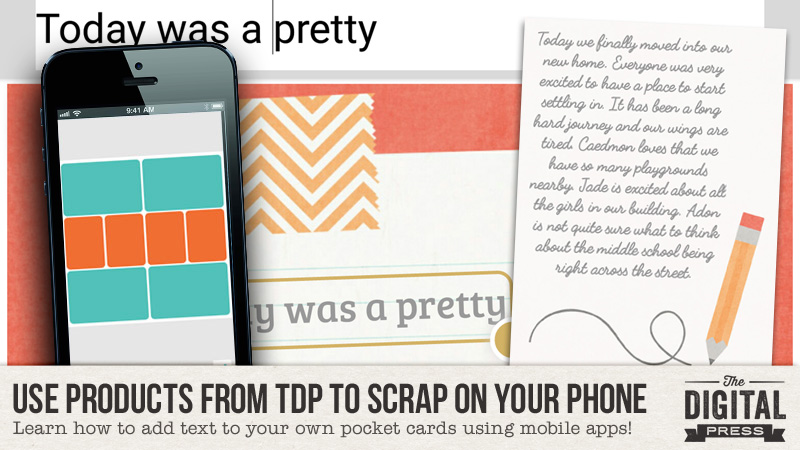
About the Author  Kate is on the hybrid team here at The Digital Press. She lives on the Utah/Colorado border with her husband, 5 kids, 10 chickens, and a dog named Gracie. She’s a city-born girl who found she’s really a country girl at heart. She can be found outside, barefoot, and probably in her garden.