Category: Tutorials

Tutorial Tuesday | Alternative Uses for Themed Products


Have you ever seen a themed kit that was just plain gorgeous — or hilariously awesome — and you just had to have it? The only problem being… you really didn’t have any photos to use with it? Or maybe the theme wasn’t one that was applicable to your life and/or the memories you were trying to document, etc.? This happens to me all. the. time.

If you’ve ever found yourself in this situation — I’m here to help. Today’s tutorial is designed to help you figure out some ways to use those must-have products you see in the shop and can’t stop yourself from buying (and/or how to use an old kit you’ve had on your hard drive forever, but haven’t ever been able to find a use for)!

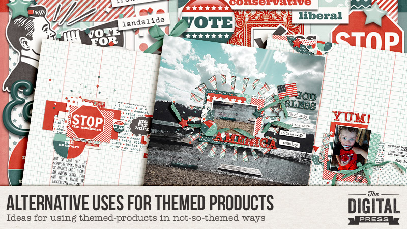
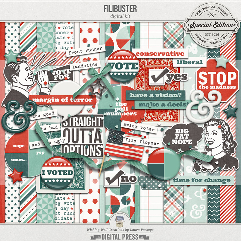
I’m going to show you a few ways you can use a hilariously awesome kit (like Filibuster by Laura Passage, which released a couple of weeks ago)… even if you don’t have any election/voting photos. First, here’s a look at the kit…


One of the options you always have when trying to use a themed kit… is to simply match the color scheme. TDP creative team member Erin took this super cute photo of her son eating a snow cone (see below) and was able to build a fantastic layout around the colors of his outfit…


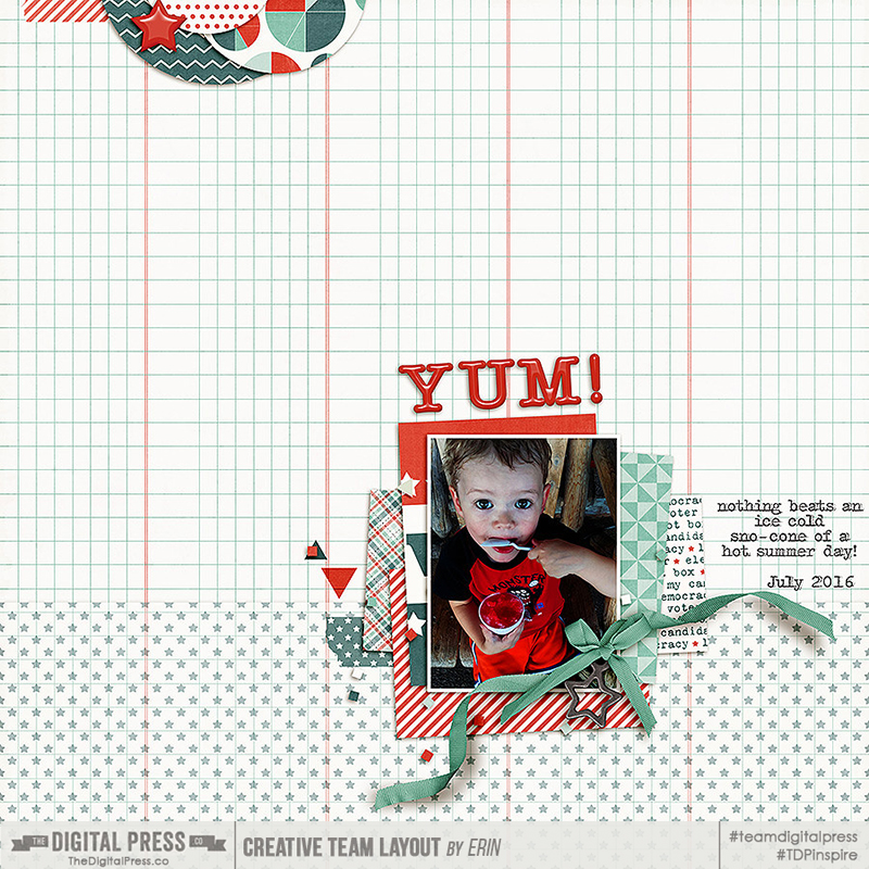
Another trick — she also used themed items in a way that our eye doesn’t notice. For example, you can see that she used the “VOTE” journal card as a mat for her photo. While this trick draws your eye to the photo — you don’t really even notice the election theme, and the fact that it doesn’t match the theme of her layout. Lastly — blue & red can be considered to be “boy” colors. The color scheme, used with a photo of her son, emphasizes her boy-centered layout.

A second option that I often like to use in order to use a themed-product for a non-themed project — is finding an alternative theme within the kit. For example, while Laura’s kit is obviously “election/voting” in its theme… the colors & the stars & stripes can easily lend themselves to a simple patriotic theme, as well. I used her kit to make this next layout, which documents a 4th of July day at the lake house…


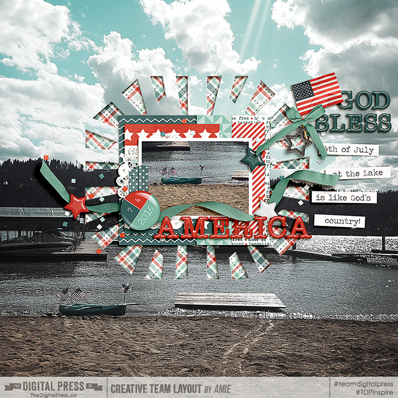
Again, I hid the word “VOTE” on the journal card by using it as a mat (and all you can see is the stars). I also used the typewritten phrase paper, but left the portion that’s peeking out to read mostly “land of the free” — again, in support of my patriotic theme. You’ll find that in the majority of themed kits, there is usually an alternate theme you can work with!

Finally, TDP creative team member Kimberlee shows off a third option for using a themed-kit if you don’t have photos to go with it, but you really want to use the product… a photoless page! If you don’t have any photos to match, but you still love the theme — just do it!


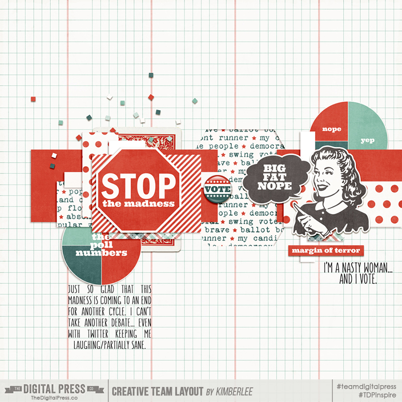
As you can see, you can still use a themed-kit to document a moment in your life — even without photos — by capturing what you were feeling, thinking, etc. in the journaling you include. Kimberlee used this fun kit to document her feelings about this year’s election (which can often be a controversial topic!). It is a time in our history that memory-keepers like us may want to document/record for future generations, who may enjoy looking back and remembering this crazy election year in 2016!

In closing… I hope that I have inspired you to either use those themed kits you’ve already got on your hard drive but haven’t figured out a use for. Additionally, the next time you see a themed kit that you love — I hope these ideas will provide you with the inspiration you need to go ahead and look for alternative uses!


Amie

About the Author  Amie is a craft-loving dental hygienist who lives in Washington state. She loves her husband, her two kids (ages 8 & 5), and her English Bulldog… as well as coffee, baking cupcakes, daffodils, glitter & sprinkles, reading a good book, and lip gloss — not necessarily in that order.

Tutorial Tuesday | New Uses For Planner Kits

Hey everyone! I hope you are enjoying the various shades of Autumn wherever you are. I certainly am waiting for the leaves to turn a rich autumnal colour and take some leaf jumping pics of the kids. 🙂

Today I am here to share some ideas about ways to use all of the lovely planner kits you can find in The Digital Press’s shop — but for traditional digital layouts. Not everyone has jumped aboard the planner craze this past year, but there are so many cute products. Why not use them in other ways? Today I am here to show you how.

I have always wondered about all these gorgeous planner stuff in the shop. Because I don’t do hybrid or paper scrapping, I have always sort of believed that these items are just not for me. But then curiosity got the cat (or rather, me!), and I looked into the idea of using these items on my digital layouts. At first glance, you may think there is not much one can do with planners except, yes, make a planner/record-keeping kind of page. But the many possibilities may just surprise you, yet!

My first attempt involved using planners and printables in my usual way — I treated these as I would any other digital element. I clipped them to shapes and used them as paper pieces in their own right. I found that I really liked the end result; they add to the look of the layout, which is about a snapshot of a fun day…

[see link here for credits]

In my second attempt, however, I used multiple planner pages and layered them to create a focal point of paper mats. Not only do I think that it enhances the interest of the page… but it also adds a depth that looks almost real! This one’s definitely a keeper for me…


[see link here for credits]

But planner kits contain more than just papers. What about those cute little stickers, tags and other embellishments? You could use them individually, of course, but here I wanted to showcase how to use them purely as design elements. So I have used them to form leading lines on the page… arranging them in a flower or any other interesting shape. The possibilities, again, are endless…


[see link here for credits]

And how could I not also create a traditional planner page?! As you can see, this is messy, colourful, and random… but that’s the beauty of it. To mimic my own physical daily planner/journal, I tried couple of things here. I have focused on the shadowing a bit more, again to give that realistic look. For example, when I was placing those planner pages as though they were attached to the journal, I used clipping masks to reveal the binder holes beneath selectively and then added a large shadow. I won’t lie — that took some time, but I like the end result!


[see link here for credits]

So there it is… my little venture into the world of planners, and using these great digital planner products for other purposes! As you can see, there are no rules here or right/wrong ways of using them; you can experiment and find a style that works for you. Hope this post has given you some ideas and more importantly piqued your curiosity! If you do try some of the above styles or come up with your own, please share with us in the gallery. I would love to see them!


Profile pic avatar small

About the Author Shivani Sohal is a donner of many alter-egos. A finance professional by day in busy London, she morphs into a seemingly normal mum of two in the evenings and weekends. She is constantly found with her fingers in too many pies and juggling the metaphorical balls. That is living on the edge for her; aided by the two ankle biters and a darling hubby who define the warm and mushy for her. She is ferociously dedicated to memory keeping — almost immune to any nay-sayers (or equally-disruptive crying children or annoying house fires!); keeping her head down and forging ahead at all times.

Tutorial Tuesday | Easy Font Management


I have to admit it – I am a font addict!

Until just recently, my fonts were a mess on my computer… and believe it or not, all 1600 were installed in the Windows font folder. This slowed down my machine when using text in any program. Oops! In the past, I had used “The Font Thing” to organize my fonts — but when it stopped operating with this newer computer, I was lost. Good news — I have found a fantastic little freeware program called NexusFont, which has proved to be a perfect replacement for me.

This program catalogs all of the fonts on your computer and then allows you to sort fonts into categories that you, yourself, can set up. For me, the best thing is that I can access any of my fonts… no matter where they are stored on my computer (and from any program, even though they are not actually installed). Fantastic!

To start out, you can download the NexusFont program HERE*.

*NOTE: this is a program that is only available for those who are using Windows as their operating system


Once you install the program, you will see under Library (left panel) that there is a folder called Installed. This folder contains all the fonts currently installed on your computer and located in the windows/font folder. Under this there will be a heading Collection but until you set up collections (ie categories for your fonts) this will be empty.

After organizing all my fonts, this is what my main screen looks like when I have one of my Collections (Typewriter fonts) highlighted.


So what do you do after you have installed the program?

  1. First, add any font folders you have (of fonts not installed and located in your windows font folder) to the Library by right clicking on Library and selecting New Folder Group. I have created 2 folder groups – one for purchased fonts and one for free downloaded fonts. You can then right click on this new folder group and select Add Folder.  This will allow you to navigate to the relevant font storage folder on your computer so that you can add this to your Library.
  2. Set up your Collections by right clicking on Collection and selecting New Collection. My collections include Serif, Sans Serif, Hand Printing, Hand Script, Typewriter, Wingdings, Grunge, Stencil or Stamp etc.
  3. Type in a sentence into the display panel so that you can preview the fonts.
  4. You can add fonts to Collections either using drag and drop to drag fonts from any folder in your Library to one or more of the collections or right clicking on a font and selecting the category (see following screenshot). And one of the best things is that you can put a font into more than one Collection! Note that if you have a large number of fonts as I did, this will take you a few days to complete.


Once everything is set up, it is much easier to search for types of fonts just by clicking on one of your Collections. It certainly saves time. On a recent page I was looking for a particular chalk font, so clicked on the CrayonChalk collection above and only had to search through 23 fonts rather than 1600. And best of all it so easy to compare fonts.

One of the other features of this program which I love are that it is easy to find duplicate fonts even though they may be named differently. Just go to Tools and select Find Duplicate Fonts. Easy! The program found over 50 in my folders which I then just deleted.


And a handy fact — remember earlier that I said that you do not have to install the fonts to be able to use them. All you have to do is open NexusFont before using the text tool in Photoshop and all fonts within the NexusFont Library will be available to you. This is so handy! You can install and uninstall fonts straight from the NexusFont program itself.

NexusFont would have to be one of the best programs for those of us who love fonts and who use Windows as our operating system. Why not download it and start rediscovering some of your lost fonts? 🙂

Postscript: In the latest Windows update, there were changes to font management and this slowed down the loading of fonts in NexusFont. The workaround, if this occurs for you, is to disable Windows Font Cache Service. I did this and NexusFont is now running as quickly as it was before the update.


AvatarAbout the author  Carolyn lives with her partner, eldest daughter, and 3 rescue dogs on 5 acres of paradise in the hinterland of the Sunshine Coast, Australia. Her camera, along with an assortment of lenses, is never out of sight. When not taking photos, she loves cooking and gardening and, of course, scrapbooking.


Tutorial Tuesday | Create Your Own Postage Stamp Frame


I love the look of postage stamps on a scrapbook page. They add a nice little touch of interest to a page. Papers look great when they’re clipped to postage stamp shapes, but what I really love is the look of photos inside a postage stamp frames. You can get some great postage stamp frames in digi kits, but you can also easily create them on your own in just a few quick steps while you’re scrapping a page. Let me show you how.


When I create a postage stamp frame I usually create it right on my page as I’m creating it, but for ease of instruction I’m going to show you on a blank canvas. My instructions are for Photoshop CS6 but you can use the same basic instructions in Photoshop Elements and other versions of Photoshop as well.


1. Create a blank 5″ x 5″ canvas.


I’m going to create a 4 inch x 4 inch frame so I’m going to create it on a 5″ x 5″ canvas. (Again, you can easily create your frame directly on your scrapbook page as well.) Here’s how to create a 5″x5″ canvas:


File > New > Width: 5 inches, Height: 5 inches, Resolution: 300 pixels/inch


2. Create a new blank layer.


You can create a new blank layer several different ways. You can click on the Create a New Layer icon in the layers panel (it looks like a folded piece of paper) OR you can select Layer > New > Layer  OR you can press CMD+SHIFT+N and press OK.


3. Create the shape you want to turn into a postage stamp.


With the new layer active in the layers panel, use the Rectangular Marquee tool (hotkey M) and click and drag to create your shape. I’m going to create a square about 4″ x 4″, but you can create a rectangle as well. NOTE: If after you click and drag to create your shape you press the SHIFT key, you will get a perfect square.


4. Fill your shape with a color.


Since I’m working on a blank white canvas I’m going to fill my shape with a color. I like to fill my shape using the Paint Bucket tool (hotkey G). With the Paint Bucket tool active, simply click inside the marching ants of the shape you created in Step 3 and your shape will be filled with whatever color is in your foreground color picker.


5. Create the postage stamp edge.


Now comes the fun part – creating the postage stamp edge. Using the Eraser tool (hotkey E), choose a hard round brush. (Do not use a soft round brush.) For my example I used a 60 pixel hard round brush. You will also need to adjust the spacing of the brush in order for this to work. Click on the Brush Panel icon (it’s next to the brush size and looks like a file folder with paint brushes). Adjust your spacing to about 150%. As you change the spacing you can see the effect it will have in the brush tool.


Now that you’ve set your Eraser Brush settings, line the center of your brush shape up with one of the corner edges of the square shape that is going to become the postage stamp. I like to center the dot of the Eraser Brush right on the edge of the shape. (NOTE, as long as your Caps Lock is OFF you should be able to see the outline of your brush shape.) I like to start at the left and work around the square.


While holding down the Shift key (which will keep the line straight), click at the start and then again at the end of the top edge of your shape. The Eraser Brush will have erased a straight line of circles from your shape giving you a postage stamp effect on the first side of your shape.  Release the Shift key and your mouse and then do the same thing on the other sides of your shape. Continue until you’ve done the same to all four sides.


At this point you can mask a photo or a paper to this shape. You can also cut out the center and make it a frame.


6. Create the frame.


To create the frame effect you will want to cut out the center of the postage stamp shape you just created. With the postage stamp shape layer active in the layer panel, simply use the Rectangular Marquee tool (hotkey M) and click and drag to create a square over your newly created shape. When you’re happy with the area you want to cut out, simply press the Delete key.


NOTE: If you do not want to erase away part of your postage stamp shape, you can also create a new layer above the postage stamp shape and, using the Rectangular Marquee tool, create a new shape layer ABOVE your postage stamp shape (be sure to use a contrasting color so you can see the shape you added) and you can clip your photo to the new shape.


7. Embellish your new Postage Stamp Frame!


Voila! You’re done! You’ve created a quick postage stamp frame. Now you can embellish the heck out of it. here are some ideas:

  • Add a drop shadow to your frame
  • Clip a textured paper to the frame
  • Clip some paints, etc. to the frame
  • The possibilities are endless!


NOTE: I used River Rose Designs’ Sunday Morning kit to embellish my frame.


So what do you think? Did you know that you could create a postage stamp frame on your scrapbook pages so quickly?  Give these steps a try and please let us know if you’ve got any questions.


BarbaraAbout the Author |   Barbara is a member of the creative team here at The Digital Press. She lives in Minnesota, is married and has two awesome kids (a 19 year old boy and a 17 year old girl) as well as an adorable 10 year old Soft Coated Wheaton Terrier. In her free time she loves to take photos and play around in Photoshop. Life is good!

Tutorial Tuesday | Blending Text

Hi there, scrappers!

My tutorial for you today is all about making your text look more realistic. When you write or type on real paper, what you see is a mixture of the ink and the texture and material of the paper. But, when we add a type layer on top of a digital paper, we don’t automatically get the same result. I’ll show you a couple quick steps that you can follow in order to make digital text look more like it is written on the paper instead of floating on top.

  • First, type your text as you would like it to appear on your layout
  • Right click on your type layer and choose Blending Options (or, you can also click the little ‘fx’ button at the bottom of your layer palette)

  • When the Layer Style menu opens up, you will see two sliders. You want the bottom one, Underlying Layer
  • Grab the left side of the bar and drag it to the right until the text starts to disappear
  • Hold down the Option key and click on the little carrot you just dragged to the right so that it splits into two little arrows

  • Drag the left of the two new arrows to the left until you like the way the text looks

  • Tweak it as much as you like until your text looks just right!


Here is a look at the original text… and the blended text… so you can see the difference!


Isn’t that great? I hope you’ll give this technique a try. I find that it really gives that extra realistic look to my digital layouts.


KatieAbout the Author  Katie is a member of the creative team here at The Digital Press. She lives in Central Florida with her husband and their four sweet but crazy boys. When she’s not dodging Nerf bullets or trying to dig out from under the never-ending pile of laundry, she enjoys photography, cooking, going to Disney World with her family, and, of course, digital scrapbooking.

Hybrid How-To | Halloween Countdown Decor

ahgordon_octhybrid_tdphead

Hello and HaPpY OcToBeR!!! And Happy Digital Scrapbook Day! Arielle here and I’m so glad you stopped by today! I have a great project that will get you all scrappy this weekend – snipping and gluing and layering – oh my! I’m going to show you how I designed this little Halloween Countdown decor, and give you some tips on creating your own Halloween decor!

Here are the supplies I used:

  • Digital Kit – Magic Hour by Mari Koegelenberg
  • Thin cardstock
  • Adhesives (I used an ATG gun & dimensionals)
  • Scissors and paper trimmer
  • Other embellishments such as buttons and twine.
  • Base material – you can adhere your decor to an adhesive magnet sheet to use on your fridge or a filing cabinet or you could mount it to black foam core.

mkc-magichour-kit

Step One – Design your project! I like to pick my kit and completely design my project In Photoshop before I print out the elements. That way I know everything will work together and I will only print what I need for the project.

I found this antique~y frame in another kit and blew it up, adjusted the threshhold settings and superimposed it over the star paper. I used some free spooky fonts, as well.

ahgordon_octhybrid_tdp

(Once my design is complete, I divide all the elements onto separate sheets for printing. I usually throw in some extra elements in case I mis-cut something or I decide it needs a little something extra!)

ahgordon_octhybrid_tdp-5

Step Two – Print your elements and gather your supplies! It’s always a great idea to add some buttons, gems, ribbon, twine… you get the idea – mix in some real stuff. It will be fun & you can’t get it wrong. I promise.

ahgordon_octhybrid_tdp1

Step Three – Trim out your elements. Yes, you could think of this as tedious… or you can realize it’s really therapeutic! I just love cutting out cute little things!

ahgordon_octhybrid_tdp2

Step Four – My frame paper printed really dark, so I went back in with a white pencil to add a little definition. Don’t be afraid to grab paint, glitter or other media to layer onto your project! It adds another dimension to your hybrid work!

ahgordon_octhybrid_tdp3

Step Five – Start layering! Pop up different layers with dimensional adhesives. It’s great when you can find them at different heights. Add some different textures, I used buttons and twine. (I added a couple enamel dots to the cat’s eyes, too!)

ahgordon_octhybrid_tdp4

(I made my own Halloween “sticker” by just leaving a white border as I trimmed around the word. I used a craft knife to cut out the space in the “H”. I added some depth to my paper flowers by pressing them into my palm to push the petals up!)

ahgordon_octhybrid_tdp5

Here’s the finished project! I still can’t decide if I want mine on my fridge or my wall, but I have both magnetic sheets and black foam core when I do! I’ll just trace around my frame, and trim the backing to size.

ahgordon_octhybrid_tdp6

Craft stores also sell all kinds of blank signs you could use as a base – canvas, chalkboard, wood, burlap. You could also make a hybrid Halloween banner or bunting, on paper or fabric. hey, you could even print out a bunch of these and let your kids decorate a tin can pencil holder or a cute garland!

Now it’s your turn! Want to try your hand at some hybrid Halloween decor? It can be as easy and as simple as you want it to be! Please come join us in The Digital Press’s forum for a fun challenge related to this tutorial! You can create an amazing item for yourself or someone you love AND earn points doing it! Points can later be cashed-in for discount coupons to the shop at the end of the month if you participate in the challenge system at The Digital Press!