Tips to Easily Recolor Elements


TipsToEasilyRecolorElements


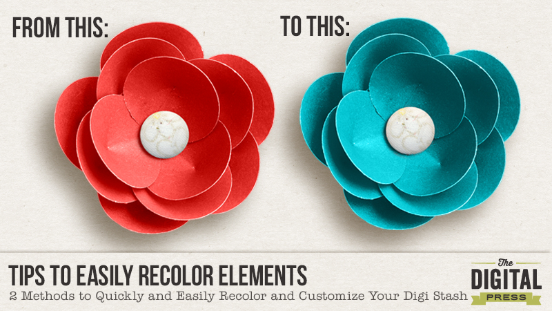
With Photoshop, there are lots of way to recolor and customize your digital stash. I thought I’d share with you two of my favorite ways to recolor in Photoshop:


#1  Using a Color Overlay Style


#2  Using a Fill/Adjustment Layer


NOTE: There are lots of different ways to recolor items. These are just two of my “go-to” methods.


#1  HOW TO: Recolor Using a Color Overlay Style


When I’m recoloring an item with just one color (i.e. a single colored flat item like a brush), I like to use a color overlay style. For my example I’ll use a PNG word art from Digital Design Essentials Live Colorfully Word Art. Here are the steps I use:


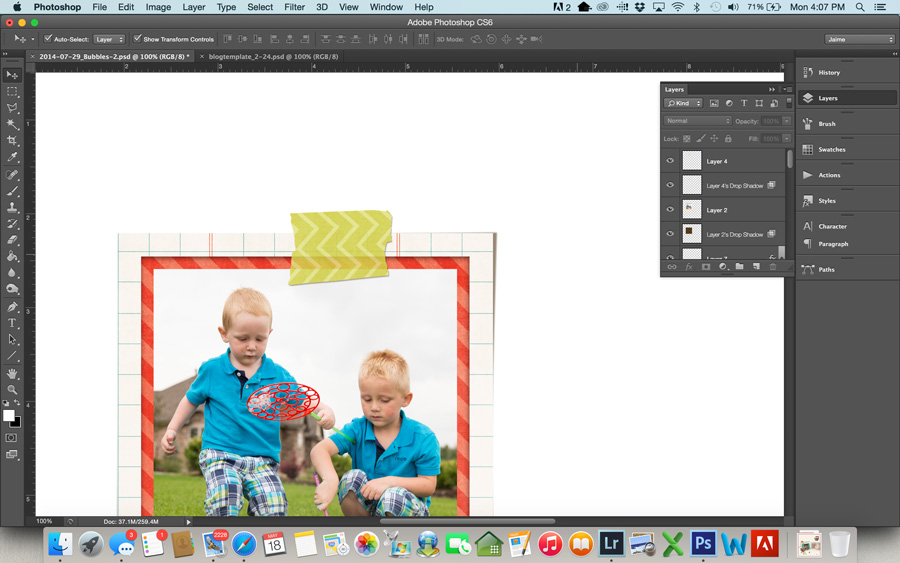
1.  Make sure the item you want to recolor is the active layer in the layers panel.


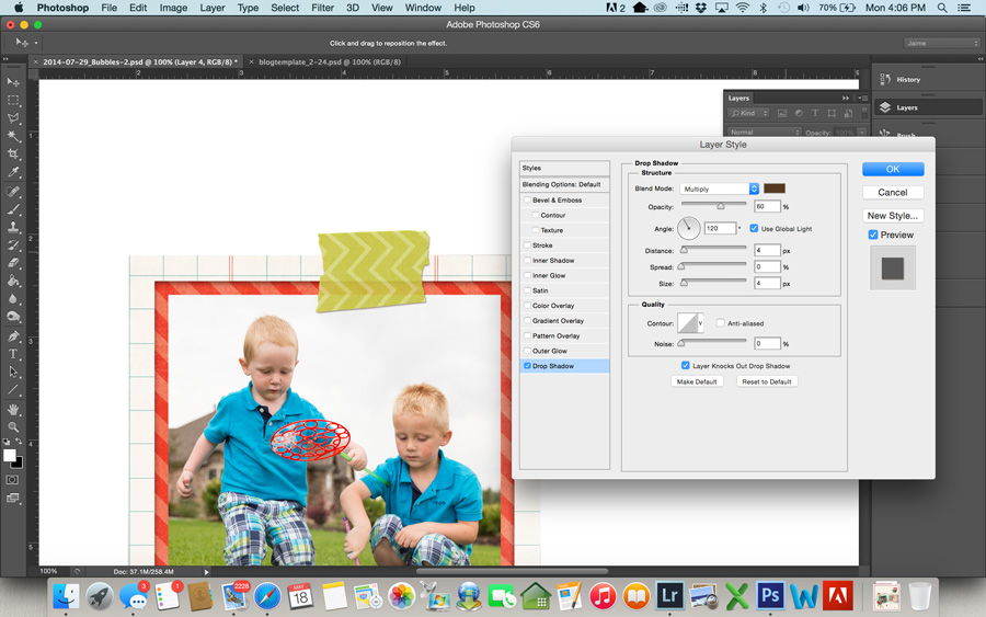
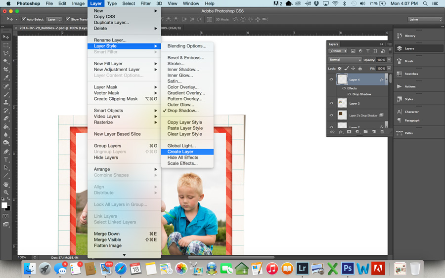
2.  Click on the fx button in the layers panel and choose Color Overlay. (Another option is to go to Layer > Layer Style > Color Overlay)


3.  Click on the color box and select the color you want to use as a replacement. You can sample a color from your layout, choose one of the foreground or background colors, or choose a color from the color wheel.


TipsToEasilyRecolorElements (ColorOverlay)2


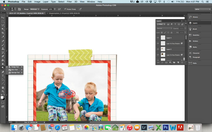
4.  The default blend mode is set to Normal. If the item you are recoloring is completely flat you can leave the Normal blend mode and your element will be recolored. If your item is more dimensional (i.e., a flower or button), change the blend mode from “Normal” to “Color” and your recolored element will retain the depth and color variations of the original item.


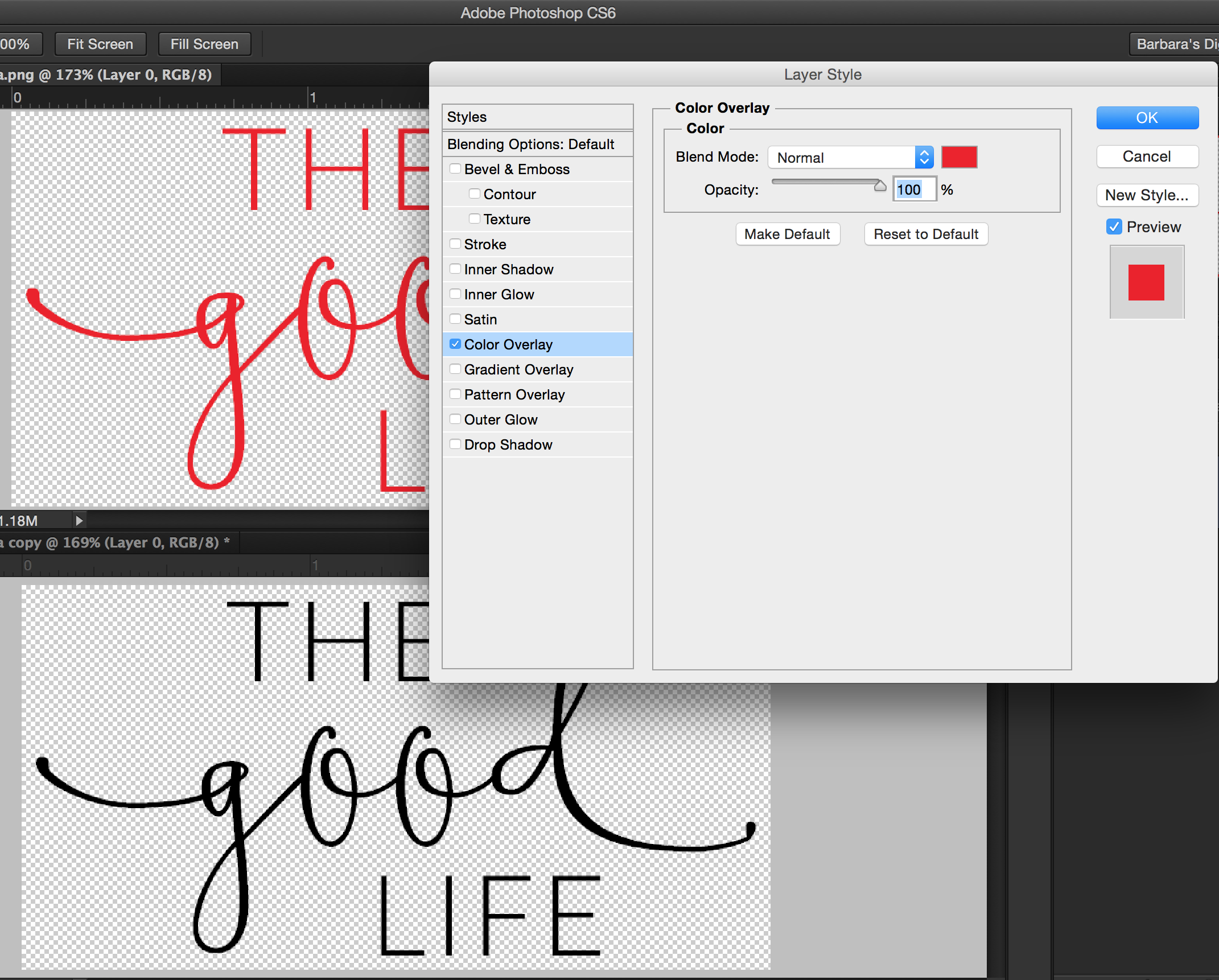
#2  HOW TO: Recolor Using a Fill/Adjustment Layer


When I’m recoloring a dimensional item (an item with shading or more than one color) I like to recolor using a fill/adjustment layer. Here are the steps I use:


1. Make sure the element you want to recolor is active in the Layers Panel


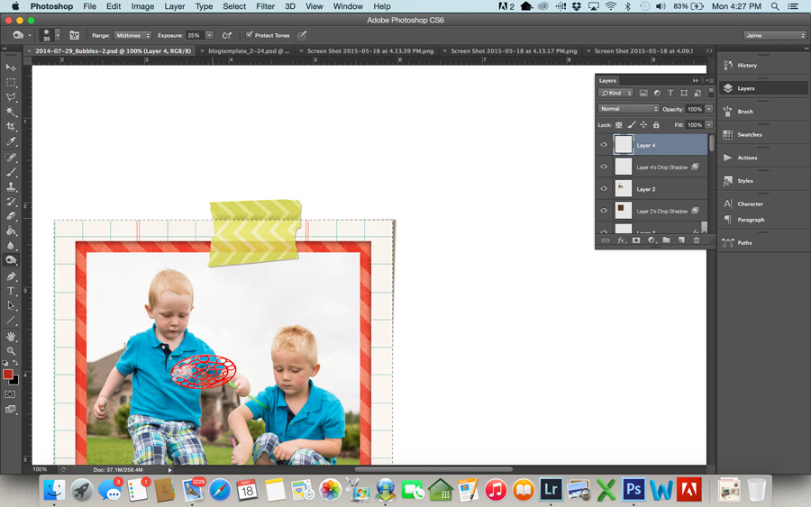
2. Click the New Fill or Adjustment Layer icon (it looks like a half white/half grey circle) and choose Solid Color. Your new layer will be filled with the foreground color. (Another option is to go to Layer > New Fill Layer > Solid Color) Don’t worry, you will just see a layer of solid color, you won’t be able to see the element you’re recoloring until the next step.


TipsToEasilyRecolorSolidColor2


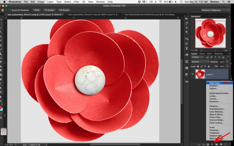
3. Clip the new fill layer to the element you want to recolor by pressing OPT+Click (Alt+Click on a PC) on the line between the two layers. (Another option is to right click on your new color fill layer and choose Create Clipping Mask.)


4. Change the Blend Mode to “Color”.


NOTE: Since you used an adjustment layer you can go back and change your replacement color or the blend mode at any time.


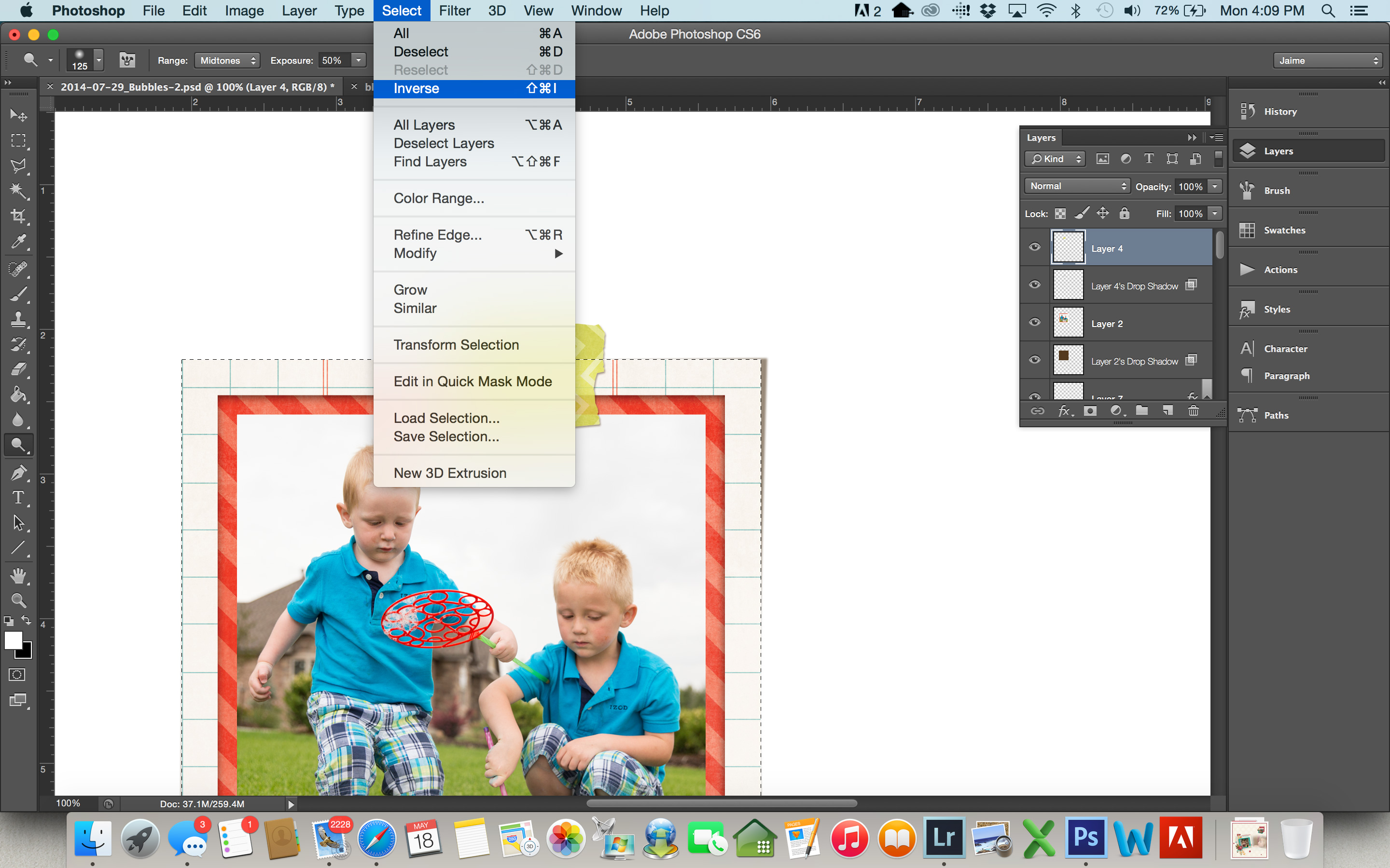
For my example I’m using a flower from Amanda Yi Designs’ Enjoy Today Mini No. 2 kit. You can see that the entire flower is a shade of red but the fabric button in the center is a cream color. I want to recolor the paper petals of the flower, but I want the center of the flower to remain the cream color. I will accomplish this using the layer mask that was created when I created the new fill/adjustment layer. To do that, just add the following steps:


5. Make sure that the layer mask is active by clicking on the layer mask. You will see a white bounding box around the mask.


6. Choose a soft round brush (Hotkey b activates the brush tool) set to 100% opacity. (NOTE: Depending on the shape of what you are masking out, a hard round brush may be more appropriate.)


7. Set your foreground color to black. (Hotkey d) Resize the brush to fit to the area you are masking out. In my case it’s the center of the flower.


8. Paint over the area you want to mask out (return to the original color).


TipsToEasilyRecolor-Masking


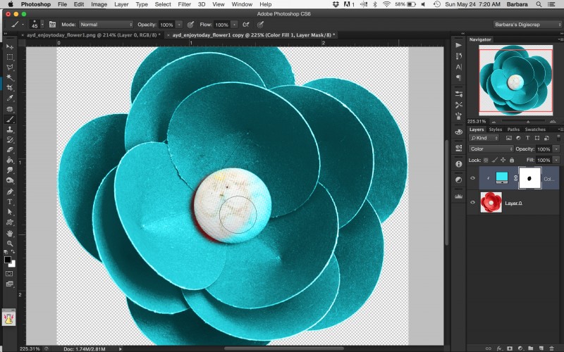
Voila, that’s’ it! You’ve now got a recolored flower and the center stayed the same color!


Like I mentioned, as with all things in Photoshop there are lots of different ways to recolor items. These are just two of my favorite go-to methods. If you’ve got another tried and true recoloring method you use and that you’d like to share with us, please share that in the comments!


Barbara
Barbara


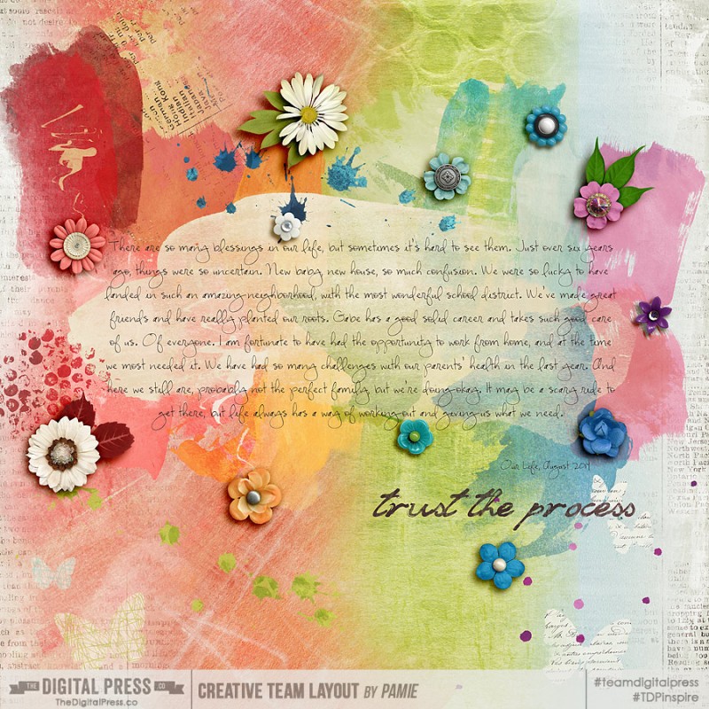
About the Author:  Barbara is a member of the creative team here at The Digital Press. She lives with her husband, two teenage kids and their fluffy dog, although as she types this she realizes her son is moving away to college in less 3 months and she won’t be able to say she lives with her 2 kids for much longer. EEK! In her free time she loves to digi scrap, take photos and hang out with her family.

Be Brave. Scrapping what makes you Brave

Be Brave. Scrapping what makes you Brave

When I first took on this Challenge, I thought I would scrap about what makes me BRAVE. But the more I thought about it, I wanted to know what makes my middle child, Emily BRAVE. As parents I think we have preconceived notions about our children, but maybe that isn’t how they view themselves. She will be starting Kindergarten in the Fall and I am pretty sure she will walk right in and quickly wave good bye and be on her way. She will take over that room like nobody’s business! We joke about it with her and she throws up a peace sign and says, “I am going to be like Bye Daddy!”

But what if she is actually nervous? scared?

Like at an Ice Cream social last summer. There was a petting zoo and pony rides and my outgoing, BRAVE little girl wanted nothing to do with either of them. That surprised me. Her Big Sister took her hand and led her around.

So, I thought it would be fun to interview her before she starts Kindergarten and see what she thinks about being BRAVE.

Me: Emily, do you know what it means to be Brave?

Emily: Yes. To not be scared.

Me: What makes you scared?

Emily: Ghosts and dreams about Witches.

Me: What do you do to not be scared?

Emily: I just forget about it.

Me: And you remember those aren’t real things, right?

Me: What about the time you were scared to go into the Petting Zoo and ride the horse?

Emily: I just took Katelyn’s hand and then it wasn’t scary.

Be Brave. Scrapping what makes you Brave

Materials Used-

Be Brave : The Kit by Kim B Designs

STITCHED GRIDS TEMPLATES VOL 3 BY: SCOTTY GIRL DESIGN

And now come over to the forums to join us in the challenge!!


Krista About the Author: Krista Lund is a mom of 3, married to her High School Sweetheart living in SF Bay Area. Some of her favorite things are brownies, chips n dip, taking pictures and documenting her family’s story.

Real Inspiration for Hybrid Layouts

Finding Inspiration for Hybrid Layouts


We all know that Pinterest is a great source for inspiration for layouts, but beyond being inspired by other people’s layouts, what do you look at for inspiration? I’m a firm believer than inspiration can come from anywhere. One of my very favorite ways to get inspired is by looking at vintage record covers. I have several of these pinned on my inspiration board.

Find Inspiration for Hybrid Layouts

For this layout, I found a record cover that I really loved and modeled my layout almost exactly after it. I used The Digital Press’s shop Collab called Go Play and created a sketch in Silhouette Studio and used print and cut with my Silhouette Cameo to cut out all the different pieces of this layout.

blog 2

Source here

Another example of a layout based off of a record cover is this layout I made using Mari Koegelenberg’s and Laura Passage’s #HappyThings collection.

Finding Inspiration for Hybrid Layouts

This layout was based off of another record cover and made within the Silhouette Studio. This collection was so fun and inspired me to document all the things that make me happy currently. The record cover was very graphic and geometric which is one of my favorite ways to scrapbook— clean and with lots of circles/triangles/stars, etc.

Finding Inspiration for Hybrid Layouts

Source here.

And if you can’t find the inspiration you are looking for in record covers, I recommend finding a good scrapbook sketch.

Finding Inspiration for Hybrid Layouts

I found a sketch on the Paper Issues blog and was immediately inspired to use Amanda Yi’s and Karla Dudley’s Limitless collection. Again, I recreated the sketch in the Silhouette studio using the shape tool and shapes I owned and dropped the digital patterned papers directly into the shapes. Then I did a print and cut and assembled and added a few extra embellishments.

Don’t be afraid to think outside of the box when it comes to finding inspiration. Record covers or any sort of visual art can be great forms of inspiration. And if all else fails, find a great paper scrapbooking sketch and go from there!

Finding Inspiration for Hybrid Layouts

About the Author: Brenda Smith is a mother of two littles and wife located in Southern California. When she is not scrapbooking, you can find her working full-time, trying to finish up her college degree with online classes, or sleeping because there are never enough hours in the day. Hybrid scrapping satisfies her addiction to technology and her addiction to paper and glue.

“Real Life” can be “Real Tough” – Scrap Therapy

"Real Life" can be "Real Tough"

As “Memory Keepers” we strive to document our lives, from the everyday “little” things to the big events or occasions, vacations or day trips and milestones or achievements. Our pages and projects tell our story, document our life, and they will be around for generations to come! Our loved ones, ourselves, family, friends all smiling and joyful, jubilant and merry!

Now all of this is absolutely great to see, amazing to look back on, and it is simply wonderful to reminisce about those magical and joyous times in our lives when looking through our printed books, or handmade projects! However, what about those times of worry, times of stress, those hiccups along life’s path? Those cloudy days, the sick days, times when you or a loved one has felt heavy hearted? We all have these moments, and there is no harm in sharing or documenting them! Don’t be afraid to lay testimony to those moments in your life too, because “Real Life” can be “Real Tough”!

The tough times, sadness, down days and nail biting moments are just as important to remember, and sometimes scrapping them out can make dealing with those sad, gloomy and bleak times a little easier! I like to call it “Scrap Therapy!”

Here is an example of documenting the sad and difficult times of family life. Erin (Miimsgirl) documents here in this layout the passing of a family pet and shows the sadness and grieving from her sons eyes. A part of  life we all experience for the first time in many different ways, and something that is monumental for a child and can be the very beginning of watching your children grow into compassionate  and caring young people.

Goodbye Tiger

Real Life can be "Real Tough"

Credits:  Monsters in my Head by Sugarplum Paperie & Studio Basic 


“Scrap Therapy” can also take you out of your usual comfort zone, I first tried an “Art Journal” style page when I was going through a particularly tough time back in 2013, I was struggling with my chronic illness and the comments of “But you don’t look sick” plus lots of  “well meant” advice or “bright ideas” had me ready to just scream! My page was dark and messy with a mix of brushed, painted  and bold stamped alphas, lots of paint and some serious heartfelt journaling! It took a whole weight off my shoulders just by  “scrapping it out”.

“Real Tough” doesn’t necessarily mean something heavy or depressing!  I’d like to share with you my most recent “Art Journal” style page. In this page I’m expressing what’s going on right now in my weight loss journey, it is starting to get a bit rocky, I’ve hit a bump in the road and need to power on through it! I’m reminding myself to “keep my chin up” I’m documenting my struggle yet being positive about it too,  reminding myself that this is a journey and I need to keep going!

Keep Going

Real Life can be "Real Tough"

Credits: Heart Art : Value Bundle #10 & Let’s Go Outside : Collection by Sugarplum Paperie


Another visit to the gallery had me admiring this arty and creative layout by Pamie! Journaling is a fantastic way to document your feelings and emotions, your thoughts and worries.

Here Pamie documents a time in her families life when things seemed so uncertain, yet there were some blessings in disguise too! Getting those thoughts out of her mind and into a visual diary of sorts, had her noticing and realizing that although it was a rough ride, life had a way of working things out in the end!

Trust The Process

Real Life can be "Real Tough"


I’m going to leave you with this page I made documenting my everyday life living with chronic pain and having to self inject every 2 weeks. I scrap my families every day moments, vacations and achievements in “Pocket Style” pages, so why leave out the “Real Tough” side of our life in this style of memory keeping? It is telling a story of part of me, the fact I have overcome my fear of needles to a certain extent, that I have been braver in the last year than I ever though I could be.

I’m hoping that one day I can look back on this time in my life  and see how far I have come since the treatment began, that I can remember how tough it was and hopefully how easier it has become? Who knows what the future holds, but at least I have documented  the memories and events of my life right now!

Be Brave

Real Life can be "Real Tough"

Credits: Be Brave : The Kit & Be Brave : Journal Cards by KimB – Everyday Life Templates Set 4 by Sabrina’s Creations


So yes, “Real Life” can be “Real Tough” but I hope you can see that documenting those tough times is easier than you think, and that these moments are just as important to document  as all the wonderful happy, bright and cheery pages we see in the galleries and have printed in our memory keeping books.

Please join me in the Forum where I am hosting a challenge this month, and hoping to help you get those “Real Tough” times documented too.


VickyD

About the Author: Vicky is a member of the Creative Team here at The Digital Press. She is a stay at home Mum who lives in the UK about 10 or so miles from Central London, with her husband and their “karate mad” 8 year old son. She is an avid reader, memory keeper and coffee lover! With an obsession for Yankee candles!


Real Love

Real-Love

Real Love. What does that look like to you? It is actually a very deep question. Some people run from real love. Some people run towards real love. Some will even fight for real love. It will evoke emotion within you. As you are sitting there reading this post, what are you feeling about REAL love? It is a tough question. If you are in a great spot in your life, it will give you happy thoughts. If you are in a rough spot, I will be surprised if you have read this far. It can be very painful. Where are you?

I want you to think about real love. Where you are at right now. One of the places I am at is seeing 15 years of “work” paying off. I have fought for real love with my girls. My oldest never liked her younger sister (shocking, I know.). But she is finally at a place where she is maturing and appreciating the relationship she has with her. She is even starting to mentor her. As a SAHM, this has been my job. Raising a loving, caring family. There were days I wanted to quit. But I knew I couldn’t. So I kept fighting for real love. It got messy. It was beautiful. And it was worth it.

Real Love

Join us in scrapping your real love moment here.


ct-photo100

About the Author:  Heidi has been scrapping for 17 years. Her passions include dark chocolate, photography of her family and reading Christian fiction. When not doing one of these activities, she can be found working at an elementary school library or enjoying being a SAHM.

Realistic Washi Tape

header


Washi tape is probably one of my very favorite elements to scrap with. I love it both in real life and in digital form. In this tutorial, I’m going to show you how to use shadows and highlights to make your washi tape look a bit more realistic on your layouts. I’m going to use this layout below. I have everything finished on it, and the washi placed. The only thing left to do is add shadows to the washi tape. You can see here that it just looks a little flat with no realistic dimension.


1


  • First, add a basic drop shadow to the washi tape. The settings below are what I used, but use whatever suits your preference. I typically prefer a small shadow on washi tape, because if you look at a piece of real washi tape on paper, it doesn’t come off of the paper much. There’s not a lot of shadow there.

2


  • Now, we’re going to put this shadow on its own layer. To do this, go to Layer>Layer Style>Create Layer. This will put the drop shadow on its own layer below the washi tape.

3


  • Even this shadow makes the washi look better than it did, but the shadow darkened the washi tape. I like to preserve the transparency of the tape. To do this, load a selection of your washi tape layer by using Command-click (or Control-click for Windows) on the tape layer in the layers palette. This should give you marching ants around your tape. Now click on the shadow layer in the layers palette, and hit delete (make sure you are on the shadow layer before hitting delete… this is important). This will delete the shadow that sits directly beneath your tape and bring back the transparency of the tape. (You can use a layer mask if you’d rather not permanently delete it, but I never have wished I had it back, so I just go ahead and delete.)

4


  • Command-d (or Control-d on Windows) will deselect the tape.

5

I think this looks good, and you can stop here if you like. I have left my tape with a basic shadow like this sometimes when I am trying to save time and get a page done. If you want to take it one step further to make the washi tape really look like it’s stuck on your page, follow the steps below.

  • First, you need to select the item the tape is holding down. In my layout, it’s the framed photo of my boys. Command-click that layer in the layers palette to load a selection.
  • Next, select the dodge tool from your tool bar. At the top of your screen, you want a soft brush that’s big enough to brush over the bottom part of the tape covering the photo. For this particular page, I used a brush size of 125. Set your range to Midtones and the Exposure to around 50%. You may need to play around with this exposure depending on the specific tape and how dark or light it is. Most of the time 50% works pretty well.
  • Make sure your washi tape layer is selected in the layers palette on the right, and brush over the tape 2-3 times. This highlights the part of the tape that is “stuck” to the photo.

6


  • If you think about pressing a piece of tape over a photo in real life, it’s going to leave a little crease where photo meets the background page. In this next step, we’ll create this look digitally.
  • Your frame selection should still be loaded (meaning you have marching ants around your frame). If it’s not, select it again. But now we want the tape that outside of the frame area, so we’re going to select the inverse of what is currently selected. To do this, go to Select>Inverse. It won’t look any different, but now everything except the frame is selected.

8


  • We’re going to use the Burn tool to add some shadows to the top part of the tape where it is “sticking” to the page. Select the burn tool from the toolbar.
  • This time you want a pretty small brush… just big enough to shadow the tape right at the edge of the photo. I used a brush of size 35, and for this particular tape I set my exposure to 25%. If the shadow isn’t as dark as you like, you may want to change this to 50%. Use the burn tool on your washi a few times along the edge of your selection, until the shadow is as dark as you want it.

9


  • Command-D to get rid of your selection, and you can see the end result.

10


Here’s a look at the final layout:

Layout using Summer Bucket List by Amanda Yi Designs and Wishing Well Creations


JaimeAbout the Author: Jaime is a member of the creative team here at The Digital Press. She is a stay-at-home mom to 4 boys and 1 girl. When she’s not chauffeuring, volunteering at school, or helping with play costumes, she likes to digitally record her family’s memories, improve her photography skills, and read (there’s always a stack of books on her nightstand).