Author: The Digital Press

Tutorial Tuesday | Creating Diagonal Flow

Hello, and welcome to another edition of our Tutorial Tuesday series here on The Digital Press blog! Today, I am here to share information with you about creating diagonal flow when you are working on a scrapbook page.

In one of my previous tutorials here on the blog — Creating a Focal Point — I explained how to grab the viewer’s attention with an obvious focal point, and then to use visual hierarchy to guide the eye throughout a layout. In today’s tutorial, I will explain how to create a visual emphasis going from top left to bottom right (the way Westerners read)… or alternatively, going from top right to bottom left for variety.

Here’s a quick look at what I mean…

In that first example, the text stamp is the foundational element that I duplicated in order to place it on either side of the band of papers (at the top left and lower right corners). I would usually duplicate and horizontally flip an element to make it the perfect opposite; however, this would be immediately visible with text (as the text would be backwards on one side) and so that does not work. 🙂

The act of duplicating the stamp forms a frame, of sorts, bracketing the design so that the eye naturally joins these two halves together. This draws the eye from top left to bottom right.

As an extra layer, I have added the vellum heart (top left) and the small word art cluster (lower right) along the same diagonal line. Then, for fun, I have two heart scatters, but I placed them on the opposite (blue) line. A touch of tension is always a great idea: something that makes one look again, to see if anything is different or out of line. This re-enforces the diagonal.

Here’s another example…

In the second example, I used paper blocks and placed them at kitty corners to create the diagonal line (again, top left to lower right). This accentuates the angle at which my hubby is pointing the laser light, as well; when the subject of a photo is looking in a certain direction, the eye naturally follows the line to see what they are looking at. I tilted the title and journaling card slightly to fall on the diagonal, but not perfectly in line — again, to add a bit of tension, once again.

These are just a couple of ideas and examples for creating movement within a layout (especially one that uses a multiple photos), in order to help the viewer navigate their gaze through or across the page. Give it a try! I think you’ll find that creating this sort of flow within your next scrapbooking layout is easy and helpful!


small avi

About the author Stefanie is a member of The Digital Press creative team and a stay at home mother of three older children living in Cape Town, South Africa with her hubby of 30 years, one of their three children, and 3 Siamese cats. She loves photography, traveling, and digital scrapbooking — documenting the good and the ordinary everyday.

Tutorial Tuesday | Make Your Subject Stand Out

Hello, and welcome to another edition of our always-popular Tutorial Tuesday series here on The Digital Press blog! Today, I’m here to share with you some practical tips for making your subject stand out more when taking photographs.

Whenever we take a photo, it’s usually much stronger if it has a subject (or a main subject, at least) that can be immediately identified. To make the subject of your photo stand out, you have several “tools” at your disposal. Today, I will show you how to use those tools… using a toy that was recently gifted to my newborn son (because it’s a toy and not a person, it was able to “stand still” for a loooong time while I took all the pictures to illustrate this tutorial, LOL — so it was the perfect subject for me!). Here’s a look…

As you can see in this first picture… it’s a cute stuffed animal, but there is a lot going on visually around the toy (let’s be honest and call it what it is… clutter!). Because of this, it’s not standing out as well as it could be; you cannot easily tell, in just a split second, what the subject of this photo is.

How can I change that without having to clean up the mess around it? Here are a few ideas…

Use Focus and Depth of Field

“Depth of Field” is the sharp area of your picture. If you use a shallow depth of field, that means that only a small “slice” of your image is in focus, the rest of it, in front and behind this “slice”, is blurry. This is a great technique to avoid distractions in the background and separate your subject from the background, even when it’s super messy (like my example here).

How to achieve this effect?

  1. Use a wide aperture (small f/stop in manual mode, macro mode, “portrait” mode on some smartphones)
  2. Zoom in
    …or…
  3. Increase the distance between your subject and the background

You can also mix all of those steps/techniques for an even bigger effect. That’s what I did in the 2nd image, above, when compared to the first image above it. I moved the toy away from the background (closer to the camera), and switched to my “nifty fifty lens” to have a much wider aperture (f/1.8  vs  f/3.5-5.6 with my zoom lens that I had used in the first picture).

Want to read more about depth of field? Here’s an older tutorial from TDP’s blog all about focus and depth of field.

One other idea — you can also “fake” this technique after-the-fact, using your favorite photo-retouching software to blur your background, if your subject isn’t standing out to your liking.

Use the Rules of Composition

The rules of composition — such as the most famous “rule of thirds” — are great at helping guide the eye of the viewer towards the subject to make it immediately visible. There is a great tutorial on TDP’s blog about the most common composition rules.

To quickly recap the concepts that are covered in that previous blog post… here are some of the Rules of Composition to think about…

  • Rule of Thirds
  • Balance
  • Leading Lines
  • Viewpoint
  • Background
  • Symmetry and Pattern
  • Depth
  • Framing
  • Cropping

We definitely recommend giving that old tutorial a quick read! Lots of great info.

No matter what rule you use (or if you decide to break them!)… what’s important is that you make a mindful, creative choice that’s dictated by your subject and what you want to convey. Isolating your subject is key — whether you do that through use of negative space or, on the opposite, by filling the frame completely with it. Each of these two composition choices work really well to eliminate distractions. When you use the “fill the frame” technique, don’t be afraid to crop part of your subject. To achieve these two techniques, you might have to move yourself around your subject… and sometimes move your subject itself, if it’s possible.

Here, I chose to focus on the toy’s face and fill the frame with it…

Use Color

Color can be a very powerful visual tool. Using complementary colors (colors that are opposite each other on the color wheel — for example, purple and yellow… or blue and orange… or green and red), or using contrast between bright and neutral colors, is a great way to add dynamism to your image.

If your subject is red, well… lucky you, because red is a color that stands out naturally! Watch out for red elements that are NOT your subject, however, because they will attract the viewer’s eye and distract from your subject. In this example I used the toy’s bright colors in contrast with the neutral background by photographing it from above…

If you need more color inspiration, there is an older tutorial on TDP’s blog about using colors in layouts …but those examples can perfectly apply to photographs, as well!

Change Your Perspective / Point of View

Try taking your time to work your subject… move around it… experiment various points of view… different angles, etc. Try shooting at your subject’s level, or above it (like I did for the image up above), or from below it (like this next example), or from the front or the side, or even from the back for a “faceless” portrait.

Use Light

Light is the photographer’s raw material (photography means “writing with light”)… and you can definitely use it to make your subject stand out. For example, you can use backlight (with subject between you and the light source); rim light (the light is on the side of your subject and defines it with a “glow”); or a pocket of light in an otherwise darker environment.

In this image, above, the light was actually a mix of backlight and rim light.

Focus on Details

Last but not least, sometimes you don’t have to see the “big picture” to tell a story through your photo. You can focus (no pun intended) on small parts of your subject and still evoke emotions and memories, and sometimes they will even be more powerful than an image of the whole subject.

Focusing on details can easily be “mixed” with the “filling the frame” technique I mentioned before. Here I decided to focus on the toy’s ears that are, to me, the cutest part of it. My hand got into the picture as a nice “prop” to help attract the eye to the part I wanted to highlight.

Hopefully all of these practical tips and tricks will help you get stronger photos by helping to ensure that your photos have a clear subject! Now it’s time to get out your camera, and start capturing the little Everyday things in your life from a new perspective!


ChloéAbout the author  Chloé is in charge of PR and communication for her small town by day, is a digiscrapper “by night,” and a photographer whenever the light is beautiful. She lives with her man and dog Kira in a small town of Alsace (in the northeast of France), where she loves to read, watch good TV shows (TWD being her absolute favorite), and just hang out with her friends — no matter if they are close by, online, or away in her Swiss hometown. Right now she’s busy growing her baby boy that should be here in February.

10 Holiday Tips & Tricks | Day Ten

Hello! Welcome to Day Ten of our annual Holiday Tips & Tricks series here on The Digital Press blog!  I’m here to share a little bit of my family’s December album and show you how I went outside the pocket pages to add interactive elements or tell a special story.

Pocket pages can be such a helpful tool to get things organized and finished up quickly, and I love them, but this year I wanted to try adding some texture and bulk to my album.  It’s always fun flipping though an album with different size pages! And it makes the reader slow down a little and see things they might otherwise have missed.

Here is my intro for 2018.

(December Stuff by Dunia Designs)

This is a letter to my family telling them why I make this album. I used a printed pocket card for the journaling and a patterned paper from the same kit for the back.

Here I used Photoshop Elements to merge word art onto a photo.

The back is a journaling card merged with the striped paper to cover the word art on that side. I added a photo and a little flower.

(Home for the Holidays Collab)

These next pages surprised me. Amie of Little Lamm Paper Co. makes the most amazing travel notebook and photo templates. I usually pass them up because I’ve never made a travel notebook in my life, but I grabbed them for my December album this year. They were so perfect! I love love love how these pages turned out. These templates are so easy to work with and so versatile.

(Sparkle by Little Lamm Paper Co.)

This page was a new experience for me. I enlarged a journaling card to fit my album, printed it on vellum, and then used self seal to make my own transparency.

(Christmas Magic Journaling Cards by Cornelia Designs)

Here I took the photos of all the gingerbread creations from my kids and turned them into tags that you can pull out of the pocket card.

(Christmas Magic by Cornelia Designs)

This last page I want to share includes a shaker card.

Vellum is usually the go-to for shaker cards, but since I’m using a photo, I wanted to be able to actually see it clearly. I cut down a pocket page just a little bigger than the photo and sewed along three edges, dropped some sequins in and sewed it the rest of the way up. Ta-da! My daughter is now a shaker card. She thought it was hilarious.

I hope you liked these ideas for adding some “extras” to your pocket pages. In the past I’ve done an all digital December album and was thinking that it would have been awesome to add some hybrid pages.

If you’re thinking of giving this project a try… head over to The Digital Press’s challenge forum and get the details about how you can earn challenge points for December 2018 at TDP if you try any of our “Holiday Tips & Tricks” throughout the month as they appear here in this blog series! Also, we’d love to see any photos of your holiday projects using TDP goodies in the gallery this month, so link us up after you’re finished creating and uploading!


Kate About the Author  Kate is on the hybrid team here at The Digital Press. She lives on the Utah/Colorado border with her husband, 5 kids, 10 chickens, a dog named Gracie, and a cat named Kit. She’s a city-born girl who found she’s really a country girl at heart. She can be found outside, barefoot, and probably in her garden.

10 Holiday Tips & Tricks | Day Five

Hello there! Dunia here (of Dunia Designs)… excited to be bringing you Day Five of the 2018 edition of our always-popular 10 Holiday Tips & Tricks series here on The Digital Press blog!

I hope you’ve been having an amazing December so far! I’m here today to show you a really fun project I just completed in the past week or two — how to use your digital scrapbooking papers to create your own custom wrapping paper! This is just way too cool. 🙂

SUPPLIES NEEDED:

  • digital paper(s) of your choice
  • photo editing software (I used Photoshop CC; most photo-editing programs will work, however)
  • computer with internet access (to enable you to upload your image to a printing company; I used Overnight Prints)

Here’s a look at the digital papers I chose to use, from one of my most recently-designed collections — December Stuff

First, you’ll want to choose the paper/pattern you want to use… and then open it up in your photo editing software in order to prepare your digital image.

Based on the specifications of the wrapping paper printing company I worked with (Overnight Prints), I created a custom-sized canvas that was 27.125″w x 19.125″h.

Then, I dragged my 12″ x 12″ paper onto the canvas area I’d just created. As you can see below, a 12″ x 12″ paper won’t fill the entire 27.125″ x 19.125″ space. So I duplicated it, and lined the 2 copies up with each other, side by side…

I continued duplicating the papers, arranging them so they lined up with each other (appearing to be seamless), until I had filled the entire space…

*NOTE* You’ll find that some digital papers are “cleaner” (i.e. less distressing or texture… especially around the edges), and others are more distressed/textured. Pay attention to the edges where the duplicated paper copies meet, and you may find that you need to crop or erase the heavily-distressed edges so the pattern you create ends up appearing to be more seamless.

Once I had my entire canvas area filled, and the papers arranged in a way that looked good to me… I saved the image as a JPEG (.jpg file). Then I followed the instructions on the web site of the printing company (again, I used Overnight Prints) and uploaded my image / placed my order.

The wrapping paper was shipped to me in single sheets that were sized at 28″ x 20″ with a small border. As of the date of this post, the finished wrapping paper sheets from Overnight Prints were available for less than $2.00 a sheet (anywhere from $1.36-$1.74/sheet)… making it a relatively cost-efficient way to add a tiny bit of customization to your holiday wrapping!

Here’s a look at the finished product that I received in the mail, rolled into individual rolls…

And here’s a look at a few packages I wrapped in these fun & unique custom wrapping papers…

Isn’t that so cool?! Just think of the possibilities; I already have so many fun ideas for papers in the future, for all sorts of events… from Christmas, to birthdays, and more!

If you’re thinking of trying this project… head over to The Digital Press’s challenge forum and get the details about how you can earn challenge points for December 2018 at TDP if you try any of our “Holiday Tips & Tricks” throughout the month as they appear here in this blog series! Additionally, we’d love to see any photos of your December/holiday projects using TDP goodies in the gallery this month, so link us up after you’re finished creating and uploading! 🙂


Dunia Acauan

About the Author  Dunia Acauan is the designer behind Dunia Designs at The Digital Press. Originally from Brazil, she currently lives in Ann Arbor, Michigan with her husband and three children… and is a talented and accomplished photographer, in addition to running her own graphic design business.

10 Holiday Tips & Tricks | Day Four

Hello there! Amie here (of Little Lamm Paper Co.)… wishing you a very Happy December and welcoming you to Day Four of the 2018 edition of our always-popular 10 Holiday Tips & Tricks series here on The Digital Press blog!

I hope everyone is having a wonderful December so far! I’ve been having a great time making paper decorations with the kids this year. Stars are a huge favorite… and so today I’m going to show you one easy star you can make with just a few tools, in order to create really fun and easy holiday decorations.

SUPPLIES NEEDED:

  • paper (plain paper, patterned paper, printed digital paper, cardstock… it’s up to you!)
  • scissors
  • ruler
  • pencil
  • plate/bowl/other circular object

INSTRUCTIONS:

  1. Grab a plate or bowl and measure the diameter. Halve this, and make a note. For example — my plate was 11 inches, so I need to remember 5.5″ (you can totally use a compass for this. I’m not sure why I can’t find mine; probably because small kids and items with sharp points need to be hidden, LOL).
  2. Draw around the plate, and then mark distances of 5.5″ around the rim, giving me 6 equidistant points.
  3. Join up these marks with straight lines, skipping alternate points, ending up with a star.
  4. Cut the star, and fold right sides together along each of the inner angles of the star. Do this 3 times total.
  5. Turn over and fold the wrong sides together along each of the outer points of the star, again 3 times. This will give you your 3D shape.
  6. Refold and score again to reinforce sharpness of the folds, then pop out to make your star.

**NOTE** don’t worry too much about getting your fold lines up super perfect. It’s not noticeable if they are a bit off. 

Here’s a look at a few different stars I created, using different patterned papers…

To hang the garland, I used some metallic baker’s twine and mini clothes pins… but you can string the stars, or staple them, or even attach them directly to your wall. Mix and match with other fun paper decor or letter banners, or even some fairy lights!

Take a peek at how cute this is hanging along a wall, or a window, etc…

If you would like even more paper garland and decor ideas, you can check out my Pinterest page HERE.

And if you’re thinking of trying this… head over to The Digital Press’s challenge forum and get the details about how you can earn challenge points for December 2018 at TDP if you try any of our “Holiday Tips & Tricks” throughout the month as they appear here in this blog series! Additionally, we’d love to see any photos of your December/holiday projects using TDP goodies in the gallery this month, so link us up after you’re finished creating and uploading! 🙂


Amie Lamm

About the Author  Amie Lamm is the designer behind Little Lamm Paper Co. at The Digital Press. She is a work at home mom/graphic artist living in Fargo, North Dakota with her hubby, her almost 6 year old son, 2 lazy cats, and a hyper bulldog. She survives her days with copious amounts of coffee and recorded episodes of Fixer Upper.

10 Holiday Tips & Tricks | Day Three

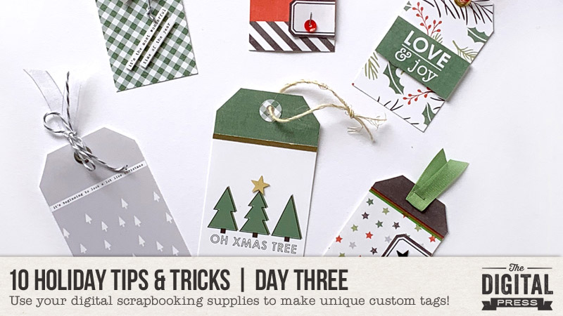
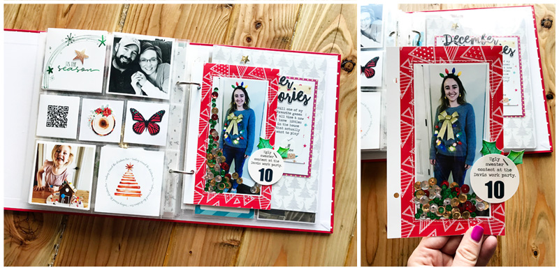
Happy holidays, everyone, and welcome to Day Three of our annual 10 Holiday Tips & Tricks series here on The Digital Press blog! Today I’m here to share a few ideas for using your digital papers and elements to make some festive holiday tags.

I love making tags; I use them on packages & gift bags, bottles of wine, and sometimes I even hide gift cards in them. I also like to use them in my pocket pages in my scrapbooking albums (often, the smaller sizes fit nicely in a 3×4 pocket, or attached to a larger journal cards).

For today’s project, I am going to to show you how to create some photo-based tags (for memory-keeping purposes), and also some gift tags (for wrapping purposes).

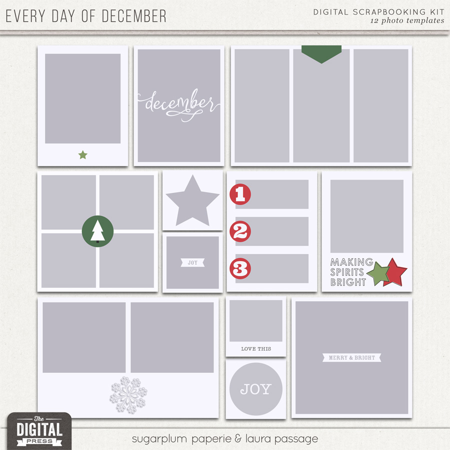
To create the photo-based tags, I used a bunch of different items from the all-new holiday collection Every Day of December by Sugarplum Paperie and Laura Passage. Mainly, the photo template set…

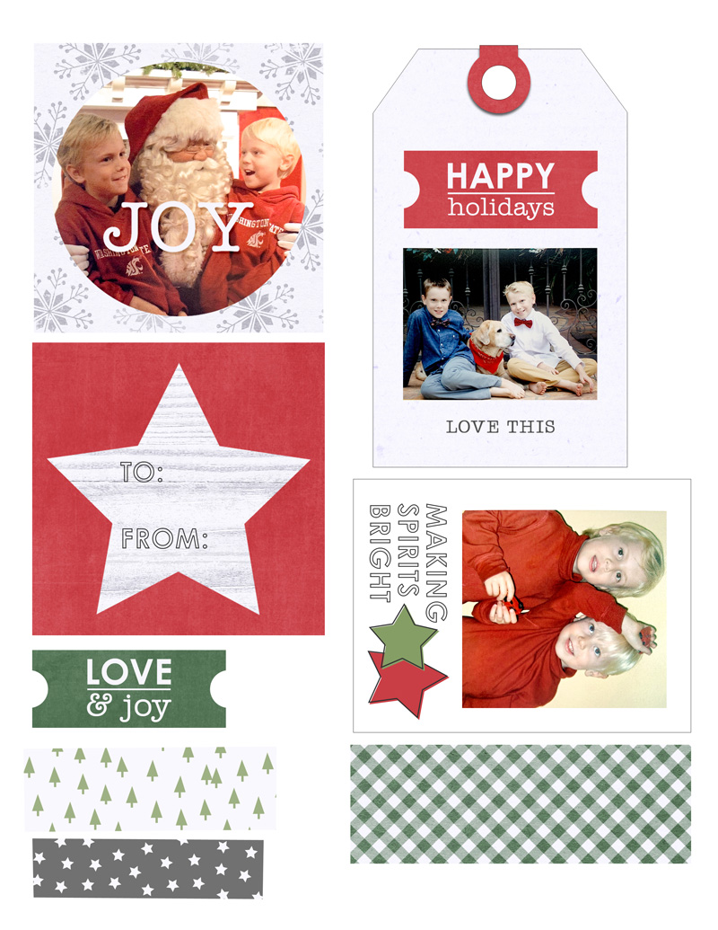
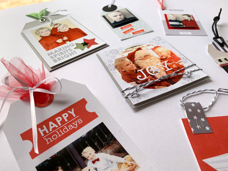
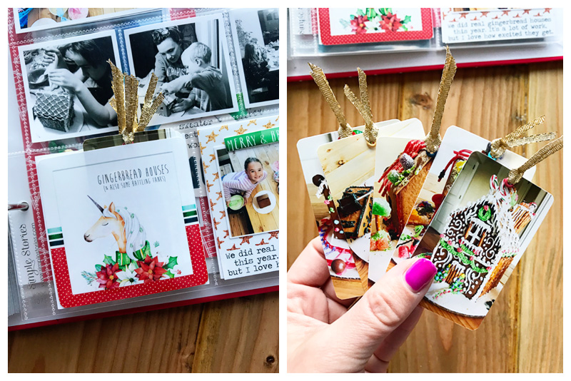
First, I took out a few of my old Christmas cards from when my kids were little, and snapped a few photos. Then, using Photoshop Elements (PSE), I attached the photos to some of the blocks on the templates (Ctrl-G in PSE; Ctrl-Alt-G in PS)… and I also picked some cute patterned paper and elements to attach to others.

Once I had the templates filled, I printed it all on 8.5″ x 11″ white matte presentation paper. I usually add a stroke around each item make it easier to see the edges for cutting. I wasn’t exactly sure how I was going to use everything; the process was just to print things that I could easily cut or punch and then play around (and it was super fun)!

Here’s a look at what my first print sheet looked like as it came out of the printer…

I just use my Fiskers cutter, some scissors, and some punches to cut everything out. I don’t have an electronic cutting machine — yet! (hello, Santa…!)

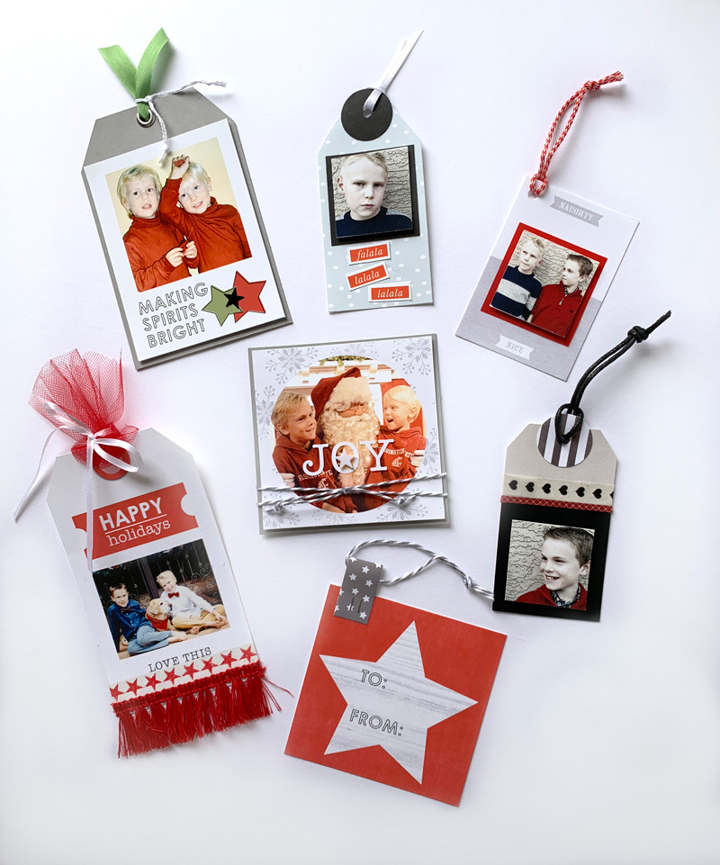
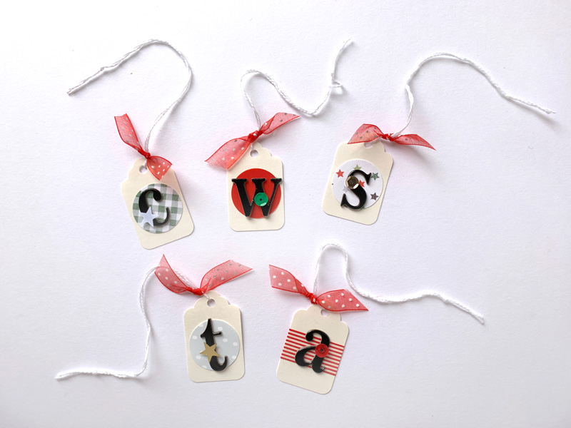
Once I had everything cut out, I started assembling the tags… which came together quickly! First I added ribbon, bows, and twine. For dimension, I used glue dots to add some stars I had in my scrap stash.

I love the way these turned out, and it is so fun to have these old photos front and center this year! Take a look…

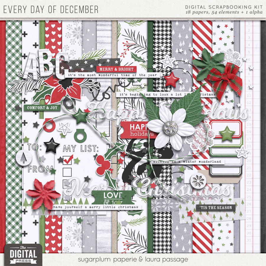
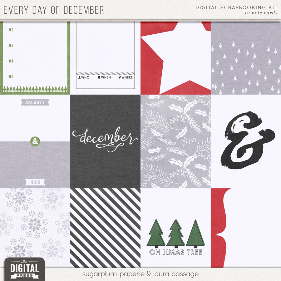
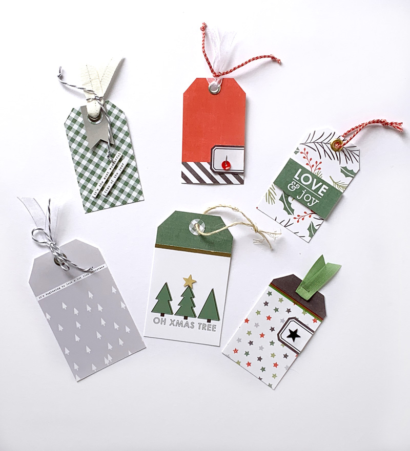
For the non-photo-based simple gift tags, I wanted to utilize all of the beautiful patterned papers and journal cards that I found in the Every Day of December collection. Here’s a look at the kit and cards, so you can see what I used…

First, I found a generic tag shape from my digital scrapbooking stash, and I used it as a clipping mask to attach the patterned paper (see the next image, below; the shape I used is shown in the top two rows — and also — as you can see, I try to use every square inch and align items evenly to make for quick cutting)…

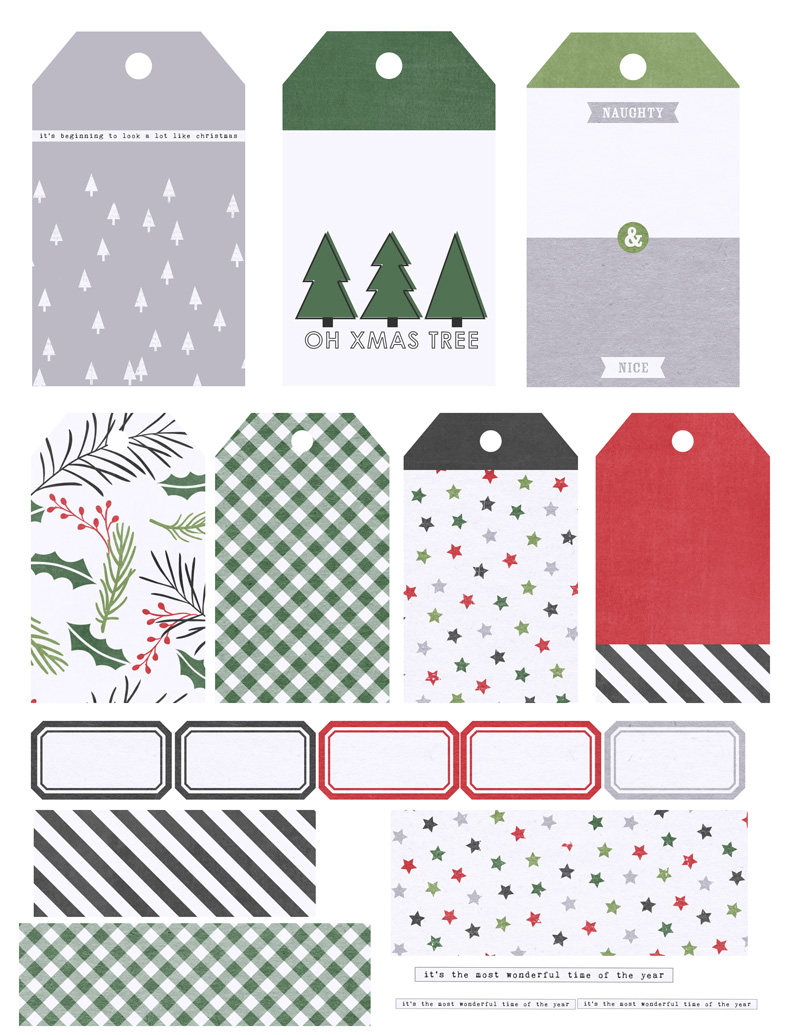
As you can see, above, if you compare my print sheet to the original journal cards/etc… on some tags I wanted the top of the tag to be in one color, and the body of the tag in another… so I just clipped the two papers and moved them up or down in Photoshop until I got them each where I wanted to create the two-tone effect.

Then, after adding a stroke around each tag (again, to give myself a handy cutting line, once printed)… I printed them on an 8.5″ x 11″ paper and cut them out.

Once the tags were cut apart, I then punched a hole in the top of each one — and even brought out my crop-a-dile to place a few grommets in the holes, which is a little touch that just gives them a little extra sparkle. 🙂

I also selected some twine, ribbon, and a few other embellishments from my stash (and/or word art from the kit) to complete these tags. Here’s a look…


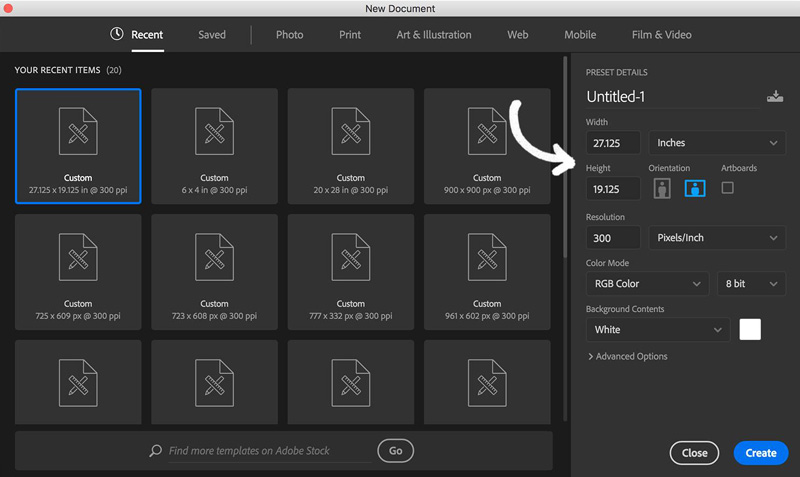
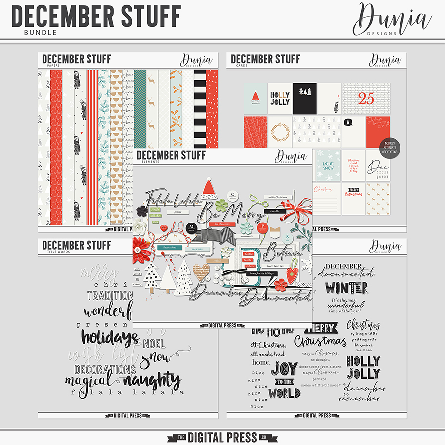
I was having so much fun, I decided to make another group of tags — this time, using the December Stuff collection by Dunia Designs, as shown here…

I fell in love with the little doodled trees… so I decided to use them as embellishments on a bunch of tags.

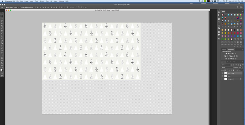
Here is a look at my print sheet, after I arranged them on a 8.5″ x 11″ canvas in PSE…

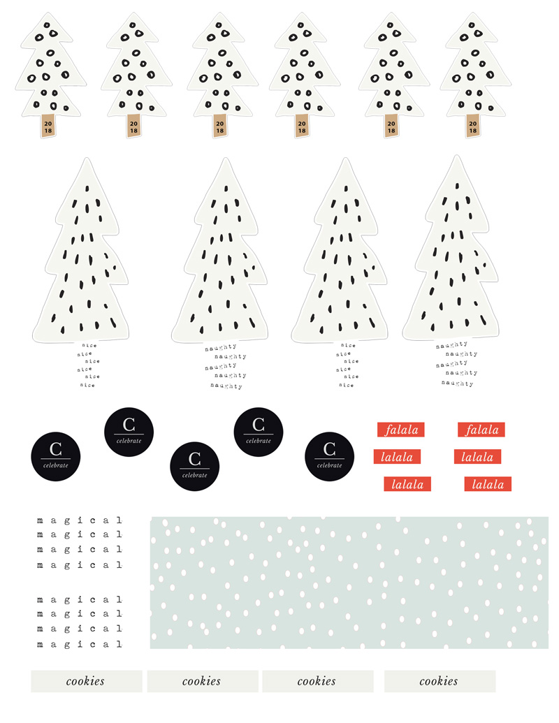
I did have to cut each of these items out by hand — and I am not perfect at “fussy cutting” — but it was quick and easy!

After cutting the trees, I thought they looked great and really stood out on black and kraft-colored solid papers. This time, I just cut the tags out free form — maybe not perfectly-cut, but fine for my purposes! The key to these tags is to give some of the elements dimension. I did that with pop-up dots in a couple of different sizes, and also with the twine, ribbons, washi tape, and stars that I added (oh, and a few circles I added from punches)…

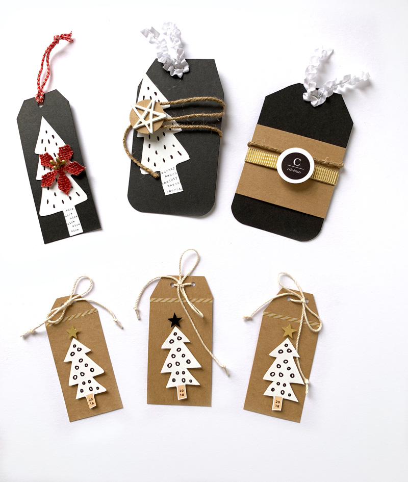
*TIP* — on the trunks of the trees in the top row of tags, you can see the little bit of “naughty and nice” word art that came in the kit. I added it to the trees, creating my own custom trunks, by layering it and clipping it to the tree shapes in PSE — super easy, and a great way to add just a bit more interest (plus, “naughty and nice” is perfect for life around here)! In this same way, I also put the year “2018” onto the tree trunks of the smaller tags in the bottom row, as well. I felt like I had a lot of kraft paper on the smaller tags… so rather than adding another patterned paper, I broke things up by using a thin strip of some washi tape.


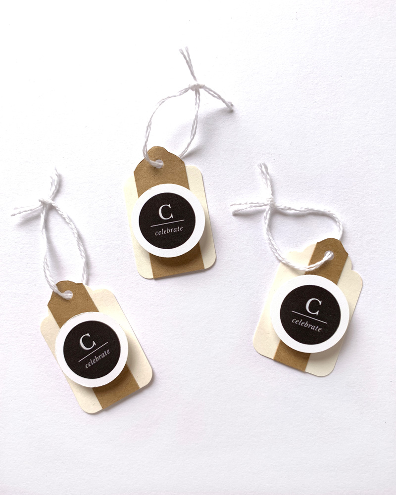
Finally, for one last project… I had some very small cream-colored tags laying around in my physical stash for years, and I thought this would be the perfect opportunity to use them! I knew they would be perfectly-sized to put around a wine bottle or box of chocolate to give to girlfriends and neighbors.

For these, I just punched out some more 1 inch circles from various patterned digital papers that I printed out, and then I attached those circles to each tag. On top of the circles, I added each friend’s first initial with some chipboard letters, and a topped it off with a small star or sequin and some ribbon. I think they are going to like this bit of customization on their gifts!

I also used a punch for some of the word art (“celebrate”) that I found in the kit… and added that to these small tags. I thought these might be nice for New Years Eve.

I hope I have inspired you to print out a few papers and elements and put together some tags this holiday season. This was seriously a fun and therapeutic project for me — and I know I’ll be so glad I’m getting it done early in a couple of weeks when things get really hectic!

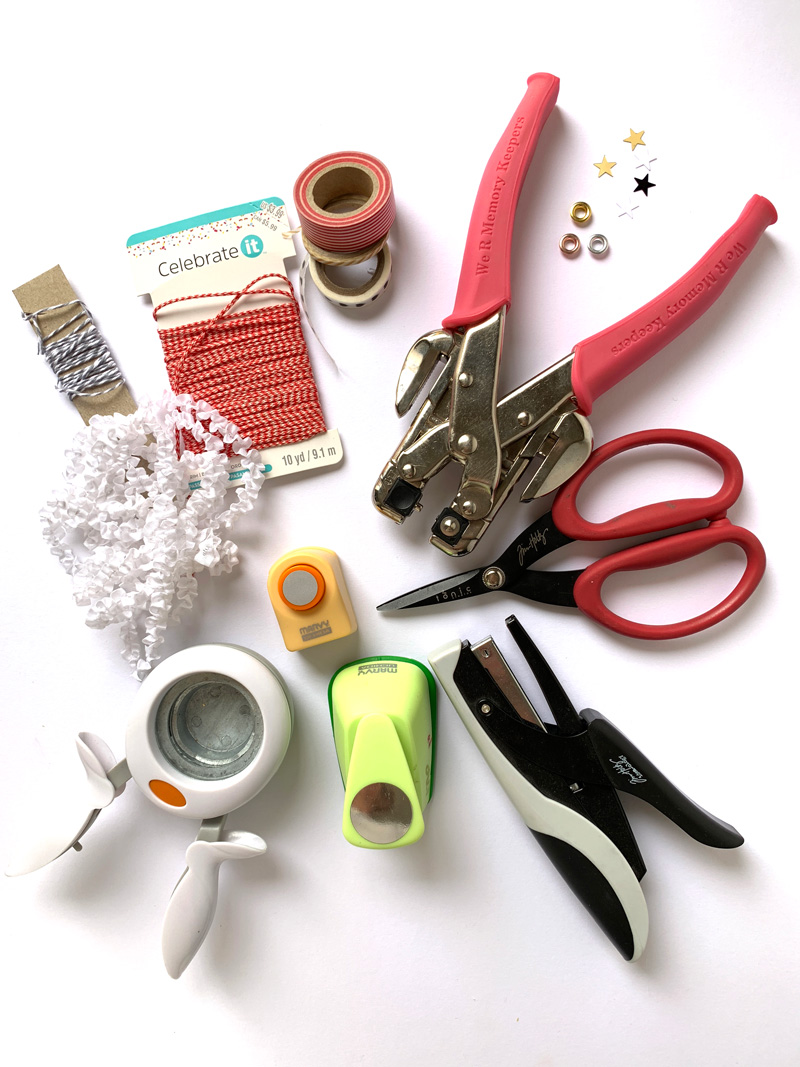
This project is nice because you really don’t need any fancy tools or machines (other than a photo-editing program such as Photoshop or Photoshop Elements, etc.). Here is a look at the other tools I used…

I hope this has given you some ideas! If you’re thinking of giving this project a try… head over to The Digital Press’s challenge forum and get the details about how you can earn challenge points for December 2018 at TDP if you try any of our “Holiday Tips & Tricks” throughout the month as they appear here in this blog series! Also, we’d love to see any photos of your holiday projects using TDP goodies in the gallery this month, so link us up after you’re finished creating and uploading! 🙂

Happy crafting and happy holidays!


IMG_2617lightedt100w

About the Author  KerriAnne is a homebody who resides in the desert SW. She started scrapbooking when her kids were little and hasn’t stopped despite the teenagers rolling their eyes and sticking out their tongues!  When not scrapping or being a chauffeur, she can be found consuming large amounts of iced coffee.