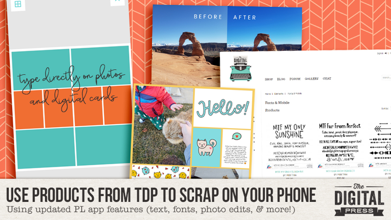
Hello, and welcome to another edition of our Tutorial Tuesday series here on The Digital Press blog! Today I’m here to to share an update to our “phone scrapping” series that ran here on the blog back in 2016. There are a bunch of new features and capabilities in the Project Life app nowadays, compared to when we ran the first three parts of our series — so we figured it was time to update you!
If you missed the first 3 parts of this series… you can find them here:
- PART 1: transferring your own digital products into the Project Life app
- PART 2: adding text to your own pocket cards imported into the app
- PART 3: creating non-pocket style pages using the app in combination w/ photo editing software
The Project Life App has been an integral part of me being able to catch up on 7 years’ worth of pictures and memories in only 2 years’ time. The Project Life App has continued to grow and add some really cool features, which I’m going to talk about today.
When I first started using the Project Life App, I was very pregnant with baby #2. I still hadn’t done my first son’s baby book, or any of the thousands of pictures I took of him in his first 3 years, or any of the photos from the years before him. I hated that I had gotten so far behind on scrapbooking our family’s memories. Once I realized how easy it was to use the Project Life App, however, I told myself I would use it just to catch up on the early years of our marriage, and then I’d go back to my pretty Photoshop layouts for my son’s baby book. Well… as I began to crank out pages quicker than I EVER would in Photoshop alone… I realized I had found my saving grace for scrapbooking. In all honesty, I felt a little guilty buying kits in the Project Life App when my computer was FULL of beautiful digital kits… and I wanted to use them… but it was just easier to stay in the app. That is… until the Project Life App began adding new features. 🙂
For reference, I use my Samsung Galaxy 9 phone for the majority of my scrapping. We Android users often refer to ourselves as the ‘red-headed stepchildren’ of the app world (our updates always come 1-2 months later than the iPhone updates, for the Project Life App). But the new updates have been totally WORTH THE WAIT!
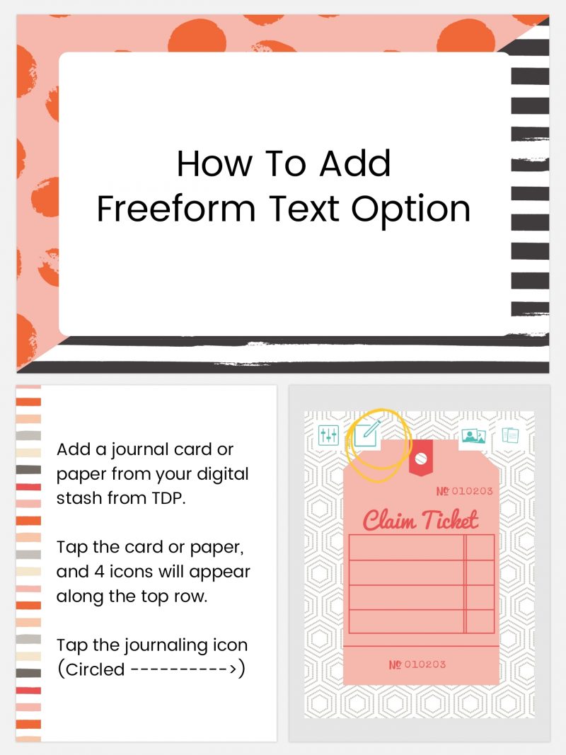
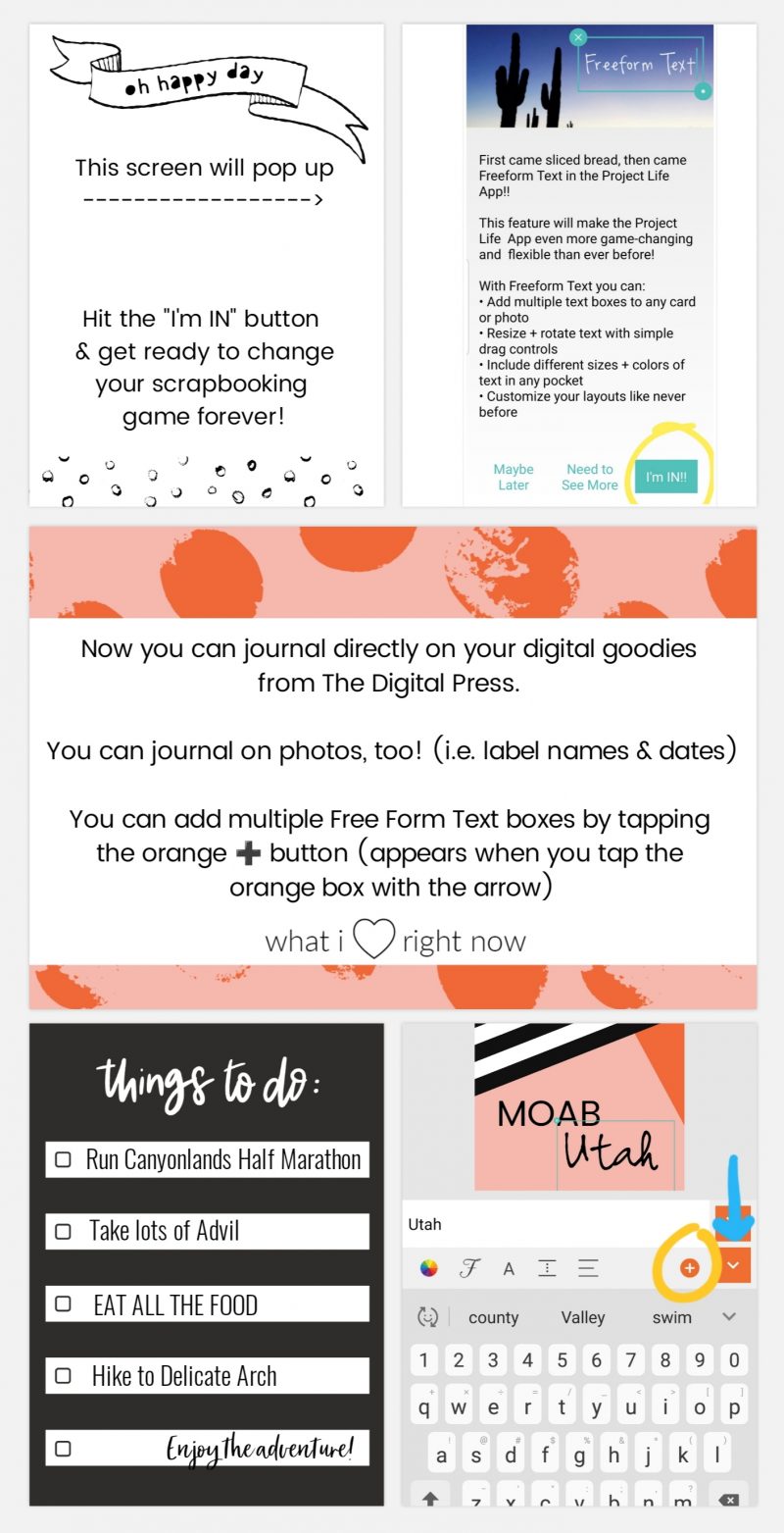
FREE FORM TEXT
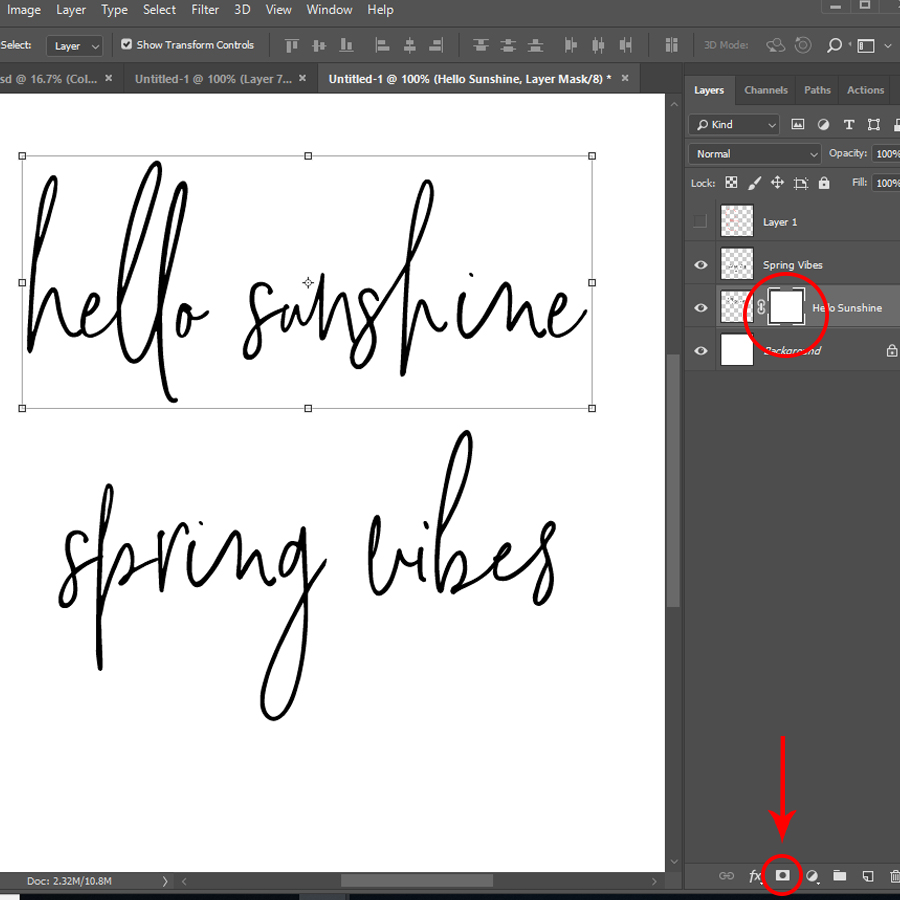
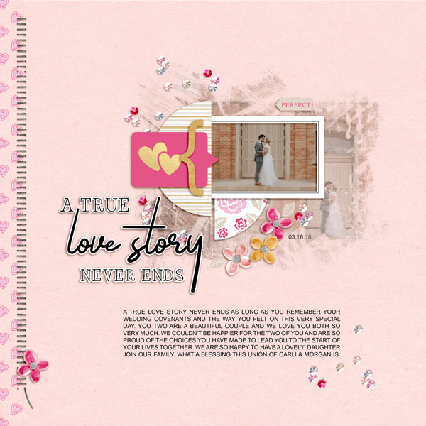
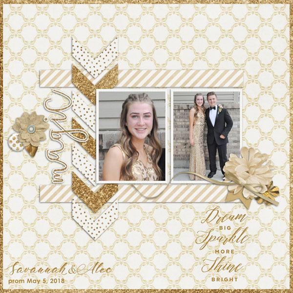
The first feature I’m going to talk about is “Free Form Text“. Free Form Text allows you to add a text box to any pocket or picture. Prior to the update that included Free Form Text… when using TDP products in the PL app you would need to use another app (like Rhonna or Pixel Lab) to journal on your cards or photos (this previous method was covered in the 2nd part of our blog series, found here). Then you’d have to save the new card that included text to your gallery, go back into the PL app, and add it to the layout as a photo. Free Form Text eliminates those extra steps. I remember totally geeking out about this update last May. I could FINALLY use all my beautiful digital kits from The Digital Press! Free Form Text is an add-on in the app, but in my opinion it is a great feature for only $2.99.
Check it out…
[ examples above were made in the Project Life App using Rachel Etrog’s March Stuff Journal Cards ]
Now, there are some limitations to the Free Form Text feature. The text box will not wrap to the confines of the journal card (or photo), so you will have to hit the “enter” key to go to the next line. If you have a large amount of journaling, it may take some tweaking to get it just right.
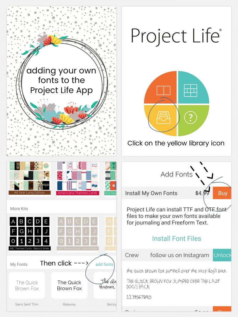
ADD YOUR OWN FONTS
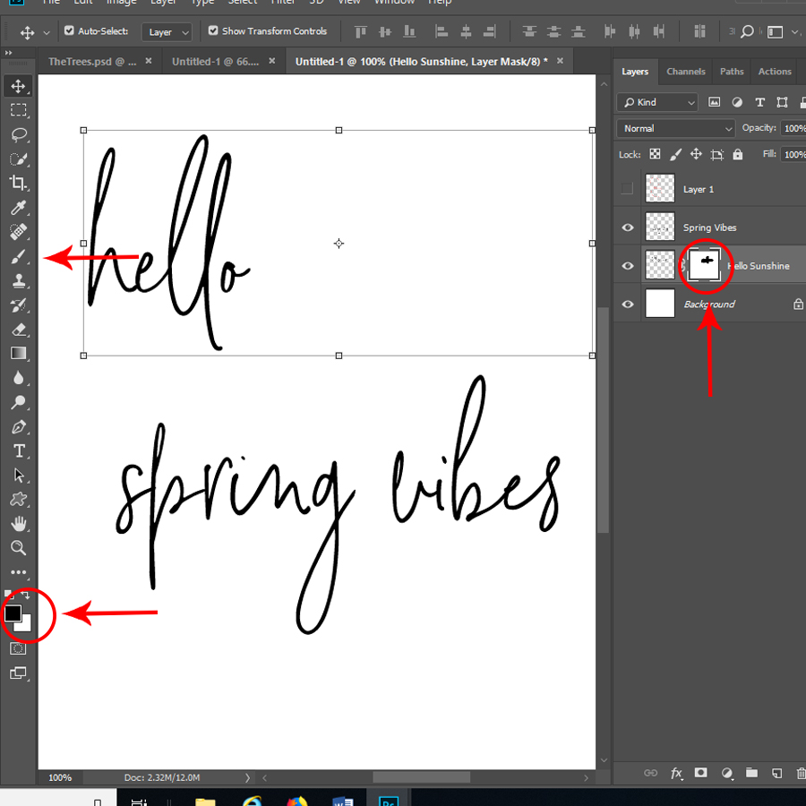
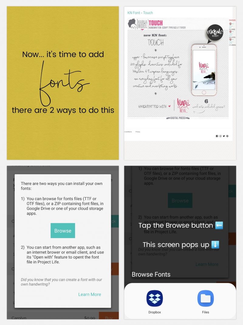
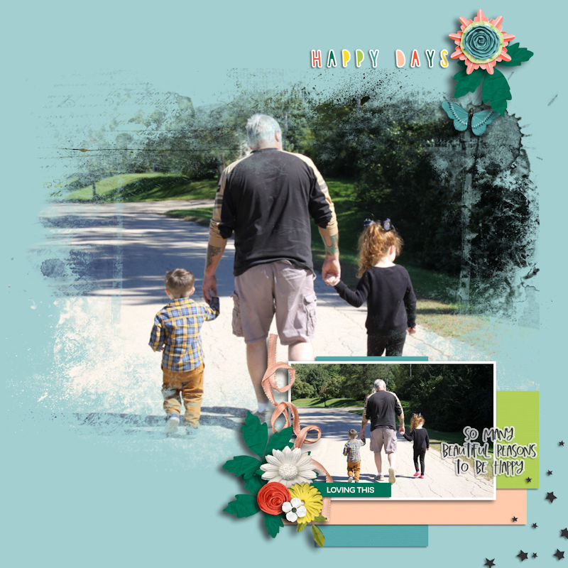
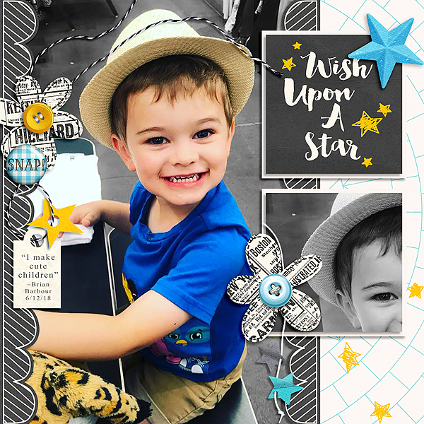
The next feature that totally changed my app-scrapping game was the “Add Your Own Fonts” (Font File Installation) feature. You can add ANY font to your Project Life pages, and you are no longer relegated to using the fonts available in the app. This feature — plus the Free Form Text — means you can add titles in beautiful script fonts, add dingbats to your photos, etc… the possibilities are endless! Like Free Form Text, this feature is an add-on to the app and it’s a bit more expensive at $4.99, but still very worth it, in my opinion! The ease of not having to switch apps and add extra steps to the process when making a page are priceless to me.
[ examples above were made in the Project Life App using Rachel Etrog’s A Boy Life Journal Cards, Papers, & Karla Noel’s Touch Font ]
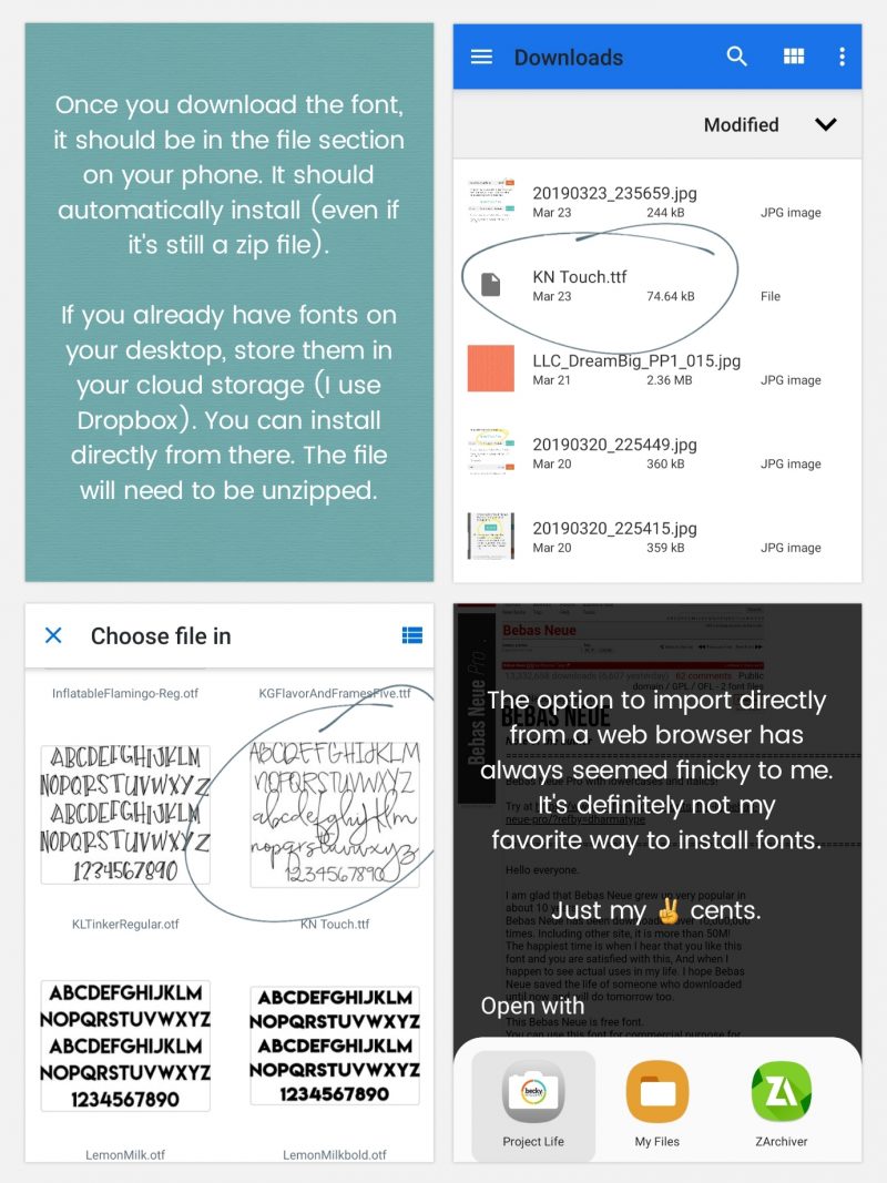
The majority of the time, I download fonts through my desktop, unzip & install, then copy to my Dropbox Fonts folder. I love app-scrapping, but sometimes I just need a bigger screen to see what I’m doing. 99% of the time, I’m installing fonts from my Dropbox. You can find lots of cute fonts at The Digital Press HERE.
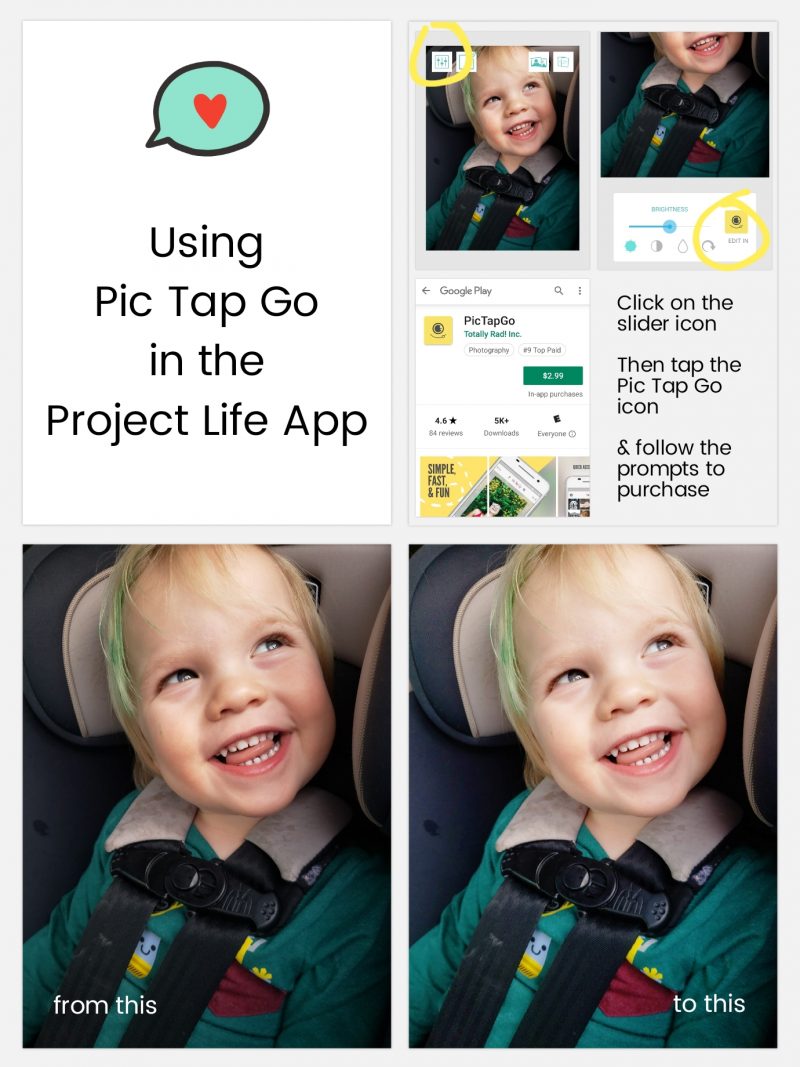
PicTapGo
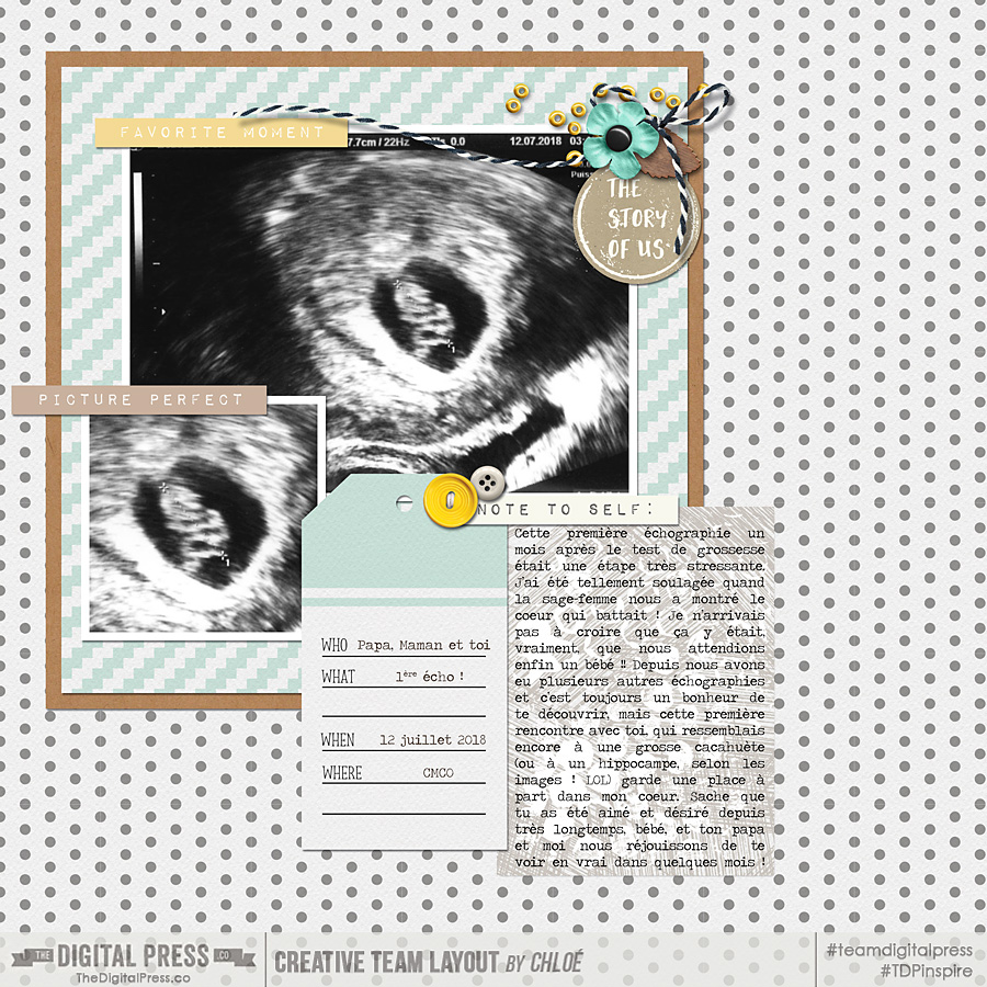
The newest feature that I’m going to tell you about is “PicTapGo“. This app has been available for iOS users for a long time, but it just recently became available to Android users in August 2018. It became integrated into the Project Life App in early September. It is a great photo-editing app and I almost always lighten/brighten my photos using the “Brightside” filter (usually turned down to 50-ish% depending on the photo). Remember, when scrapping on your phone, your photos may look bright enough, but because your phone screen is back-lit, they will often print darker than what they appear on your screen. You can turn your screen brightness down on your phone while you’re working, or simply lighten your photos. It’s another great addition to the Project Life App — and at $2.99 as an add-on feature, it’s another upgrade that I think is worth it to have a better photo-editing system integrated directly in the app. I tell you, I will pay for the ease of NOT having to leave the app to complete my layouts!
[ the journal card on the example layout shown above is from the Meow Journal Cards set by Dunia Designs ]
The edit is a subtle difference on this particular photo, above, but you get the point!
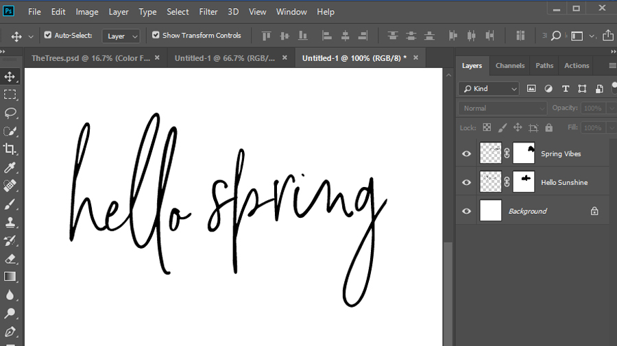
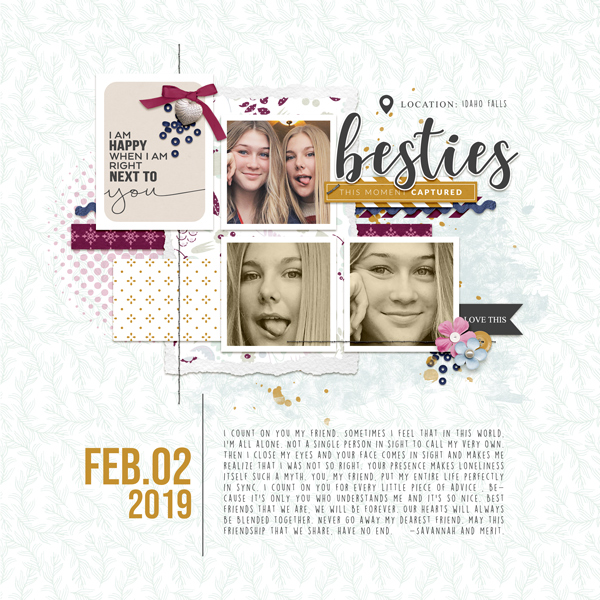
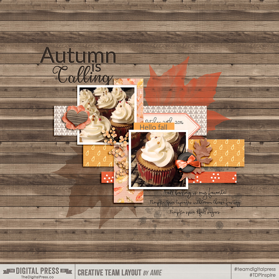
Another cool tool in PicTapGo is the rotate function. I love using patterned papers in my digital pockets, but sometimes I find that I want to tweak them a little (for instance: turning striped papers on a 45 degree angle to get a different look, etc.). Here’s a look…
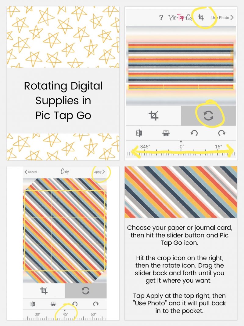
[ this example layout, above, uses papers from the TDP Designer Collaboration collection Control ]
Pretty easy, right? I also made the title card (top left) using Free Form Text. It’s actually the letter “I” (two of them), rotated and stacked on top of each other (clever, right?!). Yet another reason to download the Free Form Text option.
One quick reminder — you should always back up your pages from the app. Don’t rely on the app as a way of storing your completed layouts (I learned this the hard way one time… but never again, you guys!). How to do this? Well, for myself… as soon as I’m done with a page, I export a “social sharing” copy to my phone gallery, and a 12×12 size to my Dropbox. I recommend always exporting at least the 12×12 size, even if you plan on printing at 8×8 or 10×10 — because at least you have the option to print at a bigger size later, if needed (if you save at 8×8 and decide later to print larger, you will lose quality and it’s not recommended; better to save the larger size, just in case!).
I hope this post helps you see the possibilities of using the Project Life app with your TDP goodies. If you are completely new to the Project Life app, be sure to check out the original post in the series here. The third post in the series is also a really fantastic resource, and talks about using the Project Life App and Photoshop or PSE together (which is probably my favorite way to scrap now!). I love the clean lines of pocket style layouts, with some embellishments added later to give it that little something extra.
Be sure to post your layouts that use TDP products along with the Project Life app in the gallery! We’d love to see what you come up with!
Happy Scrapping!
 About the Author Ashley is a member of The Digital Press creative team. She lives in Utah with her husband, 2 young boys, and 1 lazy (but lovable) pup. She works full-time at a busy medical clinic. She has been scrapbooking since childhood… scrapbooking digitally for 10 years… and most recently (& obsessively) app-scrapping on her phone.

 About the Author Wendy has a strong passion for the arts, lots of creative spirit, and is fearless in working with new products and techniques. During the day, she works full-time as an Audit Manager. Wendy and her family live on the Gulf coast of emerald waters in Navarre, Florida. Her husband is from Italy and is an amazing Executive Chef at an Italian restaurant in Navarre. Her daughter is a Yorkie named Principessa. Wendy has over 20 years of experience in the scrapbooking industry. She has been published several times in print and online scrapbook magazines, and has designed for several manufacturer’s creative teams. Wendy is currently designing for The Digital Press as a hybrid artist.
 About the Author Beckie is a creative team member at The Digital Press and who lives near Austin, Texas. In addition to scrapping and photography, she enjoys spending time with her family, reading, and ignoring household chores.
 About the Author Jill W is a creative team member at The Digital Press and has been scrapping for over 13 years. She resides in Northwest Illinois. In addition to scrapping, she enjoys spending time with her family — especially her three young grandchildren (ages 6, 4 and 2). Retirement is getting closer for her, and she is anxious to travel the country with her husband, taking photos and scrapping them as they journey across the USA.
 About the Author Kate is on the hybrid team here at The Digital Press. She lives on the Utah/Colorado border with her husband, 5 kids, 10 chickens, a dog named Gracie, and a cat named Kit. She’s a city-born girl who found she’s really a country girl at heart. She can be found outside, barefoot, and probably in her garden.