Author: The Digital Press

Composition in Square Scrapbook Layouts


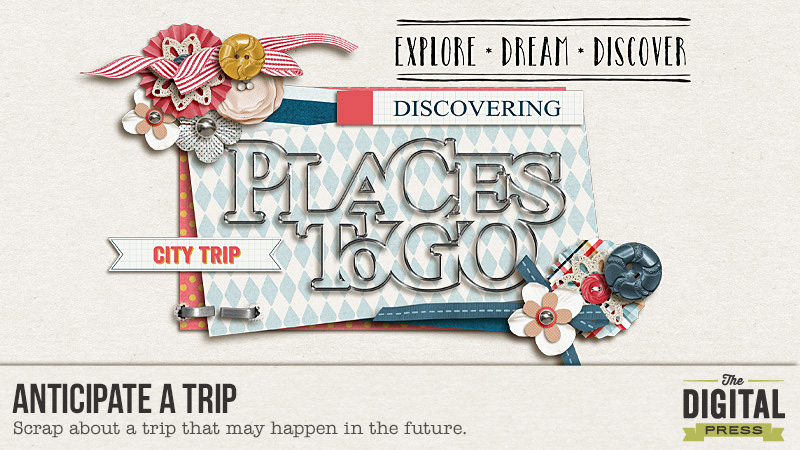
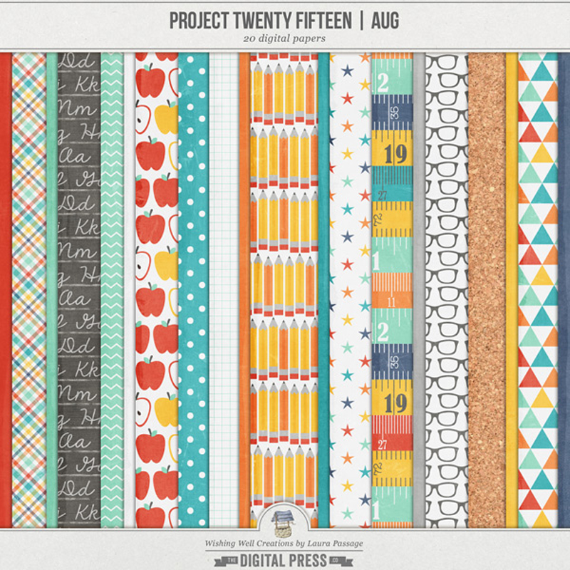
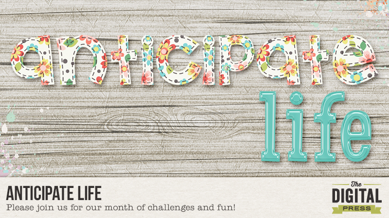
When I’m looking to make a successful composition in a photograph, one of my go-to tactics is to use the Rule of Thirds to find a place to put my focus of interest. But, with the rise of the square format in recent years, I’ve been looking for alternative ideas and it struck me that, with the dominance of the square format in scrapbooking, that these ideas can apply in my other hobby too.

Apparently, when we look at a image in landscape orientation, we scan from left-to-right. If the image is portrait, we scan from top-to-bottom. Because of this, it can be advantageous to put elements in the image (or layout) on the right for landscape and towards the bottom for portrait. This stops the gaze travelling out the other side of the image and on to something else! But in a square image, the eye is much more likely to move in a circle around the image, this means that we don’t have to worry so much about the viewer wandering off, but it means that we have to think about how we guide the viewer around the frame or page in a slightly different way. It can sometimes have the effect of making the image less dynamic. Depending on our intent, that can be useful – or it might be something we need to counteract.

So, what are we trying to achieve? We need to work out what the focus of our layout is. Often it’s the photograph itself, but it could be the journalling, the title-work or even a part of the photograph if we’re using a large image. Once we know that, we can use the papers and elements to guide our viewer around the layout to finally arrive at our focal point.

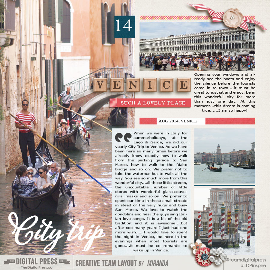
Let’s look at some examples from The Digital Press’ Creative Team:

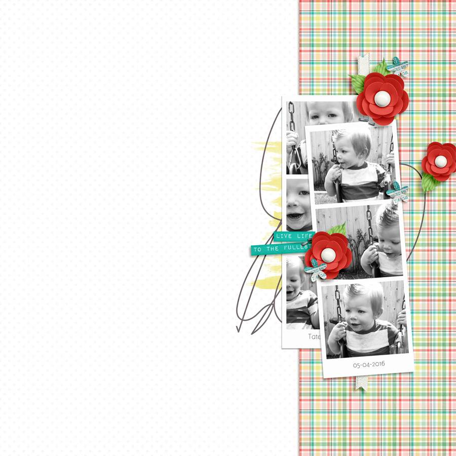
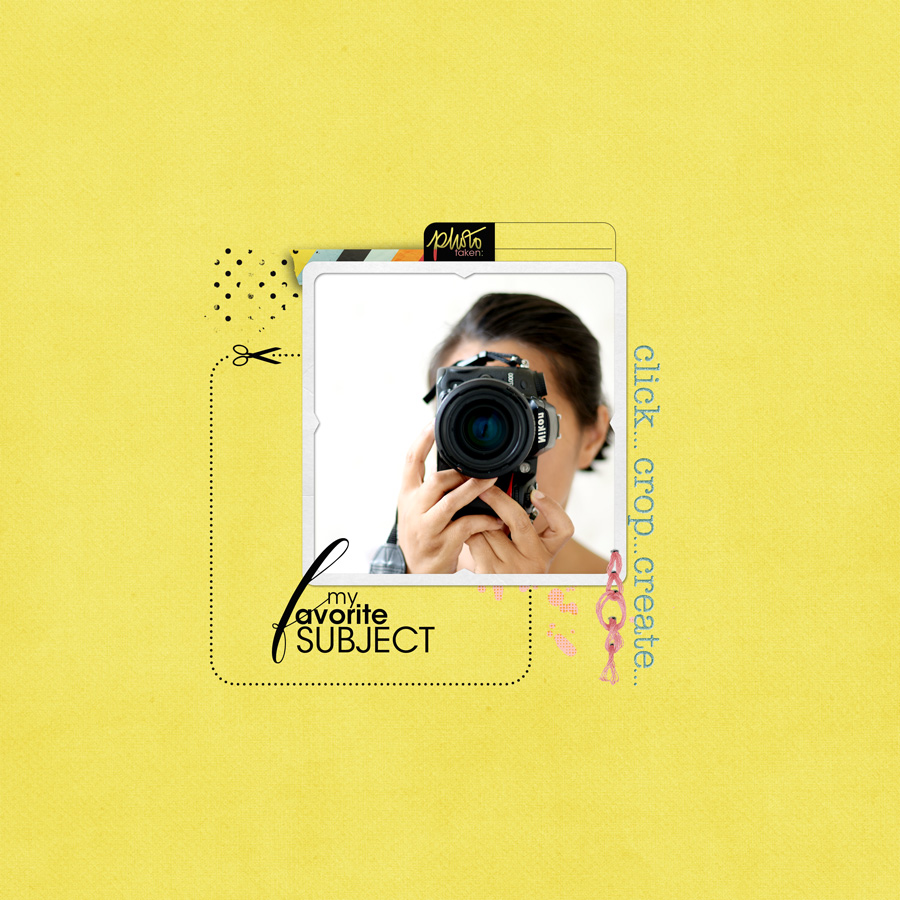
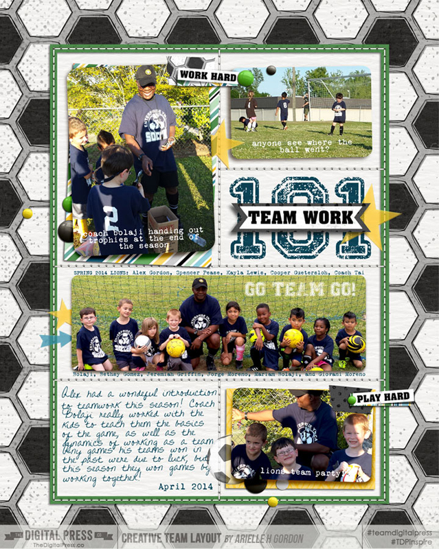
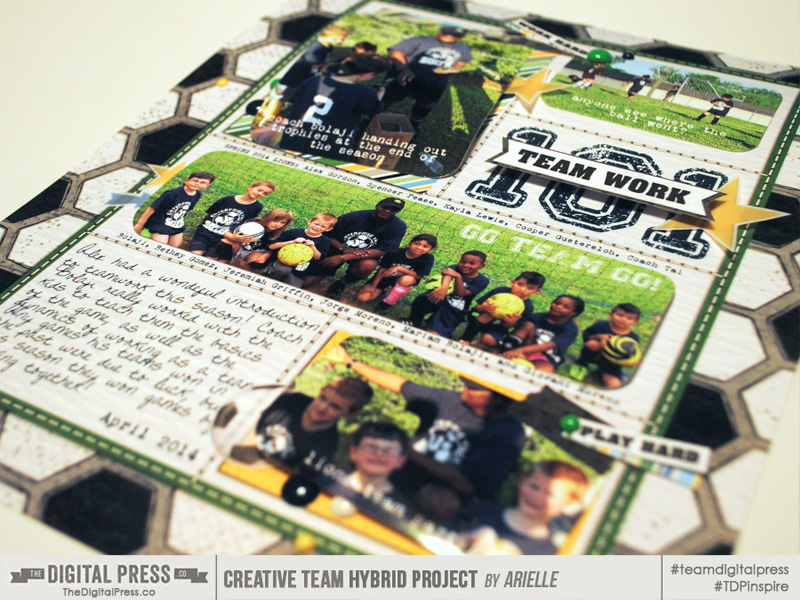
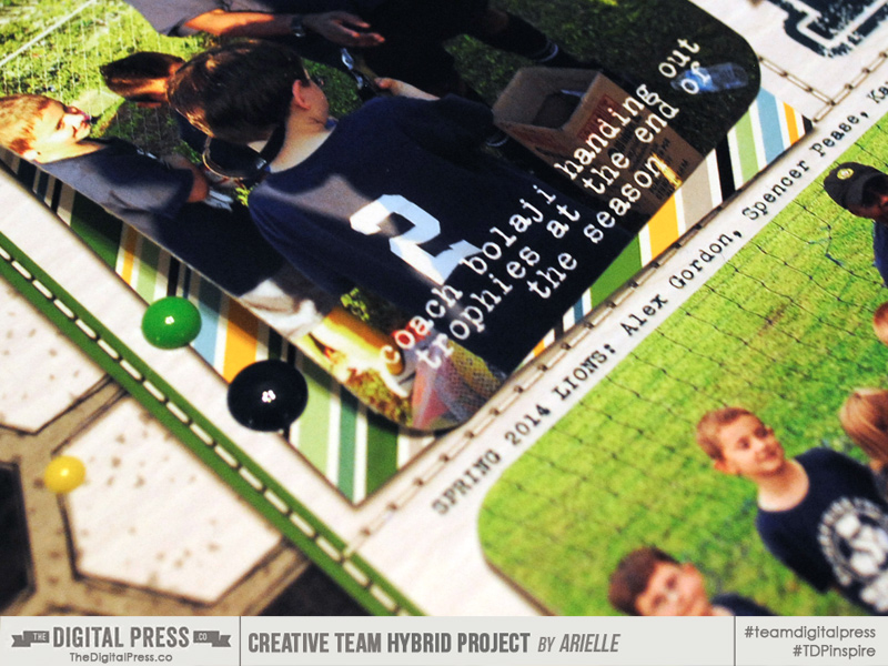
In this layout, Arielle has used a frame within the layout to effectively turn a square layout into a more dynamic rectangle.


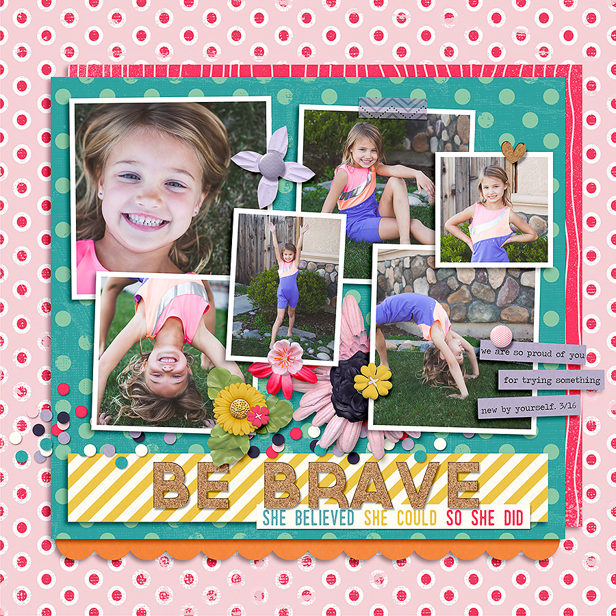
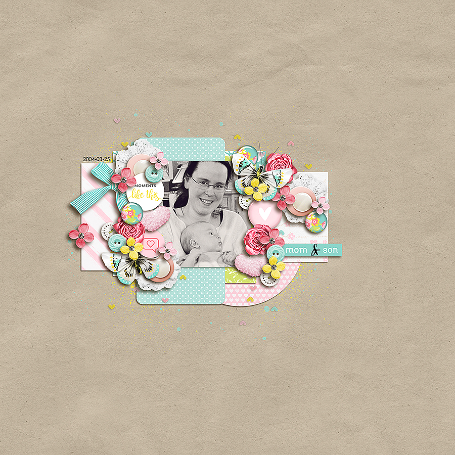
Next, Hillary’s use of strong rectangles results again, in a dynamic composition where we scan down the page and then back up to focus on the adorable photos. The brights reds of the repeated flowers contrast against the more subtle colours of the rest of the layout to ensure that we’re focussing on the most important part of the page.

This layout from Bao, shows clearly the calming effect of placing the focal point in the centre. Her subtle use of color and minimalist design reinforces that feeling.

Biancka has a rectangle within her square frame, but in this layout, her positioning of her papers and elements have, along with the white space around them, defined the area without need for an actual frame or mat.

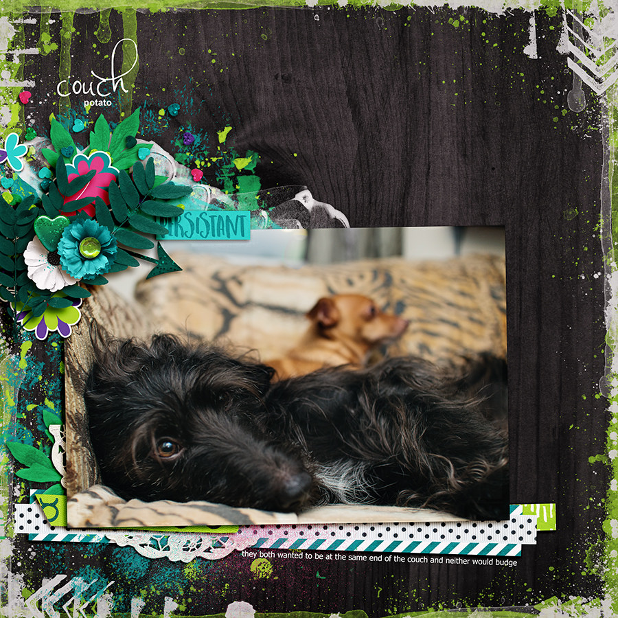
When using a larger photo, it can be sometimes harder to define where the focal point of the layout should be. Rae has used the face of her lovely dog and the elements around the edge draw my eye in a circle in to connect with his gaze.

Of course, one of the best things about scrapbooking is that we can use all these rules to give us a starting point, we can adhere to them strictly or we can ignore them completely and do whatever makes us happy! It’s worth stepping away from your layout for a while though. You’ll come back with fresh eyes and when you open it up again, think about how your eye travels around the layout and see if you can move anything around to guide the viewer to exactly where you want them to look.


JudeAbout the Author  Jude is part of the creative team here at The Digital Press. She lives in the UK with her husband and two fantastic girls. She loves traveling, and would be off in her campervan every weekend if she could get away with it. She loves time spent exploring new places, trying new experiences and photographing them! She also spends too much time on the computer, and still doesn’t go running as often as she says she’s going to.

Hybrid Saturday | Easy Hybrid Hacks For Digital Layouts

Hello and happy Saturday! Arielle here, getting all “hybrid~y” today, as I show some techniques for turning digital layouts into hybrid. Sometimes I think certain layouts are far too awesome to be stuck in an album – they should be featured on my walls or given as gifts. But I like to jazz them up a little before I stick them in a frame!

Today I will show you two hybrid layouts based on this all digital layout, and show you some of my fail-proof tips for adding just the perfect amount of pop!

It’s great if you already have a layout you’d like to use, but if not, you can certainly start from scratch! Alex loved this layout so much, that I decided to “hybrid~ize” it for his room. I used the kit Game On by Inside Pixels by Lisa BellWhat a great soccer kit for boys! (She needs to do one for gals, doesn’t she? wink, wink!)

When you know what you’re using, gather your crafty supplies! I used:

  • Thin cardstock
  • Tissue , vellum, and other assorted papers
  • Adhesives (I used a Xyron machine, ATG gun & dimensionals)
  • Scissors and paper trimmer
  • Other embellishments such as enamel dots or buttons.
  • photos
  • layout base

When I do a hybrid layout, I always start with creating the digital layout. That one’s for the albums. Then I decide what the base of my layout will be. Either printed on 8.5×11″ at home or on photo paper. I did one of each for this layout.

The pros for paper are:

  • You can write, stamp, paint without destroying it
  • You can print it at home
  • Much cheaper

The pros for photo are:

  • Colors are more vivid
  • Is nice and glossy
  • Lasts longer, perhaps?

First up is the paper based layout. I decide before I print, what layers/elements I will leave, and what I will print separately and add on. For this, all the elements, photos and the two paper layers under the photos were removed (the text remained, along with the stitching and the frame and background soccer paper) from the digital layout before printing. Then everything was printed and adhered back on.

This one is an 8×10″ photo base. I printed this exactly the same, except I also left the two papers that are layered under the photos. (That way, I know those paper will match up, and save me a little time.) They are all shadowed, too. You can’t tell too much of a difference between the two layouts in these photos, but I love the look of the one with the photo base, the shadows really pop!

Now onto the fun stuff!

HACK ONE – POP IT UP!

Adding a little bit of height is a great way to jazz up your hybrid layout… it will also create more interesting shadows! You can use a thin dimensional – say 1/8″ or so, and it will still fit in a regular frame. But not much more than two additional layers above the base, otherwise it will get a squashed look. (Of course, if you’re putting it in a shadow box – go crazy with the layers!)

HACK TWO – PRINT ON VELLUM

You can easily add some pop by printing on vellum! It’s so fun to get a little peek of what’s underneath the vellum, it’s a classy little hack! (After I printed the vellum stars, arrow and soccer ball, I put a few of them in my palm, one at a time with the image up, and pressed into the middle of it a little, so it wouldn’t sit so flat on my layout.)

HACK THREE: PRINT ON TISSUE PAPER

Last month on the blog, I showed off a technique for making your own washi. (In this post) I made a couple small pieces and you can see one below. Yes, it may sound like a lot of trouble, but they do match the kit – LOL! I loved this soccer ball pattern! But you could always use any washi you have!

HACK FOUR: ADD EASY LITTLE DETAILS

I love adding buttons or enamel dots to hybrid layouts. Or paint, glitter and stiching. It’s fun to shake up the whole paper thing with some actual hardware ~ to me it creates a Trompe-l’œil effect. It’s interesting to see people trying to figure out what is real and what’s printed. (Text or overlays on photos is another great detail, too.)

Now it’s your turn! Want to try your hand at a hybrid layout? It can be as easy and as simple as you want it to be! Please come join us in The Digital Press’s forum for a fun challenge related to this tutorial! You can create an amazing item for yourself or someone you love AND earn points doing it! Points can later be cashed-in for discount coupons to the shop at the end of the month if you participate in the challenge system at The Digital Press!


Arielle H Gordon
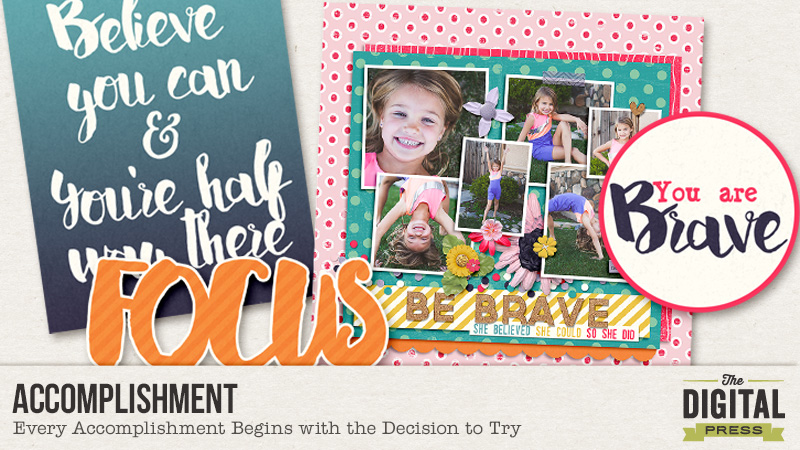
About the author  Arielle H Gordon is a wife and mom of two crazy kiddos, ages 6 & 7. She moved around (a lot!) before returning to settle down in her hometown of Enterprise, Alabama, to marry her sweetheart and start her family. She is an avid crafter — digital, hybrid and otherwise! She LOVES Jesus, family time, camping, gardening, reading cozy mysteries, hot tea, popcorn, and anything on the BBC! This time of year, you’ll find her gardening, gearing up for summer and reading like it’s going out of style (while sipping sweet tea!)…

Anticipate a Trip

Anticipate a Trip

Hi everyone! Miranda here bringing you a new challenge!

Don’t we all have that wish list of places we want to go for a day or maybe even longer? Maybe you will go there one day and maybe it will remain a wish.

On my list I have Rome, Istanbul and Marrakech.  They may not be far from where I live in The Netherlands, but they are far enough for me to have them on my list of “maybe one day” trips.

On top of my list, however, is Venice. My friends ask why Venice when I have been there so many times – very true, but each time I visited I was only there for just a few hours. When we spend our summer holidays at an Italian lake, we always make a day trip to Venice. My wish is to spend a few days there, to really experience the city.  I want to be there in the evenings – how romantic it must be to wake up in a hotel room and look out the window and see the gondolas passing by or even hear the gondoliers sing.

As of the publishing of this post, I will be having my last few hours in Venice and will then be flying home in the morning – my wish came true!

Below is a page I have created about Venice using Our Trip Kit and A Great Adventure Templates by Anita Designs.

Anticipate a Trip

Join me in the forum for a challenge all about scrapping your future or hopeful trips.  I cannot wait to see what you come up with!!


MirandaAbout the Author  Miranda is a mom of two teenage boys, aged 13 and 15 years old, and is also a fur-mummy for her 3 Bernese Mountain Dogs. She lives in the South of the Netherlands, close to the beach where she loves to walk with her dogs. In real life, she is HSE-responsible for few companies in the construction industry. She loves gardening, to walk her dogs, to read Danielle Steel novels… and has been digiscrap-addicted since 2007.

Tutorial Tuesday | Teacher Appreciation Cards

Tutorial Tuesday | Teacher Appreciation Cards

Did you know May 2-6 is National Teacher Appreciation Week? This is always a great time to show appreciation and love to a favorite teacher.  Today, I am here to show you two simple ways to dress up a card for a teacher gift.  For this project, choose a favorite school themed scrapbook kit.

Supplies Needed:

  • ribbon
  • glue dots
  • scissors
  • template
  • pencils
  • printer
  • digital elements (School-themed, etc.)
  • card stock

I chose School Rules by Mari Koegelenberg for the petal gift cards.

Tutorial Tuesday | Teacher Appreciation Cards

For the pencil card I chose  Project 2015 August Papers  and journal cards by Wishing Well Creations (Laura Passage).

Tutorial Tuesday | Teacher Appreciation Cards


Tutorial Tuesday | Teacher Appreciation Cards

Pencil cards are a fun way to show appreciation for your child’s teacher.  They are so simple to create! To make one, gather your supplies.

I created my card from Laura Passage’s 2015 August collection papers and journal cards.  Don’t you just love that little clip element from LJS Design?

To create one I sized my graphic design 8″ x 3″ using the darling pencil papers.  I incorporated some digital stitching elements from my stash around the image and sized down the journal card to 2.5″ x 2″ and then added my text.  I placed all of the elements on the right side of an 8 1/2″ x 11″ paper as  you can see below.   Once you have the graphic designed, you can print on card stock, then fold and trim.  Or just cut around the graphic as a single page. I added some glue dots to the back of the pencils and tied them with a bow. You can write a fun little note on the back or folded on the inside of the card!

Tutorial Tuesday | Teacher Appreciation Cards

For the second card I created a petal gift card.  I chose elements and paper from the School Rules kit by Mari Koegelenberg.

Tutorial Tuesday | Teacher Appreciation Cards

Click on the image to save and print.

Tutorial Tuesday | Teacher Appreciation Cards


First, you want to choose your paper and card element to print.  I centered my 3.75″ x 3.75″  apple graphic on the center of my page. With my chosen printed paper behind the image, I used an 8 1/2″ x 11″ size for the paper.  Next, I printed out the image.  Now I am ready to trace the template and score the edges.  Once you have folded your card, you can add a fun gift card inside.  I closed my card with a glue dot – you could also punch two holes across from each other on the petals and close with twine.

Tutorial Tuesday | Teacher Appreciation Cards


Tutorial Tuesday | Teacher Appreciation Cards

I hope you have fun creating a pencil card or petal gift card for your child’s favorite teacher. Happy Teacher Appreciation week!


Terresa

About the Author  Terresa is a mother to 5 beautiful children. She loves capturing memories with her digital camera and creating a visual family memory book to be enjoyed and treasured. She enjoys designing and creating personalized items for her home and children. Other interests are crafting and gardening, and you will often find her enjoying the outdoors and soaking in the beauty of nature.

Anticipate Life

Anticipate Life

Happy May!  Spring is definitely in full force where I live and I am so excited to see everything in bloom all around us.  I always love this time of year and always anticipate seeing what this favorite season of mine brings with it. Fittingly for this time of the year, our word of the month is ANTICIPATE.  This can mean many things: to ANTICIPATE an age, holiday, pregnancy, season, vacation, graduation, Mother’s Day, end of the school year, garden in bloom, etc.  This time of year is certainly full of things/events to look forward to. What a perfect opportunity to capture this ANTICIPATION in your memory keeping!

Browsing around the web, I found some fun inspiration images to kick-start your thoughts about the word ANTICIPATE

Anticipate Life

[ sources 1, 2, 3, 4, 5, 6, 7, 8 ]

Each month, we like to encourage you to step out of the box with regard to our challenges. Below, you will find the list of upcoming challenges for the month of February — each of which focus on our theme of ANTICIPATE. For more information about our challenge system, please read this information post in the TDP forum.

Anticipate Life

The handy image you see above can be saved to your computer for reference throughout the month, as it features our schedule for May. 🙂 It was made by the ever-talented Alina from TDP’s creative team, using the brand new store collab, A Mother’s Heartwhich was released today and can be purchased for just $4.00 for the first 4 days of the month!

We cannot wait to see how you implement our Word of the Month into your daily lives and memory-keeping!

*** Header image created using A Mother’s Heart Collab by the TDP Designers and A Mother’s Love Alphas by River~Rose Designs.


About the Author  Rachel Alles is on the creative team here at The Digital Press. She is fortunate to share her life with her loving husband, Doug, and her two blessings: Madeline and Maxwell. The three of them are her main source of inspiration for her pocket and traditional style pages. When she’s not scrapping, she enjoys anything Disney-related, learning more about photography (and attempting to turn the dial off “Auto”), and dabbling in home decor projects.

Accomplishment: Every Accomplishment Begins with the Decision to Try

My middle daughter just started gymnastics. This is a pretty big deal for several reasons. Our older daughter has no interest in team sports. While she is quite active at school in basketball, gymnastics, soccer, etc., she has no interest in partaking in something where other people watch her. I do have to give her some credit because she did do a trial class and was interested enough for us to sign her up. But when it came down to it, she decided she didn’t want to do it after all. So it was kind of a big deal for my middle daughter to join gymnastics without the support of her big sister. And you know what?? She loves it!

We are hopeful something will come along that will spark an interest for our oldest, but for now we are celebrating the bravery and courage of our middle and trying to teach the importance of just trying.

Materials Used: You Can Do Anything Kit – River Rose and Inside Pixels Collab and Duo 06 | Love Me Like You Do Template – La Belle Vie

Now, I invite you to come over to the forum to join us in this week’s challenge! You can earn points toward monthly discounts in the shop if you participate (and you’ll get a page done for your album… win-win!).

.


Krista


About the Author  Krista Lund is a mom of 3, married to her high school sweetheart and living in the San Francisco Bay Area. Some of her favorite things are brownies, chips ‘n’ dip, taking pictures, and documenting her family’s story.