Author: The Digital Press

Tutorial Tuesday | Using Word Art Creatively


Hello everyone! I’m back with one of my favourite topics — using word art. As the name suggests, “word art” is an artistic representation of a phrase… or simply a set of words. But… they can be much, much more. When I started thinking about this, I went back and looked at some of my pages to get some ideas to share here today about how to use these digital scrapbooking items creatively to enhance your layouts.

A big, bold piece of word art is what attracts me most when I am shopping for kits to work with… and I often use them front-and-center on my pages. If you think about it, they can be really versatile; you can use them as a title, you can use them as a primary design element, or you can even replace or support your journaling to explain the story you’re telling on your layout.

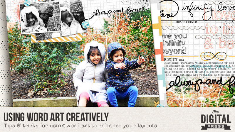
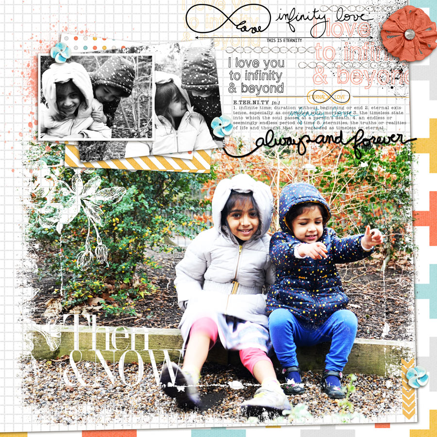
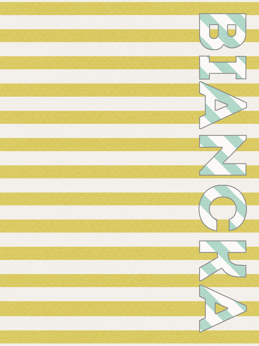
Today, the layout I’ll be showing as an example uses the fabulous kit Eternal by MEG Designs (and a template from her coordinating Eternal Templates set)…

“CUT ALONG” TECHNIQUE

The first technique I’ll share is one that I saw used in the galleries in my early days of scrapping… and I then reverse-engineered my own method to do it. It uses the word art as a design element, and adds so much interest to the layout.

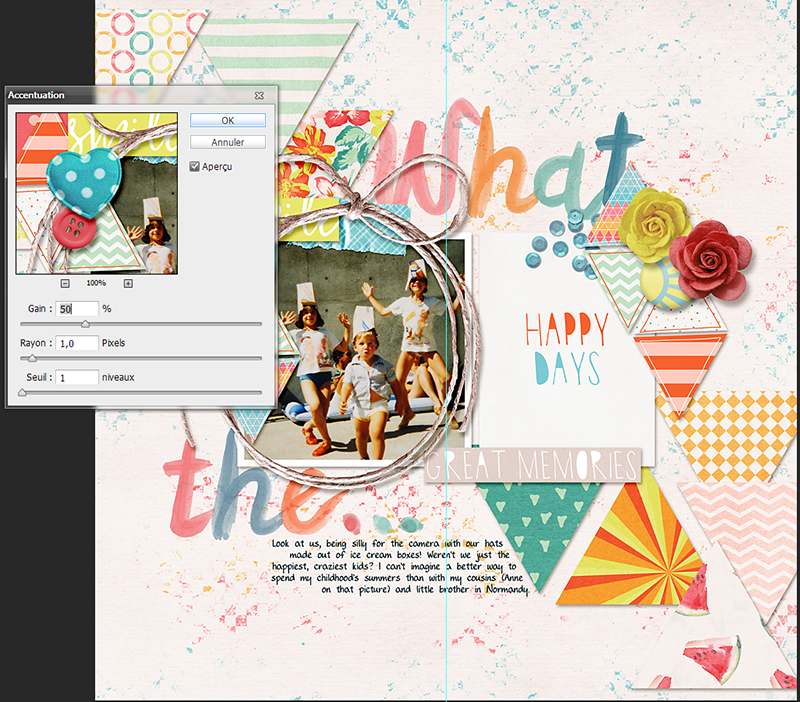
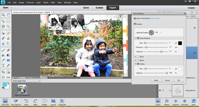
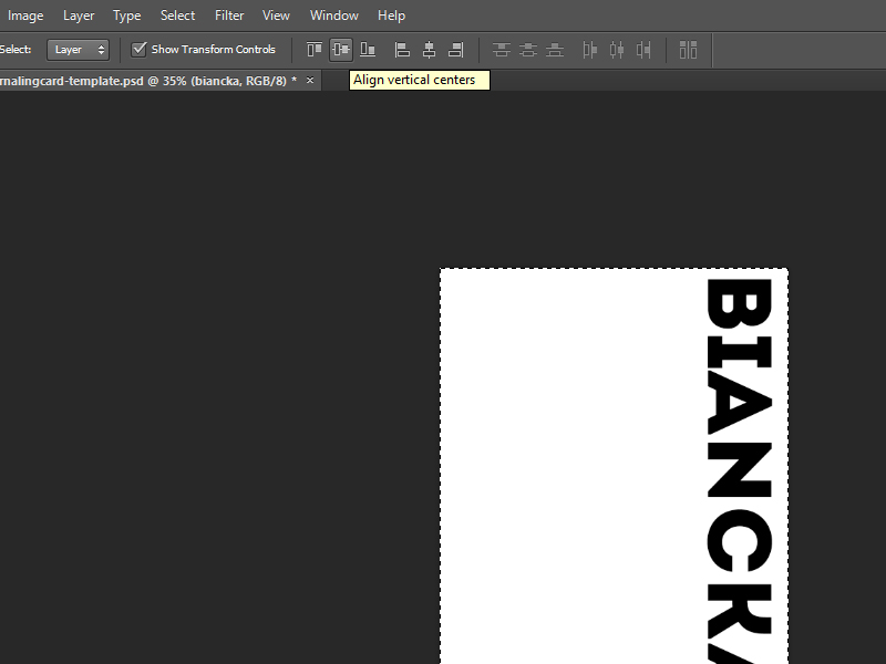
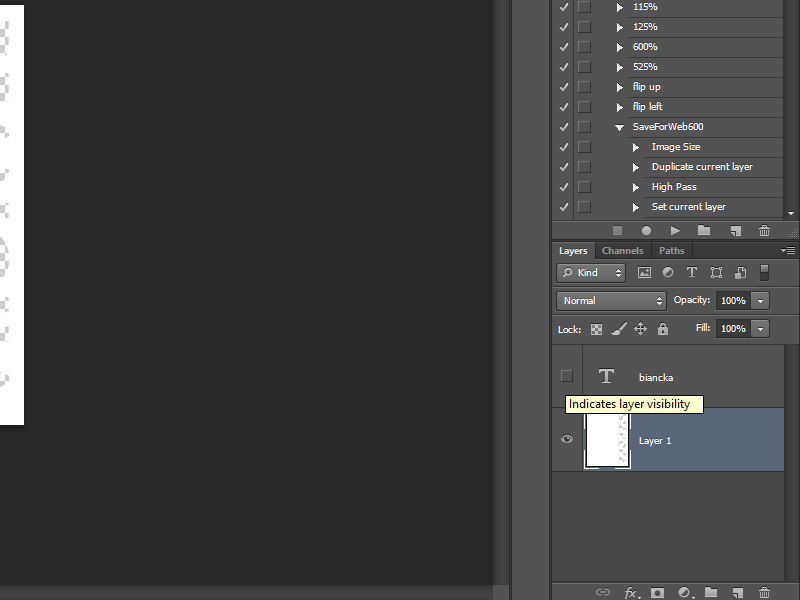
As you can see in the screenshot below, I have selected a piece of word art and placed it on top of my photo… and now I want to cut out the photo along the lines of the word art. Before I begin, though, I should mention that I am using a rounded brush tool to draw curved lines so that the word art is continuous…


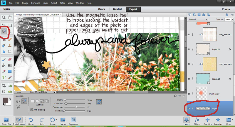
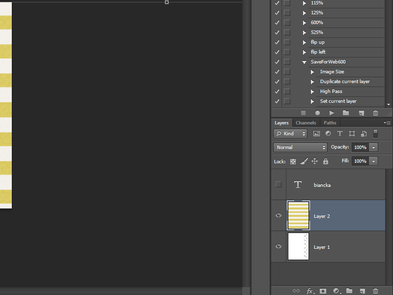
Using the magnetic lasso, I trace along the lines of the word art (and then, over the rest of the photo to make a closed loop). Marching ants appear as soon as I complete this step, highlighting the area I have selected (see above).

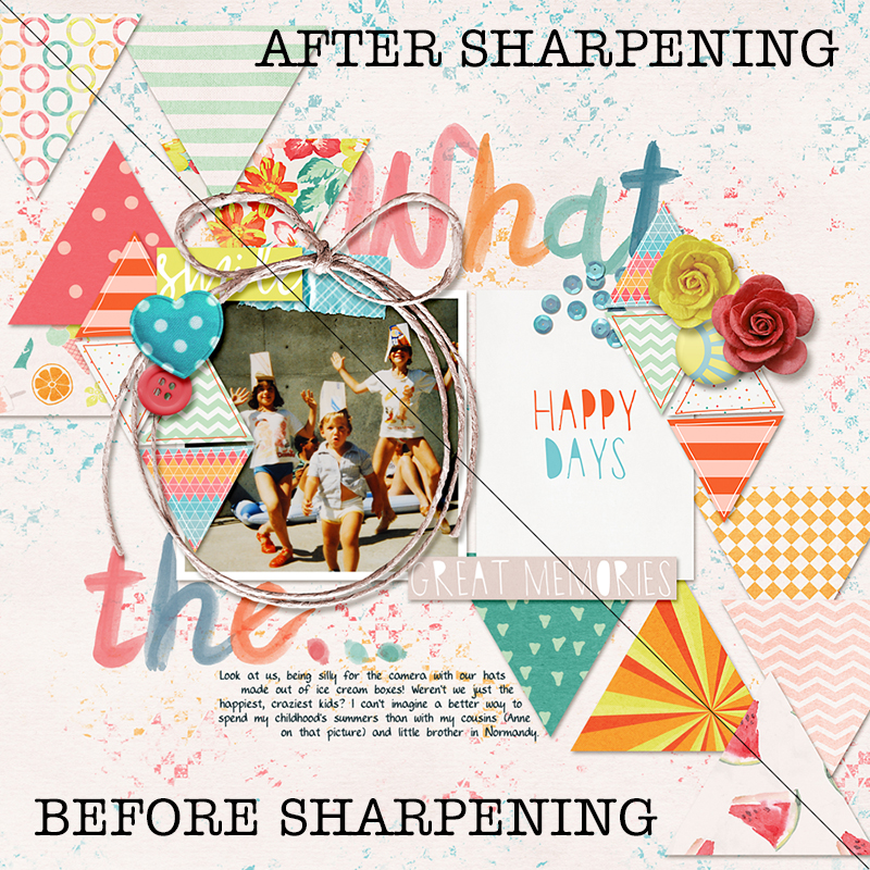
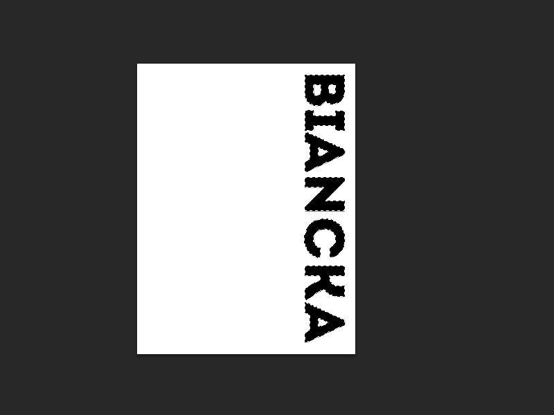
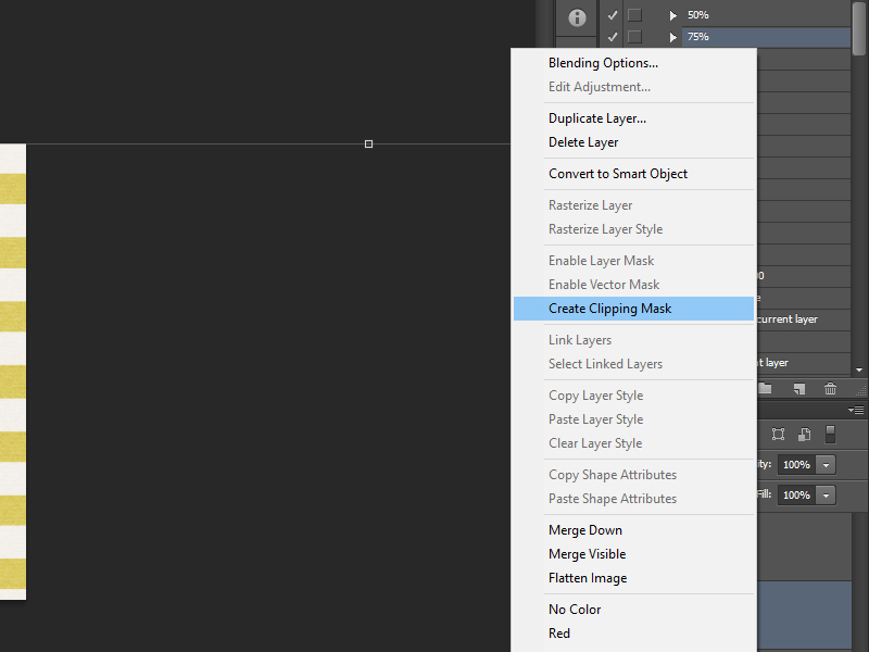
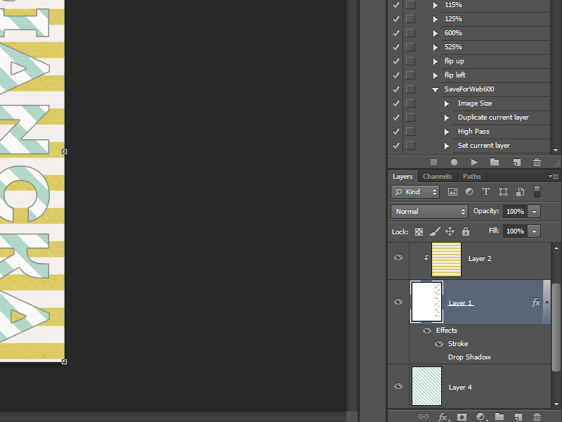
Now I select the photo layer in the layers panel… and cut away the selection shown by the marching ants…

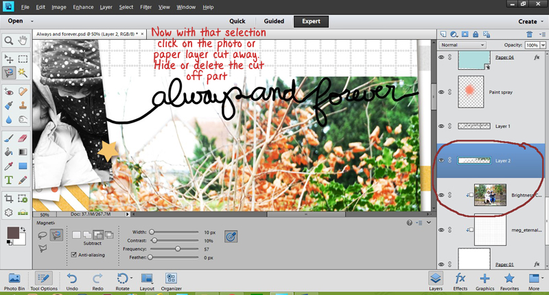
Hide or delete this cut-out portion, and using a soft round brush — erase any other unwanted parts of the photo to get clean edges. I also added a small shadow to the piece of word art, to add dimension.

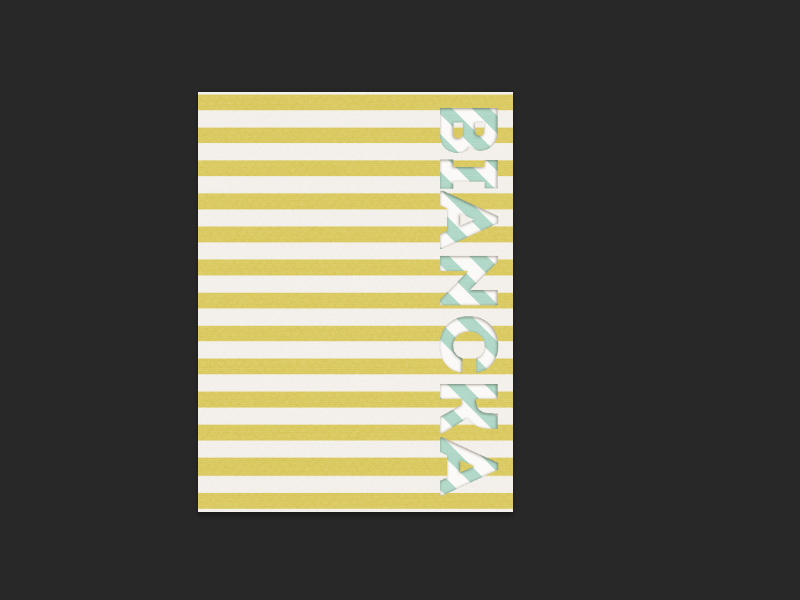
Voila! The layout has quite a dramatic detail on it now!


“CREATE A BACKGROUND” TECHNIQUE

In this technique, I use a few pieces of word art — as well as a few other elements — to create a background that is unique, and yet adds to the sentiment found in the layout.

I have used a mask to crop the big photo to make some space for this. Then I have scattered the word arts and some other stamps on the background paper to give a graffiti effect (see upper-right corner of the layout)…


You can re-size, re-color, or reduce the opacity of the repeated word art bits as desired, in order to get a much more realistic and interesting look.


“WORD ART AS STICKER” TECHNIQUE

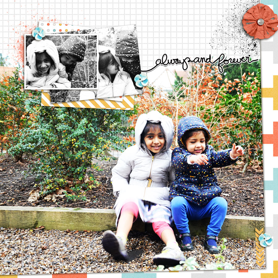
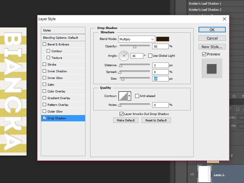
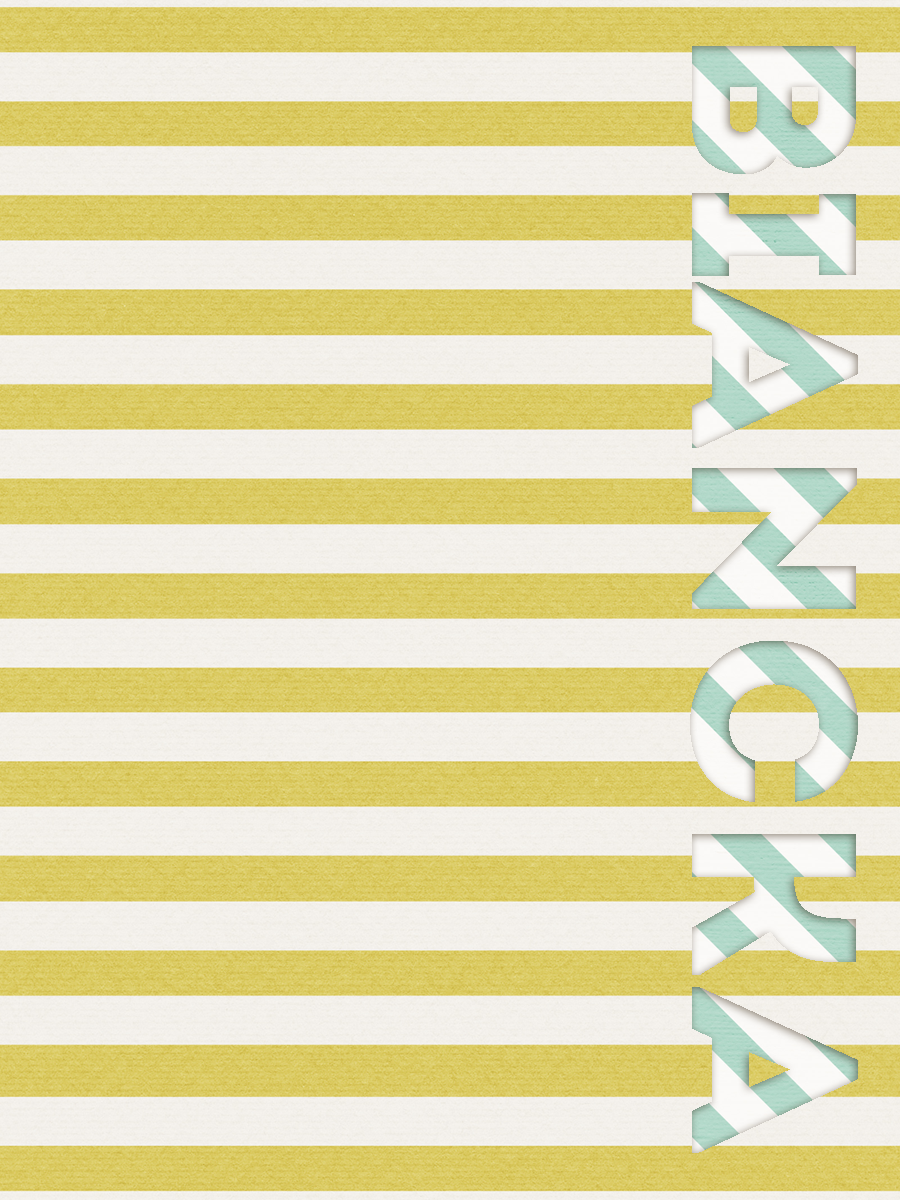
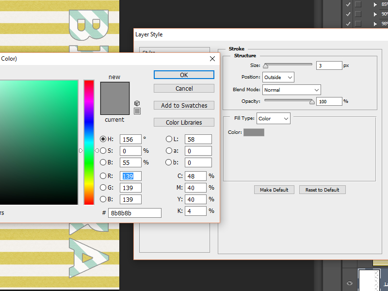
In this instance, I am using the same word art piece I used in my first example, above… but this time, I add a white stroke and a shadow to turn it into a sticker…


See the settings in the screenshot, above, for an example of what you might do. You can, of course, play with your own settings to achieve your own desired results.

To give it an even more realistic look, you can even try using the wave shadowing technique that was found in a previous tutorial post here at The Digital Press (found here).


So that’s it… just a few examples of some pretty crafty stuff that you can do with your word art pieces!

I’m sure you have your own ideas and tricks, too, so please share them in the comments, below… and if you’ve liked any of the techniques shared here, I’d love to see the results when you try them out!

Until next time, then… happy scrapping!


Profile pic avatar small

About the Author  Shivani Sohal is a donner of many alter-egos. A finance professional by day in busy London, she morphs into a seemingly normal mum of two in the evenings and weekends. She is constantly found with her fingers in too many pies and juggling the metaphorical balls. That is living on the edge for her; aided by the two ankle biters and a darling hubby who define the warm and mushy for her. She is ferociously dedicated to memory keeping – almost immune to any nay-sayers (or equally disruptive crying children or annoying house fires!!!); keeping her head down and forging ahead at all times.

Tutorial Tuesday | Creating Cut-Out Journal Cards


I love using journal cards on my digital scrapbooking layouts. I don’t pocket scrap very often, but I do love to tuck a journal card in behind my photo or behind clusters of elements. A few days ago, I was working on a layout when I thought, “I would love to be able to add a card with my name on this layout…” and there it was — my idea for this Tutorial Tuesday blog post! Today I’ll be teaching you how to create a cut-out card for an extra fun twist.

I created a card template for the purposes of this tutorial, and you can download yours HERE. The zip file contains PSD, TIFF & PNG versions of the template. I will be using the layered PSD file in the examples shown below.

We will also need a few fonts. I am going to use bold fonts for this tutorial, and I found a few freebie fonts which I thought you’d also like: Axis Extrabold, Bohemia Slab Serif, CastIron Condensed & Intro. Follow the links and you will be able to download the fonts (I think that you have to enter your email address with one of those; if you don’t want to do that… just skip it and use a bold font that you already have in your collection, instead).

And now that we have everything we need… let’s start!

First, open the card template.

01

Go to the type tool. I chose the horizontal but you can always chose the vertical option, if you prefer.

02

Type something. I am going to type my name. I chose the Intro font, size 60. As you can see… my name doesn’t fit on the card.

03

I don’t want to re-size it, so I decided to rotate the text (if your text does fit, you can skip the following steps for rotating the text). Select the move tool. I have auto select on, layer and also show transform controls.

04

Now, click on the text. When you click on the text… you can see the transform boxes around the text. Hold the shift-button and hover next to one of the transform boxes. You will see a bowed arrow (I cannot get a screenshot of this, so sorry). Continue holding down the shift-button and rotate the text. My text is now vertical… but I feel it’s a bit too big so I am going to change the font size from 60 to 56. After doing that, it looks perfect now!

05

I want my text to be centered. That’s easy to do. While you have the move tool selected, click CTRL-A. This will select the text (make sure you have your text layer selected). Click “align vertical centers” and your text is perfectly in the center.

06

Next, click CTRL-D to de-select the layer.

Now select the Magic Wand Tool. In the following screenshot (at the top) you can see my settings…

07
Select your text layer and while holding the shift-key, select all of the letters.

08
Select the card layer and hit the delete button. The CTRL-D to de-select. Now make your text layer invisible. Just click on the eye that’s in your text layer.

09
You can now see on the card layer (layer 1 in the template) that the text you typed is cut out… but this is still a little boring. So let’s add a paper to the card and make it a little bit more fun. I have used a paper from The Digital Press’s June shop collaboration collection, Family Man. I am addicted to stripes, so I chose a cute stripey paper.

10
Select the paper (CTRL-A), copy the paper (CTRL-C) and go back to your card template and paste (CTRL-P) the paper above your card layer.

11

The paper now sits above the card layer. If you click CTRL-ALT-G (I love my shortcuts!)… you are creating a clipping mask with this shortcut. You can also right-click on the paper layer and choose “Create Clipping Mask.” Either method works.

12
I’ve added a white background so you can see what happens when you play around with shadows on the card layer (layer 1).

13
It will make the cut-out text from your card stand out more. Also adding another background (as you will have on your layout) enhances the effect. I played around with the paper size that’s on top of the card and added a cute background and this is what you’ll see….

14

I thought I was done with my card (and this tutorial), but then I realized… I still have to save the card! When you’re happy with your card, first save it as a layered PSD. I always do that so I can customize the card again whenever I like. Don’t forget to use the “save as” option… otherwise you will over-write your original template file. So you want to “save as” and change the file name. After you’ve saved your card as a PSD… go again to the “file” menu, click “save as” once again, and save your card as either a JPG or a PNG (JPG if it’s a solid card, and PNG if it has any transparency). Give your card any name you’d like.

And here’s a look at the final result…

biancka002

One last tip/trick… you can change the effect of the cut-out by adding a stroke instead of a shadow, in order to achieve a totally different look to the card (for myself, I actually like the stroke effect better on this card).

To do this, I opened my saved PSD (layered) file of my card. Then I clicked on the arrow next to the “fx” on layer 1…

17
Next, I double-clicked on “effects” and the effect panel will opened. I chose stroke, and used the following settings (to change the color of the stroke, I first had to click on the box next to color)…

18
This is what I ended up with after saving this new version of my card…

biancka002-stroke

This effect makes the text pop even more, so I like this version better than the shadowed version, for my own purposes. For yourself, now you have two options to use with your custom-made cut-out journal cards!

I hope this tutorial was useful, and that you are excited to create your own cards from time to time! If you do… definitely link me up in the comments, below, to layouts in the gallery that use your new cards. 🙂


bianckaAbout the Author  Biancka is a creative team member here at The Digital Press. She is a stay-at-home mom (SAHM), a wife to Edwin, and mom to Jasper. She lives in the east of The Netherlands (about 30 minutes from the German border). She is addicted to scrapping, but also enjoys baking, reading books (mostly thrillers), watching her favorite TV shows, and photography.

Hybrid How-To | Straw Rockets

Are you ready for something fun and easy? I found this simple project on Pinterest, and knew it would be the perfect way for my littles to spend a summer afternoon.

Supplies Needed:

  • Digital image of your choice (I used the rocket from County Fair, seen below)
  • Cardstock
  • Scissors
  • Hot Glue
  • Curling ribbon (optional)
  • Straw

Directions:

  1. Print out the image you want and cut it out. Before printing, make sure the image is the size you want. It shouldn’t be too small; I actually ended up making the rocket from the kit a little bit bigger.

  1. Next, cut a rectangle of out of plain paper (I just used some scratch paper). It needs to be a little longer than your image.
  1. Roll the rectangle paper around a pencil and glue the edge together to form a tube. Pinch one end of the tube and glue together so that the end is sealed. At this point, I decided to glue some curling ribbon to the bottom of my rocket. Next, glue the tube to the back of the image.


And that’s it!

Now you can slide the tube over the top of the straw… and blow to make it fly. 🙂


Kate


About the Author  Kate is on the hybrid team here at The Digital Press. She lives on the Utah/Colorado border with her husband, 5 kids, 10 chickens, and a dog named Gracie. She’s a city-born girl who found she’s really a country girl at heart. She can be found outside, barefoot, and probably in her garden.

Feature Friday | France M. Designs


Happy Feature Friday! Today you get the opportunity to get to know France Meunier, also known as France M. Designs! I’ve had the chance to get to know France over the past few months, and not only is she an amazing, kind, and generous person… she is an incredibly talented designer. Her products are whimsical, unique, and charming… with a perfect mix of traditional paper-style designs and graphic elements. Her kits include amazing word art (because who doesn’t just LOVE word art?!), realistic flowers, traditional flat elements (perfect for those paper-style or pocket-style layouts), and versatile stamps that are perfectly-crafted.

This is just a small sampling of the inspiring product offerings you’ll find in her store here at The Digital Press…


We asked France some questions about her life outside of the crafting world so we can get to know her even better! Here’s what she had to say…

Where do you live?
I live near Lyon, in France. With my future husband and our 2 girls.

When you’re not designing, what do you do with your time?
First and foremost, I’m a mother… so I spend most of my time with them. The grandparents are near us, so we are often with them on the weekends. I bake, a lot… macaroons, meringues, rainbow cakes, and a lot of other cakes are my passion (I intend to create my own business to sell them). I love watching TV shows and movies, listening to music, and reading a good book. And of course, I love taking pictures and scrapping… but I don’t seem to have much time to scrap!

What are 5 tidbits of trivia we might not know about you?
— Often, I do not wear the same socks!
— When I was young, I didn’t like my name. France is the name of my country too… but now, I love it!
— I met my man at work. We worked in a sports shop, and you know what? I don’t like sports!! haha!
— I love red nails
— I’m still a little girl… I love watching cartoons with my girls… Especially Disney or Pixar cartoons.

Which of your products is your favorite?
I should say, “the one I am working on!” But — I really like Awakening


Now that you know more about Franny, check out her products in action (and see how versatile her products are)! You don’t have to scrap in a particular ‘style’ to love her products. They are perfect for paper-style layouts, graphic layouts, and pocket-style pages alike…


Now that I have you drooling over all of this loveliness, your next step is to go over and take advantage of the 30% OFF SALE IN HER STORE throughout this week. I mean, you just cannot lose here… beautiful, unique products to inspire your creativity — and at a great discount, this week only (sale will end at 11:59pm ET on Thurs 6/23). Happy Scrapping!


Heidi NicoleAbout the Author  Heidi Nicole is happily married to an amazing man, a step-mama to 2 wonderful kiddos, and mama to 3 sweet and sassy furbabies. She’s a radiation therapist by day, and creator of pretty things by night (she’s pretty confident that she’s hit superhero status, but refuses to wear a cape). She loves cats and huskies, coffee, audio books, Friends reruns, St. Louis Blues hockey, cooking, baking, and traveling. Oh, and wine… she really likes wine. She lives a normal and happy life, and enjoys all the absolutely extraordinary people she gets to share it with on a daily basis!


Feature Friday | Laura Banasiak


Once again, it’s Feature Friday… and this week, we are featuring the designs of the lovely Laura Banasiak!

Laura’s kits are full of colorful and funky elements, loads of doodles, and various hand-crafted artsy elements. In addition to digital kits, she also creates awesome fonts, alphas and word art setc… all of which have a very special style that is all her own, and you can recognize her products without even seeing her name on the packaging. I love working with her products, because Laura creates all kind of goodies for cool boys and sweet girls, alike!

I picked some of my favorite products to share with you from Laura’s store (which was not easy, as I love all of  her work!)…


And now, let’s get to know Laura a little better! We asked her to answer a few questions so we could learn more about her…

Where do you live?
About an hour from Chicago, Illinois.

When you’re not designing, what do you do with your time?
As of right now, I am keeping pretty busy nursing a newborn (come check out her baby announcement in The Digital Press forum! cute baby pics! yay!), changing diapers, and passing him from one excited sibling to the next. 😉

What are 5 tidbits of trivia we might not know about you?
— I have about 15 tattoos
— My boyfriend is a police officer
— My stepmom and I share the same first name
— I was once a librarian
— I’m a cat lady… but am allergic to cats

Which of your products is your favorite?
This always changes. I love all of my Scouting-themed products, but there’s also a special place for my Walking Dead inspired kit, Apocalypse


Laura Banasiak’s products are super versatile and easy to use for all kinds of projects. Here is a sampling of some of my favorite projects using Laura’s designs…


If you haven’t already browsed through Laura’s shop here at The Digital Press… definitely check it out HERE! You will definitely want to take a peek this week, because her entire shop will be 30% OFF through the end of next Thursday (sale will end at 11:59pm ET on Thurs 6/16)!


Miranda

About the Author  Miranda is mom of two teenage boys, aged 13 and 15 years old, and is also a fur-mummy for her 3 Bernese Mountain Dogs. She lives in the South of the Netherlands, close to the beach where she loves to walk with her dogs. In real life she is HSE-responsible for few companies in the construction industry. She loves to read Danielle Steel novels, long walks at the beach and she loves Italy; and has been digiscrap-addicted since 2007.

Tutorial Tuesday | Save for Web


I often say that Photoshop is like our brain: we only use 10% of it. Well, “save for web” is probably one of those features that we don’t put to as good of a use as we should! It’s a simple tip… yet it can change the way you share your pages online!

As is often the case with Photoshop, there are several ways to get to the same end result… so I will simply share my own process (I use PS CS6), but keep in mind it’s definitely not the only process.

First, I always save 3 versions of the same file:

  1. My original layered file. I used to save it in .PSD format, but I’ve recently switched to .TIF format as they are non-proprietary (hence readable by software other than PS), smaller in file size, and can be previewed in my windows folders.
  2. The high definition .JPG file. This is the file that I use for printing (at 300dpi).
  3. The web version. This is a low-resolution .JPG file (72dpi), but it’s still nice and crisp.

When my layout is finished, I save the .TIF file first. Then I flatten it and save the high-resolution .JPG file. Then, I start my “save for web” process.


Here are my “save for web” steps

First, I go to  Image>Image size  or  Alt+Ctl+I  and change the resolution to 72 dpi (from the printing resolution of 300 dpi) for screen use, and I re-size the file. The file size/image size settings that I need are different from one gallery to another. The Digital Press gallery allows layouts from 600px to 900px in size (900px preferred), so when I re-size my layout I switch to 900px (because I scrap square layouts, I re-size my file to 900px x 900px). If your page isn’t square, just keep the proportions of your original but make sure the longest side is set to 900px.

Next, to ensure that my layout looks fantastic when displayed online, my file often needs to be sharpened. Now is the time! Again, there are various ways to do it. I simply use Filter>Sharpen>Accentuation (you could also use Smart Sharpen or a Highpass filter). Here are my settings when I sharpen — but pick whatever suits your own taste and your page, using the preview window to help you…

Here’s a small comparison of the before and after of my layout; it’s a subtle difference, but it gives my page a really nice oomph (you can really tell the difference if you look at the string frame… look how nice and sharp it is on the right side)!


Next, I will save this web version using… wait for it… “save for web” (in the File menu)! Ha! The shortcut in my version of Photoshop is Ctrl+Alt+Caps+S. Then I use the following settings…


I make sure to set a file size limit using the “optimize for image size” option. Here’s where the menu is located, in the top right corner (click the little 3-lines/arrow icon at top right, and you’ll get the following drop-down menu)…

A pop-up window allows me to pick the maximum file size I wish to allow, which I choose according to the online gallery’s requirements/guidelines. In The Digital Press’s case, the max size allowed is 400kb — so I could increase the 350 you see in the following image to 400…

The quality level of the layout will automatically adjust to fit within this size limit you just set. Use the preview window to make sure it still looks good, then click “save”.

This tip is super simple, but it will help your layouts take up less space online (including helping you adhere to different gallery limits/requirements), while still looking nice, beautiful and sharp! You can even create an action to record the steps you end up using to do this… and make it even quicker/easier! I hope this info will help you out; don’t hesitate to ask if you have any questions!


In case you’re wondering the layout I used for the examples in this tutorial, above, was made using several items from the new June 2016 Special Edition that launched this past weekend!


ChloéAbout the author  Chloé is in charge of PR and communication for her small town by day, is a digiscrapper “by night,” and a photographer whenever the light is beautiful. She lives with her man and fur-babies in a small town of Alsace (in the northeast of France), where she loves to read, watch good TV shows (TWD being her absolute favorite), and just hang out with her friends — no matter if they are close by, online, or away in her Swiss hometown.