Author: The Digital Press

Tutorial Tuesday | Brightening Dark or Dull Photos

Have you ever just been browsing through the gallery and seen a page that really just POPPED right out at you? More often than not, that page popped like that because of a gorgeous photograph that the scrapper used. Photographs, and I mean really good photographs, can really make even the most simple page shine!

I hear scrappers comment “Well, I am not a professional photographer, and I don’t have time to learn, so I just use whatever photos I have!” Believe me when I say, “I GET THAT!”  Life is crazy!  At least I know mine is, and I don’t want to spend hours tweaking every single photo I put into our memory books either.

But what if I told you that you could tweak most photos, even the photos you take on your phone, just a little, and improve their appeal incredibly?  Would you be interested to learn how?

Here at The Digital Press we are starting a simple Tutorial Tuesday Series entitled Quick Photo Fixes.  Little tips and tricks to help you step up your everyday photos quickly and easily, so they shine on your layouts and even make those layouts pop right out of the galleries.

Today I want to start with something simple – brightening dark/dull photos.  We all have photos that we took (often with our phone) that are just too dark and drab feeling.  Sometimes they are WAY too dark and you can barely make out the subject matter, but a lot of the time photos are just dark enough to look muddy and dull. They are still usable, but they don’t say WOW! Today I want to show you three simple ways you can brighten those photos and make them stand out just a bit more.

Now, before we start, I want to say that in the world of photography, how under or over exposed a photo is has really become a very personal and artistic thing.  Some photographers swear by certain levels and others just go with what makes them happy.

Here are two different portraits taken from a popular photography site – both are beautiful, and tell their story well, but have different levels of brightness/exposure and so create a different feel.

Since we are working on photos to use in our family memory keeping, I want you to feel free to go with whatever level of brightness makes you happy or fits the mood of your layout.  I personally tend to lean towards brighter, lighter photos with lots of contrast, and sometimes get told mine are “overexposed.” But that is OK with me, because I like the way they feel.  Unless you are a professional photographer and make a living on other people’s desires and opinions, don’t let other people’s aesthetics make you doubt yourself. These are your memories, you make them as bright and happy as you want!

Now, for the fun stuff.

These days I find I am taking a lot of photos with my phone, mostly because my favorite DSLR is starting to die on me and I can’t face the pain of admitting that. But also because I almost always have my phone with me, but my big bulky camera, not so much.  Camera phones really have come a long way, but I find mine still tends to struggle with getting the brightness levels right – especially when we are indoors, and I currently live in the Pacific Northwest where rainy season has taken on a new meaning – even for this Southeast Asian Tropical family – so most days we are inside.

However, I have found that most of the time I can correct the dark drab look of my photos, through one of these three different methods.

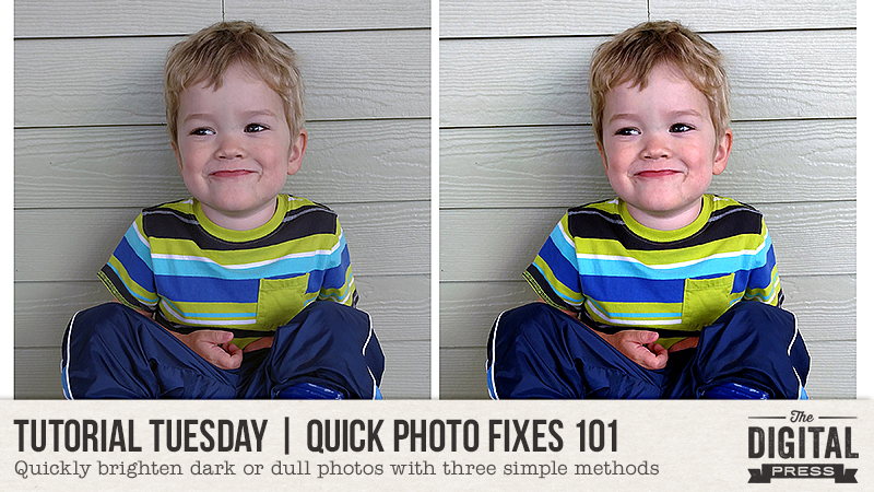
1. BRIGHTNESS and CONTRAST

The quickest and easiest method is to play with the Brightness and Contrast.  Granted, this won’t always do the trick, but it is a good place to start if you are new to photo editing or get overwhelmed in PS or PSE when playing around with photos.  It is pretty quick and simple, but it will still make a lovely difference in your photo.

Take this photo for example.

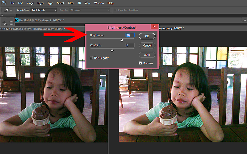
I took this photo of my daughter in a little shop outside a Thai village up in the mountains somewhere.  It was the middle of the day, very hot, very bright outside, but there was no lighting inside the shop except what came through the windows. That made the shop nice and cool, but it also meant that my photos ended up pretty dark.

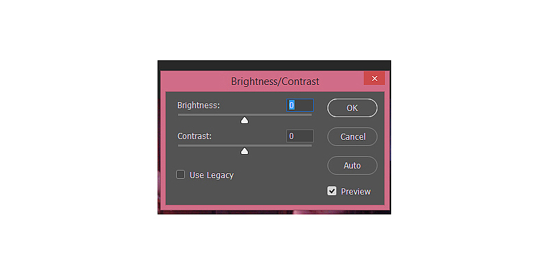
To correct this, I opened up the brightness/contrast control panel.  You can find it under Image>Ajustments>Brightness/Contrast.

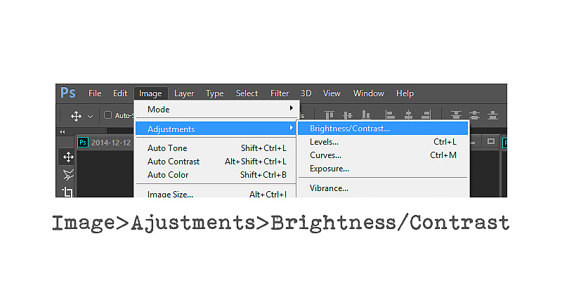
That will open up this little box with sliders for both brightness and contrast.

I brightened my image just enough to bring her face to the right skin tone and leave behind that grey tinge.

Then I added some contrast to bump the shadows back up and bring some pop to the photo.

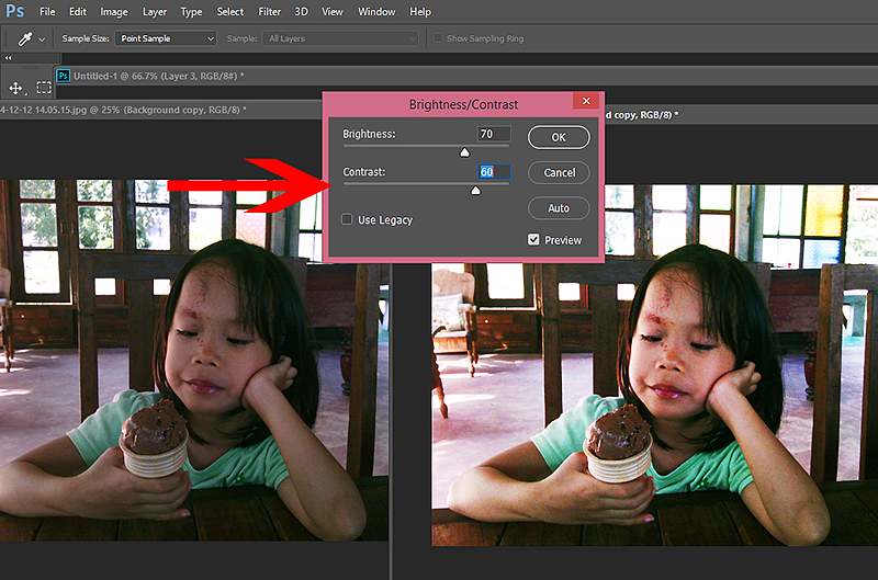
You will notice that this washed out the background a bit – after all there is a LOT of bright sunshine poring in from those windows.  In this case, I don’t really care, because the background was not so important to this photo, but there are techniques that allow you to adjust for that.  We will cover those at a later date.

Here is a side by side of the original and final photo.

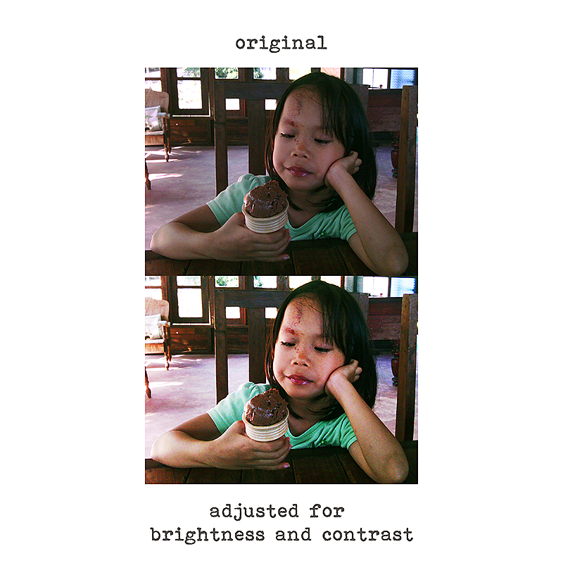
The whole process took less than a minute, and now I can plop this photo into a page.  The photo is not that great to begin with, a bit grainy because my phone was an older model, but the final product has much more appeal to me than the original photo.
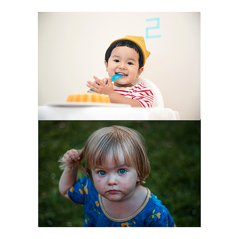
2. ADJUSTING LEVELS

A second way to brighten up dark dull photos is by playing with the Levels.  This method is my personal favorite, and although it can seem a bit scary if it is unfamiliar to you, it is really not that difficult to get the hang of.  I like adjusting the levels because it gives you more control over all sections of your image, from shadows to highlights, while allowing you to make more subtle adjustments, and yet it stays pretty simple if you want it to.

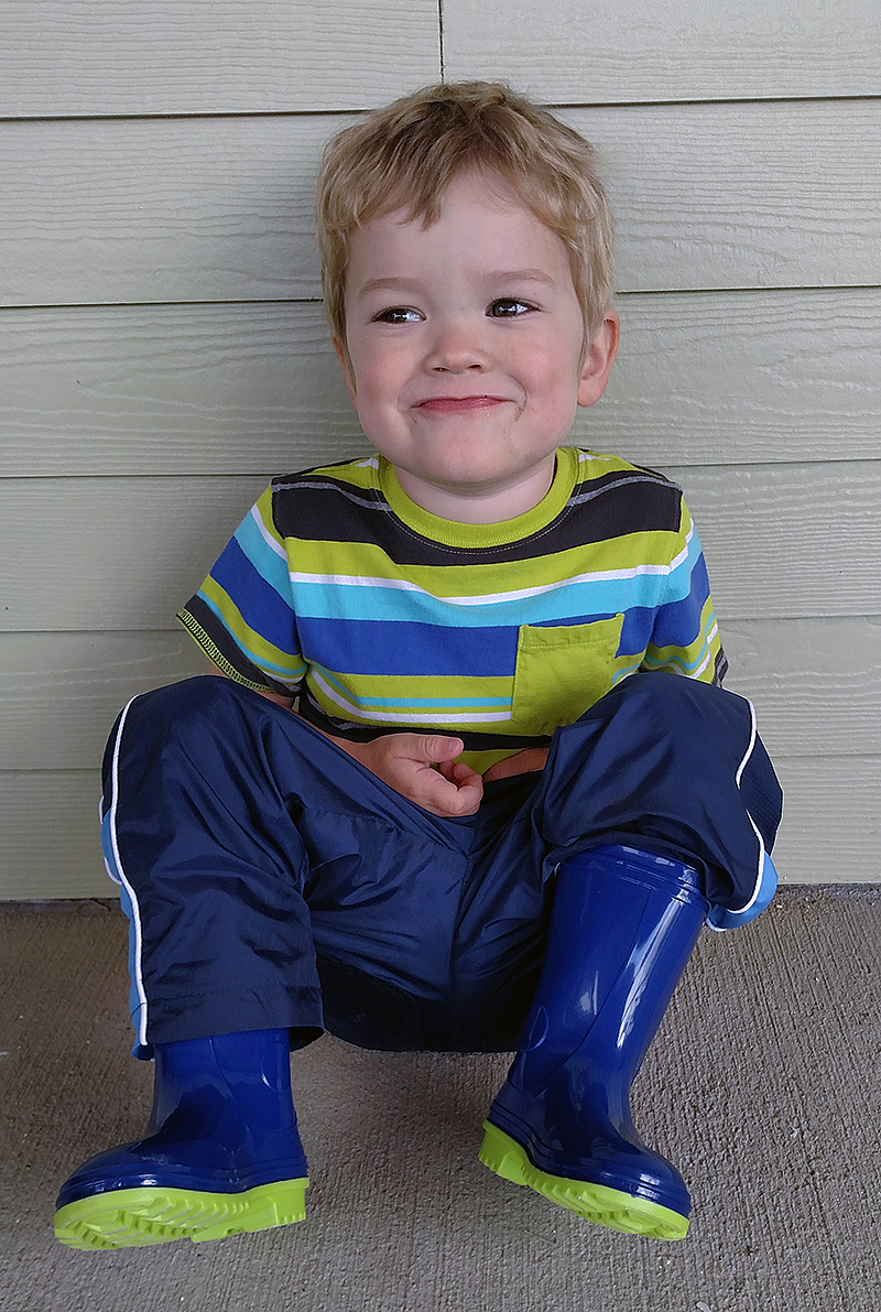
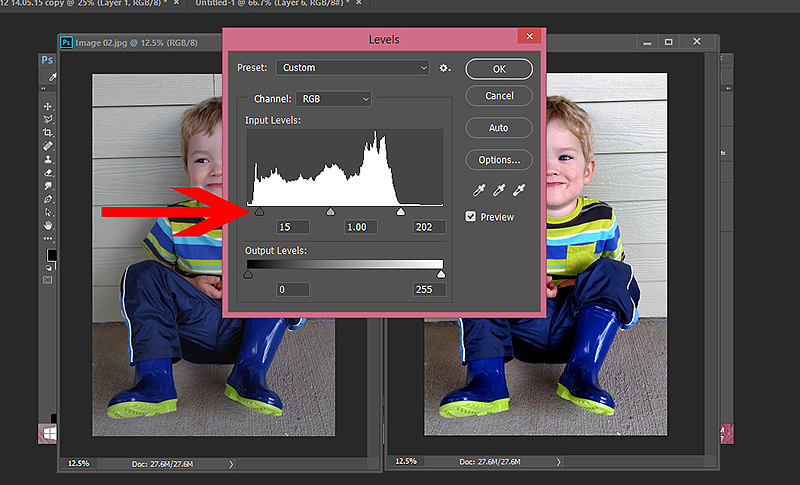
I took this photo of my youngest on our front porch during a rain storm.  While there is obviously some light, the photo still ended up dark and dull feeling.  We can easily fix that with levels.

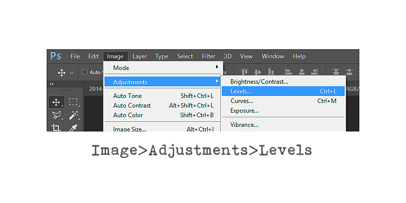
To adjust your levels go to Image>Adjustments>Levels and you will get a little box like this.

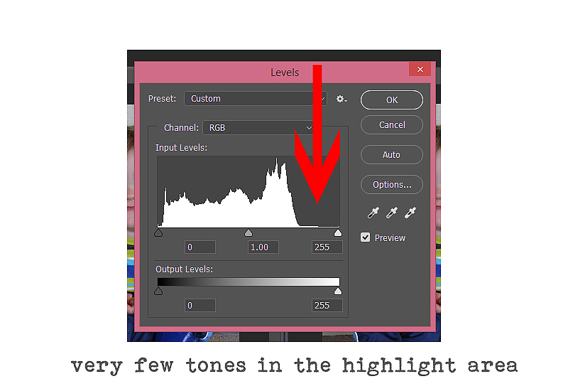
The graph that comes up that looks like a mountain range is called a histogram.  A histogram is nothing more than a graphical representation of the tonal values of your image – so basically it shows the amount of tones of a particular brightness found in your image.  Simply speaking, the blacker, or darker tones, are to your left while the whiter, or lighter tones, are to your right.  A good image will have a “mountain range” that spreads pretty evenly through all the values, stretching from left to right.  You can see from my histogram above, that this photograph is missing most of the lighter values to the farthest right.  We correct that by adjusting the sliders that you see at the bottom of the histogram.

For my photo I started with the right most slider, and pulled it towards the left, until it was right at the edge of my “mountain range”  That brightened up the lighter areas of my photo.

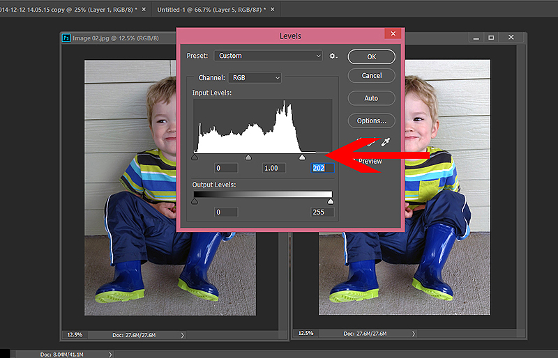
I then pulled the leftmost slider over to the right a little, to deepen the darker areas back up a touch.

You can also adjust the middle slider to correct the mid-tones if you feel the need.  I adjusted mine just a bit to bring back the facial features and little details of the photo I wanted to capture.

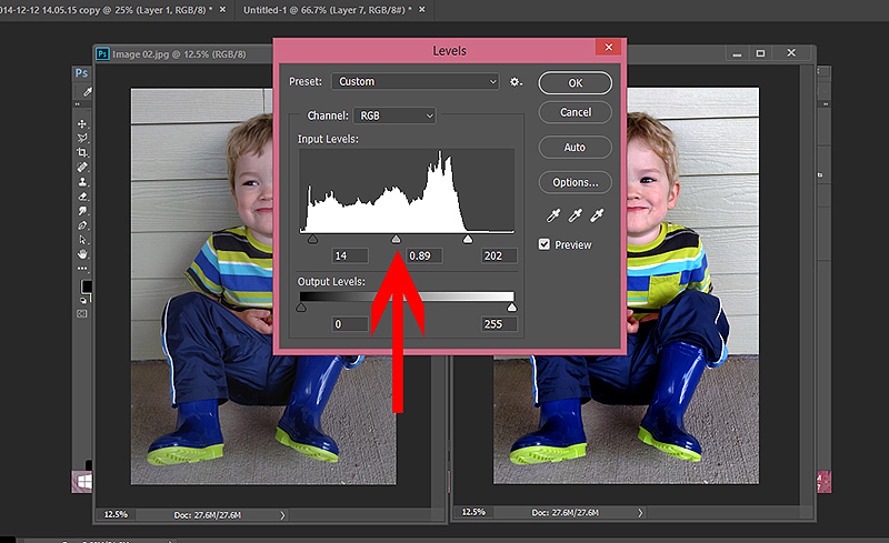
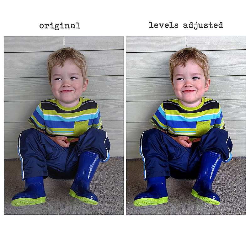
And again, in just a minute or so we have taken a dull photo up a notch to a fun, colorful capture of a playful moment. There is a lot more you can do with levels if you really want to learn, but this simple step will give you a bit more control over your photos.
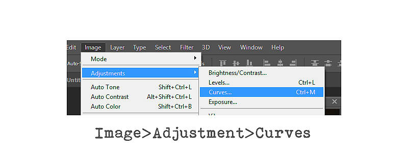
3. CURVES

Finally, the third way to quickly brighten dark/dull photos is to use Curves.  You find curves in the same place, go to Image>Adjustments>Curves.

Now, there is a whole lot that you can do with curves, and it can get complicated.  However, for the sake of today’s tutorial we are going to keep it simple.

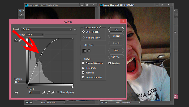
This time I am using an image that my oldest took in the car.  The selfie camera on his phone is not good at all, and it came out really dark!

So I open my image and go to adjust the curves. Again, a little graph will pop up, this time showing both your histogram, and a line running diagonally through it.

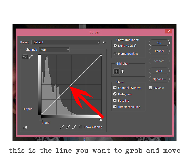
To adjust your curves for brightness, you want to make sure that the RGB path is selected in the channel drop down menu and then you are going to place your cursor on the mid-point of the line and drag it slightly higher.  You generally don’t need to move the line too far in order to change up the image, but you can move it around a bit, both up and down from the starting line, to get an idea of what happens when you do.

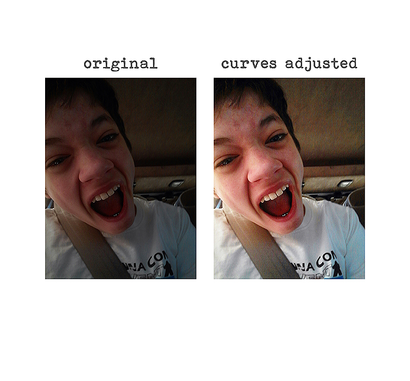
Here they are side by side, still not the best image in the world (what kind of face is that anyway ) but much better than the original don’t you think?

So, I hope that gave you a few new ideas on how to quickly brighten up dark or dull photos and really help them pop.  If you find one method does not give you the results you want on a particular photo, then try one of the other two and see if that works better.  Or, if you really want to have some fun tweaking your images, you can combine two or even all three of these techniques to really add contrast and color to your dull photos. If all of that still seems like too much work, you might want to look into some Photoshop Actions.  There are some really fun ones out there for the daring, and just plain simple ones as well for everyday fixes like this one. Some are free, and others cost a bit of money, but actions really do make photo edits quick and easy.  I use actions for a lot of my photo helps, so feel free to ask for recommendations if you don’t know where to look.

Thanks so much for following along with me, and have fun making those everyday photos just a bit more appealing!


ErinErin is an artsy crafty kind of girl who is currently dabbling in far too many things, but is working hard to enjoy every moment of it, while avoiding the rain, which is difficult due to living in the land of many rains.  She is slowly learning to use her smart phone to capture all the fun little bits of life that would otherwise go unremembered in the busy,craziness that is raising a family!

Hybrid How-To | Paper Pouches

Hello, everyone! Kate here to show you how to create these fun paper pouches — just in time for Easter!

Supplies

  • Digital kit of your choice (I used It’s a Spring Thing, found in the Juno Designs shop here at TDP)
  • Scissors or a straight cutter
  • Adhesive (for this project, I prefer glue dot strips OR hot glue)
  • Sewing Machine

Instructions

1. Print your chosen digital papers and cut into rectangles. Mine are 4″x5″ and 3″x5″…

2. Add the adhesive of your choice to the short edge of the rectangle and roll the paper up, adhering to the other short edge. You’re basically making a bunch of paper tubes.

3. Pinch one open end of the tube together and sew along the edge. Fill with candy, but don’t overfill or you will have trouble getting the other side to close. Once it’s filled, pinch the other end together — in the opposite direction (see below) — and sew along the edge…

And that’s all there is to it! I like to display these in a glass bowl on the coffee table, but they would also make an awesome edition to an Easter basket.

Want to give this a try (and earn challenge points toward the March 2017 challenges here at The Digital Press)? Come check out our monthly hybrid challenge information in the forum HERE.


Kate About the Author  Kate is on the hybrid team here at The Digital Press. She lives on the Utah/Colorado border with her husband, 5 kids, 10 chickens, and a dog named Gracie. She’s a city-born girl who found she’s really a country girl at heart. She can be found outside, barefoot, and probably in her garden.

Tutorial Tuesday | Quick & Easy Photo Collage in Lightroom

I love creating pocket pages, and I just recently discovered that I could quickly and easily create photo collages in Lightroom to use on my layouts. It’s a fantastic time-saver, and I’m here today to show you how to do it, too!

First, I collect all the papers and photos that I want to use in my collage, and place them in a single folder on my computer’s desktop.

Next, I import all these files into Lightroom. For my example, I chose to only use patterned paper… but you could use journal cards, too!

Next, I went to the Print Panel. You can see that I have a bunch of pre-made templates (the best thing is that I found them free on the web, but you can also create your own)! These templates can be edited to fit your needs or you can create your own!

In the Print Job drop-down area, input the dimensions you like. In this example, I chose 9″ x 8″ for my size. In the Print To field, make sure it says JPEG file and that the file resolution is set to 300ppi.

In the Cells drop-down area, I edited one of the sizes in the Add to Package area to 4″ x 3″ (the size of most journaling cards).

Then I added six 4″ x 3″ boxes to my photo collage by continually clicking on the 4″ x 3″…

Next, I added the photos and paper I wanted to use simply by clicking and dragging the photos and paper onto the collage…

And finally, here is a look at my finished photo collage.

I clicked on Print to File in the lower right hand corner and saved my collage…

Then, I opened up my collage image in Photoshop to complete my Pocket Page with some embellishments/etc…

[ products used –My Garden elements, papers, and extra papers by Meagan’s Creations ]

And that’s it! It’s so simple… and such a great time-saver. 🙂


Krista


About the Author  Krista Lund is a mom of 3, married to her high school sweetheart and living in the San Francisco Bay Area. Some of her favorite things are brownies, chips ‘n’ dip, taking pictures, and documenting her family’s story.

Feature Friday | Juno Designs

Hello, everyone, and welcome to another edition of our Feature Friday series here on The Digital Press blog!

This week, I’m very happy to be highlighting the amazingly talented Jill of Juno Designs. This is Jill’s second feature here on the blog (you can find her first feature from September 2016 HERE)… and whereas last year we used our feature series to help you get to know some fun trivia about your favorite designers — this year, we’re going to use our designer feature series to give you a little peek into our designers’ creative spaces and more insight into their creative processes.

Jill lives in the Netherlands with her boyfriend and their 2 pet rabbits. About her job as a designer, she says, “I feel very lucky to spend my time doing what I love
most. If I’m not designing, I like to work on my Project Life album or the occasional 12×12 layout. I also enjoy being outside, going for walks, or geocaching if the weather allows it. But since it rains more often than not here in Holland, I love watching Netflix and reading, as well.”

Here’s a look at Jill’s creative space, where she works her design magic:…

Here’s what she says about her workspace: “At the moment, my workspace isn’t anything special. I recently moved in with my boyfriend and we don’t have a spare room for my office yet, so I have a desk in the corner of the living room. We are planning to move house in the near future, so I’m keeping my fingers crossed for extra space. But I like my little corner of the room. I love my cute little pen holder and I always have a few bowls filled with labels, die cuts and wood veneers on my desk. I feel like it helps keep me inspired and reminds me to keep up with my Project Life album as well (which can be a problem sometimes LOL).”

What a beautiful space! And did you see that adorable owl pen holder? Could it be any cuter?

We asked Jill to provide us with a Top 5 List that is representative of her at this point in her life… and she chose to share 5 things she currently loves.

Jill’s Top 5 “Things I Currently Love”…

  1. Project Life. I fell off the wagon last year, but I’m determined to finish an album for this year.
  2. Binge-watching Netflix. My boyfriend and I are currently watching Breaking Bad.
  3. Anything Copper and/or Rose Gold. Jewelry or homeware… I want it all! LOL
  4. Tea. I drink a lot of tea, and mint tea is my favorite.
  5. Books. I’ve always loved books. Buying, collecting, and reading them.

I don’t know about you, but I can sooooo relate to her choices (especially #2 and #5)!

Jill has an amazing, realistic, and paper-like design style. She uses bright colors, gold, and glitter like nobody else… and even though her kits are often themed, they are super versatile and can be used for any type of page!

Here are just a few of my favorite products from the Juno Designs shop at The Digital Press…

As mentioned above, Juno Designs’ kits are super versatile and allow users to create anything they can imagine — from minimalistic layouts to pages that are full of clustery awesomeness; from traditional 12×12 pages to pocket pages; and more!

Here, you can see just a teeny tiny sampling of layouts (in many styles!) that have been created with Jill’s products…

I hope you enjoyed learning a little bit more about Jill’s workspace, her creative process, and also discovering her amazing products! And as if all of this fun info wasn’t enough… the entire Juno Designs shop will be 30% OFF throughout her feature week (the sale ends at 11:59pm ET on Thursday 3/16), including her newest releases!

Additionally, Jill has a special Free-With-Purchase offer for everyone this week! Don’t miss out on this opportunity to stock up on your favorite wish-listed products from Jill… and you can also snag her “Lucky In Love” Kit for FREE with any $10+ purchase in her shop — this week only!


ChloéAbout the author  Chloé is in charge of PR and communication for her small town by day, is a digiscrapper “by night,” and a photographer whenever the light is beautiful. She lives with her man and fur-babies in a small town of Alsace (in the northeast of France), where she loves to read, watch good TV shows (TWD being her absolute favorite), and just hang out with her friends — no matter if they are close by, online, or away in her Swiss hometown. She recently became quite obsessed with Bullet Journaling, Miracle Morning and Zero Waste.

Tutorial Tuesday | Creating Your Own Shadow Styles

Today I’m here to help teach you how to create your own shadow styles, save them to your computer, and use them again in the future. Such a time saver!

As we develop our scrapbooking craft, the tips and techniques we learn along the way help us to work faster — and processes get easier. That’s the goal, right?  When we’re itching to create, we don’t want anything standing in our way — not laundry, cooking, grocery shopping, work, or a commute. Nothing. We want to scrap. Period. 🙂 Anything we can do to speed up the process of creating, especially when the mojo is flowing, is welcomed!

With that in mind, I wanted to show you a quick and easy way to add shadows to your layouts — and also save those shadow styles for repeated use in the future. It’s easier than you might think!

When I was first exploring digital scrapbooking, shadows (and the process of shadowing things in Photoshop/etc.) used to scare me. Let’s be honest… it’s a little intimidating for a beginner! Some designers here at The Digital Press offer shadow styles for sale in the shop… with the idea being that you can install the styles on your computer, and then with a few simple clicks of the mouse, voila! Instant shadows! Super time-saver.

For myself, now that I am almost 15 years down the digital road… I find that I’ve developed my own “shadowing style” over time — it is personal to me, based on my own preferences about how things should look. The trouble is… it often takes a lot of time to customize shadows over and over. For instance — I might find myself applying a particular shadow depth for some items, a specific shade of brown (instead of the default black), a certain blending mode, and even specific changes to the opacity of the shadows. On a good week, I can scrap five pages or more… but that’s a lot of added shadow work! So the idea of being able to quickly click-and-apply my own shadow styles was very appealing.

To take a look at how this works… let’s start with an unshadowed version of a page I created for this month’s scraplift challenge (I’ve deliberately left my shadowing off this copy of the page so I can walk you through the quick steps for creating — and using — your own, personalized shadow styles)…

As you can see, with regard to what needs to be shadowed — I’ve got some large flowers and some small flowers, a piece of flair, some papers, some thick and thin string elements, and even a small crotchet piece. Each item needs its own shadow, and based on my preferences… each of these items would be treated a little differently.

Let’s take a look at the large yellow flower and start there.

Click on the “fx” button at the bottom of your Layers Palette and select Drop Shadow …or use the menus and go to Layer > Layer Style > Drop Shadow. Either one will give you a pop-up menu in which to create your shadow. As you can see, I like a large, feathered shadow for my  larger flowers (or similarly-sized elements). Oh, and in case you’d like to know, my “brown” color is #30200E.

See the difference on the yellow flower (lower-right corner) now?

Once you have the foundation of your shadow set, instead of hitting that “OK” button… click “New Style” instead. Give the style a name you’ll easily remember, and now click “OK.” How easy was that?! You’ve just created your own, personalized shadow style! Repeat this step for each of the different design elements.

But how do you actually use these styles once you’ve created them?

If you don’t see the Styles palette in your workspace, go to Windows > Styles. When this panel first opens, you might see something like this – but don’t panic! (and please don’t judge, haha! …I have a lot of styles in Photoshop!)…

You’re probably wondering how on earth are you supposed to find the styles that you just created for yourself? I’ll give you two tips that will help:

  1. You can change the “view” for the palette to something that’s much more manageable. In the upper right-hand corner of the Style box, there’s a drop-down menu button — click on that. I like “Small List” or “Large List” as my preferred viewing format as it gives me both the display icon and the text label, like Large Flower.
  2. As you create or add styles, they will be at the bottom of your list; they append each time. Scroll down.

To apply your new styles, click on the element layer to make it active, and then click on the appropriate style. See? Two clicks of the mouse and you are done! You can even select multiple layers by holding down the Shift key and then apply a single style to them all at once (which is very handy when you’ve got a lot of paper layers, or if your scrapbooking style includes a lot of clustering).

Remember the non-shadowed page that I started with (see above)? By using my own custom styles, I was able to shadow the entire layout in a matter of just minutes — seriously, minutes! (even with further customizing a shadow or two)…

[ Credits: I Can Do This | March 2017 Collaboration kit from the designers at The Digital Press ]


If you’re in a time-crunch, or you just find yourself repeating the same steps over and over again while shadowing your scrapbook pages… creating your own personalize styles might just be the short-cut you are looking for! Easy to create. Easy to use. What more could you ask for? 🙂


KatAbout the Author  Kat Hansen is a creative team member here at The Digital Press. A Director of Human Resources by day, she loves the opportunity to spend a few hours each evening being creative. Vacation memories feature pretty heavily in Kat’s scrapbooking pages, as do her son and “daughter” (of the four-legged furry kind). Kat has quite the sense of humor (she “blames” her father for this), which she incorporates into her journaling and memory-keeping.

Feature Friday | Sahin Designs

It’s Friday, and time for another Feature Friday post. I am so excited to bring you more about Elif of Sahin Designs! Elif is a 25-year old graphic designer from Turkey, and this is her second feature at TDP (you can find her first feature from July 2016 HERE)… and whereas last year we used our feature series to help you get to know some fun trivia about your favorite designers — this year, we’re using our designer feature series to give you a little peek into our designers’ creative spaces, and more insight into their creative processes.

Here is a peek at Elif’s super clean, simple, and modern creative space…

About her space, Elif says, “I love having small dishes on my desk to put my wood chips and excess label prints in. They remind me that I should take a break from the work and do some crafting! And let’s be honest, they are also very cute to look at (can’t resist wood)! I also love that I turned my desk to a white space. It really keeps me focused on what I am working on, and white brightens my soul. And I can’t do without my little “office-assistant”…the blue chimp (which was a gift from Mailchimp) adds that childish joy to my working space and indeed helps me out with a very important job: holding the charger cable. You can’t imagine how important that job is!”

We also asked Elif to share a Top 5 list with us that is representative of herself and her life right now… and she gave us a list of her Top 5 Current Favorite Things

  1. Organization“I can’t stress enough the importance of organization in my life. I am a multi-focused person that I love to work on handful of things. The negative side of having different interests all at the same time is not having the time to fully complete one of these works. And it’s a real challenge for me to keep focused and get the job done! On top of my design life I have an MS degree to complete, which makes everything complicated. So organization is the key to do all these things together and trying to improve my organization skills is my number one priority at this time.”
  2. Breaking the habits — “When you love your job, there is no force on earth that can keep you from doing it! I love my job and I’m a workaholic. Can you blame me? Designing was my dream job, but I know it has to have limits. So breaking the bad habits — like over-working myself — is one of the things I am working on. In this breaking-the-bad-habits list there is also drinking water, exercising regularly, and giving myself some “me” time.”
  3. White-Gold“My latest and greatest favorite color combination of all time!”
  4. Illustration & Calligraphy“These are the things I try to develop my skills about at the moment, and I am crazy about both.”
  5. Family“This year was a tough one for my family; health problems, unexpected events, promises and future plans… all made us closer and united more than ever before and I am grateful for the improved relations & connections in the family.”


Overall, Elif defines herself as a graphic designer because has interests in every aspect of design, not solely scrapbooking. Her design style is minimal and modern with a tiny touch of eclecticism. She believes that quality of a finished product is more important than the quantity, and when she designs scrapbook goodies she sticks to the basics and focuses on how each collection could be used to make an outstanding scrapbook layout. Her products are versatile and easily lend themselves to digital layouts or hybrid projects, and she is especially adept at putting together interesting color palettes.

Here are some of my favorite products by Sahin Designs (it was hard to choose just a few!)…

And here is a look at just a few stunning pages that use Elif’s gorgeous products…

I hope you’ve enjoyed learning more about Elif Sahin. To celebrate her week as our Featured Designer at the digital press, the entire Sahin Designs store will be 30% OFF all week long (the sale will end at 11:59 ET on Thursday 3/9).

Additionally, Elif has a special Free-with-Purchase offer for everyone this week! Don’t miss out on this opportunity to stock up on your favorite products from Sahin Designs… and you can snag her gorgeous “Sunday Morning” Kit for FREE with any $10+ purchase — this week only!


Headshots Hartford0828-Edit

About the Author  Celeste has been married to her college sweetheart, Terry, for 20 years. They have  two teenage boys, Adam and Sam. They keep her busy chauffeuring them to and from clubs, scouts, band practices, and other activities. Celeste works full-time in the Insurance industry, and her days are filled with numbers… so she fills her evenings with patterned paper and design! Celeste is a self-proclaimed “crazy cat lady.” She lives with two male brown tabbys, Milo & Gibby, and a gorgeous, long-haired calico named Girlie. In her spare time, she reads on average 50 novels a year and watches far too much junk on television.

Save

Save

Save

Save

Save

Save

Save

Save

Save