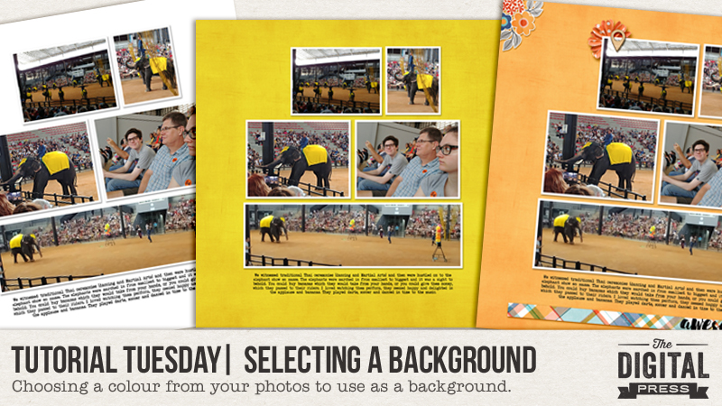
Hello there, and welcome to another edition of our Tutorial Tuesday series here on The Digital Press blog! Today, we’ll be talking about the process of selecting the “perfect background” when creating a digital layout.
When I started paper scrapbooking, I always needed help in choosing papers to match my photos or make them really pop. Our goal as scrapbookers and memory-keepers is to make the photos the center of attention and to have the background bring out the best of them, without competing with them. Doing this when you have a mix of strong colors within your photos, however, is not always easy. Sure… you can change the photos to black and white — but if you don’t want to do that, then this tutorial is for you!
I start out my layouts with the photos sized and shadowed as I want them, and the journaling written… and that way, I know the most important items are already taken care of…
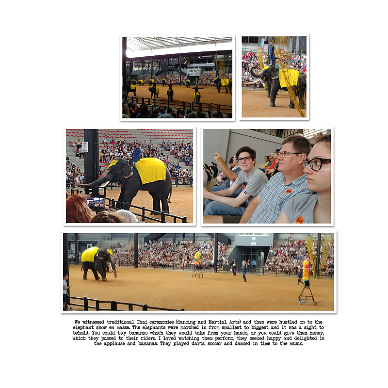 I don’t always add a title. This layout is one of a series that details our travels to Asia last December. Next, I choose a kit or collection that I want to use (I find that TDP’s store collabs are often my go-to for a fabulous mix of goodies in my desired colour palette). As I began this layout, I found that I loved Fresh Air by The Digital Press Designers.
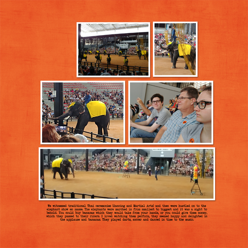
When thinking about a background, I started with the dark grey — thinking that it would draw attention to the elephants…
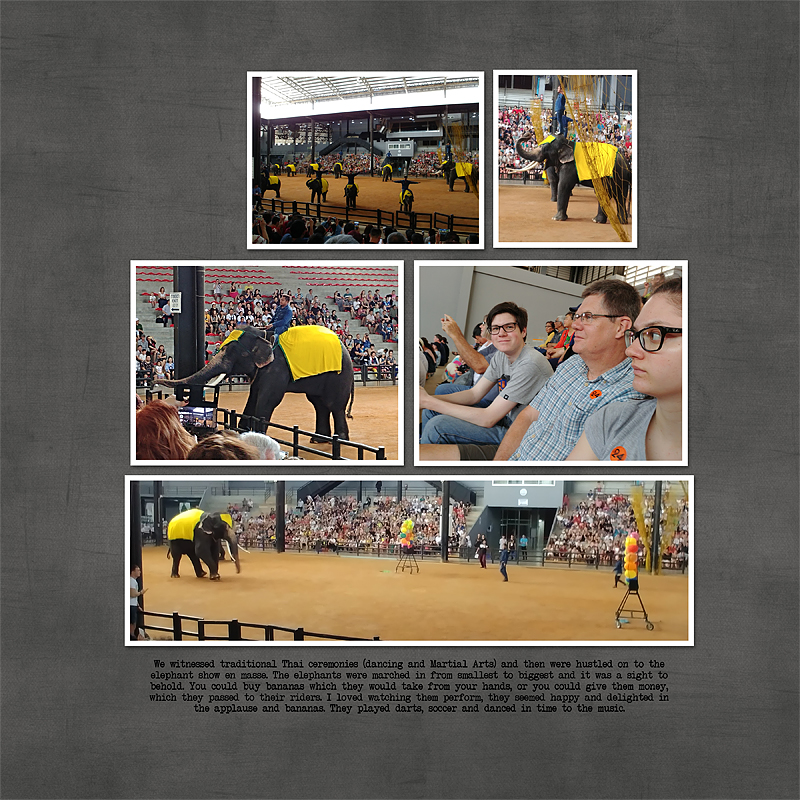
And while I thought that this color did work, I also thought that the bright yellow of the cloth on the elephants became a bit of an eye sore (contrasting too much for my liking).
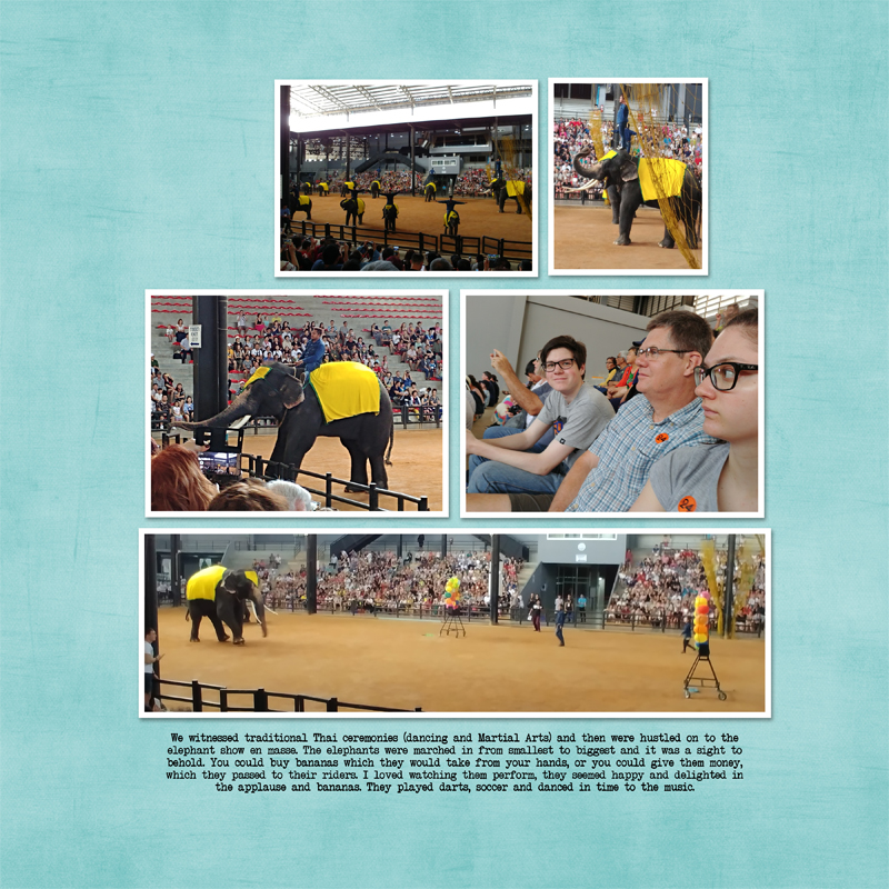
Therefore, next I tried the light blue of my hubby’s shirt, but still was not completely thrilled with the result…
Next, I tried the bright orange background — which was bold and not really my style. It did draw attention to the “24” stickers we were each wearing, and to some of the balloons, but still not quite right…
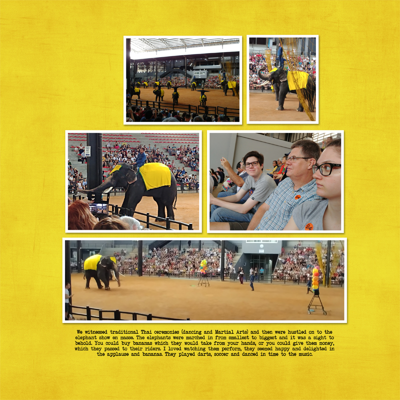
Next, I tried to create my own custom background color — by adding a hue and saturation layer and playing around with that a little bit, while trying to re-create the bright yellow of the elephant’s cloth…
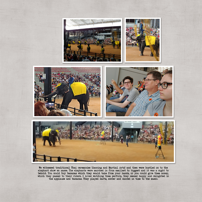
The yellow still didn’t feel right… so I tried out the light grey solid paper as a background. I found that it was easier on the eyes and drew attention to the light grey of my son’s and my daughter’s clothing (and to the stands in the background of the photos).
I decided that it worked, and so I added a paper strip from the kit that contained all of the colours that were present in the photos, serving to tie everything together and give a cohesive feel to the layout. I also added some coordinating embellishments…
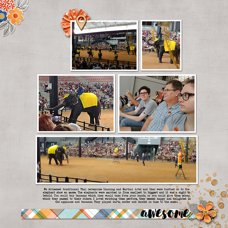
To be honest, at this stage I was happy with it and saved it, walked away, and made tea. But when I came back I was inspired to try one last background paper colour — one that felt warmer, as it was hot and humid in Asia.
My new choice was a warm yellow/orange color that resembled the sand found in the photos…
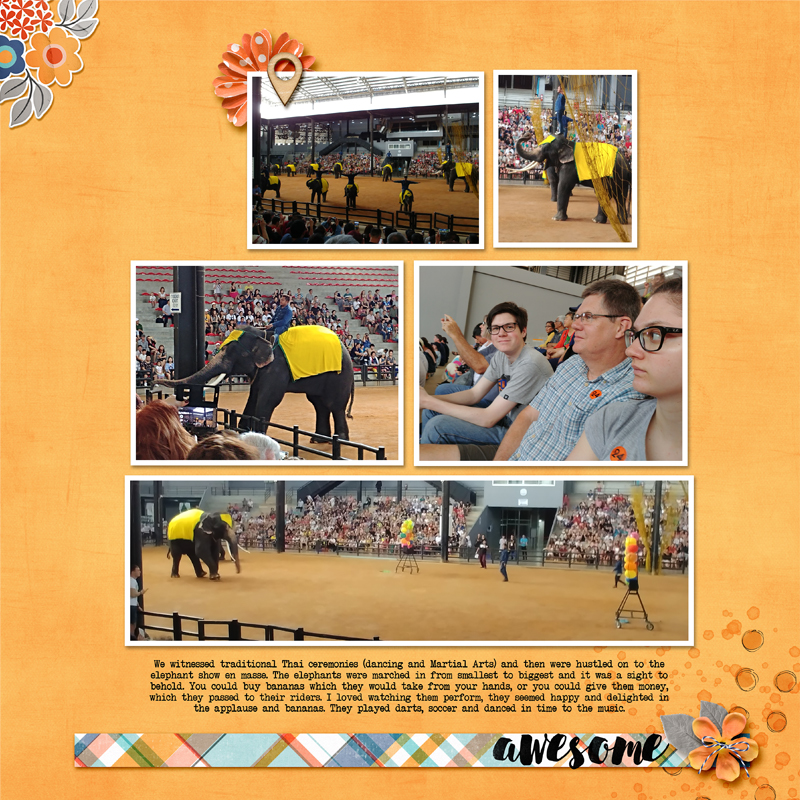
As soon as I saw it, I knew that this last option was the correct one for me!
As you can see, choosing a background colour is a personal choice… and is one that often requires/involves some trial-and-error to achieve a result. I find that it’s helpful to see all of the different options in order to choose the one that works best for your page. And that’s the beauty of digital scrapbooking — you can try out any number of different background color choices without any hassle!
In general, though, my rule of thumb is to choose a background paper that coordinates with one of the background colours from my photos, and/or a color found in the focal photo. I definitely encourage you to play around with different color options — especially if you’re working with a kit that contains solid papers in all of the colors of the collection (in which case, the designer has done all of the hard work for you!). Once you choose your favorite main/background color… you can add a small-scale patterned paper or a striped paper or a plaid paper strip, etc. — something to tie the colors together and lend cohesion to the layout.
Have fun and fill your albums or photobooks with layouts that make your heart sing when you leaf through them!

About the author Stefanie is a member of The Digital Press creative team and a stay at home mother of three older children living in Cape Town, South Africa with her hubby of 30 years, two of their three children and 4 Siamese cats. She loves photography, traveling and digital scrapbooking, documenting the good and the ordinary everyday.