Hello, and welcome to another edition of our Tutorial Tuesday series here on The Digital Press blog! Today, I am here to share information with you about creating diagonal flow when you are working on a scrapbook page.
In one of my previous tutorials here on the blog — Creating a Focal Point — I explained how to grab the viewer’s attention with an obvious focal point, and then to use visual hierarchy to guide the eye throughout a layout. In today’s tutorial, I will explain how to create a visual emphasis going from top left to bottom right (the way Westerners read)… or alternatively, going from top right to bottom left for variety.
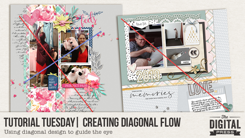
Here’s a quick look at what I mean…
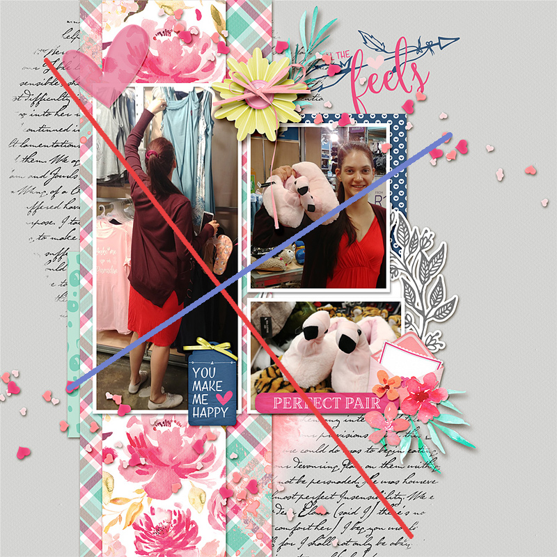
In that first example, the text stamp is the foundational element that I duplicated in order to place it on either side of the band of papers (at the top left and lower right corners). I would usually duplicate and horizontally flip an element to make it the perfect opposite; however, this would be immediately visible with text (as the text would be backwards on one side) and so that does not work. 🙂
The act of duplicating the stamp forms a frame, of sorts, bracketing the design so that the eye naturally joins these two halves together. This draws the eye from top left to bottom right.
As an extra layer, I have added the vellum heart (top left) and the small word art cluster (lower right) along the same diagonal line. Then, for fun, I have two heart scatters, but I placed them on the opposite (blue) line. A touch of tension is always a great idea: something that makes one look again, to see if anything is different or out of line. This re-enforces the diagonal.
Here’s another example…
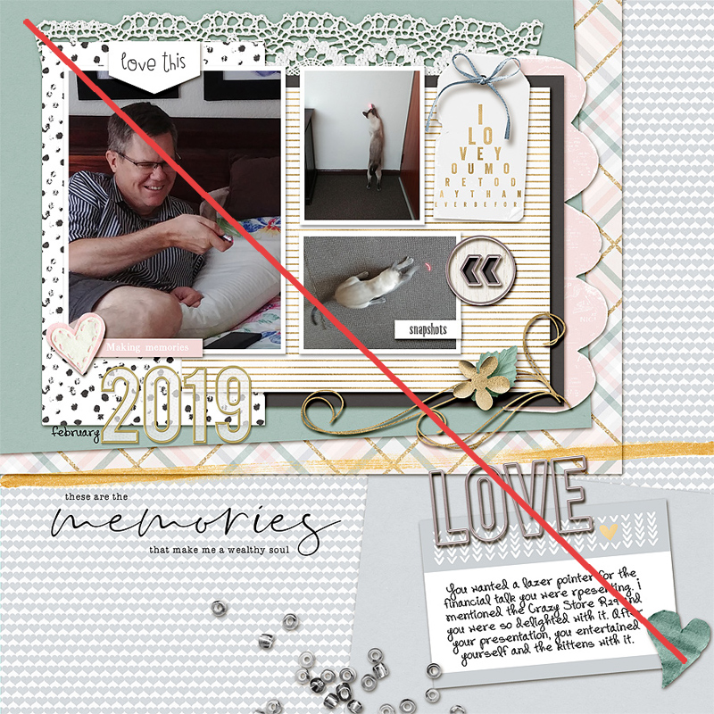
In the second example, I used paper blocks and placed them at kitty corners to create the diagonal line (again, top left to lower right). This accentuates the angle at which my hubby is pointing the laser light, as well; when the subject of a photo is looking in a certain direction, the eye naturally follows the line to see what they are looking at. I tilted the title and journaling card slightly to fall on the diagonal, but not perfectly in line — again, to add a bit of tension, once again.
These are just a couple of ideas and examples for creating movement within a layout (especially one that uses a multiple photos), in order to help the viewer navigate their gaze through or across the page. Give it a try! I think you’ll find that creating this sort of flow within your next scrapbooking layout is easy and helpful!
About the author Stefanie is a member of The Digital Press creative team and a stay at home mother of three older children living in Cape Town, South Africa with her hubby of 30 years, one of their three children, and 3 Siamese cats. She loves photography, traveling, and digital scrapbooking — documenting the good and the ordinary everyday.
Some good ideas. Thanks, Stephanie.