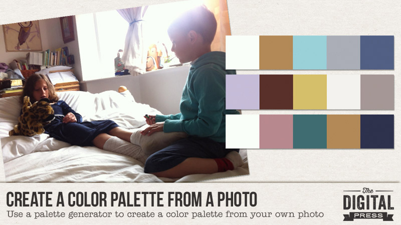
Every now and then, I come across a photo that I want to scrap… but find that it is hard to work with because it has lots of colors in it. Or maybe it does not have many colors in it; or maybe even colors I don’t really want to focus on (I am not much of an orange and brown person!). In these tricky instances, I don’t always know what to do with it! There is nothing that kills my scrapping mojo faster. To solve this problem, I have found a way to create customizable color palettes from my photos — which helps me determine the color palette I should use — which, in turn, helps me find a kit to use!
I know there are a few programs/websites around that can do this (if you google “color palette generator” you will find lots of options), but the one I find easiest to use is Adobe Color. Thus, it’s the one I will focus on for the purposes of this tutorial. If you want to try using it too, here is my process…
Adobe Color’s homepage looks like this (see the image that follows), and you’ll begin by using the little camera icon that you’ll find in the upper-right-hand corner…
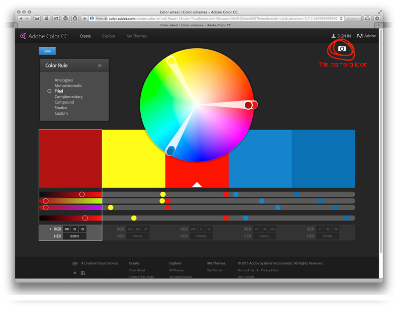
You will either (1) click on that camera icon, and then load your photo, or (2) drag your photo from your computer onto that icon.
Next, the program will give you a color palette using the colors from your photo, like this…
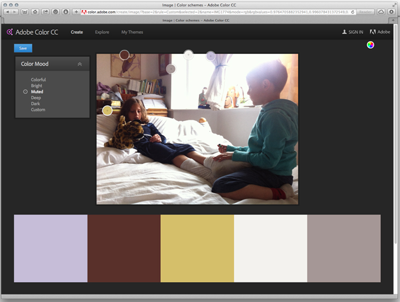
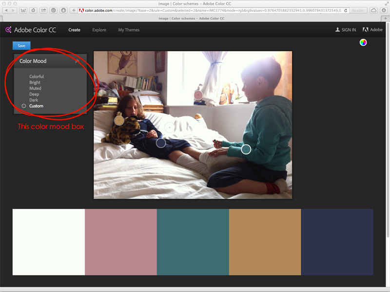
Now, if you aren’t 100% happy with the first palette it generates… you can choose from the options on the left — “Color Mood” — and play around until you like one of those options better. Alternatively, you can even customize any of the palettes yourself by moving the little targets around on your photo, until you get something you like, as I’ve done here…
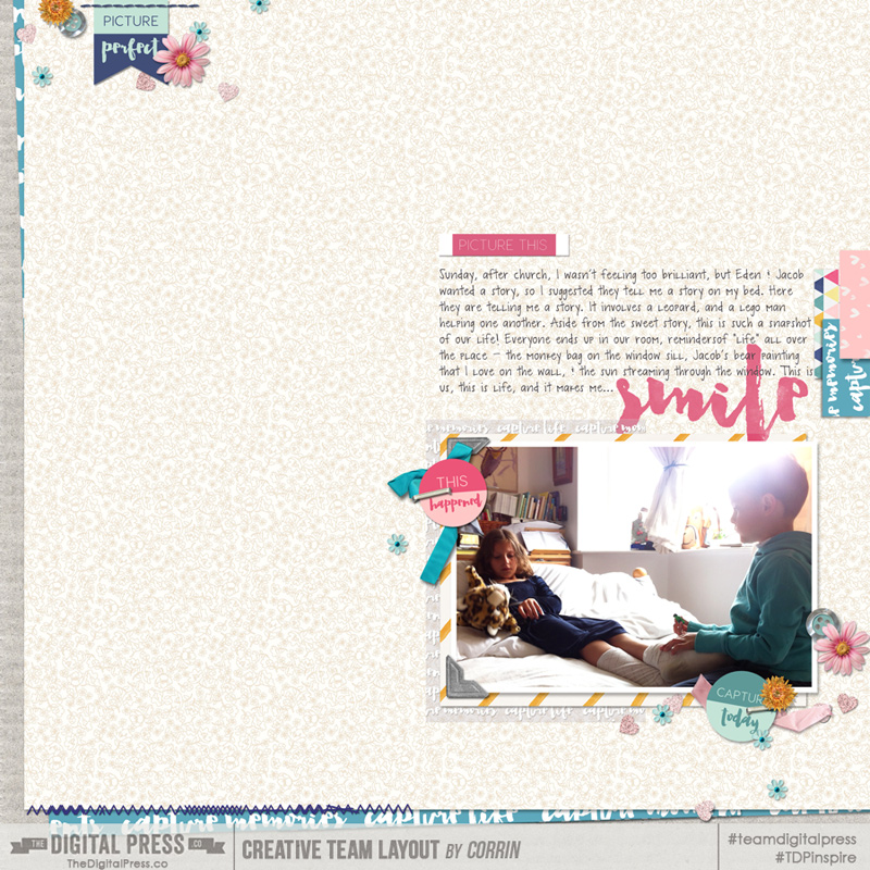
Once you have a palette you are happy with, all you have to do is choose a digital kit that uses those colors… and off you go! I chose to use the Capture | Kit by Little Lamm & Co., found here at The Digital Press, for my page (as well as a template from MEG Designs’ H2O Templates set). Here’s a look at my finished page…
I find this process to be infinitely helpful when I am feeling “stuck” while scrapping. For instance, I wouldn’t have thought to bring out the pink in the photo, but once the palette generater showed me that it was there… I really liked the idea of using that color as an accent!
I hope this simply tip will help you next time you are stuck, or at least it might be something new and fun for you to try!
 About the Author Corrin is on the creative team here at The Digital Press. She is a fan of the Big Bang Theory and a lover of cozy pajamas. She lives in the currently-sunny but breezy South of England with her husband and 4 crazy kids, who regularly discover & plunder her secret chocolate stashes! She is still trying to get the house straight after moving 2 years ago. Who knows… maybe this will be the year she reaches the bottom of the laundry pile!
Didn’t knew about that program but will definitely give it a try!
Such a great tutorial. I often struggle with colour combinations so I’ll definitely be checking out Adobe Color! Thanks so much!