Hello everyone, and welcome to another edition of Tutorial Tuesday! I’m here today to share some tips on combining patterned papers on your layouts in visually pleasing ways.
Patterned paper is one of my all-time favorite things… but I avoided using much of it for a long time because I was intimidated by the idea of “how to use it correctly.” I tended to use just one pattern per layout in order to not have to worry about the patterns clashing, or about matching more than one pattern, etc. The fact is that combining patterned paper on one layout can be a challenge! Over the years, though, I’ve become more and more comfortable combining patterned papers… so I want to share a few tips that have helped me to be more comfortable using patterned papers together. Before we get to the tips, I want to remind you to have FUN with patterned paper… it is all about experimenting and trying different things!
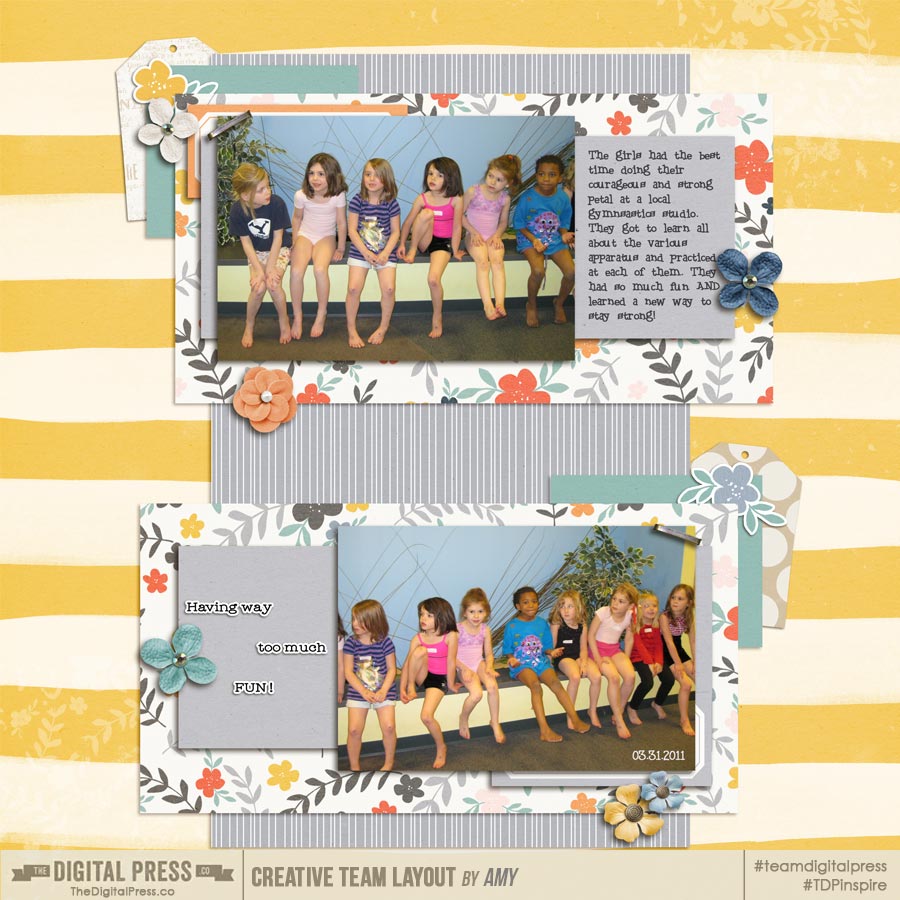
Tip #1: Keep It Simple
Try to remember that a designer designs the patterned papers together for a given kit because they go well together. Use that to your advantage and use the papers from one kit together since they are likely to go together easily. Using patterns from different kits can be difficult since lining up color schemes and patterns can be challenging. This layout is one that I created using Dawn by Designs’ Globe Trotter kit. The patterned papers in this kit go so well together – each one complements the others. The papers that Dawn by Designs created were perfectly suited to one another and made this page all the more special!
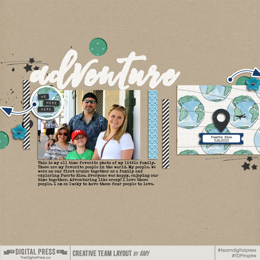
Tip #2: Focus on Neutrals
I have found that using one pattern as a neutral to ground the other patterned papers is a great way to balance the patterns on your page. Your neutral pattern can be any pattern that you feel like will help the other patterns come together cohesively. I’d recommend using a large pattern that incorporates most of the colors you plan to use so it can act as an anchor for the rest of the patterns. Another option is to choose a pattern that contains the more neutral colors of the overall color palette which allows you to add other more colorful patterns without your page looking busy. For this layout, I chose a large map pattern that uses the neutral colors of the overall palette in order to add the more colorful patterns throughout the page. That map pattern really anchored the page and kept the page cohesive.
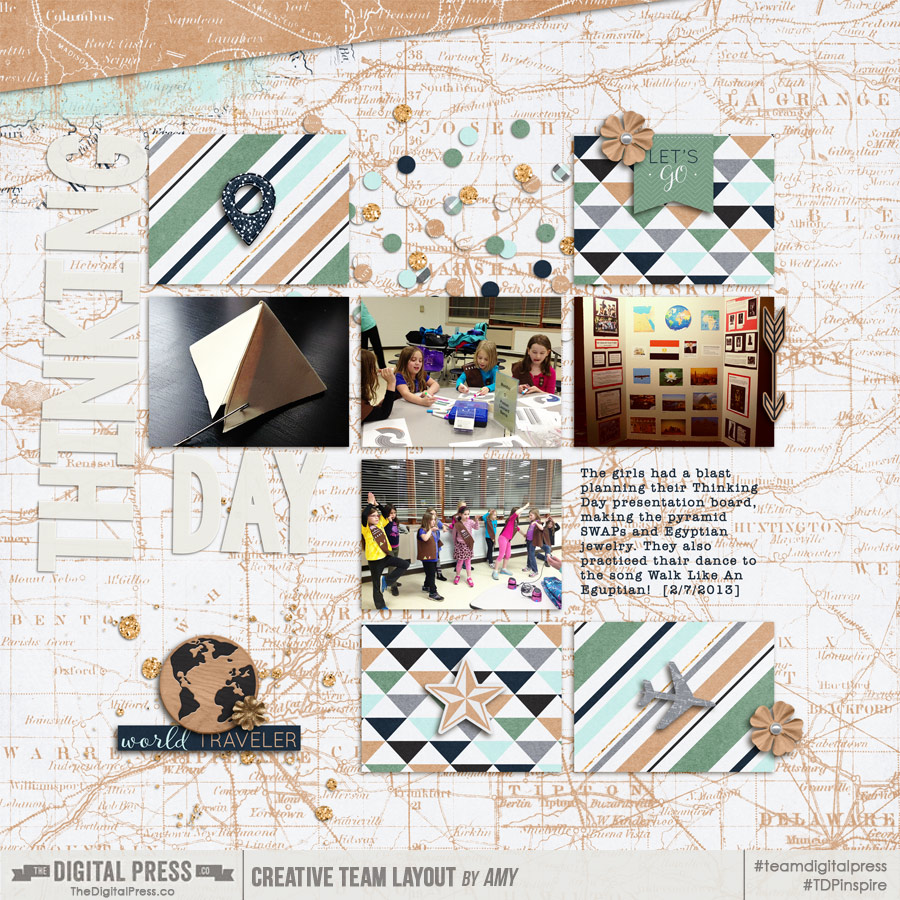
Tip #3: Choose a star!
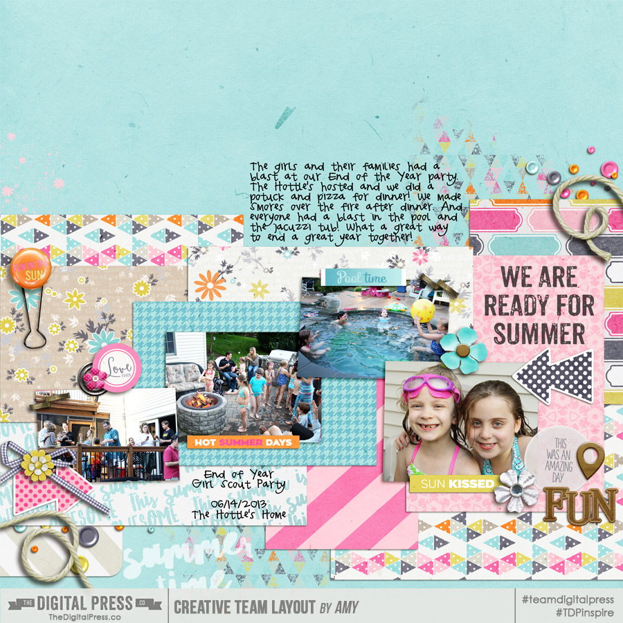
Choose one bold pattern to be the star of your page and then add a couple of medium patterns to support the main bold pattern. You can then add subtle patterns or solids to round off your page and bring it all together. For this page, I chose the very bold yellow stripe to be the focus of the page but added the medium patterns (grey stripe, flower pattern) which came together nicely with the bold yellow stripe. Lastly, I added a few smaller bits of solid colors to bring the various patterns together.
Tip #4 – Just Go For It!
I suggest you also give yourself the freedom to just go for it! Use a solid for the base of your page but layer a variety of patterns in different sizes across the page. In my opinion, contrast is key with this method. If the patterns or colors are too similar or of the same intensity, the page won’t look as cohesive as it could. While creating this page, I decided to use a blue solid as my base but then layer a variety of patterns over top of the solid. I made sure to put the patterns down in a way that really added as much contrast as possible which made the patterns work better together than if I’d layered them differently.
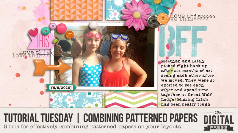
Tip #5 – Use Simple Shapes
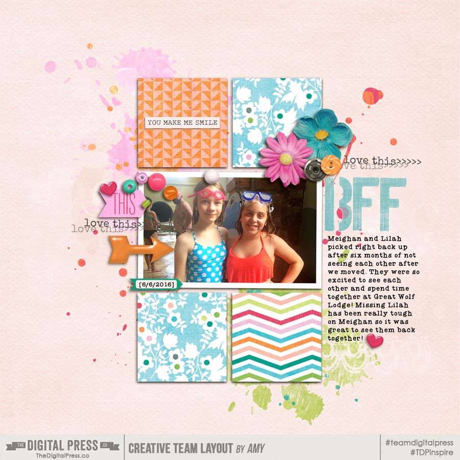
Using simple shapes with patterned papers will help frame your page and keep it from looking busy. The simple shape such as a square, circle or a rectangle will help balance the boldness of the patterns and make your page look a lot more cohesive. With this page, I decided to frame my photo with squares of patterned papers in order to keep the page from looking off balance. The simple shapes of bold patterns can really ground your page and make it visually pleasing to the eye.
I really hope that these five tips will help you to increase your comfort with using patterned papers together on your scrapbook projects. Don’t shy away from the bold patterns … in fact, embrace the boldness and showcase them by using these tips! I think part of the joy of creating scrapbook projects is getting to use all of the patterned papers that I love, regardless of how bold they are! Trying some of these approaches to combining patterned papers will give you more options for using lots of different patterned papers on one project without feeling like it looks like a crazy mess! The most important thing to remember is that using patterns is supposed to be fun. Give it a try and see what you can come up with! I bet that you’ll find it to be much easier than you expected! Good luck!

About the Author Amy lives in Richmond, Virginia with her husband of 17 years and their 12 year old boy/girl twins. Their 21-year-old daughter has recently begun graduate school at Clemson! Amy has been scrapbooking since the early 1990s but discovered digital scrapbooking in 2005 when her twins were born and has primarily scrapped digitally since that time. She is passionate about telling her family’s stories and documenting their life together! Amy is a huge reader (mostly literary fiction), and is a pop culture junkie! She also LOVES all things beauty & makeup!