Category: Tutorials

Tutorial Tuesday | Layers Panel Options in Photoshop

Layers Panel Options

I always play around with the settings in Photoshop and sometimes you find something that really makes your life easier when it comes to scrapping. This time I want to show you a little trick that will change the look of your Layers in the Layers Panel. When you scrap, you end up with a lot of Layers and I always had a difficult time finding out which element/papers was on which Layer. You can see what I mean….

Layers Panel Options

As you can see, you can’t make any sense of it. I decided to see if I could change those settings and I ended up opening the Panel Options. You can find the Panel Options by clicking on the small menu icon in the top right corner of the Layers Panel.

Layers Panel Options

Layers Panel Options

I was still using the standard settings that are used after you install Photoshop, but as you can see, you can change the look of the Layers Panel so you have a better understanding of all the Layers in your layout (are you still with me ?? ;)).

Layers Panel Options

I wanted to see the elements/papers, etc. in my Layers Panel so I chose the largest size of icons, but you can chose any of the sizes that suit you more. The other thing you have to do is also choose the option ‘layer bounds’. This will make the icons visible…..if you don’t change this setting, you will not see the icons.

Layers Panel Options

Here is what my Layers Panel looks like now…

Layers Panel Options

I love it that I can see everything and don’t have to guess which layer everything is on.

This is a very quick & easy tutorial and I hope that some of you didn’t know this yet (I just found this out myself ;)). Have fun changing the settings of your Layers Panel!


biancka

About the Author: Biancka is a creative team member here at The Digital Press. She is a stay-at-home mom (SAHM), a wife to Edwin, and mom to Jasper. She lives in the east of The Netherlands (about 30 minutes from the German border). She is addicted to scrapping, but also enjoys baking, reading books (mostly thrillers), watching her favorite TV shows, and photography.

Tutorial Tuesday | Mini Easter Baskets

EASTER BASKETS: A HYBRID RECYCLE PROJECT

Since we just celebrated the first day of Spring, I thought it fun to start it off with bright Spring colors!   One of my favorite things to do is take recycled containers and turn them into treasures.  One of my co-workers has McDonald’s oatmeal every morning.  Every time she threw the container away, I couldn’t help to think what cute little Easter baskets they would make, so I started collecting them.  I used them to make mini Easter baskets for my kiddos.

Since it’s an Easter project, I wanted to used an Easter themed kit.  When I saw this new kit, It’s a Spring Thing by Juno Designs and Wendy P Designs, I knew it would be perfect to use.

EASTER BASKETS: A HYBRID RECYCLE PROJECT

I also used the Deco Trims: Simple by Scotty Girl Designs.    I loved using the scallop for a fun edge around the top of my baskets.

EASTER BASKETS | A HYBRID RECYCLE PROJECT

I used my Silhouette Cameo to do this project, but you can easily use your favorite photo editing program and a pair of scissors.

Let’s get started!!

SUPPLY LIST

  • Recycled oatmeal containers from McDonald’s
  • White cardstock
  • Ribbon
  • Scissors
  • Glitter – optional
  • Double sided tape
  • Glue pen
  • Pop dots
  • Green Easter Grass
  • Assortment of candy

EASTER BASKETS: A HYBRID RECYCLE PROJECT

Step 1:  If using a Silhouette, open the scallop from deco trims and do a trace.  I had to trace so that I could fill the image with the papers from the kit. To do this,  open Select Trace Area, uncheck High Pass Filter and move the Threshold bar to the right until the image is completely yellow.  Next select the Trace Outer Edge option.

EASTER BASKETS: A HYBRID RECYCLE PROJECT

After the image is traced, move  it off to the side.

EASTER BASKETS: A HYBRID TUTORIAL

Now pick the paper that you want to use from the kit and fill the image.  The Fill Pattern section is where you would enlarge the print and move it around as well.

EASTER BASKETS: A HYBRID RECYCLE PROJECT

To make the band around the container, you will draw out a rectangle at least 10.5 in long x 3 in wide.  Fill that shape with the paper of your choice.  After printing, I simply used my paper trimmer to cut the band.

EASTER BASKETS: A HYBRID RECYLE PROJECTNow choose the elements that you want to embellish  your basket with. I made a name tag to put in the middle of the basket and tied off with a cute tag.  Make sure that you have the registration marks on and double check to make sure that cut lines are on in the right places.  Send through printer and then through your Silhouette machine to cut.

EASTER BASKETS: A HYBRID RECYCLE PROJECT

Step 2:  Gather pieces and start assembling.  I first wrapped the band and the scalloped trim around the container with double sided tape.  I gave dimension to my tags by cutting additional pieces with a pair of scissors and assembled with pop dots.

EASTER BASKETS: A HYBRID TUTORIAL

EASTER BASKETS: A HYBRID RECYCLE PROJECT

Final Step:  Fill with Easter grass and fill with candy…..you can eat the ones that fall out…hehehe!  (I later added a gift card to the baskets)  After filling, I wrapped with a cellophane bag and tied it off with ribbon and added the tags.

EASTER BASKETS: A HYBRID RECYCLE PROJECT

I also made some treats for my co-workers.  I made this simple tag and tied it to the little tubes that I filled with M&M’s.

EASTER BASKETS: A HYBRID RECYCLE PROJECT

I hope that everyone has enjoyed this tutorial and has a Happy Easter!!

Hugs, Tanya


About the Author  TanyaTanya is a part of the hybrid team here at The Digital Press. She has been hybrid crafting for at least 10 years now, and loves creating and sharing those creations with others. Her all-time favorite tool is her Silhouette Cameo. She has been married for 26 years and has two sons: Chris, 23 and Chance, 19. She also enjoys crocheting, photography and woodworking.


Hybrid Saturday | Tissue Decoupaged Bunny

HYBRID: Tissue Decoupaged Bunny

I am a sucker for bright colors, and Easter is one of my favorite holidays of the year! Arielle here with today’s “fun, easy, inexpensive and perfect to work on with the kiddies” project, a Tissue Decoupaged Bunny. Wouldn’t it make an awesome centerpiece for your Easter table? This technique is perfect for other decor items, such as picture frames, miscellaneous objects, old wooden chairs… you name it!

First, pick your favorite papers! I used It’s a Spring Thing | Papers by Juno Designs and Wendy P Designs. All these beautifully bright papers were perfect for my little bunny!

HYBRID: Tissue Decoupaged Bunny

Then gather your crafty supplies —

  • Thin cardstock
  • Tissue paper
  • Adhesives (I used a Xyron machine & scotch tape)
  • Scissors or paper trimmer
  • Other embellishments such as ribbon and buttons.
  • Paper mache animal (or picture frame, etc…)
  • Mod Podge (optional)
  • Paint and brushes (optional)

HYBRID: Tissue Decoupaged Bunny

Start off by cutting some tissue paper to fit your cardstock.  (I picked up some cheap tissue at the dollar store.) I cut it approximately 7.5″x 11″, then using invisible tape, I adhered it to the cardstock at the top and bottom. Be sure to put the paper into your printer so that it will print onto the tissue.

ahg_easterhybrid2

Set up a document of “swatches” to print. My swatches measured 3.5″ x 2.5″, and I was able to fit eight, centered, onto each page.

HYBRID: Tissue Decoupaged Bunny

Remove the tissue, and trim off the excess, then run it through the Xyron. If you don’t have one, use Mod Podge, or some other glue. Be careful though and use it sparingly to prevent the ink on the tissue from bleeding.

HYBRID: Tissue Decoupaged Bunny

Tear your tissue into pieces and start applying. You’ll notice I also put a thin wash of white paint on my bunny before I started. Keep tearing and sticking the tissue to your project until it’s covered. It took a little over 2 sheets to cover everything.

HYBRID: Tissue Decoupaged Bunny

To finish, you can cover it in Mod Podge or spray a fixative on it to preserve it. I also added a pink button nose and an orange ribbon around his neck! Get creative ~ you could even add paper flowers, pearls or beads.

HYBRID: Tissue Decoupaged Bunny

Add some candy and Easter grass and you’ve got a great centerpiece!

HYBRID: Tissue Decoupaged Bunny


Want to try your hand at this easy decoupage? Please come join us in The Digital Press’s forum for a fun challenge related to this tutorial! You can create fantastic decor items AND earn points doing it! Points can later be cashed-in for discount coupons to the shop at the end of the month if you participate in the challenge system at The Digital Press!


Arielle H Gordon About the author  Arielle H Gordon is a wife and mom of two crazy kiddos, ages 6 & 7. She moved around (a lot!) before returning to settle down in her hometown of Enterprise, Alabama, to marry her sweetheart and start her family. She is an avid crafter — digital, hybrid and otherwise! She LOVES Jesus, family time, camping, gardening, reading cozy mysteries, hot tea, popcorn, and anything on the BBC! This time of year, you’ll find her hoarding Cadbury Mini Eggs and Peeps, dying Easter eggs and waiting for Lent to be over so she can resume one or two of her less obnoxious vices…

Tutorial Tuesday | Playing with Color to Change the Mood of Your Photos

Playing with Color to Change the Mood of Your Photos


This tutorial is about playing with color in post-processing to change the mood of your photos… but first, I want to give you a basic idea of white balance.

White balance measures the color of the light. DSLR cameras have the ability to preset various white balances. White balance is the setting on your camera that is telling the camera what kind of light you are shooting in. It’s called white balance because the goal with this setting is to make anything white (or neutral) actually look pure white with no other color contaminating it. The color temperature is how white balance is measured — in degrees kelvin. For a lot of my shooting scenarios, Auto White Balance (AWB) is just fine. If I need minor changes, I can always do that in Photoshop’s Adobe Camera Raw (ACR) when I open my photos, so I will save the in-camera discussion for another day, and for now, we’ll just stick with AWB.

Once we have a photo, we can use color to change the mood of our photos (and/or scrapbooking layouts). We can create a fun, bright, white-light look for a summer afternoon… or a dark, moody feel for Halloween… etc.  An over-saturated, high-contrast look could give the feel of an urban travel layout, while a de-saturated portrait might draw attention to the subject’s soulful eyes. The warmth of an image can even change the feel of the season — a warm tone is perfect for the beach, while a cooler tone works best for the winter scenes.

Easy ways to change the mood of your photos with color

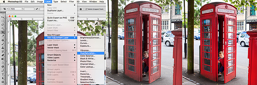
1. Increase/decrease the saturation & contrast — The degree of saturation in your photo can give a feel for a location. Urban scenes tend to have a more dramatic look, using higher saturation and contrast… while a more rural setting tends to have lower saturation & contrast. To change the saturation and contrast in Photoshop, use Layer –> New Adjustment Layer –> Hue/Saturation and/or Contrast.

Playing with Color to Change the Mood of Your Photos

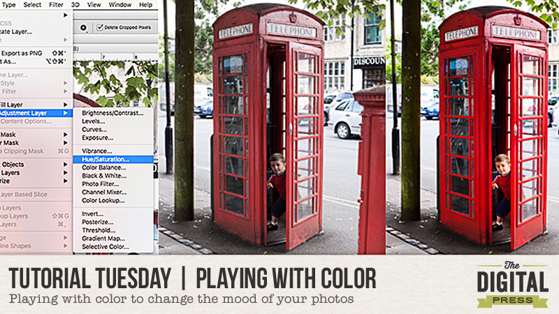
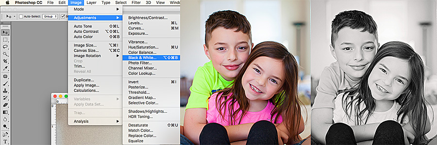
2. Turn your photo to black & white — Ted Grant once said, “when you photograph people in color, you photograph their clothes. But when you photograph people in black & white, you photograph their souls!”  Sometimes our subjects (specifically, my daughter; choose your battles, right? hee hee) are wearing mismatched outfits and/or obnoxiously bright colors… and yet, that smile gets us every time. If you want to eliminate distracting backgrounds, you can change the photos to black and white! It’s an easy way to focus on the important parts. Black & white photos can also work really well when you’re scrapbooking and you’re using elements and papers that have different colors than in your photo, but happen to have just the right sentiment for your overall layout. There are many different ways to turn a photo to black & white, so feel free to use your favorite method. For a quick and easy method, just click on Image –> Adjustments –> Black & White.

For instance, looking at the picture below — ok, really?!  Neon green and hot pink? MY EYES! Who buys them these clothes, anyway? 😉  BUT… by changing the image to black & white, we lose the distraction of the bright colors and instead see a sweet moment between brother and sister.

Playing with Color to Change the Mood of Your Photos

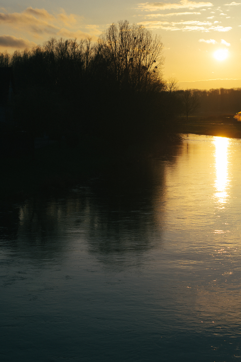
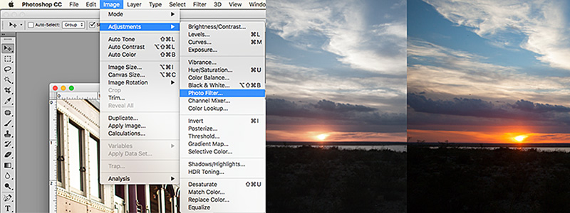
3. Change the temperature, change the season — The warmth/coolness of a photo says a lot about the season. Warmer tones indicate summer, while cooler tones feel like winter. Sometimes AWB can be fooled (especially in the winter). Snow is white, not blue… correct? Or maybe, on occasion, we actually want an overall blue tone for our whole scrapbooking layout, as we journal about the long winter months, etc. A summer evening sunset can be full of vivid colors, but might look a little dull when we pull the photo into Photoshop.

Sunsets can be tricky; they can go from bright and glowing to dull in less than a minute.  I missed the best of this sunset, below, by a minute or two when I was photographing it. Not to worry, though. To change the temperature of the photo, I simply used a photo filter. To do this, click on Image –> Adjustments –> Photo Filter (I used warming set at 85).

Playing with Color to Change the Mood of Your Photos

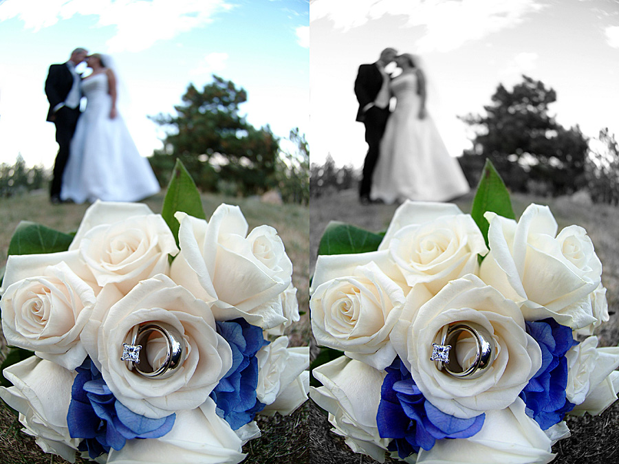
4. The proper use of selective color — I have a love/hate relationship with selective color. There are times in which selective color can really make or break a photo. To create a photo that is partially black & white, open your image in Photoshop and then duplicate the image onto a new layer. Use the tip from #2 (above) to turn the top layer to black & white. Then, use a layer mask to selectively add color back to your image.

Playing with Color to Change the Mood of Your Photos

5. Bam…..whhaatttttt? Mix it up and do something unexpected — Play around with different color overlays, seasons, or a combination of all of the above to create a photo for your AMAZING layout. There really are no rules, so just have fun!

Here is a layout I created using photos from a series… in which the kids were in the bright green and pink shirts. I changed the photos to black & white, because I love the more muted yellows and how the black & white photos help to tell the story instead being a distraction with clashing colors.

Playing with Color to Change the Mood of Your Photos


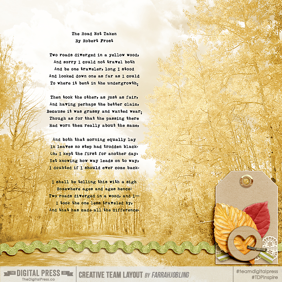
And here is another layout I created. I added a soft yellow layer over the photo to really highlight the poem by Robert Frost…


Playing with Color to Change the Mood of Your Photos


FarrahAbout the Author  Farrah Jobling is a member of the creative team here at The Digital Press. She lives in Denver with her amazing family — Mike, Nicholas (9), Claire (6), Hope (1.5 yr old puppy) & Kringle (3 mo old bunny). She works from home as a photographer and enjoys scrapping her personal photos.
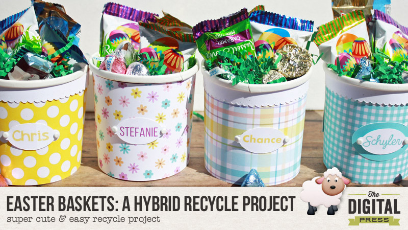
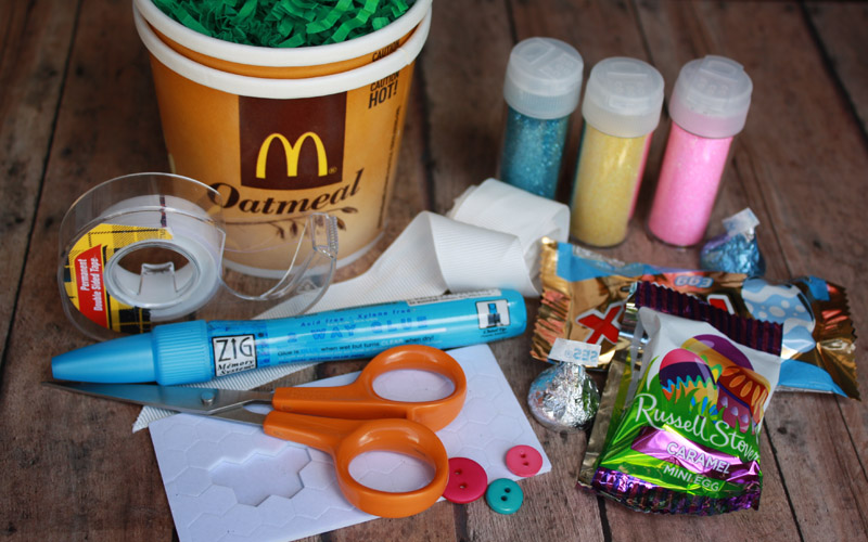
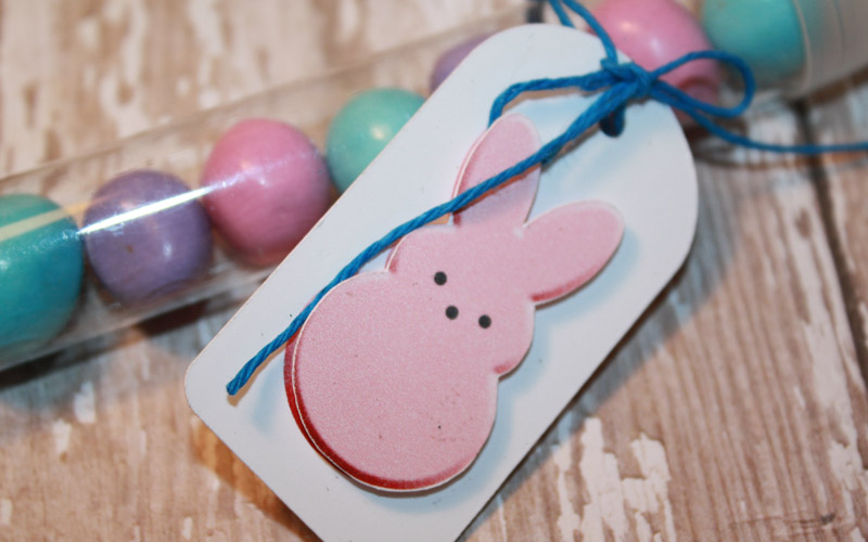
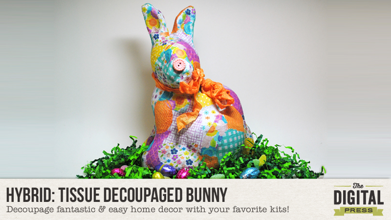
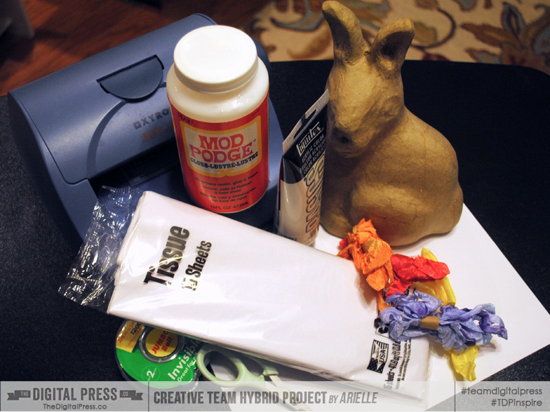
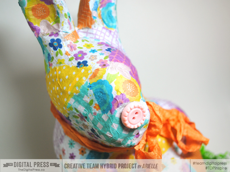
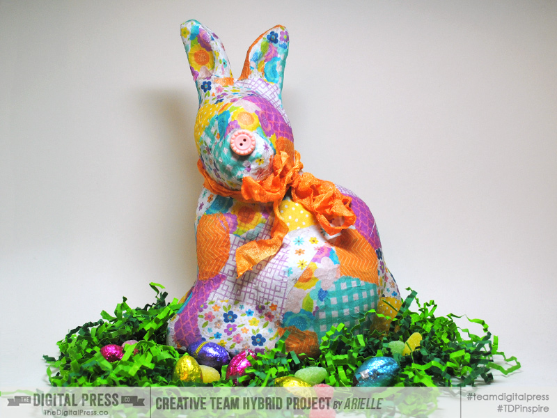
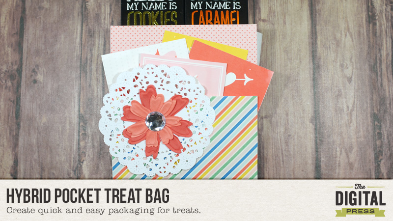
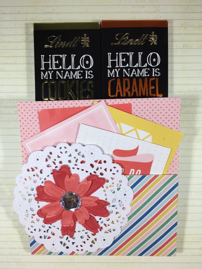
Tutorial Tuesday | Hybrid Pocket Treat Bag

Hybrid Pocket Treat Bag


Hi everyone! Indah here with an easy hybrid tutorial for you today…

Recently, I wanted to give my good friend a couple of chocolate bars I brought for her from abroad, so I used a plain paper bag to create a treat bag that doubles as a card. The good news is that this project is easily adaptable to all sizes of paper bags (and therefore, all sizes of treats!).

Here’s a look at the finished product…

Hybrid Pocket Treat Bag


To make this pocket treat bag, I decorated it with papers and cards from Scotty Girl Design’s Happily Ever After Collection. This is such a pretty collection and it really fit the girly theme/feeling I was going for.

Hybrid Pocket Treat Bag

To make one of your own… start out by folding up the bottom part of the paper bag. This will be the pocket to your card.

Hybrid Pocket Treat Bag

Then, you will cut down the paper bag to the length that you want. I cut mine down to about 5-3/4 inches (just below the notch on my paper bag)…

Hybrid Pocket Treat Bag

Next, you will adhere patterned paper on all sides of the paper bag. I printed mine using the digital kit shown above. You can do the same (with any kit you choose)… or you can even use actual physical supplies from your own paper stash.

Hybrid Pocket Treat Bag

*NOTE* do not glue down the front flap/pocket before you adhere the paper on the inside.

After you finish adhering all the papers, you will glue down the pocket. Use strong double-sided tape and only stick it to the sides of the pocket.

Finally, you will decorate your bag. I decorated the front side of mine with a doily, some flowers, and a little bling. I also printed out some pocket cards and added them to the front pocket — making the treat bag into an instant greeting card that the recipient will love!

That’s it! It’s easy, right? You can certainly go crazy when it comes to decorating. The best part of this project is that you can totally customize it to meet your needs.

Have fun and I hope you enjoy making this as much as I did!


IndahAbout the Author  Indah is on the creative team here at The Digital Press.  She has been a hybrid crafter for over 8 years, and loves making cards and paper crafts. She also loves collecting stamps and stickers.

Tutorial Tuesday | Intentional Blur in photography

Tutorial Tuesday | Intentional Blur in Photography

In many cases, blurry photos are a bad thing: photos are supposed to be in focus and sharp to be considered good. I usually follow this “rule” but I’ve been trying to be more creative recently and I’ve decided to create intentional blur in my photos. And I found out that the result could be awesome, fun, and creative (as is often the case when you break an artistic “rule” on purpose!).

Let’s discover the 3 types of blur you can have in photography (all images are retouched with Dunia Designs‘s The Basics Lightroom Presets):

Camera shake: when your shutter speed is too slow to handheld your camera, you get camera shake. It can be “bad” when it’s distracting from the subject of your picture, but it can also be a fun technique when done on purpose. I took this very abstract image, for example, with a 3 seconds exposure and while spinning my camera in front of Christmas lights.

Tutorial Tuesday | Intentional Blur in Photography

Cynthia Haynes is a photographer I discovered recently who is known for her long exposure / intentionally blurry pictures, and she has some pretty inspiring shots!

Bokeh: this type of blur is created by using a very big aperture (very small f/number, like f/1.8 for example) and it’s usually in the backgound of something sharp, but you can also create bokeh “by itself”, on purpose. Last week we had some spectacular sunsets, and I obviously had to snap some pix after work. I started with the classic, in focus, shot.

Tutorial Tuesday | Intentional Blur in Photography

Not bad, but not very original either, right? Then I decided to manually un-focus and create bokeh with the sun reflection on the river. You can’t see the landscape any more, but you get an abstract picture where light and colors are the most important things.

Tutorial Tuesday | Intentional Blur in Photography

Here’s a more classic example of bokeh, that I created by focusing on the puddle right in front of me with a very big aperture, so that the background (and a bit of the foreground too, since the depth of field is very small) is out of focus.

Tutorial Tuesday | Intentional Blur in Photography

Movement blur: this happens when your camera is steady (because your shutter speed is fast enough for you to handheld it or because it’s on a strong support like a tripod, a table, etc.) but that your subject moves faster than your shutter speed. This is the technique you use to photograph fireworks, for example, that’s how you create those gorgeous “flowers”.

Tutorial Tuesday | Intentional Blur in Photography

You can also use this technique to show movement and gives a sense of speed. That’s what I did (without even knowing, I was just starting to take pictures and had absolutely no idea what I was doing! LOL) while photographing the Tour de France in our little town in 2005. I got on the first floor of a building, right above the road, and since the day was cloudy and dark, my camera (in auto mode) selected a shutter speed too slow for those speedy athletes.

Tutorial Tuesday | Intentional Blur in Photography

If I had do take that picture again, knowing what I know now, I’d definitely try to use a technique called panning where you follow your moving subject with the camera. That way, your subject will look sharp and the environment around it will become blurry, kinda the opposite of the image above.  It’s a perfect technique for races of all sorts because of how much it materializes speed.

I hope you’ll enjoy playing with intentional blur and find these tips helpful! Don’t hesitate to comment with your questions or post in the forums!


Chloé

About the author  Chloé is in charge of PR and communication for her small town by day, is a digiscrapper “by night” and a photographer whenever the light is beautiful. She lives with her man and fur-babies in a small town of Alsace (in the northeast of France), where she loves to read, watch good TV shows (TWD being her absolute favorite), and just hang out with her friends — no matter if they are close by, online, or away in her Swiss hometown