Category: Tutorials

Tutorial Tuesday | Make it Clean & Simple

There are many styles of design/composition in scrapbooking. We can find layouts with many photos aligned, and some with no photos at all; some with many embellishments, and some that are instead very simple. After digiscrapping for 5 years, I discovered the world of clean & simple design… and I fell in love with it.

Why?

  • I feel I can better highlight my photo, by using only one (or at most two)
  • My page can stay focused on the main emotion or message that I want to share or remember
  • It takes me less time to make a clean & simple page! 🙂

Today, I would like to share with you, step-by-step, how I create my clean & simple layouts.


Step 1

First, I choose a solid paper (yes, for me a solid background paper is more appropriate to maintain the clean feel on the page). Then I put a photo onto this paper. You can frame the photo or not… your choice. For the example I will show you here today, I clipped my photo to a brush…

Step 2

Next, I add a title. I usually like to put a title on all of my pages; it helps me to focus on what I would like to see on the layout. For this one, the purpose is to remember the good times my kids shared with their cousins, and how much they enjoyed it…

Step 3

Next, I add some embellishments. One or two, but usually not more… for me, the page must be light, and using colored elements helps to add a pop… 🙂

Step 4

I am not good with journaling (I tend to prefer to let my photos saying everything)… but journaling is part of scrapbooking and memory-keeping, and most of the time mine is so minimal it actually acts mainly as decoration. Here, I put on a title… telling nothing! LOL


Here is the final result of this clean & simple page I have been creating today…


You can do anything with a clean & simple page. The most important thing to work with, if you want to make your page clean, is some white space!


DSC_3131About the Author  Bao is a creative team member at The Digital Press. She has been a digiscrapper for about ten years now, and her style tends to be clean & simple. Most of the time she scraps her family’s photos. She also loves, however, to scrap other subjects such flowers, nature, environment, and foods. She says hello to all of you from her big island of Madagascar, and feels blessed to live there.

Enregistrer

Enregistrer

Enregistrer

Enregistrer

Enregistrer

Enregistrer

Enregistrer

Enregistrer

Tutorial Tuesday | Importing Photos into Lightroom

How many times have you opened your new Lightroom (LR) software and shut it because you found it too daunting? How many times have you tried to drag images over to LR, like we so easily do in Photoshop (PS), only to realize nothing happens? If you are anything like me, your answer is more than a few times! 🙂

We’ve all heard it time and again — Lightroom is a powerful program. It’s a game changer. And… it truly is. But how do we harness its power if we can’t even complete the initial step of getting started? Well, this post is here to do just that — to help you get your pictures into LR.

The first thing you need to do to get started is open the program. Once you have it open, click on the “Library” button at the top (see image, below). Then, press the “Import” button.

[Please note that my screen (shown above) might look a little different than yours… as I already have pictures in my LR.]

Next, from the left side panel, you will now need to select the photos that you want to import into LR. Photos can be on your hard drive… or on an external hard drive… or on a memory card. Wherever your photo is, you need to browse on this left side panel and select that source (as shown below)…

Using the image above as an example… suppose I were to select “Year 5 — April” as the source. LR will now show me all pictures contained in that folder. This is where you can select the specific photos you want to import. You can choose to select one photo… or a few photos… or even all photos in the folder.

Another thing to note — that top panel (see next image). I shoot in Raw, so I choose the “copy as DNG” option… which is the suggested option for Raw files. For JPEG images, I always choose the “Add” option.

Now we come to the right side panel (again, see next image). Here, there are two steps that I usually complete. First is to select the “Don’t Import suspected duplicates” box. You don’t want to import the same photo twice, right? 🙂

The other step I complete using the right side panel is very important — the destination step. This is where you tell LR where (and how) to save your images. I save my images chronologically… so my files are saved by year and by month. You can organize your files however you like, creating a filing system that works for you.

Now you come to the very last step. You can just press “Import” (as shown below) and tada ….. your photos should start uploading in LR. At that point, once the photos are imported, you are all set and can start playing with the program more! 🙂

Hopefully this “first step” tutorial is helpful in getting you out of the starting blocks, and on your way to using Lightroom. If you have any questions, definitely feel free to reach out to me using the comments on this post, and ask away!


PallaviAbout the Author  Pallavi resides in Mexico City with her husband and her ever-growing little son, Rajveer. She has previously lived in Calcutta, Pune, San Francisco, Chicago, and London. She reflects all these places in her pages as she captures her everyday stories. She is an alumnus of Northwestern University. Currently, she is learning photography and working towards getting to a healthy weight. Her days are full and she loves it that way!

Tutorial Tuesday | Expanding Your Digital Toolkit

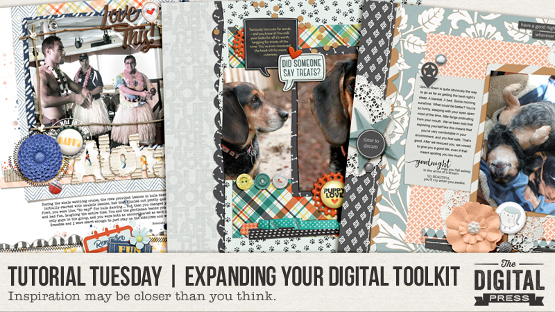
We’ve all had that moment when our creative mojo just escapes us. You’ve been there before, right? You’ve got the time to create… a brand new kit that you really want to work with… and nothing. So what do you do?

Most of us browse galleries for inspiration, of course. Then you find “it” — a layout that has you saying, “wow, I really love that!” Maybe it’s the pictures, the composition/proportions on the page, the kit selection. Oh, hang on a minute… that’s your layout! Wow, that’s a little embarrassing. Actually, it’s not. Most of us are the resident memory-keeper for our family. We should be proud of – and love – the layouts we create. So how about using your own layouts as the inspiration for something new? Yes, I’m talking about expanding your digital toolkit and scraplifting yourself!

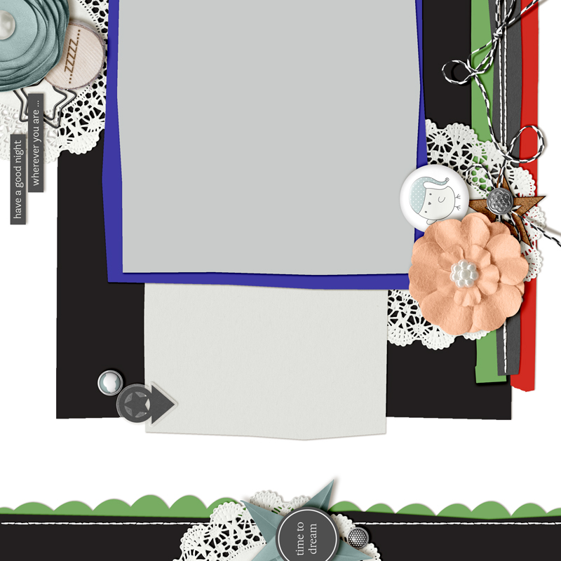
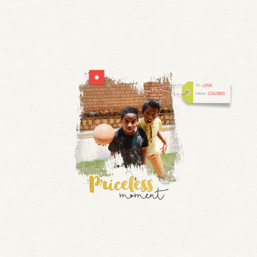
I look at scraplifting as one of the sincerest forms of flattery in the digital world. When you scraplift a page, you’re saying to the creator that their page inspired you to create; it struck a chord with you. It’s okay to give yourself a pat on the back for a layout well done… and if you find a formula that you like, why not repeat it? Scraplifting could be duplicating a layout design, or using it as inspiration to build from. I love doing the latter and wanted to show you my process for “lifting” the page shown here…


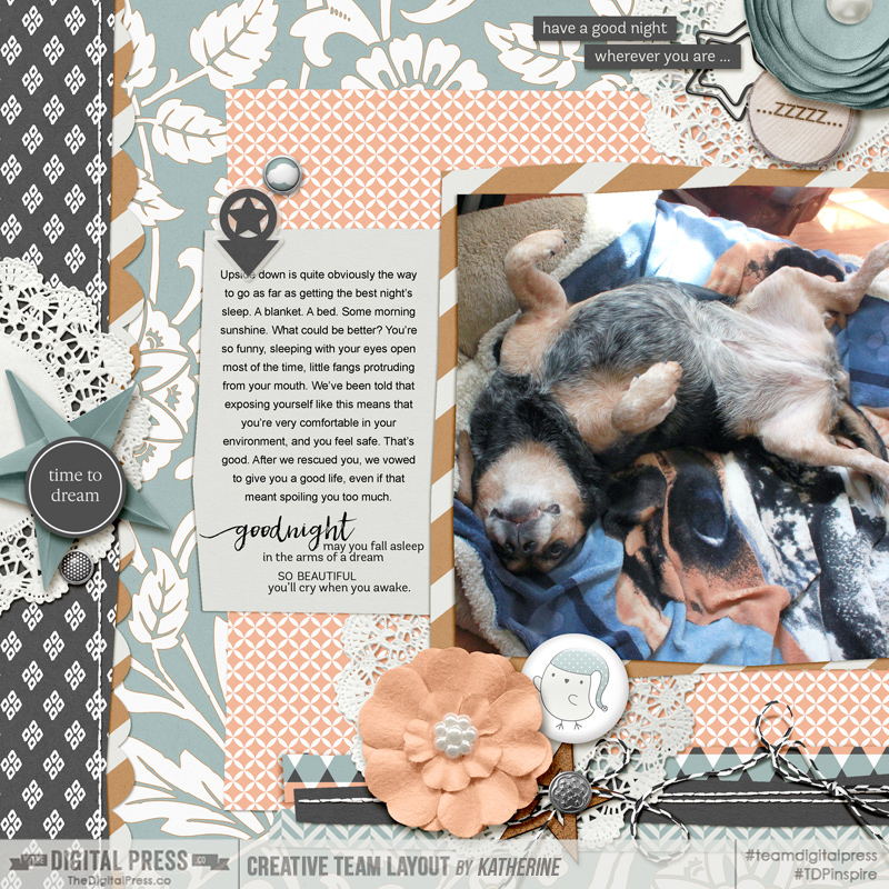
[credits: Sweet Dreams — a collaboration by Sabrina’s Creations and Designed by Soco]


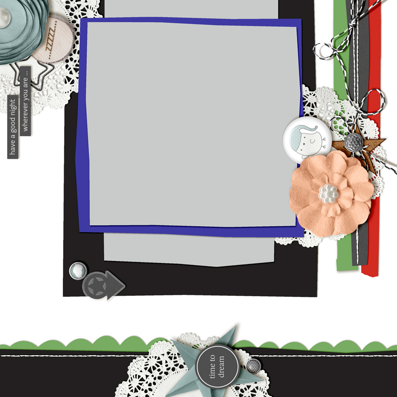
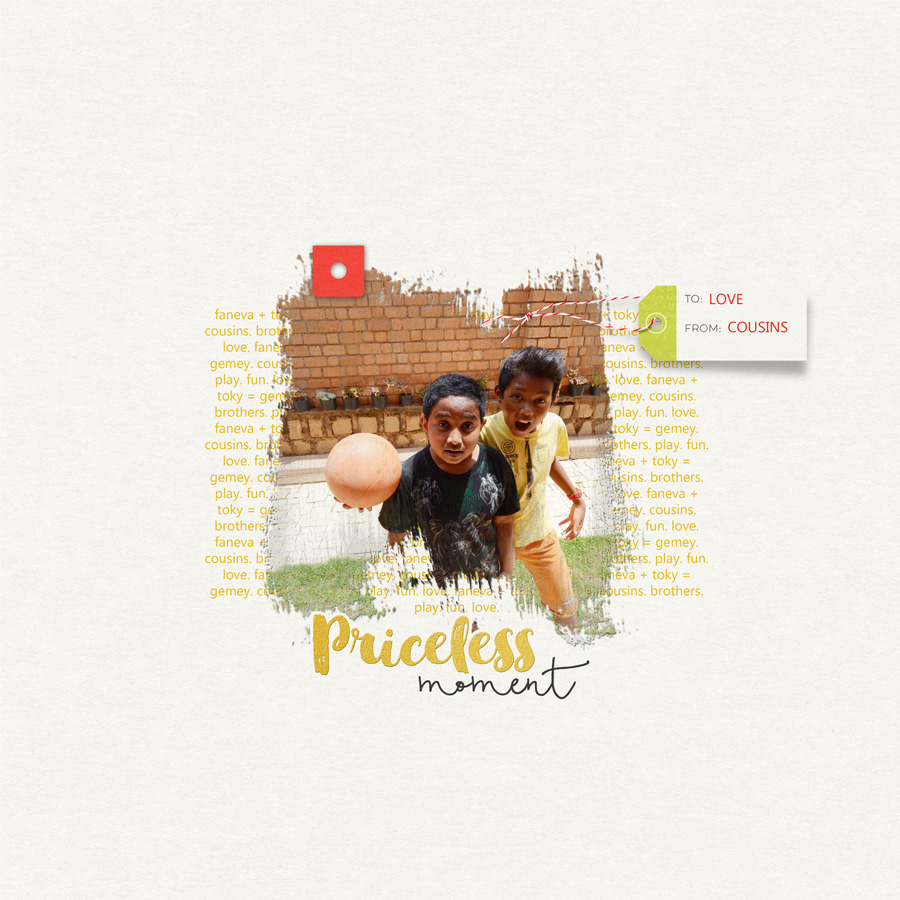
Where to begin? Open your original file in Photoshop or Photoshop Elements and save a copy to work from. This is so important! You don’t want to make changes to your original file and then accidentally save them and over-write your original! Take it from someone who has “been there, done that” — it’s not pretty. On your duplicate file, start removing any paper or photos layers that you might have clipped to shapes. You want to strip the layout down to the basic design elements, like this:


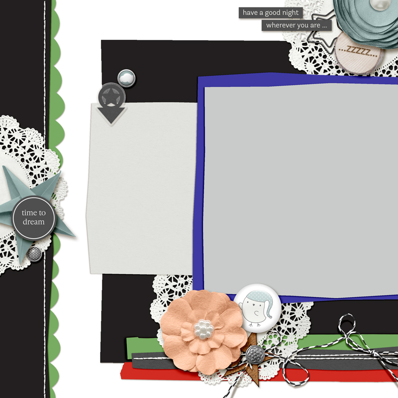
Now, I like to use my existing layouts as inspiration and not necessarily duplicate an existing design (although that’s a great option, too). With that in mind, now that I have the base design laid out in front of me, it’s time to play around by moving elements (or groups of elements) around to create something new.

I like the vertical paper strip on the left with the scalloped edge peeking out and the stitched top edge. This would really lend itself to being on the bottom of a page. Ah, rotate the layout counter-clockwise (all layers), and then lower that portion of the design just a little…


With that central cluster of elements on the bottom edge, I’m now starting to think a vertical design — right down the center of the layout — might be the way to go. Here’s what the design looks like after I’ve moved and re-sized some of the papers. You’ll see that the overall design of the original page is still there; it’s just been modified enough to make it a little different…


Some of the original element clusters on the sides are now looking… well, “off” for want of a better word. This doesn’t mean they should automatically be deleted, however; they can still be re-purposed in the new design layout. Sometimes simply rotating and moving the elements can breathe new light into them. The cluster on the right-hand side of the page, for example, is one I really like. However, the vertical placement just doesn’t work now. Making it horizontal again (as it was in the original layout) will work.  Rotated and moved around a bit, here’s how my page’s composition is shaping up…


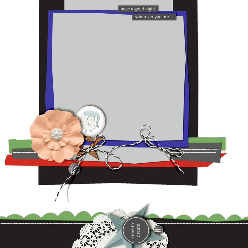
You’ll see that I’ve also hidden a few layers, like the element cluster that was originally in the upper left-hand corner of the new design. It was just too much. Also, at this point I haven’t even thought about a kit design, new papers, or new elements. I’ve simply been setting up the foundation on which to build from — and that’s not always easy to do, as I want to jump right in!

Using this scraplifted version of my original layout, I can now start adding all of the new pieces to complete my layout. If I move things around again, that’s fine — it’s my page, my memory. I can do whatever I like with it. I’m a firm believer that there’s no right or wrong way to scraplift a page. Bottom line: have fun with it!

Here’s how my now newly-designed page came out:


[credits: Away by Creashens]


…and just for fun, I did a second variation of the original page, just to show you that you can expand your toolkit and scraplift one page several times with each layout being unique to the memory you wish to record:


[credits: Leelo and Kiwi by Wildheart Designs]


So, if you like what you create… go ahead and give yourself permission to create it again, with a twist! A few things to remember:

  • Create a copy of your original Photoshop file and work from that.  Don’t work on your original file.
  • If you rotate the design, watch for your shadow angles as they will rotate, too.
  • If your original layout was based on a template, which you would normally credit a designer for, think about whether you will still give credit when you share your new layout. My own personal rule of thumb: If the new layout still closely resembles the original template, give credit with something like, “Template (modified) by …”

Scraplifting from your own gallery can be a great way to get your mojo going — or even just a fun exercise to do when you’re in a creative rush. It’s an easy way to expand your digital toolkit since you have all the inspiration right there at your fingertips: it’s you! If you would like to give this a try, I’d love to see what you can do with your own layout, so link me up with a before and after!


KatAbout the Author  Kat Hansen is a creative team member here at The Digital Press. A Director of Human Resources by day, she loves the opportunity to spend a few hours each day being creative. Vacation memories feature pretty heavily in Kat’s scrapbooking pages, as do her son and “daughter” (of the four-legged furry kind). Kat has quite the sense of humor (she “blames” her father for this), which she incorporates into her journaling and memory-keeping.


Hybrid How-To | Custom Composition Books

Hello and happy Saturday! Summer is quickly coming to an end. Can you believe it? My kids go back to school in 2 weeks and we’ve been busy getting their supplies. I noticed both kids have composition notebooks on their lists — woohoo! Why have a plain notebook, when you can have a fantabulous notebook? I thought it might be fun to create some personalized covers, and am here today to show you how to use your favorite digital kit to do so!

For my own composition book cover, I included a happy memory from my kids’ previous school year, as well as a little inspirational quote. I even left a blank space to write in the subject. I’m also putting a blank sheet of adhesive on the back, too, so the kids can add their own personal touch! Anything to keep them motivated, right?

Supplies Needed:

  • Digital kit of your choice (I used Project Twenty Fifteen | August by Laura Passage, shown below)
  • Full sheet adhesive labels (I used Avery #15265)
  • Paper trimmer, scissors, pencil, and a ruler
  • Composition notebook(s) of any size


Directions:

  1. Measure the cover of your notebook.
  2. Create a document in Photoshop that is the exact size of your book’s cover — plus an extra 1/4″ on the top and bottom (this will ensure the design you are about to create will cover the front of the notebook).
  3. Print your design onto the full-sheet adhesive label sheet.
  4. Using the paper trimmer, trim the excess from the left side of your design, the side closest to the binding tape of the book. Don’t peel the backing off yet! First, you will center it and mark where you’ll need to cut the other 3 sides. Trim those before adhering.
  5. Start to peel the backing from the left side, only a half inch or so, and adhere it starting on the left. Then slowly continue to peel back an inch or so at a time, as you adhere it. Doing it this way not only ensures you get it centered, but also eliminates pesky air bubbles!
  6. Using the scissors, trim around the corners.
  7.  Optional — If you want it to be just a little more permanent, add clear contact paper on top of your cover.

And that’s it — easy peasy!

Now it’s your turn, make one of these super simple comp books and come share your creation with us in the forum! During July 2016, you can even receive points in TDP’s challenge system if you complete this project and enter it into the July 2016 Hybrid Challenge. 🙂


Arielle H Gordon
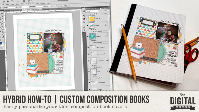
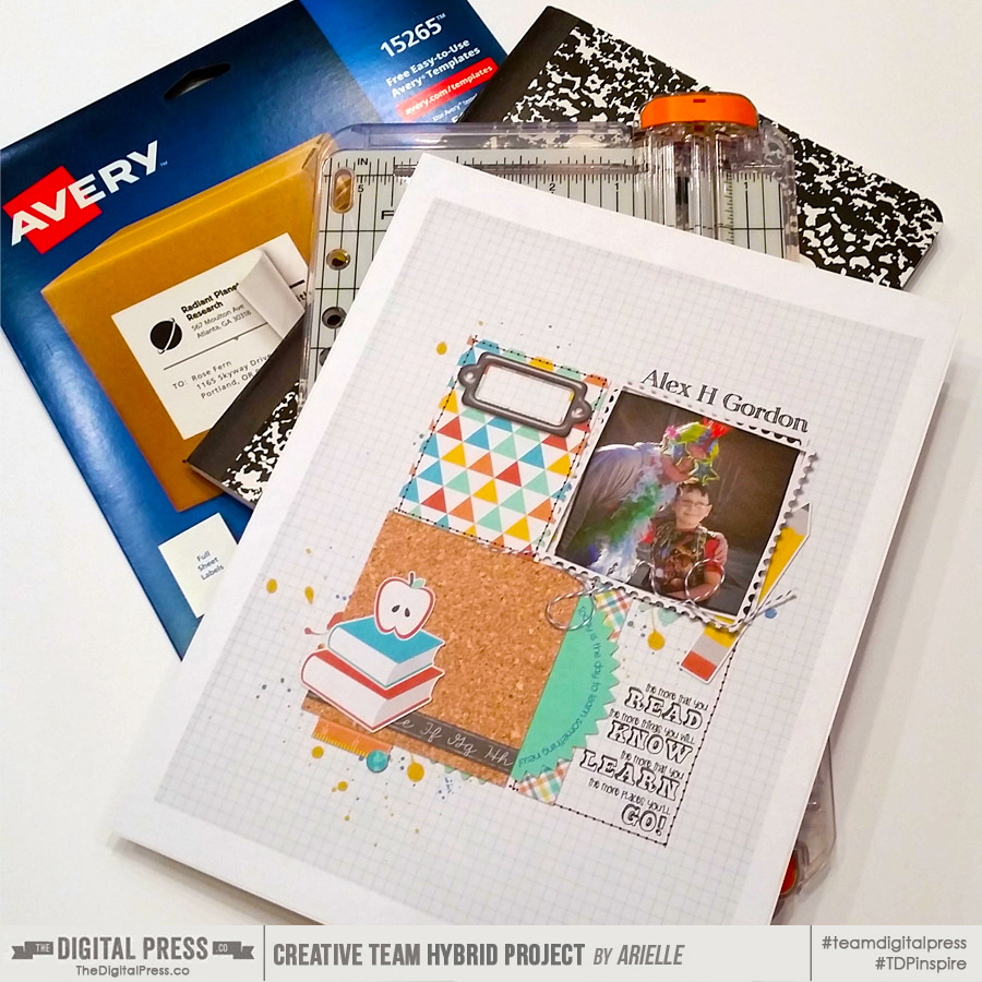
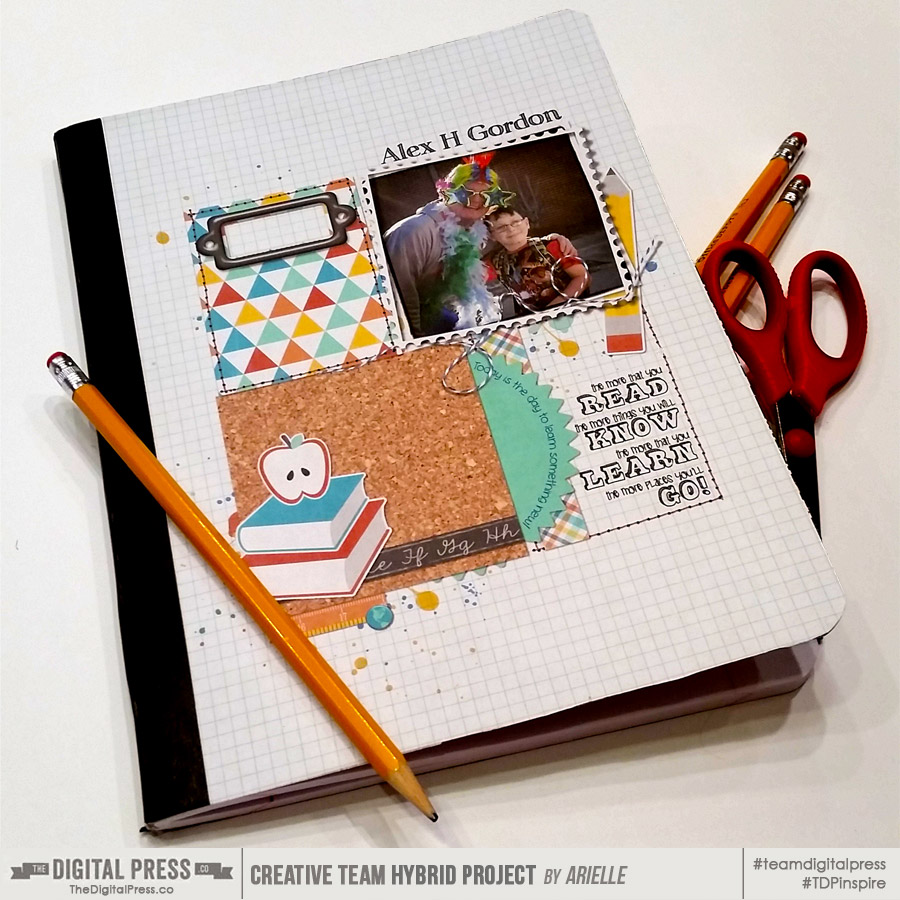
About the author  Arielle H Gordon is a wife and mom of two crazy kiddos, ages 6 & 7. She moved around (a lot!) before returning to settle down in her hometown of Enterprise, Alabama, to marry her sweetheart and start her family. She is an avid crafter — digital, hybrid and otherwise! She LOVES Jesus, family time, camping, gardening, reading cozy mysteries, hot tea, popcorn, and anything on BBC! This time of year, you’ll find her buying school supplies, gearing up for VBS and reading like it’s going out of style (while sipping sweet tea!)…


Tutorial Tuesday | Capture the Everyday

I’ve been following a few photography challenges this year, and even if I don’t do them every week (or at all, let’s be honest!), they are slowly influencing me and helping me see my daily world with new, creative eyes. A few days ago I was doing our laundry and decided to capture this everyday, mundane task as artistically as possible, and in as many different ways as I could think of. And it was so, SO fun!
Capture the Everyday

Of course, some of my images didn’t turn out… but that’s OK because experimenting was part of the fun. I decided to implement various photography techniques — like macro, changing angles and perspectives, long exposures, purposeful blurs, compositional “rules” like leading lines, centered compositions, repetition/pattern, texture, rule of thirds, etc.

Capture the Everyday

This was truly an eye-opening experience and I never thought photographing something as mundane as the laundry would be so fun and could bring so much variety in the images.

Capture the Everyday

To add some cohesiveness to the photos I took, I edited them all with The Basics Lightroom Presets (#1) by Dunia Designs.

If you, too, want to see — and document — your everyday life with new eyes, why not try something similar?

  • Grab your camera and focus (pun intended!) on some daily aspect of your life — a task (like my laundry), an object, a place, etc. You don’t need much time to do this; 5-10 minutes is plenty to do this sort of creative exercise
  • Try to look at your everyday event like an explorer would when discovering a new civilization. Forget everything you know about this thing and try to see it with fresh eyes, as if it were the first time you laid your eyes on it
  • Then… simply grab your camera and start playing! Change your angles, take a wide shot to capture the whole environment (or the opposite — come closer and do a close-up shot), play with light and shadows, experiment with the composition rules and have fun. Maybe you won’t produce a masterpiece but you will definitely start seeing your world with new eyes!

I hope you’ll have fun experimenting and being creative, and I’d LOVE to see the result if you try your hand (and eye) at it! You can leave links to photos in the comments, below… or if your photos actually result in the creation of a scrapbook layout, you can post it in TDP’s gallery and then link me up here!


ChloĂ©About the author  ChloĂ© is in charge of PR and communication for her small town by day, is a digiscrapper “by night,” and a photographer whenever the light is beautiful. She lives with her man and fur-babies in a small town of Alsace (in the northeast of France), where she loves to read, watch good TV shows (TWD being her absolute favorite), and just hang out with her friends — no matter if they are close by, online, or away in her Swiss hometown. She recently became quite obsessed with her BuJo (bullet journal) and can’t wait to discover how much it’ll help her improve her (so far non-existent!) organisational skills!

Tutorial Tuesday | Using Clipping Masks

In Photoshop, I often create clipping masks in order to “change the shape” of the papers and photos I am using on my page, and/or to blend my photos or papers into the rest of the page. Today, I’m going to share a few ways that I utilize them and how I achieve different looks with clipping masks.


CREATE A MASK FROM A SHAPE OR ELEMENT

One way to use a clipping mask is to clip a photo or a digital paper to an existing shape or element, such as I’ve done in my Vroom Vroom page, shown here…


See the photo, above? It takes the shape of a mask that I created using flower elements (if you look on the right-hand edge of the photo mask in the layout above, you can see a few spots along the edge of the mask that look like flower petals… similar to the flower you see on the left-hand side of my layout. That’s because I created the mask using those shapes!).

To do this, first I selected a few flower elements and then merged those layers to create one shape. Then I applied a color overlay to it (while this step isn’t totally necessary, it’s really helpful because the colored flattened layer makes it much easier to see what your masking shape looks like without any dimension to it).

At this point you can re-size, warp, or re-position your newly-created mask shape as much as desired. Warping or puppet-warping are my preferred tools for manipulating a mask shape.

Once you have a shape you like… it’s time to clip your photo or your digital paper to that shape. While your newly-created mask layer is selected, open whichever item you want to use (photo/paper/etc.) and drag or place it onto your page. It will create a layer just above your mask layer. Now you are ready to clip them together. There are a few ways to achieve this and it all boils down to a personal preference. To create your clipping mask you can select Layer > Create Clipping Mask in the menu… or you may right-click on the paper layer and select “create clipping mask” from the pop-up menu that appears… or a third option is to press CTRL-ALT-G (for Photoshop) or CTRL-G (for Photoshop Elements, a.k.a. PSE). My personal preference is to hold the ALT key as I hover over the line between the paper and mask layer (you will see the cursor change to a downward pointing arrow) and then click. Choose your favorite method.

Now your item is clipped to your mask shape, and your item takes the shape of that mask. Refer again to my photo in the layout image above. Meanwhile, if you look in the layers palette at the right side of your Photoshop/PSE workspace… you’ll see that the top photo or paper layer will be indented just above your mask layer when you look at it in the list. Until you merge these layers, you will be able to independently manipulate these layers.

In my layout, above, I actually used a second clipping mask, as well — see the pink painty splatter just behind the photo layer? I clipped a pink paper to a mask from Hello Sweet Pea: Masks by KimB Designs, positioning this below the first mask and resizing to allow edges to peek out from under the other mask. Here’s a look at the mask I used before I covered it with that pink paper you see in my layout…


…and that actually brings me to my second method for using clipping masks on my digital pages…


CLIP MULTIPLE PHOTOS OR PAPERS TO A MASK

Another way to use a clipping mask is to clip more than one photo or paper to a mask, as I’ve done in my Ruffle Your Feathers page, shown here…

This mask was a little more labor intensive, as I ended up stuffing my mask with 3 photos, some paint, and an overlay.

To do this, I used a mask from Cracked {Quick Masks} by Anita Designs, shown here…

You can clip as many products as you wish to your mask. To clarify, the bottom layer will be your mask, and then each layer above it will be “clipped” (CTRL-ALT-G in Photoshop; CTRL-G in PSE) to the one below, so that all layers clip together above the mask layer.

Because the mask I chose to use was not solid (there were some transparent areas, as you can see in the examples on the preview, above), some of the underlying background paper was visible in the masking. When I erased back some edges from the photos, they blended more easily because of the transparency of the mask, allowing the underlying background to unify the 3 images (there had been rocks that I erased out of one photo). In addition to adding some paint and an overlay into my mask… I stamped over the clipped layers with some paint and another overlay.

The mask opacity may be increased or decreased. A simple way is to erase away the desired areas you wish to be more transparent or if you want the mask to be more solid, select a brush and fill in areas of the mask. Be sure to have selected the mask layer in the palette first.

If you haven’t used a clipping mask before, give it a try! It opens up a myriad of possibilities in your page design (and the process can also be quite addicting). Have fun with it!


Rae


About the Author  Rae is part of the design team at The Digital Press and has been a scrapbooker and photographer for many years. She lives on the west coast (USA), with her hubby and labradoodle. She’s addicted to chocolate, TV shows, books and Photoshop.