I haven’t always been the most positive person. I will admit that I have gotten that “%*&# my life” attitude at times, and sometimes it is over something small and stupid (like a bunch of cans falling out of the cupboard onto my toes). At those times, I try to dig a little deeper than what is going on at the surface. Sure there are times when things may feel like they are all falling apart at once, but when you take a breath, step back and look at life as a whole, you can get yourself out of the negative moment.
About fifteen years ago, I had a group of ladies who were traveling buddies on a trip to Europe. A lot of things that were planned ended up falling through, but we had each other to keep balanced. We started a gratitude practice. It was simple. One person who was feeling a moment of doubt, homesick, or crankiness would shout “gratitude!” and we’d stop what we were doing and say something we were thankful for. It was wonderful. I still think about those ladies and that experience. I don’t practice gratitude as often as I probably should, but there are definitely moments when it slips over me and I find the sweet spot.
One of the ways I am able to find gratitude and appreciation for life is through scrapbooking and art journaling. Getting the chance to be creative and share those pages with a worldwide community of fabulous creatives is something I would have never imagined way back when. And getting to be on a team of creatives? Beyond amazing.
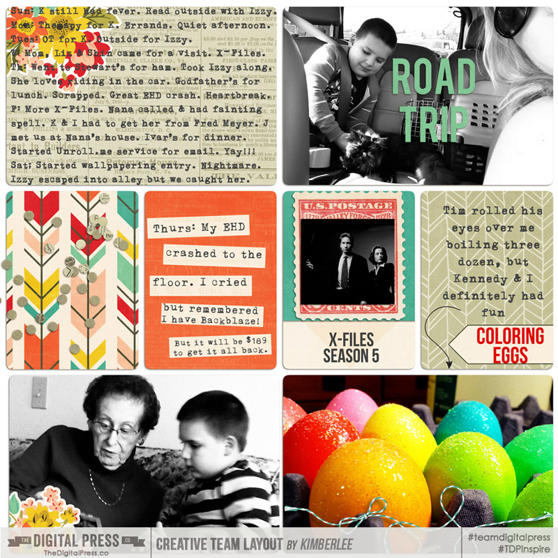
For me, pocket scrapping is one way I’ve found moments of appreciation in everyday life. I used to think that I didn’t have enough excitement in life to document. But looking back over two and a half years of daily notes, I realize how special our life is. I’m sure our lives would seem beyond boring to some, un-traditional to others, and some might even question why I’d bother documenting all of the little odd moments that I do document. But I love it. I love that I can look back and remember when we went to a certain yearly plant sale to get things for the garden, or how many times my grandma came over to see her great-great grandson. I love it. I am never “caught up” and probably never will be, but it doesn’t matter. I’m enjoying the process.
And you don’t have to pocket scrap. Any of the little moments you capture and put onto a page is worthwhile. Heck, you can fall in love with your life just going back through and looking at your photos. Find those moments that take your breath away. They are yours. They don’t have to mean anything to anyone else. Find enough of those moments, and you will be in love/stay in love with your life. Let the moments wash over you. Feel them. Breathe them in. Run your fingers through your hair with them. Add them up and savor them.
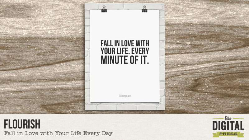
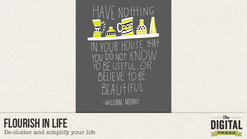
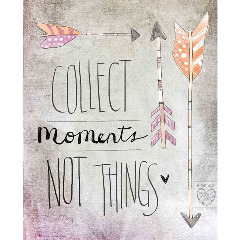
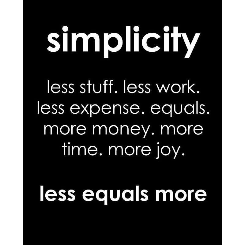
Here are some quotes I found that inspire me and remind me to fall in love with my life. Because you do only live once. You better be in love with it.


Now it is your turn. Document the small things that leave a rich mark. Head over to the challenge forum to participate in loving your life.

About the Author: Kimberlee is a lover not a fighter; a stay-at-home gran, a poet, and a lifelong learner. She grooves on saturated colors, Tuesday dance parties, optimism, glitter and sunshine. She colors outside the lines. She is a dreamer. She is a collector of moments. She is all about the story. Kimberlee completed her MFA in Creative Writing and is currently working toward a M.Ed. in Instructional Design.
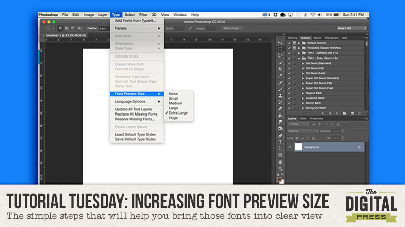


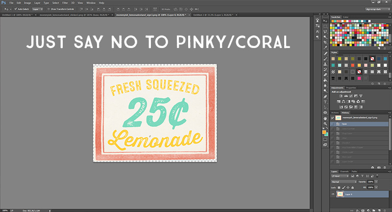
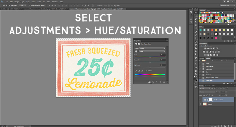
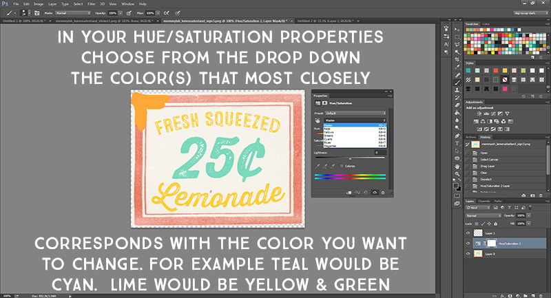
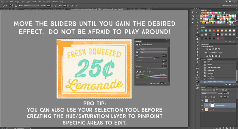
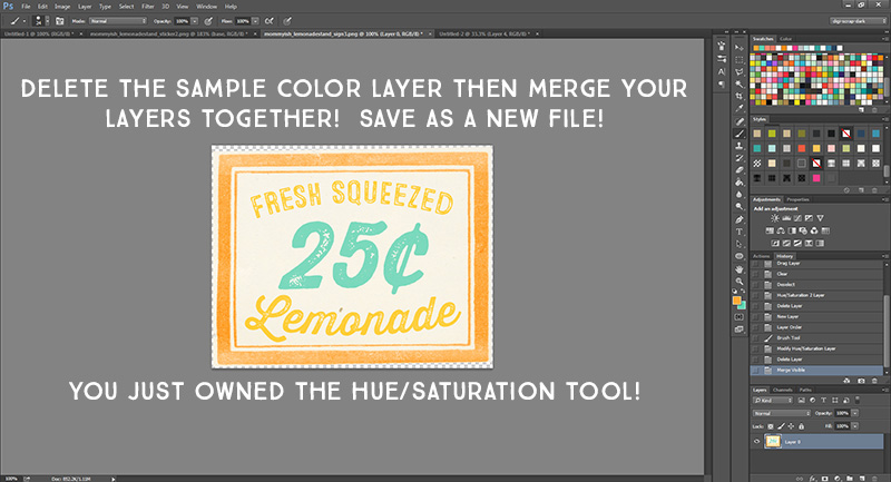
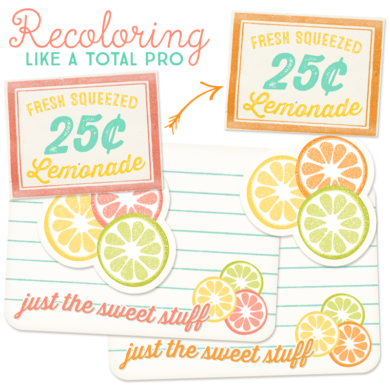
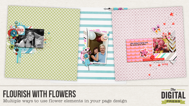 Not only are flowers a beautiful addition to any page, they are a versatile element that can be used in a multitude of ways. A quick and easy way to use flowers over and over again on your page is to resize and color them. I use the shortcut “control + T” for the transform tool and hold down the shift key while pulling a corner to enlarge or decrease the size. (The shift key ensures a uniform re-sizing.) I select the move tool (shortcut key V), hold down the ALT key and with your mouse, move a new copy of the flower onto your page. You can skip that step and just select the flower again from your folder but I find selecting and copying the flower layer so much faster and easier. I most often recolor with a hue/sat adjustment or if changing a single color, I sometimes use a replacement color adjustment layer.
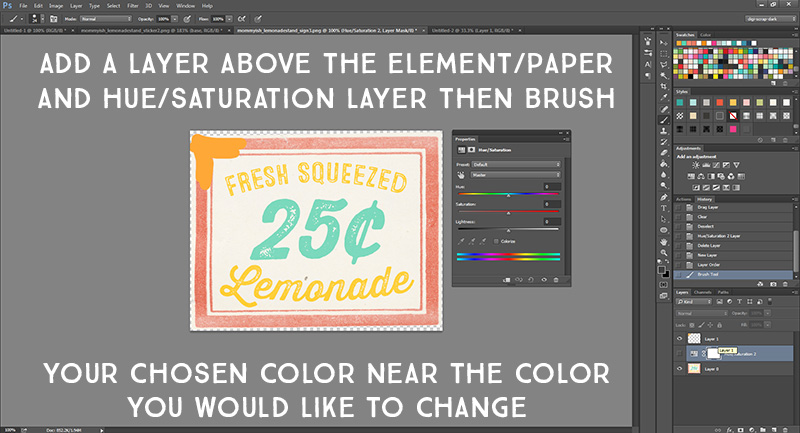
 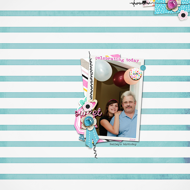 Flowers can be reconstructed, extracting parts of it to build up multiple layers. I use the original flower in it’s entirety for the base layer. I might even add a white stroke around it to give it a flat sticker look. There are many ways to select and extract but I like using the quick select tool (make sure the + box is ticked in the options bar but change to the – box if you need to erase some of your selection, moving the mouse over the area to be added/subtracted). Select a portion of the flower (you’ll see marching ants around your selection), then right click mouse and select “layer via copy”. Now you can recolor, resize, whatever you want to do with this layer, moving it overtop the original flower to build up a layer or anywhere else on your page.
  Regardless of how you use and manipulate your flower elements, adding drop shadow styles will give depth and dimension. On a single flower I will add a darker, semi-hard shadow, which looks realistic. On a thicker, bulkier flower or rolled flower, I will add a slightly lighter toned, softer shadow. I like to put the shadow on its own layer. Apply a drop shadow style. In the layer palette, hover over FX, right click your mouse and select “create layer”. This will put the shadow onto its own layer so you can manipulate it, separate from the element layer. I always choose Control + T (transform tool) and then choose warp so I can pull the shadow or puppet warp which is a bit trickier to use but Google it, watch a few videos, and you might hooked on using that also. I hope that these ideas spark your creativity and you try some of these ideas out on your next page.
  Head over to our challenge forum and check out my
  Rae Clevett is part of the Creative Team at The Digital Press. She lives on the west coast of BC with her hubby and Labradoodle, Taz. Her favorite way to start the day is to grab a coffee and sit down to scrap a page or two with Taz lying beside her in his dog bed or under the table.