Rating, Keywording, and People in Lightroom

150922Blog Post


Now that you know how to get your photos off your camera, let’s talk about how to manage them in a timely manner using Lightroom.


I use Lightroom CC to organize and edit my photos. Lightroom is an extremely powerful tool for doing both. As a Mac user, I have used both iPhoto and Aperture in the past and while I have loved them both for different reasons, I just couldn’t resist the pull of Lightroom because  everybody else was doing it! Yes, (bowing head in shame) I followed the crowd. Why, you ask? Because whenever I asked someone how they got their photos looking so good, the answer was always Lightroom. Whenever I saw beautifully processed photos, the answer was always a Lightroom preset. So, I decided to check it out. And while the interface is not nearly as pretty as Apple products, I was not disappointed in its functionality. While my photos definitely look better, I am still no expert in editing in Lightroom. I have, however, come up with an organizing workflow which is definitely worth mentioning. And which is the subject of this post. So let’s get started.


Last month I talked about getting your photos off your camera and into Lightroom. If you missed that post, you can find it here. Once  your photos are in Lightroom, there are a number of resources at your fingertips to help you get and stay organized: Rating, Keyboarding and Tagging People.


Ratings

While many people rate their photos using a number of different methods, I keep mine VERY simple. I only use a 5 star rating (I don’t use 1-4 stars at all.) to tag photos that I LOVE and know that I want to scrap one day. These photos are super special photos. They are either beautiful photos with great composition or they evoke a special emotion or relationship that I want to document. So, as I upload my photos to Lightroom, I look at them quickly and if they pull at me, I press the number 5 on my keyboard. That’s it. Then, when I am looking for a photo to scrap, I use Lightroom’s filter system to filter out my 5-star photos and choose one to scrap.


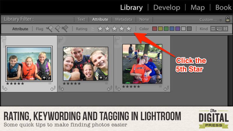
In the Library panel, click on attribute:

Rating in LR1


Then, click on the 5th Star:


Rating in LR2


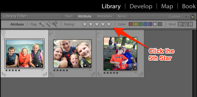
That’s it! Now you will see all of your photos that have a 5-star rating. Pick the photo you want to scrap and scrap away!


Keywords

The next order of business is Keywording. Keywording is very personal, so how you want to keyword is completely up to you. However, I will share with you a few things I have learned about how I search for photos.


  • I often search by subject to match a Kit’s theme such as travel, bike riding, garden, etc.
  • I often search by event such as birthdays or holidays.
  • I often search by grade for school assignments or yearbook requests.
  • I often search by sport for layouts or because my children are requesting it for school assignments.
  • I often search by name (but I will discuss this in the next section).


So, here is what I do. Once I upload my photos, I quickly go through them. Because I do upload pretty regularly, (I have to because I shoot in raw which takes up a lot of space on my SD card.) it’s a fairly painless process. Most photos are from the same event and therefore would have the same keywords.


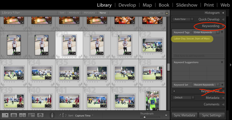
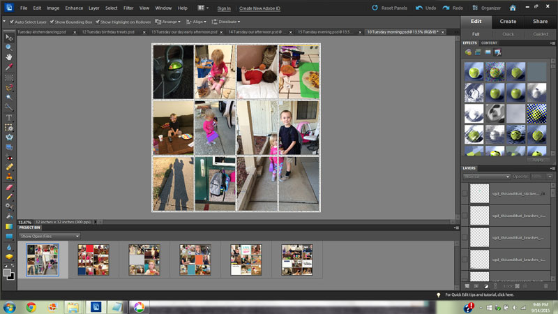
I click on the first photo and shift click and command (Mac) or control (PC) click on the other photos until all of the photos from the same event are highlighted. Then, I type the keywords that they all have in common in the Keywording panel (not the Keyword List). The keyword list is an option where you can just check the boxes next to any existing keywords that you have in order to apply them once you have already created them. However, I prefer to type them in. Especially since it auto populates as you type to finish the keyword for you if you have already created it.


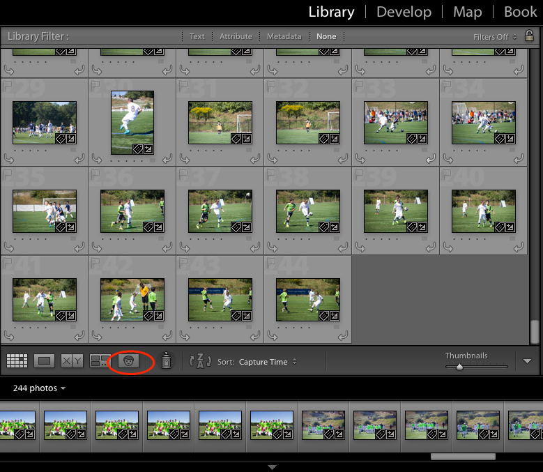
In the example below, they are all photos of both of my sons, playing soccer, at the Stars of Massachusetts Soccer Tournament on Labor Day Weekend. Therefore, those are the keywords I used.


Rating in LR4


Next, I will weed through those photos and select the ones that are of each of my sons’ teams and keyword them with the team name. Then I will go through the rest of them. I created a video to show you just how quick the process is. You can watch it below:


People

Now, I mentioned before that Lightroom now has the ability to tag People using Facial Recognition and I have to tell you, it’s pretty good. However,  if you set it to work on large groups of photos, you could be there for a while. But, if you use it on a select group of photos, say, photos you just uploaded, it is a pretty painless process. Once you identify a person in your photo, Lightroom keywords the photo with that person’s name. So in the video above, I didn’t need to keyword the photos with my children’s names. Instead, it makes more sense to tag them using the people tag. This is because the more you use it, the better it gets at identifying people, making it easy to search for photos with specific people in it.


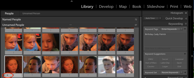
It’s pretty easy to use. In the Library module, all you do is click on the face tab on the bottom toolbar or you can press “O” on your keyboard.


Rating in LR5


Lightroom will bring up a bunch of faces for you to identify. In the photos I used for the demonstration, there are a lot of faces I do not need to tag. So, the first thing I did was to get rid of all of those faces by highlighting them and clicking on the “X.”


Rating in LR6


Next, I highlighted all of the photos of one person and type their name into the box below one of the photos which tags them all at once. These tags are then automatically added to the Keywords field of the photos metadata.


Rating in LR7


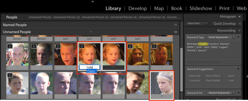
One caveat, once you start tagging people, Lightroom begins to think it’s pretty smart and starts grouping photos into stacks that it thinks are all the same person. While it is pretty good, it does sometimes make mistakes. So, you can choose to change it after the fact, or you can unstack a group of photos to make sure they are all correct before you ok Lightroom’s work. To do this, click on the stack icon at the top left corner which will spread them all out and then you can approve them all individually. Personally, I think it is easier to delete one wrong one after the fact than it is to approve them all individually.


Below is another video. This one shows you how easy it is to tag People.


I hope I’ve inspired you to tag and organize your photos as soon as you upload them. If you have any questions, feel free to ask them below and I’d be happy to help in any way I can.


Cheers!


Jen Flaherty

About the Author: Jen is a member of the Pocket Team at The Digital Press. Having scrapped digitally for many years, she has come to embrace the simplicity of Pocket Scrapping since it fits more easily into her busy lifestyle of shuttling her three children from field to field. When she is not on the computer, you will find her working out or really doing anything else she can besides cooking, cleaning and doing laundry.

Move Forward Towards Your Scrapping Goals – Scraplift Yourself!

Move Forward Towards Your Scrapping Goals - Scrapbook Yourself!

Do you ever get into a scrapbooking rut when you feel like you can’t come up with a clever page design for your layout? I know I have been there! When it happens to me, I usually head over to the TDP gallery for some layout inspiration. But today, I’m going to encourage your to head to your OWN gallery! That’s right! You should scraplift yourself!

When I’m feeling bad about my scrapping skills (and don’t we all sometimes?) a quick stroll through my gallery to look at my favorite layouts can usually get my mojo flowing again. One of the easiest ways to get back to scrapping and get those layouts finished is by scraplifting your own layouts. A lot of people might say that they don’t want such similar pages in their albums, but I promise that nobody will notice when they admire your work! If you want to shake things up from your original layout, you can always rotate your original or change the number of photos for a quick fix.

I find that using this scraplift yourself strategy gets me in a positive mindset about scrapping and helps me get my layouts finished without too much stress. The greatest part is that the pages come together so quickly! I use the original layout as a template and then just clip the new papers to the originals and swap out the embellishments. It is so quick and easy!

Here is an example for you:
Here is the original layout-

http://www.thedigitalpress.co/move-forward-towards-your-scrapping-goals-scraplift-yourself/


And here is the new layout I created with my scraplift

Move Forward Towards Your Scrapping Goals - Scraplift Yourself!

As you can see, they are quite similar, but when separated in an album, it is no big deal at all! It got my layout done on a day when I might have otherwise given up on getting a page done.

I would love to see what you can come up with when you scraplift yourself! I’m hosting a challenge over on the TDP Challenge Forum and you should come play along!

KatieAbout the Author: Katie is a member of the Creative Team here at The Digital Press. She lives in Central Florida with her husband and their four sweet, crazy boys. When she’s not dodging Nerf bullets or trying to dig out from under the never ending pile of laundry, she enjoys photography, cooking, going to Disney World with her family, and, of course, digital scrapbooking.


Repetition in Hybrid Pocket Pages

Repetition in Hybrid Pocket Pages


A design principle that I often rely on in my hybrid pocket pages is the use of repetition. If I’m needing to get a pocket page done quickly, I’ll repeat design and elements on my page.


Repetition in Hybrid Pocket Pages


On this pocket page made using Laura Passage’s A Moment Captured, I used repetition in a few different ways. I made the 4 corner cards all very similar. I blocked paper at both the top and bottom of the card and then used the scripted word art and journaled. Having these 4 cards very similar really unites the page and sets the tone for the other cards. And obviously, repetition, such as on these cards, makes the design process much easier because you finished almost half the cards with only having to design one card.


Repetition in Hybrid Pocket Pages


The four inner cards are also using repetition, but in a more varied sense. The photos, the doilies, flowers, and the word strips are all very similarly placed but there is a variation in placement, shape, and color. This look provides a more visually stimulating effect while keeping the same mood.


Repetition in Hybrid Pocket Pages


The middle card has its own form of repetition with the repeating embellishments. I punched out 18 starburst circles and layered the blue on top of the gold for all except the one where I wanted to add the word art. This breaks up the monotony of the repeated shape and draws the eye in.


Repetition in Hybrid Pocket Pages


By really designing only three cards on a nine card layout, I cut down my designing time and decision process drastically. A page that would’ve taken me an hour and half took only 40 minutes. That’s pretty fast for a hybrid page!


Brenda

About the Author: Brenda Smith is a mother of two littles and wife located in Southern California. When she is not scrapbooking, you can find her working full-time, trying to finish up her college degree with online classes, or sleeping because there are never enough hours in the day. Hybrid scrapping satisfies her addiction to technology and her addiction to paper and glue.

Move Your Process Foward

A few years ago, if there was a medal or award for word’s slowest scrapbooker, I, Carrie, probably would have won it. Turtles traveled to island destinations faster than I made a page.  My mind would be blown when seasoned scrapbookers told me they only spent 30 minutes to an hour on a page without a template. I spent a solid two years learning to make a page in 45 minutes or less and, now, I’m going to save you those two years by sharing how to make quick decisions based on line and flow.  There will be a challenge at the end of this post! 

I did, in fact, time both of the example pages used in this post. Secret Recipe, made with Plastic Pocket Templates #2 Mommyish and Brilliant- Papers & Elements by Danielle Engerbretson took a full 45 minutes. Finally Together, made with Sahin Designs’ Monochrome Fall Bundle was completed in 37 minutes and 15 seconds.  A 45 minute or less scrapbooking session not only adds to my library of memories, it keeps me sane and happy. I can scrap with my morning coffee before getting to work and with my cup of tea before bed. I can start and end my day with a dose of scrappy creativity and so can you! You’re about to become a smarter, faster, more strategic scrapbooker… 

Before you even open Photoshop, the first steps to moving your process forward involves very simple planning.  I always know ahead of time:

  • what product I’m using
  • what photos I’m using
  • what story I’m telling
  • the shape of my page design

You can make these decisions ahead of time, eliminating choices you have to make once you start scrapping. Aside from the photo processing, you can come up with the rest while you’re doing the dinner dishes or while you’re taking a shower. Easy, peasy.

Helpful Hints:

  • Limit the amount of product you use and use product you know works for you.
  • Process your photos ahead of time.
  • Be familiar with some basic composition (or page design) shapes.

Just in case you aren’t familiar with basic composition shapes, I’ll give you a crash course now. When starting your process, pick one of these shapes. If you’re using a template, be aware of the template shape; This will help you the next time you create your own page design. If you know this, feel free to skip this part, but feel welcome to compliment on my awesome vector skills.

Move Your Process Forward by knowing composition shapes for scrapbook pages via The Digital Press

A block can be rectangle, square or grid. A circle would a variation on a block design.

A band is a design runs across the page, usually surrounded by generous white space.

A cross is made up of two bands that intersect centrally to create a lower case “t”, upper case “T”. Variations include rotating the “t” to creating an “x” or adding more lines to create a burst or star shape.

A bracket consists of a horizontal and vertical lines that meet at a right angle, creating an “L” shape. Variations include any sort of bracket or bookends, such as “[” or “{“.

(You can certainly use your creative genius to ramp up the basic composition shapes)

Okay, so now your…

  • Photos are processed
  • Your product is picked
  • You know what story your telling
  • You selected a basic composition shape (I use a block in the example pages)

…and you haven’t even starting putting things on the page. You, my lovely, are way ahead of the game! You’re ready to open a new canvas.

Keeping your page design shape in mind, place your photos on your canvas. Yes, before you even put on your background paper. No, I’m not crazy. There is an actual strategy for deciding where to place your photos, whether your using one photo or five hundred (which, you probably don’t want that many on a page, but ya never know!).

It’s all about the lines in your photo and where they are going. For people, you normally want your subject looking into the page. Our brains will naturally follow a persons line of sight. If your cutie pie kids’ eyes are looking off the page, the viewer’s eyes will go off the page. If those cutie pies are looking at the nearest photo or embellishment cluster, that’s where the viewer’s eye will go. Also take into consideration body positions: Where are the shoulders going? How are the arms directed? Is the torso leaning in or out of the composition? The lines in the photo will tell you how to position the photos within the shape of your page design.

On this page eyes of the kids are kinda all over the place in these photos, but the shoulders and torsos in the photo on the left point to the photo on the right. The torsos of the kiddos on the right are turned more towards the left than right.

Move Your Process Foward


For photos without people, you still want to let the lines in the photo dictate placement. Notice on this page that the pan on the left leads to the pot on the right. The spoon on the right leads back to the pan on the left.


Flow is the way the eye moves across your page. The lines on your page and the flow of your page go hand-in-hand. By positioning your photos based on line, you’ve already begun creating the flow of your page. (yay, you!)

Now that your photos are in the right spot, add in your background paper. Add in other papers to fill out the shape of your page design and think about where to put a title and journaling. Add in the journaling and title before embellishing (trust me on this one).

It’s time to embellish, so how do you know where to put all the pretty goodies? The lines of our photos within the shape of our page design will tell us where embellishments need to place to create strong flow. The embellishments areas create stops along your page. They tell the viewer what’s important to notice and help the eye decide where to move next.

There are three areas you usually want to the viewer to stop on your page: The start position (grabs the eye and leads it into the rest of the page), the photos, and the title and/or journaling. The focal point should always have the biggest, most visually interesting embellishing.

On this page, the embellished tag doubles as both a lead in to the page and establishes the focal point. The rest of the embellishing creates lines through the photos… notice that the lines fall through or next the kiddo heads and the embellishing is smaller and less dramatic.

Finally Together


There are a lot of bold, potentially owhelming elements on this page, but I’ve used the embellishing to control the flow and establish my huge title as the focal point.  Notice how the embellishing points also work with the shape of the design and the lines in the photos.

TDP-8-21-carriew2f


If you understand how line and flow work together, you can decide where to put everything quickly. It’s choice that slows down our process and it’s choices we are simplifying with this process. To add to the awesome, when you understand how to use line and flow, it’s going to be hard to make a page you don’t like. It’s a total win. Now that you have these new, mad skillz…

For the challenge, you’ll follow this recipe:

  • Grab a timer (or use an app or use Google’s timer) and put 45 minutes on the clock.
  • Have your photos processed
  • Select the product you like to use (if you want to use multiple designers, this month’s Special Edition or Store Collab allow you that versatility and it’ll all go nicely together)
  • Pick your design shape (and stick with it!)
  • Open your canvas and place your photos
  • Add in background paper and additional papers to fill out your shape
  • Add your title and/or journaling
  • Embellish your page in three important areas– putting the most dramatic embellishing near the focal point

You can stop the clock as needed, for instance, if you need refresh your drink, answer the phone or use the restroom. Just remember to hit start when you come back to your page.

Share your page in the challenge thread HERE and tell us what composition shape you used (if you used a template, let us know what the shape it has) and how long it took you put the page together. (if you took longer than 45 minutes, no worries, I still love you.


Carrie About the Author: Carrie lives in coastal Delaware with her husband, teenage son and 5 cats. She produces and hosts The Digiscrap Geek podcast where she gets to   talk to amazing people about her favorite topic. Carrie creates for The Digital Press, Just Jaimee, Get It Scrapped and is a Be Photo Wise contributor. In her spare time, you may find her kicking but on Call of Duty, herding cats, star gazing or whipping up magic in the kitchen.

Moving Forward with Projects

In the land of scrapbookers we make lofty goals and aim to create so many projects. Sometimes, we have so many projects ‘on the burners’ that is hard to figure out how to move forward with them. I am guilty of having too many projects going at the same time and not putting the full effort into just one. Yet, I do have a system when it comes to starting, getting through and completing projects. I take baby steps to move forward.

1- My first step is to gather the photos and then edit them down to the ones I will scrap. I use the amazing IPhone app PicTapGo that makes the photos look incredible or just fixes the lack of light. The image on the left is the before and the image on the right is the after using PicTapGo. It is a game changer.
Moving Forward with Projects


2- Compile all the photos by clipping them into pocket pages. My current project is tackling Week in the Life and here is a screen shot of my pocket pages in progress. I clip every single page together before doing anything fancy.

Moving Forward with Projects


3- Pick my supplies. For Week in the Life I am using Scotty Girl Design kits. And to keep it interesting I am using a different kit for each day. But, I will be using the awesome Pocket Essentials (especially the brushes). Here is a collage of several kits I will be and am using to complete this project.


Moving Forward with Projects


4- Once my supplies are picked I dump the pieces I want to use on all the pages. I do a rough placement, like a rough draft, and add shadows if needed.


Moving Forward with Projects


5- Refine the embellishments and put into correct spots.

6- Finally add journaling (and proofread).

7- Save the files as jpegs and web versions. Here are a few pages that are completed. I have a few days left in this project and I am excited to get it completed.


Moving Forward with Projects


Moving Forward with Projects


Moving Forward with Projects


These little steps help me to complete projects and I think it is so helpful to complete big projects in batch processes. Doing a small piece each time you get some creative time helps to get to your goal of finishing the project.

Can’t wait to see your projects! And I will continue to post more Week in the Life pages as I complete them.

ATDP_blog_sabrinabout the Author: Sabrina is a mom of two little monkeys and is a dreamer of many projects. If she isn’t chasing after her toddler or discussing Legos with her son, then she can be found scrapbooking or reading.


Personalizing Folder Icons on a Mac

Personalizing Folder Icons On A Mac


Today I want to show you how to turn generic folder icons on a Mac to a personalized image of your choice. What the heck do I mean? Let me show you:


Personalizing Folder Icons on a Mac


I like to do this for the main folders of digital scrapbook kits. I replace the generic folder icon with an image of the kit preview. It’s super easy to do. Here’s how:


1.   Copy the image you wish to use to the clipboard.


I prefer to do this directly from within a Finder window without opening Photoshop. When I’m using a kit preview (you can do this with any image of course):


  • Right click on the kit’s preview image provided by the designer (usually a JPG image)
  • Choose “Open With”
  • Select “Preview.app”


Once the image has opened in a Preview.app window:


  • Choose Edit > Select All (or press CMD+A)
  • Choose Edit > Copy (or press CMD+C)


At this point the image you copied is in your clipboard. You can now close the preview image. (Click the red X radio button or press CMD+Q.)


2.   In a Finder window locate the folder icon that you want to change. 


  • Right click on the folder icon
  • Choose “Get Info” (or press CMD+I)
  • Click on the small folder icon in the upper left corner of the Get Info window that just popped up
  • Choose Edit > Paste (or press CMD+V)


The folder icon has now been replaced by the image you copied in step 1 and you can close out of the Get Info window. (Click the red X radio button or press CMD+W.)


That’s it. You’ve now personalized a folder icon!


NOTE: If you change your mind and want to go back to the generic blue folder icon, just open up the Get Info window again, click on the small folder icon in the upper left of the window and press delete. Easy peasy, right?!


One more thing!  You can also personalize file icons following these steps as well! I find it really useful to personalize my styles files (.asl files). I have a master folder where I keep all of my styles. I like to keep only the .asl file from purchased styles (not the whole folder of stuff that comes with the style). If I didn’t personalize the files, I would have a folder filled with files that look like white folded pieces of paper. I follow the same steps I outlined above and copy the style preview image to the .asl file. Since I do this I can easily find the style I’m looking for and see who the designer is without having to read through for the style I’m looking for. Cool, right?!


BTW … the kit I used in my sample image is Laura Passage’s (aka Wishing Well Creations) gorgeous Project 2015 September Collection!


BarbaraUnzen

About the Author:  Barbara is a member of the creative team here at The Digital Press. She’s a mom to two teenage kids (her son, the oldest, is a freshman in college and her youngest, a daughter, is in high school). She lives in the midwest with her husband, daughter and their dog Maggie, a cuddly ball of fluff. (This is the first time she has had to say she lives with only one kid. So weird!) In Barbara’s free time she loves to digi scrap, take photos and hang out with her family.