Tutorial Tuesday | Photography Tips for Shooting in the Dark

As the Northern Hemisphere eases its way into winter and the days get shorter and shorter, the amount of light available for our photography decreases significantly. Don’t put your camera away for the season and let your scrapbook go empty, however. Grab it back out of the closet and take great photos with these shooting tips!

Low Light Photography Tips

EXPOSURE TRIANGLE — We already know that light is the most important consideration for taking great photos. You’ve heard about the “exposure triangle” with regards to photography — which refers to ISO, aperture, and shutter speed. To make the most out of our settings in low-light conditions, we’ll need to increase our ISO, open our aperture as wide as we can, and lower our shutter speed to as slow as we can get it without incurring camera shake. A tripod can be useful if you need a very slow your shutter speed. Make sure you double-check your white balance, too (one of the disadvantages to using ambient light is that indoor light has more of an orange-ish tone to it).

FLASH — Use a flash. I’m not a huge fan of the onboard flash, and my camera body doesn’t even have one… but sometimes, we have to do what we have to do so we don’t miss capturing something. If you have an onboard flash, explore some options for diffusion or direction. If, however, you have an external flash, try pointing it up and behind you to avoid direct flash and red-eye.

ALTERNATIVE LIGHT SOURCES — Get creative with other light sources! Ipads, flashlights, or even the moon can give you enough light for a great shot. Here are a couple of examples…

Turn your photo black-&-white and increase the contrast! It can be tricky to get the coloring just right without a great light source (and/or your photos might have more graininess with a high ISO)… but you’d never know that in black-&-white! Black-&-white images also look GREAT on scrapbook layouts…


I hope these tips will help you create photos — and scrapbook layouts — that you love (easier and faster)!


FarrahAbout the Author  Farrah Jobling is a member of the creative team here at The Digital Press. She lives in Denver with her amazing family — Mike, Nicholas (9), Claire (7), Hope (2 yr old puppy) & Kringle (9 mo old bunny). She works from home as a photographer and enjoys scrapping her personal photos.


Save

Hybrid How-To | Decorate Your Home


Hello everyone!!  Today I’m here to show you how to create this cute sign with your digital word art stash.  I love crafting and especially hybrid crafting.   I made this one for my craft room.  I’ve also decided it’s the perfect time to get started on those Christmas gifts.  I don’t know about you, but I love getting and giving homemade gifts.  This year I’ve decide I’m going to make everyone a sign for their home.   The Digital Press has tons of word art kits.  There is something for everyone!!!

SUPPLIES:

  • Cutting Machine
  • Digital word art (From The Digital Press…of course)
  • Wood (I used scrap pieces I had laying around in the garage)
  • Paint – make sure to get matte
  • Paint Brushes (The cheap sponge ones are fine)
  • Vinyl
  • Transfer Tape

I used the new release, GRATEFUL, and ANOTHER 25 DAYS by Sabrina’s Creations.  GRATEFUL word art is perfect for home décor.

boards

There are different ways to achieve the same look.  Today we are going to do the PVPP method….Paint Vinyl Paint Peel

Prepare the wood.    To start off you will base coat the wood with the color that you want your word art to show.  On this project I base coated my board white because I wanted the writing to show up white.  While the wood is drying you will start getting your vinyl ready.

draganddrop

Open your cutting software.  Shown here is Silhouette Studio Designer Edition.  Simply open the file you have your word art saved it and drag the one you want to work with first to the mat.

You are going to have to give the image cut lines.  If you were to go to cut now, it would cut a square box around the image, because it’s not a svg file.  I will show  you how to TRACE the image so that you will have those cut lines.  Highlight the entire image and uncheck the High Pass Filer and move the Threshold over until the image is completely yellow.

cutfileattop

Now select Trace. Move the image over and you can see the red lines.  These are the cut lines.  You can delete the black image now.

cutsetting

Cut your vinyl to size, apply to your mat, load and cut.  Make sure that you have chose the right material type and have changed your blade settings.  I don’t think you have to change your blade on the newer machines.

Now it’s time to weed your image.  To start off you will remove the bigger pieces around your image (1).  Next, you will use a weeding tool or a safety pin to remove all the smaller pieces (2).

The next step is to apply your transfer tape over the entire image (3).  Now apply it to the prepared wood.  Use a flat card to burnish it to the wood (4).  This keeps the paint from going under the vinyl.

remove-transfer-paper

Carefully remove the transfer tape.  Use your finger and go over the vinyl to make sure that it is adhered to the wood good.

Using the color you want on top, paint over the entire image….vinyl and all.    Make sure there is not a lot of paint on your brush.  A couple of lighter coats is better than one thick coat.  If you do it too thick, the paint will get under the vinyl.

This is the step that you will hear different opinions on.  Some say to wait to remove the vinyl until it’s completely dry and others say to remove the vinyl while it is still a little wet.  I prefer doing it while it is still a little wet.  You can work on a scrap piece of wood and see what works best for you.

Here are the final results.  I’m really happy with the way it turned out.  Below are photos of some more signs I am still working on.

This one I’m going to sand the edges to give it a more rustic look.

For this one I’m going to add a frame to the bottom left.  I thought it needed a little something more.  It’s a little wood frame that I purchased at Hobby Lobby,  I’m going to paint it black.  That way you can add a photo of something or someone that you are Thankful for.

Another suggestion to try if you don’t want to paint is to simply add vinyl to an already painted plaque or piece of wood.  The possibilities are endless.  I hope that this tutorial was helpful and that you will give it a try….. ENJOY!!


TanyaAbout the Author  Tanya is a part of the hybrid team here at The Digital Press. She has been hybrid crafting for at least 14 years now, and loves creating and sharing those creations with others. Her all-time favorite tool is her Silhouette Cameo. She has been married for 28 years to her high school sweetheart, Richard and has two sons: Chris, 25 and Chance, 20. She also enjoys crocheting, photography and woodworking.

Tutorial Tuesday | Journaling Techniques

Hey ladies! I know that journaling is something that many scrappers struggle with. And yet to me it’s the main reason for scrapping: to tell a story, to remember the moment and the feelings. My job is to write 95% of the time, so my “writing muscle” is strong and always ready to get to work, but I can understand how difficult and overwhelming the idea of journaling can be when your muscle isn’t as strong as mine. So let’s flex and stretch and build up your writing muscle together, shall we? Here are some journaling techniques you can use to help you tell your story even when you feel uncomfortable writing.

  • Answer to the “Five Ws and One H” that journalists use. Those questions are interesting because you have to elaborate somehow, you can’t just answer them with yes or no! You can talk about facts (what happened?) or about feelings (what emotions did you feel?), and of course you can pick and choose which questions to answer!
    • What?
    • Who?
    • When?
    • Where?
    • Why?
    • How?

On this LO, Corrin added the When (date on upper corner), the Who (kids’ names) and the What with lots of details!

  • “Talk” to someone. It’s hard to express ourselves “on our own”, but if we write to someone like we would talk to them during a conversation, it becomes much easier. Try talking to the person your page is about, telling them why you decided to scrap this story, why you love this or that in them, why they make you go nuts with this habit of theirs. Try writing to someone that is gone, or that isn’t here yet. Write to someone you admire, a fictional character, an historical figure. You could even write to your pet or to a thing! “Dear Netflix,…”

What a touching “letter” Heidi wrote to her dad! Sweet!!

  • Use someone else’s words. If you’re not confident enough to journal from scratch, why not “borrow” someone else’s words: a song, a poem, lines from your favorite book or movie, a quote.
  • Use wordbits or wordart. Our beloved designers work hard to provide us with beautiful kits, but often those products are also terrific tools to help us tell our story. Let those elements be your journaling or inspire words of your own!

Here the wordart is used by Shivani both as a title and a starting point for the journaling!

  • If you feel comfortable writing but not sharing your journaling, you can easily hide it when you create the web version of your LO: delete it, blur it, add paint on top of it, blend it into the paper until it’s unreadable… There are lots of ways to keep it secret!

On this LO I could easy have blended the journaling even more to make it unreadable if I wanted to keep it a secret!

I hope those few tips will help you overcome your fears or awkwardness towards journaling! If you need an extra push to try it, why not join this month’s journaling challenge hosted by Amy?


ChloéAbout the author  Chloé is in charge of PR and communication for her small town by day, is a digiscrapper “by night,” and a photographer whenever the light is beautiful. She lives with her man and fur-babies in a small town of Alsace (in the northeast of France), where she loves to read, watch good TV shows (TWD being her absolute favorite), and just hang out with her friends — no matter if they are close by, online, or away in her Swiss hometown. She recently became quite obsessed with her BuJo (bullet journal) and can’t wait to discover how much it’ll help her improve her (so far non-existent!) organisational skills!

Feature Friday | MEG Designs

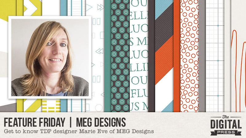
It’s Friday!  That means it’s time for another edition of Feature Friday… and we get to learn a little bit about one of our beloved TDP designers. This week, we’re featuring Marie Eve of MEG Designs!

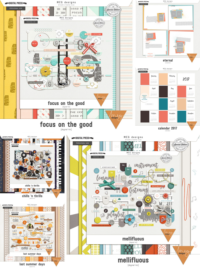
Anyone who has shopped at The Digital Press already knows her beautiful designs: her store is filled with digital kits, calendar templates, word art, journal cards, and amazing layout templates.  She has a knack for putting vibrant colors and patterns together with unique elements that work seamlessly with traditional ‘paper-style’ scrapbooking, pocket scrapbooking, and graphic style pages. You will find something that works for any photo and memory that you want to document and treasure! Personally, I love some of the names of her kits!  They are unique and fun… such as my personal favorite… Mellifluous. I mean, seriously. How awesome is that?! 🙂

Before we get to some of my favorite products of hers, however, let’s learn one little tidbit of info about her, shall we? As you can see above, her name is Marie Eve. For the longest time, I thought it was Meg, but alas, I was wrong! MEG is actually her initials (last name starts with a G). Huh! Creative, right?

Okay, now I’ll share a few of my favorite items from the MEG Designs store here at The Digital Press…

I asked Marie Eve some questions so we could learn a little bit more about her, and here’s what she had to say…
Where do you live?
I live in a house in the countryside in Belgium. We see lots of of sights. There are fields and meadows with horses near the house. I don’t know if everybody knows where Belgium is located in Europe; the capital is Brussels, and it’s a country between France, The Netherlands, Germany, and it’s in front of the United Kingdom.

When you’re not designing, what do you do with your time?
First of all, I work another full-time job throughout the week. After work, I like to go 2 times a week doing some sport like Zumba or Turbo Kick Power. This allows me to decompress and think about nothing. I also love spending time cooking, especially making desserts. I never have to go to the bakery, because I make my bread myself. I also try to spend time with my 2 children, and enjoy them while they are still young. They really like to play board games.

What are 5 tidbits of trivia we might not know about you?
—I never wear dresses or skirts, I’ve never liked that. I prefer to wear trousers; it is much more comfortable.
—When I play board games with my family and I lose, I’m never rattled, and I am not at all a bad loser. It’s all part of the game.
—I am a shy and quiet person. I do not talk much about my private life, but I am a very cheerful person. One day someone told me that when she heard me on the phone she knew I “spoke with a smile.” This is absolutely me, it’s my personality.
—I am a chocolate addict, and it’s really difficult to do without. When I make desserts, they are often based on chocolate. When I have coffee, I like to eat a dark chocolate tip, my favorite.  Belgians say the best chocolate comes from Belgium. Swiss say it’s at home, but who tells the truth? LOL
—I wish I had more time (like most people). I have started lots of scrapbooking albums that are still not finished. It’s hard to balance between creating products and progress in my albums, and I can not choose. My children are growing up and their albums are not moving much. The only albums I’ve finished are my December Daily since 2010. Last year, I decided to make it in hybrid,  which takes a little more time than digital, but I like this style too.

Which of your products is your favorite?
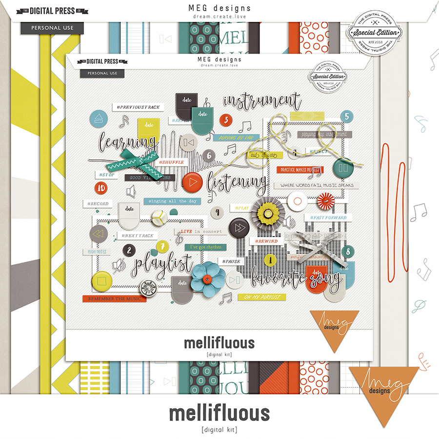
That’s a really difficult answer because I like everything I design. If I don’t like something, I don’t release it. If I had to choose, I think my favorite product is Mellifluous

About her designs, she also had this to say: “All of my products are inspired by my private life, whether it’s my children, holidays, things we do, or even something that one of my children said. Usually, I have a theme in mind and then I observe what is around me and I find a color palette that fits my theme.”

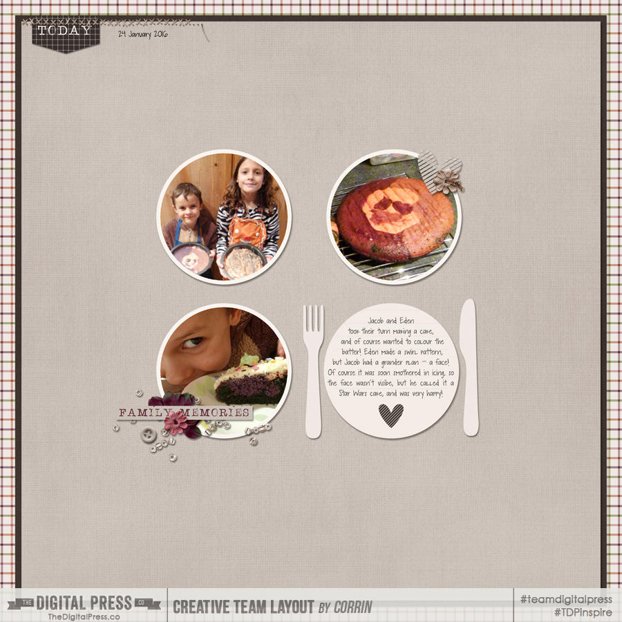
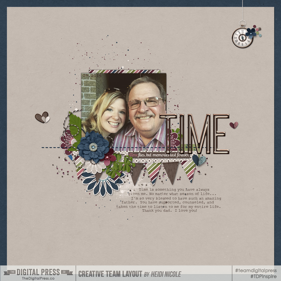
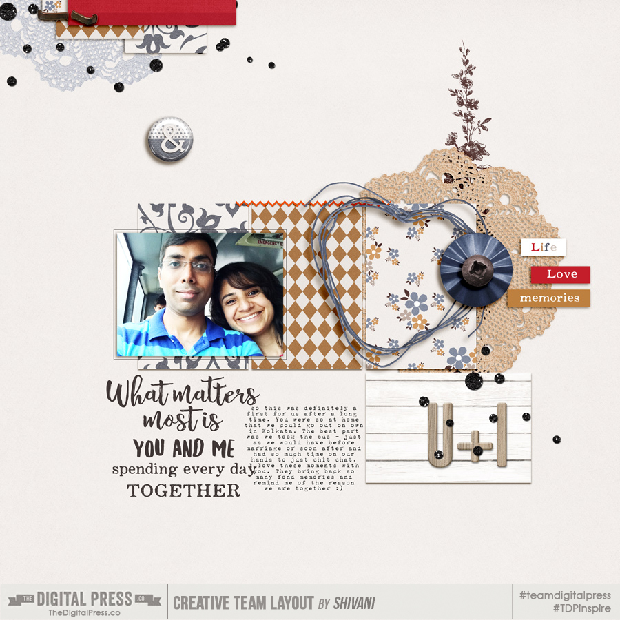
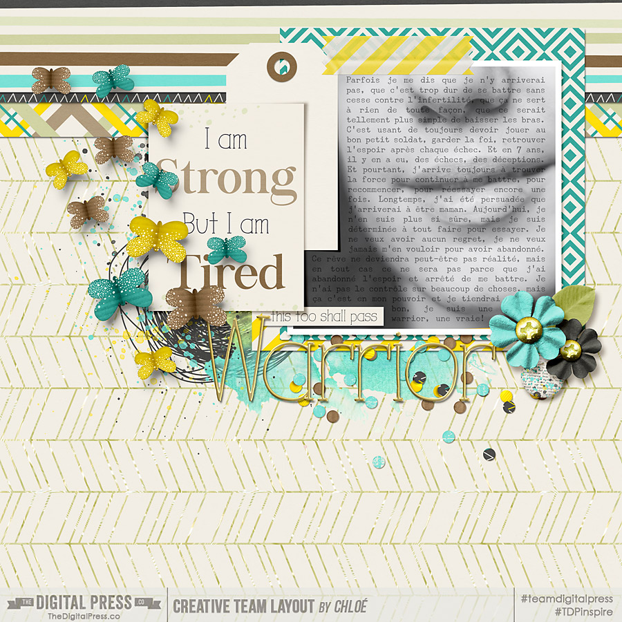
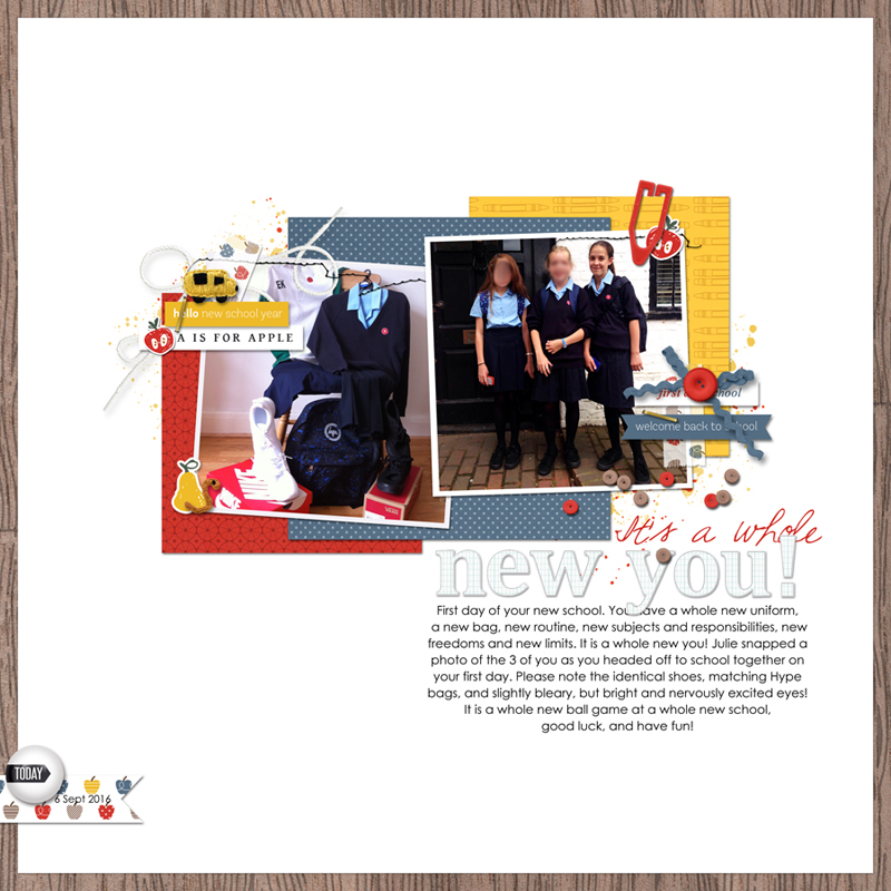
MEG Designs’ products are so versatile, they can be used for all of your memories and in whatever style suits you.  Here are some examples of her products in action…

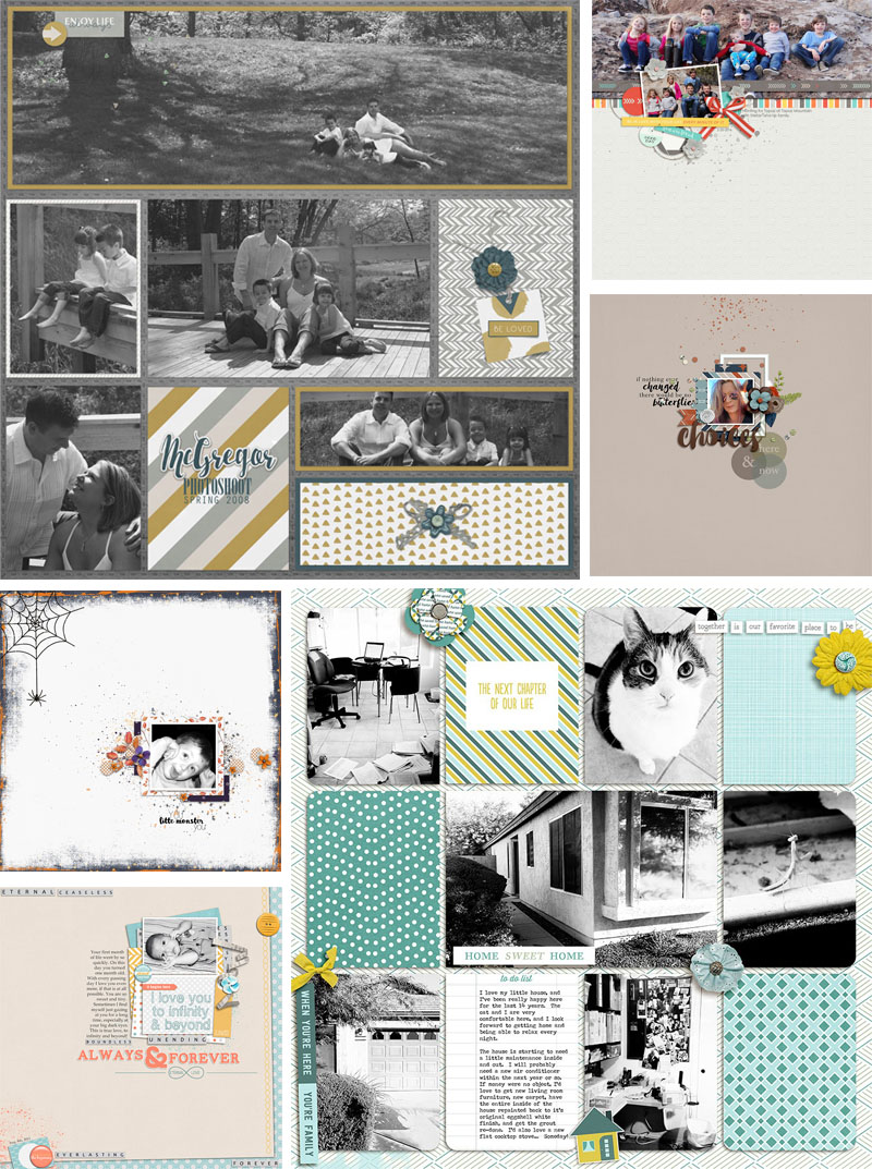
As you can see, her products are perfect for simple “white-space” layouts, for full-page pocket-style layouts, and everything in between!

I don’t know about you, but I loved getting to know Marie Eve, and I can totally relate to loving coffee and dark chocolate. I’d love to taste some of her yummy desserts! She’s down-to-earth, sweet, cheery, totally creative, and we love her here at The Digital Press!

Good news… if you visit her shop this week you will enjoy 30% OFF her gorgeous products (sale runs through the end of 11/17)!  Thanks for joining us this week and getting to know Marie Eve. I hope you enjoyed it as much as I did!


Heidi NicoleAbout the Author  Heidi Nicole is happily married to an amazing man, a step mama to 2 wonderful kiddos, and mama to 3 sweet and sassy furbabies.  She’s a radiation therapist by day and creator of pretty things by night (she’s pretty confident that she’s hit super hero status, but refuses to wear a cape.)  She loves cats and huskies, coffee, audio books, FRIENDS reruns, St. Louis Blues hockey, cooking, baking, and traveling.  Oh, and wine… she really likes wine.  She lives a normal and happy life, and enjoys all the absolutely extraordinary people she gets to share it with on a daily basis!
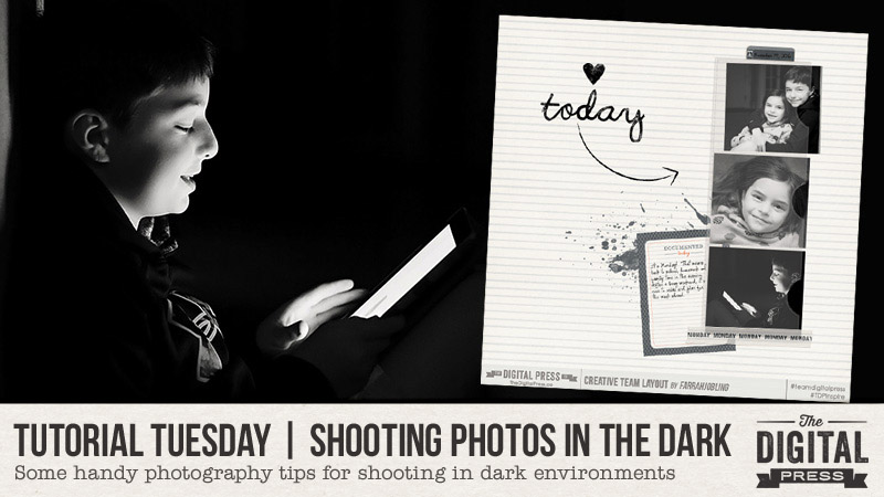
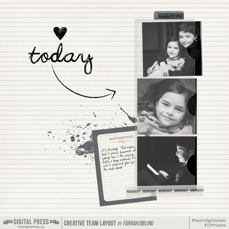
Tutorial Tuesday | Combining Fonts

Hello and welcome to another Tutorial Tuesday from The Digital Press! I don’t know about you, but I love, love, love all the pretty, swirly, quirky, office-y, bold, simple and all other kinds of fonts that are around (and often free!) in digiland. I have to admit I have bunches of them that I loved the look of, and downloaded, but have never used because I tend to stick with a few old favourites. Are you a bit like me? Well this tutorial is all about how to mix, or combine fonts – in the hope that perhaps you and I will go on to use a few more of the pretty fonts that we have stashed away, gathering digital dust in on their virtual shelves!

There are no hard and fast rules when it comes to combining fonts, just like everything else, if it looks good to you, then it is good! But there are a few guidelines to help if you want to mix and match your fonts.

Before we get the those guidelines though, it is good to know what the different font types are:
Serif — these fonts have little lines at the end of each stroke (so at the beginning and end of the s, at the top and the bottom of i etc).
Sans serif — these fonts DON’T have those little lines at the end of each stroke! (The font you are reading right now, the main text of this tutorial, is written with in a sans serif font).
Script — these fonts are based on handwriting, and tend to look more casual than the serif and sans serif fonts.

Different fonts can help to create a different character for your pages, and when used well, they can give you a brilliant title, inviting journaling and clear notation of the facts (like when and where your event occurred).

Here are the 3 most helpful guidelines that I found…

1. 2 could be the magic number! Most pages can be improved by using more than one font, but few pages will be improved by using more than 3.

2. Contrast is key! When combining fonts, try looking for fonts that have plenty of contrast. For example, if you have used a tall and thin sans serif font, try pairing it with a shorter or rounder scripty font.

3. Size matters! Pay attention to the size of your fonts. If you are creating a title, you might want to have one focus word bigger than the rest. Titles are also usually larger than the main body of journaling. When thinking about your journaling font, remember that some fonts are easy to read even when they are quite small (serif, or sans serif fonts for example), while some fonts can be quite difficult to read if they are small (script fonts tend to be more difficult to read in small sizes). You can try adjusting the font size, or the spaces between the lines (called leading), or even the space between each letter (called kerning).

So, putting all these guidlelines to work, I made this page! You can see that I went for 3 fonts (2 in the title, and 1 for the journaling and date). I used a script font (“Sunshine in my soul” – seen in red) and a serif font (this is actually an alpha from Project Grateful – Crisp, which is the collection I used to make my layout) for the title, and then I stuck with a popular and easy to read sans serif  font (“Century Gothic”) for the journaling and date.

So there you have it! I hope you have found this helpful, and if you know you have some great fonts, but haven’t used them much yet because you need a little help organising your fonts, Carolyn (Amson) recently wrote a blog post all about a way to help organise your fonts so they are easily accessible next time you want to try using some of them! That tutorial can be found here: Easy Font Management.


CorrinAbout the Author  Corrin is on the creative team here at The Digital Press. She is a fan of the Big Bang Theory and a lover of cozy pajamas. She lives in the breezy South of England with her husband and 4 crazy kids, who regularly discover & plunder her secret chocolate stashes! She is still trying to get the house straight after moving nearly 3 years ago. Who knows… maybe this will be the year she reaches the bottom of the laundry pile!

Hybrid How-To | Credit Card Sleeves

For the first time in 16 years, my credit card information was stolen. It was actually stolen twice. Both cards use the new EMV chip technology. The Thieving Scum used the information to generate a new, physical card, and they were having all kinds of super duper fun times in New York City. Not cool, Thieving Scum.

I was told by one of the Fraud Departments that the best way to prevent Thieving Scum from taking what isn’t theirs is to buy a foil-lined sleeve for each EMV-chipped card.

Well, I thought I could cute-ify this project a bit with some pretty scrapbooking paper.

Supplies

  • Card Sleeve Template (download my template HERE)
  • Digital Scrapbook Paper of your choice (I used Gratitude by Anita Designs)
  • White Cardstock
  • Tinfoil
  • Double-sided tape
  • Boxing tape (The cheaper, the better! You want it to be thin.)
  • Scissors

To start, clip your paper of choice to the template. Print and cut. I used my Silhouette for this, but the design is also simple enough to cut by hand.

Smooth out the foil and cut it to 2” x 6”. Adhere to the back of the card sleeve with double-sided tape…

2016_11_2_cardsleeves

Next we need to reinforce the foil so it doesn’t rip every time you slide the card in. I used two pieces of boxing tape, overlapping each edge a little. I used my scissors to cut away the excess around the edges.

Using the double-sided tape, adhere the flaps to the inside of the sleeve. This actually works better if you lay your card in the sleeve before taping. You don’t want the folds to be too tight. I reinforced the outside edges with more boxing tape

And there you have it! Here’s a look at two different sleeves I created…

If you give this project a try… come show us your final product in the gallery here at TDP! We’d love to see what you come up with. You can also join the monthly challenges for November (as you can earn points by creating this hybrid project!). Come check it out HERE.


Kate About the Author  Kate is on the hybrid team here at The Digital Press. She lives on the Utah/Colorado border with her husband, 5 kids, 10 chickens, and a dog named Gracie. She’s a city-born girl who found she’s really a country girl at heart. She can be found outside, barefoot, and probably in her garden.