Author: The Digital Press

Make Your Scrapbooking Life Easier with Shortcut Keys

Make Your Scrapbooking Life Easier with Shortcut Keys


It is very helpful to have shortcut keys available when we scrapbook. Other than the shortcut keys we all already know, like “Ctrl+S” to save or “Ctrl+T” to transform our image, we would like to share with you 15 other shortcuts you can use for Photoshop. Let’s try them and you will see how they will help make your scrapping life much easier!


Fill a layer : Allows you to fill an empty layer with current background color.

  • PC: Ctrl+Delete
  • MAC: Command+Delete


Merge visible layers : Allows you to merge all your visible layers. Beware – it is difficult to separate merged layers.

  • PC: Ctrl+Shift+E 
  • MAC: Command+Alt+E


Bring layer forward : Allows you to bring the selected layer to the front.

  • PC: Ctrl+]
  • MAC: Command+J


Invert selection : Allows you to select the area around an already selected image.

  • PC: Ctrl+Shift+I
  • MAC: Command+Shift+I


Select all layers : Allows you to select all layers at the same time.

  • PC: Ctrl+Alt+A
  • MAC: Command+Option+A


Select everything in a layer : When you hold the control key and click on a layer in the layers pallet, you can select everything in that layer.

  • PC: Ctrl+Click on a layer
  • MAC: Command+Click on a layer


Deselect all : Allows you to deselect a selection.

  • PC: Ctrl+D
  • MAC: Command+D


Keep proportion : Allow you to keep the proportion size of your image when you are making them bigger or smaller with your mouse, while in transform.

  • PC: Shift+Resize with mouse
  • MAC: Shift+ Resize with mouse


Create perfect forms : Allows you to make a perfect square or circle if you hold Shift down when you use a marquee tool. Can be used for cropping as well.

  • PC: Shift+Marquee tool or Crop tool
  • MAC: Shift+Marquee tool or Crop tool


Draw a perfect line : Allows you to draw a perfect line if you hold Shift down when you use the eraser, pencil, or paintbrush.

  • PC: Shift+Eraser, Pencil, or Brush
  • MAC: Shift+Eraser, Pencil, or Brush


Distort a layer : If you hold the control key when you drag the corners of your layer, you can distort it.

  • PC: Ctrl+Drag with mouse
  • MAC: Command+Drag with mouse


Align text : Allows you to align your text Left, Center or Right.

  • PC: Ctrl+Shift+L, C, or R
  • MAC: Command+Shift+L, C, or R


Zoom in or out : Allows you to zoom in or zoom out.

  • PC: Ctrl+Minus (-) or Plus (+)
  • MAC: Command+Minus (-) or Plus (+)


Fit on screen : Allows you to fit the size of your work on screen.

  • PC: Ctrl+0 (zero)
  • MAC: Command+0 (zero)


Adjust photo level : Allows you to access directly to level parameters when you want to edit your photo.

  • PC: Ctrl+L
  • MAC: Command+L


I hope you find these little tips helpful!


DSC_3131About the Author : Bao is a Creative Team member at The Digital Press. She has been a Digiscrapper for about ten years now.  She joined The Digital Press in March and enjoys being active on the site. Her style tends to be clean & simple. Most of the time she scraps her family’s photos. She loves, however, to scrap other subjects such as flowers, nature, the environment, foods … She says hello to all of you from her big island named Madagascar, and feels blessed to live there.

Using Masks Creatively

using masks creatively banner

Hello everyone. Hope you are all enjoying the sun and the fabulous summer school here at the Digital Press. I have been following all the lessons and there have been so many useful tips and tricks that I have noted down to try on!

In line with the Art Journaling week, I thought about sharing some techniques I use with masks. Now masks can seem a little intimidating at first but once you get the hang of them there is no better way to make certain adjustments to your images or layouts non-destructively. These are especially helpful when you might change your mind later, especially as I am prone to!!!

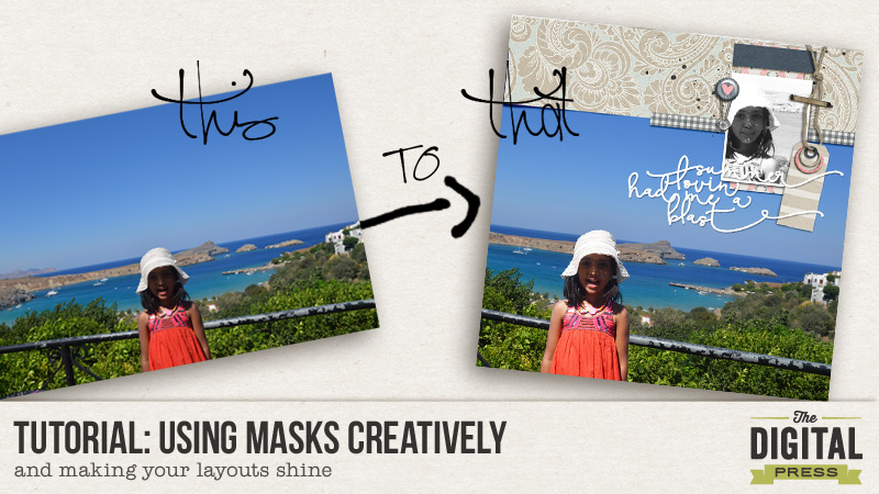
So the first technique is what I use to selectively apply adjustment layers to my photo. Take for example the one below. It was taken against a very bright background but my daughter’s face and body are a little dark. I especially want to bring out the little light rays filtering on to her face. So ideally I would like to brighten only her face a bit and not the whole picture. I use Photoshop Elements but these steps should be fairly simple to replicate in Photoshop as well.

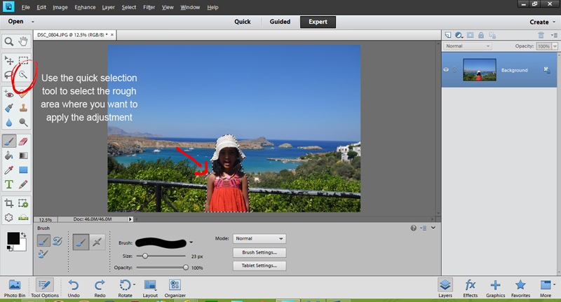
The first thing I do is use the quick selection tool to roughly select the portion to which I will apply the adjustment layer.


Step 1
Step 1

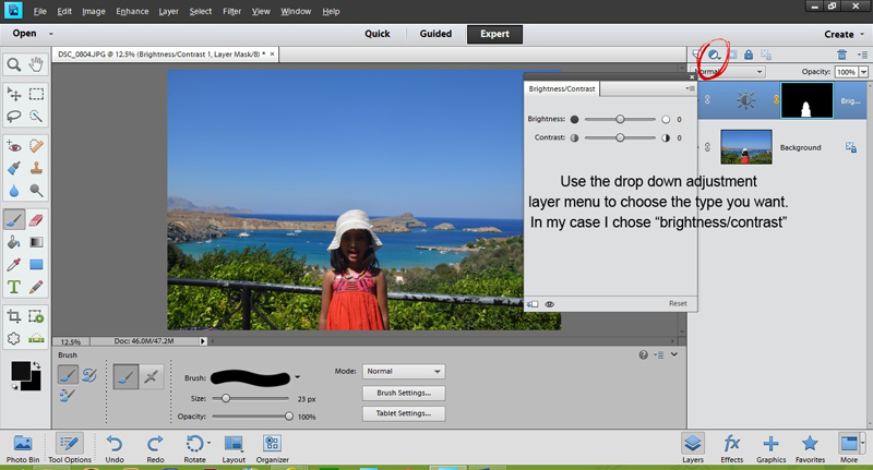
Next from the adjustment layer drop down list choose the adjustment you would like to apply. In my case I chose the “brightness and contrast” . You will see a layer mask appear with the selected portion in white and rest in black. That is the thumb rule when using masks – white reveals and black conceals. This also means any fine tuning we do on this layer will only apply to selected portion. Before doing this, however, you can also further refine the selection by using black or white brushes but make sure you have the right layer i.e. mask layer selected and not the background photo.

Step 2
Step 2

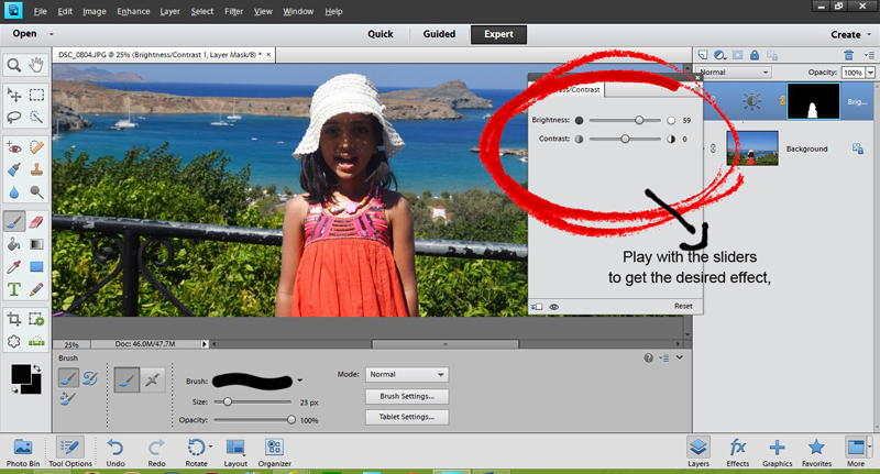
That is most of the work done! Now play with the brightness and contrast till you are satisfied and voila there is a little more light and colour on that face!

Step 3
Step 3

The second technique I want to share is for realistic element placement on the layout. For example if you are using a paper clip on a stack of papers or a thread looping through a bead or button or some such element. Now the idea is that certain portion of the clip or thread should be visible and others hidden. Using layer masks again helps us do that in a non-destructive and stress free way!

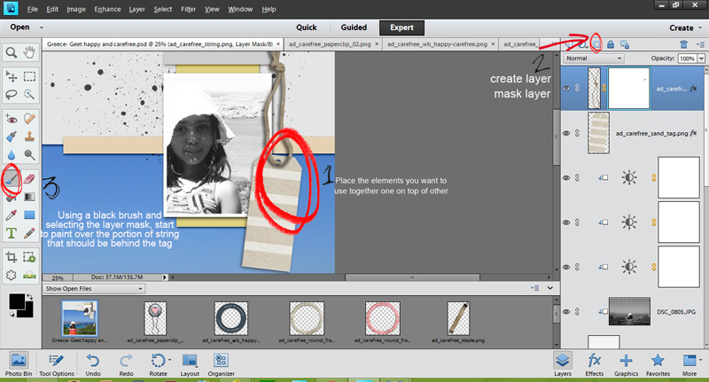
In the same layout, I have now added a tag and a closed loop string. What I want is for the string to loop through the little hole on the tag.

1. First place your elements one on top of the other.

2. Now select a layer mask to apply to the string layer

3. Use a black brush and start erasing portions of string that you want to hide. You may want to zoom in to do this step.

Tucking-elements
Tucking-elements

We are nearly there ! But there is still the erased string’s shadow left which is looking quite odd indeed. To edit this, simply place the string’s shadow on a separate layer and follow steps 2 and 3 again.

I added a few more rings to that string and here is the final layout.

Using masks creatively - final layout


Hope you found these tips useful and I would love to see any layouts created using these techniques. So please do not hesitate to share or any other techniques you use to get the same effects.


Profile pic avatar small

About the author: Shivani Sohal is a donner of many alter-egos. A finance professional by day in busy London, she morphs into a seemingly normal mum of two in the evenings and weekends. She is constantly found with her fingers in too many pies and juggling the metaphorical balls. That is living on the edge for her; aided by the two ankle biters and a darling hubby who define the warm and mushy for her. She is ferociously dedicated to memory keeping – almost immune to any nay-sayers (or equally disruptive crying children or annoying house fires!!!);keeping her head down and forging ahead at all times.

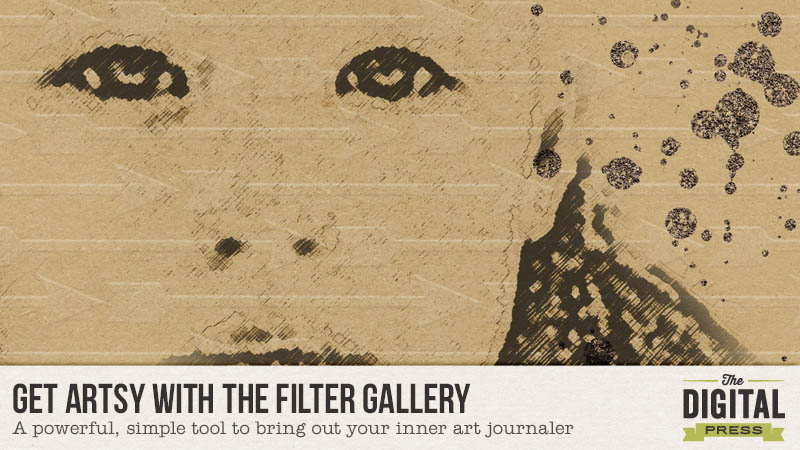
Tutorial – Get Artsy with the Filter Gallery in Photoshop

 Tutorial- Get Artsy with the Filter Gallery in Photoshop | The Digital Press

It’s Artsy Week in Summer School and I’m here to tempt you to put your art journaling hat on by using the Filter Gallery in Photoshop. Sure, we all know how to do a pencil drawing, but did you know you can do so much more and easily, too using the Filter Gallery? With Photoshop CC 2015, you can now apply multiple effects to one image. It’s 100% non-destructive, artsy heaven! I say this as an artsy non-art-journaler.

I’ve selected two photos to work with for this tutorial. One is a pretty decent photo of my hubby and son, if I don’t say so myself, and the other is a hot mess photo of my son as a toddler. Open a photo or two in Photoshop and play along with me.

First, we need to prepare our photos: I recommend deciding what size photo you’d like to use on your layout, so you won’t need to do any difficult re-sizing of the filters on your canvas. Once that’s done, you need to convert your photo for smart filters.  If you don’t have PS CC 2015, yet, (and you so should), you will only be able to apply one filter to your image. To apply another filter, you will need to rasterize your image and start again.

In Photoshop CC 2015:

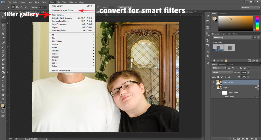
In the menu bar, click Filters> Convert for Smart Filters

All this means is that Photoshop is working magic so you can add more than one filter on your photo at a time.

 Tutorial- Get Artsy with the Filter Gallery in Photoshop | The Digital Press


When the scary dialogue box appears, click “ok” (really, it’s okay)

One thing to note is that the color selected in the color palette will effect the filters. I recommend you start with the default colors picked (B&W) and explore the different filters before going a bit wild with colors. (and I do hope you get to that wild place!)

Now it’s time to open the Filter Gallery! Click Filters> Filter Gallery

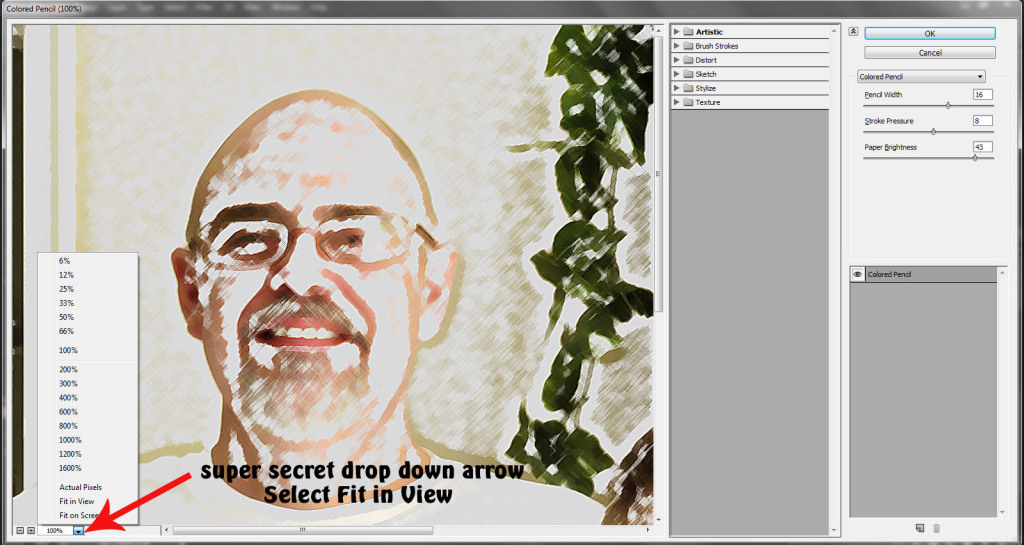
To see your entire photo, in the bottom left-hand corner, click the drop down arrow. Select Fit in View.

 Tutorial- Get Artsy with the Filter Gallery in Photoshop | The Digital Press


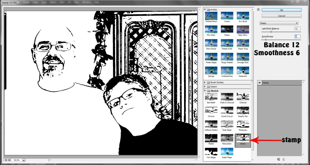
For this photo, I selected the Stamp option. I reduced the smoothness and the lightness until I have the fewest lines, but can still tell what I’m looking at. Start with these settings and adjust the sliders until you’re happy with your image:

  • Light/Dark Balance: 12
  • Smoothness: 6

 Tutorial- Get Artsy with the Filter Gallery in Photoshop | The Digital Press


The next photo I’ll be using is already prepared. It’s an old, damaged, sad photo that was scanned. I neglected to wipe off the dust… um, d’oh! It’s the perfect photo to use with the Artistic Filters.

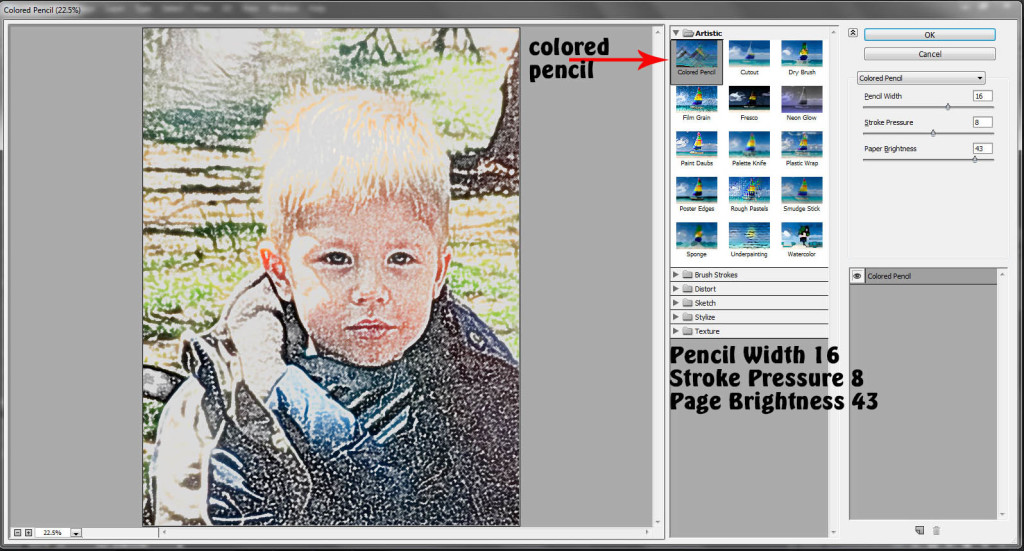
I started by using the Colored Pencil Filter. It doesn’t have be perfect because we’re going to add another filter on top of this one. What I want here is to really just bring out the eyes and lines of the face. I’m not worried about the background- I’ll take that out later.  If you’re photo isn’t a person, the same still applies- bring out the lines that define the object. When you’re happy with your photo, click okay. 

Start Here:

  • Pencil Width: 16
  • Stroke Pressure: 8
  • Page Brightness: 43

 Tutorial- Get Artsy with the Filter Gallery in Photoshop | The Digital Press


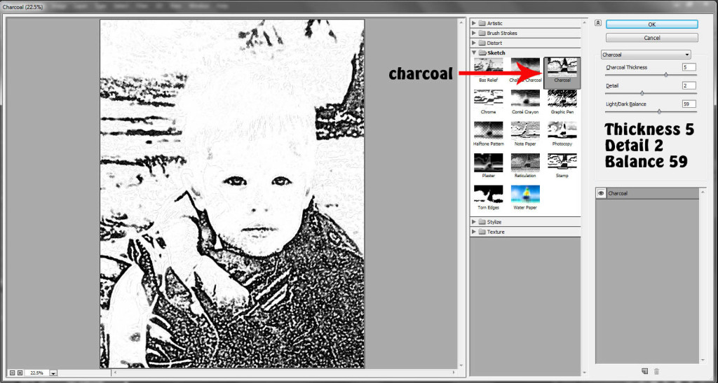
Go back into the Filter Gallery. This time, we’ll use a Sketch Filter, specifically, Charcoal. Again, we’re making sure the important lines are clearly defined…in an artsy way of course.

Start here:

  • Charcoal Thickness: 5
  • Detail: 2
  • Light/Dark Balance: 59

 Tutorial- Get Artsy with the Filter Gallery in Photoshop | The Digital Press


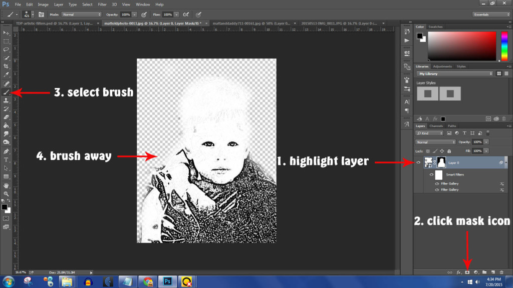
Click on your photo in the layers palette. Now click on Layer Mask icon. Select black as your color, use a round brush and brush out your background. You can select a different brush with a lighter opacity if you want to keep some of your background. If you brush out too much, don’t worry. Swap your color to white and brush over the area of the photo you erased. It’s magic!

 Tutorial- Get Artsy with the Filter Gallery in Photoshop | The Digital Press


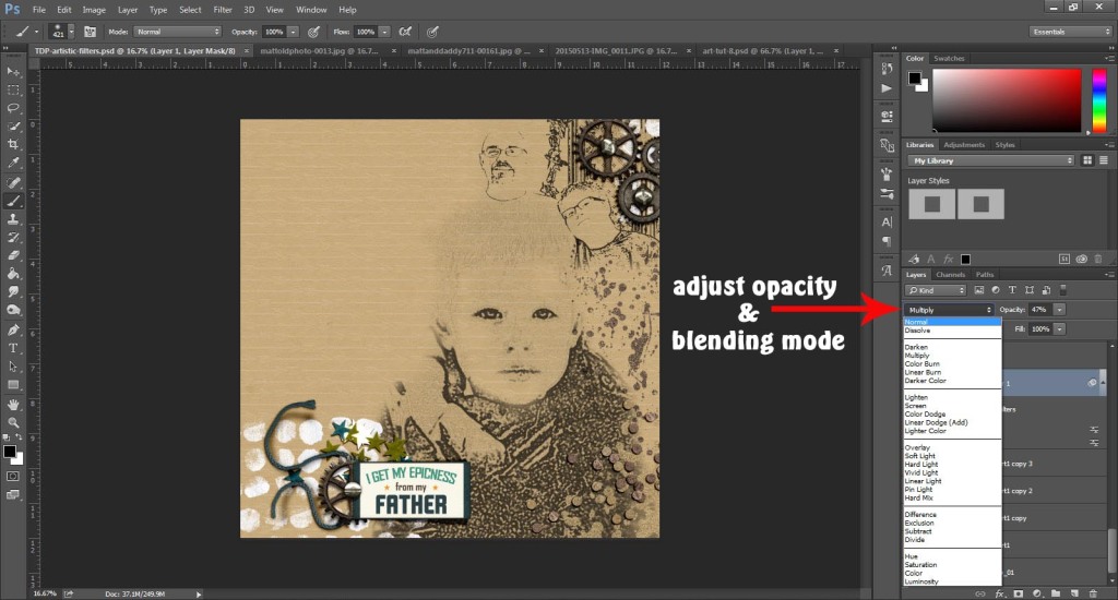
When your happy with your image, it’s time to drag onto to your layout. I’m using Real Life in Pockets: Rad Lab: Elements, Papers & Word Art by Mommyish and Just Jaimee. I’ve chosen an embossed kraft paper to show off my artsy photos. If you’d like your work of art to show the background paper, choose a blending mode like Multiply or Color Burn. Then, reduce the opacity so it blends into the paper.

 Tutorial- Get Artsy with the Filter Gallery in Photoshop | The Digital Press


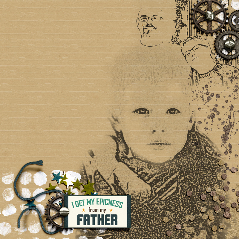
Here’s my finished product:

  Tutorial- Get Artsy with the Filter Gallery in Photoshop | The Digital Press


There you have it: a simple way to get artsy looks on your pages. Now, off to Summer School with you to learn more artsy techniques you can pair with this tutorial.  


Carrie About the Author: Carrie is a mom to an ASD teenager and wife to a Chiarian living in coastal Delaware. Currently, the producer and host of The Digiscrap Geek Podcast, Creative Team Lead for Just Jaimee, creative team member at The Digital Press & Get It Scrapped. Carrie’s other passions include genealogy and family history, beating your husbands and sons at Call of Duty, binge watching TV shows on Netflix, visiting the beach, reading, doting on her cats, making cards with digital products and front porch chats with her neighbors.

Tutorial – Text on A Path with Shapes

Tutorial: Text on a path with shapes

Hi there scrappers! I’m back with another tutorial post and today I am going to teach you how to do text on a path with the shape tools. It’s a super easy way to add some interest to your journaling or title work. I’m using Photoshop CC for this tutorial, but I’ll also link you to a video at the end that will teach you how to do the same technique with Photoshop Elements.

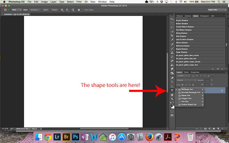
To use a shape to create a text path, you need to first choose the shape tool. For this tutorial, we will use the ellipse tool, but you can choose whichever shape suits your layout.

Tutorial - Text on a path with the shape tools


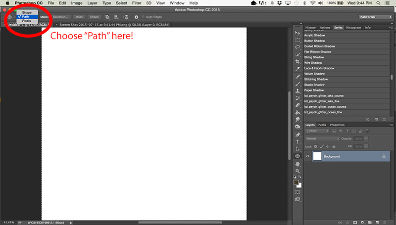
Once you have chosen your shape, on the top left of the screen, be sure that you have chosen “Path” from the dropdown menu, next to the shape.

Tutorial - Text on a path with the shape tools

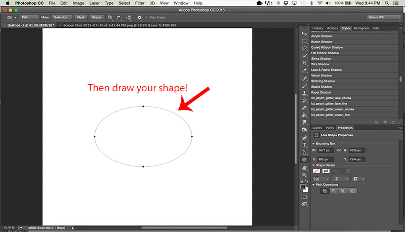
Then, draw your shape.

Tutorial - Text on a path with the shape tools

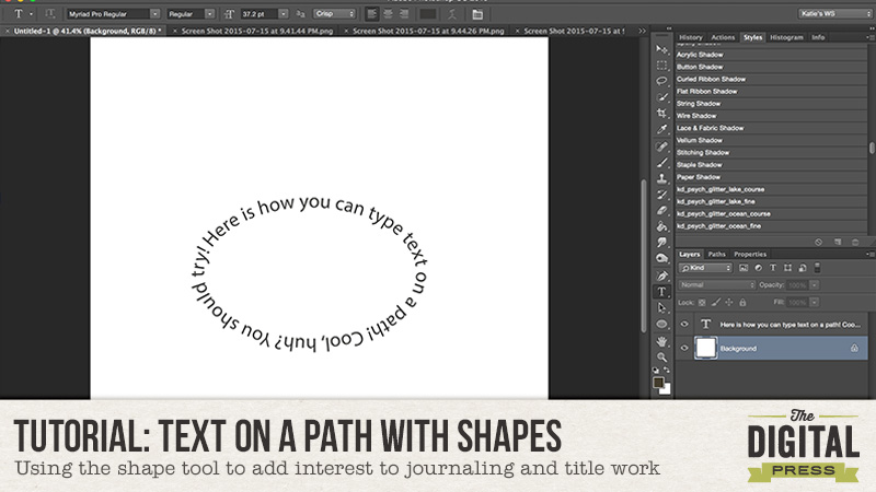
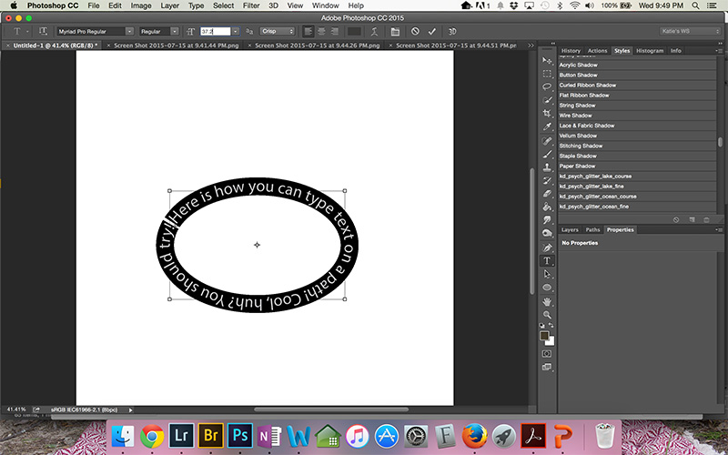
Once you have created the path with the shape tool, you will choose the horizontal type tool (the one you usually use for typing text). Hover your cursor over the path for the shape and you will see a wavy line appear in the middle of the regular symbol for the type tool. Click down where you want your text to begin and type your text. You can adjust your size, font, and color just like you would if typing in a regular text box. When you are finished typing, adjust your font size to fill the shape as desired.

Tutorial - Text on a path with the shape tools

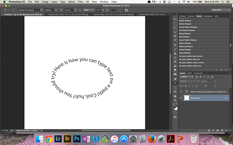
Finally, to make the path disappear so that only the type remains, click off the layer with the path.

Tutorial - Text on a path with the shape tools

If you are a PSE user, you can see this Adobe video to get the steps for this technique.

I hope this tip helps typing on paths seem less intimidating! I know I was hestitant to try it, but once I gave it a shot, I realized it was easy! If you use this technique, link me up to you layout in the comments so I can see what you have created! Happy scrapping!

KatieKatie is a member of the Creative Team here at The Digital Press. She lives in Central Florida with her husband and their four sweet but crazy boys. When she’s not dodging Nerf bullets or trying to dig out from under the never ending pile of laundry, she enjoys photography, cooking, going to Disney World with her family, and, of course, digital scrapbooking.

Photoshop Tutorial: Head swapping made easy

blogtemplate July

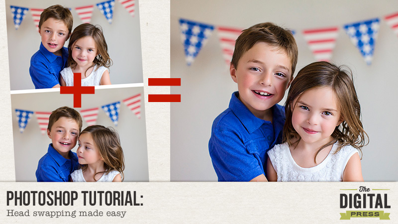
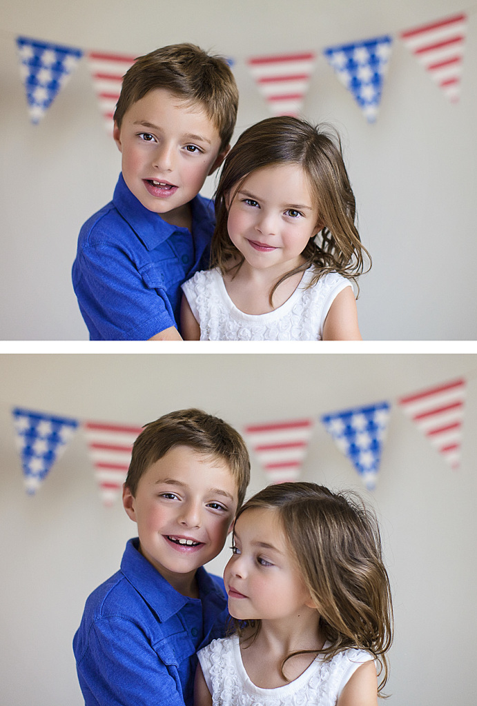
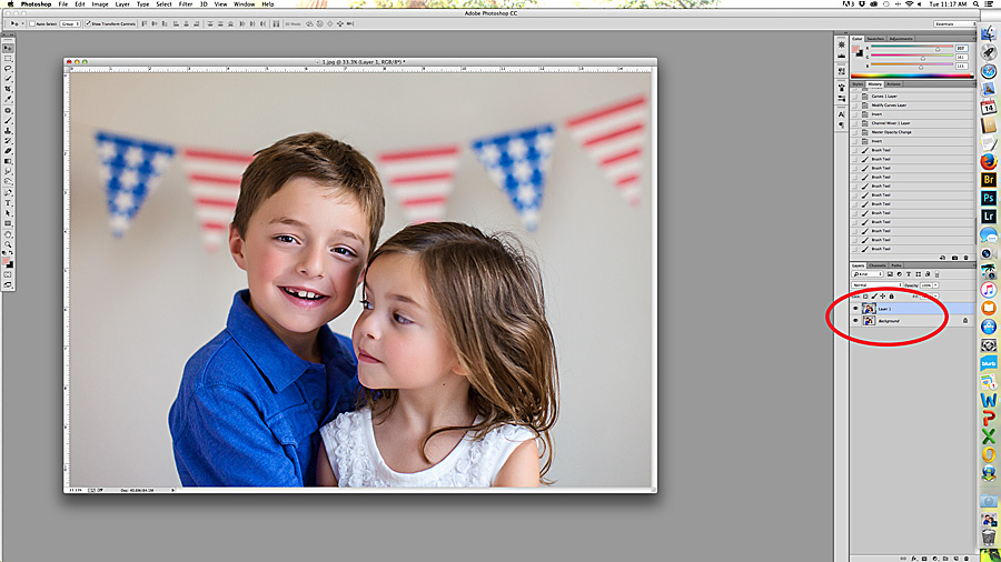
My kids are complete goofballs, especially when it’s picture time. I’ve gotten in the habit of taking multiple shots of them instead of trying to make them cooperate. The result is that I’ve become a expert at swapping heads! Here are two shots- in one, my daughter looks great, but my son’s expression isn’t quite what I was hoping for. In the second shot, my son has a nice smile, but my daughter is looking away. The obvious solution is to combine the shots. Here are some easy tricks to making sure that everything lines up:

1

  1. Using unedited photos, drag the 2nd shot over onto the first shot. ***note: I usually do any head swapping first before editing the final image. ***


6


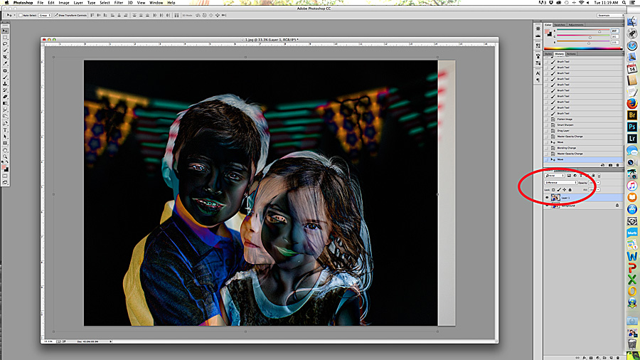
  1. Change the layer style to DIFFERENCE. Line up the photos so that the head is mostly black. Black means that there’s no difference. Of course, the parts that you’re trying to change will not be black, but it’s important to make sure that as much as possible is lined up.


7

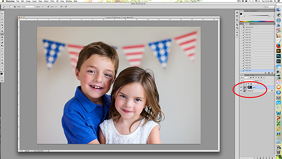
  1. Change the layer style back to normal and add a layer mask. Use a white brush to mask the head that you’re swapping, paying close attention to the borders. Once you’re happy with the swap, flatten the image and edit as you would normally.

8

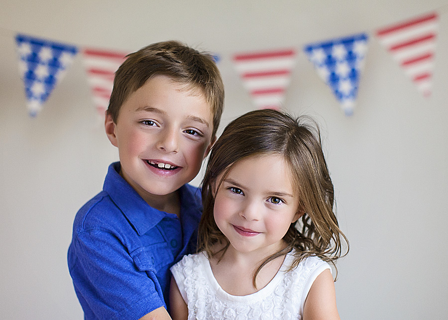
  1. Voila. YES…it is that easy. Here is my final image.9


FarrahAbout the Author:  Farrah Jobling is a member of the Creative Team here at The Digital Press.  She lives in Denver with her amazing family, Mike, Nicholas (8), Claire (5) and Hope (1 yr old puppy).  She works from home as a photographer and enjoys scrapping her personal photos.

Quick Tips: Rocking your Shadows on a “Time Budget”

Quick Tips- Shadows on a TIme Budget

I have to confess, I am a bit of a shadow-tweaking fanatic.  I first  learned that I could tweak my shadows about a year and a half ago and I am still learning new tricks all the time.  Playing with the shadows is my favorite part of creating a digital layout.  I love seeing the elements “come to life”and pop right out of the page at me.  Sometimes I spend more time on my shadows than the rest of the layout, and I am fine with that because I enjoy it so much.

But I also have to confess that some days I just don’t have it in me.  I home school three kiddos aged toddler to preteen and we live in the tropics – which means it is LOUD and HOT all the time at my house.  Some days I am lucky if I even get to touch my computer, and when time is running short on a project, I sometimes just don’t have the energy to spend hand- tweaking every single shadow.

BUT I really like having realistic shadows!

Over the course of the last year I have been compiling a list of little tricks I either found on the web or discovered on my own to help me create more realistic shadows when I am on a “time budget” and just cannot warp and tweak.  I work in Adobe CS6, and I understand that not all of these will work in every program, but hopefully you can find one or two tricks to help you create beautiful, simple shadows in no time at all.

Quick Hints for Creating Great Shadows in Less Time

1. Invest in a Shadow Style Set.

You can interpret this one of two different ways.

You can either invest the money, or you can invest the time.

Either way, a good shadow style set will do wonders to cut down on your crafting time.

In general, elements that are of the same type tend to have roughly the same shadow settings.  For example, all buttons are pretty close to the same in dimensions and so their shadows will fall roughly the same way.  However, a sticker and rumpled paper flower will have much different shadow settings.  Paying attention to the different ways shadows fall is one of the key elements in great shadowing, but it can take time. That is where styles are helpful.  They take into consideration the various dimensions of different elements but can be applied in a single click. Just using the default drop shadow for all of your elements leaves a very flat look to your page.  Using the preset styles costs you the same amount of time, but gives very different results.

See what I mean?

with default drop shadow only

Quick tips to Rock your shadows 01

with shadow styles (no tweaking)

Quick Tips to Rock your Shadows 02

credits: A Story Captured Vol 10 by Anita Designs

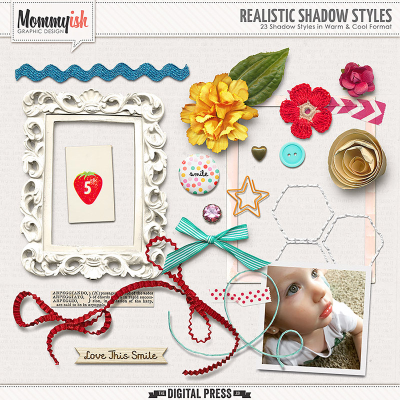
The shop has two gorgeous Shadow Styles Set both of which would work great for those times when you need to get a page done quick. (And might I add that they are priced ridiculously LOW for they amount of time the save – by far they are both an AWESOME deal!)
Quick Tips To Rock your Shadows Leah

Realistic Shadow Styles by Mommyish

Quick Tips To Rock Your Shadows Sabrina

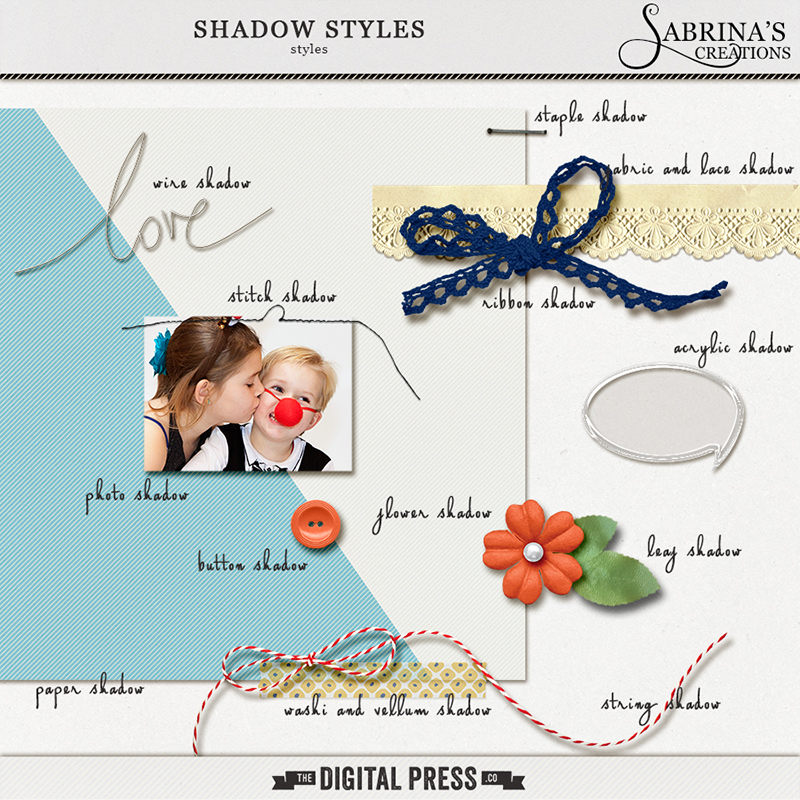
Shadow Styles by Sabrina’s Creations

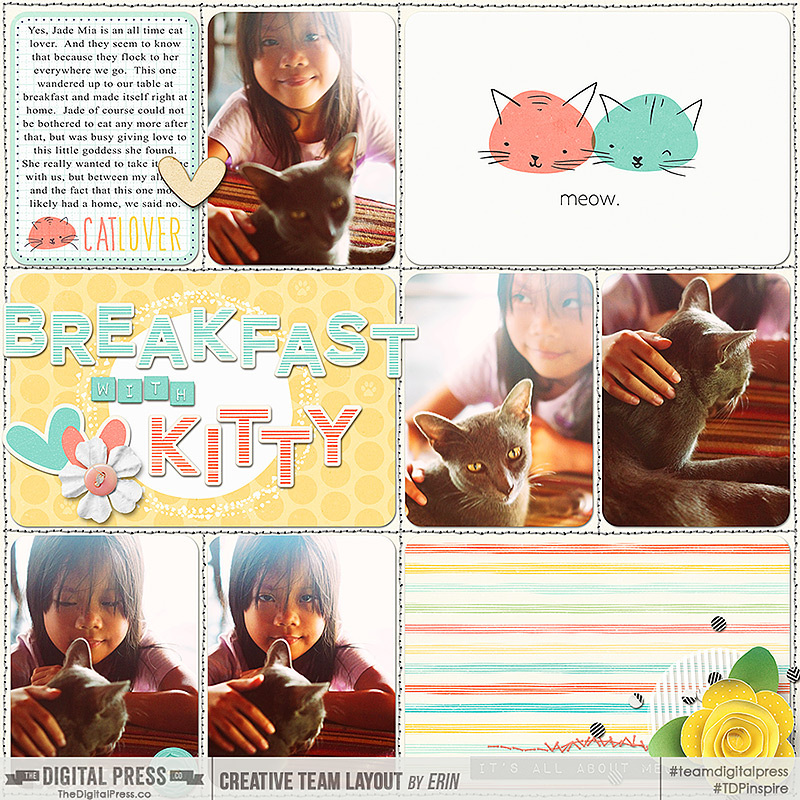
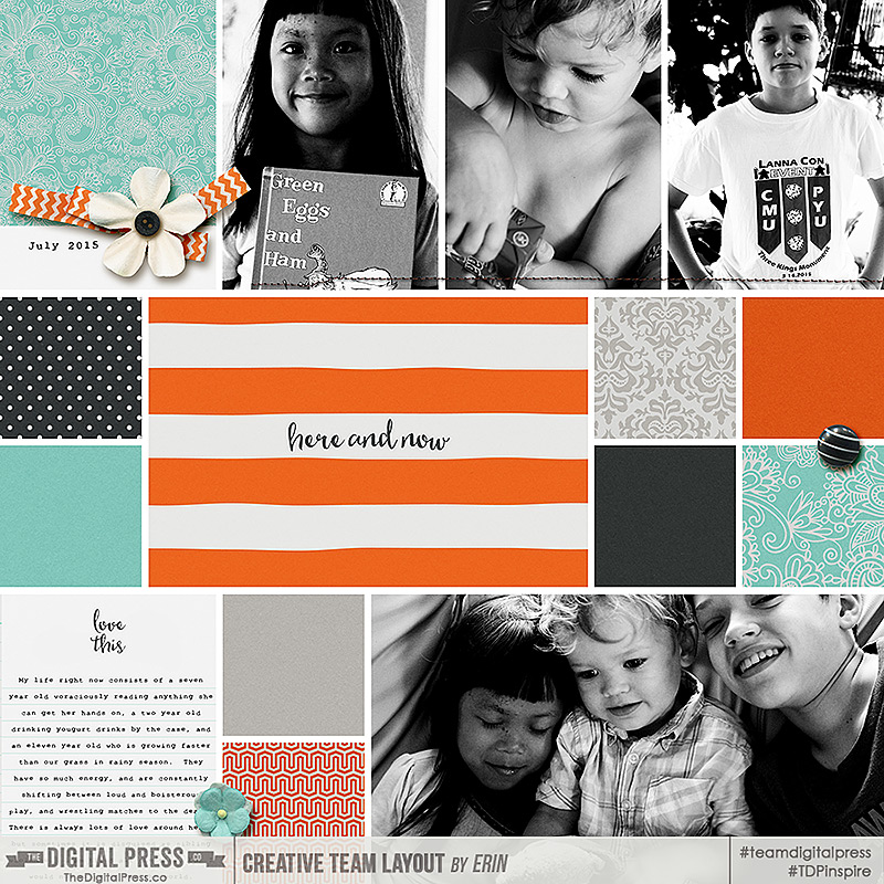
Here are some pages I made just using each of these style sets so you can see them in action.
Quick Tips to Rock your Shadows 09

credits: Crazy Cat Lady Collection by Mommyish, Realistic Shadow Styles by Mommyish, and Project Twenty Fifteen Templates Vol. 2 by Laura Passage
Quick Tips to Rock Your Shadows 10

credits: Currently Collection by Sabrina’s Creations, Everyday Life Templates Vol 4 by Sabrina’s Creations, Shadow Styles by Sabrina’s Creations

If you just don’t have the extra funds at the moment and would rather invest your time, then you can make your own shadow style set fairly easily. ( If you do not know how to do that then I have a little tutorial for you HERE.)  Choose some of your most commonly used elements and set the shadows to the settings you prefer.  Once you have them set, you can go through and save them so you can repeat that look with a single click on other layouts.  When creating your own shadow styles do keep in mind what the real life counterpart to this element looks like and how its shadow might fall, this will help you love your shadow styles even more.

2. Choose your light source/direction and keep it consistent.

I think this is probably one of the most important things to achieving realistic shadows, whether you warp them or not.

Many elements already have an established light source.  This is indicated by the highlights and shadows on the element. The highlight shows us from which direction the light is coming and the shadow tells us the angle and depth at which any shadow we add should fall.

Designers often have a favorite light direction that they use, so if you are a one kit scrapper this may not be as big of a problem. However, different designers have different preferences so if you are mixing multiple designers you will need to pay close attention to the light source and direction.
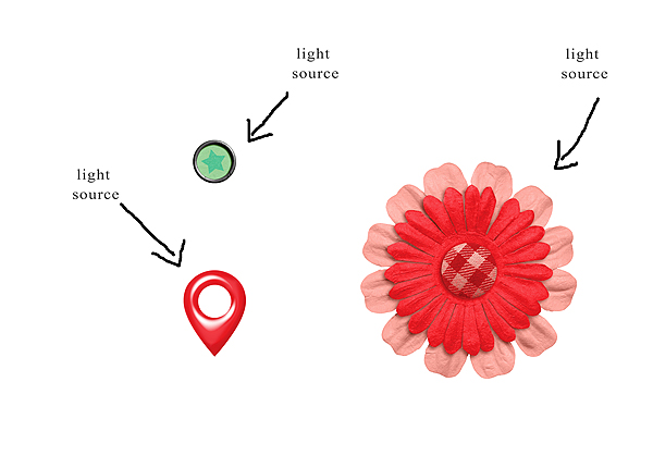
Quick Tips to Rock your Shadows 03

Why does it matter? Well when two elements have different light sources (or the drop shadow is different from the established light source of an element) it causes a disjointed feeling in the composition of the page.  The brain is trying to understand how this can be possible and so something feels a little off. Take a look at these elements, for example. It is not immediately noticeable, but they are not quite right because the light source on the elements is different from the light source of the drop shadow.

Quick Tips To Rock Your Shadows 04

This can be fixed quite simply by either rotating/flipping the elements so the light source matches or by applying a shadow that follows the light source on the elements.  In this example, I horizontally flipped the elements to go with the shadow. Can you see the difference?  This really helps the elements come to life and creates a consistency that makes our eyes and our brains happy.
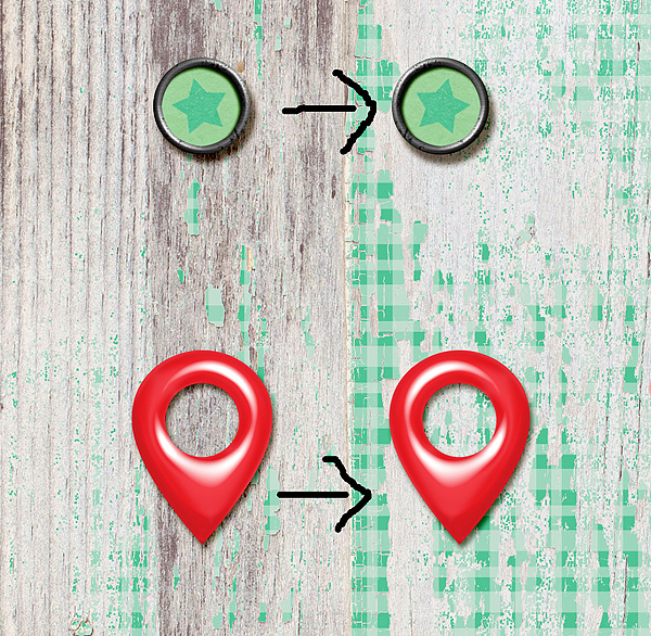
Quick Tips to Rock Your Shadows 05

With most elements there is no one “right way”  to place them on the page so they can be rotated, flipped or whatever to achieve the unified light source you need.  However, elements with  letters, numbers, and text can be tricky. You cannot flip a word flair, for example, or the writing will be backwards and no longer useful.  Take a look at these two elements.  Both have an established light source (which are different from each other as well) and text.

Quick Tips to Rock Your Shadows 06

When I know I want to use an element that has both words and a defined light source I generally try to match the rest of my page to that element so as to avoid shadow issues.  In this case I would change my shadow style to match the larger red element.  The flair can then be slightly tilted to match, like this.

Quick Tips To Rock Your Shadows 07

credits: Gingham Style by The Digital Press

See how much better that looks! And it really does not take all that much time at all.

3. Set your default drop shadow to your most commonly used shadow settings.

I only learned this one this last year.  I just assumed the default was set in the program and so was constantly having to go in and alter for everything, because I hated my default drop shadow setting.  One day I found this little check box at the bottom of the layer styles palette (been right there in front of me the whole time).  I checked it and voila!  My most used drop shadow was now my default!  For me that is the paper setting I use.   If you have a drop shadow setting you find yourself using often then set it as the default and save yourself some time.

You can do that here: Layer Style>Blending Options>Drop Shadow
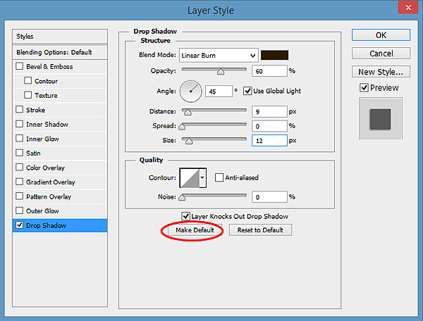
QUick Tips to Rocking Your Shadows 08

4. Format your shadows as you go.

This was a new idea for me too.  I used to throw everything on a page then go back and tweak shadows later, but I found that when I ran into a problem, like a word flair with lighting opposite to the rest of the page, I would have to start all over and so wasted a LOT of time.  Now obviously if you are going to be really tweaking your shadows you should probably wait to warp and smudge till you have a solid idea of your page design because who wants to re-tweak an entire page.  But if you are going the quick route with drop shadows it really does save time to add them as you go. By doing this I catch the problem areas sooner and so have less to re-do, and often no re-dos at all.  Plus, once I get that last bit on the page I am done, which always feels good right!

5. Make Actions for your most used commands.

If you just cannot give up warping and smudging, and I hear ya on that one, but still want to save some time, make actions for your most common techniques.  An action for separating your layer styles for example (Heidi showed us how to do separate our layer style here), or for adding a wave or a blur or whatever you find yourself always doing,  would give you that one click satisfaction of having a great shadow in half the time!

I hope that you are able to use some of these little tricks I have found to improve your shadows and lessen your crafting time.  I am always looking for more ideas and I would love to hear form you as well.

Do you have some quick tips for great shadows?

Share them with us in the comments below!


Erin 1About the Author: Erin is a work from home mom of three living in Thailand. She loves playing with her kids and anything artsy. She can often be found knee deep in toys with paint on her face. She is slowly learning the meaning of living an authentic life, and enjoying every minute of the adventure.