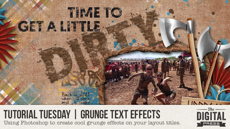
Hi scrappers! It’s time for another tutorial… and this week I’d like to share my technique in creating a grunge title. I’ve been all about simplicity lately, and this effect is quick, simple effort for a big effect result. Perfect!
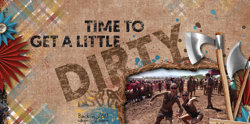
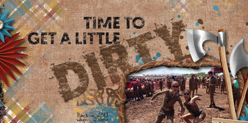
I ran a Warrior Dash race with a friend of mine years ago and we got all kinds of messy! I think it was the mud pit that we had to army crawl through at the end that really did us in. So for this page, I wanted a grunge title to match.
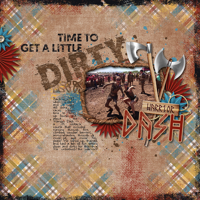
Here’s what my page ends up looking like.
It’s super easy to do this! To get started, I chose a big chunky font that had plenty of surface area for effects. The font I used here is called Geomanist. Go ahead and create your text layers, positioning your title where you want it on the page.
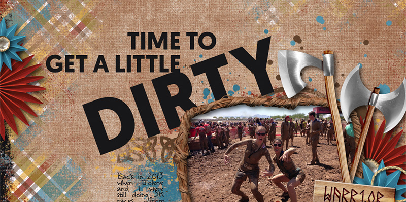
Next, we need to convert the text to shapes. To do this, right click on the layer in the layers panel and choose “Convert To Shape”. You can also hit Cmd/Ctrl + E.
Before I added the grunge effect, I wanted to give my text the right color and texture. So I clipped one of the papers in the kit I was using to the text. Since we need that to be just one layer, I then merged the clipped paper and the text shape by selecting both layers and then right click in the layers panel to choose “Merge Layers”.
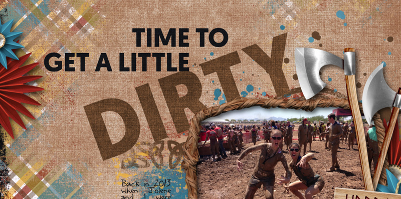
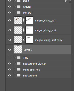
Now it’s time to use some brushes. I used two sets of brushes for this effect. First was a set of grunge brushes that I got for free here. The second set, which I’ll use later, are paint splashes, and I got those for free here. To use these, first make sure that new shape layer (the one that used to be text) is selected. Then go to Layer > Layer Mask > Reveal All to add a layer mask to the shape. Then using the Brush tool (B) and with your foreground color set to black, choose a grunge brush (like the ones I referenced above) and click over and around the edges of the text shape until you get a texture effect that you’re happy with. I changed my brush size to about 700 in this example.
Next, I added a new layer just underneath the text layers. To do this, select the layer just underneath your text shape layers in the layers panel and then choose Layer > New > Layer. This is going to be for my paint splotches that will match the color of the text.
With this new layer selected, I first make sure my foreground color is the same as the text. I used the color picker to match it exactly. Now I’ll grab my brush again, this time choosing one of the paint splatter brushes that I just added. I actually used a few different brushes from that same set, and I brushed (just click once, no dragging) some paint splatters behind my text to get something that looks like this:
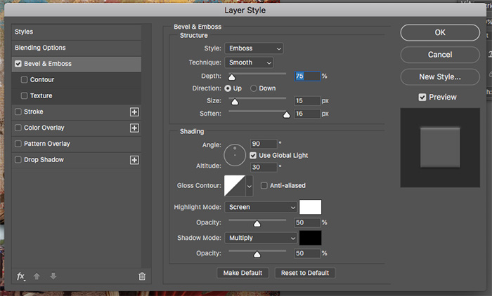
And finally, I added a tiny bit of beveling to both the text and the paint layers. To do this, I double clicked on the paint layer and checked the Bevel and Emboss checkbox and used the following settings. I did the same with the text shape layer.
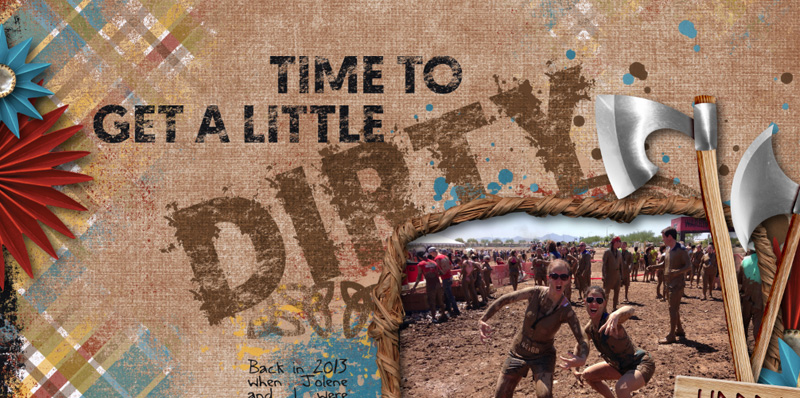
The result is this grunge, paint splattered titled that works really nicely with the theme of my page! Hopefully you guys will try this out and find it to be super easy to get this cool effect for a title. Experiment with your brushes – both the brush and the size – until you get it looking just how you want it to. Have fun!
 About the Author Shannon has been completely addicted to digiscrapping since she began in early 2016 (though she’s been a scrapper since 2000). Her early morning ritual of a few quiet hours of scrapping while sipping a chai tea is her favorite part of each day. She is also the owner of a web design company, and when she’s not at the computer designing websites or digiscrap layouts, she’s probably hiking one of the local mountains in her hometown of Phoenix, Arizona. She is an avid reader and loves to travel to foreign countries.
Awesome job! Love your page!