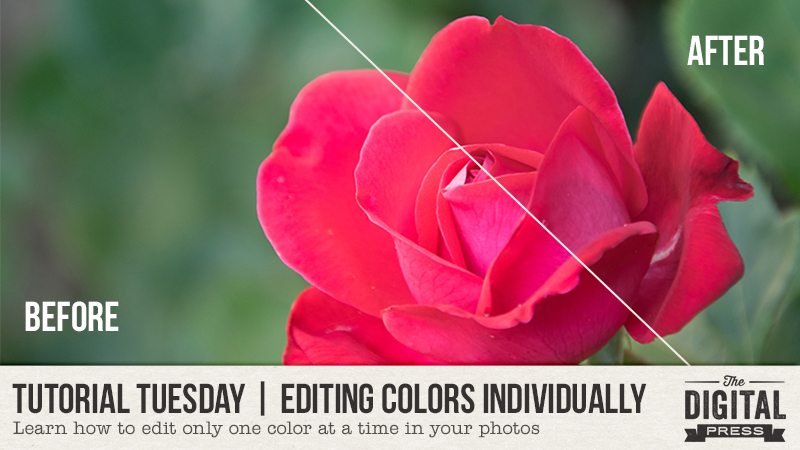
Hey everyone, and welcome to another edition of our Tutorial Tuesday series here on The Digital Press blog! Let’s talk about photo editing and color today!
You probably know how to change the colors of your picture globally (and if you don’t, there are some other tutorials on the blog that can give you some simple tips like this one about saturation and contrast, etc.). But sometimes, editing all the colors of a picture at once can lead to an unnatural, “fake” looking photo. To avoid that, you can work on each color individually so that you can edit just the color you want to change, not the whole picture. I will show you how to do so in Lightroom and Photoshop, but I’m confident you will have similar settings available in just about any photo-editing software.
Here’s a look at the picture I will be working on today…
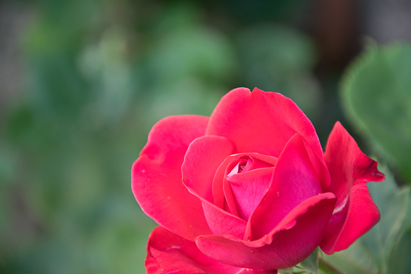
This is the straight out of camera image (SOOC). As you can see, the red rose is very bright and saturated — almost neon — and I would like it to be more natural-looking.
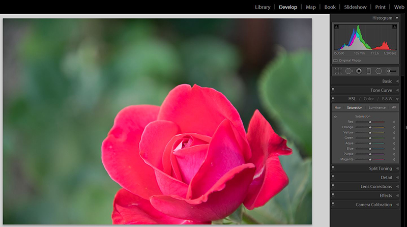
First, I will show you how to do that in Lightroom. Import the image in the software, then open it in the “Develop” module. Then find the HSL/color/B&W panel, which is the one open on the image below, on the right. We will work in the HSL settings. HSL stands for Hue, Saturation and Luminance. In each of those three areas you can edit eight different colors: red, orange, yellow, green, aqua, blue, purple and magenta.
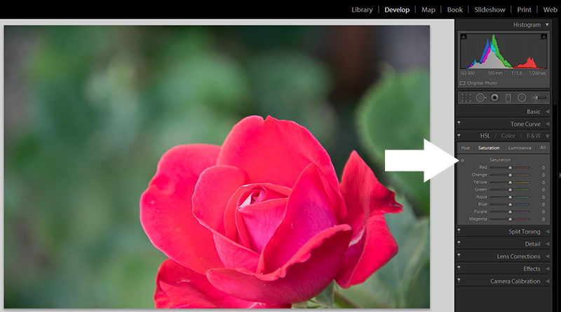
If you’re not sure which color you should be working on, use the little circle (pointed by the arrow in the image below), click on the color you need to edit and move it all the way up and down. You will see one of the colors change drastically, probably one or several other less notably. The main color will be the one that changed the most, that’s the one you need to work on.
For my rose here, I had to work mainly on the color red and a bit on the color magenta (in the inner petals). I edited those two colors in saturation (to change how “strong” the colors are)…

… and in luminance (to change how bright or dark the colors are).
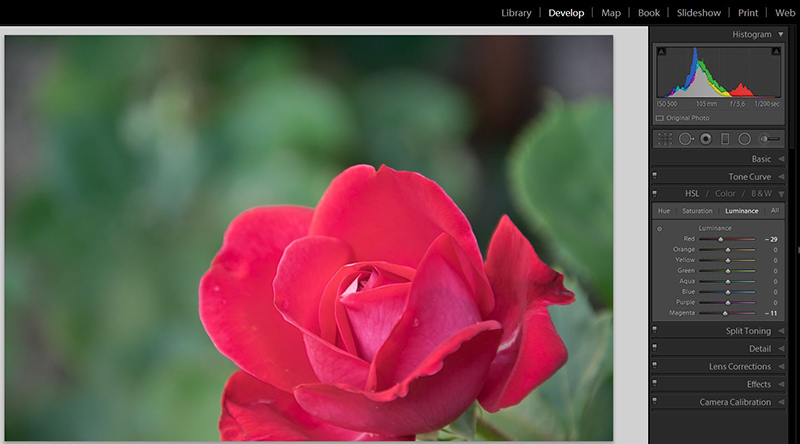
As you can see, the greenery in the background isn’t affected at all by the changes I made in the red and magenta areas.
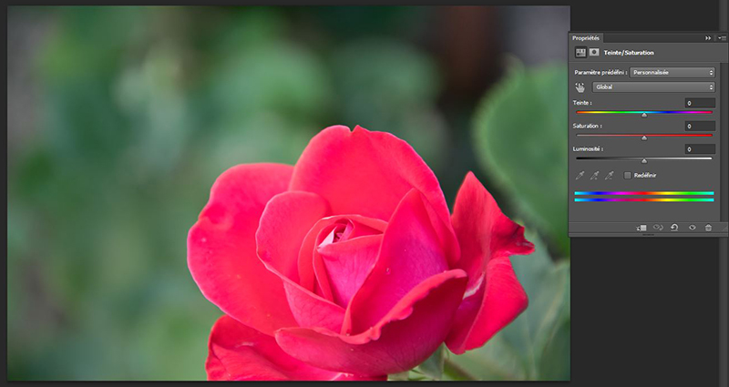
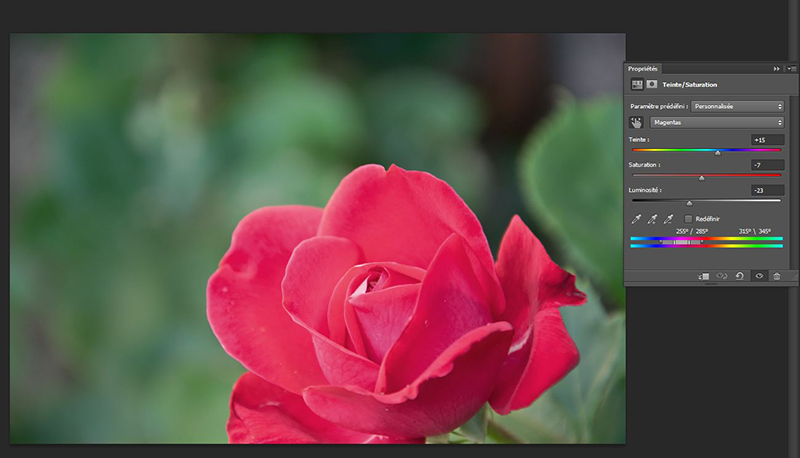
Let’s move to Photoshop now. You can do something pretty similar using the “hue/saturation” adjustment layer. To use this tool, go to Layer –> New Adjustment Layer –> Hue/Saturation or click on the “new adjustment layer” icon on the bottom of your layers panel. As you can see, unlike the HSL panel in Lightroom where you decide first what setting you’ll work on (hue, saturation or luminance), and then which color you’ll edit, here you will first decid on the color and then on the settings you’ll edit. To do so, you will pick the color in the menu that says “global” by default. You will have 6 colors to pick from: reds, yellows, greens, cyans, blues and magentas.
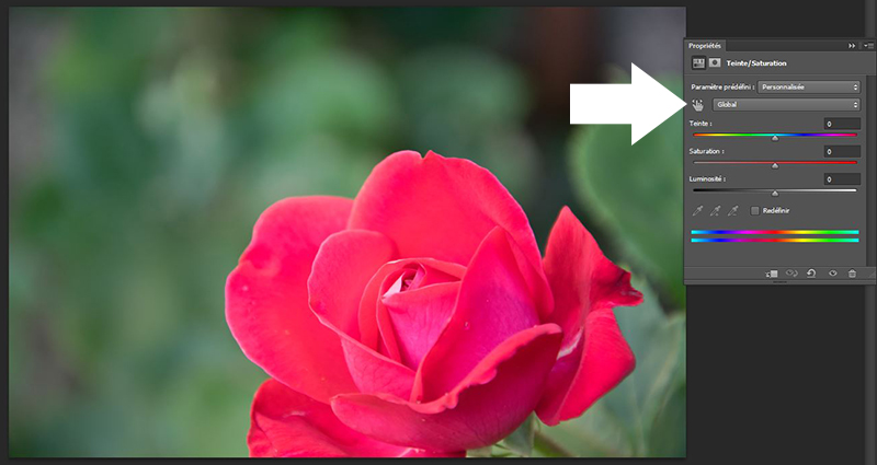
As in Lightroom, if you’re unsure exactly which color you should be working on, there is a helpful tool. Use the little “hand” (pointed by the arrow below), click on the color you wish to edit and move the hand from left to right. The “global” menu will change for the right color you need to change.
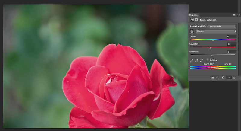
As I did in Lightroom, I changed the reds, editing saturation and luminance…
… and the magentas, where I changed saturation and luminance but also the hue (teinte in French). I did that because I wanted to bring the pinkish inner petals closer to the rest of the flower, which is more red than magenta.
And that’s it! As you can see, it’s not super complicated and it can be very useful for specific images, like making a red dress pop (be careful as skin often has red and yellow in it, so don’t oversaturate your subject’s skin if you don’t want her to look like an alien!) or decreasing the “visual weight” of the bright greenery we often get in Spring, so that your subject will stand out, not the grass he/she’s sitting on!
I hope you’ll find this tutorial helpful, don’t hesitate to ask your questions in the comment below or in the forums!
 About the author Chloé is in charge of PR and communication for her small town by day, is a digiscrapper “by night,” and a photographer whenever the light is beautiful. She lives with her man and fur-babies in a small town of Alsace (in the northeast of France), where she loves to read, watch good TV shows (TWD being her absolute favorite), and just hang out with her friends — no matter if they are close by, online, or away in her Swiss hometown. She recently became quite obsessed with Bullet Journaling, FlyLady and Zero Waste.
great tutorial! i use a completely different designing program but i will see if this will work in that one. Thank you so much!